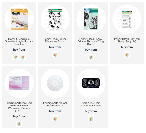
Pencil Poppies
Posted: April 29, 2022 Filed under: brilliant, Coloured pencil, Gouache, Penny Black | Tags: Faber-Castell Polychromos Colour Pencil, Gouache paints, Penny Black stamps 10 Comments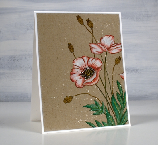
Today’s pencil and gouache technique was inspired by a beautiful card recently posted by Debby Hughes. Debby did a video of her process so if you are interested you can pop over to her youtube channel and follow her directions like I did.
I used a different stamp, ‘brilliant’ from Penny Black but the other supplies and technique are the same as Debby’s. I stamped on kraft cardstock with pumice stone ink, painted inside the petals with white gouache then did all the colouring with Faber Castell Polychromos pencils.
When I first stamped the ‘brilliant’ poppy stamp I used Papertrey ink soft stone ink which is my current favourite for no-line watercolour techniques. It stamped well on the kraft cardstock but when I looked at it ten minutes later it had faded quite a bit. It would be fine for someone whose eyesight is perfect but mine is not so I stamped in pumice stone distress which gave me a bit more contrast.

Debby’s technique included painting the petals in white gouache then colouring over the top. I hadn’t tried it before but I will do it again in the future. It worked very well and took the place of my previous method which was colouring in white pencil first then adding colours over the top before blending again in white. Painting with gouache first gave me a base which happens to also be a nice matte surface to colour over. I finished the design with some white gouache splatter as Debby did. So basically I am saying, ‘ do what she did!’ Thank you Debby for a great technique tutorial.
The polychromos pencils I used were: white, medium flesh, medium cadmium red, raw umber, emerald green, pine green, naples ochre and walnut brown.
Supplies
(Compensated affiliate links used when possible)

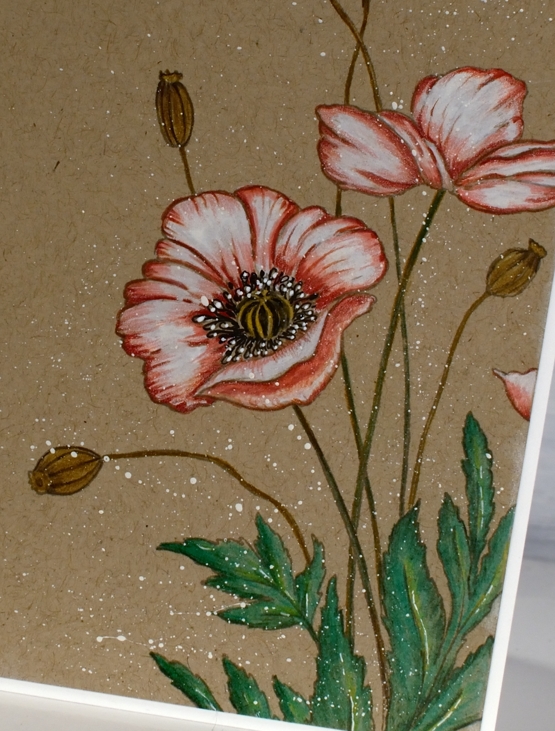
Gouache Hand Painted Wreath
Posted: September 1, 2021 Filed under: Finetec paints, Gouache, Hand painted, Penny Black | Tags: Finetec artist mica watercolour paint, Gouache paints, Penny Black stamps, Stonehenge black watercolour paper 7 Comments
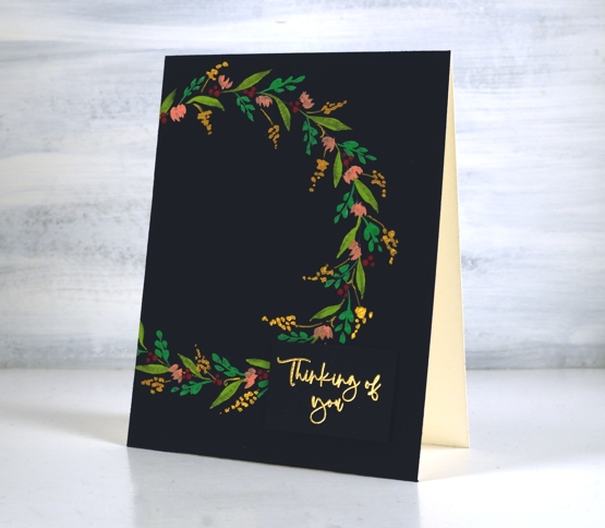
I’ve been experimenting with gouache paint. I posted a few cards with gouache painted backgrounds early last month and now I have a painted wreath to share. The Foiled Fox kindly sent me the set of gouache and I have been practising colour mixing and painting very simple shapes and patterns. You can find me on the Foiled Fox blog today with more tips and tricks about this card.
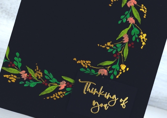
Even though I am still a gouache newbie I decided to film the process for painting a simple wreath. I only used four different gouache colours, a green, a yellow, a red and white along with one pearlescent paint. In the video you will see the process and all the colours listed by name.
You certainly don’t have to use gouache on a black background but it does really pop! I think my next path of experimentation might be to use watercolour and gouache in the same project. On a slight side note, I don’t set out to do such tiny details; I can’t help myself. My art teachers in high school and college always told me to use bigger, bolder strokes!
Supplies
(Compensated affiliate links used when possible)

Gouache skies
Posted: August 2, 2021 Filed under: Gouache, Penny Black, snowy village, soulful silhouettes | Tags: Gouache paints, Penny Black stamps, Tsukineko Versafine inks 9 Comments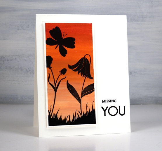
Some of you may remember me mentioning a while back an interest in trying gouache paint. The Foiled Fox kindly sent me some to try and I have been learning and practicing the techniques over the last couple of months. I am sharing over on their blog today so make sure you visit to read more about my process. Gouache is an opaque acrylic paint with some similarities to watercolour paint. It is possible to dilute with water until it becomes somewhat transparent but it is more common to see it used in its opaque form. I watched several videos to learn what to do (and what not to do!) and will continue to experiment.
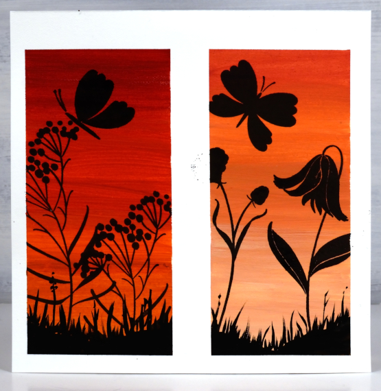
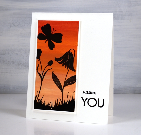
One key fact I learnt after trying to paint with several colours right out of the tube is the need to mix with a little water to get a creamy consistency. Another important thing to note is that unlike watercolour, where I add water to get a lighter shade, with gouache I add white paint. In the photo above you can see two panels side by side. I taped the watercolour paper with washi tape and painted the one on the left without adding white paint to the red and orange paints used. For the one on the right I added white to both the red and the orange increasing the amount of white to get the lighter colour at the bottom.
I also included the photo of the uncut panel so you could see how well the washi tape masked against the paint but was not thick enough to keep out all the versafine clair nocturne ink.
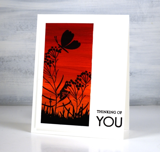
To turn the painted panels into scenes I used PB ‘soulful silhouettes’ stamped in nocturne versafine clair ink. It stamped really well on the gouache.
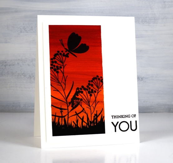
I popped up the panels and added sentiments using the PB ‘only you’ sentiment set.
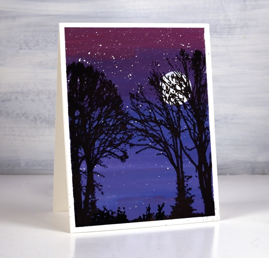
After some success with the warm toned panels I taped off a larger one and used blues and red to create a gradated purple sky. Although it is quite dark I did mix white paint with each of the colours used. ( I listed the paint colours used on the Foiled Fox post)
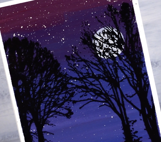
Once the background sky paint dried I splattered white gouache for stars then painted a circle for the moon. Once again the nocturne ink worked beautifully over the painting as I stamped trees from the PB ‘snowy village’ set.
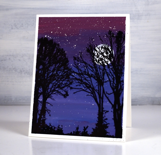
I finished all three panels by painting some black foliage along the base to look like grass and plants.
Let me know if you use gouache either for cards or other purposes. I have a few projects I hope to try as I continue to learn more about the medium. Thanks for dropping by.
Supplies
(Compensated affiliate links used when possible)