
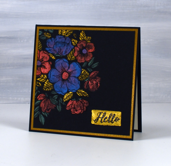
HB shimmer on black
Posted: December 30, 2025 Filed under: cricut, Finetec paints, Hand drawn | Tags: cricut, Finetec artist mica watercolour paint, Hand drawn, Kuretake Gansai Tambi watercolour paints 2 Comments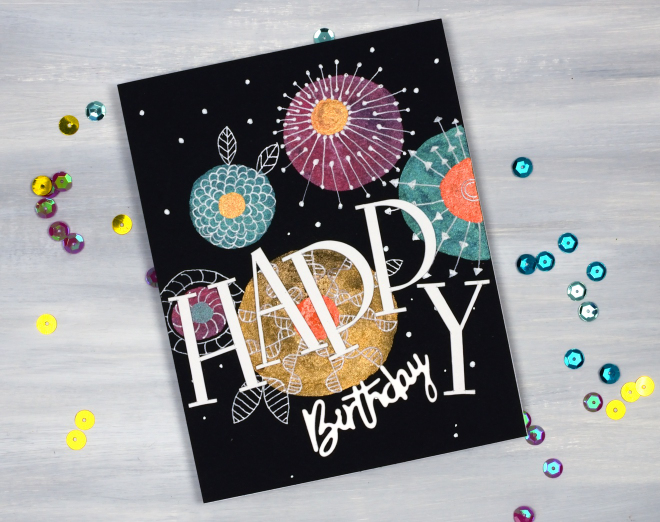
As I’ve mentioned before I have a ‘pile of possibility’ which is actually a box filled with panels that might be good for a future card or project. This painted and doodled panel came from that pile. I think I created it when I was teaching shimmer paint on black watercolour paper back in 2021!
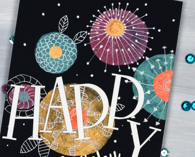
I have a selection of metallic paints, also called mica or shimmer paints from Finetec and Kuretake. They all work well on black and show up more dramatically than on white or pale coloured paper. My next bookmaking project will be an art journal made up of black watercolour paper pages so I’m planning to put my shimmer paints and markers to use along with opaque paints and markers.

To turn this panel into a birthday card I doodled with white gel pens then cut the HAPPY letters on the cricut and paired them with a smaller die-cut ‘birthday’.
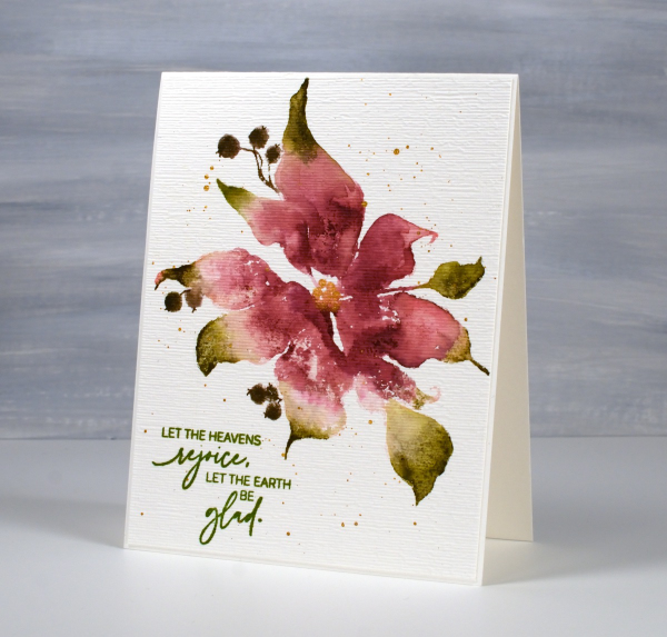
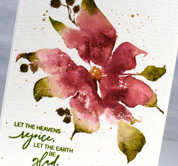
Shimmery Foliage
Posted: October 14, 2025 Filed under: Airy, Dies, Finetec paints, Leaflets, Leaves, Penny Black, Taylored Expressions | Tags: Fabriano Watercolour Paper, Finetec artist mica watercolour paint, Penny Black creative dies, Taylored Expressions 2 Comments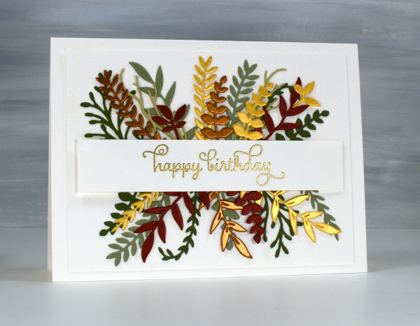
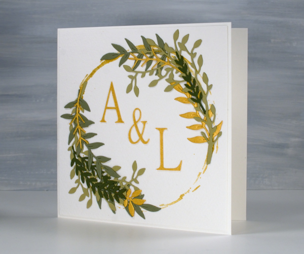
Recently a friend and I got together and worked on wreath style wedding cards. Mine is featured further down in this post. After my friend left I used some of the die-cut foliage leftovers to make her a birthday card. You can see a few matte green leafy branches plus more cut from gold, bronze and reddish shimmer cardstock. I arranged it all either side of a stamped and embossed banner. This sort of a card takes a while to arrange in a balanced way so once I had it looking good I took a photo so I would be able to glue it all down again in the same way.
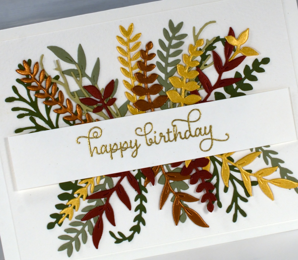
All the die-cutting was done with Penny Black foliage dies from a variety of sets. The curly twirly birthday sentiment is from the Taylored Expressions set, ‘In & Out Birthday’ embossed in gold powder

To make the wreath card I began by stamping a rough circle using gold watercolour paint on a jar lid. It was the lid of the lentil jar so yes, I had to wash it carefully before it was returned to the jar.
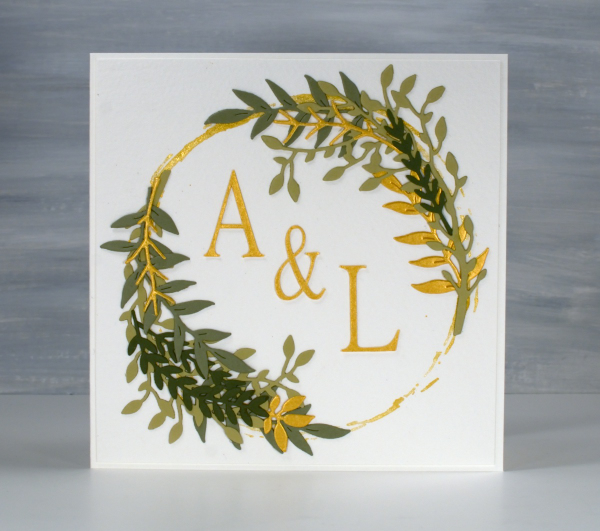
I arranged die-cut foliage around the gold circle not with perfect symmetry but I aimed for balance.
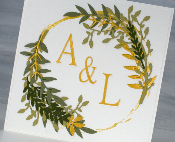
I cut the A, & and L on the cricut using the Linux Libertine Display G font. Both cards were made on cold pressed watercolour paper which has a nice creamy colour and soft texture.
Bethlehem Mask
Posted: December 4, 2024 Filed under: Bethlehem skyline, Echidna Studios, Finetec paints, gel press, gelli plate | Tags: Echidna Studios, Finetec artist mica watercolour paint, gel press, gel printing 4 Comments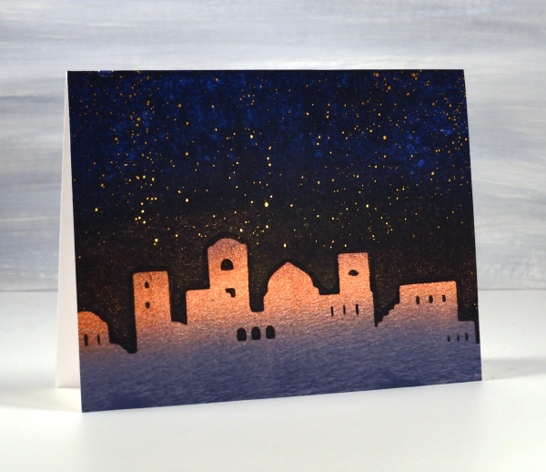
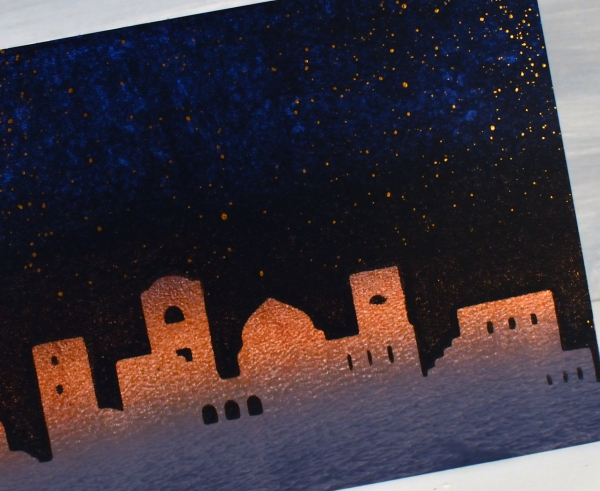
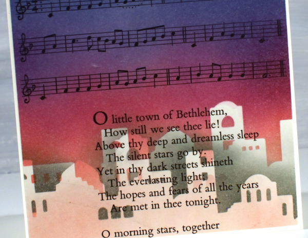
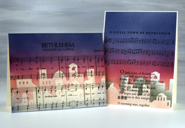
It’s been quite a while since the gel plates have been out of their tins but I was able to do a few prints recently to turn into Christmas cards. I cut a stencil using the Bethlehem Skyline digital cut file from Echidna Studios. To create the scene above I gel printed a blended grey, copper and blue panel. Next I brayered black onto the plate then lay the Bethlehem mask (cut on the Cricut) on the black before pressing the three coloured panel down on the plate. Once I had put the card together I splattered bronze watercolour paint in the sky as stars.
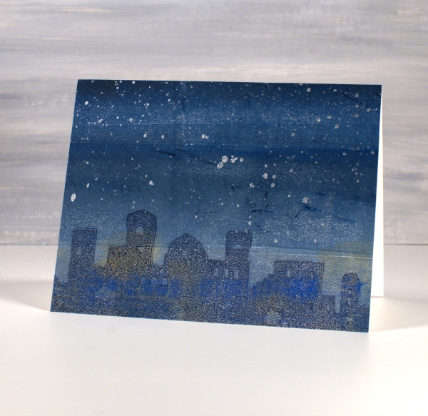
The panel below is less distinct as I pressed the mask into a layer of Paynes grey paint on the gel plate, removed all paint around the mask then lifted it to reveal a shadowy Bethlehem. Once it was dry I brayered blue and gold paints over the top before pulling the print. Once again I added metallic paint splatter to sky, this time lunar silver.
In a similar style to the carol and stencil cards I shared last week I used the Bethlehem mask cut from Matte Dura-lar to blend a scene on two carol panels cut from vintage carol books.
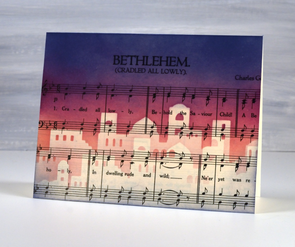
I blended pale peony over the top edge of the mask then switched to seedless preserves, then to chipped sapphire at the top of the panel. To add depth to the buildings I lifted the mask and positioned it below the first silhouette blended with either pink or grey ink
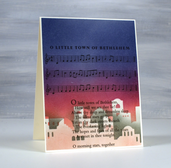
Once again no need for sentiments on the front but I will stamp a message inside.
To see more cards made with this digital set click here. The set includes two versions of the silhouette plus a outline image for printing. Today’s post features affiliate links to The Foiled Fox. If you buy through these links I receive a small commission at no extra cost to you.
2 for 1 with Delicate Pines
Posted: November 20, 2024 Filed under: delicate pines, Finetec paints, Penny Black | Tags: Fabriano Watercolour Paper, Finetec artist mica watercolour paint, Penny Black stamps, Ranger Distress inks 4 Comments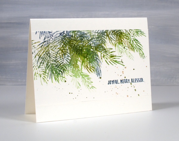
Although I don’t tend to make exactly the same card in large numbers I do like a quick and simple way to make a few similar cards at the same time. To create these pine needle cards I started with a watercolour panel larger than an A4 card. It was about 5¾” x 6″ and I placed it in the stamp positioner with the long side tucked right against the long side of the positioner.
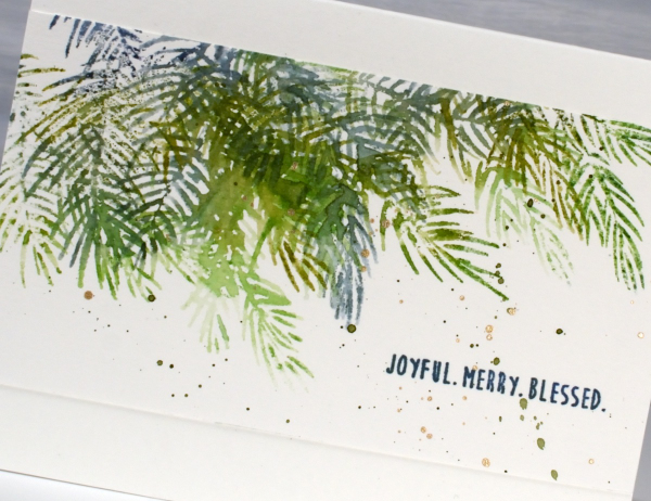
Using the two of the three Penny Black ‘delicate pines‘ stamps positioned to stamp along the top edge of the panel I inked them with a few green and blue distress inks. Before stamping I spritzed the stamp lightly so the different greens would blend on the stamp and then on the paper. I then moved the stamps around so I could use the third stamp and get some overlapping branches. Without moving the stamps I turned the watercolour panel 180° and repeated the stamping steps. The panel ended up with a border of pine branches on each side. I cut the panel in half and trimmed the sides so I had two 5½” x 3″ panels to add to card bases.

I finished off both panels with a sentiment from the PB ‘jolly snippets‘ set and some green and gold splatter. Simple yet pretty. Today’s post features affiliate links to The Foiled Fox. If you buy through these links I receive a small commission at no extra cost to you.
Pink Majesty
Posted: November 4, 2024 Filed under: Finetec paints, Penny Black, Scarlet Majesty, Stampin Up, subtle | Tags: distress markers, Fabriano Watercolour Paper, Finetec artist mica watercolour paint, Papertrey ink, Penny Black stamps, Ranger Distress inks 10 Comments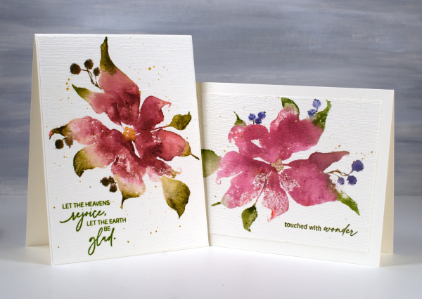
Today’s cards feature the beautiful Penny Black stamp, ‘scarlet majesty‘ but as the title suggests, I have chosen pinks over scarlet for the ink colours. I worked on Fabriano hot pressed watercolour paper in my stamp positioner.
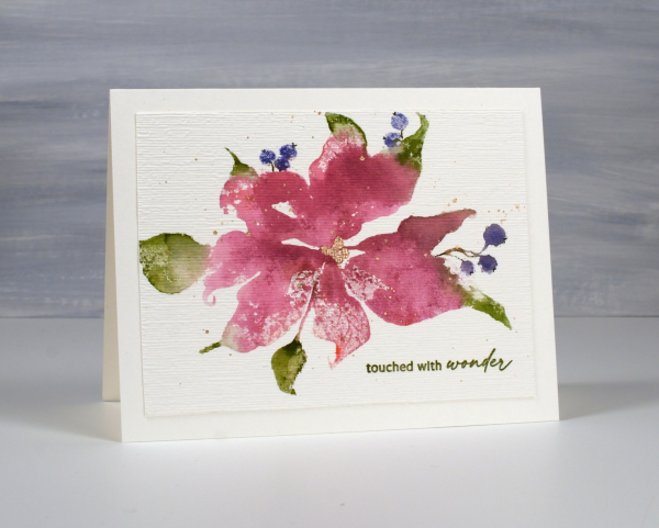
I inked most of the petals with a pink ink then added darker ink with more of a burgandy such as aged mahogany. I use a mix of small cube ink pads and markers to ink the stamp. The leaves were inked with peeled paint and the berries a purply blue such as chipped sapphire. Before stamping I spritz the stamp so the inks can move a little. I stamp the first impression then decide whether more ink is needed, more water or often some blending with a paintbrush and water.
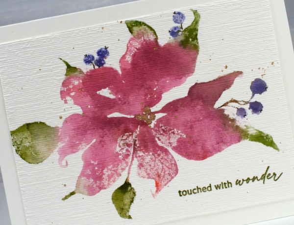
I don’t remember fiddling much with this panel as I liked the watery blends and the paler veins showing through here and there. I painted the centre of the poinsettia with gold finetec paint and of course added some splatter.
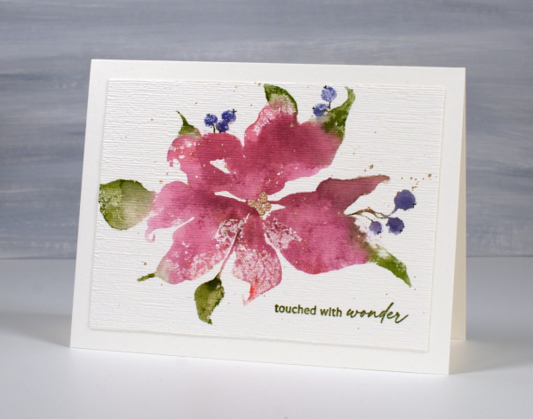
The sentiment is from PB ‘jolly snippets‘ and the texture from the retired SU ‘subtle’ embossing folder.
I used the same technique on this second card but used darker inks for leaves, petals and berries. My guess is aged mahogany, forest moss and a dark brown which was possibly made by mixing the first two. (I don’t always take note of my ink colours)
I think ‘scarlet majesty’ is a stunning stamp; I like the curl at the ends of the petals. Here are a few more cards made with it. I will admit that it is tricky to ink because you can’t always see where to try and define edges. I have another post coming up where I handle this issue by adding lines after stamping. I’ll share that soon. The sentiment this time came from the PB set, ‘promise of hope’.

Today’s post features affiliate links to The Foiled Fox. If you buy through these links I receive a small commission at no extra cost to you.
Window Box
Posted: August 8, 2024 Filed under: Echidna Studios, Finetec paints, Stampin Up, Window box | Tags: Coliro paints, digital stamps, Echidna Studios, Fabriano Watercolour Paper, Finetec artist mica watercolour paint, Staedtler watercolour brush pens, Stampin Up 4 Comments
Don’t you just want a window like this? With blooming flowers not wilting in the heat! This digital stamp is called ‘Window Box’ and it is new from Echidna Studios. My daughter designed it and there are three files to play with in the set, the image you see here as well as a separate window image and a separate window box image. I’m looking forward to trying the window box image by itself enlarged to fill a card front.
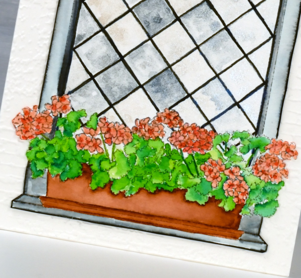
I printed the image on hot pressed watercolour paper and used Staedtler watercolour brush markers to colour the flowers, leaves, box and window frame. The window panes I painted with Coliro pearlcolors from Finetec. Some pearl or metallic paints are ‘interference’ paints which look very different on black paper as compared to white. The blue pearl paint I used from the ‘Ocean’ set looks very blue on black paper but looked silvery grey on white even with a touch of cream depending on the way the light hits it. This was exactly the effect I wanted so the panes appear like old leadlight windows where each pane reflects the light differently.
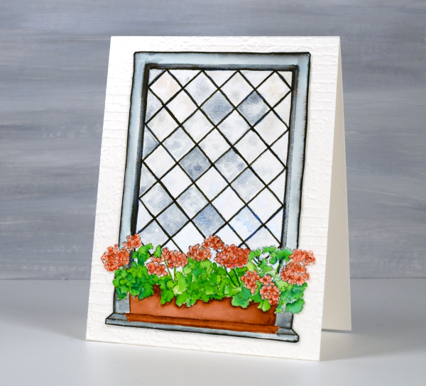
I coloured the leaves with two greens, blending them together with water and a paintbrush. I used the same technique for the flowers with a coral and a peach coloured marker. The planter was painted with a terracotta colour and the frame with black, diluted to appear grey in places. I wasn’t planning to cut this image out but it really needed to be attached to an embossed panel of aged brick. I’m sure you understand. The embossing folder is ‘exposed brick’ from Stampin Up. This post includes affiliate links from Foiled Fox. If you buy through these links I receive a small commission at no extra cost to you.
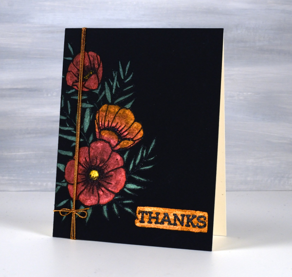
Florals on Black
Posted: May 21, 2024 Filed under: Concord & 9th, fine line florals, meadow blossoms, online class, Penny Black, radiant | Tags: Concord & 9th, Finetec artist mica watercolour paint, online class, Penny Black stamps 6 Comments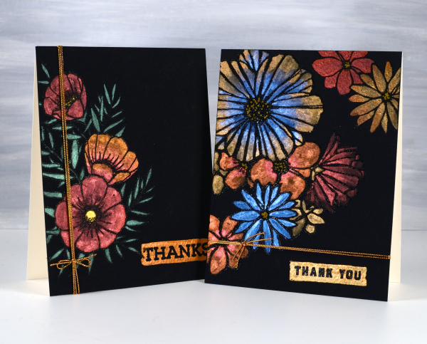
I haven’t used this eye catching technique in a while but I really should try it more often. These two cards were made as part of my Floral Faves online class, a lesson about using metallic watercolours on black watercolour paper. Maybe black watercolour paper has been around for a long time but when I first found it several years ago I was very keen to try it.
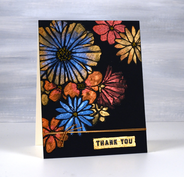
As you can imagine the paints need to be somewhat opaque to show up on black. I use Coliro and Finetec metallic watercolours (two names but all made by Finetec). I have also been given some Beam metallic watercolours which I will try out soon. I used Stonehenge Black watercolour paper for these cards and it worked well. It is very soft so I am careful if using tape on the edges as it lifts the surface off. I just work on a piece slightly larger than I need so I can trim it down to size after painting. I recently bought some of the Van Gogh brand so I will report back once I have tried it.
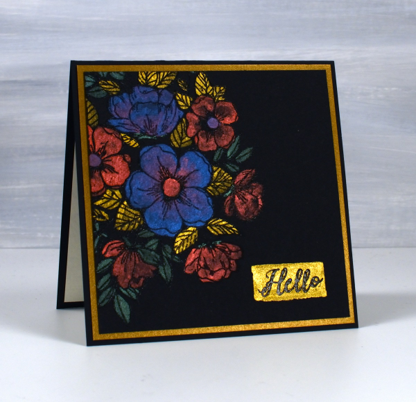
All these designs were made with embossed outlines making it easier to stay inside the lines. One feature of these cards that I quite like and need to remember to incorporate is the little painted strip where I embossed a sentiment over the top. It’s a trick that doesn’t have to be used only on a black background; I could paint a strip on any colour then emboss on top of it. For the cards featured today I used Penny Black ‘radiant’ set and Concord & 9th ‘fine line florals’ and ‘meadow blossoms’
If you have metallic watercolours let me know in the comments your favourite ways to use them.
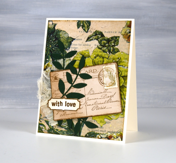
Greenery Collage Cards
Posted: April 3, 2024 Filed under: Collage cards, Darkroom Door, Dies, Finetec paints, gift card pocket, global postmarks, Leaves, measuring tape, Mixed Media, paris postcard, Penny Black, Tim Holtz, wild flowers #1 | Tags: collage, Darkroom Door stamps, Finetec artist mica watercolour paint, Mixed Media, Penny Black creative dies, Penny Black stamps, Tim Holtz 6 Comments
Continuing with the collage theme I have three cards featuring greenery from a paper napkin. I know people have been creating with paper napkins for years but I am new to the game. I have a small collection of pretty paper napkins to use on cards, book covers and journal pages. The green ones featured here are large dinner napkins found at Winners, probably in that tempting ‘just before the checkout’ area!

I glued the printed layer of the napkin over book pages to make my main panels and aged the edges with green and brown inks. I created a couple of little vintage postcards with the Paris postcard stamp, a background with the Measuring Tape stamp, sentiments and postmarks all from Darkroom Door.
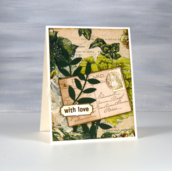
Once again I used some cute dies from Penny Black to cut tickets, file divider, tag and leaves adding blending around the edges for the vintage look.
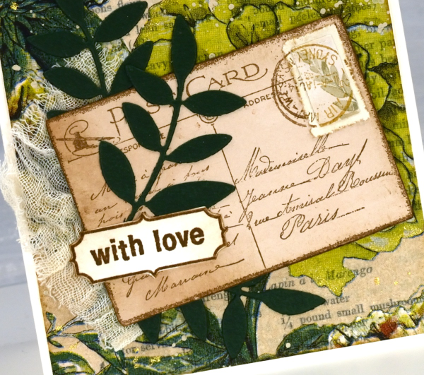
The scrap of cheesecloth, the lace and the grosgrain ribbon were all found around here, maybe the ribbon is actually vintage; it looks a bit discoloured from age which meant it co-ordinated well.

The lovely Queen Anne’s lace die is from the Tim Holtz ‘wildflowers #1 set.
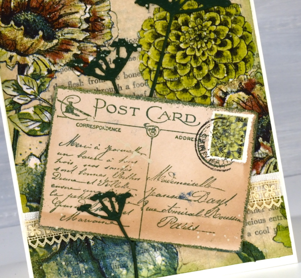
I did make my own little postage stamps for the postcards because I’m still in love with faux postage. These ones had to be quite small so I didn’t use a die I just punched tiny holes with a needle to perforate the edges. You can see a bit of splatter here and there with ivory paint and there are touches of gold watercolour paint on the petals of a few flowers too!
This post includes affiliate links from Foiled Fox and Scrap’n’Stamp . If you buy through these links I receive a small commission at no extra cost to you.
Scarlet Majesty
Posted: October 26, 2023 Filed under: Finetec paints, Penny Black, Scarlet Majesty | Tags: distress markers, Fabriano Watercolour Paper, Finetec artist mica watercolour paint, Penny Black stamps, Ranger Distress inks 7 Comments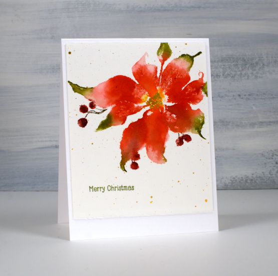
Penny Black has released a lovely selection of poinsettia stamps over the years but this one might just be my favourite (don’t tell the others). The endearing feature on this image is those curly ends on the petals. I just love how whimsical they look. This pretty poinsettia is called ‘scarlet majesty‘ and I have featured it in years gone by.
You might have noticed that I don’t have pictures of the products used in my projects at the end of my blog posts anymore. I decided to return to just linking to products in the written text of the post. Many of the links will still be affiliate links and when clicked will take you straight to one of the three stores where I earn affiliate income. Some of the links won’t be affiliate links, they will just be for your convenience.
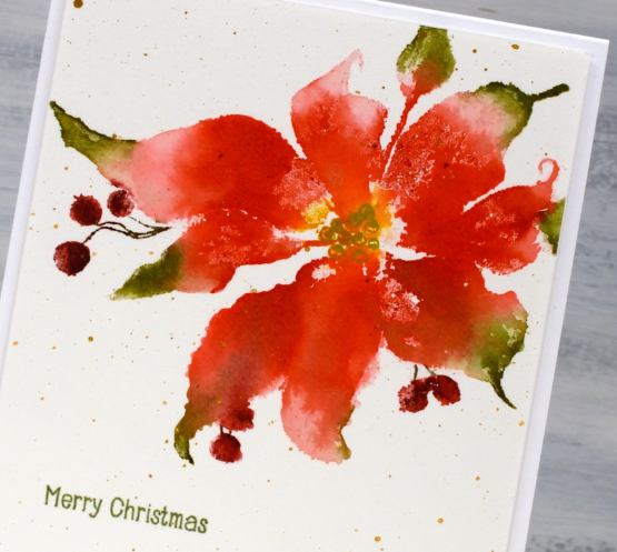
To create this panel I worked in a stamp positioner so I could work on one or two parts of the stamp at a time rather than try and get it right in one go. I used a couple of red distress inks to stamp the petals but wiped ink off the tips so I could ink them with green ink. I gave the stamp a spritz to get the inks moving and after stamping, blended from red to green with a paint brush. I also used some yellow ink in the centre of the poinsettia and later drew the seeds over the top with a gold gel pen.
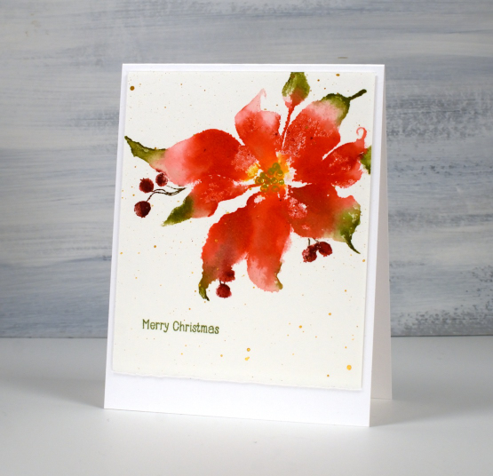
To ink those sweet little berries I switched to water-based markers. Once dry I splattered gold paint over the panel and added a little sentiment from the PB ‘holiday snippets’. As is my preference I worked on Fabriano hot pressed watercolour paper.
Thanks for dropping by today. I appreciate your support and love to read the kind messages you leave in the comments.
Today’s post features affiliate links to The Foiled Fox. If you buy through these links I receive a small commission at no extra cost to you.
Butterflies
Posted: October 3, 2023 Filed under: butterflies, Echidna Studios | Tags: Echidna Studios, Finetec artist mica watercolour paint, sennelier watercolours 2 Comments
The two butterfly images featured on today’s cards are part of a digital set called ‘butterflies‘ from Echidna Studios. If you look closely at the butterfly above you can see a hint of shimmer in that centre blue section. Most of the paint is actually shimmery in real life I just couldn’t capture it on camera.

To get the shimmery look on the wings I painted with traditional watercolours first then painted over the top with finetec pearlescent watercolours.
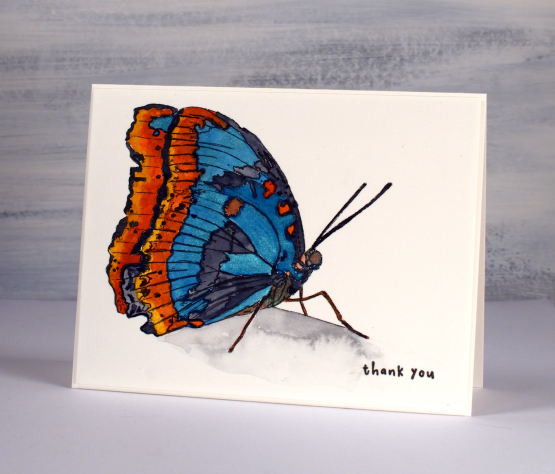
The stamp above has a line on it which suggests an edge to ground the butterfly; it’s clearly not in flight. I painted the area under the line with a pale grey paint then added water to spread and dilute the colour. You can see I added water to a dryer area; that’s why I got the cauliflower effect. I could have smoothed out the whole area but I occasionally like those kind of watermarks; they add interest. I completed the card with a teeny sentiment which balances the black outlines of the printed butterfly.
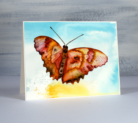
The second butterfly is in flight so I have nothing in the scene other than background colour. I printed the digital image with the laser printer on hot pressed watercolour paper then, before painting the butterfly I picked up some smooshed and diluted ink from my glass mat.

I feel like I have described my smoosh, spritz and swipe method many times but if you haven’t heard me mention it before here’s how it goes. I smoosh(press down) a distress ink pad on my glass mat to leave ink. In this case I used tumbled glass, scattered straw and weathered wood. I spritz the ink so it spreads and sometimes blends then I swipe my panel of watercolour paper through the ink. You never know what you’ll get. Sometimes I re-swipe to pick up a bit more ink.

After the abstract background was dry I used Sennelier watercolours to paint the butterfly. Painting a butterfly is trickier than I thought. In my mind the wings are full of blended colour but actually they are full of intricate patterns that don’t blend together. All that to say this is definitely not a botanically correct painting!
Today’s post features affiliate links to the The Foiled Fox. If you buy through these links I receive a small commission at no extra cost to you.


