HB shimmer on black
Posted: December 30, 2025 Filed under: cricut, Finetec paints, Hand drawn | Tags: cricut, Finetec artist mica watercolour paint, Hand drawn, Kuretake Gansai Tambi watercolour paints 2 Comments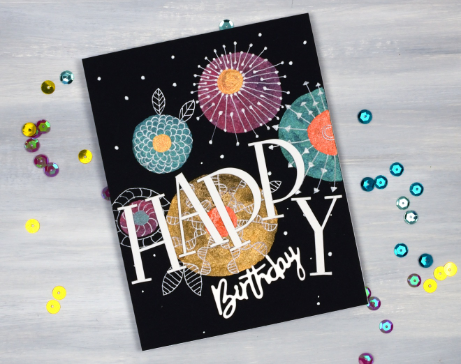
As I’ve mentioned before I have a ‘pile of possibility’ which is actually a box filled with panels that might be good for a future card or project. This painted and doodled panel came from that pile. I think I created it when I was teaching shimmer paint on black watercolour paper back in 2021!
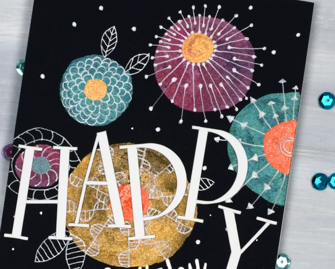
I have a selection of metallic paints, also called mica or shimmer paints from Finetec and Kuretake. They all work well on black and show up more dramatically than on white or pale coloured paper. My next bookmaking project will be an art journal made up of black watercolour paper pages so I’m planning to put my shimmer paints and markers to use along with opaque paints and markers.
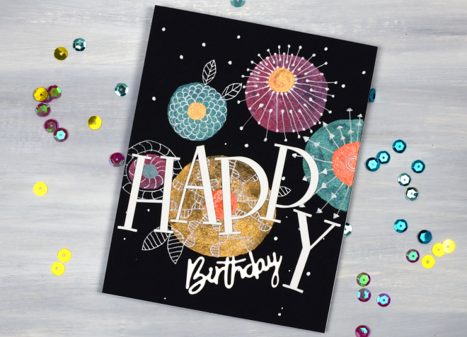
To turn this panel into a birthday card I doodled with white gel pens then cut the HAPPY letters on the cricut and paired them with a smaller die-cut ‘birthday’.
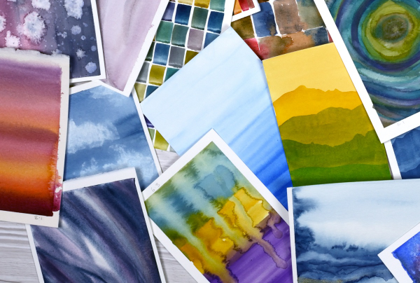
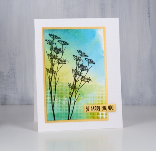
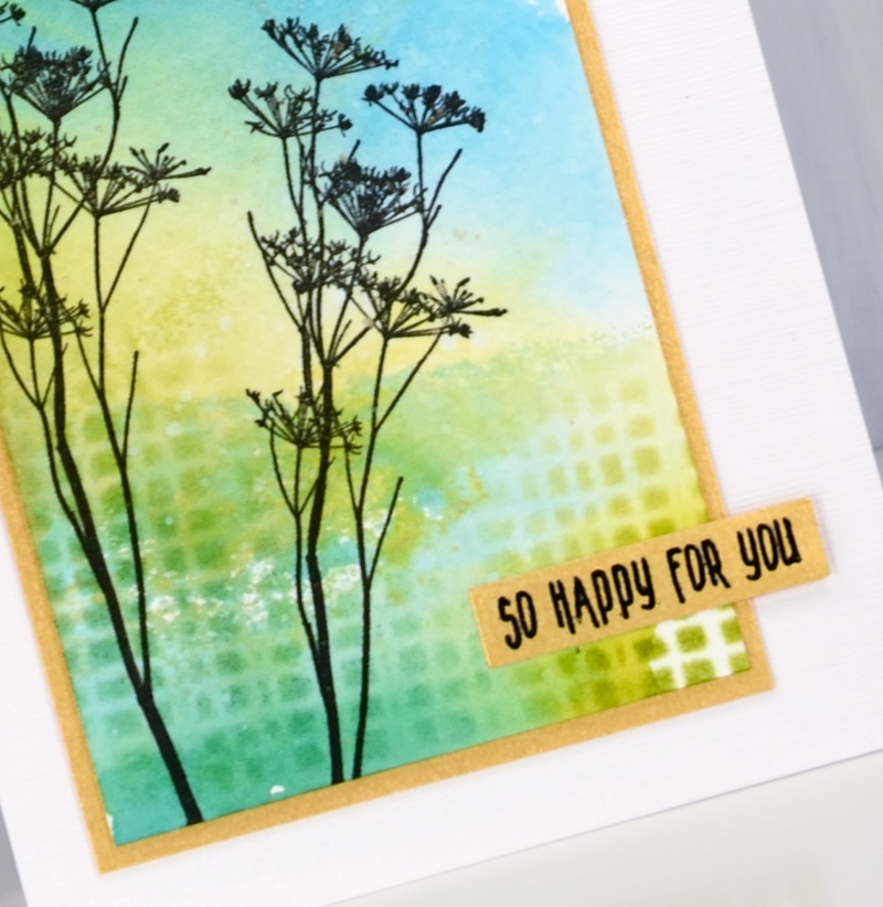
Pile of Watercolour Possibilities
Posted: February 27, 2025 Filed under: Classes, Hand painted, sennelier watercolours, Watercolour | Tags: Canson watercolour paper, Classes, Fabriano Watercolour Paper, Kuretake Gansai Tambi watercolour paints, sennelier watercolours 7 Comments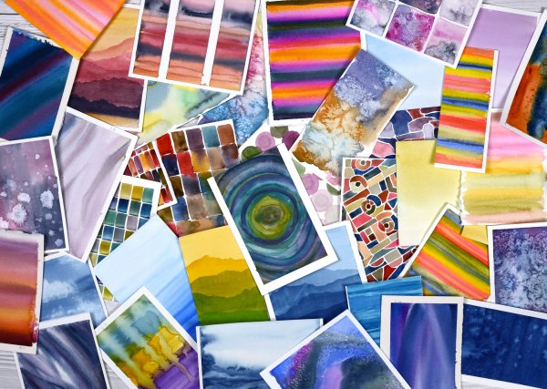
After teaching a couple of watercolour classes lately I have amassed quite the pile of panels. They are full of potential for card making. As well as painting separate panels I’ve also been creating abstract or background watercolours in a couple of art journals.
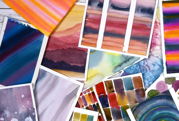
The purpose of the exercise has been two-fold. The main plan was to revisit a range of watercolour techniques in order to share them with others in classes. Additionally I chose to work small so we could complete quite a few practice pieces during class leaving us with ‘card sized’ panels to turn into cards later if we wished.
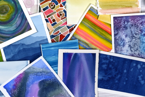
I have enjoyed the preparation and the classes so much that I have almost 100 panels on hand! My next in person class is going back to basics in regard to card making. I will cover assembly tips and tricks as well as design principles in order to create balanced and beautiful card layouts. It is exciting to have all these panels around just waiting to be transformed into cards.
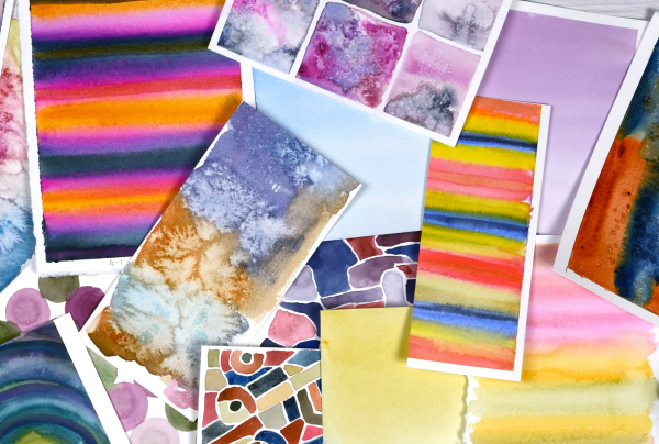
As you can imagine I also have piles of gel prints, alcohol ink panels, collages and patterned papers that could be turned into cards. It’s rather nice to have all these options…
Pines and Pinecones
Posted: December 4, 2023 Filed under: Brush Pines, Penny Black, treasured pine | Tags: Kuretake Gansai Tambi watercolour paints, Penny Black stamps 9 Comments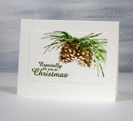
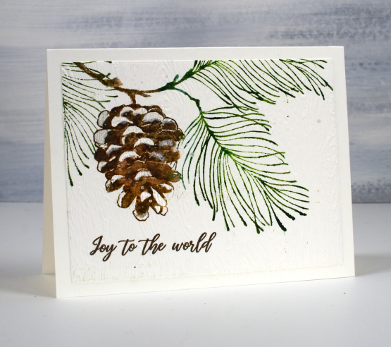
I have a couple more simple one stamp cards to share today. This style has been the main contributor to my stack of Christmas cards this year. I love brushstroke stamps and always enjoy using watercolour techniques with them. The stamp above is from Penny Black and is called ‘brush pines‘. It is a small stamp so you could stamp it more than once to fill a card front or combine it with a berry stamp. I chose to position it in the corner of a watercolour paper panel, ink the stamp with a couple of green and a couple of brown distress inks, spritz the stamp then press it onto the paper. The ink moves and blends a little and if I want more blending I use a paintbrush and water.
Because it is a simple design I embossed the little panel (after stamping the sentiment) with a woodgrain embossing folder. I like the differentiation between the panel and the card base not by colour, but by texture.
By the way, on Friday I posted a card that is part of the Scrap’N’Stamp Christmas Critters blog hop. There is a prize to be given to a commenter as well as some discounts and a free gift to read about. Make sure you pop back to my post to comment yourself into the draw.
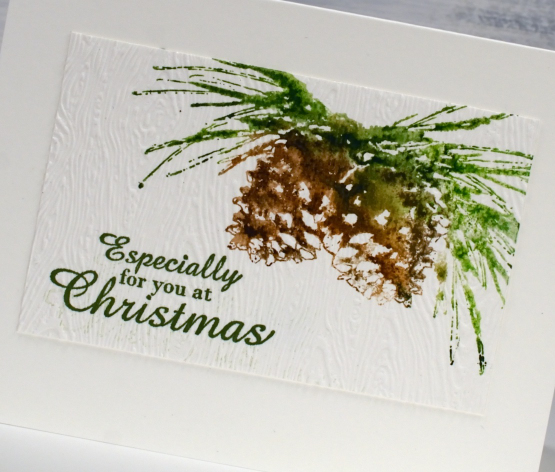
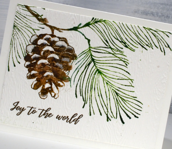
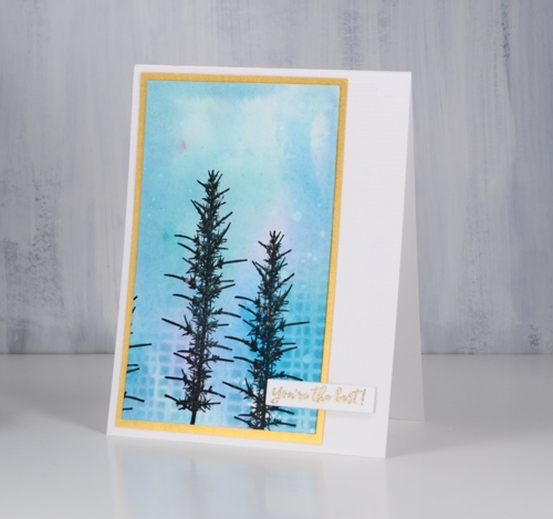
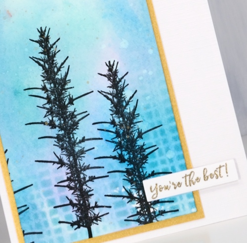
I gave the same treatment to the PB ‘treasured pine‘ stamp which is larger but still a simple cone and needles design. After stamping I added some pearlescent white paint to the design where there might be snow sitting on the pine cone. I used the same Stampin Up ‘woodgrain’ embossing folder to add texture after the sentiment from PB ‘Christmas sentiments‘ was added. (PB treasured pine is available at both Foiled Fox and Scrap’N’Stamp)
Today’s post features affiliate links to the following companies. If you buy through these links I receive a small commission at no extra cost to you. The Foiled Fox & Scrap’n’Stamp
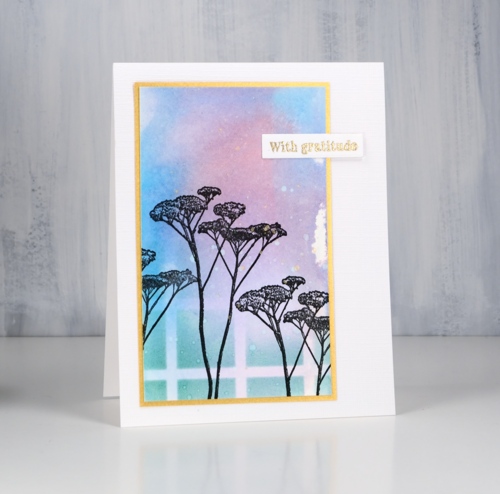
Salt & Dandelions
Posted: February 21, 2023 Filed under: Dandee, Penny Black | Tags: Fabriano Watercolour Paper, Kuretake Gansai Tambi watercolour paints, Penny Black stamps 6 Comments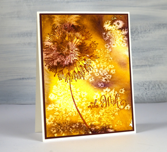
Just in case you are wondering this isn’t a recipe, well not an edible one! I know you can eat several parts of a dandelion plant but I don’t know about the little seeds that blow everywhere to plant new dandelions. This card has been hiding out in a drawer with a few others cards that give the impression of light and shade.
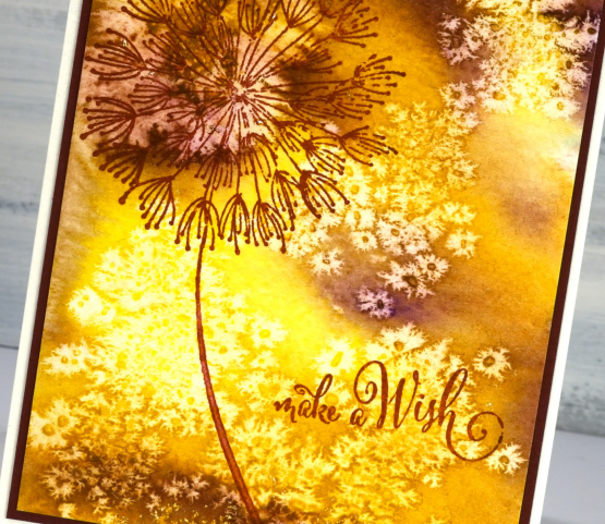
I didn’t create the multicoloured background for the dandelion stamp; I just created it while experimenting with watercolour paints and salt crystals. You have probably done the same sort of thing yourself. If not, try sprinkling salt crystals of different sizes on wet watercolour paint or die ink. As it dries it creates fabulous patterns. The ones on this panel looked so much like dandelion seeds I had to find the right stamp and sentiment to finish the card. You can find a video demonstrating the salt sprinkling technique here. After the paint and panel has dried you can gently brush off the salt to reveal the patterns.
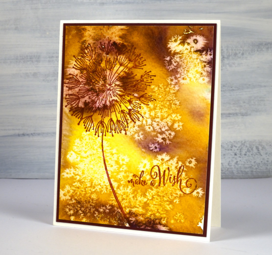
I used gansai tambi watercolour paints and a large PB stamp called ‘Dandee’. If I had wanted a background that looked like dandelion fluff blowing about I’m sure I couldn’t have created it. That’s why I play and experiment then see what I should make with the panels.
(Compensated affiliate links from Foiled Fox, Scrap n Stamp)
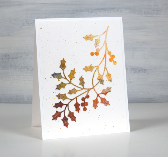
Holly Flourish 2 for 1
Posted: October 19, 2022 Filed under: Dies, Finetec paints, gel press, holly flourish, Penny Black | Tags: Finetec artist mica watercolour paint, gel press, Kuretake Gansai Tambi watercolour paints, Penny Black creative dies 7 Comments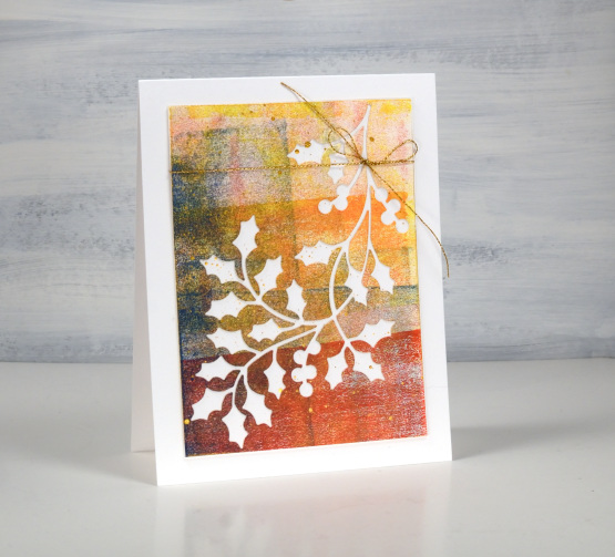
This isn’t the first 2 for 1 card combo I have posted. A few weeks back I did a similar thing with a striped watercolour background. Today’s cards are cut from gel printing clean up sheets. When gel printing I have a heavy weight art paper to the right of my gel plate where I roll off excess paint from the brayer. I cut this yellow, red and blue panel from one of those sheets.
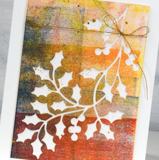
The pretty Penny Black die is called ‘holly flourish’ and, as you can see fills a card front nicely. I have used the cut out below and splattered both negative and positive panels with gold paint. The cardstock is Neenah solar white and I added a gold cord detail to the card above.
(Compensated affiliate links from Foiled Fox and Scrap’n Stamp )

Pinecones & joy
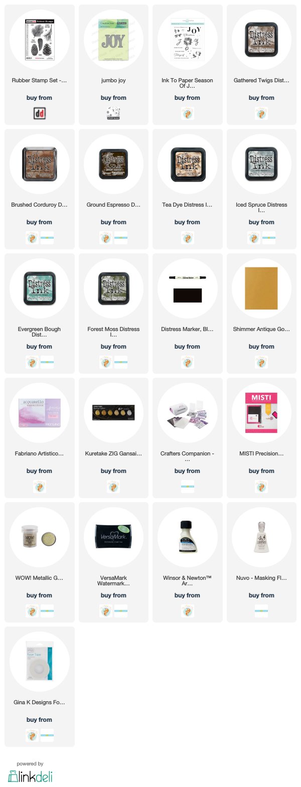
Posted: December 19, 2019 Filed under: Darkroom Door, Ink to Paper, jumbo joy, Penny Black, pine cones, season of joy stamps | Tags: Darkroom Door stamps, Fabriano Watercolour Paper, Ink to Paper, Kuretake Gansai Tambi watercolour paints, Penny Black creative dies, WOW embossing powders 11 Comments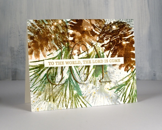
The pine needles and pine cone stamps I used for this card are from Darkroom Door and I love how realistic they are. The stamps are quite large and there are several sizes and shapes of cones which makes for lovely feature images and fillers as well. I used one pine cone stamp but two of the pine needle stamps and worked on hot pressed watercolour paper which had been splattered with masking fluid. If you look at the close up below you can see large white dots as well as tiny ones; they’re all made by the masking fluid.
I stamped the pine cone three times using a stamp positioner and four different brown distress inks. A spritz of water started the browns blending and I did a little blending with a paint brush as well.
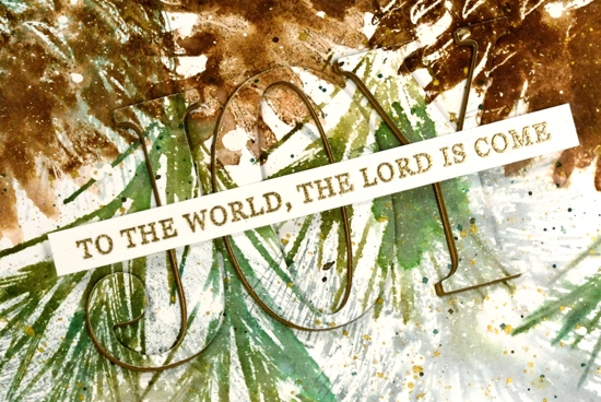
I stamped the green pine needles with forest moss and evergreen bough distress inks and the fine needles in the background with iced spruce. I added some green splatter then some gold splatter using one of the gansai tambi starry colours. I used the ‘jumbo joy’ die from Penny Black to cut out the word joy from the stamped panel and cut three layers from shimmer gold cardstock as well so I could stack them up just a little offset so the gold peeps out on the side.
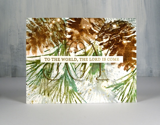
I stamped the rest of the Christmas carol lyric using a stamp from Ink to Paper’s ‘season of joy’ set and some gold embossing powder. The overall pattern may be a little messy but it reminds me of what I see if I look up into the branches of the very messy pine tree in my front yard, which is currently covered with snow but not gold splatter!
I have been blessed to receive some beautiful handmade Christmas cards in the mail this week and I am enjoying them on my window ledge. I hate to say it but as yet I have not sent a single one! As I’ve said before there are twelve days of Christmas so I haven’t run out of time yet!
Supplies
Floral Faves giveaway – Bouquet Ballet
Posted: March 15, 2019 Filed under: bouquet ballet, Inktense pencils, Penny Black, Uncategorized | Tags: Hand lettering, Inktense, Kuretake Gansai Tambi watercolour paints, Penny Black stamps 16 Comments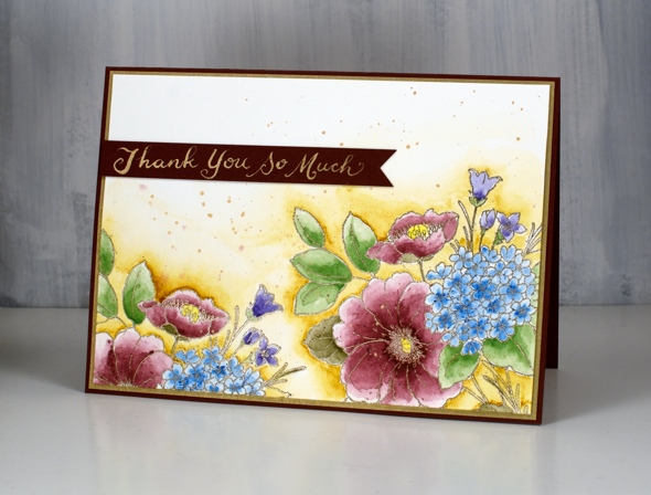
This little bouquet is one of my favourites from the recent Penny Black release. With its combination of flowers I thought it was perfect for wrapping up my current giveaway with the Foiled Fox. All you have to do to enter is visit my earlier post or The Foiled Fox post and leave us a comment telling use your favourite flower. We will close the comments on Sunday night and announce two winners next Tuesday.

I’m not absolutely sure what the flowers are in this bouquet, perhaps a hydrangea, a couple of poppies and some little bell shaped flowers. Once again I embossed the outline stamp with platinum powder; it’s so classy, I just keep choosing it. I stamped off the edge twice to get a border design and used Inktense pencils for the watercolouring.
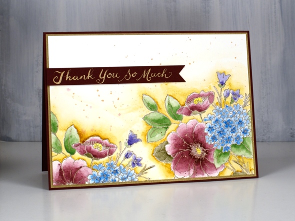
I built up colour on the pink flowers and leaves in layers letting each one dry before adding another. On the blue flower I painted it all pale blue then added dots of the same blue pencil to the centres. I painted around the outside of the bouquets with a mustard pencil and blended it out to nothing with water. I added some fine splatter over the flowers using the same pencils.
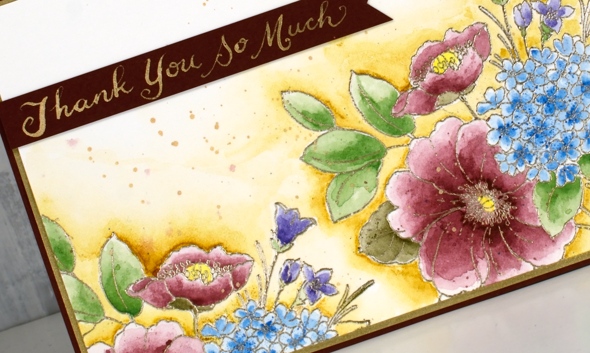
Inspired by a beautiful hand lettered sentiment on of Shauna’s recent cards I used a dip pen and wrote the sentiment in gold ink on a strip of co-ordinating cardstock. I splattered some of the same champagne gold gansai tambi ink over the panel before putting the card together with a gold mat and a burgandy card base.
Supplies
Nature walk portraits
Posted: February 5, 2019 Filed under: Avery Elle, boxes, mesh, Nature Walk, simple sentiments | Tags: Avery Elle, Darkroom Door stamps, Darkroom Door stencils, Kuretake Gansai Tambi watercolour paints, Ranger Distress inks 6 Comments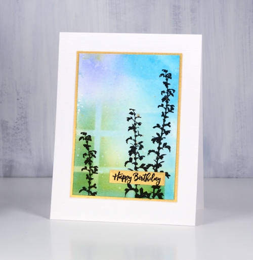
I have mentioned before how beautiful these Darkroom Door ‘nature walk’ images are but have I mentioned how easy it is to create pretty cards with them. Each card today features just one image, stamped twice over a quick watercolour background.
I created the backgrounds with my glass mat and some distress inks. I squished the ink pads down on the mat side by side (three or four colours at a time), spritzed with water then swiped my hot pressed watercolour panel through the diluted ink a few times until there was good coverage on the panel. I dried the panel with a heat tool before sponging one or two of the distress inks through a section of stencil then added splots of water for some added texture. The panels were all different, all pretty and done within minutes.
I used the MISTI for stamping because the texture of the watercolour paper makes it necessary to stamp a few times to get a solid image. I used versafine clair nocturne ink which always gives me a crisp print. Once the ink was dry I splattered gold paint from the gansai tambi starry colours palette. The gold splatter might just be my favourite part of these cards; unfortunately it’s not very obvious in the photos.
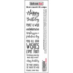
To draw more attention to the gold splatter I matted with gold and stamped the sentiments either on gold cardstock or with embossed in gold powder. The sentiments are from Darkroom Door’s new sentiment strips. The sentiments are in list format and I have kept the stamp uncut. I stamp on a cardstock panel and cut out the sentiment I want. I now have a handy die set from the Foiled Fox which neatly cuts out the smaller fonts and I always love sentiments in small fonts! The set is called ‘simple sentiments’ and it has ten lengths of sentiment strip dies.
In putting together the cards I used one more happy new product. I am always searching for textured white cardstock. Today’s cards feature a linen texture with enough depth to be seen by the camera. It is in 8½ “x11” sheets so one sheet did four card fronts, no waste. This is the first time I’ve used it so there will be more testing to come with dies, inks etc but so far, so good.
Thanks for listening to me prattle on about this and that. I hope you are enjoying some ‘nature walks’ even if they are of the snowy variety! While we have been experiencing extreme cold followed by loads of snow, friends and family on the other side of the world are experiencing extreme heat and flooding!
Supplies
Stamps: nature walk, (DD)


Stencils: mesh, boxes 12 up
Dies: Simple Sentiment (Avery Elle)
Distress inks: crushed olive, pine needles, blue print sketch, milled lavender, stormy sky, mermaid lagoon, wilted violet, worn lipstick
.
Inks: versamark, nocturne versafine clair,

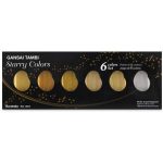
Paint: gansai tambi starry colours
Paper: hot pressed watercolour paper, snowbound textured white cardstock, gold cardstock, neenah solar white

![]()

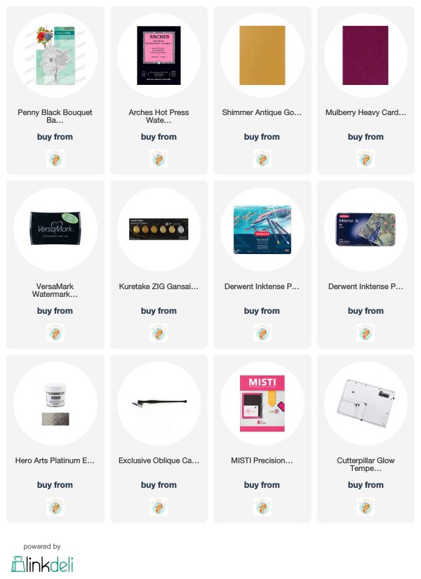
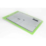
Also: Cutterpillar glass mat, MISTI, gold embossing powder
Aviary
Posted: March 8, 2018 Filed under: aviary, Coloured pencil | Tags: Faber-Castell Polychromos Colour Pencil, Kuretake Gansai Tambi watercolour paints, Penny Black stamps, Tsukineko Versafine inks 7 Comments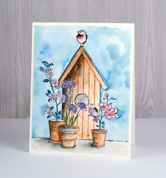
I have been using my coloured pencils more often recently. For this card I used them to add finishing touches and details after I had painted the majority of the design with watercolours. I used my gansai tambi paints for the watercolour then polychromos pencils for the details. I even wrote down the numbers just in case you were interested but really you don’t need my choices you could just use your own favourites.
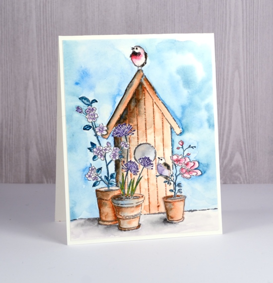
One thing I did which worked in my favour was limit my colour palette. I mixed colours I had already used rather than continually adding new ones. This helps with the cohesiveness of the finished panel. I started by stamping the ‘aviary’ stamp on hot pressed watercolour paper in versafine smokey grey. I painted the area surrounding the birdhouse first with blue and green paint. I kept it mainly blue and used a ‘wet into wet’ method, painting around edges first with water then adding paint. A medium sized brush that comes to a good point can help with this as there is a lot of space to cover but also some tricky areas to navigate. Also if your brush is too small or doesn’t hold liquid well you will be forever picking up more water or paint.
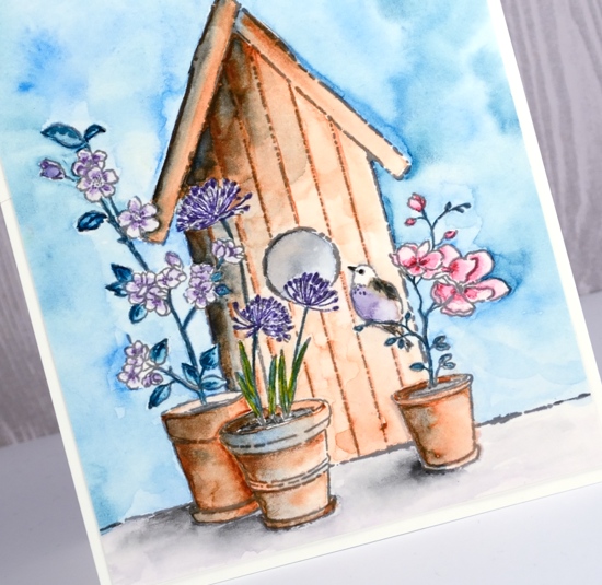
Once the background was dry I painted the flower pots in brown and added shadows with the blue I used on the sky. After that I painted the birdhouse, once again with the brown and blue then added black for some darker shadows and definition. I decided to limit the flowers to pink and purple painting the taller plant on the left with a diluted purple paint and the magnolia on the right with touches of dark pink blended out with water. I left the centre flowers to do with coloured pencil. I used the same green from the background to paint the leaves and a combination of colours already used to paint the birds.
I couldn’t decide on a colour for the foreground the pots are sitting on so I used the dirty paint water. It turned out to be a teeny bit on the purple side but mainly on the dirty side so it didn’t clash with anything else. I added shadows with black. With all the basic painting done I switched to coloured pencils to add fine details. I picked pencils that matched the paint colours and went over some outlines or added tiny details inside leaves and flowers.
Thanks for dropping by today.
Supplies
Stamps: Aviary
Inks:

Paints: Kuretake gansai tambi 20, 36, 57, 46, 63
Pencils: Faber Castell polychromos 108, 158, 188, 274, 136, 142, 141, 231, 101
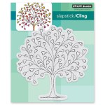
In my heart
Posted: January 24, 2018 Filed under: Tree heart, Triple Banner | Tags: Kuretake Gansai Tambi watercolour paints, Penny Black creative dies, Penny Black stamps, WOW embossing powders 4 Comments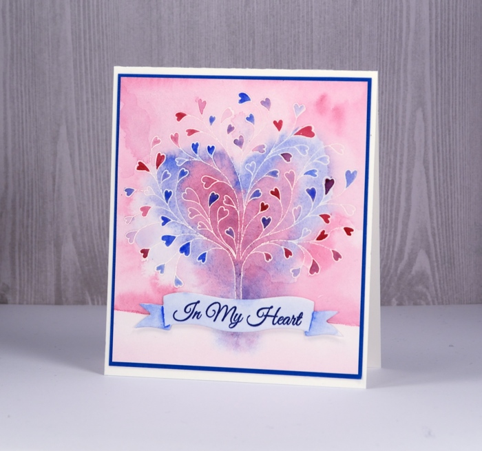
This stamp is called ‘tree-heart’ but I always think of it as a family tree. After all what better to have on a family tree but a whole bunch of hearts? I stamped the tree in versamark and embossed with clear powder on hot pressed watercolor paper. Next I painted water over the top section of panel and added pink and blue watercolour paints. Keeping it loose I painted a heart shape over tree with both pink and blue. I filled in the heart leaves with more intense pink and blue paint then painted diluted pink over base area.
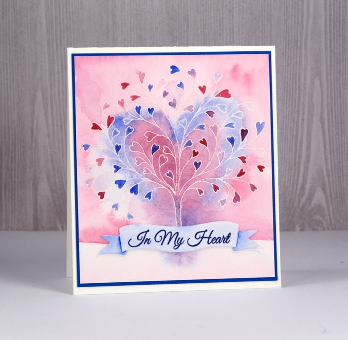
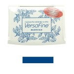
I grabbed a scrap of watercolour paper, painted diluted blue over it and stamped a sentiment from ‘happy hearts’ in versafine majestic blue ink. I die cut a banner to contain the sentiment and painted shadows on the ends of banner with blue paint.
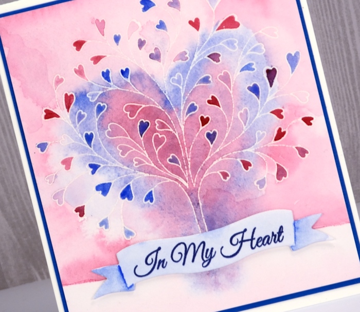
To finish I attached the banner to the tree panel with very low profile adhesive dots and matted the panel in blue cardstock before attaching to a white cardbase.
Supplies