
Nature’s glory background
Posted: August 3, 2020 Filed under: nature's glory, Papertrey Inks, Penny Black, Triple Banner | Tags: Fabriano Watercolour Paper, Papertrey ink, Penny Black stamps 3 Comments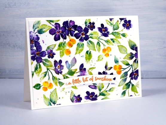
The nature’s glory stamp from Penny Black is a current fave of mine so I decided to try it with a different colour scheme. (previous cards here and here)
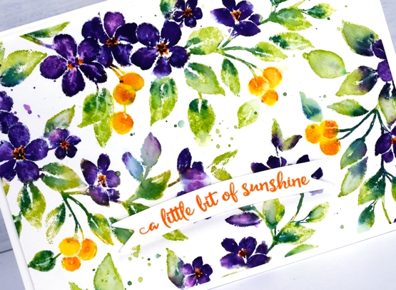
I worked on hot pressed watercolour paper with papertrey ink cubes then distress markers for some smaller details. The spray of flowers has a curve to it so I was able to move it around and stamp it four times in order to fill the 4¼” x 6″ panel.
I used a Papertrey ink royal velvet ink cube to ink the flowers and wiped any stray purple ink off the stamp before inking the leaves with green parakeet and the berries with bright buttercup. I spritzed the stamp before stamping so the inks would move a little. Before stamping again I added spiced marmalade distress ink to the berries and pine needles distress ink to the leaves with markers, gave the stamp another light spritz and stamped again.
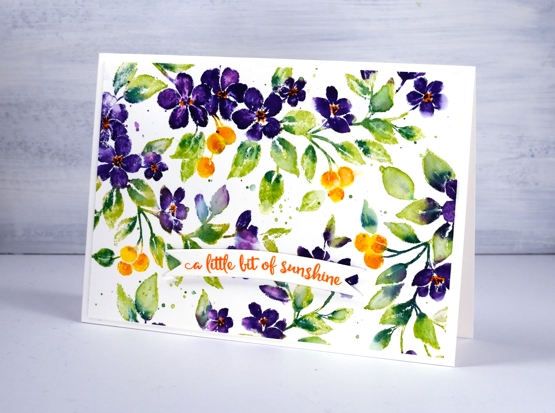
I switched to a paintbrush to blend some of the leaves, berries and petals. When the ink dried I used the spiced marmalade marker again to add orange centres to the purple flowers.
I stamped a sentiment from PB ‘happy snippets’ on a banner die cut and popped it up over the panel. Oh and I splattered too…you probably noticed that.
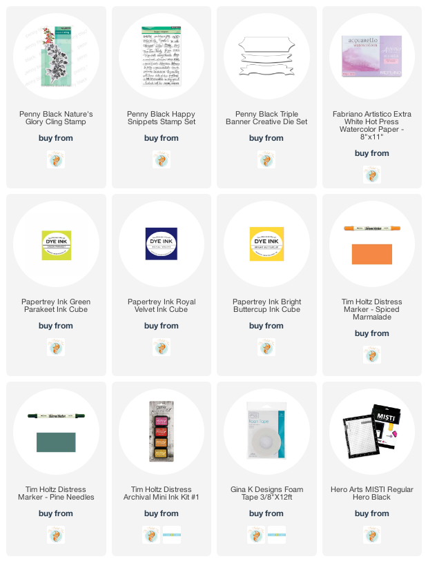
Supplies
Birthday birdhouses
Posted: June 8, 2020 Filed under: A2 layers, Additional A2 layers, Good neighbours, Penny Black, Triple Banner, Waffle Flower | Tags: Fabriano Watercolour Paper, Penny Black creative dies, Penny Black stamps, Ranger Distress inks, Waffle Flower dies 7 Comments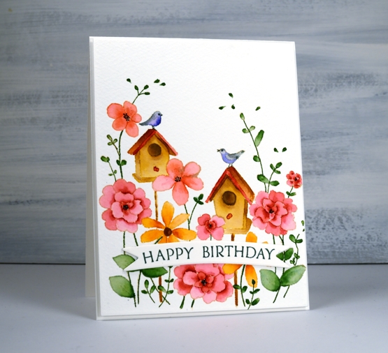
I hope your garden is full of birds and blooms right now, mine is getting there slowly. If you are having a birthday during this season, it’s possibly a little different to past celebrations. My birthday is in the dead of winter but I do remember fondly when it was in the height of summer when birds, blooms and strawberries were in abundance!
To create this bright happy card I did some no line watercolour with distress inks. I stamped the PB ‘good neighbors’ outline stamp in antique linen then did all the painting with distress inks smooshed on my glass mat. For fine lines and tiny spaces I used distress markers.
I used cold pressed watercolour paper for this one; I switch back and forth between hot pressed and cold pressed, often choosing hot pressed for the ease of stamping detailed stamps. Once I was finished I decided to pop up the panel on a piece of foam but first I cut the panel with the new love of my card making life, Waffle Flowers ‘additional A2 layers’ dies. I love both their A2 layers dies and additional layers dies the same, no favouritism, in fact the reason I love them is because there are two sets making it possible to mat panels with a ⅛” border. I’m not demonstrating that feature on this card but I will be on future projects. I also love the fact that my rectangle is even and perfect first go. My cutter still does a great job just not sure if my steady hand and eye do the stellar job they once did.

I finished off the card by cutting two banners with one of Penny Black’s triple banner dies, two so it was raised up just a bit, not as much as foam tape would raise it. I stamped a sentiment from banner sentiments on the banner but if you know this set you might realise the stamp doesn’t actually curve that way; let me tell you it does when you snip it in two and arrange it on the door of your misti.
Supplies
Love’s glow
Posted: May 20, 2019 Filed under: Leaves, love's glow, stitched square & circles, Triple Banner | Tags: Penny Black creative dies, Penny Black stamps, Ranger archival inks, Ranger Distress inks 7 Comments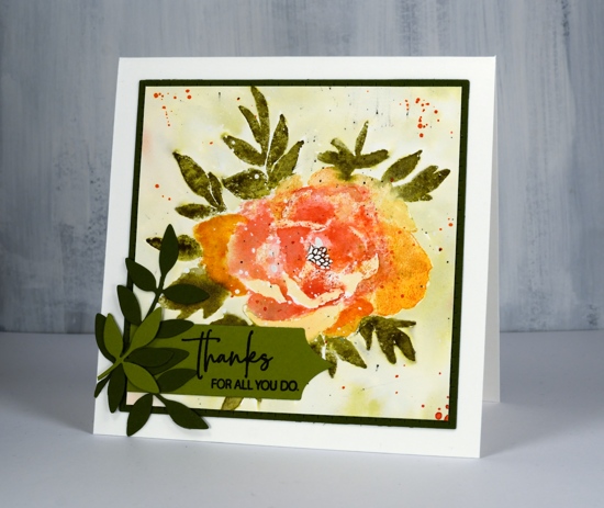
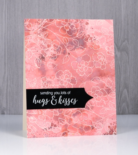
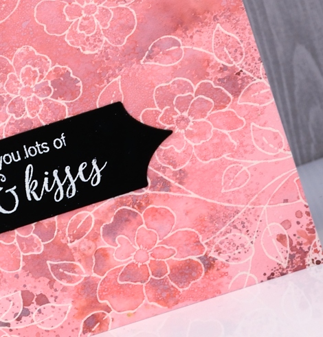
Here’s another new beauty from Penny Black. This one is a large rubber cling stamp called ‘love’s glow’. I’ve stamped it with a mix of archival and distress inks then added some die-cut extras on the corner. I think I might have gone a little over board with the splatter at the end but not enough to make me give up on the floral. There is a lot of shaded detail in this stamp so it is very helpful to stamp it in a medium to dark colour first on a scrap of paper so you can have the image off to the side while adding colour to your project. Before I started stamping I splattered some masking fluid on the hot pressed watercolour panel so the finished design would have some white dots here and there. You could use white paint at the end to get a similar effect. I used my MISTI so I could work on the oranges and reds separate from the green.
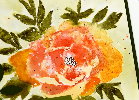
I stamped the flower first in archival spiced marmalade ink, it is one of the colours Ranger has recently brought out in mini archival packs. I learnt this trick from Jill Foster, just one of many tricks I have learnt from her! By stamping the flower first in archival I have an image on my paper that I can watercolour over but it will not be diluted and lost as I add water. Because I was using similar colours in distress inks the initial archival ink does not stand out as different. When I inked the stamp initially with archival ink I wiped any of the spiced marmalade that ended up on the leaves. To achieve the blended red and orange tones in the petals I inked and stamped the flower again in wild honey and festive berries distress inks. I then used a damp brush to blend the colours in the petals using my reference photo to help me when necessary.
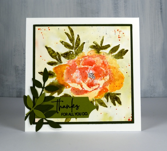
I followed the same process for the leaves stamping them first in archival peeled paint, then again in forest moss distress ink which I blended with water and a paint brush. I added definition to the centre with a black marker. Once the panel was dry I painted shabby shutters ink around the flower after first pressing my shabby shutters inkpad onto my glass mat and adding some water. I splattered with festive berries, forest moss and black soot ink. I trimmed the panel down to a square then die cut a square mat of olive green cardstock with the stitched square die.
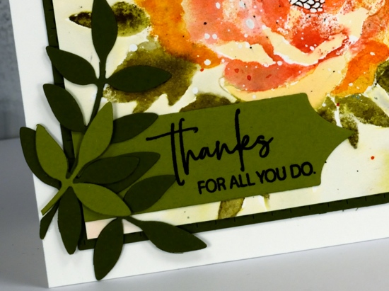
To finish off the card I added some green die cut leaves; I think these leaves might be from the first die sets I ever received from Penny Black. I’ve used them over and over. I cut a sentiment banner with one of the ‘triple banners’ set and trimmed one end so it could align with the mat. The sentiment is from the Best Mom set but I did some partial stamping to get only half the words on my banner.

I hope you are having a great Monday. I just want to remind you there is a sale happening at Foiled Fox all the long weekend and a ‘Color Trio challenge’ continuing until May 30.
Supplies
Sparkle With Us challenge
Posted: March 1, 2018 Filed under: Challenges, Gilding Flakes, Swirling Wings, The Foiled Fox, Triple Banner | Tags: Gilding, Penny Black creative dies, WOW embossing powders 4 Comments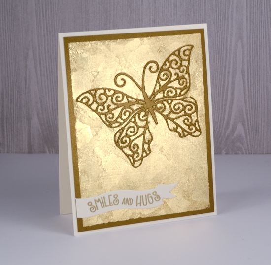
It’s time to put on your sparkly shoes, my friends, or at least your sparkly embellishments! I have teamed up with The Foiled Fox for a sparkly challenge that starts now.

I might have got a little bit carried away in choosing sparkly elements for my card. There is not much that doesn’t sparkle on this one. You can follow my lead and pull out all the sparkle or you can choose to feature just a little sparkle. Either approach will qualify you to enter the ‘Sparkle With Us’ challenge.
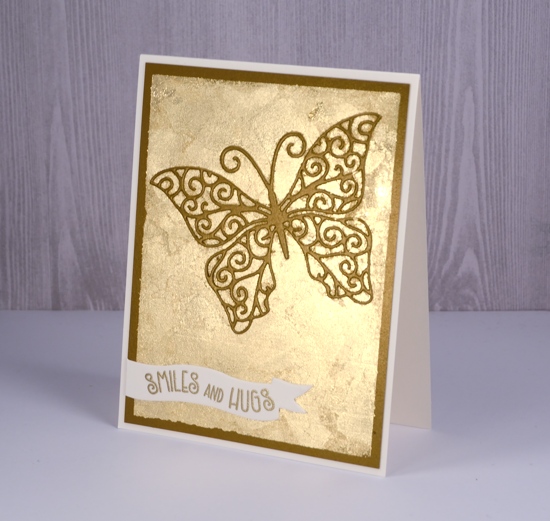
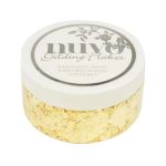
I used some lovely shimmer cardstock from The Foiled Fox and a whole bunch of gilding flakes. I know they can end up all over the place but I love the textured look of gilding flakes. Because there is some creasing and overlapping there is a lot of variation in the gold of the flakes. I also used gold embossing powder for my gold on gold on gold sparkly card. There are some step by step photos on the Foiled Fox blog so make sure you click on over.
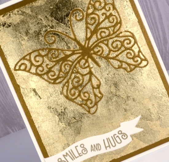
I am excited to share some more sparkly inspiration over the next few weeks and hope to see your creations in the challenge gallery: you can get there by clicking the frog below.


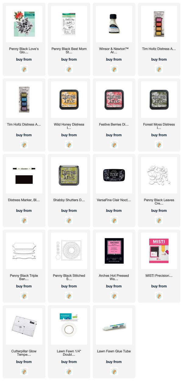
Sparkly Supplies
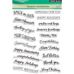
Stamps: Penny Black banner sentiments set
Dies: swirling wings, triple banner die set


Cardstock: shimmer antique gold, neenah natural white,
![]()
Also: stick it adhesive, gold gilding flakes, gold embossing powder
In my heart
Posted: January 24, 2018 Filed under: Tree heart, Triple Banner | Tags: Kuretake Gansai Tambi watercolour paints, Penny Black creative dies, Penny Black stamps, WOW embossing powders 4 Comments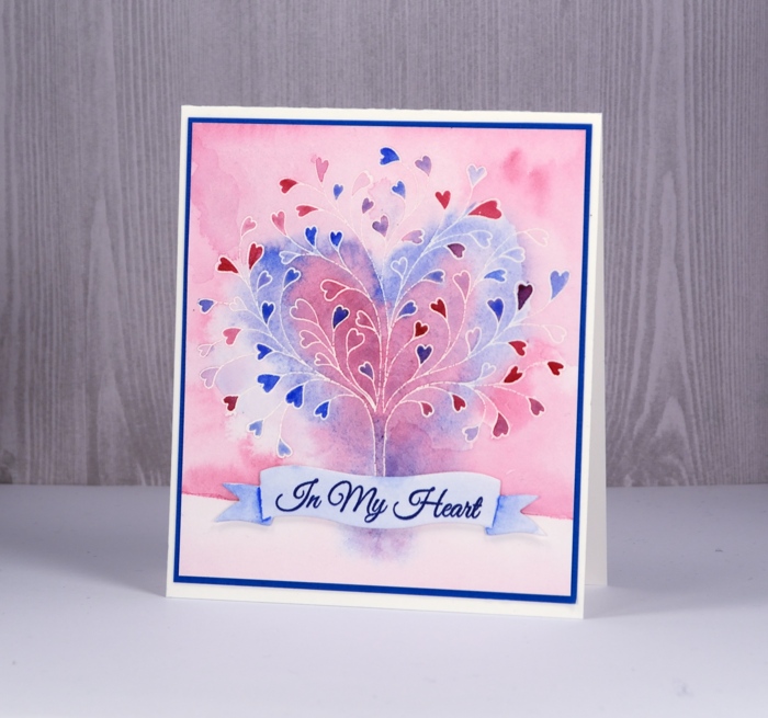
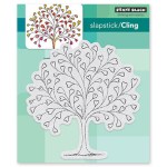
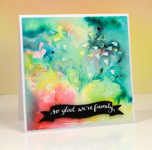
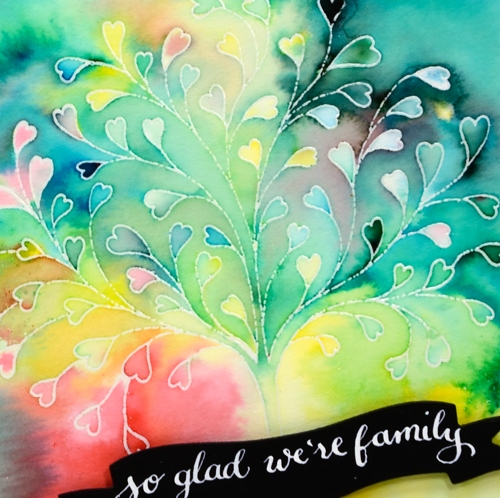
This stamp is called ‘tree-heart’ but I always think of it as a family tree. After all what better to have on a family tree but a whole bunch of hearts? I stamped the tree in versamark and embossed with clear powder on hot pressed watercolor paper. Next I painted water over the top section of panel and added pink and blue watercolour paints. Keeping it loose I painted a heart shape over tree with both pink and blue. I filled in the heart leaves with more intense pink and blue paint then painted diluted pink over base area.
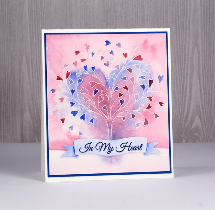
I grabbed a scrap of watercolour paper, painted diluted blue over it and stamped a sentiment from ‘happy hearts’ in versafine majestic blue ink. I die cut a banner to contain the sentiment and painted shadows on the ends of banner with blue paint.
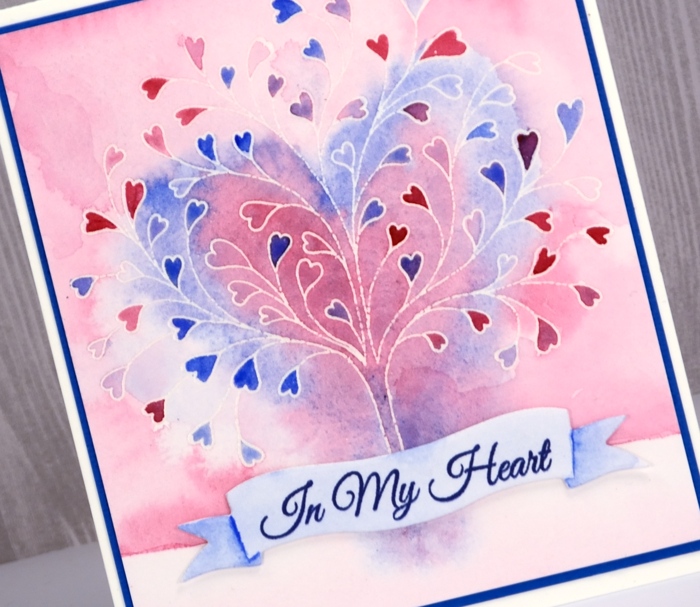
To finish I attached the banner to the tree panel with very low profile adhesive dots and matted the panel in blue cardstock before attaching to a white cardbase.
Supplies


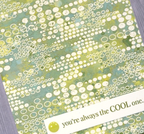
Distress Oxide Trials – one or two colours
Posted: May 5, 2017 Filed under: Blips, Felicity, Shades, Triple Banner | Tags: distress oxide inks, Penny Black creative dies, Penny Black stamps, WOW embossing powders 15 Comments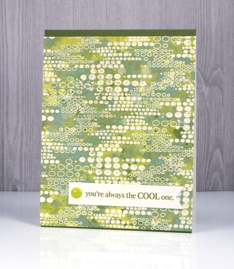
As I’ve been reading your comments about distress oxide inks I have noticed some of you are not sure you want them so have held off or only bought one or two to try. I decided to see what I could do with just one or two colours. I’ve been having so much fun with about half the colours I haven’t even opened them all yet and sadly spiced marmalade is currently hiding somewhere in my messy busy and productive workroom. All that to say, if you only have one or two colours, do some experimenting with them anyway; you might be surprised.
This green themed card is inked with only peeled paint distress oxide ink and yet there is a light and dark teal green, and dark and light olive tones as well. I was pretty impressed. I think the key to this effect is in the layering of colour. I pressed my ink pad on my craft mat, spritzed the ink then swiped my embossed panel through the ink. Colour only partially filled the panel; I dried it then repeated the process over and over. Each layer of ink reacts with the ink already on the paper and the un-inked areas on the paper. I also did some splattering of ink and water and some dabbing of water with a paper towel to lift a bit of colour. Because my panel was embossed I had to be careful not to reheat the embossing too much so I kept the heat tool moving. I love the effect around this ‘blips’ background stamp. A friend of mine used this stamp with great results recently by sprinkling brusho over the embossed image. Seeing her lovely card reminded me I had this stamp tucked away.
My second card uses only two distress oxide inks, worn lipstick and fired brick. I was hoping to do cards in just one colour but I wasn’t getting the same variety of colours from worn lipstick. My guess is that I spoiled my chances by covering the whole panel with my first layer of diluted ink rather than just part of the panel. I did manage to build up some different pinks over the top of the first layer but the differences were not as dramatic as shown on the green above. I will try again and use the same partial inking technique over and over and see what happens.
I did still manage to get some nice colour trapped inside the embossing creating light and dark petals and leaves. To provide just a bit more contrast I swiped it through some fired brick diluted ink a few times. When I press my ink on my craft mat then spritz it lightly it forms little beads of ink. Swiping through them spreads colour across the panel but pressing the paper down on top picks up little dots of ink, another cool effect I think.
I finished both cards with embossed sentiment banners and a few embellishments.
I have a growing list of suggestions from readers to try next week. Thanks for all your encouragement, tips and questions.
Supplies
Stamps: Felicity, Blips, Amazing!, Special Thoughts (PB)
Dies: Triple Banner, Shades
Paper: hot pressed watercolour paper, Neenah natural white and epic black cardstock
Inks: versamark (Tsukineko) Distress oxide peeled paint, worn lipstick, fired brick (Ranger)
Also: WOW clear embossing powder, Studio Katia sparkling crystals, Simple stories enamel dots
Family Tree
Posted: February 6, 2017 Filed under: Hand lettered, Tree heart, Triple Banner | Tags: color burst, Hand lettering, Penny Black creative dies, Penny Black stamps 16 Comments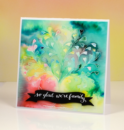
This delicate tree stamp is called `tree heart`but it reminded me of a family tree. I tried turning it into my family tree with names along the branches but it did not look that good! Instead I used the emboss resist technique with colorburst powders.
I embossed the tree in clear powders on hot pressed watercolour paper then sprinkled a few different colours of powder over the panel. I kept the colours separate as I sprinkled knowing they would blend anyway as I started adding water. I spritzed first then used a small paintbrush to move and blend the paint.
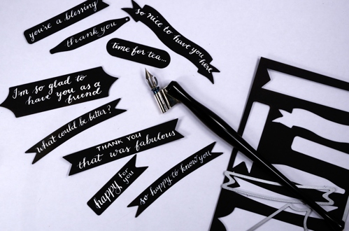
I love the way the emboss resist technique traps colours in little white borders. My next live class is a Watercolour resist class and, as often happens, I nailed two projects then took much longer to finalise the third. I was so happy to complete the designs I rewarded myself with some lettering playtime and made a bunch of custom black on white sentiments. I pulled out nine different banner, tag and label dies by Penny Black, cut them from black cardstock then used Dr Ph Martins Bleedproof white paint and a nib pen to write a sentiment on each one. The nib holder in the photo is an exclusive handmade holder sent to me by the lovely team at The Foiled Fox. It is delightful to write with. The bleedproof white paint is too thick for the nib straight out of the jar so I mixed some with a bit of water and it worked nicely.
Now I have a few sentiments in reserve ready to add to future cards.
Supplies:
Stamps: Tree-heart(PB)
Dies: Triple banner, Tagged, A Pocketfull (PB)
Paint: Colorburst watercolor powder (Ken Oliver) Bleed proof white (Dr Ph Martin)
Cardstock: hot pressed watercolour paper, Neenah Solar White
Ink: versamark (Tsukineko)
Also: clear embossing powder (WOW)
Nib holder: Handmade by The Foiled Fox
Ten Tulips
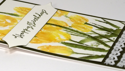
Posted: May 18, 2014 Filed under: Promise Me, Triple Banner, Watercolour | Tags: Fabriano Watercolour Paper, May Arts ribbon, Penny Black creative dies, Penny Black stamps, Tsukineko Memento inks 8 Comments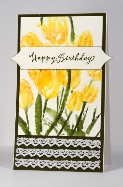
The Tulip Festival finishes tomorrow so I am glad I can slip one more tulip card in before the end. I worked on this one latish last night and all did not go according to plan. I stamped the tulips first on watercolour paper and they were fine. It was in the finishing off that I had problems. But I will go back to the beginning and explain my process.
I began by inking just the flower heads in Memento Dandelion and Cantaloupe using markers. I spritzed before stamping them at the top of the panel. I stamped just the tulip heads twice, one set under the other and the third time inked the stems and leaves as well. I was happy with the whole panel even the bit that is now covered by a large sentiment banner. I matted with Olive card stock and decided to attach the three strips of lace; I am still not sure if I like the lace there but I decided to stick with it. The panel is long and thin as you can see so it was difficult to work out where to put a sentiment on a 4.25×5.5 inch card base. I tried a sideways sentiment or a small sentiment beside the lace but neither looked right. Anyway, to make a long story a little shorter I stamped the sentiment on the tulips, messed it up and had to either cover the mess or crop the panel. I decided to cover it with a die cut banner and make a very narrow card so the points of the banner could go over the edge.
“Over the Edge” just happens to be the current challenge at Addicted to CAS and it’s a birthday card featuring May Flowers so I will join in at Seize the Birthday as well.
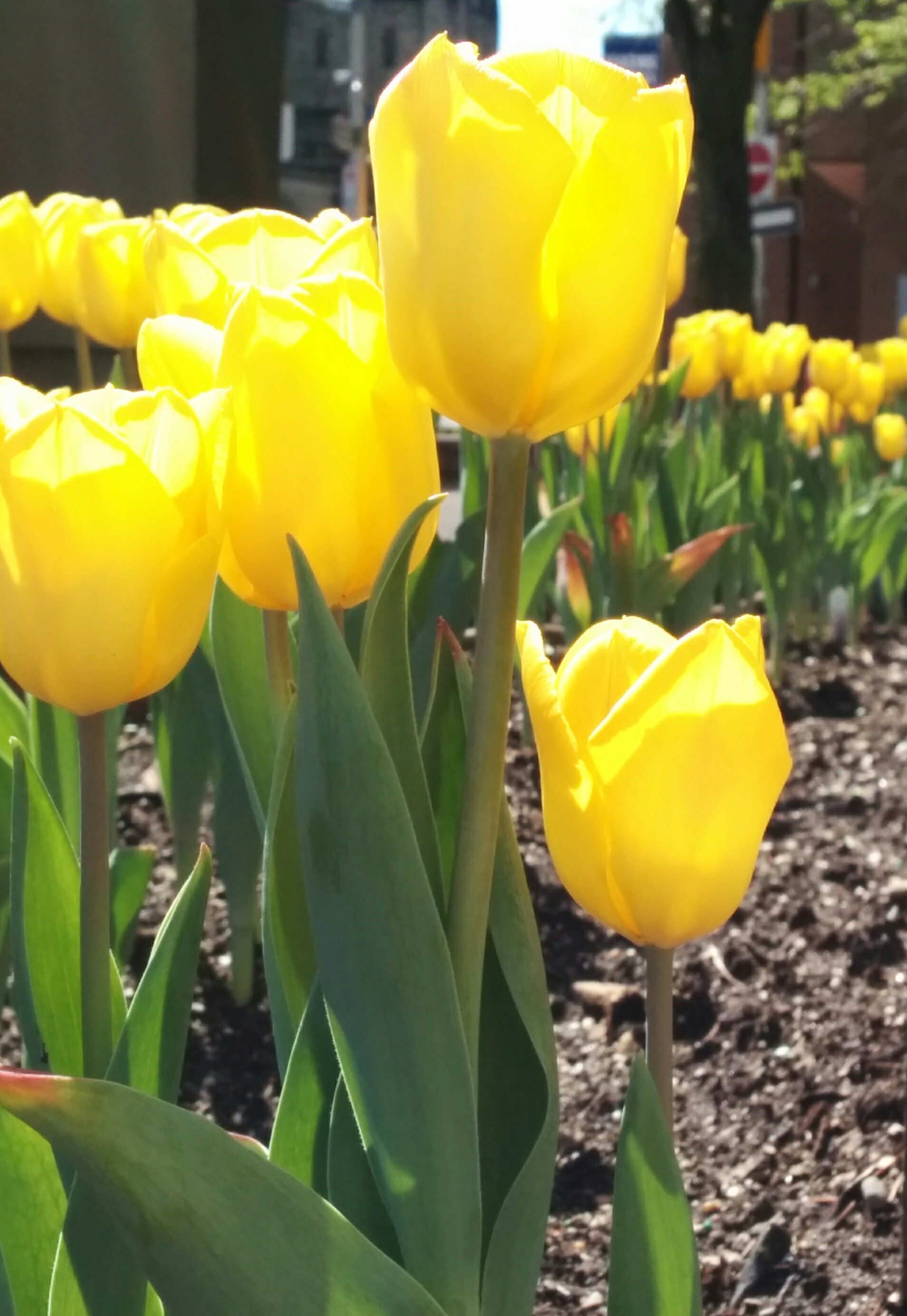
This morning we were down town having a coffee before church and I snapped these tulips in the sunshine.
Supplies:
Stamps: Promise Me, Tweet Wishes (PB)
Inks: Memento Dandelion, Cantaloupe, Bamboo Leaves & Olive Grove markers (Tsukineko)
Creative Dies: Triple Banner
Cardstock: Fabriano 100% cotton hot pressed watercolour paper, Neenah Classic Crest Avon Brilliant White 110lb smooth, Penny Black Olive Grove Mix & Match Papers
Also: Crochet Trim ribbon (May Arts Ribbon)


