
Love’s glow
Posted: May 20, 2019 Filed under: Leaves, love's glow, stitched square & circles, Triple Banner | Tags: Penny Black creative dies, Penny Black stamps, Ranger archival inks, Ranger Distress inks 7 Comments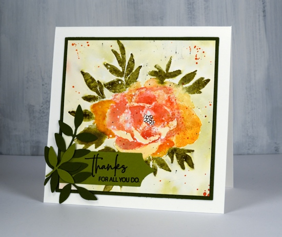
Here’s another new beauty from Penny Black. This one is a large rubber cling stamp called ‘love’s glow’. I’ve stamped it with a mix of archival and distress inks then added some die-cut extras on the corner. I think I might have gone a little over board with the splatter at the end but not enough to make me give up on the floral. There is a lot of shaded detail in this stamp so it is very helpful to stamp it in a medium to dark colour first on a scrap of paper so you can have the image off to the side while adding colour to your project. Before I started stamping I splattered some masking fluid on the hot pressed watercolour panel so the finished design would have some white dots here and there. You could use white paint at the end to get a similar effect. I used my MISTI so I could work on the oranges and reds separate from the green.
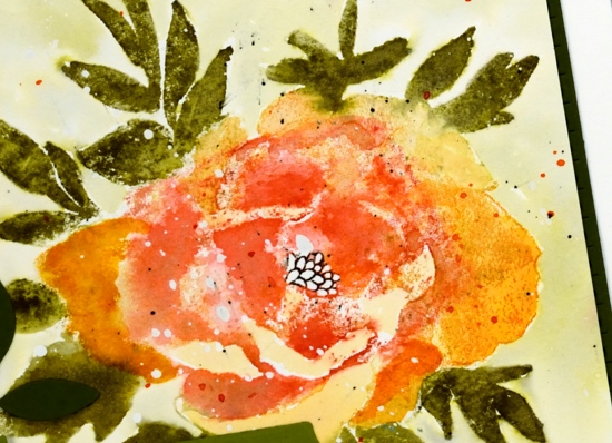
I stamped the flower first in archival spiced marmalade ink, it is one of the colours Ranger has recently brought out in mini archival packs. I learnt this trick from Jill Foster, just one of many tricks I have learnt from her! By stamping the flower first in archival I have an image on my paper that I can watercolour over but it will not be diluted and lost as I add water. Because I was using similar colours in distress inks the initial archival ink does not stand out as different. When I inked the stamp initially with archival ink I wiped any of the spiced marmalade that ended up on the leaves. To achieve the blended red and orange tones in the petals I inked and stamped the flower again in wild honey and festive berries distress inks. I then used a damp brush to blend the colours in the petals using my reference photo to help me when necessary.
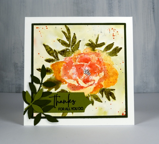
I followed the same process for the leaves stamping them first in archival peeled paint, then again in forest moss distress ink which I blended with water and a paint brush. I added definition to the centre with a black marker. Once the panel was dry I painted shabby shutters ink around the flower after first pressing my shabby shutters inkpad onto my glass mat and adding some water. I splattered with festive berries, forest moss and black soot ink. I trimmed the panel down to a square then die cut a square mat of olive green cardstock with the stitched square die.
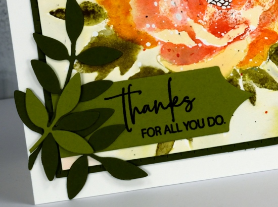
To finish off the card I added some green die cut leaves; I think these leaves might be from the first die sets I ever received from Penny Black. I’ve used them over and over. I cut a sentiment banner with one of the ‘triple banners’ set and trimmed one end so it could align with the mat. The sentiment is from the Best Mom set but I did some partial stamping to get only half the words on my banner.

I hope you are having a great Monday. I just want to remind you there is a sale happening at Foiled Fox all the long weekend and a ‘Color Trio challenge’ continuing until May 30.

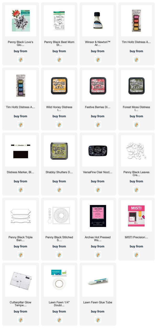
Supplies


Gorgeous card, I love the added interest of the masked background giving little white dots!
This is so pretty. I saw the archival Holtz colors and this gives me some nice insight on what to do with them. Thank you, Heather! Love the multi-color splatter, too.
A wonderful looser watercolour look here Heather, and I adore the added die cut leaves and sentiment tag using that lovely rich green coloured card. Fabulous! x
Great way to achieve the look of real watercolor! Beautiful color choices Heather.
I like it very much
I find that it is not always obvious how to treat and colour these large, bold PB flowers, but your step by step shows how to make them come alive.Thanks for showing us how. I love the splatter too.
[…] (Card originally posted HERE) […]