Old favourites
Posted: November 10, 2023 Filed under: Berry kissed, Penny Black, Uncategorized | Tags: Fabriano Watercolour Paper, Penny Black stamps, Tsukineko Memento inks 6 Comments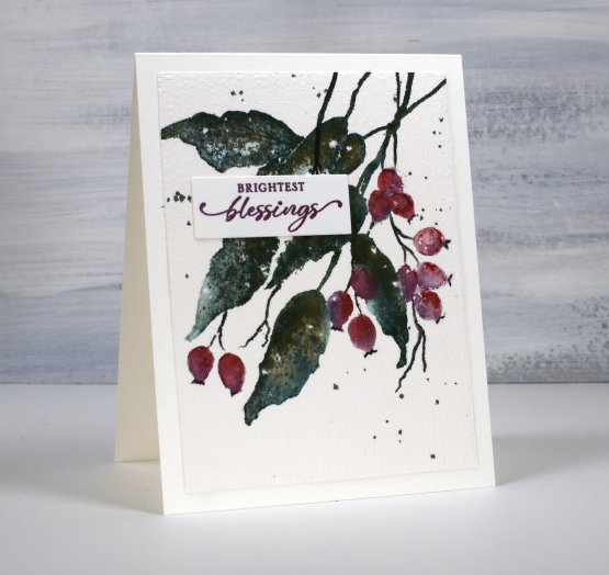
When I say old favourites I am talking in crafting years not harking back to my grandmother’s time. The PB stamp featured on today’s card is definitely a favourite, it’s called ‘berry kissed‘ and it’s been around a few years.
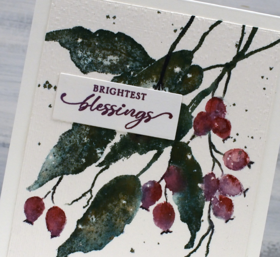
Another old favourite on this card is my often used technique of splattering masking fluid on my hot pressed watercolour paper before stamping or painting. After all the ink is added and dried I remove the masking fluid to reveal little white dots here and there which look like snow.
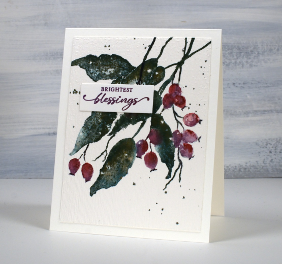
The final old favourite worth mentioning on this card is the ‘magic’ ink, memento northern pine. It is a dark green dye ink and when it is wet it bleeds into greens, blues and browns. I stamped the leaves with this ink then blended over them with a paintbrush and you can see all the different tones, especially in the close up photo. And yes, the placement of the sentiment does cover a few blotchy berries!
Today’s post features affiliate links to the following companies. If you buy through these links I receive a small commission at no extra cost to you. The Foiled Fox & Scrap’n’Stamp
2022 BuJo – February theme
Posted: February 8, 2022 Filed under: Bullet Journal, Dingbat notebooks, Hand lettered, Penny Black, Soft Grace, Spread Cheer | Tags: Bullet Journal, Dingbats notebook, Hand lettering, Penny Black stamps, Tsukineko Memento inks 2 Comments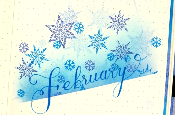
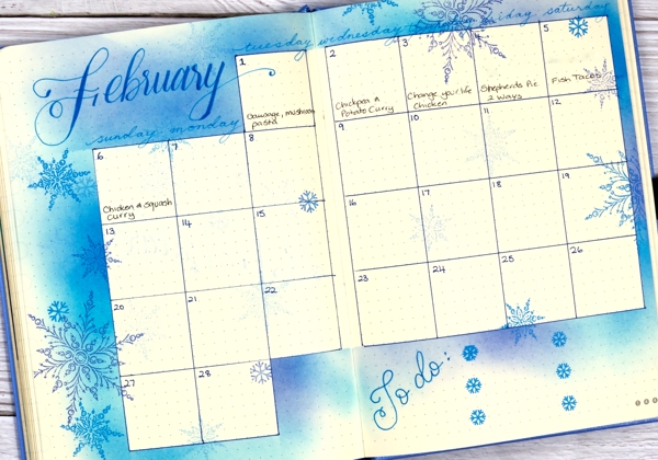
I am a week late with my February BuJo set up; we are already 25% of the way through the month! I went with the snowflake theme as we have plenty of snow now and I assume more to come. It is a pretty simple layout on account of the need to get it done so I could record and plan in the journal rather than on scraps of paper!
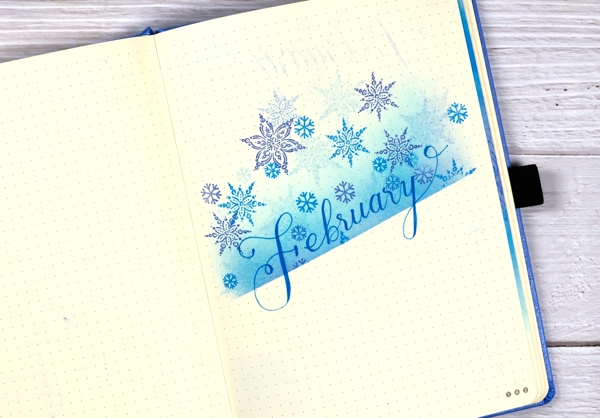
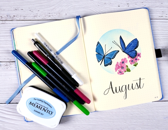
I lay a piece of post-it tape across the page then used brushes to blend memento inks above the tape. I used three blue inks (listed below) and used the same inks to stamp snowflakes to decorate the top half of the page. I’ve found post-it tape to be very safe on these pages. Washi tape and painter’s tape (delicate) have both taken some surface off if I have not been careful. I wrote ‘February’ with the Bahama Blue memento marker but haven’t linked it as I am not sure where to get them these days. I was delighted to find mine still worked and had plenty of ink in it.
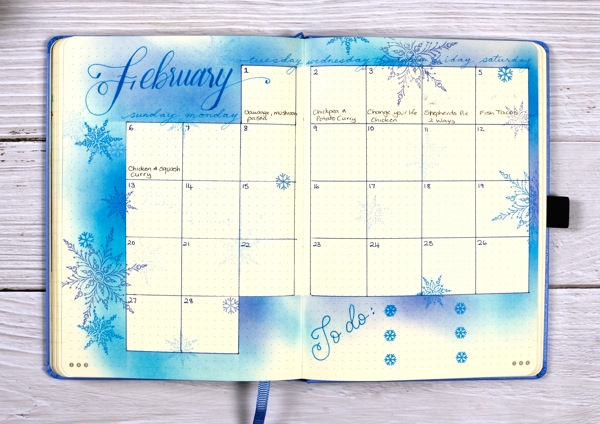
I ruled up the calendar grid as I often do then used strips of post-it tape to mask as I blended ink around the edges. Once again I stamped snowflakes from Penny Black sets to decorate the spread. As we are already a week into the month I added the to do list to the calendar page. The important thing at this stage is to do the ‘to-dos’ not to decorate them!
If you are in the middle of winter right now what are you up to? Are you hunkered down inside or braving the outdoors? I am definitely doing both; we have enjoyed several cross country skis and a few walks but I have also been busy with journal projects, sorting and organizing supplies and planning future classes and lessons.
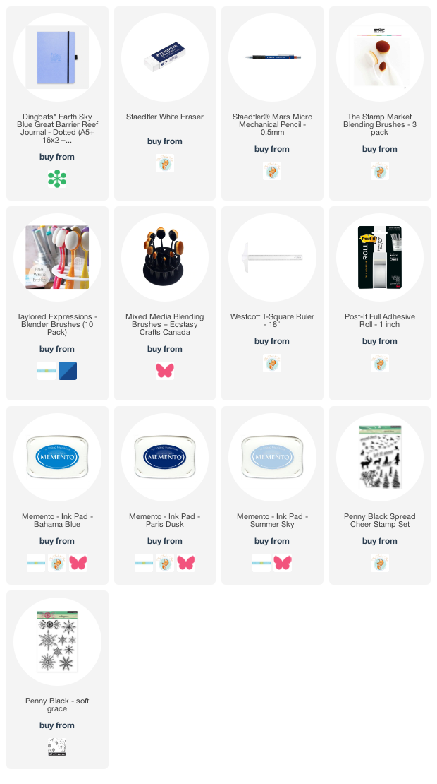
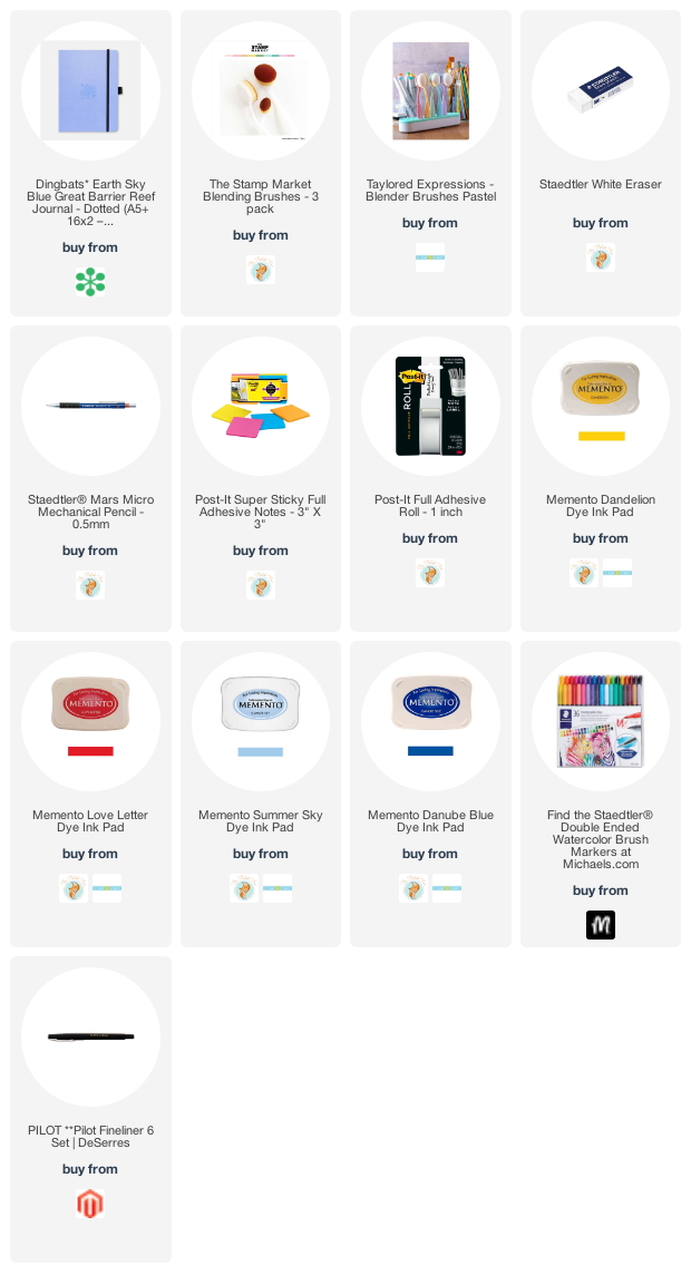
Supplies
(Compensated affiliate links used when possible)
2021 BuJo – August theme
Posted: July 31, 2021 Filed under: Bullet Journal, Dingbat notebooks, Hand lettered, perfect pairing | Tags: Bullet Journal, Dingbats notebook, Papertrey ink, Staedtler watercolour brush pens, Tsukineko Memento inks 5 Comments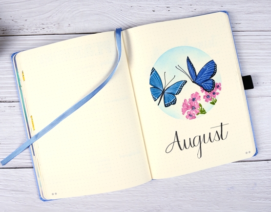
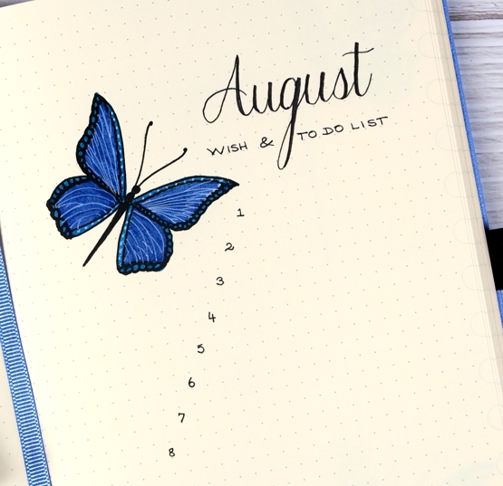
This might be a first, having my month theme set up and ready to share before the month has even started! I wanted to include butterflies as the garden has been attracting quite a few. I’ve been enjoying both blooms and wings.
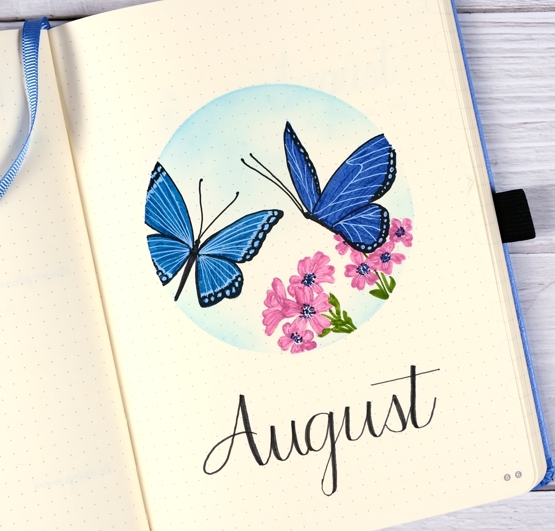
I masked the circle with an ‘express-it mask it sheet then stamped butterflies and flowers from the PB ‘perfect pairings’ set with soft stone ink. Before colouring I added memento summer sky ink with a blending brush.
As I did the last two months I used markers to colour the flowers and butterflies; I am still new to (non-blended) colouring with markers. Usually when I use markers for colouring I add a little ink then blend it with water to fill a space. As the bullet journal pages do not handle water in the same way as watercolour paper I’ve avoided water blending.
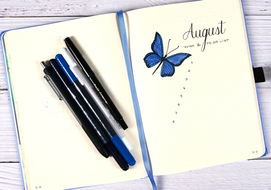
On both the title page and list page I filled the wings with blue first then added all the details over the top with black and white gel pens. I switched to a pilot fineliner to do the numbers and lettering.
After prepping my August pages with flowers and butterflies it is time I headed out to my garden and did some real life tidying up. Thanks for dropping by.
Supplies
(Compensated affiliate links used when possible)
2021 Bujo – March to do list
Posted: March 20, 2021 Filed under: Bullet Journal, Dingbat notebooks, Hand drawn, Hand lettered | Tags: Bullet Journal, Dingbats notebook, Staedtler watercolour brush pens, Tsukineko Memento inks 5 Comments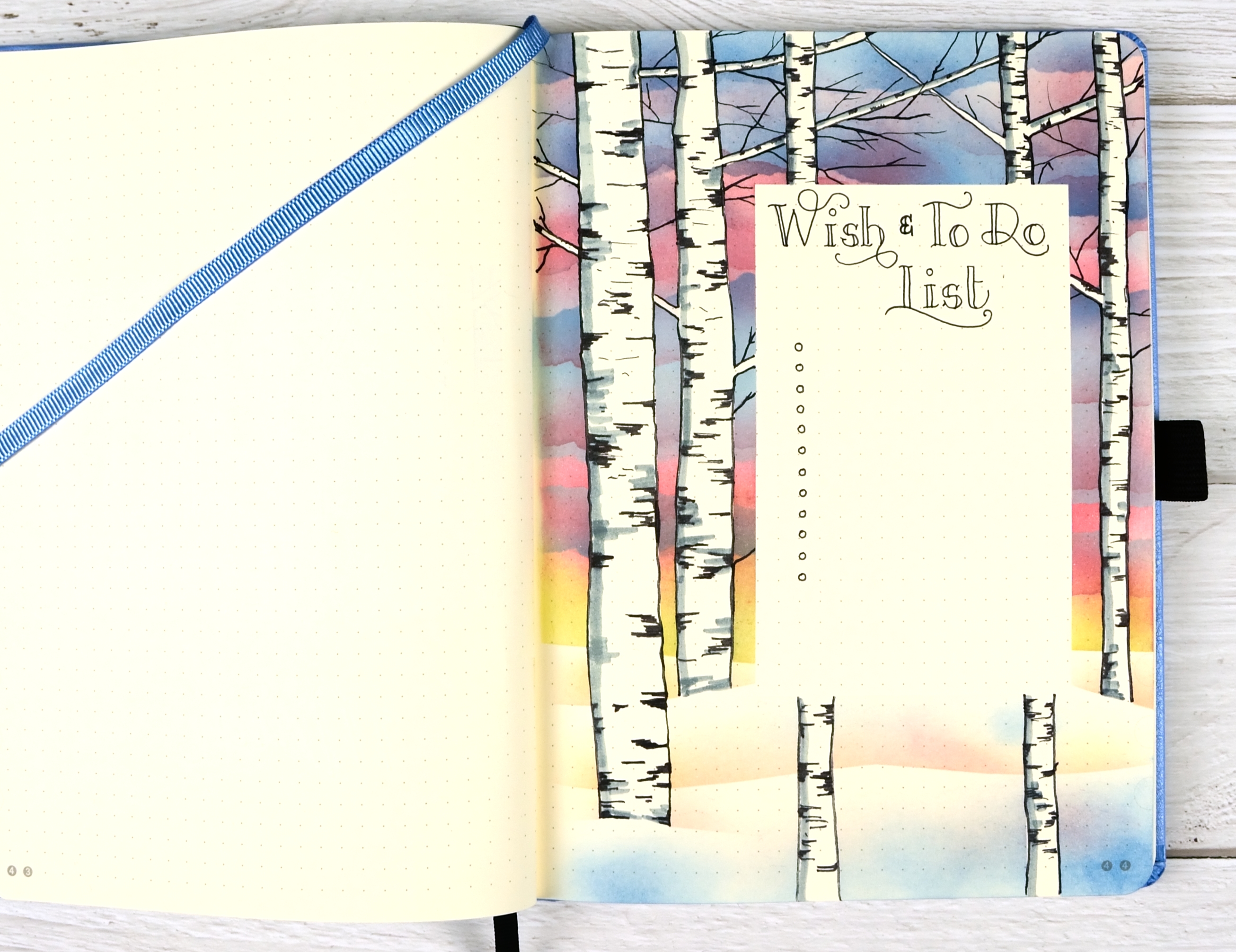
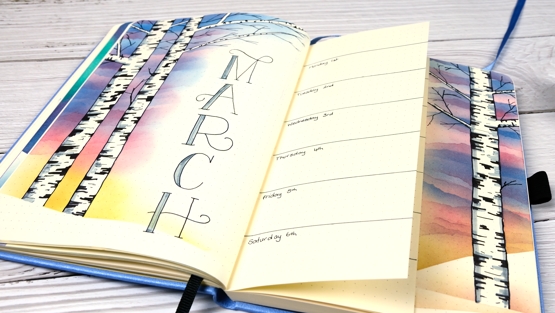
This is the last of my birch themed pages, photographed before I added all the to-dos and wishes. We are two thirds of the way through March and I’d like to say I have done two thirds of the things I added to this list but sadly that is not true!
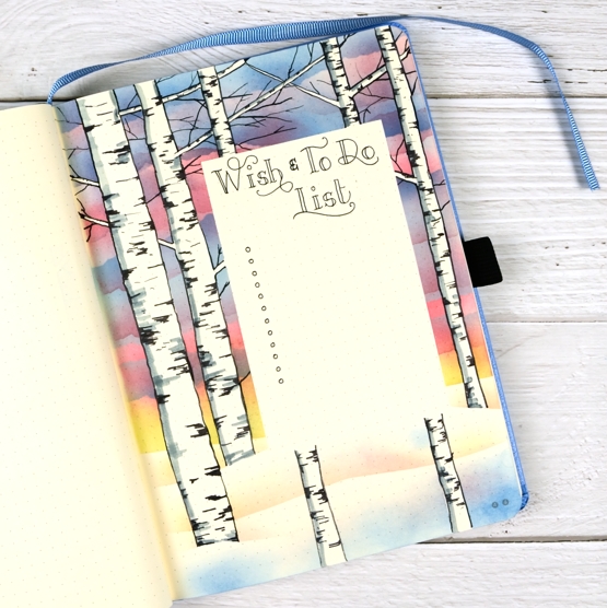
I used the same technique for this page that I described in previous birch + sunset posts here and here. One unexpected outcome of reusing the post-it tapes for four different pages was some pretty blue, pink and yellow tape to use on another page! Seeing I am primarily a card maker I plan to create a card using this technique and hopefully a video to show you the process.
Thanks for dropping by.
Supplies
(Compensated affiliate links used when possible)
Lemon Lush
Posted: March 15, 2021 Filed under: floral notes, Karin brushmarkers, lemon lush, Peerless watercolours, Pink Fresh studio | Tags: Brutus Monroe, brutus monroe embossing powder, Karin brushmarkers, Peerless Transparent Watercolors, Pink Fresh studio, Tsukineko Memento inks, Tsukineko Versafine inks 3 Comments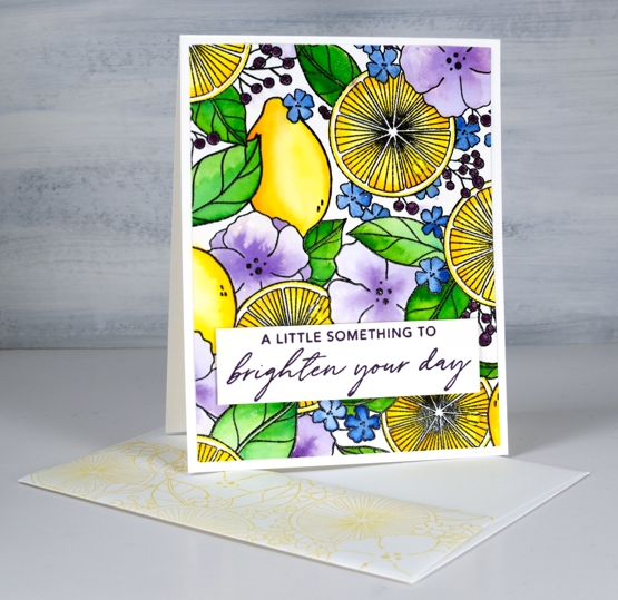
It’s a collaboration day with The Foiled Fox, so I am over on their blog and sharing here at home too. Make sure you pop over there to learn more about today’s card process and products.
Isn’t this a bright happy image? I know it’s partly the colours I chose but I think it is also the mix of lemons, leaves and flowers. It’s a glimpse of summer and that is definitely welcome! The stamp is called ‘lemon lush’ and it is a large 6″x6″ from Pinkfresh Studio. I’ve used two thirds of it for this rectangle card but I’ll be showing you the whole square image on another card soon.
I stamped the rubber stamp on hot pressed watercolour paper in raven black ink and embossed in raven powder (both from Brutus Monroe). For the watercolouring I used Peerless watercolours. I watercolour with quite a few different products so sometimes the Peerless paints sit on the shelf feeling forgotten. Once I bring them out however, I remember just how beautifully they blend and what gorgeous colours are available. If you haven’t heard of Peerless watercolours paints they are an old, old company and the paint is in pieces of thick paper. I use a wet brush to pick up paint to use on my project.
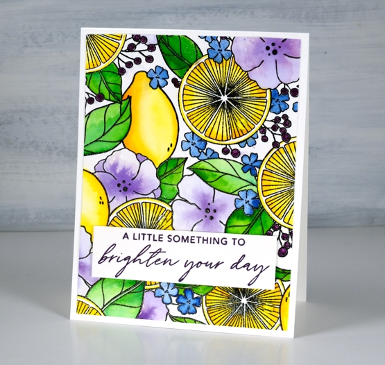
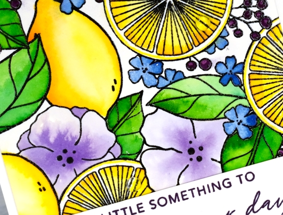
When painting the cut lemons I used a yellow and a light orange paint, for the whole lemons I used the same plus darker orange tones to get depth and shadow. I used two greens for the leaves, a blue for the tiny flowers and violet for the large flowers. To fill in the berries I switched to a purple Karin brushmarker. The sentiment is from Pinkfresh Studio’s ‘floral notes’ set stamped in monarch versafine clair. I stamped the flap of my envelope too with memento dandelion ink. If you take a close look at the second photo you will see some clear dots glued to the lemon halves, those droplets of juice might just be my favourite part of the card! Thanks for joining me today and thank you Foiled Fox for sending me this stunning stamp to create with.
Supplies
(Compensated affiliate links used when possible)
2021 Bujo – March daily record
Posted: March 13, 2021 Filed under: Bullet Journal, Hand drawn, Hand lettered | Tags: Bullet Journal, Dingbats notebook, Staedtler watercolour brush pens, Tsukineko Memento inks 4 Comments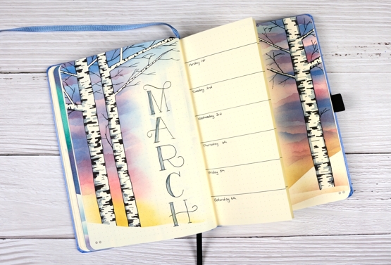
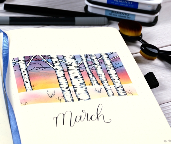
I’ve continued the birches + sunset theme on the month record spread. This is the page where I record day to day things, some in advance as reminders, but mostly afterwards so I can look back and see what I cooked last week or how long it is since I went for a run!
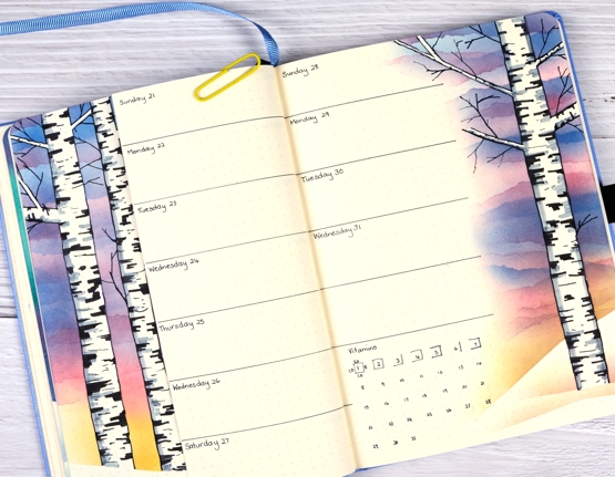
As I mentioned on my title page post last weekend we still have snow around here so this theme is currently appropriate. In the last week however we’ve had several warm days so I am thinking April’s theme might include flowers or leaves! For this spread I used the same method as for the title page where I masked trees and branches with post-it tape, masked a hill at the base then blended memento ink over the masking to create a sunset sky. After removing the post-it tape I outlined the edges of the the trees, added markings and branches in black then shading with a grey marker.
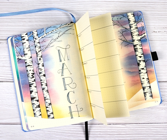
The layout is one week per trimmed page; you can see on the photo below that I cut off a portion of two pages so I would have ample room to write daily notes and still see the birches from each page.
I reduced the amount of habit tracking this month as I already have app on my phone to record water consumption and one for any exercise I do. Tracking things in two places isn’t really worth my time. I mentioned when I first wrote about this bullet journal that I want the practice of bullet journaling to help me stay on top of things rather than just be a pretty notebook. Do you keep track on paper or digitally or maybe a mix of the two like me?
Supplies
(Compensated affiliate links used when possible)
2021 BuJo – March title page
Posted: March 6, 2021 Filed under: Bullet Journal, Dingbat notebooks, Hand drawn, Hand lettered | Tags: Bullet Journal, Dingbats notebook, Staedtler watercolour brush pens, Tsukineko Memento inks 16 Comments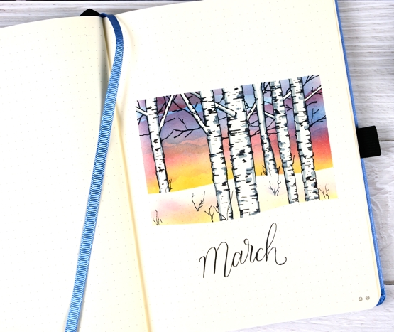
Although it’s been a few weeks since I posted any bullet journal pages here on the blog, the journal is turning out to be a handy record and planner for me. So far I have done more recording than planning as I am still working out how to use it for keeping track of ongoing projects. I have been recording all the evening meals we’ve been cooking and eating which is really helpful when I am trying to work out what to make next. All four of us take turns cooking which I love but it is sometimes a little tricky as we have a range of food sensitivities and allergies to take into account, some with serious health consequences.
As you can imagine I am also keeping track of books I’ve read and thinking about keeping track of podcasts too. Some podcasts are long time favourites while there are others I subscribe and unsubscribe from as my interest waxes and wanes.
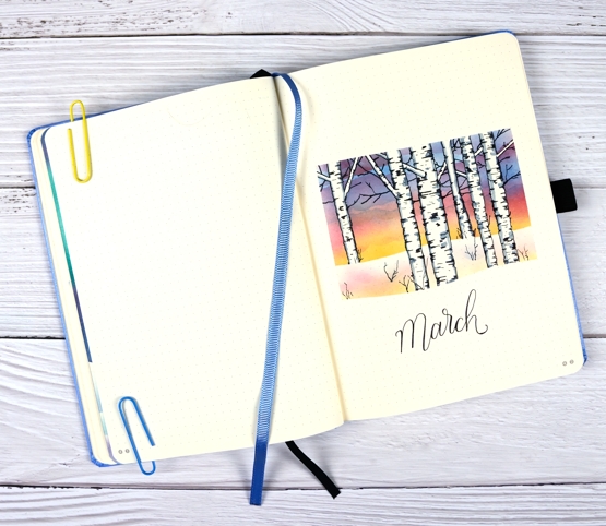
But here is my March theme, a sunset behind birch trees in snow. I have been seeing themes on the interwebs featuring blossoms and flowers but that is not a March thing where I live. We still have plenty of snow and have been enjoying some amazing sunsets so I decided on one more wintery theme.
I masked the edges of a rectangle with post it notes top and sides then cut a curved edge along one for the bottom mask. I masked the trees by cutting strips of post-it tape in different thicknesses including some very thin scraps to lay on the page as branches. With the masks in place I used blending brushes to apply the inks shown below to fill the sky. To get some pattern in my sunset sky I tore some post-it edges and blended ink over the top of the first layer along the torn edges moving them around to get the look of clouds.
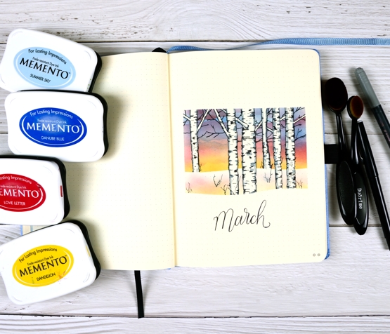
Once all the sky was done I removed the bottom mask and put a different one in place to blend a snow bank shadow. I then removed all the tree masks and drew edges and black marks with a black Pilot fineliner then some grey shadows with a staedtler brushpen.
I’ll be back next weekend with other birch sunset themed pages. I’m continuing to be a fan of the Dingbats notebook I’m using and was given another for my birthday which is just as lovely. They have just this week come out with a new, bigger style with thicker paper, so who knows I might have to let that one join the family one day too!
Supplies
(Compensated affiliate links used when possible)
Fern and floral art journal page
Posted: March 5, 2021 Filed under: Art Journal, fresh ferns, garden variety, Penny Black | Tags: Art Journal, Fabriano art journal, Penny Black creative dies, Penny Black stamps, Tsukineko Memento inks, Tsukineko Versafine inks 8 Comments
Recently when I was making a card with the new Penny Black stamps, ‘garden variety’ and ‘fresh fern’ I also began an art journal page. I really need to be braver with my art journal, I tend to reach for the same mediums that I use all the time in my cards. Today’s journal page was not particularly adventurous but I did pull out my box of pastes, gels and mixed mediums only to find several of them had dried up completely in their containers while others that used to be thick had turned to liquid. Those ones got tossed but a jar of distress collage medium came in handy along with some modelling paste. I think they might have both done the same job in the end.
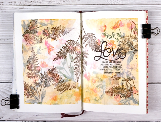
I’m still working in my Fabriano art journals made up of drawing paper so I’m trying not to rely on my watercolour habits and techniques. I began as usual by taping the edges of the pages both to keep the book open and to create an attractive frame.
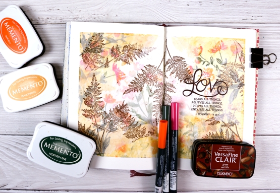
I inked the garden variety stamp with tangelo, northern pine and rosebud memento inks, spritzed it and stamped on the pages multiple times. I did first and second generation stamping to get both bold and pale prints. Then, feeling all brave and mixed media-ish I coloured some modelling paste with peanut brittle memento ink and applied it around the edges with a little plastic applicator (an old bank/library card would do). This step didn’t really yield the results I wanted but it was all in the spirit of experimentation so on I went.

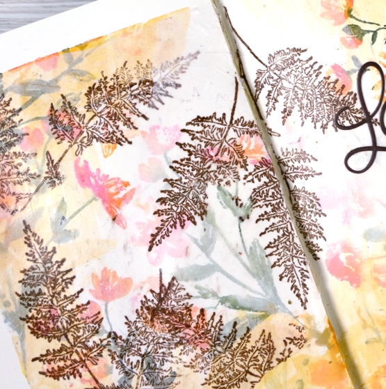
I hadn’t used tissue paper in a while so I scrounged through our wrapping paper box and found some white, stamped the fresh fern in rich cocoa memento ink then tore it into sections before gluing it on the journal pages with collage medium. The tissue became almost transparent which gave the flowers behind a soft pearly look. I stamped the verse from 1 Corinthians on tissue too and glued it down in the same way replacing the first word, ‘love’ with a die cut.

I would love to know if you have an art journaller you admire. I am a big fan of Vicky Papaioannou and have watched many if not all her art journaling videos. I am interested to know what gels, pastes and mediums people use for what purposes. Which are best for resist effects, which are great for gluing, etc. Please share any recommendations you have.
Supplies
(Compensated affiliate links used when possible)
Woolly Wishes
Posted: January 18, 2021 Filed under: A2 layers, Additional A2 layers, Darkroom Door, Karin brushmarkers, knitting, Penny Black, Waffle Flower | Tags: Darkroom Door stamps, Karin brushmarkers, Penny Black creative dies, Tsukineko Memento inks, WOW embossing powders 6 Comments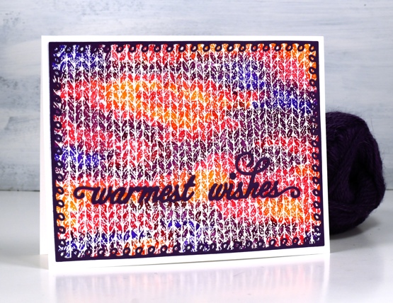
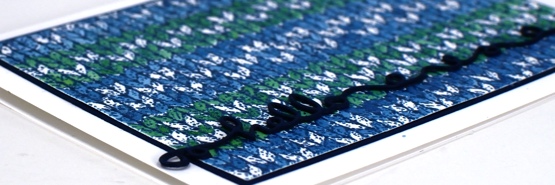
This is the first knitting project I have done in years! I keep meaning to pull out some needles and wool to see if it hurts my hands to knit. I have a little stash of wool and plenty of different sized needles and I used to knit while watching tv. My last project was never finished then my hands became quite sore so I haven’t tried again.
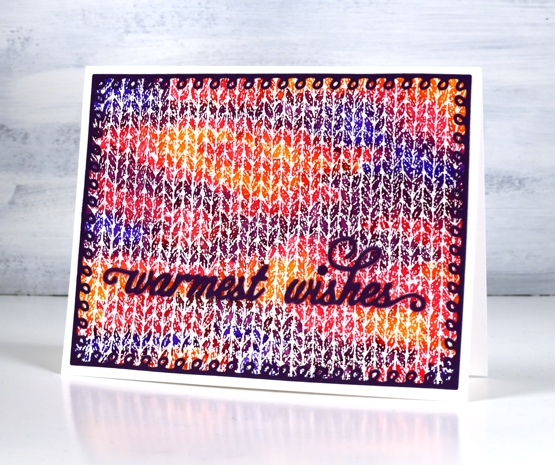
When I first saw this Darkroom Door knitting stamp I couldn’t believe how realistic it looked when stamped and coloured. I stamped with versamark and embossed in clear powder on hot pressed watercolour paper for both cards. On the panel above I used Karin brushmarkers (amber, lilac, violet blue, magenta) to colour random shapes over the panel just like you get when you knit multicoloured yarn. I spritzed lighlly over the panel with water to get the colours to blend just a little.
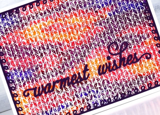
I knew just the dies to use to complete the card. Penny Black has a set of looped frame dies which look a little like knitting stitches and the PB warmest wishes die is made of small curly letters that look like loops of wool. I cut both from purple cardstock with double sided adhesive on the back.
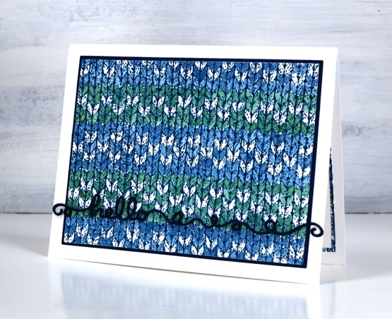
The second card features a simple pattern painted over the embossing with nautical blue and cottage ivy memento inks smooshed on my glass mat. I wanted to do a fancy snowflake pattern but decided I should start with something simple. Just as well as I missed a whole line of the pattern I was trying to do. This time I matted the panel with dark blue cardstock and stacked three layers of the ‘hello’ from the Penny Black ‘doodles’ die set which also looks a bit like yarn.
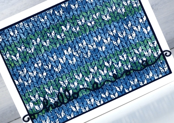
I had to make the knitting panel smaller to fit on the matching piece of blue cardstock so I re-cut it with the WaffleFlower A2 layer dies and saved the slim outline to glue inside the card. I will definitely be playing with the DD knitting stamp again because I want to colour a fancy fairisle type pattern. It will also show up in a small role on a card coming up later in the month.
I am happy to be back blogging again after my short break; I’ve missed chatting with you. I wish I could say I achieved all my planning and preparation goals but that is far from the truth. I think maybe my expectations were set a bit too high! Today’s cards feature the knitting stamp that had been sitting waiting patiently for some ink for months. I could have continued to stamp and play this image for days but I limited myself to one day so I could move onto other things. Is your year off to a good start, have you had some creative time already?
Supplies
(Compensated affiliate links used when possible)
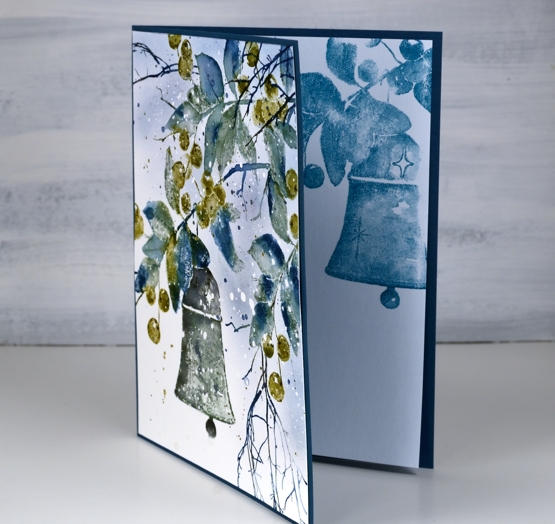
Bell & Berries
Posted: October 28, 2020 Filed under: bell & berries, Coliro paints, Finetec paints, fragile branches, Penny Black | Tags: Coliro paints, Fabriano Watercolour Paper, Papertrey ink, Penny Black stamps, Tsukineko Memento inks 13 Comments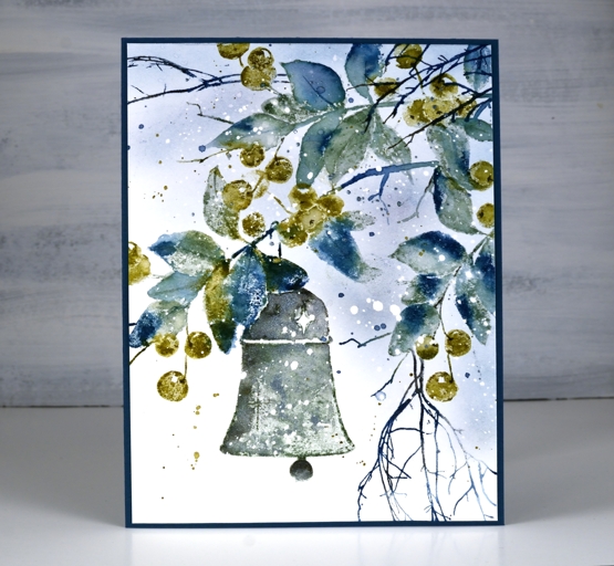
Over the summer I kept reaching for the blues and greens; they were refreshing in the hot weather. It appears that my fascination with them is continuing into the winter! I created this wintry panel with the Penny Black ‘bell & berries stamp and the versatile PB ‘fragile beauty’ set.
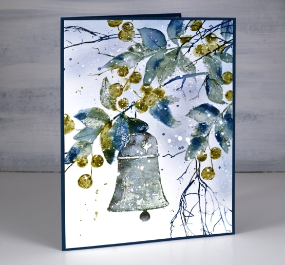
When I started this panel by stamping only the branch section of the stamp at the very top I chose only blue, grey and green inks. Choosing green over red for the berries helped to create a fresh frosty look. After stamping only the top branch I repositioned the stamp and stamped the whole image then finally a bit more branch on the right hand side. The extra twigs were added in dark blue.
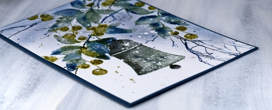
I inked the leaves with papertrey ‘enchanted evening’, a dark blue and ‘stormy sea’, a grey blue. I used the olive toned ‘prairie grass’ for the berries. When I spritzed the stamp before stamping on the hot pressed watercolour paper the inks began to blend. I did further blending on the paper with a paint brush and water but didn’t blend every part of the image, some leaves and berries I kept unblended to show the texture of the paper and stamp.
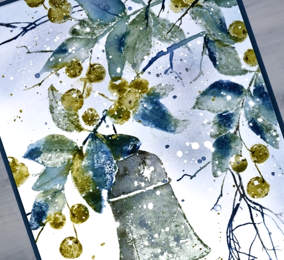
The paper had spots of masking fluid splattered over it before I began which caused the white dots you see in the finished panel.
I stamped the bell in a mix of stormy sea and true black ink and also added ‘blue silver’ pearlescent paint from the Coliro ‘ocean’ set so there is a shimmer to it in real life.
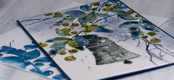
I used a piece of dark blue cardstock for a card base then stamped the ‘bell & berries’ on both an insert panel and the envelope.
I woke up to the frosty look of fresh snow on autumn leaves this morning; it’s pretty but it can go now!
Supplies