
Window Box
Posted: August 8, 2024 Filed under: Echidna Studios, Finetec paints, Stampin Up, Window box | Tags: Coliro paints, digital stamps, Echidna Studios, Fabriano Watercolour Paper, Finetec artist mica watercolour paint, Staedtler watercolour brush pens, Stampin Up 4 Comments
Don’t you just want a window like this? With blooming flowers not wilting in the heat! This digital stamp is called ‘Window Box’ and it is new from Echidna Studios. My daughter designed it and there are three files to play with in the set, the image you see here as well as a separate window image and a separate window box image. I’m looking forward to trying the window box image by itself enlarged to fill a card front.
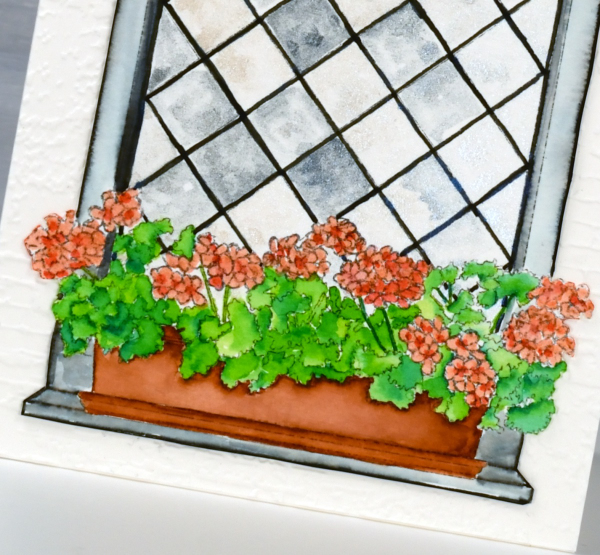
I printed the image on hot pressed watercolour paper and used Staedtler watercolour brush markers to colour the flowers, leaves, box and window frame. The window panes I painted with Coliro pearlcolors from Finetec. Some pearl or metallic paints are ‘interference’ paints which look very different on black paper as compared to white. The blue pearl paint I used from the ‘Ocean’ set looks very blue on black paper but looked silvery grey on white even with a touch of cream depending on the way the light hits it. This was exactly the effect I wanted so the panes appear like old leadlight windows where each pane reflects the light differently.
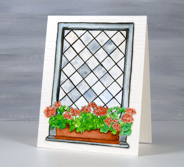
I coloured the leaves with two greens, blending them together with water and a paintbrush. I used the same technique for the flowers with a coral and a peach coloured marker. The planter was painted with a terracotta colour and the frame with black, diluted to appear grey in places. I wasn’t planning to cut this image out but it really needed to be attached to an embossed panel of aged brick. I’m sure you understand. The embossing folder is ‘exposed brick’ from Stampin Up. This post includes affiliate links from Foiled Fox. If you buy through these links I receive a small commission at no extra cost to you.
Lighthouse Journal Page
Posted: April 6, 2023 Filed under: Art Journal, Darkroom Door, global postmarks, Handmade book, this way, word labels, World Map | Tags: Art Journal, Coliro paints, Darkroom Door stamps, Fabriano Watercolour Paper, Handmade book, Ranger Distress inks 5 Comments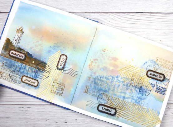
This journal spread was a joy to make. It combines so many of my favourite things. A few weeks back I posted about a new handmade art journal. This is it and these are the first pages I’ve completed. I didn’t work on the very first page; I leave that for later, so this is a few pages in. The pages are cold pressed watercolour paper so I taped the edges and created a watery blended background with distress inks smooshed on a piece of acetate then pressed onto my pages. I added more ink with a paintbrush and stamped the Darkroom Door world map stamp into the wet ink. I wasn’t trying to create sky or land or anything in particular I was just working randomly with blues and browns.
Once the background dried I used stamps from another favourite, the DD ‘global postmarks’ set, again stamped in blue and brown but archival ink, not distress, so it wouldn’t dilute and blur.
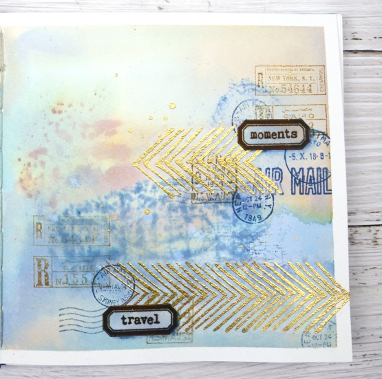
On an extra scrap of watercolour paper I picked up some smooshed and diluted ink then dried it before stamping the new ‘word labels’ stamps so I could cut them out and arrange them over the page.
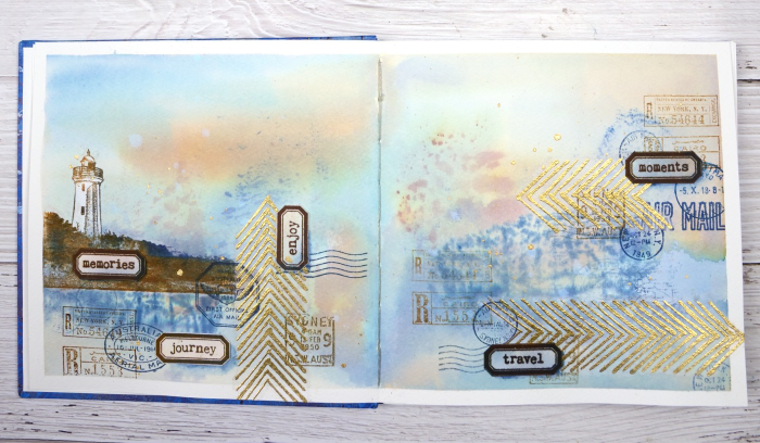
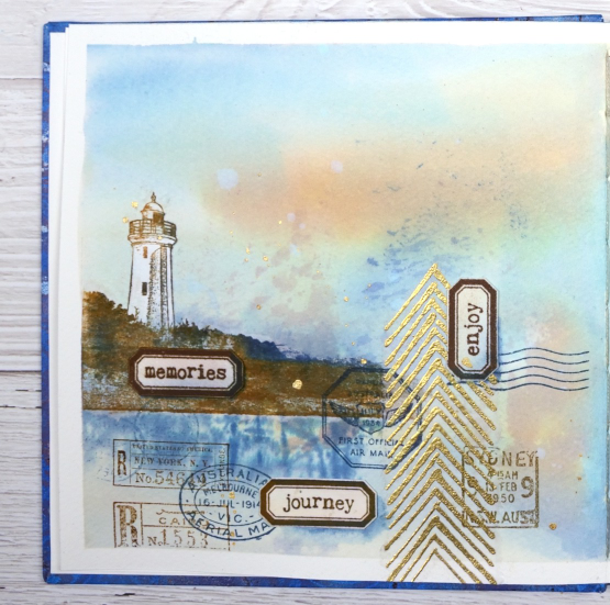
If you have been visiting my blog for a while you will have seen the lighthouse stamp before. The lighthouse is in Norah Head, on the central coast of NSW, not far from where my father lives and the Darkroom Door premises. I have visited there several times and climbed the lighthouse with my dad. You can probably see now why I chose the word labels I did. The lighthouse and the ‘this way’ arrows are stamped on tissue paper. This allowed me to move them around to work out exactly where I wanted them. The blurry world map stamping worked as a ‘reflection for the lighthouse image so that’s where it ended up.
When I am adding stamped tissue to a page I gently tear around the edges with the help of a damp paintbrush. For the lighthouse I cut carefully around the walls and light then painted white paint on the back of the tissue so it would not be transparent. Of course I splattered some water and some gold paint to complete the page.
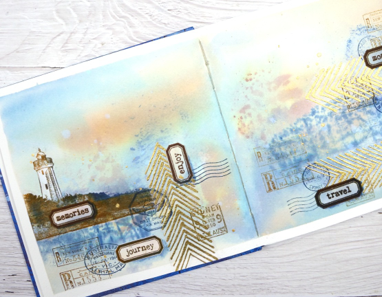
As this was the first time I had used my new journal I was interested to see how the cold pressed watercolour paper worked. Nothing soaked through the paper to the other side and I took care to dab up liquid from the centre seam so there was not much bleed through there either. The 7″ x 7″ size gave me a little more room than the 6 x 6 journals I have been working in but wasn’t so large as to be overwhelming.
(Compensated affiliate links from Foiled Fox, Scrap n Stamp & Ecstasy Crafts)
Thoughts and Prayers
Posted: June 6, 2022 Filed under: letter background, Penny Black, purity | Tags: Coliro paints, Fabriano Watercolour Paper, Penny Black stamps, Ranger Distress inks 6 Comments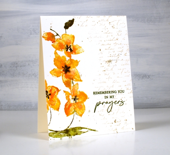
These pretty orchids are another new stamp from Penny Black. This one is called ‘purity’ and it is tall and thin featuring three flowers and a bud. I stamped one flower a second time to fill and balance the left hand side of the panel.
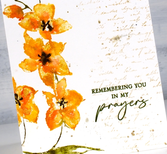
I used the same method I described for a recent floral card inking the flowers with distress inks and markers, spritzing, then stamping on hot pressed watercolour paper. Instead of spritzing water over the stamped image I added dabs of gold paint then pressed the stamp down again to spread the gold into the petals.
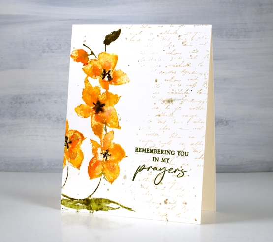
To complete the panel I stamped a partial print of the letter background stamp in antique linen distress ink and added some splatter with the same ink. I switched to archival ink for the sentiment to get a bold sharp impression with words from the new PB ‘thoughts and prayers’ set. One of my favourite ways to complete a card or an art journal page is to ‘fill’ with a bit of text. Sometimes I add it at the beginning and stamp over it, other times I added it at the end. To you have some favourite finishing touches?
Supplies
(Compensated affiliate links used when possible)

Handwoven
Posted: March 29, 2021 Filed under: Christmas bush, Coliro paints, Darkroom Door, Finetec paints, handwoven, Papertrey Inks, you are everything | Tags: Coliro paints, Darkroom Door stamps, Fabriano Watercolour Paper, Papertrey ink, Stonehenge black watercolour paper 8 Comments
Today’s cards feature the new ‘handwoven’ background stamp from Darkroom Door it two quite different ways.
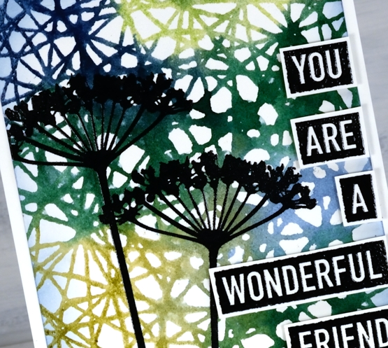
To create this first card I inked the handwoven stamp with blue and green papertrey ink cubes, spritzed the stamp then pressed it on hot pressed watercolour paper. The result was some green areas, some blue areas and some pretty blended areas where the inks overlap. The blue-green background created a pretty pattern as it was and I could have just added a sentiment and called it complete but I decided to take the risk of adding some flowers. I would understand if you wish I had left it flower free because it is a busy panel but I like the look of a patterned geometric roof or canopy over the flowers.
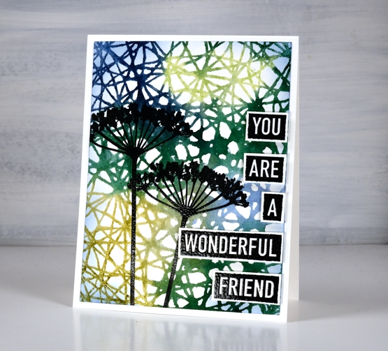
The flowers are from the new DD set ‘you are everything’ as are the words. The words in this set are great; there are eighteen negative space words that can be stamped and cut out to make countless sentiments. I embossed both the flowers and the words to give them more prominence over the busy background.
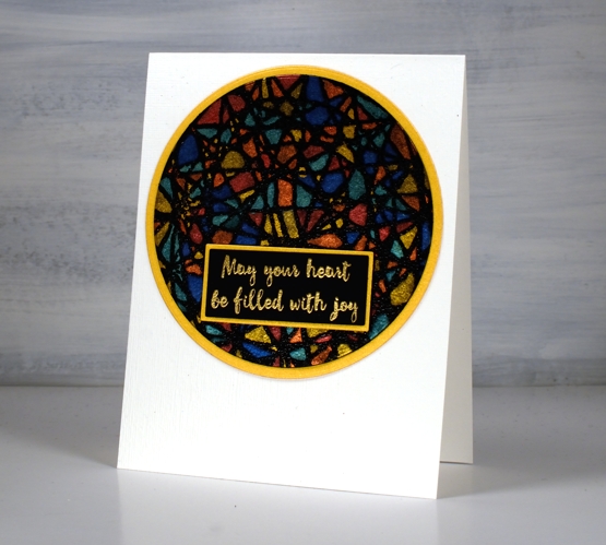
The second card I am planning to use as an Easter card. Filling the spaces of the handwoven pattern with pearlescent paint reminded me of a stain glass window so I looked through my sentiments and found this one in the DD ‘Christmas bush’ set and decided it works for many occasions, including Easter. I stamped the handwoven stamp on black watercolour paper in versamark then embossed in clear powder before painting all the little spaces with Coliro paints and a fine point brush. It did take a while and I didn’t do it in one sitting as the fiddliness factor was high!
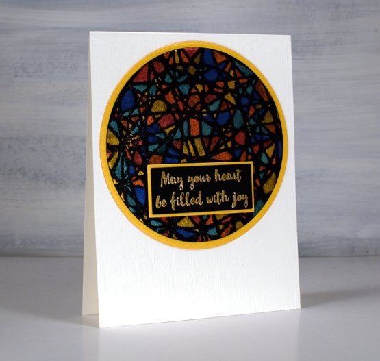
I matted both the patterned circle and the sentiment in gold shimmer cardstock and embossed the front of the card base using the ‘subtle’ embossing folder from SU.
Supplies
(Compensated affiliate links used when possible)
Vintage collage card
Posted: March 8, 2021 Filed under: Coliro paints, Darkroom Door, diamonds, Dies, Finetec paints, French Script, Gazette, gerberas, gift card pocket, global postmarks, Penny Black, shall we dance, Stencils | Tags: Coliro paints, Darkroom Door stamps, Darkroom Door stencils, Fabriano Watercolour Paper, Finetec artist mica watercolour paint, Penny Black creative dies, Penny Black stamps, Ranger Distress inks 4 Comments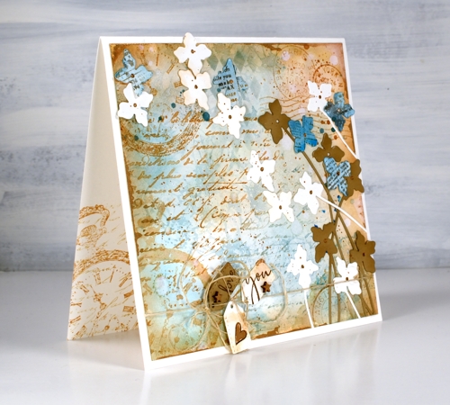
A friend commissioned me to make a ‘vintage’ themed card recently and I happily pulled out a bunch of Darkroom Door stamps to do so. You can see the pocket watch stamp managed to feature three times but the French script, global postmarks, and gerberas also contributed. I stamped, blended and painted with two brown tones of distress ink, two blues and a black. (all the supplies are listed below)
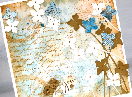
To begin I smooshed some speckled egg and antique linen distress inks on a glass mat, added water swiped the panel through the diluted ink. After that the gerbera background stamp became part of the base layer in speckled egg distress ink. I layered the other stamps over the top in tea dye and antique linen inks and blended some speckled egg ink through the DD diamonds stencil. Of course there is splatter, watermarks and extra blending to darken the edges. To add a dimensional feature I die cut several stems of flowers with the Penny Black ‘shall we dance’ die, some are from watercolour paper, some from tan cardstock and a few from paper painted with salty ocean ink and stamped with the DD gazette stamp.
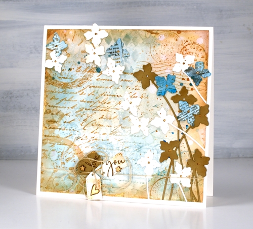
Almost finished, I added a strand of twine around the base and tied some tiny tags on with stamped PB sentiments on them and some little wooden stars I found. I was pretty happy with all this vintageness but decided to risk some gold paint. I splattered and added it to the tiny stars and heart, the flower centres. Where it worked best though was unevenly painted along the edges of the square panel. You probably can’t even see it clearly but it ended up being one of my favourite parts of the card.
By the way there are yummy new stamps on the Darkroom Door website. You will see them here soon, a few are winging their way here as you read this! Have a great day.
Supplies
(Compensated affiliate links used when possible)
Reading Year journal page
Posted: January 1, 2021 Filed under: book spines, Darkroom Door, Woodgrain | Tags: Coliro paints, Darkroom Door stamps, Ranger Distress inks 11 Comments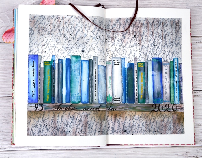
I know 2020 was a very different year from what any of us imagined but I hope you are able to look back on it and see some new habits or achievements that please and encourage you. I’ve always been a reader but I have to admit I spent more time immersed in stories this year. I read physical books, listened to many audio books as I worked on art and in the last week read e-books on my new e-reader. I was hoping to reach 100 books but fell a little short with a total of 93 and three currently on the go.
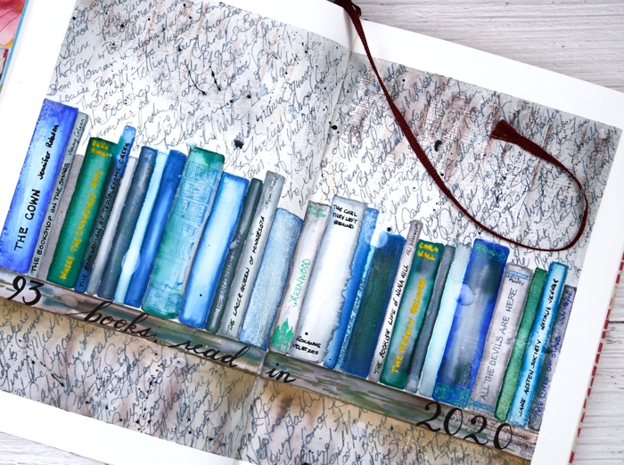
It is highly possible that I had years as a child when I read more than 93 but I don’t know; I didn’t keep a record. I have this year’s books written in a bullet journal but I decided to record them on an art journal page as well. This is the second book filled spread in my art journal and who knows, there may be more.
I love the book spines stamp from Darkroom Door and this time stamped it across the pages instead of in piles. After I had coloured all the book spines with watercolour markers and pearlescent paints I drew a shelf underneath and then stamped the DD woodgrain stamp above and below the shelf of books in grey and brown distress inks. I added a few titles to book spines with gel pens then used a scribbly script to fill the surrounding area with all the rest of the books. It soon became apparent that there would not be room for author names so I just did book titles. Once I had filled the space I had to squeeze the last few in between lines. I splattered some black soot distress ink over the page before removing the masking tape and adding the hand lettered title.
I read mysteries, war novels, crime novels, literary fiction, comedy, romance, historical fiction and a thriller. There were books I didn’t care to finish so they are not on the list and there were a handful I read twice. I read several series; I do like a good series and I took pains to try and have them arrive in my library holds in the right order or close to it.
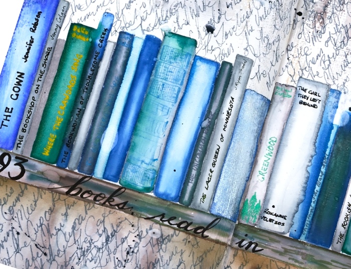
The book club I belong to did manage to meet this year, once indoors before the pandemic started then two more times, outdoors around a picnic table then, in late October, around a bonfire. We discussed ‘Where the Crawdad’s Sing’, ‘Small Great Things’, ‘The Lager Queen of Minnesota’ and ‘The River’. If you know of some good ‘book club books’ please let me know in the comments below. I have received helpful recommendations from you before which I’m looking forward to reading in 2021.
Happy New Year!
Supplies
(Compensated affiliate links used when possible)
Shimmer trees
Posted: December 28, 2020 Filed under: Coliro paints, Finetec paints, Hand lettered, Hand painted | Tags: Coliro paints, Finetec artist mica watercolour paint, Hand lettering, Hand painted, Stonehenge black watercolour paper 1 CommentThe pearlescent paints and black watercolour paper are still on my work table so I’ve continued to experiment with them. To create this little scene I taped all four sides of a square panel with painter’s tape to mask off the area in the centre. The surface of the black watercolour paper is very soft and likely to lift when tape is removed so I press the tape against my clothing before using it so it is less tacky and when it comes to removal I heat it with a heat tool as I slowly peel it off.
I painted the snowy ground and circle moon first with silver pearl from the Finetec Artist Mica set of 12, then the foliage of the trees with blue green, moss green and midnight blue from the Coliro Ocean set of 6. The tree trunks are chocolate from the Coliro Earth set. I finished by dotting stars over the sky with Sakura gelly roll pens then wrote the words ‘thank you’ with a very fine nib and the same moss green pearlescent paint.
I hope you are having a relaxing few days as the year winds down. We are back in lockdown in Ontario so life is very quiet; I’m continuing to get the word out about the Dressember Campaign. My fundraising total has grown to $1962.10 and tomorrow, December 29 is a matching day, so if you’d like to donate, tomorrow is a great day to do it. Donations in Canada will be matched up to $50, 000 starting at 9am PT on Tuesday Dec 29.

Supplies
(Compensated affiliate links used when possible)
Pearlescent wreath
Posted: December 24, 2020 Filed under: Coliro paints, Finetec paints, Hand painted | Tags: Coliro paints, Hand painted 2 Comments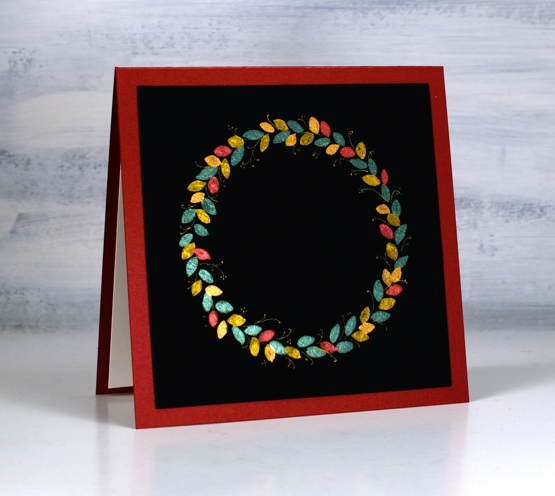
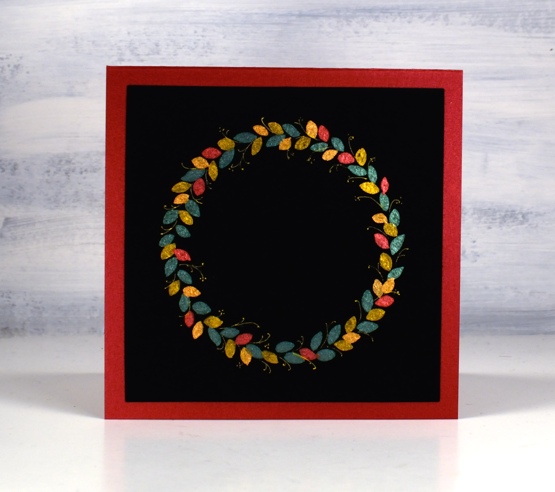
I remembered after watching Kristina Werner’s final holiday card series video that I hadn’t done anything Christmassy with my black watercolour paper and pearlescent paints. Also it’s been a while since I hand painted anything.
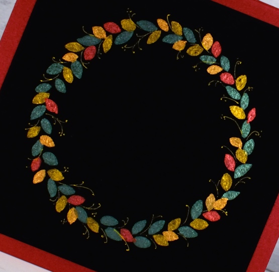
This simple wreath was painted with pearlescent paints from two Coliro sets, ‘earth’ and ‘ocean’. I began by tracing round the inside of a roll of tape with a white pencil to give myself a circle guide. I painted leaf shapes in bluegreen, Tibet gold, bronze and red from the two sets then drew tiny stems and berries with a gold gel pen.
I had some red pearlescent cardstock from Crop A While which matched the paint exactly and I’m also going to paint some leaves on a black envelope before I send this card out to a Dressember donor. Thank you for keeping the fundraising total growing. The total is now passed my original goal of $1500 and I am hoping to get to $2000! We did a little more magic editing earlier this week to keep the campaign interesting! Check it out on IG or pinterest
God bless you all this Christmas and thank you for your support and kindness through this year. Connecting with you here on the blog has been a highlight for me when most interactions have not been possible. Take care everyone.
Supplies
(Compensated affiliate links used when possible)
Shimmer on grey
Posted: December 14, 2020 Filed under: Coliro paints, Finetec paints, Penny Black, {heart} Christmas | Tags: Coliro paints, Penny Black stamps, Tsukineko Versafine inks 3 CommentsI saw a beautiful card by Dawn Wolesagle featuring shimmer paint on a dark grey base and decided to try my own. I know mine do not have the impact of Dawn’s card but I like the simplicity of design and colour on these one layer cards. I’m going to try the technique again with an even darker background.
I used the textured grey luxe cardstock from the Foiled Fox and combined outline stamps from the Penny Black set {heart Christmas} to make a design with versafine clair nocturne ink.
I painted the leaves in moss green pearlescent paint from the Coliro ocean set and the flowers with rose from the vintage set then switched to gel pens to fill the berries with gold and dot white around the designs.
The sentiments are both from the Penny Black merry up set stamped in Brutus Monroe alabaster ink and embossed in alabaster powder.
The fundraising total on my Dressember campaign page continues to grow thanks to friends near and far including many blog readers and class participants. Thank you so much for getting involved in the fight against human trafficking. To learn more about the work being done visit the Dressember blog
Supplies
(Compensated affiliate links used when possible)

Wreath & Wings
Posted: November 4, 2020 Filed under: Coliro paints, Hand lettered, mirthful, wreath & wings | Tags: Coliro paints, distress markers, Hand lettering, Penny Black creative dies, Penny Black stamps, Ranger Distress inks, Staedtler watercolour brush pens 6 Comments
I’ve combined a new PB stamp, ‘wreath & wings’ with a new PB die, ‘mirthful’ for simple elegant style Christmas card.

I used distress inks and markers to ink the wreath elements and birds, keeping the stamp in the positioner so I could work a bit at a time. I inked the stamp, stamped the image then did a bit of blending with a paintbrush to fill the leaves, berries and birds.

I used a gold gel pen to colour some of the berries then continued the gold highlights in the die cut word. The die has decorative diamond cut outs so I cut gold ones to add to the burgandy letters and framed the panel in the same burgandy cardstock.
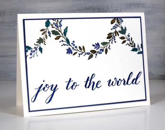
For the second card I decided to use the curve of the wreath as a hanging garland. Using a centering ruler to help me with positioning I stamped half the wreath on the centre top edge of the watercolour panel, then stamped another part loop either side.
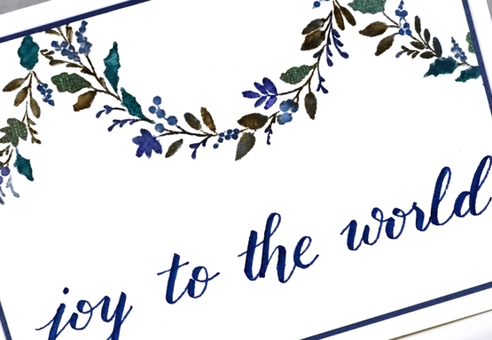
Once again I worked on hot pressed watercolour paper so I could blend the ink on the leaves. I used ocean coliro pearlescent paint on some of the leaves and berries for a little shimmer.
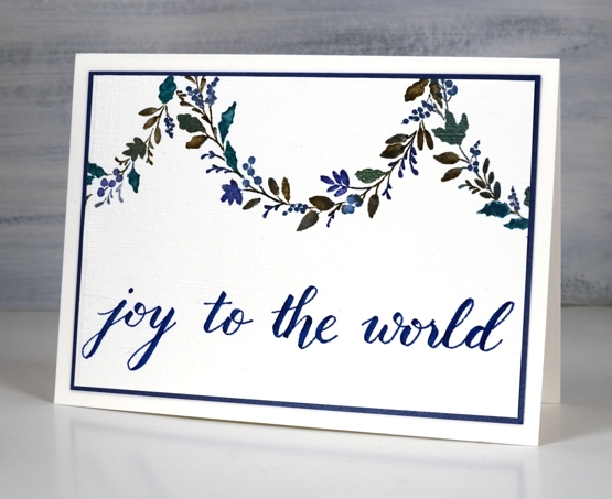
I wrote the sentiment for this one using the darkest blue marker from the Staedtler watercolour 36 brush pen set and matted the panel in a dark blue cardstock.
Even though I don’t like to over do my designs I’m wondering if the blue card is a bit sparsely decorated. What do you think?
Burgandy Card Supplies
Blue Card Supplies
 <
<


