
Dancing on gel prints
Posted: July 21, 2022 Filed under: butterfly dance, Dies, Paper Rose, Penny Black, shall we dance | Tags: gel press, gel printing, Penny Black creative dies, Penny Black stamps 8 Comments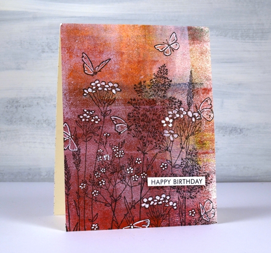
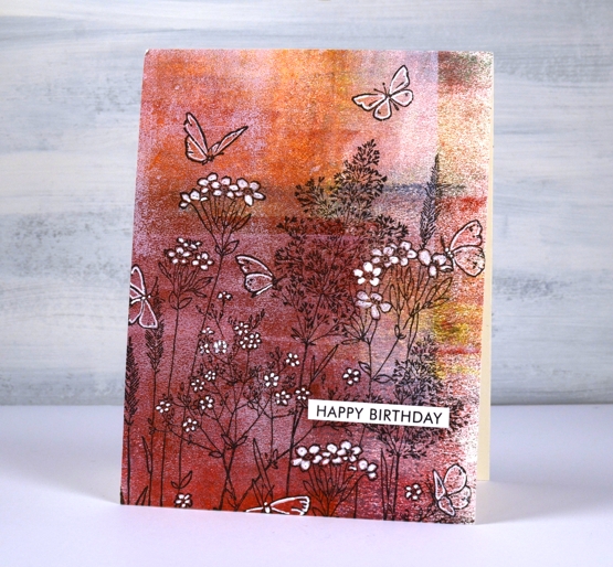
I have a couple more cards incorporating gel prints today. This first one is made with a clean up sheet; maybe you can recognise the criss cross of brayer marks on the paper. When I stamped the PB ‘butterfly garden’ stamp over the background it was a bit too delicate to show up well. Highlighting petals and wings with a white gel pen worked to keep the design subtle but still noticeable.
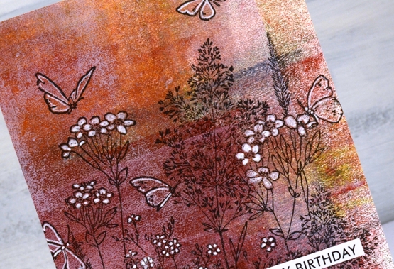
I cut the gel print to fill the card front and added a sentiment from the Paper Rose Studio ‘so extra’ sentiment strips.
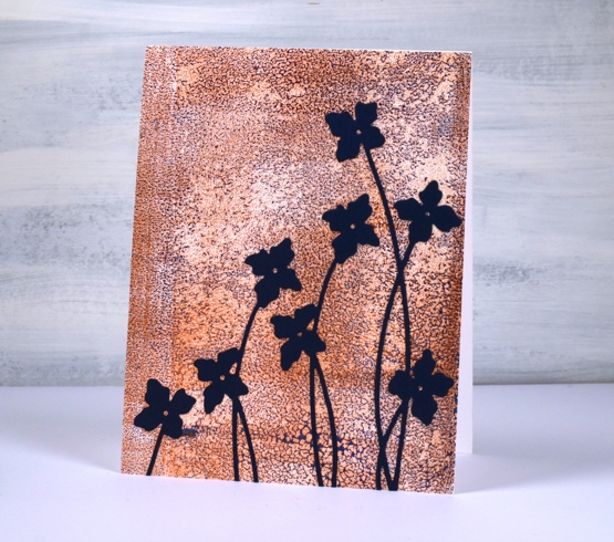
The gel print below has a delicate blue pattern over bronze made when the paint separates on the gel plate before you get a chance to take a print. I used a bronze print to pull the blue paint which had separated evenly over the whole plate. You can’t tell from the photo but the bronze has a metallic sheen to it.
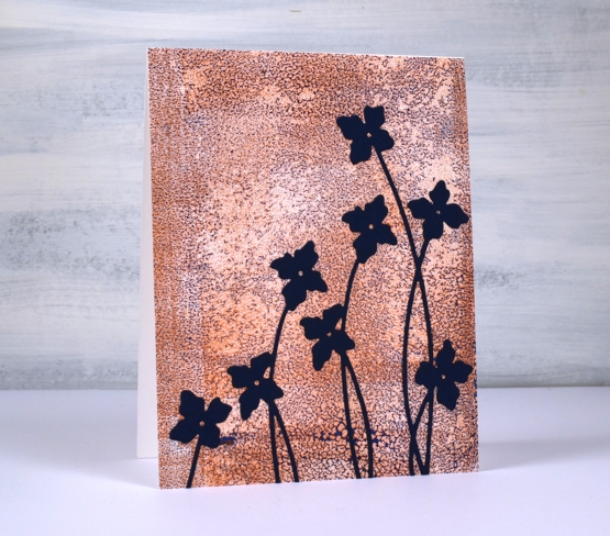
I cut flowers from navy cardstock using the Penny Black ‘shall we dance’ die to complete a card I can use for any occasion.
The Penny Black sale continues at The Foiled Fox so if you have a wish list, take a look.

Supplies
(Compensated affiliate links used when possible)
Vintage collage card
Posted: March 8, 2021 Filed under: Coliro paints, Darkroom Door, diamonds, Dies, Finetec paints, French Script, Gazette, gerberas, gift card pocket, global postmarks, Penny Black, shall we dance, Stencils | Tags: Coliro paints, Darkroom Door stamps, Darkroom Door stencils, Fabriano Watercolour Paper, Finetec artist mica watercolour paint, Penny Black creative dies, Penny Black stamps, Ranger Distress inks 4 Comments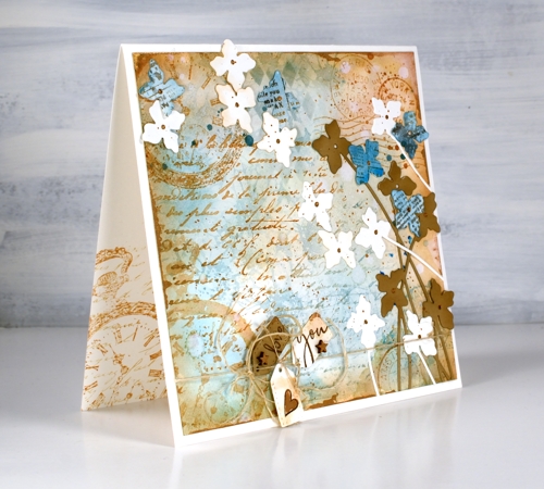
A friend commissioned me to make a ‘vintage’ themed card recently and I happily pulled out a bunch of Darkroom Door stamps to do so. You can see the pocket watch stamp managed to feature three times but the French script, global postmarks, and gerberas also contributed. I stamped, blended and painted with two brown tones of distress ink, two blues and a black. (all the supplies are listed below)
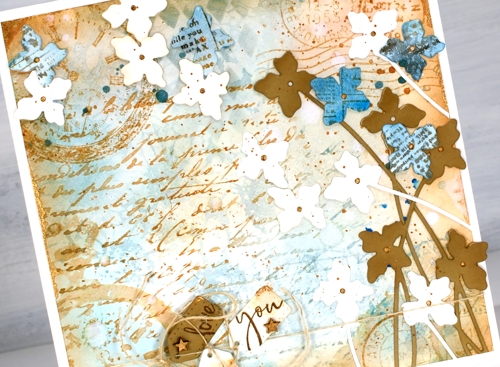
To begin I smooshed some speckled egg and antique linen distress inks on a glass mat, added water swiped the panel through the diluted ink. After that the gerbera background stamp became part of the base layer in speckled egg distress ink. I layered the other stamps over the top in tea dye and antique linen inks and blended some speckled egg ink through the DD diamonds stencil. Of course there is splatter, watermarks and extra blending to darken the edges. To add a dimensional feature I die cut several stems of flowers with the Penny Black ‘shall we dance’ die, some are from watercolour paper, some from tan cardstock and a few from paper painted with salty ocean ink and stamped with the DD gazette stamp.
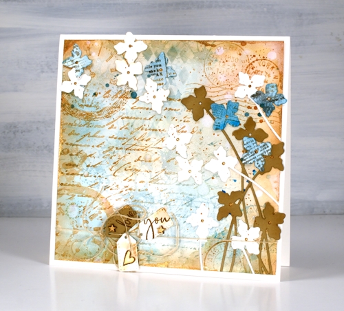
Almost finished, I added a strand of twine around the base and tied some tiny tags on with stamped PB sentiments on them and some little wooden stars I found. I was pretty happy with all this vintageness but decided to risk some gold paint. I splattered and added it to the tiny stars and heart, the flower centres. Where it worked best though was unevenly painted along the edges of the square panel. You probably can’t even see it clearly but it ended up being one of my favourite parts of the card.
By the way there are yummy new stamps on the Darkroom Door website. You will see them here soon, a few are winging their way here as you read this! Have a great day.
Supplies
(Compensated affiliate links used when possible)
Pretty in pink
Posted: February 19, 2020 Filed under: Alexandra Renke, Autumn dragonflies, Autumn plant rose, Penny Black, shall we dance, the sweetest sound | Tags: Alexandra Renke cardstock, Penny Black creative dies, Penny Black stamps 7 Comments
I’ve been playing with pretty paper again and have the Foiled Fox to thank for this lovely Alexandra Renke design. Make sure you pop over to the Foiled Fox blog where I’m sharing my process in making today’s cards. I believe I said it last time I worked with AR papers, the colours and patterns are so lovely I really don’t want to add much over the top.
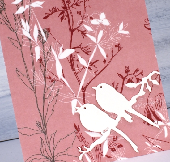
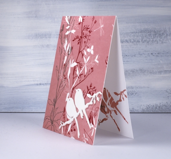
For both cards I covered the whole front with AR ‘Autumn Plant Rose’ paper. The delicate floral design covers most of the paper so I didn’t want to add too much that would clash with the paper. I chose instead to die-cut cream flowers and birds as focal images, keeping them cream coloured and stacked made them stand out from the background pattern. The tall flower die is from Penny Black and is called ‘shall we dance’. I like the way the long thin stems mimic the thin lines of the paper’s design.
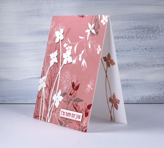
Adding the same die cut on the inside of the card was a must and simple to do after first adding stick it adhesive to the back of the patterned paper.
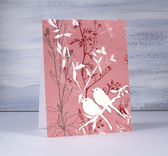
I used the same design idea and stacked three bird die-cuts for the second card and added a single patterned die-cut on the inside of the card. The die is called ‘the sweetest song’ and is another PB one.
I debated whether or not to add any sentiments and ended up deciding on one with and one without.
I will be doing more with this lovely paper and a pink abstract paper also by AR. I’ve linked the papers and supplies below and look forward to sharing more designs with you soon. Make sure you click over to the Foiled Fox and check out all the Alexandra Renke papers.
Supplies
Stacked die cuts
Posted: August 14, 2016 Filed under: Brusho, shall we dance | Tags: Brusho, Penny Black creative dies 9 Comments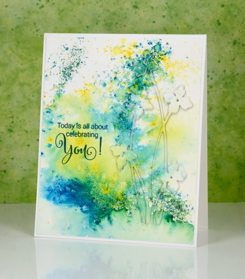
When I first tried this technique I did it the same way many did, by cutting multiples die cuts from cardstock and gluing them on top of each other. I now use a quicker method where I die-cut the image out of foam which replaces the stack of cardstock die cuts. I always find it a little tricky to stack the very fine stems and letters; the foam stretches a bit and the cardstock is very hard to line up. Despite these fiddly factors I managed to get it all in place to create this subtle floral design on another abstract watercoloured panel.
This was one of those panels where the brusho patterns turned out to be very pretty so I didn’t want to lose much by stamping over it or cropping. Raising a die cut image is a great solution when you want to preserve some pattern but still have a focal image.
Supplies:
Stamps: Sprinkles & Smiles (PB)
Die: Shall we dance
Paints: Brusho powders (Colourcraft)
Inks: Deep Lagoon ink (Tsukineko)
Cardstock: Fabriano 100% cotton hot pressed watercolour paper
Also: stick it adhesive sheet, adhesive backed fun foam
Watercolour Dance
Posted: August 3, 2016 Filed under: Brusho, CAS, shall we dance, Watercolour | Tags: Brusho, Penny Black creative dies, Penny Black stamps 21 Comments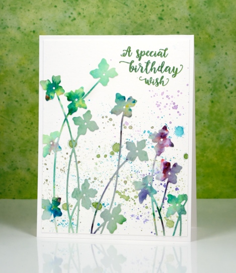
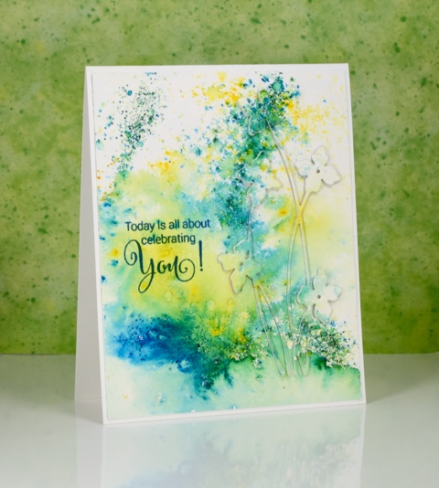
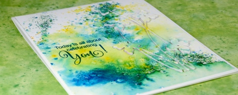
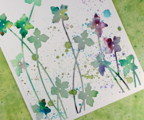
It’s really quite hot here at present and this card some how makes me feel a little cooler. It’s either the watery splatter or the cool blues and greens. I used up another abstract watercolour panel to make this card; there is quite a pile of painted or stamped panels sitting on my desk waiting to be turned into something. As you can probably guess this panel was mainly green but had a bit of purply pink on it. I am pretty sure it was done with brusho because there are little bits of other colours mixed in which is one of the nice features of brusho paint – the colours are not purely one pigment.
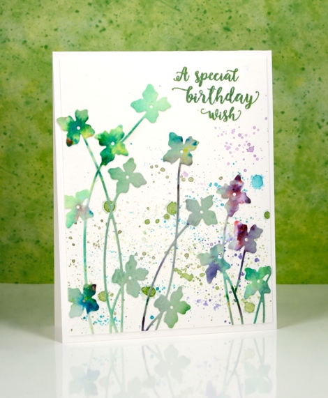
I used the new ‘shall we dance’ die from Penny Black to cut as many flowers as I could. I didn’t need them all to be complete die cuts as I wanted some tall and some short. Before I cut them I put ‘stick it’ adhesive on the back of the whole panel to make things easier later. Once I had all the flowers I could squeeze out of the panel I played around with positioning until I was happy. I did it all on a plain white panel assuming that I would keep the background blank and let the colours in the flowers pop. It would have been ok that way but I decided to use my watercolour pencils to try a little splatter in similar colours to the flowers. It may not be strictly white space any longer but it is pretty.
I am going to let this card play along with not one, but two challenges.
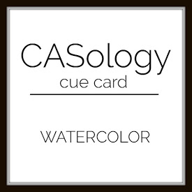
The CASology cue card is
and the CAS Mix Up challenge is
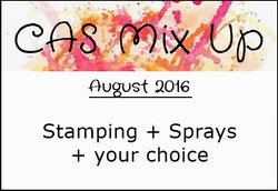
I read the fine print and discovered that if you didn’t have sprays then splatter is just fine so we’re in!
Supplies:
Stamps: Words of Kindness (PB)
Die: Shall we dance
Paints: Brusho powders (Colourcraft)
Inks: Cottage Ivy Memento ink (Tsukineko)
Cardstock: Fabriano 100% cotton hot pressed watercolour paper
Also: stick it adhesive sheet


