
Pretty in pink
Posted: February 19, 2020 Filed under: Alexandra Renke, Autumn dragonflies, Autumn plant rose, Penny Black, shall we dance, the sweetest sound | Tags: Alexandra Renke cardstock, Penny Black creative dies, Penny Black stamps 7 Comments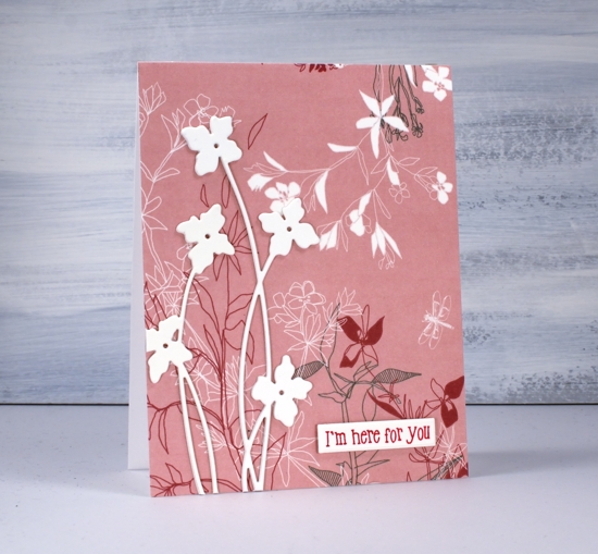
I’ve been playing with pretty paper again and have the Foiled Fox to thank for this lovely Alexandra Renke design. Make sure you pop over to the Foiled Fox blog where I’m sharing my process in making today’s cards. I believe I said it last time I worked with AR papers, the colours and patterns are so lovely I really don’t want to add much over the top.
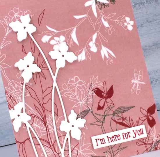
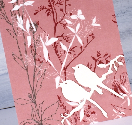
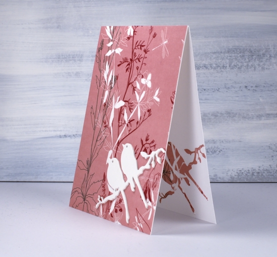
For both cards I covered the whole front with AR ‘Autumn Plant Rose’ paper. The delicate floral design covers most of the paper so I didn’t want to add too much that would clash with the paper. I chose instead to die-cut cream flowers and birds as focal images, keeping them cream coloured and stacked made them stand out from the background pattern. The tall flower die is from Penny Black and is called ‘shall we dance’. I like the way the long thin stems mimic the thin lines of the paper’s design.
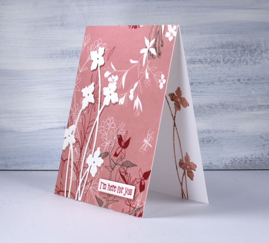
Adding the same die cut on the inside of the card was a must and simple to do after first adding stick it adhesive to the back of the patterned paper.
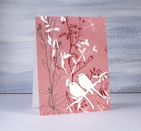
I used the same design idea and stacked three bird die-cuts for the second card and added a single patterned die-cut on the inside of the card. The die is called ‘the sweetest song’ and is another PB one.
I debated whether or not to add any sentiments and ended up deciding on one with and one without.
I will be doing more with this lovely paper and a pink abstract paper also by AR. I’ve linked the papers and supplies below and look forward to sharing more designs with you soon. Make sure you click over to the Foiled Fox and check out all the Alexandra Renke papers.
Supplies
Dragonfly Blue
Posted: February 5, 2020 Filed under: Alexandra Renke, Autumn dragonflies, little lowercase letters | Tags: Alexandra Renke cardstock, My Favorite Things, Penny Black creative dies, Penny Black stamps, WOW embossing powders 9 Comments
I don’t often use patterned paper on my projects but when I saw these Alexandra Renke designs from The Foiled Fox I wanted to make ALL THE THINGS and cover them with this paper! To be honest I just wanted to stick pieces of this ‘autumn dragonfly’ paper on the front of cards and call them done! The blue background is beautiful; the dragonflies are delicate and pretty and there are little gold lines here and there. What more do you need on a card front?
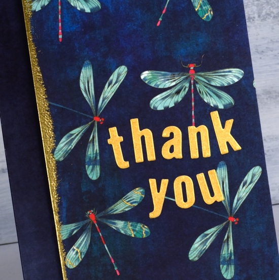
I did add a few of my own touches to the cards in the end but I might still make dragonfly paper card fronts which are simple and unadorned. Because of the little bits of gold here and there on the dragonfly wings I chose gold cardstock and embossing powder for my added elements. I swiped a versamark along edges of the dragonfly panels then embossed them with gold powder.
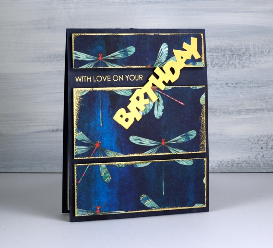
I used a co-ordinating Alexandra Renke paper on both card fronts. It’s called ‘autumn wild dark blue’ and it looks like a painted page. I popped up the dragonfly pieces on foam and added a gold embossed sentiment plus letters or words die cut from gold shimmer cardstock. I used the PB …birthday die paired with part of a sentiment from PB ‘good wishes’ set. I did all the lining up of panels with the help of the Wendy Vecchi art staytion. The board is metallic and has a magnetic ruler which can hold a panel in place while lined up with the grid lines on the board. It has saved me quite a bit of time and fidddling!

I think this paper would look good as a notebook cover and maybe as the background for an art journal page. What do you create with your prettiest papers?
Supplies
A Teddy and a Present
Posted: August 22, 2019 Filed under: a present, Penny Black | Tags: Alexandra Renke cardstock, Penny Black stamps 4 Comments
Can you believe there is a teddy bear card on my blog? I am having trouble believing it myself. Not that I have anything against teddy bears, in fact I have a soft spot for Winnie the Pooh in particular, but I have never done any teddy bear stamping and colouring before!
I kept things simple with this sweet stamp from Penny Black, it’s called ‘a present’ and I’ve paired it with a sentiment from the PB ‘peaceful time’ set. I worked on hot pressed watercolour paper and did the initial stamping with antique linen distress ink. I decided to keep my colour scheme simple; it could almost be called a primary colour scheme except that the ‘yellow’ component is more of a brown. I smooshed rusty hinge, blueprint sketch and candied apple distress inks onto my glass mat and diluted them as needed with a paintbrush and water. To paint the image I worked on one section at a time and never on adjacent sections one after the other, that way I let each section dry before painting beside it.

I didn’t do anything too fancy on this, my first teddy bear panel. The whole bear is painted with rusty hinge ink, I just use undiluted ink in places where I wanted shadow or definition. I used markers at the end to add detail that had faded with the painting.
The little bit of string peeping out the side I went over with a gold gel pen and the sentiment is stamped in versafine red satin ink. To complete the card I matted in red cardstock and attached it to an Alexandra Renke polka dot paper. Then, because I thought it would be cute, I used my 3-in-1 punch board to make a matching polka dot envelope.

Don’t look too closely at teddy, he seems to have tanned one arm way more than the other!
Supplies
Simple and Elegant
Posted: December 21, 2018 Filed under: lighting the way, three kings | Tags: Alexandra Renke cardstock, Penny Black stamps, WOW embossing powders 8 Comments
At this time of year any Christmas card making I’m doing has to be pretty simple and straightforward. But that doesn’t mean it can’t still be elegant or eye catching. I paired metallic embossing with richly coloured papers for these three nativity cards.
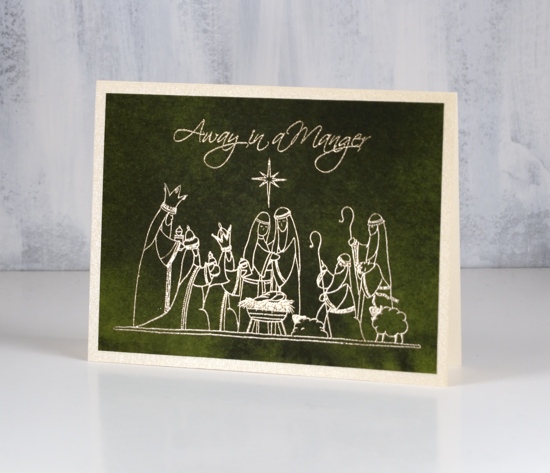
These papers from Alexandra Renke are solid colour but with the variation of a watercolour wash. They have enough interest to look like a sky but not fight with the detail of the picture stamps from Penny Black.

I always have a bit of a task matching a gold cardstock with gold embossing powder. On the top card the gold embossing powder on the dark red appeared to be an ‘old gold’ so I matted with a dark gold. On the last card I used a light gold card with the same embossing powder. The middle card features platinum embossing and a platinum mat around the deep green paper.
I hope you are further along than I with your Christmas card sending but as I say most years, December 25 is the first day of Christmas, there are twelve in total so I still have time to get my cards sent!
Supplies
Stamps: lighting the way, peaceful season, three kings (PB)


Paper: Alexandra Renke dark green, red and scarlet papers


Cardstock: neenah natural white, platinum shimmer, gold shimmer, pale gold shimmer

![]()
Ink: versamark ink

Embossing powder: gold metallic rich, platinum


Pretty Paper Neighbourhood & a Wreath
Posted: November 16, 2018 Filed under: Alexandra Renke, neighbourhood border, starry night, whirl wreath | Tags: Alexandra Renke cardstock, Penny Black creative dies, Penny Black stamps, Ranger Distress inks, Tsukineko Versafine inks 6 Comments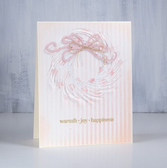
It’s all soft and subtle on the blog today. I have two projects featuring the beautiful Alexandra Renke cardstock the Foiled Fox recently started carrying in their store. The weight of the cardstock is somewhere between a good quality printer paper and a piece of cardstock. There is definitely enough weight to die cut nicely.
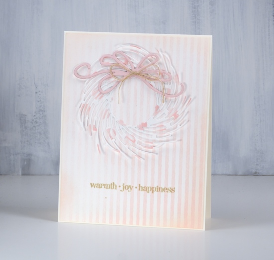
I chose the elegant ‘whirl wreath’ by Penny Black and cut one out of ‘pink dots’ cardstock. I attached it around the centre circle with adhesive but left the branches unattached ( so I will be careful putting it in a envelope) The background is ‘rose stripes’ which matches the pink dots perfectly. I cut the bow out of a piece of cardstock from my stash and layered a few together to give it some extra weight. I blended around the edge of the striped panel with tattered rose distress ink and attached everything to a cream cardbase.
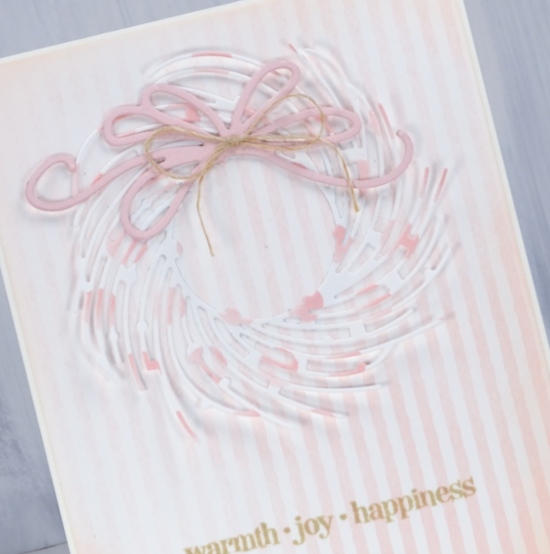
I chose to add a natural twine bow to the die cut bow then had to co-ordinate the sentiment with antique linen distress ink.
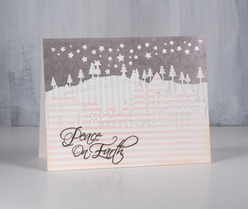
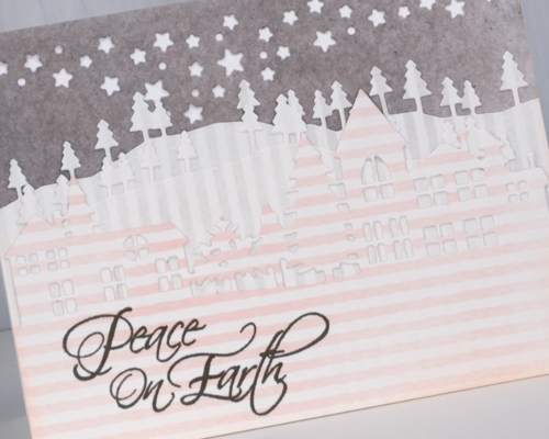
For my little neighbourhood card I use three patterns of Alexandra Renke cardstock, the rose stripes, gray stripes and medium mud watercolour. I know it is hard to see the details of the die cuts in my photo but in real life the pink striped neighbourhood is clear against two lines of gray striped trees in front of a gray mud starry sky.
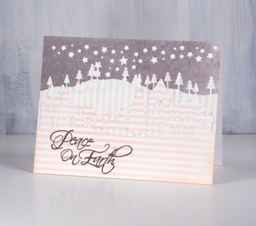
I have been wanting to try a white on white layered die cut scene and I probably still will but chose to try it with these pretty papers first. The neighbourhood is layered over two layers of trees cut with the ‘trees and hills’ dies which are layered over a gray piece cut with the starry sky night die attached directly to a white card base.
I featured some of the subtle colours and patterns from Alexandra Renke today but I do have some bold patterns and solids to share another day.
Have a great weekend.
Supplies
Stamps: Christmas sentiments, winter days (PB)


Dies: whirl wreath, neighbourhood border, starry night die, trees & hills die set (PB)


Cardstock: Alexandra Renke medium mud watercolor, gray stripes, rose stripes & Neenah solar white, cream, pink


Inks: tattered rose, antique linen distress ink, smokey gray versafine ink


Also: hemp twine
Oh What Fun!
Posted: November 7, 2018 Filed under: elf stocking, holly sprig | Tags: Alexandra Renke cardstock, Faber-Castell Albrecht Durer Watercolour pencils, Penny Black stamps, Ranger Distress inks 11 Comments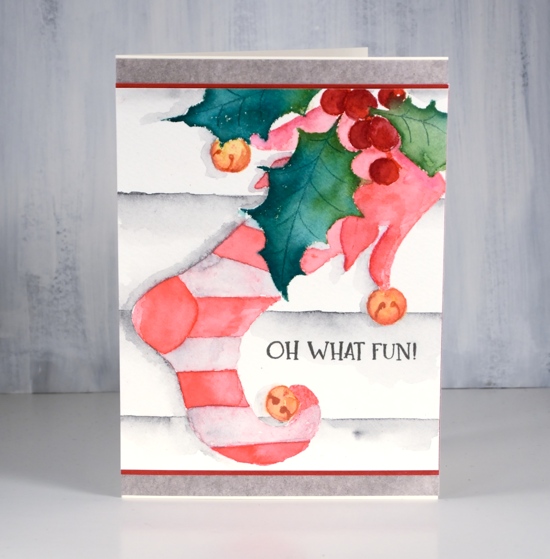
I was surprised how much fun I had colouring this stocking stamp. I worked on it on Saturday afternoon when it was wet and dreary outside; I lit a fire in my fireplace and brought colouring supplies up from my workroom so I could have a comfy cosy afternoon of colouring inspired by Kathy Racoosin’s 30 day colouring challenge.
Before colouring I’d used a stamp positioner to stamp the holly sprig stamp first in pine needles, mowed lawn and festive berries distress ink. I blended the leaves with a wet brush and let them dry. I cut a mask to cover the holly branch then stamped the stocking over the top in worn lipstick distress ink. Other than painting the leaves straight after they were stamped, all the other stamping was a base for watercolour pencil colouring.
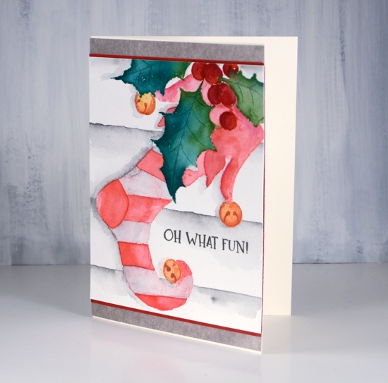
Because my base stamping was pink I decided to stay with a red and white colour scheme. I used a couple of red watercolour pencils and a paint brush to do half the stripes and the decorative top of the stocking. Rather than colour with the pencils straight on the watercolour panel, I picked up pigment from the pencils with a wet brush and painted over the stamping. I toyed with the idea of red and purple stripes but I’m glad I chose a very pale earth green which blended with the pink ink to look pale pink. I messed up a stripe at the top but I’m hoping the recipient won’t notice that!
For the berries I used darker red pencils and the bells a mustard and a rusty brown pencil. I added a background by ruling a few lines in medium grey watercolour pencil then blending and painting more grey below each line. I painted a grey shadow to the left of the stocking and leaves.
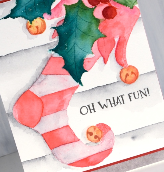
As usual I gave no thought to a sentiment until all my painting was completed and then of course I wasn’t sure where to put a sentiment or whether to have one at all. I hadn’t really paid attention to the size of my panel either so I had to do some creative matting to turn it into a card that would fit into the size of envelope I had. So as you can see, no, I don’t plan all the details of my cards in advance!
Supplies
Stamps: elf stocking, Christmas sentiments


Paper: Neenah cream, hot pressed watercolour, red, Alexandra Renke mud


Inks: pine needles, mowed lawn, worn lipstick distress inks, festive berries distress marker & smokey gray versafine ink


Pencils: Faber Castell Albrecht Dürer watercolour pencils
Tools: MISTI, T-ruler, masking paper


Simple and elegant poinsettias
Posted: November 5, 2018 Filed under: Christmas poinsettia, xmas poinsettia cut out | Tags: Alexandra Renke cardstock, Kuretake Zig clean color real brush markers, Penny Black creative dies, Penny Black stamps, WOW embossing powders 4 Comments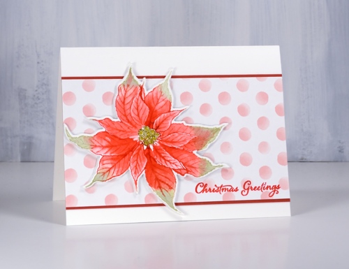
Today’s cards show two different looks from the Penny Black ‘Chrismtas poinsettia’ stamp. The first is simple distress ink colouring popped up on a fun polka dot background and the second is a bit more elegant with bold colouring inside a gold embossed image. I stamped this first poinsettia in festive berries and shabby shutters distress inks on hot pressed watercolour paper then blended the ink with water to fill the petals. If I needed extra ink for shadows and depth I picked it up from my glass mat which acted as a palette.
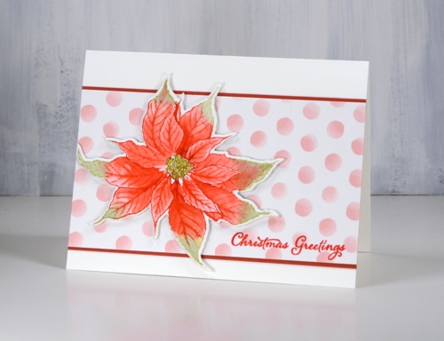
When I inked the stamp I wiped off the festive berries ink from the centre of the stamp so I could add peeled paint ink with a distress marker. After I had done all the blending I coloured the circles in the centre of the flower with a gold gel pen. My favourite part of the card though is the polka dot paper; it is so pretty. It is just one of a series of papers by Alexandra Renke. The Foiled Fox sent me some Alexandra Renke papers to try out and they are lovely. I will share more of them with you in the coming weeks. The weight is between paper and cardstock so it die cuts well but doesn’t add too much bulk when you layer it.
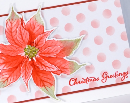
I cut my poinsettias out with the co-ordinating die but they wouldn’t be too hard to cut by hand, especially if you have fussy cutting skills (which I don’t). I matted the polka dot panel in red and added a sentiment from ‘festive snippets’ in versafine crimson red.
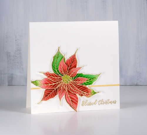
I embossed my second poinsettia in gold powder then coloured with zig clean color real brush markers. As I often do I used two reds and two greens, colouring first with the light marker then adding the darker colour at one end before blending with water to fill the petals.
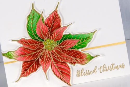
I applied adhesive to a strip of gold cardstock then trimmed it even narrower to position behind the popped up poinsettia. I embossed a sentiment in the same gold embossing powder used for the flower.
I am continuing to participate in Kathy Racoosin’s 30 Day colouring challenge. If you want some colouring inspiration pop over to her blog and check out her tutorials and link up. Let me know if you are participating.
Supplies
Stamps: Christmas poinsettia, festive snippets (PB)


Dies: xmas poinsettia cut out (PB)

Paper: hot pressed watercolour paper, Alexandra Renke pink dots, gold shimmer, red cardstock

Ink: festive berries, shabby shutters distress inks, , versamark, versafine crimson red


Markers: clean color real brush markers, peeled paint distress marker


Also: metallic gold rich embossing powder, glass mat


