
Just Trilling
Posted: October 30, 2023 Filed under: CAS, Penny Black, trilling trio | Tags: Fabriano Watercolour Paper, Penny Black stamps, Ranger Distress inks 7 Comments
These two sweet birds are from the Penny Black ‘trilling trio’ set. There is also a cardinal in the set. I made these cards as samples for my current ‘Painting with Stamps’ class. They are examples of when slow and steady wins the race. The stamps were in my stamp positioner and, starting with the palest colours I slowly added ink to the stamp a colour at a time, stamping after each application so as to not overwhelm the small image. I did some blending on the panel with a paintbrush but again my process was ‘little by little’.(Trilling Trio is available in both the US Foiled Fox store and Scrap n Stamp in Canada)
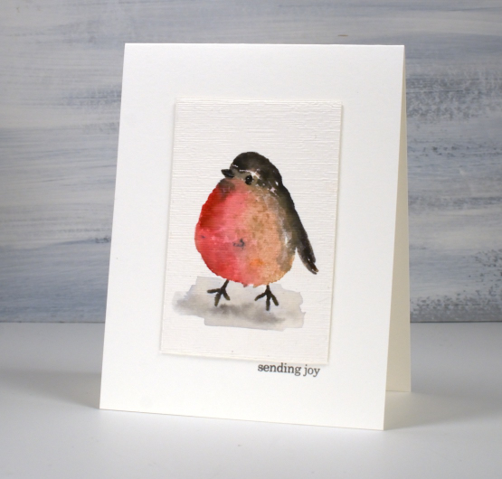
I do enjoy the clean look of a simple image on a plain card base but added just a little texture to these images with an embossing folder to create a distinction between the panel and the base.
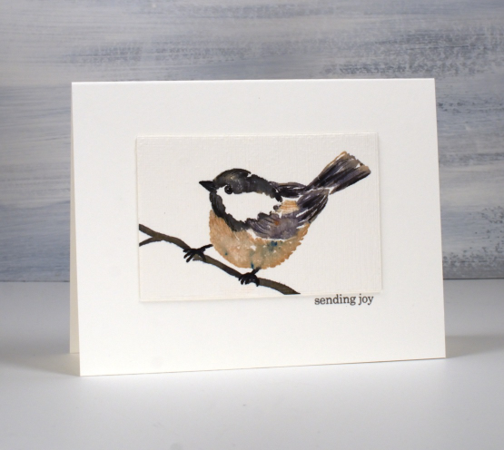
On the little chickadee above and below I stamped the large coloured sections in the stamp positioner then at the very end added some ‘feather texture’ with the fine tips of markers.
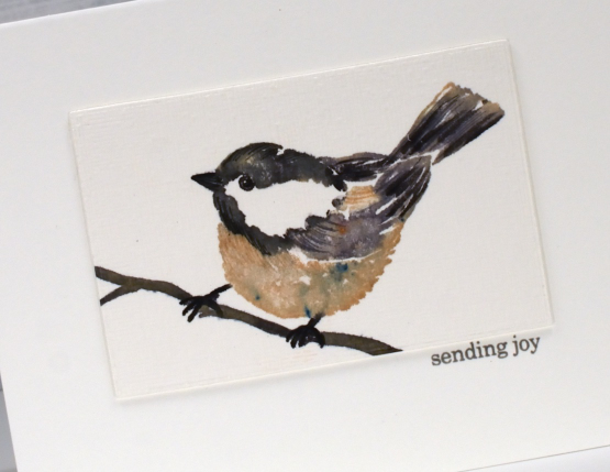
If you are working with bird stamps and your images are not quite coming alive I have found it helpful to use a fine tip pen to define the eye, adding the white dot back in if necessary with a white gel pen. I had not positioned this little chickadee well on my watercolour paper and it looked like it was falling backwards until I drew a simple twig with a marker to give it a reason to be at the odd angle I’d placed it! The tiny sentiment from PB ‘holiday snippets’ was just what I needed stamped in grey to keep it subtle.
Today’s post features affiliate links to the following companies. If you buy through these links I receive a small commission at no extra cost to you. The Foiled Fox & Scrap’n’Stamp
Let Heaven and Nature Sing
Posted: November 19, 2021 Filed under: CAS, nature sings, Penny Black | Tags: Faber-Castell Albrecht Durer Watercolour pencils, Fabriano Watercolour Paper, Penny Black stamps, Ranger Distress inks 9 Comments
This sweet bird is one of four in the Penny Black set ‘Nature Sings’. It is my plan to make a similar card with all four birds. I returned to a very clean and simple style for this one utilising some masking, blending and watercolour.
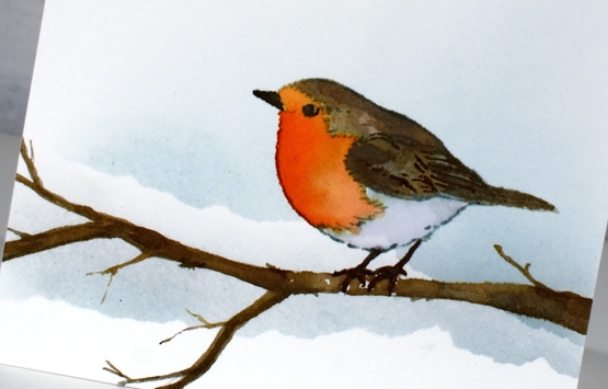
I worked on hot pressed watercolour paper because I knew I would watercolour the bird. Before stamping I tore a post-it note mask and lay it across the panel then blended speckled egg ink above it. I stamped the bird in soft stone papertrey ink then watercoloured with a few distress inks. The colours are listed below. The bird was floating in mid air so I drew a branch with a watercolour pencil then painted it with distress inks so he would have somewhere to perch. At this point I added a second area of masked blending to the background.
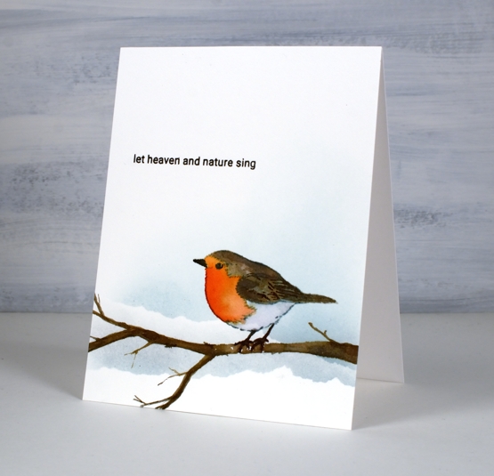
To finish off I stamped one of the sentiments from the same set in fallen leaves versafine clair ink. It just so happens that the CAS Christmas Card challenge this month is Christmas Critters so I am in!

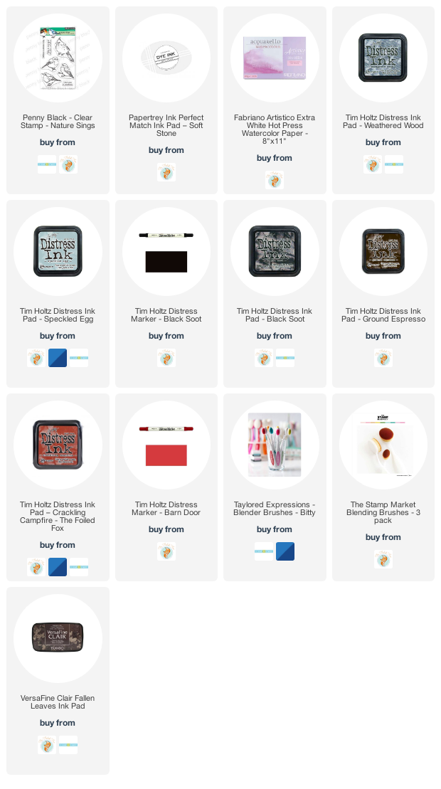
Supplies
(Compensated affiliate links used when possible)
Moving Alcohol Inks with Air – Video
Posted: February 3, 2021 Filed under: Alcohol Ink, Brutus Monroe, CAS, Dies, grafix, light as a feather, nesting squares, Penny Black, polar bears, Tutorial, Waffle Flower | Tags: grafix, grafix craft plastic, Penny Black creative dies, Penny Black stamps, pinata alcohol ink, Ranger Alcohol Ink, Tutorial, video 16 Comments
I’ve had the alcohol inks out recently and spent some time trying to get soft wavy patterns on craft plastic. I have seen several artists who do this technique beautifully but I am very much still a beginner with it. I have a few cards to share today along with a video showing my process for two of the panels. I worked on white craft plastic from Grafix which is heavyweight and totally opaque. For most of the panels featured today I used only two alcohol inks plus plenty of 99% rubbing alcohol; each panel was created with a metallic and a non-metallic ink.
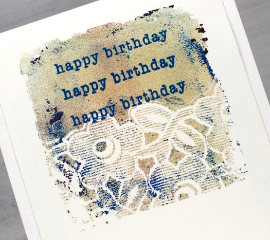
This first panel was made with turquoise AI and gilded alloy AI; I love the range of blues when diluted with rubbing alcohol. The ‘for you’ Penny Black die cut is two layers of turquoise cardstock topped with one layer of pale gold.
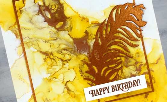
This warm toned card was made with honeycomb AI and mined alloy AI then die cut with a WaffleFlower square nesting die. I used the WaffleFlower additional square dies to cut a larger copper square then added the PB ‘light as a feather’ die cut and a PB birthday sentiment embossed in Brutus Monroe penny embossing powder.
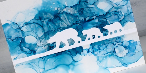
You can see the process for both cards above in the video below.
As I am working on alcohol ink panels I am evaluating my process and working out what I want to try next. I just bought a cheap lazy susan to work on the blown flowers and I’m pretty sure I don’t need to use as much coloured ink when I make the initial drops. You can be sure I will let you know what I discover.
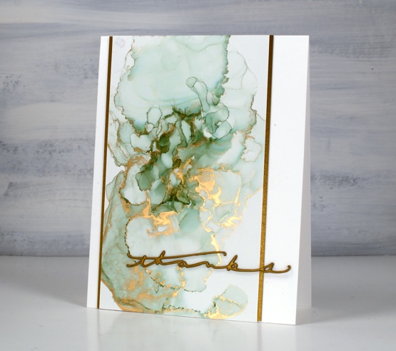
I have a couple more cards made off camera using the same technique shown in the video. The card above features juniper AI and statue alloy AI with the PB ‘many thanks’ die cut from antique gold cardstock and stacked twice.
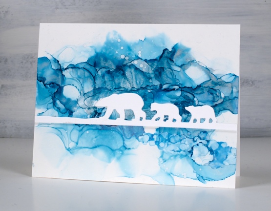
When this panel was finished it reminded me of photos of the artic and far north where the icebergs and glaciers are made up of beautiful shades of blue. It’s kind of a cross section perspective where we can see below and above the ice the bears are walking on. I did use two blue inks plus a silver for this one, ranger turquoise and stream with pinata silver. The bear die is ‘polar bears’ from Penny Black.
We’ve been watching Cecilia Blomdahl’s youtube channel about her life on Svalbard, an island off the north coast of Norway. She lives in the world’s northern most town. Polar bears are definitely around so you don’t wander outside the village without your weapon!
Supplies
(Compensated affiliate links used when possible)
All the Birthdays
Posted: October 7, 2020 Filed under: A2 layers, Additional A2 layers, all the birthdays, CAS, Concord & 9th, nesting squares, Waffle Flower | Tags: Concord & 9th, gel press, gel printing, Ranger archival inks, ranger embossing powders, Tsukineko Versafine inks, Waffle Flower dies, WOW embossing powders 4 Comments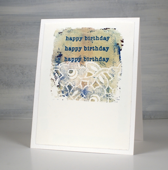
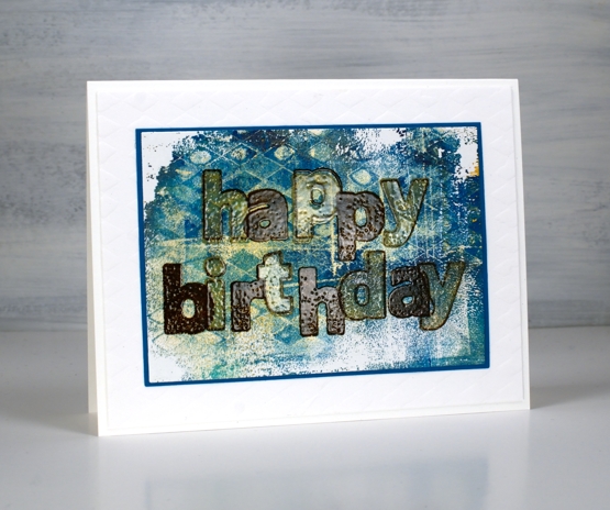
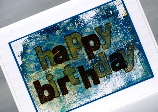
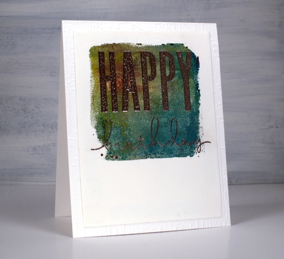
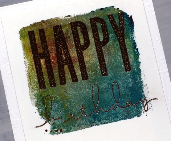
I made a short stack of birthday cards yesterday with a new Concord & 9th set, ‘All the Birthdays’. I pulled out several prints from earlier gel printing sessions and chose some which would work as panels for birthday cards.
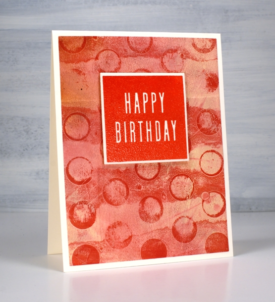
On the card above I used ranger blue embossing powder and the card below versafine tulip red was the perfect match for my printed background.
Some were printed using the petite set A gel presses so they were already shaped as squares. Others I cut from larger prints. I used stencils and lace to make the prints and a range of acrylic paints.
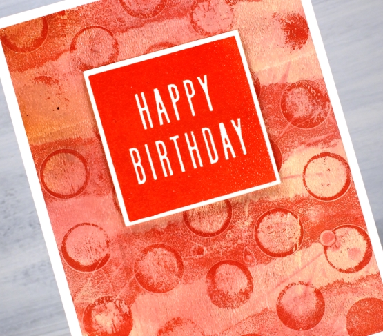
One of the stamp combinations from the C&9 ‘all the birthdays’ is a pair of stamps that overlap to spell ‘happy birthday’; there are outline stamps that frame the solid letters also. That is what I used on the card below with gold and brown inks then clear embossing powder.
I also added some texture to a few of the card bases or mats with embossing folders and stencils.
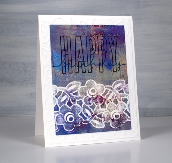
The printed panel below included such pretty blues and purples I wanted to match them in the sentiment so I stamped with archival dusty concord and faded jeans then, before the ink dried embossed in clear powder.
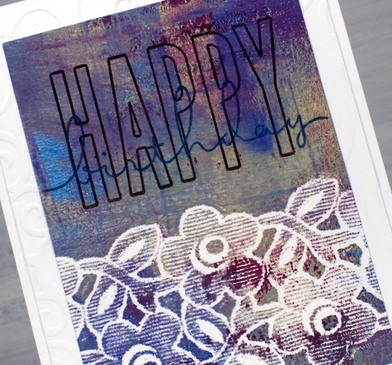
The card below features rose gold embossing powder; it looks a little darker than expected on this panel, maybe because of the depth of colour in the print.
I really enjoyed pairing sentiments from the C&9 set with my leftover gel prints. I did have some embossing challenges though; I’m just not an embossing champion. Stray powder, over heating, underheating, even when I use a powder tool and preheat the heat tool I still make mistakes. This lot took me all afternoon but I am very happy with them and I’m pleased to have boosted my birthday card stash. Now if I can just remember to send them…
Supplies
Feathers, CAS & calm
Posted: June 5, 2019 Filed under: Brusho, CAS, Catherine Pooler inks, Challenges, Concord & 9th, Feathered die set, Feathered stamp set, Leaf Canopy | Tags: Altenew, Brusho, Catherine Pooler inks, Concord & 9th 9 Comments
I finally got my act together enough to enter a challenge and not even in the last few minutes it was open! I just hosted a challenge with the Foiled Fox and we will be announcing winners in the next few days. I enjoyed visiting all the entries and was inspired by each card. Today’s card was inspired by the ‘Ombre’ challenge at CAS Mix Up and I will be entering it in the ‘Calm’ challenge at Casology as well.
Before I talk about this calm and clean and simple and ombre card I just want to thank those who joined the conversation on Monday about ‘bunchies’. I posted a photo on Monday of myself, aged 6, with my hair in ‘bunchies’ and asked what others called the two ponytail style. I was surprised to read they were known as ‘dog ears’ and ‘dust mops’ as well as the more common ‘pigtails’. One reader called them ‘bunches’ which is practically the same as me so I was not alone with that tag.
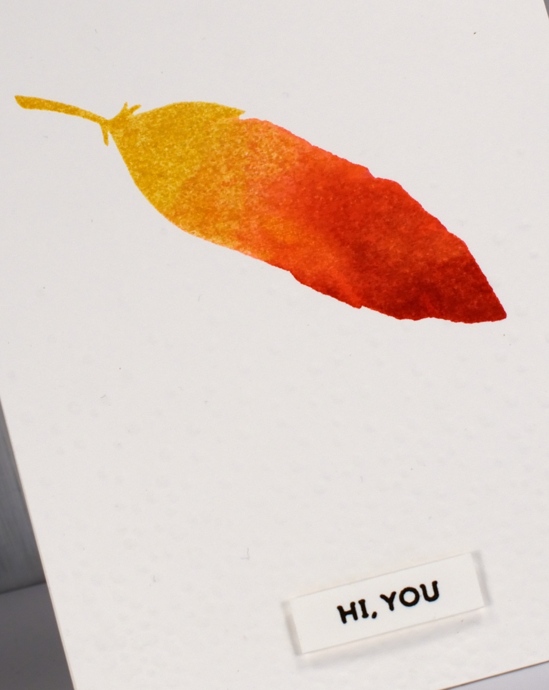
Back to the feather, I used the solid feather stamp from the C&9 Feathered set and Catherine Pooler inks to create the watercolour ombre look. The coverage and blending is just what I was after. Like some dye inks the colours continue to soak in and smooth out after stamping with the CP inks which is exactly what I needed for this look. I inked the whole stamp in ‘shea butter’ ink, stamped then inked two thirds in ‘bellini’ ink, spritzed and stamped, then finished by inking the tip in ‘rockin red’ ink, spritzed and stamped. The little spritz over the ink spread the ink on the stamp so there were no hard lines where one ink stopped or started.
I dry embossed the whole panel with the snowfall/speckles texture fade folder for a bit more visual interest and popped up the sentiment from the same stamp set. Did you know embossing folders are enjoying a rise in popularity these days? I don’t know if that is true or not, I just know they are around here! The CAS mix up challenge required ombre + stamping + my choice (embossing), so all boxes checked! There are a few metallic ombre looks featured on the challenge blog; I’ve never thought of metallic ombre but it is pretty fancy so I might have to give it a try.
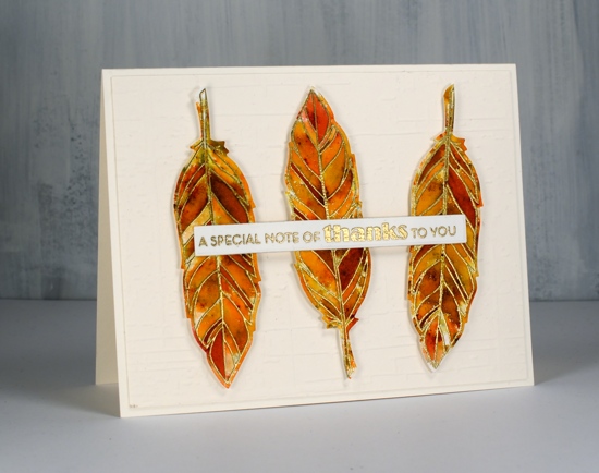
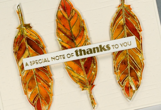
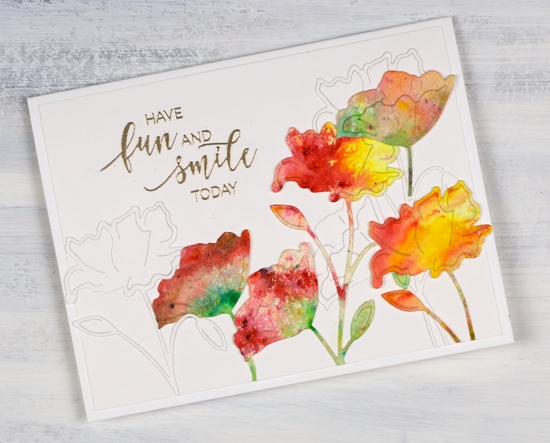
My second card is not entering any challenges; it was made because I love pairing sectioned stamps with sprinkled brusho. I embossed the sectioned feather from the same C&9 set in gold three times on hot pressed watercolour paper, sprinkled sandstone and terracotta brusho powder over the top then spritzed water gently to activate the brusho. I added more brusho and spritzing several times and then moved some paint around with a paintbrush, not much just a few places so there would be a few more solid sections. I die cut the feathers then popped them up on a different dry embossed background, ‘weathered’ by Taylored Expressions. The sentiment is from the Altenew set, ‘leaf canopy’.
Click on the badges below to see what’s happening in the challenges I’m entering.
Supplies
Bodacious brusho
Posted: April 2, 2018 Filed under: bodacious, Brusho, CAS | Tags: Brusho, Penny Black creative dies, Penny Black stamps 8 Comments
This week I have a couple of painted die cut cards to share. To create this one I first sprinkled leaf green, sunburst yellow and rose red brusho over a piece of hot pressed watercolour paper and spritzed with water to activate the paint. The colours did blend together a little but I was able to keep some distinct red, yellow and green areas. Once dry I used the ‘bodacious’ die from Penny Black to cut several flowers. I also cut white flowers with the same die. When creating my layout I glued down a few white diecut flowers first then coloured ones over the top. I trimmed stems and buds so I could arrange the flowers at different heights and facing different directions.
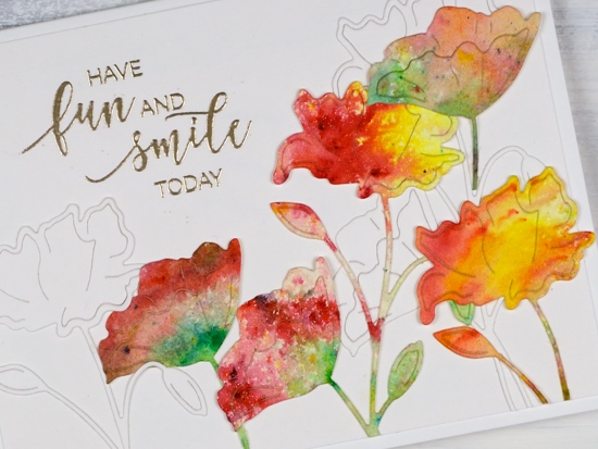
I embossed a sentiment from the ‘smile today’ set in platinum, trimmed the white background panel and attached it to a white card base.
Supplies
Stamps: smile today!
Die: bodacious

Paper: hot pressed watercolour, neenah solar white, white linen texture paper


Paint: leaf green, sunburst yellow, rose red brusho
Also: platinum embossing powder
Ferns
Posted: July 20, 2017 Filed under: Alcohol Ink, CAS, Wilderness Vol.2 | Tags: Darkroom Door stamps, Ranger Alcohol Ink, Tsukineko Stazon inks, Tsukineko Versafine inks 5 Comments
Here ends a week without internet at home! I think some internet free time is definitely a good thing but I’d rather it be planned than thrust upon me. One happy outcome is the stack of edited photos I have ready to slot into blog posts.
This one is an alcohol ink on yupo panel. The abstract panel has been sitting in my ‘pile of possibility’ for some time so I don’t remember which colours of ink I used. Just guessing though, I would say pool and juniper but I might be wrong about juniper. There’s a blue and a green for sure, possibly two blues. I used opaque yupo paper but it is still worthwhile to back it with white cardstock to keep the colours bright so I did that before matting it with teal.
I stamped the fern from Darkroom Door’s Wilderness Vol 2 set. It is a lovely delicate image. I used stazon ink on the yupo and it spread ever so slightly but as you can see not enough to lose the fine detail of the stamp. At first I didn’t have a sentiment but the white space below the panel did look a bit empty so I added a simple thank you. Stamps and inks are linked below.
Supplies:
Stamps: wilderness vol 2, thank you (Darkroom Door)
Inks: pool & juniper alcohol inks (Ranger) blue Hawaii stazon, deep lagoon versafine (Tsukineko)
Papers: opaque yupo, neenah solar white cardstock, teal cardstock
The pickle people
Posted: July 12, 2017 Filed under: Alcohol Ink, CAS | Tags: Ranger Alcohol Ink, Yupo Paper 14 Comments
I have a fun one for you today. I did this little panel way, way back when I first started playing with alcohol inks. I dropped ink on yupo paper then blew it with compressed air to create some random shapes. Only later did I see I had created pickle people.
You’re welcome.

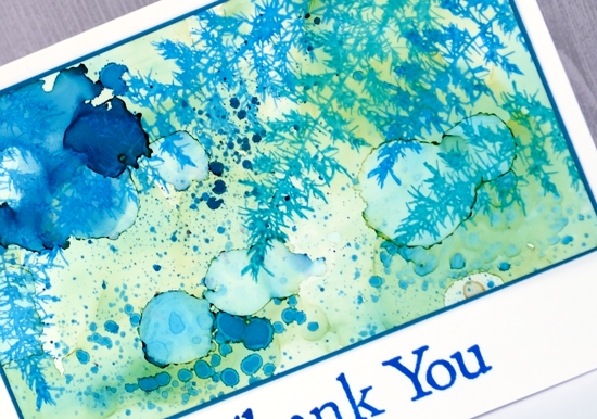
Brusho Balloons
Posted: May 15, 2017 Filed under: CAS, stencil cut, Uplifting | Tags: Brusho, Penny Black creative dies, Penny Black stamps 8 Comments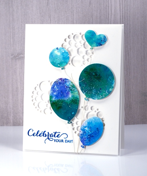
I have another card that utilises brusho experiments. If you have delved into the magic of brusho you probably have a pile of pretty brusho panels you don’t know quite what to do with. Experimenting with brusho is a bit addictive so it is rather easy to keep trying colour combinations with no project goal in mind. I decided to put a scrap of green, blue and purple brusho ‘mosaic’ to use as balloons. By brusho mosaic I mean the effect I get when I spritz over the sprinkled brusho only enough to activate it but not send it flowing all over the paper.
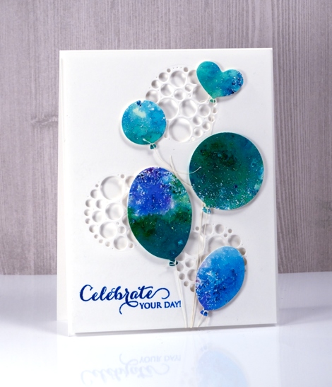
I used the ‘uplifting’ dies from Penny Black to cut out five balloons then added adhesive backed foam to each one. I cut circles of circles out of a panel of neenah solar white cardstock to create a background panel then cut circles from a piece of foam to position behind the panel so shadows would show inside the circles. The circles of circles are part of a new PB die set ‘stencil cut’.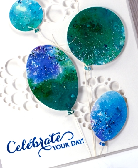
I tied a linen thread to each balloon and tucked the other ends under the background panel. The thread tying took me close to my fiddliness factor limit but I persevered and assembled the layers and added a sentiment. This happy card would work for any celebration so I am adding it to the Casology challenge this week ‘Commencement’.
Supplies
Stamps: A sweet day (PB)
Dies: uplifting, stencil cut (PB)
Paint: brusho crystals (Colourcraft)
Also: linen thread, fun foam
Burst of Bister
Posted: May 12, 2017 Filed under: Bister, CAS | Tags: Bister, Penny Black stamps, Tsukineko Versafine inks 8 Comments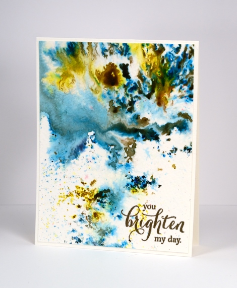
It’s been all about the colorburst and brusho powders with me lately so I thought it was past time to share the other watercolour powder in my life, bister. The concept is the same with bister; you add water and colour bursts out. The colours in the bister range are more earthy than the other brands and the crystals are, on the whole, coarser. The effects are just as magical as you can see on this panel.
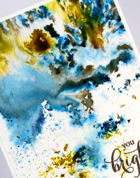
I think this panel is from my initial experimenting with watercolour powders. I really liked how the colours moved on the cold pressed watercolour paper but for a long time I didn’t have a plan for the abstract panel. Eventually I realised it didn’t need a plan; it was a stand alone! I added a sentiment and popped up the panel on foam to give it a ‘shadow frame’ and that is the card. This panel shows the versatility of watercolour powders quite well. By varying the amount of water added you can get small intensely coloured shapes which I think look a bit like mosaics, you can get soft washes and some patterning in between the two extremes.
Supplies
Stamps: special thoughts (Penny Black)
Paint: Bister paint powders
Ink: Versafine vintage sepia (Tsukineko)
Paper: cold pressed watercolour paper


