AI Brussel Sprouts video
Posted: February 18, 2022 Filed under: Alcohol Ink, Concord & 9th, grafix, simple serif alphabet dies, Tutorial | Tags: Concord & 9th, grafix, grafix craft plastic, pinata alcohol ink, Ranger Alcohol Ink, Tutorial, video 9 Comments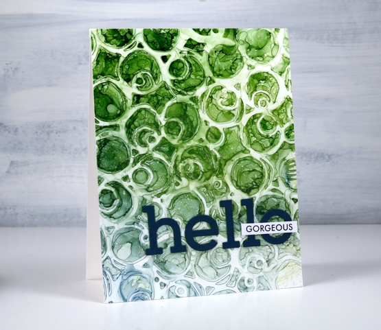
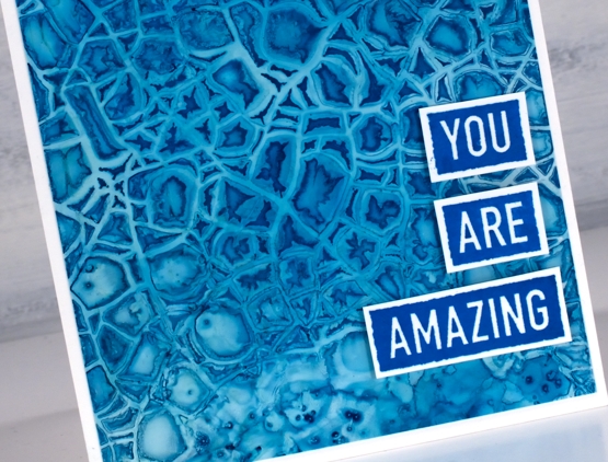
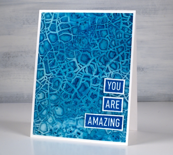
If you are a little baffled by the title of this post don’t worry no brussel sprouts were harmed or eaten or even incorporated into the making of this video! But would you agree that the little patterns formed inside the circles on the panel look a bit like brussel sprouts?
You will see in the video I didn’t set out to make a brussel sprout pattern; I actually changed track part way through the process. The video shows the technique I started with along with stencil technique I ended up doing. So it’s basically a 2 for 1 deal.
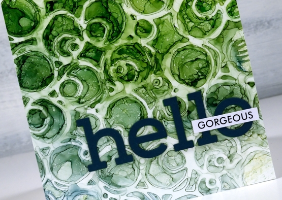
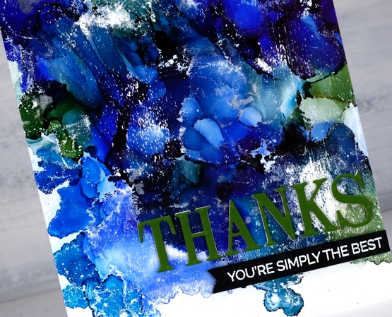
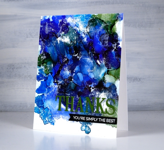
There are several ways to use a stencil with alcohol inks and this is just one. Make sure you check out Ardyth’s youtube channel for more ideas. I mentioned in the video that some alcohol inks tend to be a bit pushy and end up taking over a colour scheme. The lime green did so on this card but I’m glad there are some blues tones still visible at the base of the card.
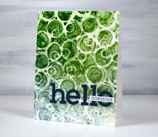
I finished the card with die-cut letters and a single word from Paper Rose Studio’s So Extra sentiment strips.
You can see other cards made using this technique here and here.
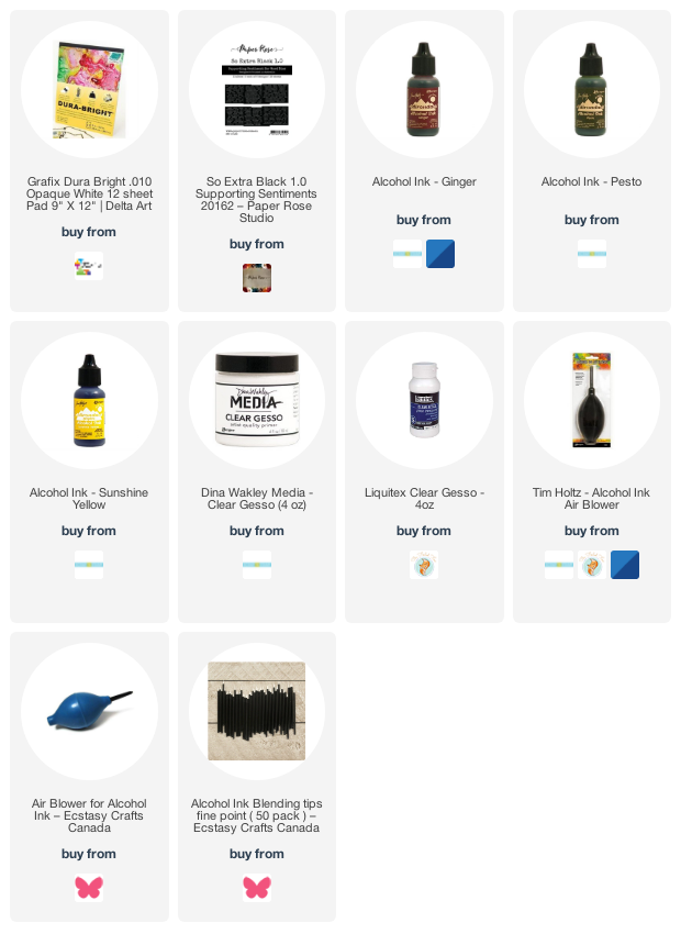
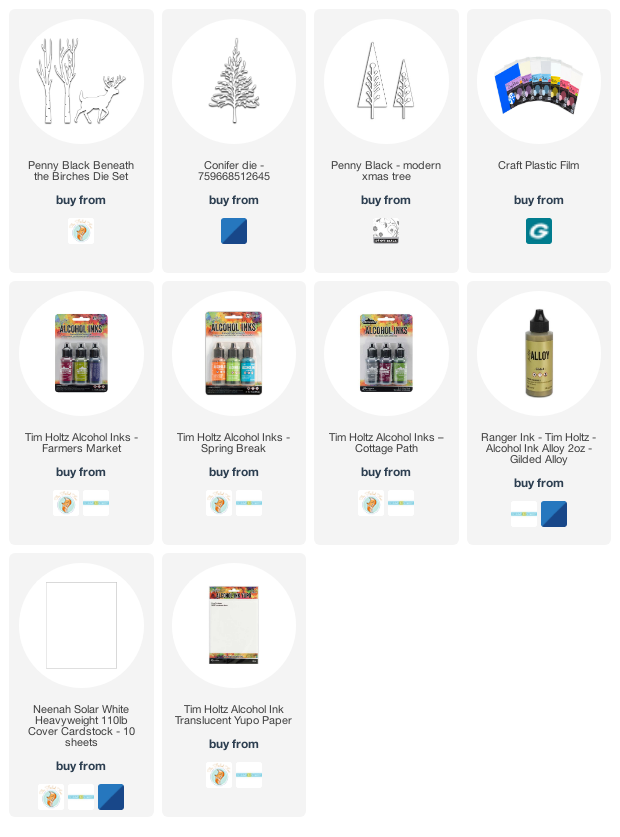
Supplies
(Compensated affiliate links used when possible)
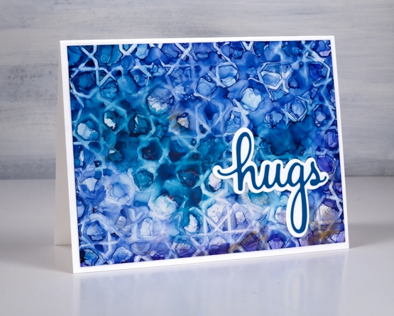
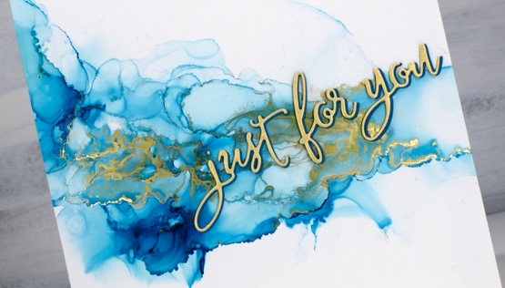
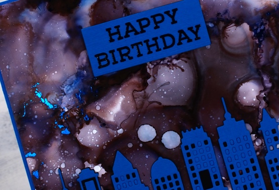
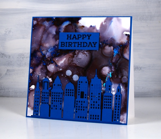
AI + Stencils Blue Edition
Posted: January 31, 2022 Filed under: Alcohol Ink, crackle, Darkroom Door, geometric stars, grafix, mesh, MFT stencils, My Favorite Things, Pink Fresh studio, Stencils, tall flowers, Uncategorized, you are everything | Tags: Darkroom Door stamps, Darkroom Door stencils, grafix, grafix craft plastic, My Favorite Things, pinata alcohol ink, Pink Fresh studio, Ranger Alcohol Ink 11 Comments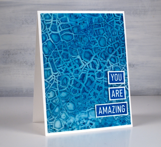
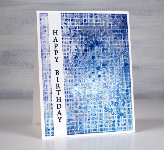
After success with one of my detailed stencils over an alcohol ink panel I tried a few more all with a mix of blue inks. The one above features the Darkroom Door crackle stencil over a mix of cloudy blue and stream inks.
There is also a little bit of salt sprinkled on the panel where the stencil did not make consistent contact. This technique is definitely not for the impatient among us!
I am still working on Grafix white craft plastic and often starting over the top of a panel that already had ink on it. All the card bases are Neenah solar white.
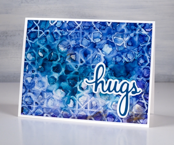
The stencil above is MFT geometric stars and I positioned it over a panel of denim and stream inks with some leftover copper as well. The ‘print’ is not very consistent but I like the way a distinct line is right next to a blurry pattern.
I finished this one off with a die from the Pinkfresh Studio ‘sending’ die set.
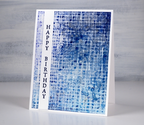
I worked with the DD mesh stencil a couple of times because it didn’t make consistent contact on my first attempts. I found if I taped it over the alcohol ink panel onto a piece of scrap cardboard I could bend the cardboard slightly to make sure stencil stayed pressed onto the wet alcohol inks. I just popped the piece in the right sized container to keep it bent while it dried.
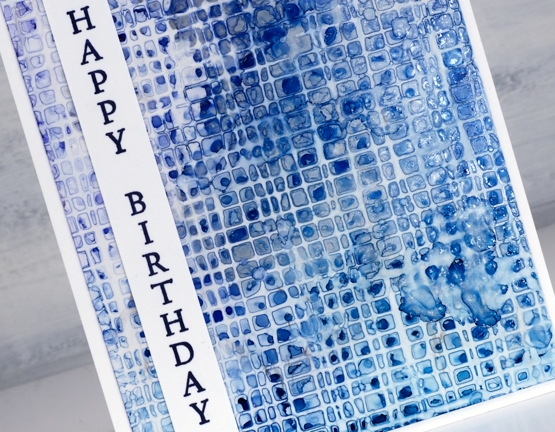
This one is a mix of denim, cloudy blue, silver and a tiny bit of stream down in the right hand corner. I added a sentiment from the DD ‘tall flowers’ set.
As you can see my fascination with this technique continues. I did pick up a couple more detail stencils the other day for this very purpose. I will also give it a try with some watercolour paints and paper. I’m sure the result will be different as the watercolour paints soak in but I think there could be a pretty and subtle pattern. Stay tuned!
Supplies
(Compensated affiliate links used when possible)
AI Abstract and Landscape
Posted: January 28, 2022 Filed under: Alcohol Ink, grafix, Paper Rose, so extra supporting sentiments | Tags: grafix, grafix craft plastic, Paper Rose, pinata alcohol ink, Ranger Alcohol Ink 6 Comments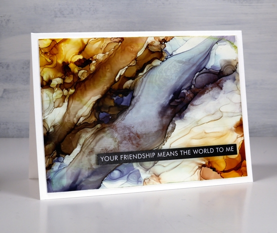
While trying the stencil and alcohol ink techniques earlier this week I also returned to techniques I’ve used before. The Grafix white craft plastic panel above was a grey & blue one which wasn’t very interesting. I added warm tones either side and using tilting and air blowing to create a pattern that looks a little like a rock cross section.
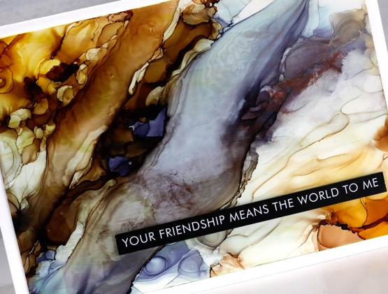
I used some clear gesso to seal this one but it did drag some colour and leave some texture lines so I wouldn’t recommend it as the best sealing solution. I could use a spray sealant but it is very, very cold outside so I’m not popping into the back yard to use aerosol cans right now!
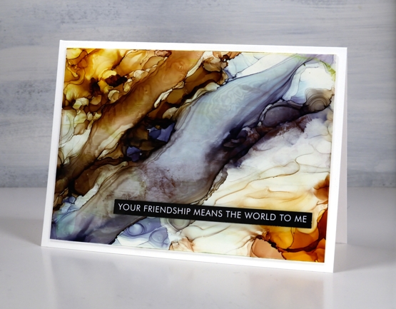
I would tell you the ink colours I used if I knew. I picked up a panel with ink from a previous session then start putting more ink here and there and in no time I saw colours and patterns appear with no idea which ink went where!
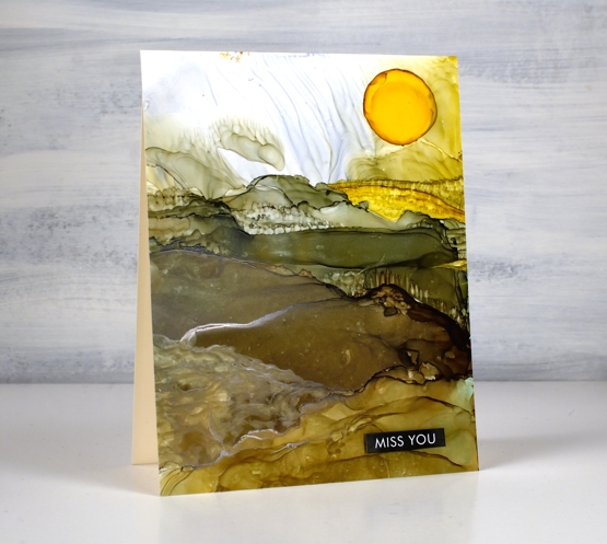
On this second panel I have a bit more of an idea of the landscape colours. I began with a previously inked panel and added pesto, ginger and sunshine yellow inks along with generous amounts of rubbing alcohol to move the inks.
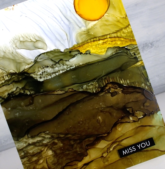
As I tipped the panel and used an air blower I was able to create stripes across the panel which looked a bit like hills. I feel like this is still a fluke for me; I wish I could give you exact instructions but it works sometimes and not others.
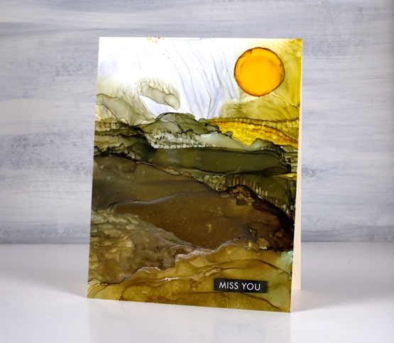
To add the look of trees and crops I used an alcohol ink paint brush and a very small amount of alcohol ink or isopropyl alcohol. I wanted to add texture to the ink that was already there rather than add more ink because when you add more ink it tends to displace the ink you already have on the panel. With this in mind I added a drop of sunshine yellow at the end to be the sun. It did not expand neatly in a circle so I used a paint brush which meant the sun was a bit larger than intended! I finished both cards with sentiments from the Paper Rose Studio ‘so extra supporting sentiments’ pack.
Alcohol ink art seems to be equal parts fabulous and frustrating but I will keep on persevering and see if I can come up with some processes I can recreate and share with you.
Supplies
(Compensated affiliate links used when possible)
Trees on Alcohol Ink backgrounds
Posted: December 8, 2021 Filed under: Alcohol Ink, beneath the birches, conifer, Dies, modern xmas tree, Penny Black | Tags: Penny Black creative dies, pinata alcohol ink, Ranger Alcohol Ink 4 Comments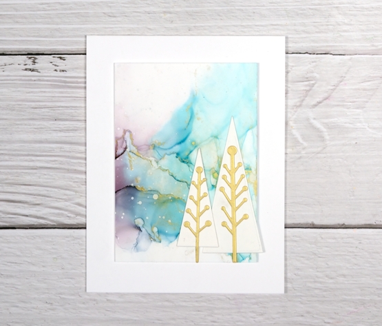
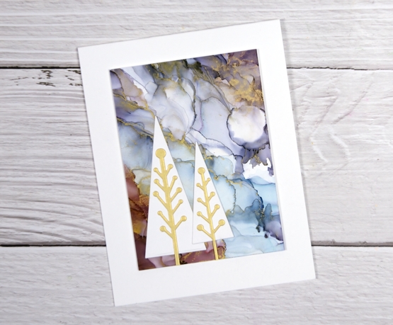
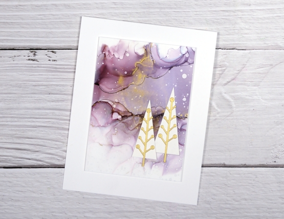
Today’s additions to the Christmas card stack are on alcohol ink backgrounds. If you have been visiting my blog for a while you will have seen the backgrounds before. I posted the panels back in June and asked you all for your thoughts on how to use them. Some of you suggested adding a quote or verse, others thought they would be good as backgrounds for cards. I liked both ideas but have chosen to cut up two of the panels for cards.

The backgrounds on the three cards above are all from one panel; I popped them up on the card base and added trees. As there was gilded alloy alcohol ink on the original design I cut the centre of the modern trees from gold shimmer cardstock.
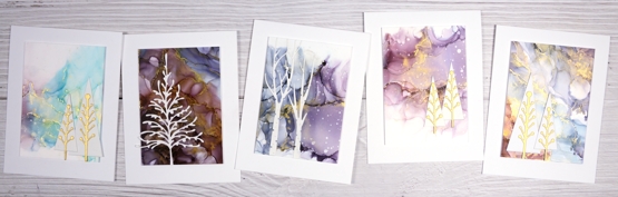
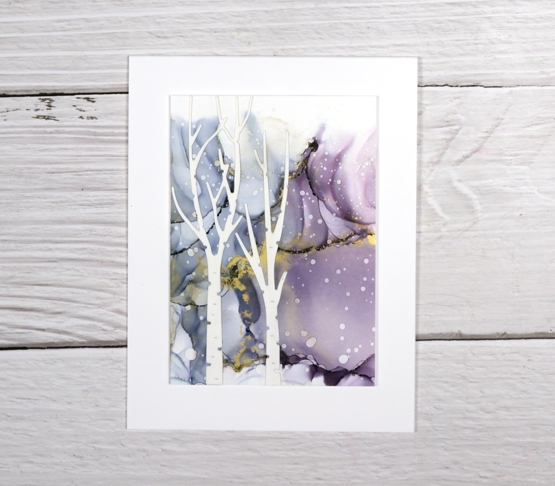
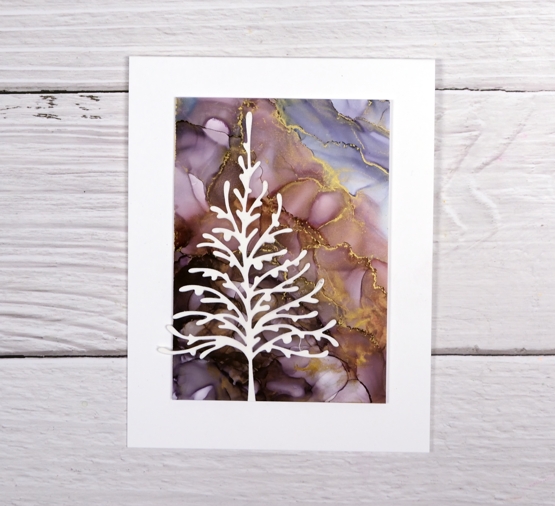
The backgrounds on the two cards below are cut from another panel. You can see where they joined up originally.
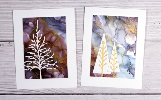
All the die-cut elements are neenah solar white cardstock (and the shimmer gold) and the card bases are also neenah solar white. This is as close to mass production as I get, same basic design but some variety within the backgrounds and added elements.
I thought about adding sentiments, just little ones below the panels but decided I liked them plain and simple. I’ll add a sentiment inside and hopefully they’ll be written and posted this week!
There are a few more alcohol ink pieces plus some paint pour scraps that have become backgrounds for die-cuts. They are still in process on my work table so you’ll see them soon.
Have a great day!
Supplies
(Compensated affiliate links used when possible)
Alcohol ink gel print
Posted: April 12, 2021 Filed under: Alcohol Ink, gel press, Penny Black, Taylored Expressions | Tags: gel press, gel printing, Penny Black creative dies, Penny Black stamps, pinata alcohol ink, Ranger Alcohol Ink, Taylored Expressions 5 Comments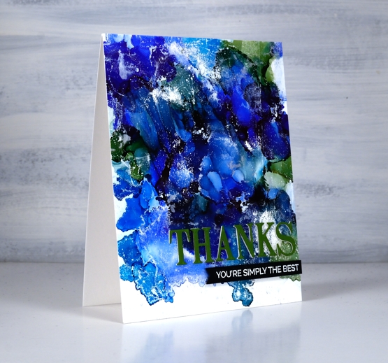
I tried a technique this week that I’ve seen demonstrated by gel printing wizards but never tried myself. In some ways it’s not that different from making abstract alcohol ink patterns on yupo or craft plastic but I found that I ended up with more of a distressed look which is rather nice.
I started with a not entirely clean gel plate and three or four alcohol inks, I’m not sure exactly which ones I used as I was very much in experimenting mode. Obviously there was a green and some blues in there and in real life you can see I also had a silver. I dropped dots of the different colours on the gel plate added rubbing alcohol and blew it all around with the air blower. It dried quite quickly so it took several additions of inks and rubbing alcohol before I was happy with the coverage. Once the AI had dried completely I brayered white acrylic paint over the painted area and took a print on some white cardstock. You can see the usual overlapping patterns of alcohol ink blobs but also some white patches and ‘grazes’ from the acrylic paint.
I trimmed the panel and added a three layer PB die cut sentiment along with an additional sentiment strip. I will definitely be trying this technique again.
Supplies
(Compensated affiliate links used when possible)
Moving Alcohol Inks with Air – Video
Posted: February 3, 2021 Filed under: Alcohol Ink, Brutus Monroe, CAS, Dies, grafix, light as a feather, nesting squares, Penny Black, polar bears, Tutorial, Waffle Flower | Tags: grafix, grafix craft plastic, Penny Black creative dies, Penny Black stamps, pinata alcohol ink, Ranger Alcohol Ink, Tutorial, video 16 Comments
I’ve had the alcohol inks out recently and spent some time trying to get soft wavy patterns on craft plastic. I have seen several artists who do this technique beautifully but I am very much still a beginner with it. I have a few cards to share today along with a video showing my process for two of the panels. I worked on white craft plastic from Grafix which is heavyweight and totally opaque. For most of the panels featured today I used only two alcohol inks plus plenty of 99% rubbing alcohol; each panel was created with a metallic and a non-metallic ink.
This first panel was made with turquoise AI and gilded alloy AI; I love the range of blues when diluted with rubbing alcohol. The ‘for you’ Penny Black die cut is two layers of turquoise cardstock topped with one layer of pale gold.
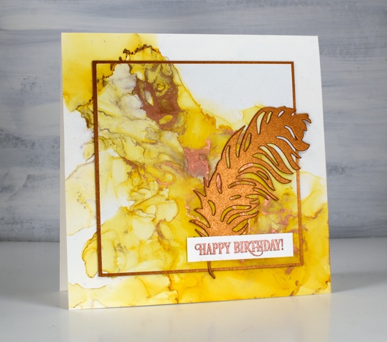
This warm toned card was made with honeycomb AI and mined alloy AI then die cut with a WaffleFlower square nesting die. I used the WaffleFlower additional square dies to cut a larger copper square then added the PB ‘light as a feather’ die cut and a PB birthday sentiment embossed in Brutus Monroe penny embossing powder.
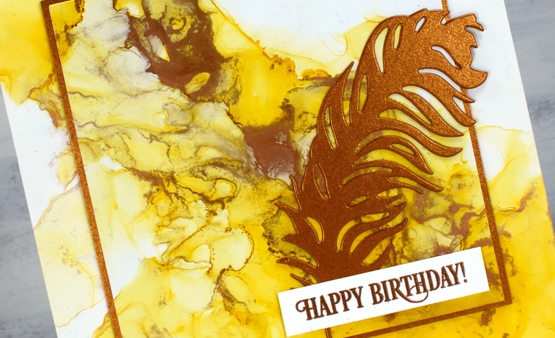
You can see the process for both cards above in the video below.
As I am working on alcohol ink panels I am evaluating my process and working out what I want to try next. I just bought a cheap lazy susan to work on the blown flowers and I’m pretty sure I don’t need to use as much coloured ink when I make the initial drops. You can be sure I will let you know what I discover.
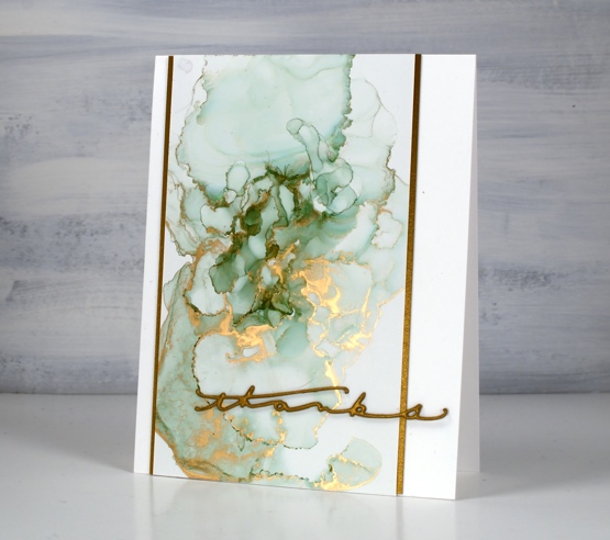
I have a couple more cards made off camera using the same technique shown in the video. The card above features juniper AI and statue alloy AI with the PB ‘many thanks’ die cut from antique gold cardstock and stacked twice.
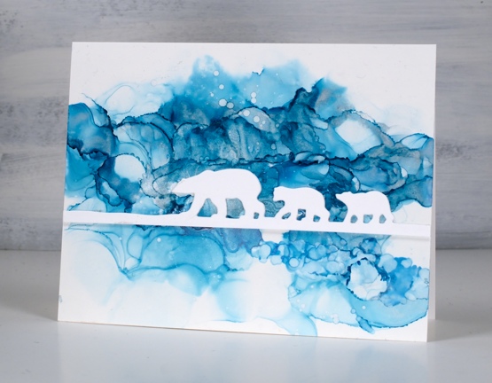
When this panel was finished it reminded me of photos of the artic and far north where the icebergs and glaciers are made up of beautiful shades of blue. It’s kind of a cross section perspective where we can see below and above the ice the bears are walking on. I did use two blue inks plus a silver for this one, ranger turquoise and stream with pinata silver. The bear die is ‘polar bears’ from Penny Black.
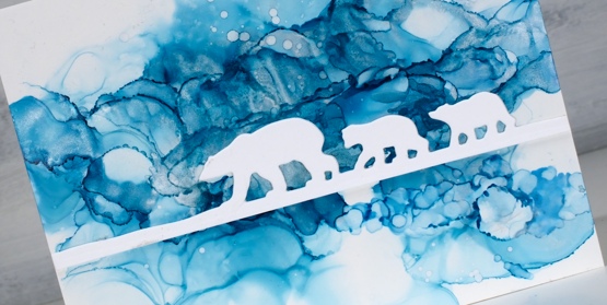
We’ve been watching Cecilia Blomdahl’s youtube channel about her life on Svalbard, an island off the north coast of Norway. She lives in the world’s northern most town. Polar bears are definitely around so you don’t wander outside the village without your weapon!
Supplies
(Compensated affiliate links used when possible)
Alcohol ink + foil
Posted: January 28, 2021 Filed under: Alcohol Ink, all the birthdays, Concord & 9th, Metropolitan, Penny Black, poppy edger | Tags: Concord & 9th, Penny Black creative dies, Penny Black stamps, pinata alcohol ink, Ranger Alcohol Ink 11 Comments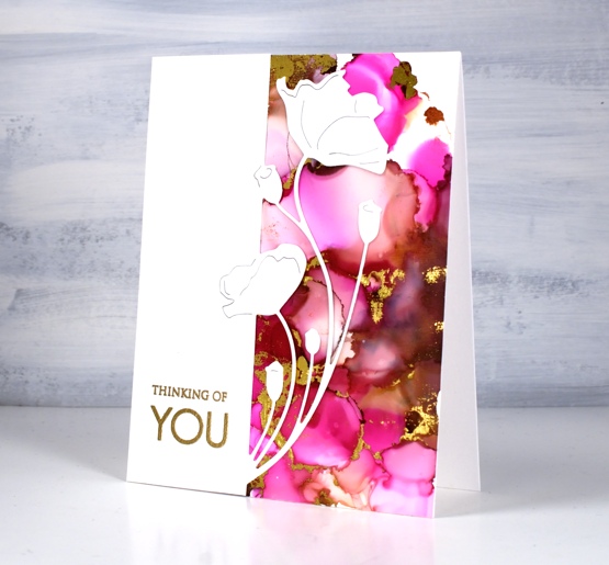
When I get the alcohol inks out I always have a stack of panels at the end of the session. Some sit around and never amount to much but others wait for inspiration to hit. This one was created on white craft plastic (Grafix dura-bright white) with ginger and burgandy Ranger alcohol inks and Pinata magenta. I added gold foil using the minc well after the inks had dried.
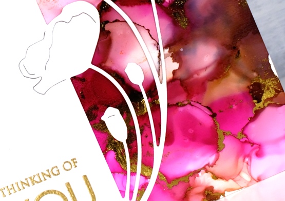
Sometimes it is possible to make the foil stick soon after finishing the inking. There is a sweet spot as far as letting the ink dry enough that it is not gooey but not so much that it is dry to touch. The sections that will hold the foil are the ‘seams’ between colours where the ink is thicker. If you press foil on these areas when they are a bit tacky you can get it to stick with just a bit of burnishing. If the panel has dried it sometimes possible to get foil to stick by running the panel through a minc or laminator using some heat. This can be risky as sometimes the foil sticks to more of the panel than you expected.
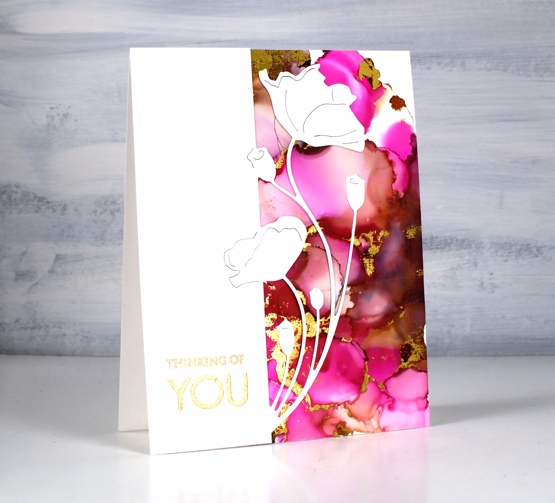
When I ran this panel through the minc I was happy with most of the foiling but there were a few sections that didn’t look great so I just used the part that looked good and covered the rest with this pretty poppy edger from Penny Black. I finished the card with a gold embossed sentiment from the PB ‘only you’ set.
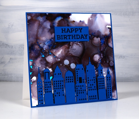
This second panel amazes me because it was created with only black alcohol ink plus rubbing alcohol. The blue and burgandy tones appeared when the black ink was diluted. Cool huh? I pressed the blue foil onto this panel at just the right time to get it to stick when the seams were tacky. It is hard to get it to show in the photo but there are small sections of blue foil here and there across the sky.
The inking on both panels was pretty experimental, a drop here and there some rubbing alcohol and tilting and blowing the ink to make a random pattern. I cut the Penny Black metropolitan die from both black and blue cardstock then stacked blue on black without removing all the window cut outs. I ended up using spray adhesive on the back of the blue die cut because gluing is not my gifting.
The sentiment is from the Concord & 9 ‘all the birthdays set stamped in black and embossed in clear then stacked up on two layers of black cardstock. More alcohol inks next week; I’m having fun.
Supplies
(Compensated affiliate links used when possible)
For some reason the images did not want to display on this list but if you click the word Supplies, above, you will get to the complete list.
I’ve been playing with the alcohol inks again!
Posted: October 2, 2019 Filed under: Alcohol Ink, Penny Black, simple serif alphabet dies, tall flowers | Tags: Concord & 9th, grafix craft plastic, Penny Black creative dies, Penny Black stamps, pinata alcohol ink, Ranger Alcohol Ink, Yupo Paper 11 Comments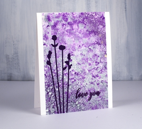
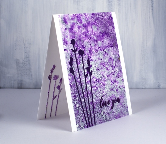
Last weekend I spent Saturday creating with alcohol inks while learning from Kathryn Kanadian who was in Ottawa teaching a couple of classes. Kathryn is a wonderful teacher and I now have a few new tricks to try and techniques to practice. This lavender panel was created with dots of ink on an applicator; I used passion purple, rich gold (Pinata) and juniper (Ranger) along with some blending solution or isopropyl alcohol. I dabbed the applicator all over the craft plastic for quite a while and added blending solution and more ink when needed. The gold ink didn’t move much but the other two colours created a lot of pattern. These delicate flowers which look a little like lavender are cut with PB ‘tall flowers’ dies. The sentiment from the PB ‘special sentiments’ set I stamped with dusty concord archival ink. I had a section of the patterned panel left over so I was able to die cut some more flowers to pop inside the card. You can be sure I put stick-it adhesive on those panels before I cut such skinny flowers out.
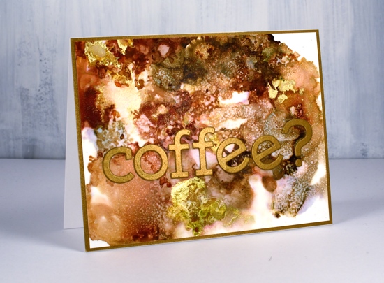
The panel of browns and gold below came together as Kathryn was encouraging us to experiment with blending solution to move the ink. I used more than I usually would and was delighted with all the variation of colour I achieved, the dotted patterns and the splotches of gold here and there. I used ginger, espresso (Ranger) and rich gold (Pinata). Kathryn had samples of her wonderful work including a coffee themed card that inspired this one.
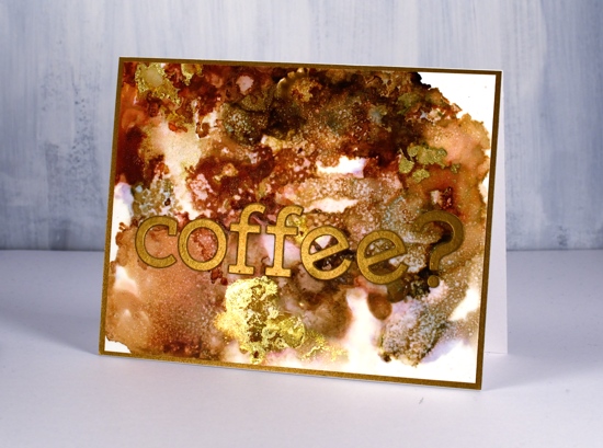
I used the Concord & 9 ‘simple serif’ alphabet dies to cut the letters from antique gold cardstock and framed the panel in antique gold also.
The daisy panel was a bit of a breakthrough for me as I had only made landscapes with alcohol inks by accident or trial and error in the past. With the introduction of a stylus and alcohol ink brushes I was able to paint some daisies and splatter a rain shower over the top of them.
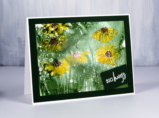
I began by creating a green background with the help of some isopropyl alcohol and green ink (not sure if it was meadow or pesto??) I used a stylus to dot the centres of the flowers in copper and pitch alcohol inks (Ranger) then I used a brush to paint petals around the centres and stems and grass at the base. The splatters of isopropyl alcohol pulled the composition together.
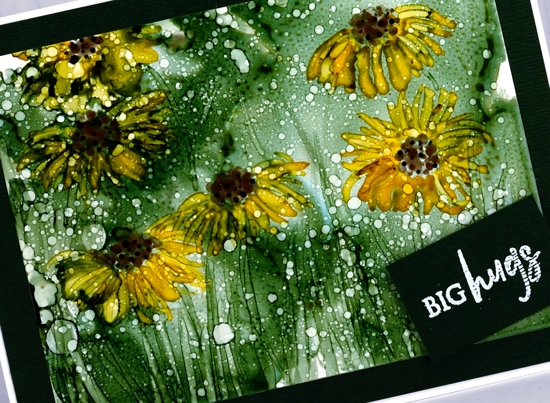
Although it looks black the cardstock framing the panel is actually dark green. I embossed a little sentiment from the PB ‘family sentiments’ set in white powder.
I created a few more panels during the class which hopefully I will turn into cards soon. Thanks Kathryn for a wonderful class.
Supplies