
I’ve been playing with the alcohol inks again!
Posted: October 2, 2019 Filed under: Alcohol Ink, Penny Black, simple serif alphabet dies, tall flowers | Tags: Concord & 9th, grafix craft plastic, Penny Black creative dies, Penny Black stamps, pinata alcohol ink, Ranger Alcohol Ink, Yupo Paper 11 Comments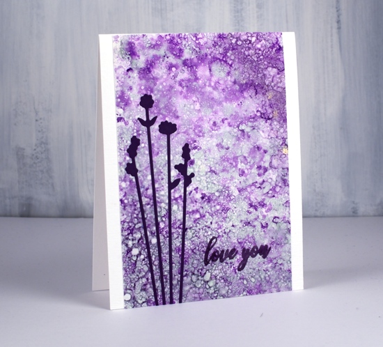
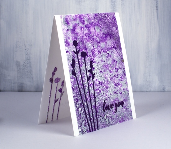
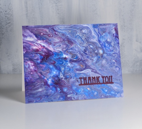
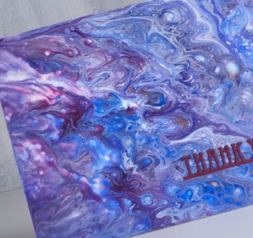
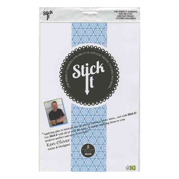
Last weekend I spent Saturday creating with alcohol inks while learning from Kathryn Kanadian who was in Ottawa teaching a couple of classes. Kathryn is a wonderful teacher and I now have a few new tricks to try and techniques to practice. This lavender panel was created with dots of ink on an applicator; I used passion purple, rich gold (Pinata) and juniper (Ranger) along with some blending solution or isopropyl alcohol. I dabbed the applicator all over the craft plastic for quite a while and added blending solution and more ink when needed. The gold ink didn’t move much but the other two colours created a lot of pattern. These delicate flowers which look a little like lavender are cut with PB ‘tall flowers’ dies. The sentiment from the PB ‘special sentiments’ set I stamped with dusty concord archival ink. I had a section of the patterned panel left over so I was able to die cut some more flowers to pop inside the card. You can be sure I put stick-it adhesive on those panels before I cut such skinny flowers out.
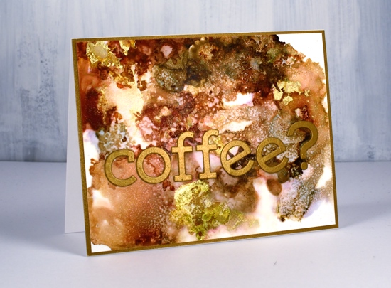
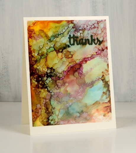
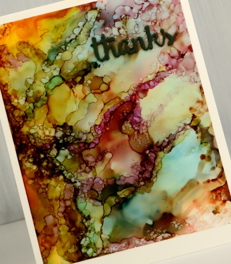
The panel of browns and gold below came together as Kathryn was encouraging us to experiment with blending solution to move the ink. I used more than I usually would and was delighted with all the variation of colour I achieved, the dotted patterns and the splotches of gold here and there. I used ginger, espresso (Ranger) and rich gold (Pinata). Kathryn had samples of her wonderful work including a coffee themed card that inspired this one.
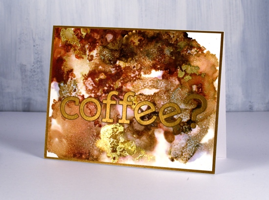
I used the Concord & 9 ‘simple serif’ alphabet dies to cut the letters from antique gold cardstock and framed the panel in antique gold also.
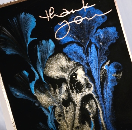
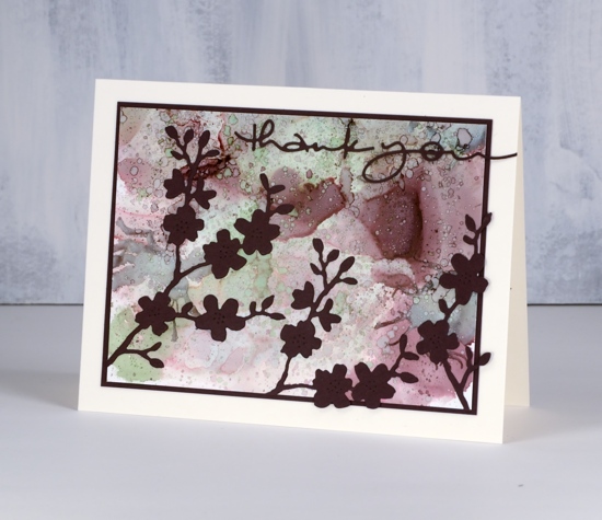
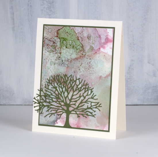
The daisy panel was a bit of a breakthrough for me as I had only made landscapes with alcohol inks by accident or trial and error in the past. With the introduction of a stylus and alcohol ink brushes I was able to paint some daisies and splatter a rain shower over the top of them.
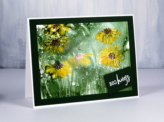
I began by creating a green background with the help of some isopropyl alcohol and green ink (not sure if it was meadow or pesto??) I used a stylus to dot the centres of the flowers in copper and pitch alcohol inks (Ranger) then I used a brush to paint petals around the centres and stems and grass at the base. The splatters of isopropyl alcohol pulled the composition together.
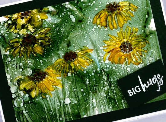
Although it looks black the cardstock framing the panel is actually dark green. I embossed a little sentiment from the PB ‘family sentiments’ set in white powder.
I created a few more panels during the class which hopefully I will turn into cards soon. Thanks Kathryn for a wonderful class.
Supplies
Alcohol ink trio
Posted: January 15, 2019 Filed under: Alcohol Ink, Dragonfly Frame, Serenity | Tags: Penny Black creative dies, Ranger Alcohol Ink, Yupo Paper 11 Comments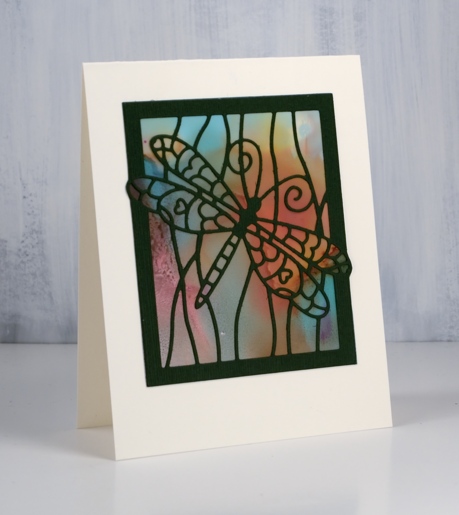
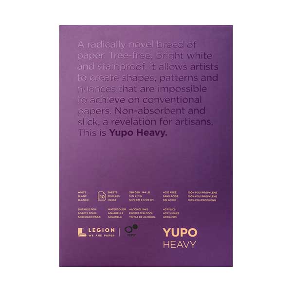
I created these alcohol ink panels months ago! They were the result of a primary colours experiment with pool (blue), raspberry (red) and honeycomb (yellow) alcohol inks and both heavy and light weight yupo paper. I restricted myself to the three colours to see what I could come up with and how they reacted with each other.
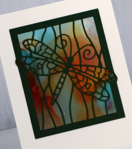
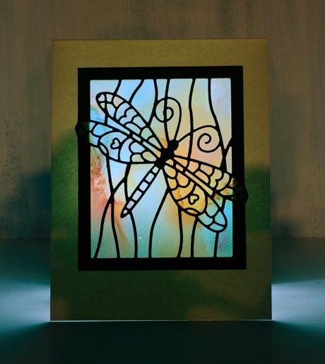
I was able to get very soft blends by adding rubbing alcohol and tilting the yupo around. This panel was done on light weight yupo which is translucent. When I held it up to the light the colours softened and looked like stained glass. I decided I had to cut the cardstock out behind the dragonfly ‘window’ so a light could be placed under the card to show off its soft blended colour. Not a real tealight mind you, remember this is paper crafting! I took a photo to give you an idea of the pretty stained glass effect you see with a soft light underneath.
The same colours appeared but with more lines by working the inks for longer. By that I mean that I kept adding and tilting and blending so there are more secondary and tertiary colours in the mix.
When it came to making the panels into cards I decided die cuts over the top was all I wanted to add. I used three Penny Black dies, dragonfly frame, serenity and heartfelt thanks. For all the cards I put double sided adhesive on the back of the green cardstock before die cutting the images and words.
In the final sample I was able to keep some of each ink colour distinct as well as each secondary colour (blue+yellow=green) (yellow+red=orange) (red+blue=purple). There is also a bit of brown which is is a tertiary colour made when a primary and a secondary mix.
I created this panel by dropping the inks onto the yupo panel and letting them move and fill the space. When there was a good mix of colour patterning the whole area I switched to placing tiny drops of ink or rubbing alcohol onto the panel to create the bubble patterns. Each tiny drop expanded into a little circle or blob shape. The pattern looked very busy all on its own so I just added a small die cut word.
Supplies
Dies: serenity, dragonfly frame, heartfelt thanks (Penny Black)
Inks: pool, raspberry, honeycomb Ranger alcohol inks


Paper: yupo both light and heavy weight, neenah cream cardstock, green textured cardstock

![]()

Also: double sided adhesive, rubbing alcohol

Paint pouring or string painting?
Posted: December 18, 2018 Filed under: paint pouring | Tags: paint pouring, Penny Black creative dies, Penny Black stamps, Yupo Paper 9 Comments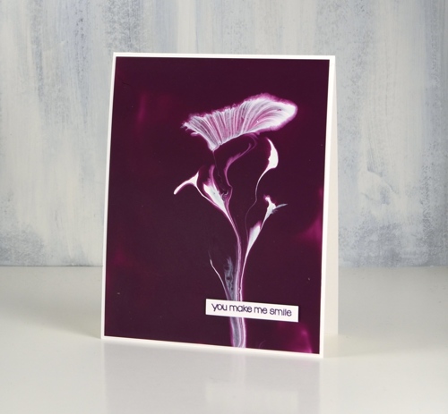
I have seen a little bit of chat in comments about my recent paint pouring panels. Are they what we know as paint pouring or are they string painting? I am a newbie at this so I’m not the best one to ask. I do have one more string painting panel for you today along with what is known as a ‘dirty pour’. I thought both turned out rather nice and this is just adding to my desire to try all these methods again plus a few more techniques I have found on the interwebs.
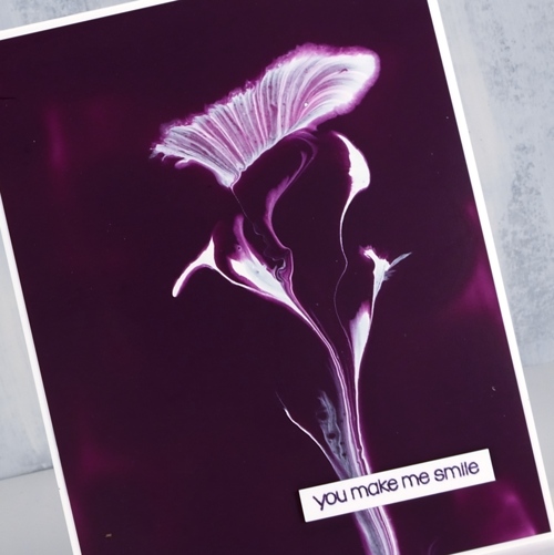
The string paint pouring panel above was completed with just the two colours, a base of deep pink paint on a yupo panel then a piece of string dipped in white paint, laid in twists and turns on the wet panel then carefully dragged off leaving a trail of paint behind it.
This second panel is a ‘dirty pour’ created when several colours are poured into a cup together, cup is turned upside down onto the yupo panel then lifted to let the paint escape in all directions. A little tilting this way and that can change the size and shape of the pattern but really I didn’t do much; the magic just happened. I also didn’t do much to turn the panels into cards, a tiny sentiment stamped in monarch versafine clair ink on the top card and a stacked die-cut sentiment on the second card.
I know I keep mentioning this but I would like to thank my card making, blog reading friends for supporting me in the Dressember campaign this year. I am wearing a dress every day this month and my fundraising total is steadily moving towards the $1800 goal I have set for myself. Readers of this blog have blown me away with their involvement. The money raised world wide will be given in grants to organizations doing amazing work in the locating, rescuing and empowering of human trafficking victims. If you would like to give to this life changing work visit my campaign page here. If you would like to check and see the daily dresses, I’m posting them on Pinterest and Instagram. I’m sending out cards to all my donors so one of today’s cards could be yours!!
Supplies
Paper: heavy weight yupo (legion), neenah solar white cardstock, purple cardstock

Stamp: snippets (PB)

Die: deco frame (PB)

Also: stick it adhesive sheets (for the little die-cut)
A little more paint pouring
Posted: December 11, 2018 Filed under: Dies, paint pouring | Tags: paint pouring, Penny Black creative dies, Yupo Paper 9 Comments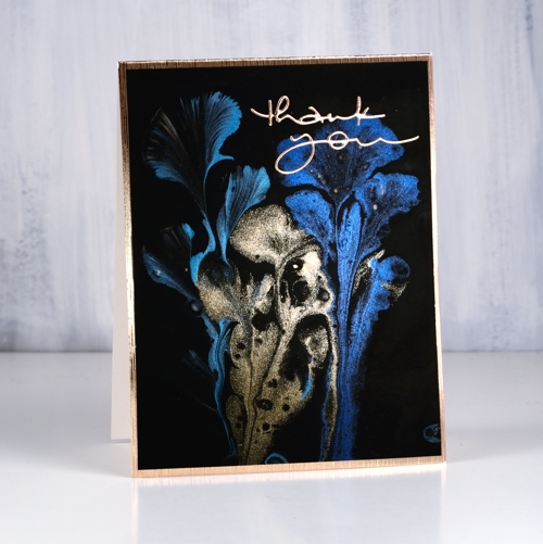
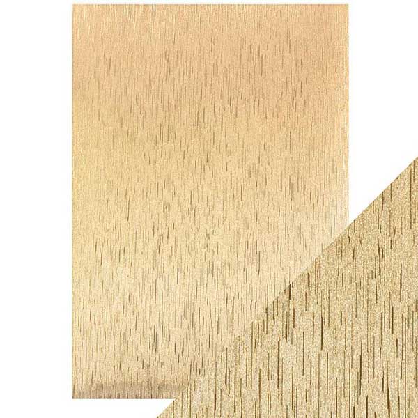
Yes, I have more from my paint pouring adventure to share! This one was done with metallic paints as you can see. When you pour or in this case ‘drag’ them onto the base colour the metallics don’t look very shiny but as they dry, well, you can see how lovely they are. To turn this one into a card I searched through my gold cardstock to find a match with the gold paint. I am a bit fussy with gold cardstock, some is too coppery, some too brown, too yellow, too light, too dark; you get the idea. The one that matched the best this time is a textured gold made by Tonic and it has a white back so I turned it into the card base. I also die-cut a ‘thank you’ from the same cardstock.

As I mentioned yesterday I won’t go into the how-to of paint pouring this time around but if I keep doing it I will definitely share what I learn. For those of you who have done some paint pouring this one was done by dipping some crochet thread in coloured paint, laying it on a base of black paint and gently pulling it through the black paint and off the panel.
I’m not sure of the brand of paints as I don’t own any (yet) but the matte colours came from a dollar store and the metallics from an art store. I was pleasantly surprised to find how many of the supplies could be bought from a dollar store or hardware store.
I have another paint pourer to recommend today and as I said yesterday be prepared to disappear into youtube land for quite some time! Mixed Media girl’s paintings are also mesmerising.
Supplies
|

https://linkdeli.com/widget.js?1549439153802
Paper: heavy weight yupo (legion), gold satin cardstock (tonic)

Die: many thanks (PB)

Also: stick it adhesive sheets (for the little die-cut)
A little paint pouring
Posted: December 10, 2018 Filed under: paint pouring, YAY for you | Tags: My Favorite Things, Penny Black creative dies, Yupo Paper 10 Comments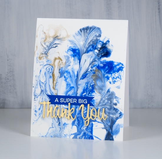
I did some paint pouring yesterday with some friends who had done it before and had skills they were willing to share. I was excited to go and try it but fairly certain it would just be a fun experiment rather than a new passion. Not so sure anymore!! It is very addictive, a bit like alcohol inks and the way they keep moving and doing magical things.
I did several pours on heavy yupo and a couple of little canvases. They take a while to dry so I have turned only one into a card so far. I won’t go into detail about the technique or supplies; I’m too much of a newbie. If you want to learn about paint pouring then look up Myriam’s Nature on youtube and prepare to give up the rest of your day being mesmerized by her beautiful panels. My base for this design was white paint then I dipped threads into blue paint and gold paint and dragged them across the panel to create these pretty patterns.
I’ve turned this panel into a thank you card with a Penny Black die and a MFT sentiment. I am so happy to be sending out thank yous to people who have donated to my Dressember campaign raising money to help fight human trafficking. I am excited that so many of my donations so far have come from people I know through card making, some I’ve met at classes, others read my blog. It is a privilege to be part of such a caring, giving community. Thank you for getting involved. If you would like to donate please visit my campaign page. If you would like to see if I’ve been wearing the dresses each day I’m posting on Pinterest and Instagram.
I will show you more of my paint pouring panels in future posts. Thanks for dropping by.
Supplies
Paper: heavy weight yupo
Stamp: YAY for you (MFT)

Die: wishes (PB)

Alcohol ink splatter
Posted: May 18, 2018 Filed under: Alcohol Ink, branching out, cherry blossom | Tags: Penny Black creative dies, Ranger Alcohol Ink, Yupo Paper 3 Comments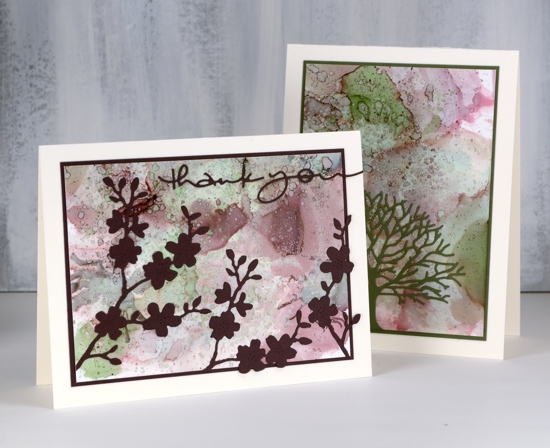
I hope you have enjoyed my alcohol ink projects this week. I could have happily continued playing with colour combinations and different techniques but other projects beckoned.
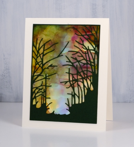
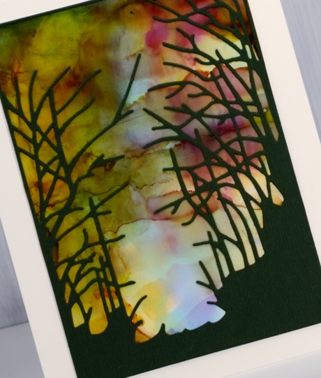
Once again I used a colour combination curated by Ranger; this one is called ‘Cottage Path’ and includes slate, currant and meadow. I worked on the heavyweight yupo paper and dropped inks randomly over the panel to begin. Once there was plenty of coverage I used a small cheap paintbrush (plastic bristles) to flick rubbing alcohol as well as the ‘cottage path’ inks over the panel. The result is very fine circles over the top of the larger blobs of colour.
I matched my cardstock to the ink colours and die cut a tree from green using the Penny Black ‘branching out’ die then matted my panel with the same colour. On the other card I cut a couple of ‘cherry blossom’ die cuts plus a sentiment.
Supplies
Dies: branching out, cherry blossom, many thanks


Inks: Cottage path alcohol inks (Ranger)

Paper: heavyweight yupo (Legion) natural white (neenah), burgandy and green
Amazing Friend
Posted: May 16, 2018 Filed under: Alcohol Ink, Anything but basic friendship | Tags: My Favorite Things, Ranger Alcohol Ink, Yupo Paper 7 Comments
If you have played with alcohol inks you will know it’s hard to stop once you get started. When I was trying out my new heavyweight yupo from the Foiled Fox I decided to experiment with another colour combo packaged by Ranger. This panel features the three inks from the Miner’s Lantern set, stonewash, rust and pitch black. What I loved about these colours as I started experimenting was the variety of tones and shades I was able to get as the colours mixed.
To create the patterns I dropped the colours randomly on the yupo then blew air on the drops with a straw. You can use a can of compressed air or an air brushing tool also. If you blow on the inks when they are still wet they spread into flower shapes and create pale transparent patterns. I used some drops of rubbing alcohol also which dilutes and mixes the inks.
When the panel was dry I trimmed it to fit on a black card base and added a die cut sentiment and an embossed sentiment both from My Favorite Things. The word die (from the ‘friend duo’ set) I cut from black foam and black cardstock. Before I attached them to the panel I embossed the black cardstock word in clear powder to give it a shiny surface. I glued the foam down first, then the embossed cardstock ‘friend’ on top. I embossed a phrase from the MFT ‘Anything but basic Friendship’ set in gun metal embossing powder – a new colour from Ranger.
My favourite part of the panel is this top left corner with all the blues!
Supplies
Stamps: Anything but Basic Friendship (MFT)

Die: Friend Duo (MFT)

Ink: Miner’s Lantern Alcohol ink (Ranger), Versamark (Tsukineko)


Paper: Heavy weight yupo, Neenah black cardstock

Also: black foam, clear embossing powder, gun metal embossing powder (Ranger)

![]()
The pickle people
Posted: July 12, 2017 Filed under: Alcohol Ink, CAS | Tags: Ranger Alcohol Ink, Yupo Paper 14 Comments
I have a fun one for you today. I did this little panel way, way back when I first started playing with alcohol inks. I dropped ink on yupo paper then blew it with compressed air to create some random shapes. Only later did I see I had created pickle people.
You’re welcome.

Butterfly Trio
Posted: July 11, 2017 Filed under: Alcohol Ink, butterfly trio | Tags: Penny Black creative dies, Ranger Alcohol Ink, Yupo Paper 9 Comments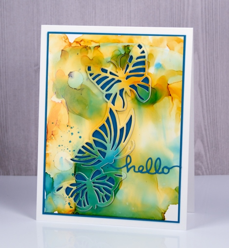
After waiting patiently through a longer than usual spring, summer finally seems to have arrived in Ottawa. The sunny days are punctuated with frequent rain but at least it is shorts and sandals weather! The background for today’s butterfly card seems pretty summery to me.
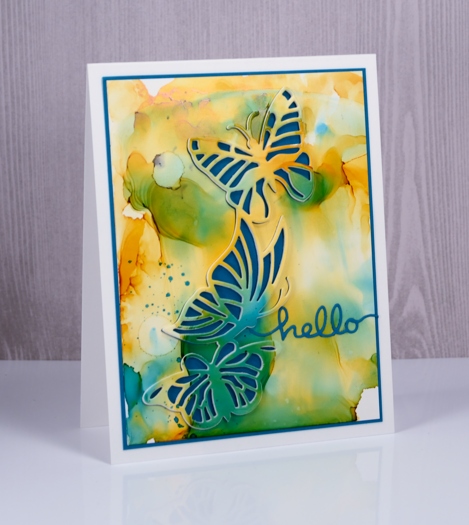
I used alcohol inks on yupo paper to create the background then attached the yupo to white cardstock before die-cutting the butterfly trio from the panel. I also die cut the butterflies from white fun foam so I could pop the trio up out of the background. I did not replace the little die cut shapes in the wings but matted the whole panel in teal instead to create a frame that matched the wings and the sentiment.
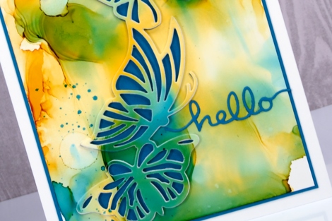
I hope the sun is shining where you are.
Supplies
Dies: butterfly trio, doodles (PB)
Inks: sunshine yellow, stream, pesto alcohol inks (Ranger)
Cardstock: yupo, solar white (Neenah), teal cardstock
Bamboo
Posted: April 20, 2017 Filed under: Alcohol Ink, bamboo cut out | Tags: Penny Black creative dies, Ranger Alcohol Ink, Yupo Paper 6 Comments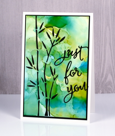
I have combined a new die, ‘bamboo cut out’ with an alcohol ink background to create this simple design. As the name of the die suggests, the die cuts out all the little pieces to make up some stalks of bamboo. The easiest way to make this card would have been to cut the bamboo out of the alcohol ink panel to reveal the black background behind and I would suggest using that method. For some strange reason however, I chose to cut the bamboo out of black cardstock and attach all the little pieces to the alcohol ink panel.
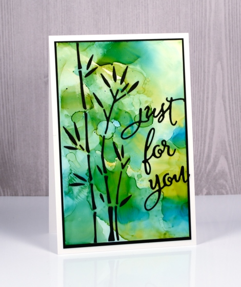
I put double sided adhesive on the back of the black cardstock before die cutting then held all the pieces together with a sheet of ‘press & seal’ so I could attach them to the alcohol ink panel but it was a tad fiddly!
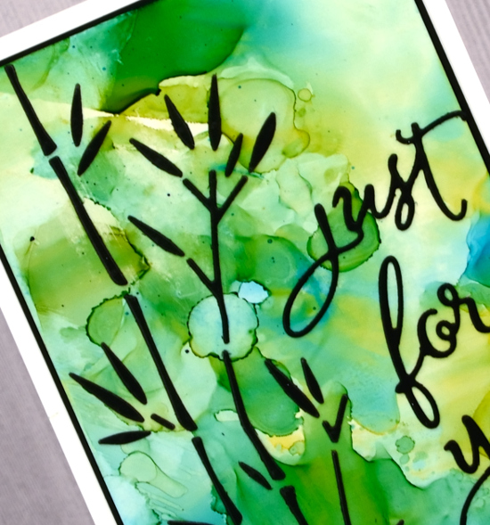
I made the alcohol ink panel on white yupo paper. I dropped some blue and yellow alcohol inks on a craft sheet, added some rubbing alcohol then swiped the yupo through it to pick up the blended coloured patterns. The colours reminded me of light through a forest so I chose the bamboo to be my feature image.
Supplies
Dies: bamboo cut out, for you
Inks: honeycomb & stream alcohol inks (Ranger)
Paper: white yupo paper, black cardstock
Also: stick it adhesive, rubbing alcohol


