
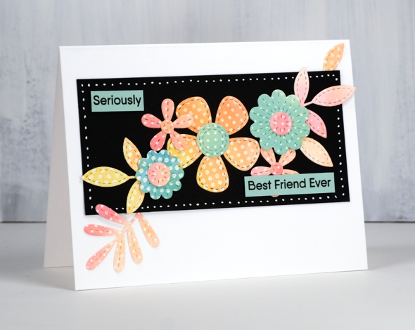
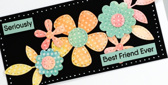
Pencil Florals
Posted: September 10, 2020 Filed under: Anything but basic friendship, fine line floral, Inktense pencils, My Favorite Things | Tags: Inktense, My Favorite Things 9 Comments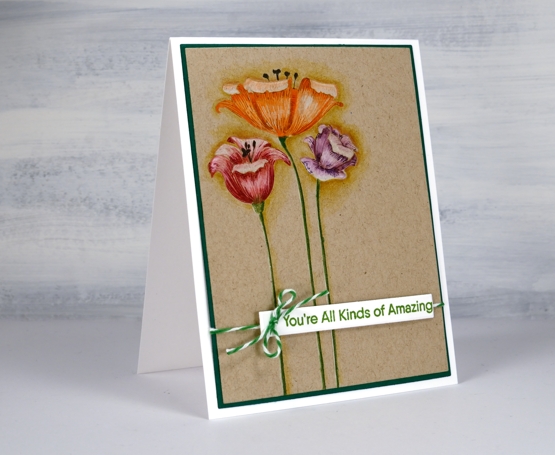
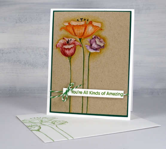
These sweet and quirky flowers are from the My Favorite Things set, ‘fine line floral’. I’m sharing this card and process over on the Foiled Fox blog today and hope you will join me there.

There is a lot of fine line detail (as the name suggests) in the flower heads so they look good stamped with a detail ink. I decided to do some pencil colouring first but was able to add detail over the top with some stamping after all the colouring was done.
All three flowers are part of one stamp so I stamped in antique linen ink on kraft cardstock to do some no-line pencil colouring. I used inktense pencils which are water-soluble but can be used without water too. All the petals are coloured with a mix of white and a colour, blending the two with white to soften the transitions. I kept the panel in my stamp positioner the whole time I was colouring which made it possible to stamp the fine detail over the top. To add the fine detail I used distress markers and just shaded lightly on the stamp towards the base of the petals and at the top. I was pleasantly surprised to see how the detailed lines popped with just that extra bit of stamping.
I did some shading around the flowers to lift them a little and then added a sentiment from the MFT ‘Anything but basic friendship’ set with some twine to match the stems.
All the bits and pieces to create this card are available in the delightful Foiled Fox online store and their blog is overflowing with inspiration. See you over there!
Supplies
Wonderful
Posted: January 30, 2020 Filed under: Anything but basic friendship, My Favorite Things, Roses all over | Tags: My Favorite Things, Penny Black creative dies, Ranger Distress inks 5 Comments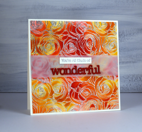
This lovely background stamp from MFT is brilliant for trapping colour. My first choice would be to colour it with paint powder like brusho or colourburst but a quicker and less messy technique is to rub distress ink cubes across the embossed panel randomly. I embossed ‘roses all over’ on hot pressed watercolour paper with silver embossing powder then randomly rubbed fossilized amber and candied apple distress inks over the panel. Because of the embossing the ink didn’t saturate the whole panel but it did leave some colour in all the sections.
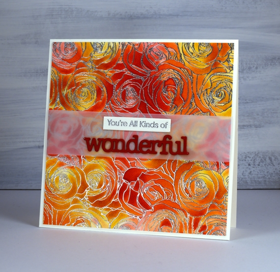
Next I liberally spritzed the panel so the inks would dilute, blend and fill the petals. This technique is one a friend of mine affectionately calls ‘drowning’. The ink mixed pretty well by itself but I did use a paintbrush here and there to make sure the whole panel was coloured. I dried it, trimmed it and added a band of vellum so my sentiment strip and die-cut would not have to fight with the busy background.
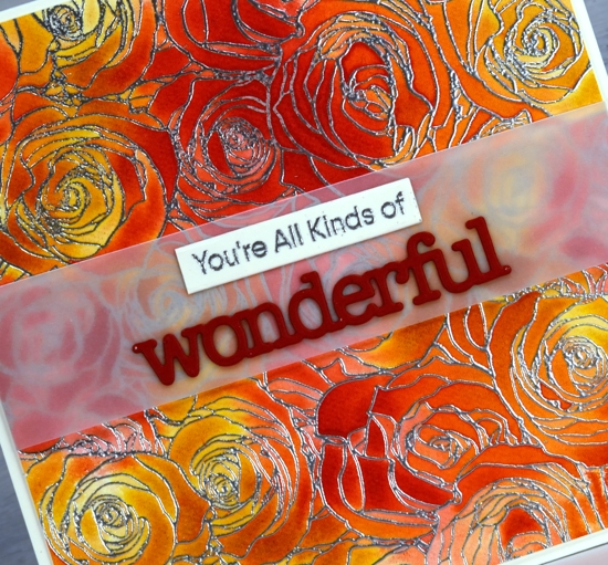
I stamped part of a MFT ‘anything but basic’ sentiment on an Avery Elle simple sentiment strip. I use those sentiment strips all the time; I have a stash cut and ready on my desk for every third card! I cut the PB ‘wonderful’ twice from red cardstock (with ‘stick it double sided adhesive’ on the back) and stacked them on the vellum.
I enjoyed reading your comments about the black watercolour paper and I’m happy some of you are inspired to pull out your own to do a little experimenting. You’ll definitely be seeing it again here.
Supplies
Stencilled blooms
Posted: July 16, 2018 Filed under: Anything but basic friendship, friend duo die, stitched blooms | Tags: Catherine Pooler inks, My Favorite Things 3 Comments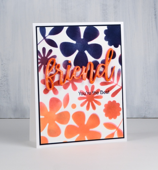
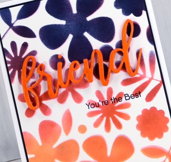
Last week I used a new stamp and new dies from MFT to create some dotted stitched blooms cards. As I had die cut the leaves and flowers from my painted panel without separating the dies I was left with a negative panel. It was quite pretty painted in party dress, bellini and shea butter inks but I decided to use it as a stencil not as a feature. I taped it over a piece of neenah solar white paper and sponged three CP inks through the leaf, flower and dot spaces. I used party dress, bellini and juniper mist inks and overlapped them in places. Unfortunately the stencil moved half way through so I started getting some shadow effects – not a problem – I gave several shapes shadow effects. You can see the depth of colour the Catherine Pooler inks give. I have now watercoloured with them and sponged with them, two techniques you’ll see me apply often. I like the results I am getting so I’ll keep putting them through their paces (and add a few more to my current collection of five).
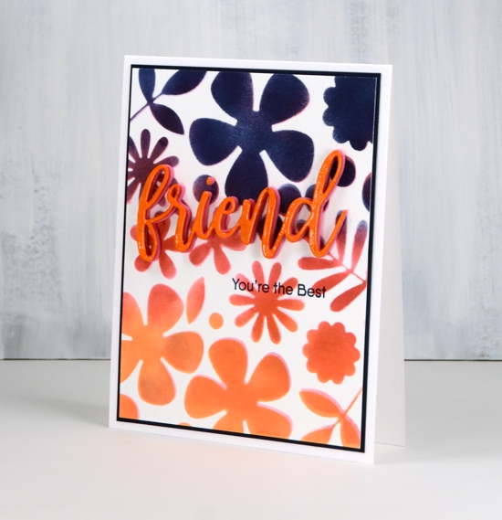
With such bold colours and shapes in the background I needed to make my sentiment stand out. I cut the word friend from orange cardstock, embossed it in clear and added it to two stacked pink foam die-cuts. I added part of a sentiment below in juniper mist ink. To tie that in I matted the whole panel in dark blue and added it to a white card base.
I have one more card made with the last of my three dotted panels; you’ll see that later in the week. Thanks for dropping by.
Supplies
Stamps: Anything but basic friendship set (MFT)
Dies: MFT stitched blooms, MFT friend duo

Inks: Catherine Pooler’s bellini, party dress, juniper mist, versamark

Paper: neenah solar white, dark blue

Also: glue, clear embossing powder
Stitched and dotted blooms
Posted: July 10, 2018 Filed under: Anything but basic friendship, little lowercase letters, radiating half tone background, stitched blooms | Tags: Catherine Pooler inks, My Favorite Things, WOW embossing powders 3 Comments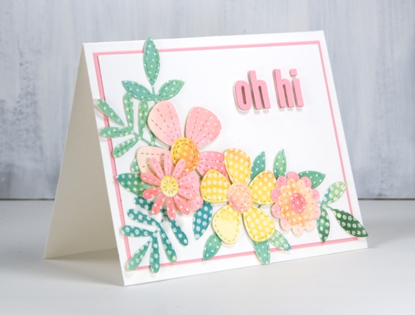
Oh, Hi!
I am excited to have new cards to share and a WINNER to announce. I teamed up with the Foiled Fox to host a giveaway just two short weeks ago and I’m very happy to announce that Lagene is the randomly chosen winner of the $25 gift voucher to spend at the delightful Foiled Fox online store.

Congratulations LAGENE, you will be hearing from the Foiled Fox any minute now!
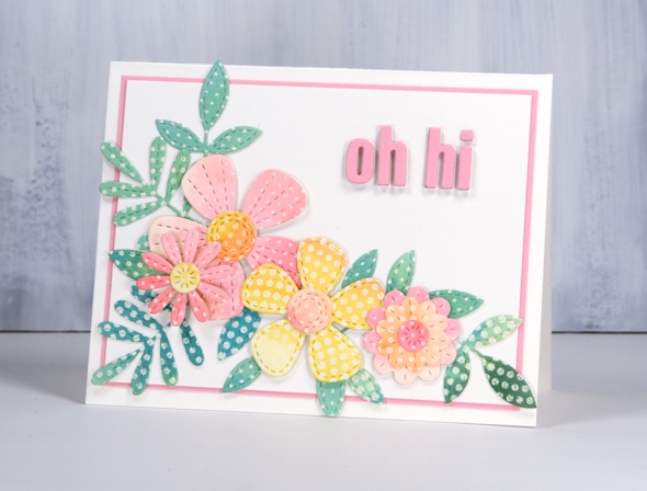
I’m on the Foiled Fox blog today featuring this new funky background stamp, delightful stitched flower dies, sweet letter dies and the oh-so-juicy Catherine Pooler inks. I’ve been planning to make a card layered with floral die-cuts for a while so when the MFT stitched blooms arrived I decided to cut out a whole bunch so I could do some ‘flower arranging’.If you look closely you can see the dots on the flowers and leaves are different sizes, that’s because I used the MFT Radiating halftone background stamp to create some patterned paper. I stamped three panels of hot pressed watercolour paper and embossed with white powder. I then used some Catherine Pooler ink to paint one panel in pink, yellow and orange (inks listed below) and the other two in greens and blue. Once the panels were dry I positioned the whole sheet of dies over the panel without separating any of them. I cut a whole set from both colour schemes then separated the dies so I could cut a few more individual flowers and leaves.
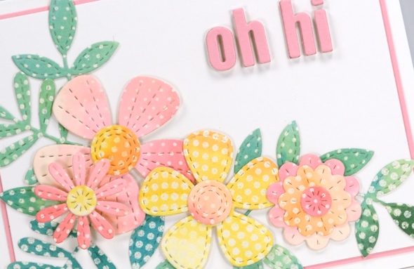
I arranged the pink, yellow and orange flowers with the green and blue leaves on a piece of white paper then, when I was happy with the layout I snapped a pic with my phone so I could recreate it and glue it all down in layers. I used liquid glue for the elements going directly on the white panel and two different thicknesses of dimensional adhesives to raise some of the flowers up higher. To create my little sentiment I adhered some white foam to pink cardstock then cut out the letters using the MFT ‘little lowercase letters’ dies. I used the same pink cardstock to mat the panel and my first flower arranngement was completed.
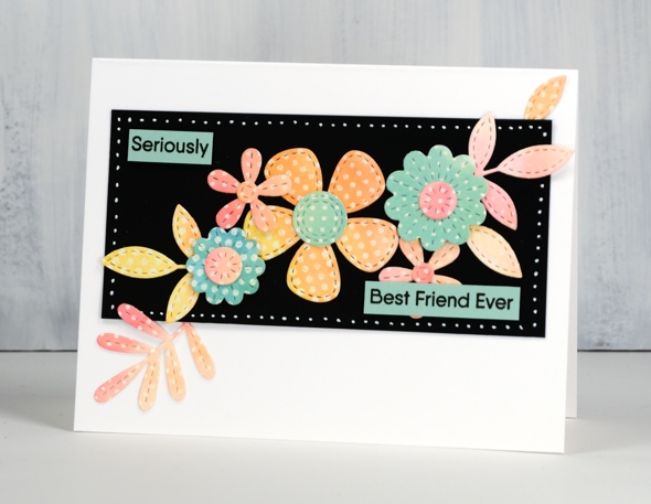
Because I had cut all the dies out of both colour schemes I had pink and yellow leaves left over along with green flowers. I decided to make a smaller arrangement on a narrow black panel and add a stamped sentiment from the MFT ‘Anything but basic Friendship’ stamp set. I stamped the whole sentiment in black on green cardstock then sliced it up to exclude those little words I didn’t need!
I used a white gel pen and a T-ruler to add dots to my panel. When I had finished these two cards I still had an uncut dotted panel in blue/green tones and the negative sheets I had cut the flowers and leaves from. I’ll share what I did with them later in the week.
Supplies
Stamps: MFT Radiating halftone background stamp, Anything but basic friendship set (MFT)
Dies: MFT stitched blooms, MFT little lowercase letters

Inks: Catherine Pooler’s bellini, shea butter, party dress, spruce, daydream, versafine clair nocturne

Paper: hot pressed watercolour paper, neenah black, neenah solar white, pink, green

Also: white embossing powder, mono aqua liquid glue, 3D dots foam dot adhesive, Kool tac clear foam roll, white gel pen, adhesive backed foam, T-ruler
Amazing Friend
Posted: May 16, 2018 Filed under: Alcohol Ink, Anything but basic friendship | Tags: My Favorite Things, Ranger Alcohol Ink, Yupo Paper 7 Comments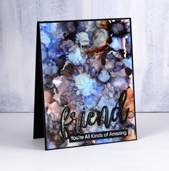
If you have played with alcohol inks you will know it’s hard to stop once you get started. When I was trying out my new heavyweight yupo from the Foiled Fox I decided to experiment with another colour combo packaged by Ranger. This panel features the three inks from the Miner’s Lantern set, stonewash, rust and pitch black. What I loved about these colours as I started experimenting was the variety of tones and shades I was able to get as the colours mixed.
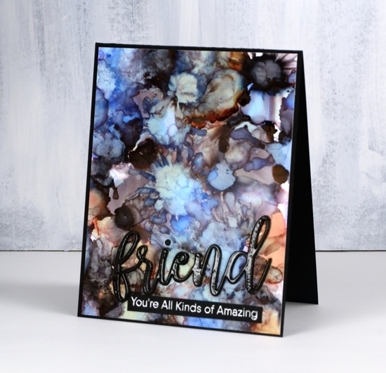
To create the patterns I dropped the colours randomly on the yupo then blew air on the drops with a straw. You can use a can of compressed air or an air brushing tool also. If you blow on the inks when they are still wet they spread into flower shapes and create pale transparent patterns. I used some drops of rubbing alcohol also which dilutes and mixes the inks.
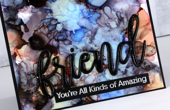
When the panel was dry I trimmed it to fit on a black card base and added a die cut sentiment and an embossed sentiment both from My Favorite Things. The word die (from the ‘friend duo’ set) I cut from black foam and black cardstock. Before I attached them to the panel I embossed the black cardstock word in clear powder to give it a shiny surface. I glued the foam down first, then the embossed cardstock ‘friend’ on top. I embossed a phrase from the MFT ‘Anything but basic Friendship’ set in gun metal embossing powder – a new colour from Ranger.
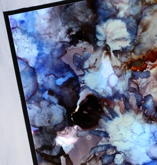
My favourite part of the panel is this top left corner with all the blues!
Supplies
Stamps: Anything but Basic Friendship (MFT)
Die: Friend Duo (MFT)
Ink: Miner’s Lantern Alcohol ink (Ranger), Versamark (Tsukineko)
Paper: Heavy weight yupo, Neenah black cardstock
Also: black foam, clear embossing powder, gun metal embossing powder (Ranger)

![]()


