AI Brussel Sprouts video
Posted: February 18, 2022 Filed under: Alcohol Ink, Concord & 9th, grafix, simple serif alphabet dies, Tutorial | Tags: Concord & 9th, grafix, grafix craft plastic, pinata alcohol ink, Ranger Alcohol Ink, Tutorial, video 9 Comments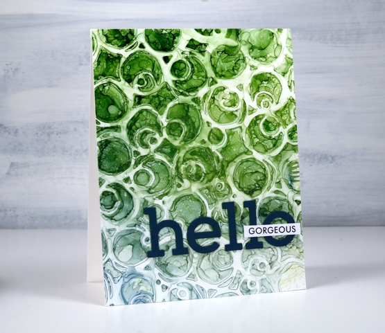
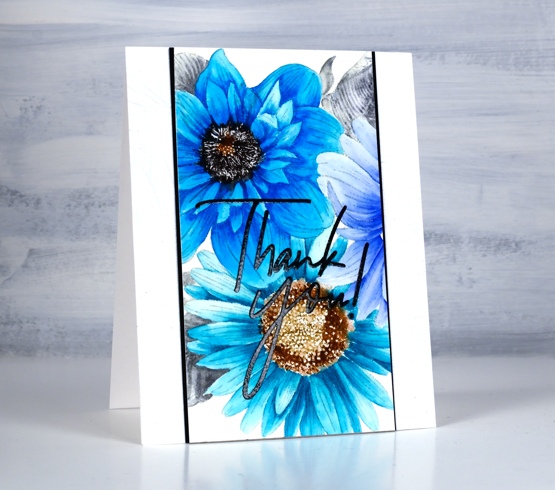
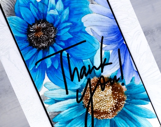
If you are a little baffled by the title of this post don’t worry no brussel sprouts were harmed or eaten or even incorporated into the making of this video! But would you agree that the little patterns formed inside the circles on the panel look a bit like brussel sprouts?
You will see in the video I didn’t set out to make a brussel sprout pattern; I actually changed track part way through the process. The video shows the technique I started with along with stencil technique I ended up doing. So it’s basically a 2 for 1 deal.
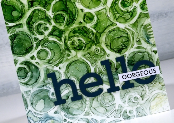
There are several ways to use a stencil with alcohol inks and this is just one. Make sure you check out Ardyth’s youtube channel for more ideas. I mentioned in the video that some alcohol inks tend to be a bit pushy and end up taking over a colour scheme. The lime green did so on this card but I’m glad there are some blues tones still visible at the base of the card.
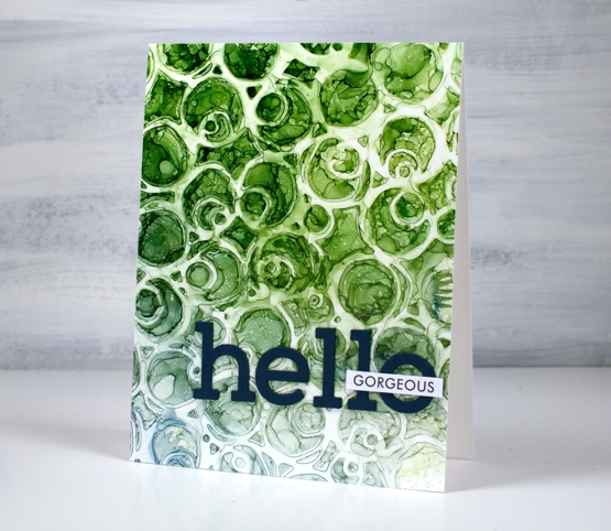
I finished the card with die-cut letters and a single word from Paper Rose Studio’s So Extra sentiment strips.
You can see other cards made using this technique here and here.
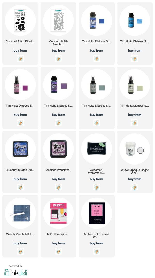
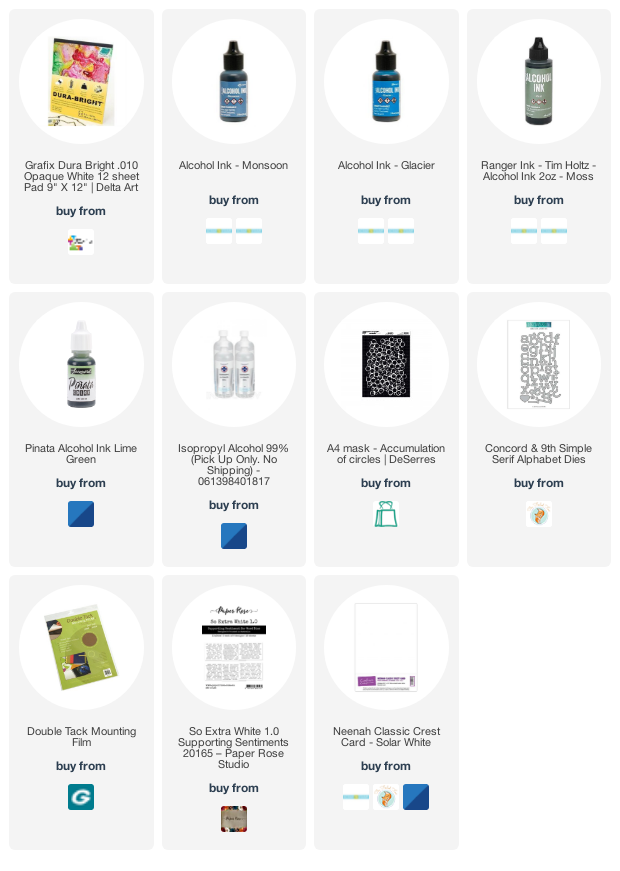
Supplies
(Compensated affiliate links used when possible)
Big & Bold thank you cards
Posted: January 25, 2021 Filed under: Brutus Monroe, Colorado Craft Company, Concord & 9th, Daisy & Dahlia, Karin brushmarkers, phrase builder you, Pink Fresh studio, simple serif alphabet dies | Tags: brutus monroe embossing powder, Colorado Craft Company, Concord & 9th, Karin brushmarkers, Pink Fresh studio 9 Comments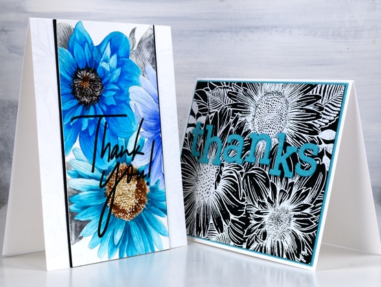
I’ve teamed up with the Foiled Fox again, as I love to do and I’m sharing two cards featuring the Colorado Stamp Company’s ‘daisy & dahlia’ stamp. I made a couple of cards last year with this stamp using a very different colour scheme.
On the card above I wanted to show you how much depth and variation you can get from single Karin brushmarkers. I was so happy to see the light and shadow I could achieve on each petal with one or two dabs of ink from the marker then blending with water. The blue flower on the right which is barely showing was coloured with a bold dark blue but as you can see it was possible to dilute it to a pale blue. I used the following Karin brushmarkers on the panel: black, henna, cool grey , rose wood, cyan, turquoise, royal blue.
It’s not easy to see but you might notice a white on white embossed image on the card base; it’s the same stamp providing a bit of texture. You can learn more about my process by visiting the Foiled Fox blog today
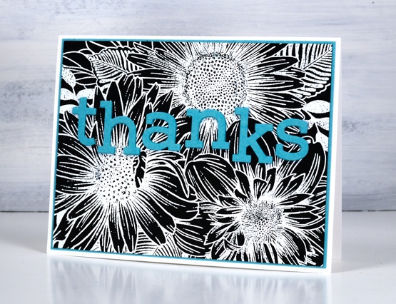
I kept some of the colours but went for a bolder look on my second card embossing the same large stamp in white on black cardstock. As you can see this stamp works as a coloured image and and a black and white image. White on red, red on white, blue on white, there are many colour combos which I’m sure would also look bright and beautiful.

Make sure you check out all the details on the Foiled Fox blog and take the time to check out Shauna’s stunning floral card from last Friday; it is a beauty.
Supplies
(Compensated affiliate links used when possible)
Oh Baby
Posted: May 27, 2020 Filed under: balloons!, City Stacks dies, Concord & 9th, Papertrey Inks, Penny Black, sennelier watercolours, simple serif alphabet dies | Tags: Concord & 9th, Papertrey ink, Penny Black creative dies, sennelier watercolours 8 Comments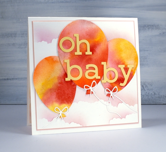
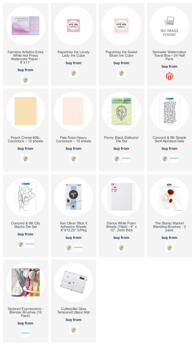
I’m not sure if I have ever posted a baby card on my blog; if I have it was so long ago I can’t remember! This one is a commission for a friend; she asked me months ago and I totally forgot. When she texted the other day to see if it was ready I admitted it was not but I would make sure it was by the next day! I was happy to have thought up a concept all those months ago and my idea came together without hiccoughs.
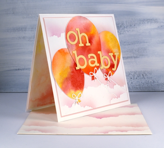
I painted pink, yellow and orange paint on watercolour paper, added water then let it blend and bleed together. Once it was dry I used the Penny Black ‘Balloons!’ die set to cut three balloons then cut the strings and bows from unpainted watercolour paper. I added stick-it adhesive to the back of some peach coloured cardstock then cut two sets of letters to stack for the words using the C&9 ‘simple serif alphabet’ dies.
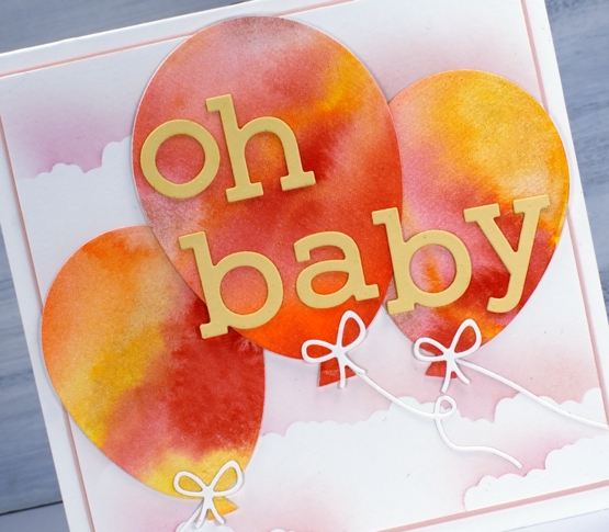
To create the cloudy sky I cut post-it masks using the cloud die from C&9 ‘city stacks’ die set then blended over the edges on a background panel and an envelope using Papertrey ink cubes in ‘sweet blush’ and ‘lovely lady’. I cut a very narrow mat of pale rose cardstock to frame the panel and attached everything to a cream card base.
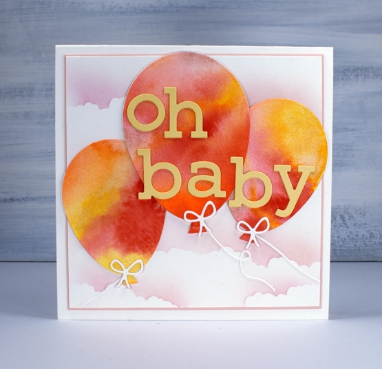
I wondered about cutting more balloons to put inside but instead painted some of the same pink, yellow and orange paint on my glass mat, spritzed it generously to dilute it then placed an extra panel of watercolour paper on top to pick up a pale wishy-washy print.
Seeing that I rarely make baby cards this might become my design of choice when I do need one; I’ll just change the colour scheme to keep things interesting.
Supplies
I’ve been playing with the alcohol inks again!
Posted: October 2, 2019 Filed under: Alcohol Ink, Penny Black, simple serif alphabet dies, tall flowers | Tags: Concord & 9th, grafix craft plastic, Penny Black creative dies, Penny Black stamps, pinata alcohol ink, Ranger Alcohol Ink, Yupo Paper 11 Comments
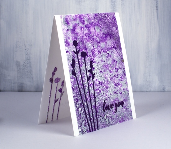
Last weekend I spent Saturday creating with alcohol inks while learning from Kathryn Kanadian who was in Ottawa teaching a couple of classes. Kathryn is a wonderful teacher and I now have a few new tricks to try and techniques to practice. This lavender panel was created with dots of ink on an applicator; I used passion purple, rich gold (Pinata) and juniper (Ranger) along with some blending solution or isopropyl alcohol. I dabbed the applicator all over the craft plastic for quite a while and added blending solution and more ink when needed. The gold ink didn’t move much but the other two colours created a lot of pattern. These delicate flowers which look a little like lavender are cut with PB ‘tall flowers’ dies. The sentiment from the PB ‘special sentiments’ set I stamped with dusty concord archival ink. I had a section of the patterned panel left over so I was able to die cut some more flowers to pop inside the card. You can be sure I put stick-it adhesive on those panels before I cut such skinny flowers out.
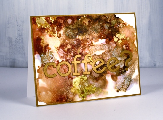
The panel of browns and gold below came together as Kathryn was encouraging us to experiment with blending solution to move the ink. I used more than I usually would and was delighted with all the variation of colour I achieved, the dotted patterns and the splotches of gold here and there. I used ginger, espresso (Ranger) and rich gold (Pinata). Kathryn had samples of her wonderful work including a coffee themed card that inspired this one.
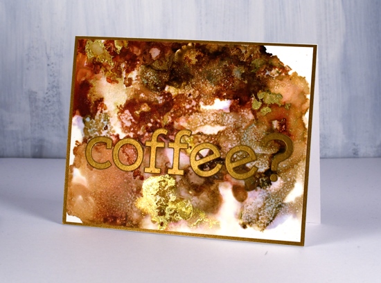
I used the Concord & 9 ‘simple serif’ alphabet dies to cut the letters from antique gold cardstock and framed the panel in antique gold also.
The daisy panel was a bit of a breakthrough for me as I had only made landscapes with alcohol inks by accident or trial and error in the past. With the introduction of a stylus and alcohol ink brushes I was able to paint some daisies and splatter a rain shower over the top of them.
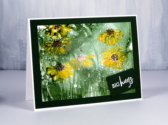
I began by creating a green background with the help of some isopropyl alcohol and green ink (not sure if it was meadow or pesto??) I used a stylus to dot the centres of the flowers in copper and pitch alcohol inks (Ranger) then I used a brush to paint petals around the centres and stems and grass at the base. The splatters of isopropyl alcohol pulled the composition together.
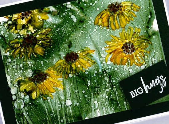
Although it looks black the cardstock framing the panel is actually dark green. I embossed a little sentiment from the PB ‘family sentiments’ set in white powder.
I created a few more panels during the class which hopefully I will turn into cards soon. Thanks Kathryn for a wonderful class.
Supplies
Filling in the florals
Posted: September 6, 2019 Filed under: big thanks, filled in florals, fine line florals, simple serif alphabet, simple serif alphabet dies | Tags: Concord & 9th, Ranger Distress inks 3 Comments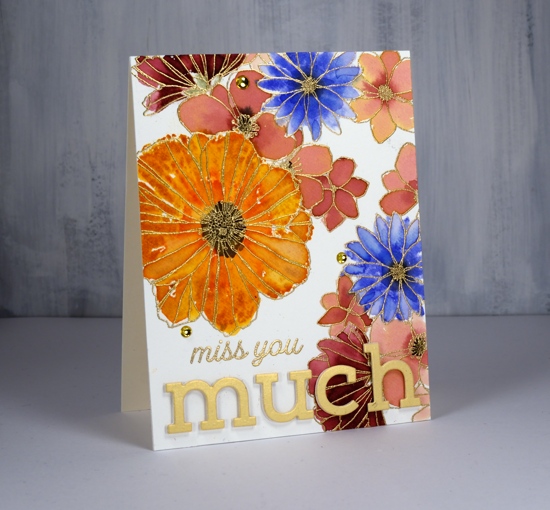
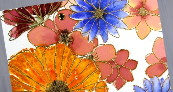
I’ve been playing with Concord & 9th’s co-ordinating stamp sets ‘filled in florals’ and ‘fine line florals’. For this first card I stamped the large ‘fine line floral’ stamp twice in versamark then embossed in gold powder. To fill in the flowers I switched to the ‘filled in florals’ stamps. I inked the large flower in wild honey ink then added abandoned coral ink around the centre. I spritzed the stamp then pressed it over the matching embossed flower. Because I had spritzed before stamping I got a nice blend of colours which loosely filled the outline. I repeated this step with the blue flowers (blueprint sketch) and burgandy flowers (aged mahogany) I diluted some aged mahogany to paint inside the remaining flowers.
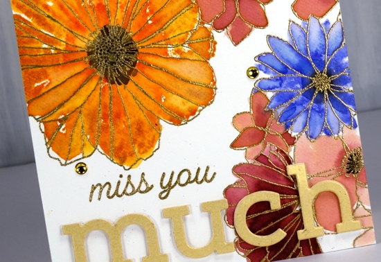
I stamped black soot ink in the centres and bundled sage for the little leafy bit below the petals. I stuck with the gold highlights when adding the sentiment, embossed ‘miss you’ in gold then popped the shimmer gold ‘simple serif’ die-cut letters with white foam. I thought it need just a little something more so added three gold half pearls. Usually I would add splatter but I guess I was feeling fancier!
The inspiration for the second card came as I was stamping off the ‘filled in floral’ stamps after I’d stamped the embossed areas. I grabbed another piece of watercolour paper then inked the flower stamps with the same colours used on the first card, spritzed the stamp then stamped one flower, spritzed again, a second flower, spritzed again and got a third paler flower. Once the panel was fairly full I switched to the leaf stamp, bundled sage and peeled paint ink and added some leaves. I used acrylic blocks for the stamping; there was no need for a stamp positioner with such a loose watery technique.

The watery technique did mean I lost much of the definition of the stamp so I drew some veins on the petals with a spiced marmalade marker once the ink dried. I used the simple serif stamps this time (they match the dies used on the other card) to stamp ‘thanks’ along with one of the sentiments from the C&9 ‘big thanks’ stamp set. This time I did want some black splatter but not all over the place so I chose the safe option of stamping black dots using two stamps from the fine line florals set then drew extra dots with a black marker. A black mat finished it off.
Are you a ‘stay inside the lines’ kind of painter or are you happy to be a bit loose and messy like I was with these cards?
Supplies
Filled in Florals
Posted: July 8, 2019 Filed under: Concord & 9th, filled in florals, simple serif alphabet dies, Wendy Vecchi | Tags: Concord & 9th, Ranger Distress inks, Ranger Distress stains, Wendy Vecchi, WOW embossing powders 3 Comments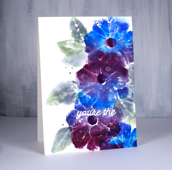
I’m on the Foiled Fox blog today showing off these lovely new stamps and dies from Concord & 9th. The stamps are from the ‘filled in florals‘ set and the dies from the simple serif alphabet set I love the size and shape of these letters and I am able to line them up neatly by using my new magnetic ‘staytion‘ so I won’t need to do the purposely wonky look every time!
I reached for some favourite distress stains to colour the big flower from the set. I used a stamp positioner but acrylic blocks would work fine too as precision is not key for this loose and watery look. As I’m still working with distress stain daubers I swiped the first colour across a third of the stamp, stamped on hot pressed watercolour paper then wiped off the stamp before inking with the next stain in the centre of the flower then repeating the process. I only spritzed the stamp lightly with water before I stamped the last colour on each flower as I didn’t want to flood the design but I did want to make sure the colours did a little blending with each other. I used a mix of blueprint sketch, salty ocean, seedless preserves and dusty concord stains on the flowers switching around the order and combo each time. I stamped the flower centres with blueprint sketch and seedless preserves ink. Is there a more beautiful colour combination than those two stains? I don’t think so!
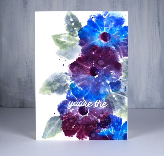
For the leaves I switched to an acrylic block and inked with bundled sage and iced spruce stains and a little spritz of water to make them soft and dreamy. I dried the whole panel before dropping water here and there all over, letting it sit and soak in then absorbing it with a paper towel to leave all those watermarks on the leaves and petals. Last but not least I added a splat or two in blueprint sketch and bundled sage.
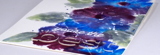
Once all those flowers were done I thought about the sentiment. I know I should consider the sentiment earlier in the process but I rarely do. I didn’t want to cover up too much of the design so I went for the subtle stacked letter die look. I cut the letters b e s t out of the panel and three more of each from blank watercolour paper then stacked them up and attached them on the card. I did some stamp surgery to separate ‘you’re the’ from one of the sentiment stamps in the ‘filled in florals’ set and stamped in versamark ink so I could emboss in white powder. The sentiment is fairly subtle when you look straight on but the recipient will be able to see and feel the texture of the raised letters.
Thank you for dropping in today, make sure you pop on over to the Foiled Fox for some extra details and to check out their lovely blog and store.
Supplies