Florals on Black
Posted: May 21, 2024 Filed under: Concord & 9th, fine line florals, meadow blossoms, online class, Penny Black, radiant | Tags: Concord & 9th, Finetec artist mica watercolour paint, online class, Penny Black stamps 6 Comments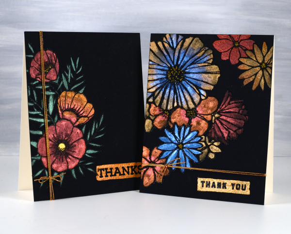
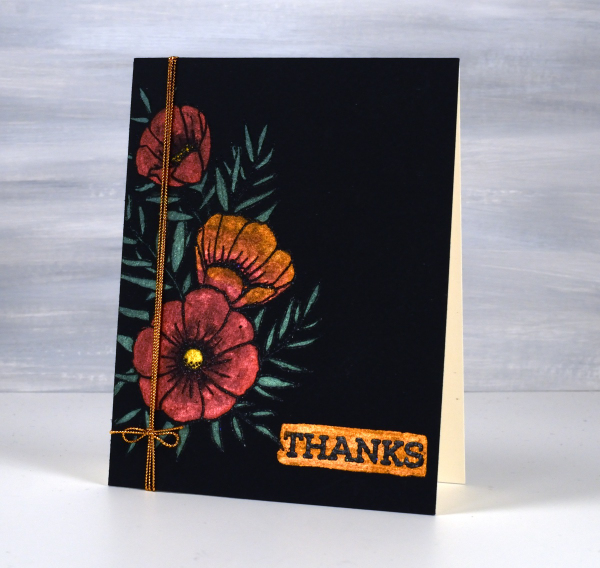
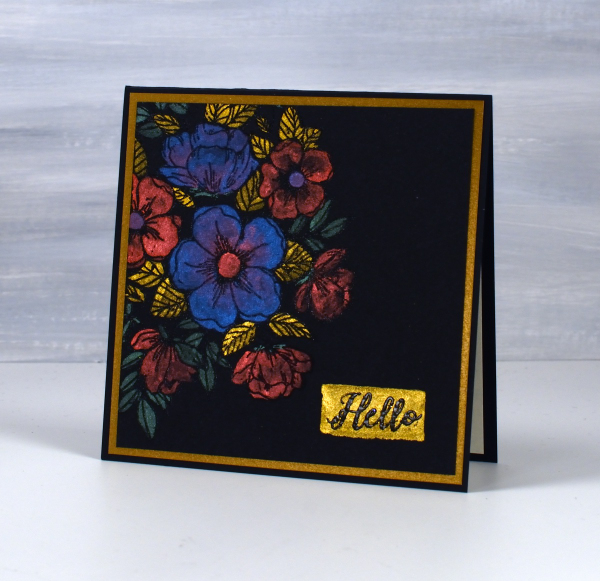
I haven’t used this eye catching technique in a while but I really should try it more often. These two cards were made as part of my Floral Faves online class, a lesson about using metallic watercolours on black watercolour paper. Maybe black watercolour paper has been around for a long time but when I first found it several years ago I was very keen to try it.
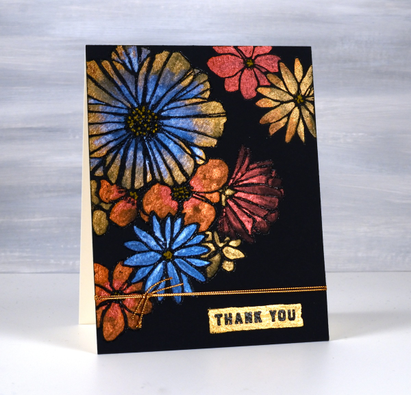
As you can imagine the paints need to be somewhat opaque to show up on black. I use Coliro and Finetec metallic watercolours (two names but all made by Finetec). I have also been given some Beam metallic watercolours which I will try out soon. I used Stonehenge Black watercolour paper for these cards and it worked well. It is very soft so I am careful if using tape on the edges as it lifts the surface off. I just work on a piece slightly larger than I need so I can trim it down to size after painting. I recently bought some of the Van Gogh brand so I will report back once I have tried it.
All these designs were made with embossed outlines making it easier to stay inside the lines. One feature of these cards that I quite like and need to remember to incorporate is the little painted strip where I embossed a sentiment over the top. It’s a trick that doesn’t have to be used only on a black background; I could paint a strip on any colour then emboss on top of it. For the cards featured today I used Penny Black ‘radiant’ set and Concord & 9th ‘fine line florals’ and ‘meadow blossoms’
If you have metallic watercolours let me know in the comments your favourite ways to use them.
New Year florals
Posted: January 6, 2020 Filed under: filled in florals, fine line florals | Tags: Concord & 9th, Ranger Distress inks 9 Comments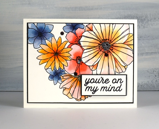
Happy New Year everyone. After a busy but wonderful December full of family visiting from Australia I am getting back into the work groove. I have some lovely products to try out and tell you about in the coming months so thank you for dropping in today to see what I have been doing.
I have used this Fine Line florals stamp from Concord & 9th several times, it is fun to colour loosely, carefully or with co-ordinating stamps that fill the outline images. On this card I used mainly distress markers. I don’t often use my distress markers for colouring directly on the paper, usually I ink stamps with them and then blend the ink with a paintbrush once stamped.
To create this panel I stamped the large image with ranger archival ink on watercolour paper then added colour to the petals with distress markers. On each flower I coloured close to the centre with the marker and blended the colour out to the edges with water and a paintbrush. The first layer on each flower was the palest colour which I let dry before adding a darker colour again from the centre.
I don’t have all the distress markers so I did some colour with markers and some with distress ink smooshed on my glass mat; both techniques work but using the ink gives intense colour more quickly and depending on the colour can be easier to blend. For quick and accurate application the markers are handy. As I use distress markers, inks and stains fairly regularly I have sometimes wondered about doing a comparision of techniques with the different distress products. Is that something you would be interested in seeing?
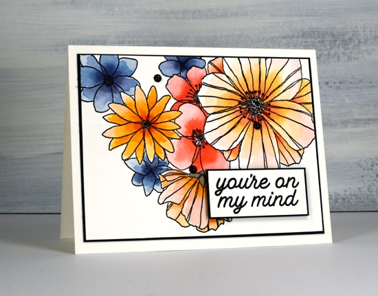
I chose black as an accent colour to team up with the black outline stamping. I cut slim mats and coloured enamel dots with a black sharpie as I didn’t have any black dots on hand. The sentiment is from another C&9 set, ‘filled in florals , and is matted and popped up with black dimensional tape.
Enjoy your day!
Supplies
Filling in the florals
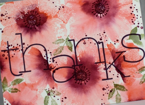
Posted: September 6, 2019 Filed under: big thanks, filled in florals, fine line florals, simple serif alphabet, simple serif alphabet dies | Tags: Concord & 9th, Ranger Distress inks 3 Comments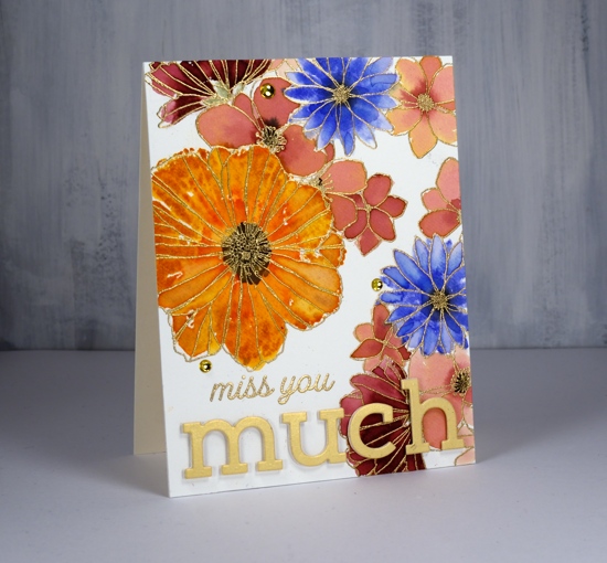
I’ve been playing with Concord & 9th’s co-ordinating stamp sets ‘filled in florals’ and ‘fine line florals’. For this first card I stamped the large ‘fine line floral’ stamp twice in versamark then embossed in gold powder. To fill in the flowers I switched to the ‘filled in florals’ stamps. I inked the large flower in wild honey ink then added abandoned coral ink around the centre. I spritzed the stamp then pressed it over the matching embossed flower. Because I had spritzed before stamping I got a nice blend of colours which loosely filled the outline. I repeated this step with the blue flowers (blueprint sketch) and burgandy flowers (aged mahogany) I diluted some aged mahogany to paint inside the remaining flowers.
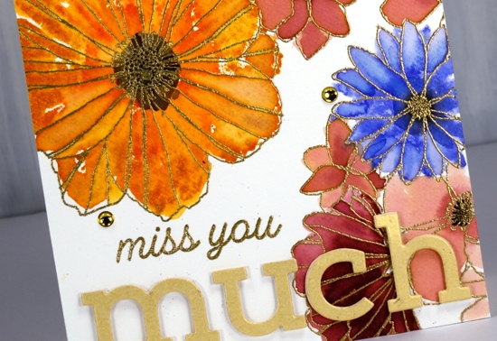
I stamped black soot ink in the centres and bundled sage for the little leafy bit below the petals. I stuck with the gold highlights when adding the sentiment, embossed ‘miss you’ in gold then popped the shimmer gold ‘simple serif’ die-cut letters with white foam. I thought it need just a little something more so added three gold half pearls. Usually I would add splatter but I guess I was feeling fancier!
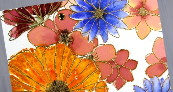
The inspiration for the second card came as I was stamping off the ‘filled in floral’ stamps after I’d stamped the embossed areas. I grabbed another piece of watercolour paper then inked the flower stamps with the same colours used on the first card, spritzed the stamp then stamped one flower, spritzed again, a second flower, spritzed again and got a third paler flower. Once the panel was fairly full I switched to the leaf stamp, bundled sage and peeled paint ink and added some leaves. I used acrylic blocks for the stamping; there was no need for a stamp positioner with such a loose watery technique.

The watery technique did mean I lost much of the definition of the stamp so I drew some veins on the petals with a spiced marmalade marker once the ink dried. I used the simple serif stamps this time (they match the dies used on the other card) to stamp ‘thanks’ along with one of the sentiments from the C&9 ‘big thanks’ stamp set. This time I did want some black splatter but not all over the place so I chose the safe option of stamping black dots using two stamps from the fine line florals set then drew extra dots with a black marker. A black mat finished it off.
Are you a ‘stay inside the lines’ kind of painter or are you happy to be a bit loose and messy like I was with these cards?
Supplies
Fine line florals with distress inks
Posted: May 9, 2019 Filed under: Concord & 9th, fine line florals, thankful leaves turnabout | Tags: Concord & 9th, Ranger Distress inks 5 Comments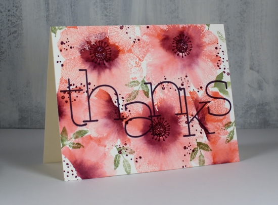
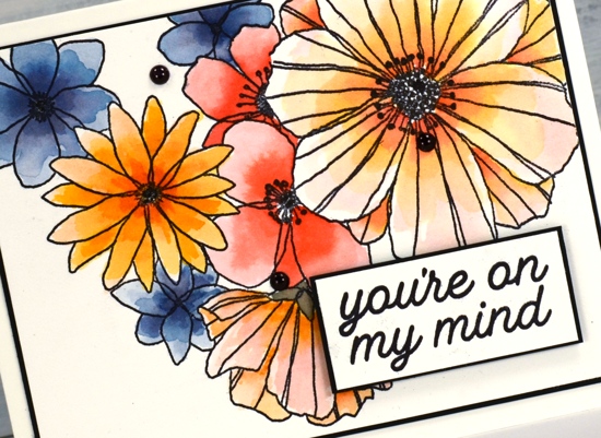
I have another card featuring the fine line florals set from Concord & 9th. I am using a similar technique as in my previous video but I’ve created a patterned panel that covers the whole card front this time. The single flower stamps from this set are made up of very fine radiating lines which look like transparent petals whether blended with water or not. I like the way part of each flower is still lined where as other sections are a soft blend of pink and purple ink. I’m using hot pressed watercolour paper which captures more of the fine lines than cold pressed does.
The Foiled Fox and I have a three-colour challenge happening during May and today’s card is features a simple pink, purple and green colour scheme which packs plenty of punch with its soft pinks through to dark purple. The stamp set includes flower centres and little splattery dots but no leaves so I pulled out a little spray of leaves from the C&9 turnaround leaves set.
I hope you get inspired to try this technique or try a three-colour card for our challenge.
These fabulous big letters are from the C&9 ‘big thanks’ set and I love the font.
Thanks for dropping in today. Hope you have a creative day!
Supplies
Loose Watercolour Florals
Posted: April 24, 2019 Filed under: Altenew, Concord & 9th, fine line florals, Leaf Canopy | Tags: Altenew, Concord & 9th, Ranger Distress inks, Tsukineko Versafine inks 9 Comments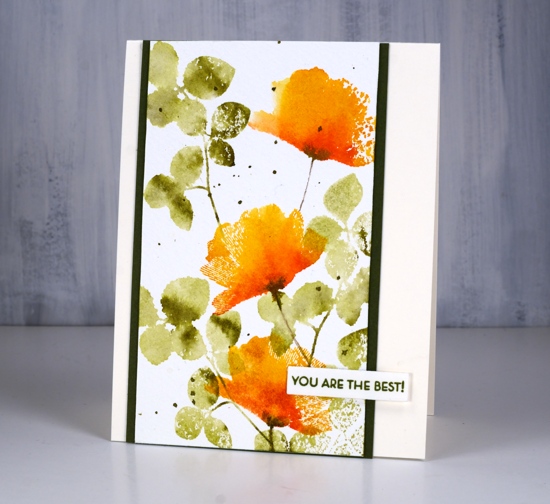
One of my favourite techniques is this simple floral card with a loose watercolour look. The foliage is from the Altenew set ‘leaf canopy’ and the flowers are from the Concord & 9th set ‘fine line florals’ (the same set I featured in a journal page last week). The flower stamp is very detailed with fine lines covering the whole stamp. Because I wanted a loose watercolour look I spritzed water on the inked stamp which meant I lost most of the fine lines. I do like the way a few of them remained giving the petals a slightly transparent look.
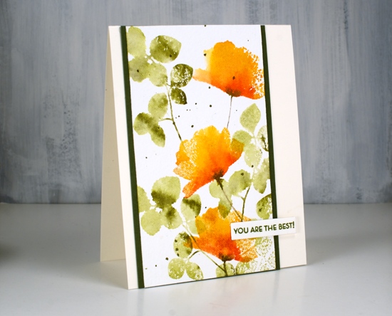
I tried the ink, spritz and stamp method a few times before creating this panel because it was easy to add too much water and end up with a splodge rather than a flower. The experiments only took a little time and a few pieces of watercolour paper so definitely not a waste.

In this close up you can see some of the texture of the cold pressed watercolour paper. Although I often use hot pressed I still reach for cold pressed at times because the rough texture adds interest particularly when using solid or semi solid stamps like these ones.
Supplies
Fine floral journal page
Posted: April 17, 2019 Filed under: Art Journal, Concord & 9th, dots and hearts, Feathered stamp set, fine line florals, Inktense pencils, songbird | Tags: Art Journal, Concord & 9th, Fabriano art journal, Inktense 5 Comments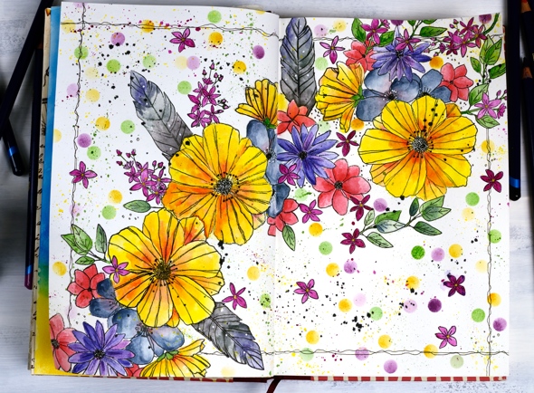
I’ve been experimenting in my journal again featuring some new and old stamps from Concord & 9th. Once again I had an idea in my head and although this does not look like my original idea, I’m very happy with the vibrant look of the massed flowers. I haven’t put any words on this page yet and possibly wont. Now if you are not an art journal type of person, hang in there, I have cards made with the new ‘fine line florals’ set coming over the next few weeks.
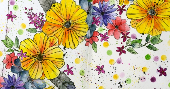
As I mentioned last time a couple of my journals do not have watercolour pages, this one is drawing paper. Sometimes I paint my pages with gesso or absorbant ground before I start or glue other papers to the page. I’ve also glued two pages together a few times to make sure liquids don’t soak through the page. The glued pages are very bulky and bumpy though so I don’t think I’ll keep that up. With this page I wanted to see if I could add watercolouring to an untreated page without it soaking through, breaking down the page or seeping outside the stamped images. Even though I love watercolouring with distress inks or stains I thought they might be too wet. I decided instead to used inktense pencils as I hoped to get vibrant colour with limited water. I tried picking up colour from the pencil lead with a wet brush and painting it into my stamped images as well as colouring the image with the pencil then adding the water over the top. I preferred the look of the former method. When I coloured directly on the page it was more likely that I would end up with shading lines or the colour would seep outside the stamping once I added water. I did get some paint soaking through the next page of the journal so I’ll cover that up with my next spread.
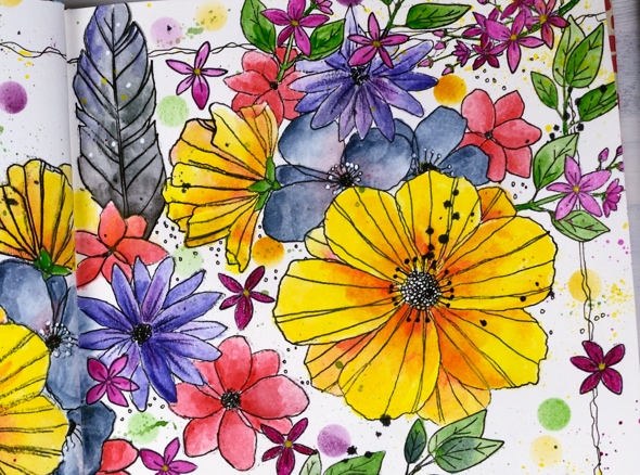
The big flowers are part of a large multiflower stamp from the new C&9 set, fine line florals. I stamped it three times on my journal double page but the page doesn’t sit flat so I was not able to get perfect prints. I was using the fiskars stamp press on the flatter right hand page but used my hand to press the stamp on the bumpy left hand page and tried to do the stamping across the centre of the two pages in two steps while masking the left then right. I kept going even with my patchy stamping and used micron pens to add in missing lines and trace over the pale stamping. I wondered whether the lines I added would be obvious but once all the colour was added it was hard to tell the difference between the stamped and the hand drawn outlines.
The other stamps in my floral explosion are a feather from the C&9 ‘feathered’ set and leaves, flowers and little sprays from the C&9 ‘songbird’ set. I did several layers of colour on the large flowers, letting it dry after each one but just one layer on the leaves, little flowers and feathers. The dots were distress inks sponged through a homemade die cut vellum stencil made with C&9 ‘dots and hearts’ die.

I also did quite a bit of splattering by flicking a wet brush across the lead of the inktense pencils. I added black outlines as I did the watercolouring but when all the painting was finished I went over the centre of the flowers drawing little circle centres with the micron pens and adding little white dots here and there with a white gel pen. To frame the spread I drew a squiggly frame with in black then added some black soot distress stain splatter here and there.
I had fun with this spread and learnt a few things along the way. Hope you are having a great day; thanks for spending some of it here on my blog.