
New Year florals
Posted: January 6, 2020 Filed under: filled in florals, fine line florals | Tags: Concord & 9th, Ranger Distress inks 9 Comments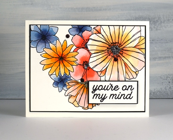
Happy New Year everyone. After a busy but wonderful December full of family visiting from Australia I am getting back into the work groove. I have some lovely products to try out and tell you about in the coming months so thank you for dropping in today to see what I have been doing.
I have used this Fine Line florals stamp from Concord & 9th several times, it is fun to colour loosely, carefully or with co-ordinating stamps that fill the outline images. On this card I used mainly distress markers. I don’t often use my distress markers for colouring directly on the paper, usually I ink stamps with them and then blend the ink with a paintbrush once stamped.
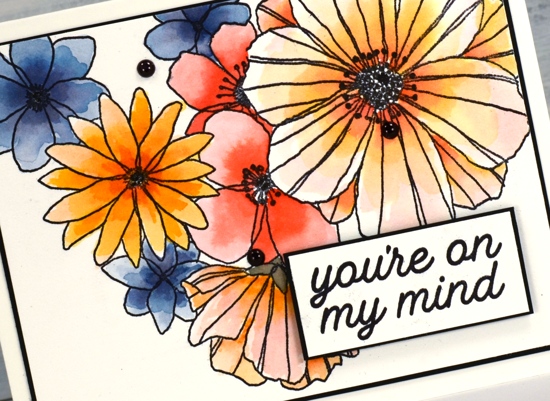
To create this panel I stamped the large image with ranger archival ink on watercolour paper then added colour to the petals with distress markers. On each flower I coloured close to the centre with the marker and blended the colour out to the edges with water and a paintbrush. The first layer on each flower was the palest colour which I let dry before adding a darker colour again from the centre.
I don’t have all the distress markers so I did some colour with markers and some with distress ink smooshed on my glass mat; both techniques work but using the ink gives intense colour more quickly and depending on the colour can be easier to blend. For quick and accurate application the markers are handy. As I use distress markers, inks and stains fairly regularly I have sometimes wondered about doing a comparision of techniques with the different distress products. Is that something you would be interested in seeing?
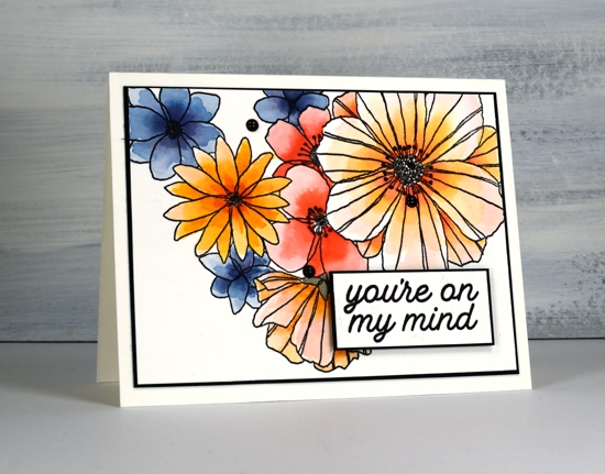
I chose black as an accent colour to team up with the black outline stamping. I cut slim mats and coloured enamel dots with a black sharpie as I didn’t have any black dots on hand. The sentiment is from another C&9 set, ‘filled in florals , and is matted and popped up with black dimensional tape.
Enjoy your day!
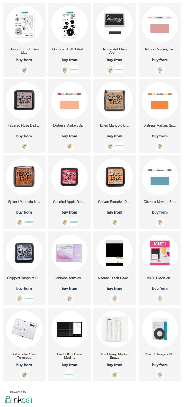
Supplies


I love the card. I use markers and links a lot. Would like to see differences.
This is a lovely card to begin the new work year as it is fresh and full of energy.( I wish I was !)
The colours are great and I would love to see a comparison of techniques. Although my distress markers are not that old, I find they dry out and lose colour quickly.
Gorgeous card! I would love to see your comparison of techniques using distress inks & markers!
Beautiful coloring!
Beautiful colours, lovely flowers! I would love to see a comparison of distress markers, inks, and stains when used for different techniques – I’m never sure which is best to use for what. Thank you in advance!
Another beautiful use of this set, Heather! Happy New Year and thanks for the beautiful card!
I do so admire your colouring, Heather, and love your loose watercolour style. If you have the time, I would really seeing a comparison of the different Distress products. Regards
Cheryl
Sent from Mail for Windows 10
Beautiful! I love the fine lines of this stamp, and how you painted it.
I love the bold black outlines to the flowers and such pretty colours too Heather and a super sentiment to finish. x