
Autumn songbird
Posted: September 27, 2019 Filed under: grateful for everything, songbird | Tags: Concord & 9th, Ranger Distress inks, Ranger Distress stains 7 Comments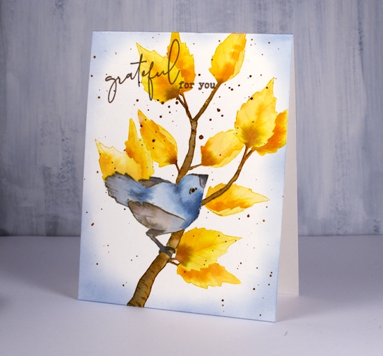
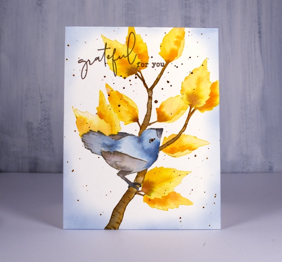
Hi there; it’s a special day! Not only am I hanging out on The Foiled Fox blog today, I also have a video to for you! I first used the Concord & 9th ‘songbird’ set last winter and incorporated the pine boughs, leaves and berries. This time I went for an autumn theme and used distress inks and distress stains as I seem to constantly be doing right now. I may need to mix things up a bit around here.
I have shared a few no-line colouring projects here lately where I stamped with antique linen ink; this project could also be considered no-line colouring but I stamped the outline images in brown, yellow or grey, colours I then used for painting. As the bird and leaves were not too fiddly I cut masks out so I could have leaves peeping out from behind things.
I worked once again with a fairly limited palette of fossilized amber, brushed corduroy, pumice stone, stormy sky and black soot, basically grey, blue and yellow tones.
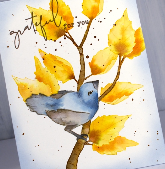
When it came to the sentiment I decided to pull out the C&9 ‘grateful for everything’ set because I love the words and that funky script. I added splatter and some sponging which filled the background a little making it appear lest stark.
I would love to know if you have some favourite ‘all year round’ stamps or sets. Here are a couple more all season options:
PB Nature’s gifts
PB Peaceful Moment
Thank you for joining me today, I’m looking forward to returning in October for some more fun with the Foiled Fox.
Supplies
Fine floral journal page
Posted: April 17, 2019 Filed under: Art Journal, Concord & 9th, dots and hearts, Feathered stamp set, fine line florals, Inktense pencils, songbird | Tags: Art Journal, Concord & 9th, Fabriano art journal, Inktense 5 Comments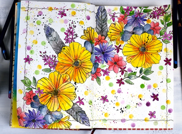
I’ve been experimenting in my journal again featuring some new and old stamps from Concord & 9th. Once again I had an idea in my head and although this does not look like my original idea, I’m very happy with the vibrant look of the massed flowers. I haven’t put any words on this page yet and possibly wont. Now if you are not an art journal type of person, hang in there, I have cards made with the new ‘fine line florals’ set coming over the next few weeks.
As I mentioned last time a couple of my journals do not have watercolour pages, this one is drawing paper. Sometimes I paint my pages with gesso or absorbant ground before I start or glue other papers to the page. I’ve also glued two pages together a few times to make sure liquids don’t soak through the page. The glued pages are very bulky and bumpy though so I don’t think I’ll keep that up. With this page I wanted to see if I could add watercolouring to an untreated page without it soaking through, breaking down the page or seeping outside the stamped images. Even though I love watercolouring with distress inks or stains I thought they might be too wet. I decided instead to used inktense pencils as I hoped to get vibrant colour with limited water. I tried picking up colour from the pencil lead with a wet brush and painting it into my stamped images as well as colouring the image with the pencil then adding the water over the top. I preferred the look of the former method. When I coloured directly on the page it was more likely that I would end up with shading lines or the colour would seep outside the stamping once I added water. I did get some paint soaking through the next page of the journal so I’ll cover that up with my next spread.
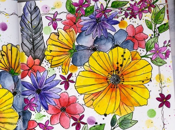
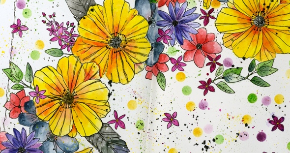
The big flowers are part of a large multiflower stamp from the new C&9 set, fine line florals. I stamped it three times on my journal double page but the page doesn’t sit flat so I was not able to get perfect prints. I was using the fiskars stamp press on the flatter right hand page but used my hand to press the stamp on the bumpy left hand page and tried to do the stamping across the centre of the two pages in two steps while masking the left then right. I kept going even with my patchy stamping and used micron pens to add in missing lines and trace over the pale stamping. I wondered whether the lines I added would be obvious but once all the colour was added it was hard to tell the difference between the stamped and the hand drawn outlines.
The other stamps in my floral explosion are a feather from the C&9 ‘feathered’ set and leaves, flowers and little sprays from the C&9 ‘songbird’ set. I did several layers of colour on the large flowers, letting it dry after each one but just one layer on the leaves, little flowers and feathers. The dots were distress inks sponged through a homemade die cut vellum stencil made with C&9 ‘dots and hearts’ die.

I also did quite a bit of splattering by flicking a wet brush across the lead of the inktense pencils. I added black outlines as I did the watercolouring but when all the painting was finished I went over the centre of the flowers drawing little circle centres with the micron pens and adding little white dots here and there with a white gel pen. To frame the spread I drew a squiggly frame with in black then added some black soot distress stain splatter here and there.
I had fun with this spread and learnt a few things along the way. Hope you are having a great day; thanks for spending some of it here on my blog.
Supplies
https://linkdeli.com/widget.js?1552642647875
Stamping is for the birds part 4
Posted: November 2, 2018 Filed under: songbird | Tags: Brusho, Concord & 9th, Tsukineko Versafine inks 4 Comments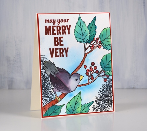
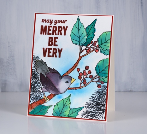
My final ‘stamping is for the birds’ card is made with the Concord & 9th ‘songbird’ stamp set. I stamped on cold pressed watercolour paper in nocturne versafine clair ink then embossed in clear powder.
I’ve been colouring with my peerless watercolours quite a bit lately so I turned to my other love, ‘brusho’ and worked with a limited palette of leaf green, cobalt blue, yellow and brilliant red. Later in my process I added some black to my palette to save me from mixing all my other colours until I had a black.
I used leaf green to paint the leaves then added some cobalt blue to get a darker green for shadow and variation. I mixed red with green to make a brown for the branch, then painted the berries red with some touches of cobalt blue. I wanted the bird to be brown and grey but ended up with purple and grey which is possibly prettier but less realistic. I created the grey by mixing purple with green from the palette I was using. I mixed some black for the tail feathers and painted the beak and feet yellow.
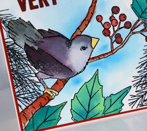
Because the image is embossed it was not too hard to paint the sky around the image. I started by painting water around the edges of the embossing and then dropped in blue paint which I spread out and diluted with more water. Even after the sky was painted the panel seemed a little empty so I add pine branches to the lower left and right edges to frame the scene then embossed a sentiment from the C&9 ‘very merry sentiments’ set.
I am participating as often as possible in Kathy Raccoosin’s ‘ 30 Day Colouring Challenge this month and enjoying the colouring of others as well. Let me know if you are participating.
Supplies
Stamps: songbird, very merry sentiments (Concord & 9th)


Inks: versafine clair nocturne, versafine crimson red


Paper: cold pressed watercolour, neenah natural white, red cardstock


Paints: brusho

Also: clear embossing powder, clear wink of stella
![]()
![]()


