Filling in the florals
Posted: September 6, 2019 Filed under: big thanks, filled in florals, fine line florals, simple serif alphabet, simple serif alphabet dies | Tags: Concord & 9th, Ranger Distress inks 3 Comments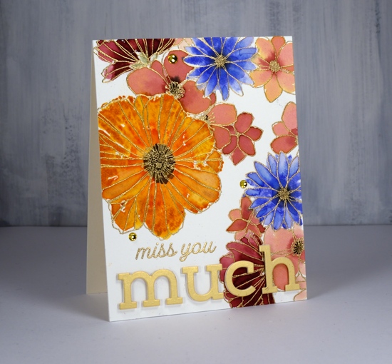
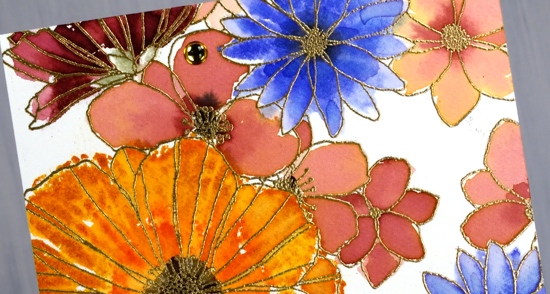
I’ve been playing with Concord & 9th’s co-ordinating stamp sets ‘filled in florals’ and ‘fine line florals’. For this first card I stamped the large ‘fine line floral’ stamp twice in versamark then embossed in gold powder. To fill in the flowers I switched to the ‘filled in florals’ stamps. I inked the large flower in wild honey ink then added abandoned coral ink around the centre. I spritzed the stamp then pressed it over the matching embossed flower. Because I had spritzed before stamping I got a nice blend of colours which loosely filled the outline. I repeated this step with the blue flowers (blueprint sketch) and burgandy flowers (aged mahogany) I diluted some aged mahogany to paint inside the remaining flowers.
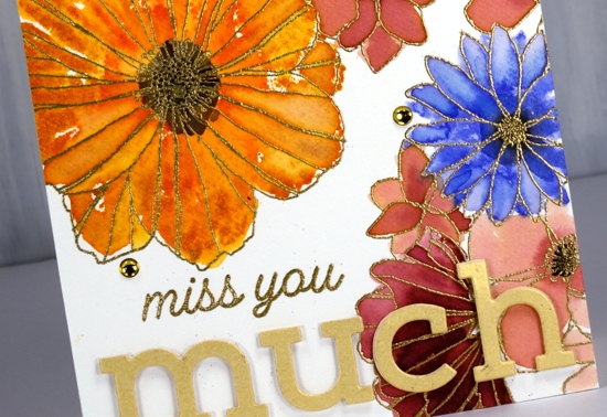
I stamped black soot ink in the centres and bundled sage for the little leafy bit below the petals. I stuck with the gold highlights when adding the sentiment, embossed ‘miss you’ in gold then popped the shimmer gold ‘simple serif’ die-cut letters with white foam. I thought it need just a little something more so added three gold half pearls. Usually I would add splatter but I guess I was feeling fancier!
The inspiration for the second card came as I was stamping off the ‘filled in floral’ stamps after I’d stamped the embossed areas. I grabbed another piece of watercolour paper then inked the flower stamps with the same colours used on the first card, spritzed the stamp then stamped one flower, spritzed again, a second flower, spritzed again and got a third paler flower. Once the panel was fairly full I switched to the leaf stamp, bundled sage and peeled paint ink and added some leaves. I used acrylic blocks for the stamping; there was no need for a stamp positioner with such a loose watery technique.

The watery technique did mean I lost much of the definition of the stamp so I drew some veins on the petals with a spiced marmalade marker once the ink dried. I used the simple serif stamps this time (they match the dies used on the other card) to stamp ‘thanks’ along with one of the sentiments from the C&9 ‘big thanks’ stamp set. This time I did want some black splatter but not all over the place so I chose the safe option of stamping black dots using two stamps from the fine line florals set then drew extra dots with a black marker. A black mat finished it off.
Are you a ‘stay inside the lines’ kind of painter or are you happy to be a bit loose and messy like I was with these cards?
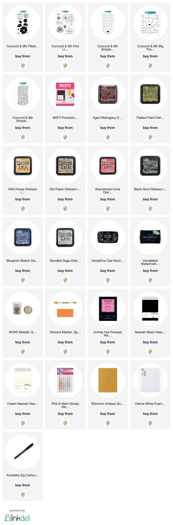
Supplies
Dotty thanks
Posted: April 12, 2019 Filed under: big thanks, dots and hearts, dotted fill in | Tags: Concord & 9th, Ranger Distress inks, Tsukineko Versafine inks 5 Comments
Polka dots are make happy patterns in my opinion. Add rainbow colours and it’s a double happy. I created this simple card with the Concord & 9th ‘dotted fill-in stamp set’. I inked the background stamp with a rainbow of distress inks, spritzed the stamp with water to blend the overlapping colours a little then stamped on watercolour paper.
I thought a bold black sentiment would stand out so I arranged the letters from the C&9 ‘big thanks’ set across the panel and stamped in versafine clair nocturne ink. The only embellishments are little gold circles die cut with the ‘dots and hearts’ die from gold foiled cardstock and popped up over a few of the polkadots.

So simple. So dotty. So happy.
Supplies