Patina peacock pattern
Posted: May 10, 2021 Filed under: Altenew, dancing peacock embossing folder | Tags: Altenew, delicata inks, Ranger Distress inks 7 Comments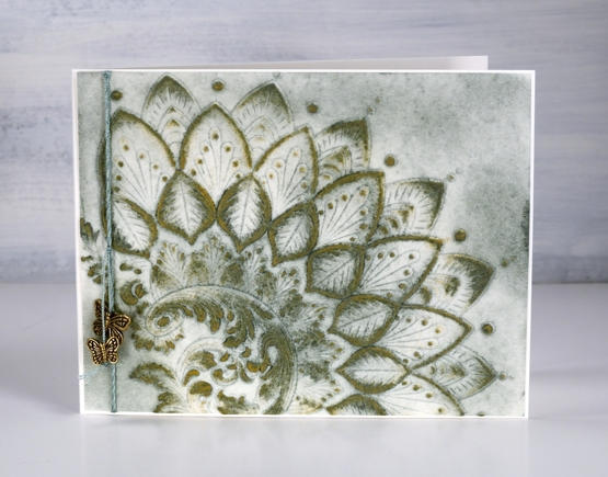
After creating a very colourful panel with the dancing peacock embossing folder I was happy to come up with a more muted and aged looking panel. Like most crafters I am always pleased to use my supplies in many different ways.
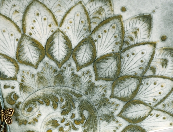
Once again I worked with hot pressed watercolour paper in case I wanted to add water but as it turned out I other than a small spritz to stop the paper from tearing in the folder I didn’t use water. This card turned out to be very much a ‘limited supplies’ card as the green ink (bundled sage) was applied in the embossing folder and then more with a blending brush after embossing. The gold ink (delicata golden glitz) was applied direct to paper so it just landed on the raised sections. Simple but effective definitely describes this technique.
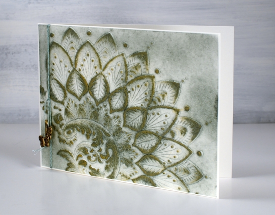
I played with a sentiment strip but ended up embellishing with only green embroidery thread and two brass toned butterflies given to me by a friend quite some crafty time ago. I am hoping for another day of simple but effective creating today!
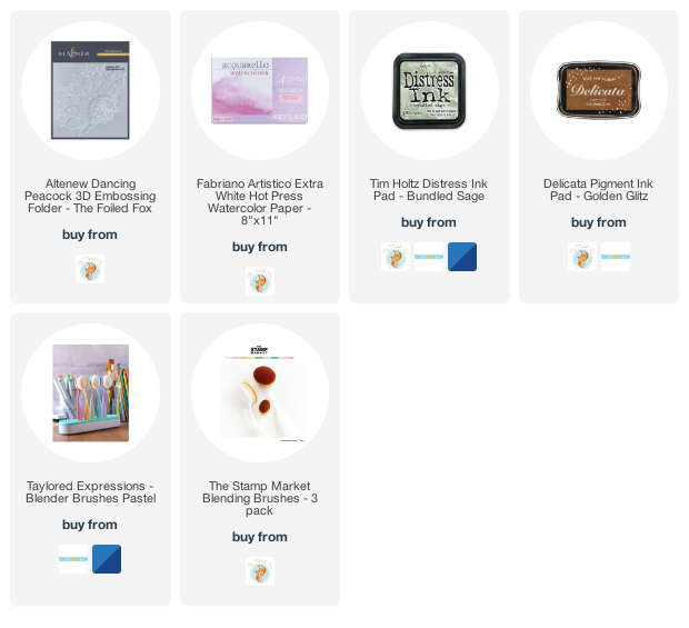
Supplies
(Compensated affiliate links used when possible)
Dancing Peacock
Posted: April 26, 2021 Filed under: Altenew, dancing peacock embossing folder, Heather lowercase die set, Papertrey Inks, Pink Fresh studio | Tags: Altenew, Papertrey ink, Pink Fresh studio 6 Comments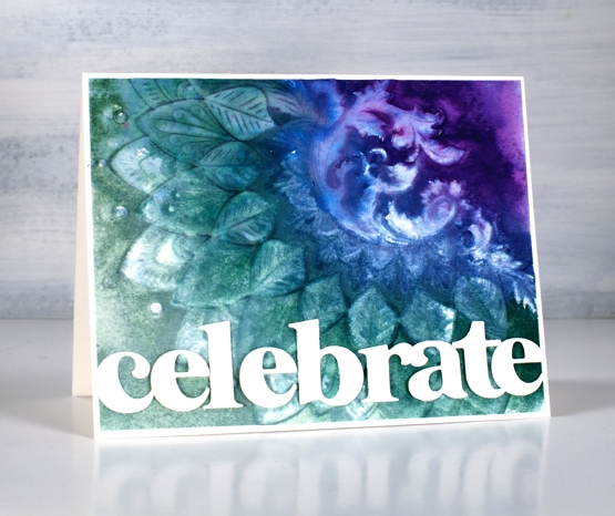
Today is another fun day on my blog because the Foiled Fox and I have teamed up to share this amazing embossing folder with you and to announce the winner of our recent giveaway. In a shared post earlier in April we asked you to tell us what is on your wish list. I really enjoyed reading your answers and share some of your wishes. Today’s card is a result of a wish list longing I’ve satisfied recently. I kept seeing cards with beautiful backgrounds achieved by using an embossing folder. I ordered a few and the Foiled Fox sent me a couple of lovely ones from Altenew including the ‘dancing peacock’ one you see here.
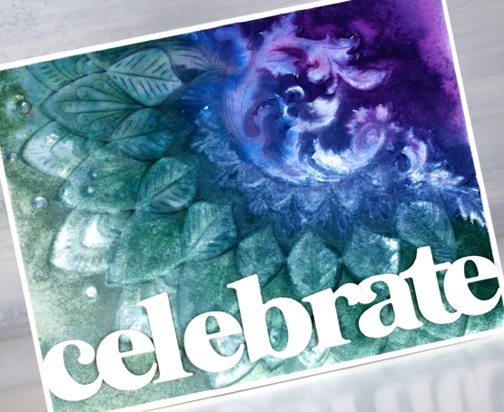
To create this dramatic panel I used hot pressed watercolour paper knowing that I would be spritzing the panel with water to make the inks blend. A spritz of water on the cardstock can also keep the panel from tearing when it is inside the folder going through the die-cutting machine. As I wanted the pattern to be raised on my card front I inked the non-raised side of the embossing folder with four peacock tones from Papertrey ink. I gave the folder a light spritz of water to get the inks blending.
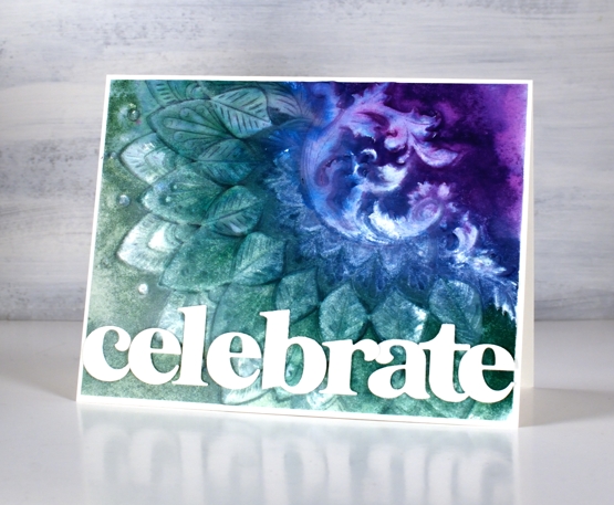
The inks and the very detailed embossing folder did exactly what I’d hoped and created a blended textured panel. The inks didn’t cover the whole area so I used a paintbrush and some water to spread the inks to the edges and let the panel dry. I waited for it to air dry but I think it would have been fine to use the heat tool. Once dry I placed it back into the embossing folder and ran it through the machine again to sharpen the edges of the design.
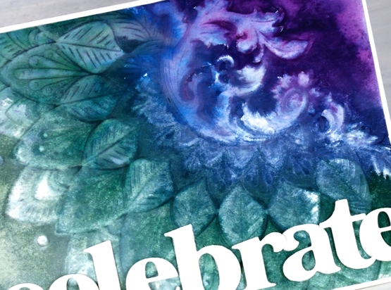
To complete the card I trimmed the embossed panel to 4⅛” x 5⅜” so it would be framed with a narrow white frame. I cut the letters of the word ‘celebrate’ with Pinkfresh Studio’s ‘Heather lowercase’ die set and snuggled them together to fit along the lower edge of the card front. To overlap the letters neatly I attached some directly to the panel and popped others up on foam tape.
And now what you’ve all been waiting for, the winner of gift certificate to spend in the Foiled Fox store. Congratulations, Jo Anna! The Foiled Fox will be in touch.

Thank you to everyone who entered the giveaway. Among the list of crafty items people are wishing for there were several mentions of new PB floral and sentiment stamps – no surprises there! A few people are wishing for markers, both Karin and distress – again I totally understand. Some of you are after inks, including the new distress colours; did you see the newest one released over the weekend, ‘salvaged patina’? Well, I now know I need some salvaged patina in my life! At the risk of sounding like I want ‘all the things’ I will stop here and once again thank the Foiled Fox for collaborating with me and supporting my blog and creativity, something I love sharing with you.
Supplies
(Compensated affiliate links used when possible)

Hand painted veggie card
Posted: June 10, 2020 Filed under: Altenew, Hand painted, Leaf Canopy | Tags: Altenew, Fabriano Watercolour Paper, Hand painted, sennelier watercolours 8 Comments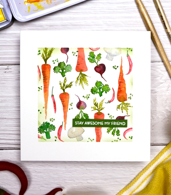
I’ve been painting again but took a break from florals. I pictured this veggie panel in my head before I sat down to paint it and realised part way through I should have been working bigger. I did the carrots first and as they were the biggest vegetable I regretted making them so small. All the rest of the veggies had to be pretty tiny to make it work.
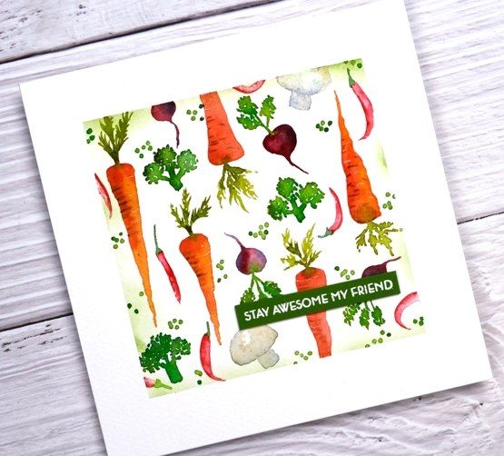
I used Fabriano cold pressed watercolour paper and Sennelier watercolour paints. The card is one layer so I folded the piece of watercolour paper then masked the edges before I started painting. I had watched some youtube tutorials to glean hints including Jenna Rainey’s ‘farmer’s market‘ and Laurie Tsou’s ‘drawing fruits and vegetables‘.
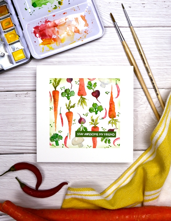
When I had filled the panel with carrots, broccoli, beets, chiles and mushrooms it still looked unfinished so I had to include the peas. I am not a fan of peas but as you can see they are the perfect filler, for a painting mind you, not a meal. When I was a child I was required to eat the number of peas that matched my age at the time and yes my family still brings that up and amuses themselves by asking if the required number of peas are on my plate! After I’d added the peas, with a stylus not a paintbrush, I still needed more definition on the masked edges so I blended some bamboo branch memento ink lightly over the tape. The sentiment is from Altenew’s ‘leaf canopy’ set.
Stay awesome my friends and eat your veggies. Or paint them if that’s more your style. Or better yet, grow them, paint them then eat them!
Supplies
Feathers, CAS & calm
Posted: June 5, 2019 Filed under: Brusho, CAS, Catherine Pooler inks, Challenges, Concord & 9th, Feathered die set, Feathered stamp set, Leaf Canopy | Tags: Altenew, Brusho, Catherine Pooler inks, Concord & 9th 9 Comments
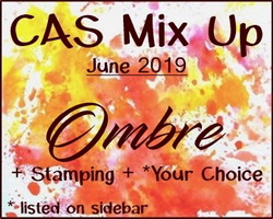
I finally got my act together enough to enter a challenge and not even in the last few minutes it was open! I just hosted a challenge with the Foiled Fox and we will be announcing winners in the next few days. I enjoyed visiting all the entries and was inspired by each card. Today’s card was inspired by the ‘Ombre’ challenge at CAS Mix Up and I will be entering it in the ‘Calm’ challenge at Casology as well.
Before I talk about this calm and clean and simple and ombre card I just want to thank those who joined the conversation on Monday about ‘bunchies’. I posted a photo on Monday of myself, aged 6, with my hair in ‘bunchies’ and asked what others called the two ponytail style. I was surprised to read they were known as ‘dog ears’ and ‘dust mops’ as well as the more common ‘pigtails’. One reader called them ‘bunches’ which is practically the same as me so I was not alone with that tag.
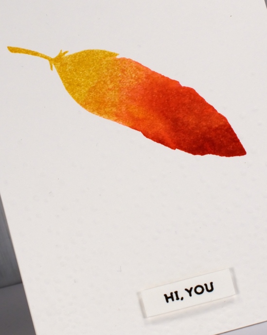
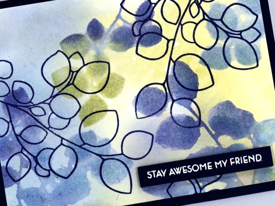
Back to the feather, I used the solid feather stamp from the C&9 Feathered set and Catherine Pooler inks to create the watercolour ombre look. The coverage and blending is just what I was after. Like some dye inks the colours continue to soak in and smooth out after stamping with the CP inks which is exactly what I needed for this look. I inked the whole stamp in ‘shea butter’ ink, stamped then inked two thirds in ‘bellini’ ink, spritzed and stamped, then finished by inking the tip in ‘rockin red’ ink, spritzed and stamped. The little spritz over the ink spread the ink on the stamp so there were no hard lines where one ink stopped or started.
I dry embossed the whole panel with the snowfall/speckles texture fade folder for a bit more visual interest and popped up the sentiment from the same stamp set. Did you know embossing folders are enjoying a rise in popularity these days? I don’t know if that is true or not, I just know they are around here! The CAS mix up challenge required ombre + stamping + my choice (embossing), so all boxes checked! There are a few metallic ombre looks featured on the challenge blog; I’ve never thought of metallic ombre but it is pretty fancy so I might have to give it a try.
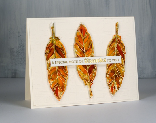
My second card is not entering any challenges; it was made because I love pairing sectioned stamps with sprinkled brusho. I embossed the sectioned feather from the same C&9 set in gold three times on hot pressed watercolour paper, sprinkled sandstone and terracotta brusho powder over the top then spritzed water gently to activate the brusho. I added more brusho and spritzing several times and then moved some paint around with a paintbrush, not much just a few places so there would be a few more solid sections. I die cut the feathers then popped them up on a different dry embossed background, ‘weathered’ by Taylored Expressions. The sentiment is from the Altenew set, ‘leaf canopy’.

Click on the badges below to see what’s happening in the challenges I’m entering.
Supplies
Three colour leaf canopy – challenge reminder
Posted: May 24, 2019 Filed under: Altenew, Leaf Canopy | Tags: Altenew, Ranger Distress inks 6 Comments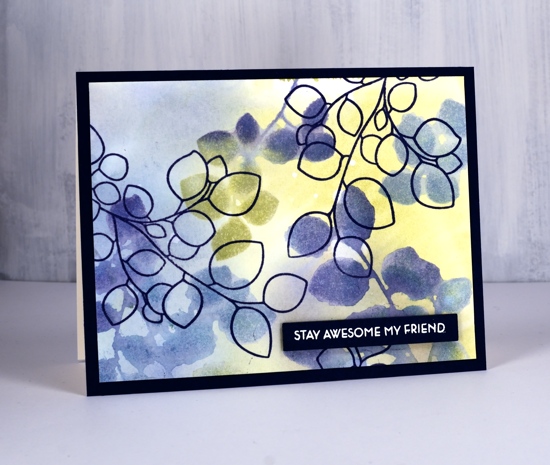
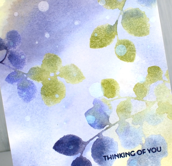
I have been bombarding you with three colour projects lately partly because I have a challenge running with the Foiled Fox but also because I love the simplicity of working with only three colours. Today I’m sharing here and on the Foiled Fox blog. I picked an analogous colour scheme which means the colours are all side by side on the colour wheel. The result is harmonious rather than bold and contrasting. I used stamps from the Altenew set ‘leaf canopy’ for both cards. Before I started stamping I pressed three distress ink pads face down on my glass mat and spritzed water over the inks until they started to run together. I swiped my panel of hot pressed watercolour paper through the colours, chipped sapphire, stormy sky and shabby shutters creating a soft blended background. I dried the panel completely before putting it in my stamp positioner. I inked the solid leaf stamps with the same three colours, spritzed them so the colours bled into each other on the stamp then closed the MISTI lid onto my panel and kept it down for 5-10 seconds. When I lifted it I had soft blurry leaf images. Any areas with excess ink pooling on them were easily fixed with the corner of a paper towel to sop them up. Again I dried the panel with a heat tool before stamping the outline leaves in chipped sapphire ink. I used my favourite sentiment from the same set and embossed it in white on navy cardstock. I used the Avery Elle simple sentiment dies again to cut it out – I can’t stop using them, I guess you have realised that by now!
For my second card I switched one ink colour, instead of stormy sky I used shaded lilac so there are more purple tones in this one. I made the background the same way and did the stamping the same way but then took a bit of time adding water droplets strategically not in a splattery way. I wanted them to look random so I took care to place each one with a drop on the end of a paintbrush! I let them sit then absorbed the water with a paper towel leaving a pale circular watermark on the panel.
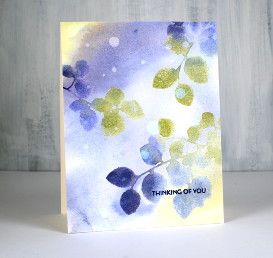
I kept this panel soft and dreamy and added a small sentiment in cobalt archival ink.
I hope this simple technique inspires you to play with three colours of ink and come up with a colourful panel of your own for the ‘Color Trio Challenge‘ on the Foiled Fox blog. There are some lovely cards linked there already, check them out then add your own.
Supplies
Shimmer poppies
Posted: April 26, 2019 Filed under: Coloured pencil, simple sentiments, Uncategorized, Wonderland | Tags: Altenew, distress oxide inks, Faber-Castell Polychromos Colour Pencil, Tsukineko Versafine inks 10 Comments![]()
I’ve been enjoying some pencil colouring lately, especially on ‘Stardream’ shimmer paper. (this background is stardream lapis lazuli) Working on a dark background requires a different approach but the results can be quite eye catching. I stamped a few of the ‘wonderland’ poppies from Altenew on blue shimmer cardstock with antique linen distress oxide ink. The oxide ink ends up looking almost white on such a bold background.
![]()
My pencils are Faber Castell Polychromos but you could use whatever coloured pencils you have on hand. With a dark background it helps to lay down a light base of white before adding colours over the top. I chose two pink pencils plus a white to colour the petals and blended from white on the petal edges to dark pink at the petal base. I preserved the stamped lines where I could but occasionally coloured over them and did what repairs I could with my white pencil. I used a bright green pencil for the stems and sepals and a tiny spot of yellow in the centre of the lowest poppy.
![]()
As always it is hard to capture the shimmer of the paper on camera but I think you can see a bit of it in each photo. I stamped and embossed the sentiment on the panel but made a patchy job of it so I stamped it on cream cardstock and cut it out with the avery elle sentiment dies that are never far from my side these days! I popped the sentiment up on dimensional tape and added the panel to a cream card base.
I love that sentiment and hope you all stay awesome today, my friends!
Supplies
Loose Watercolour Florals
Posted: April 24, 2019 Filed under: Altenew, Concord & 9th, fine line florals, Leaf Canopy | Tags: Altenew, Concord & 9th, Ranger Distress inks, Tsukineko Versafine inks 9 Comments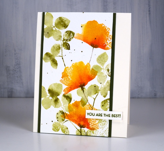
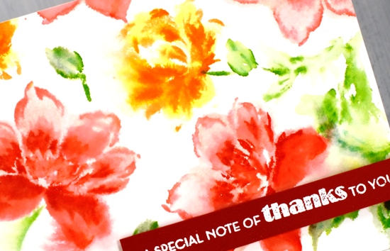
One of my favourite techniques is this simple floral card with a loose watercolour look. The foliage is from the Altenew set ‘leaf canopy’ and the flowers are from the Concord & 9th set ‘fine line florals’ (the same set I featured in a journal page last week). The flower stamp is very detailed with fine lines covering the whole stamp. Because I wanted a loose watercolour look I spritzed water on the inked stamp which meant I lost most of the fine lines. I do like the way a few of them remained giving the petals a slightly transparent look.
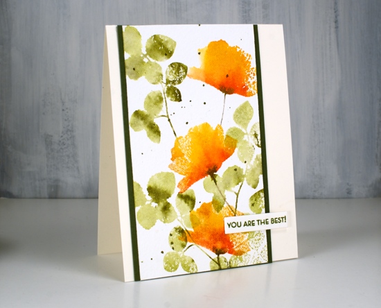
I tried the ink, spritz and stamp method a few times before creating this panel because it was easy to add too much water and end up with a splodge rather than a flower. The experiments only took a little time and a few pieces of watercolour paper so definitely not a waste.

In this close up you can see some of the texture of the cold pressed watercolour paper. Although I often use hot pressed I still reach for cold pressed at times because the rough texture adds interest particularly when using solid or semi solid stamps like these ones.
Supplies
What? More poppies!
Posted: March 21, 2019 Filed under: Wonderland | Tags: Altenew, Ranger Distress stains 16 Comments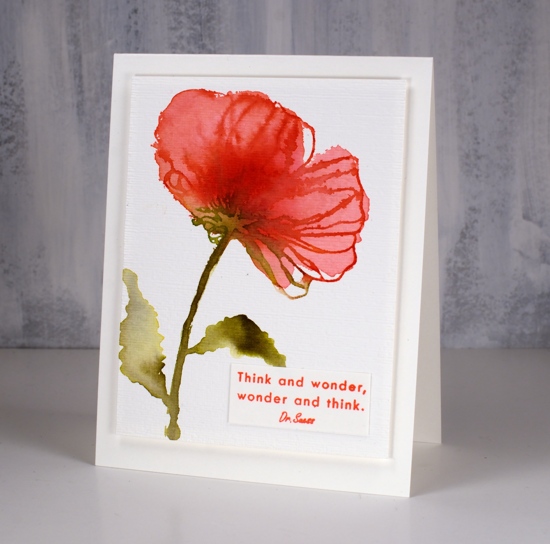
Yes I have another poppy post for you. When I get new stamps I like to try a few different techniques with them if I have time. This large poppy from the Altenew ‘Wonderland’ set was crying out to be stamped and painted with distress stains.
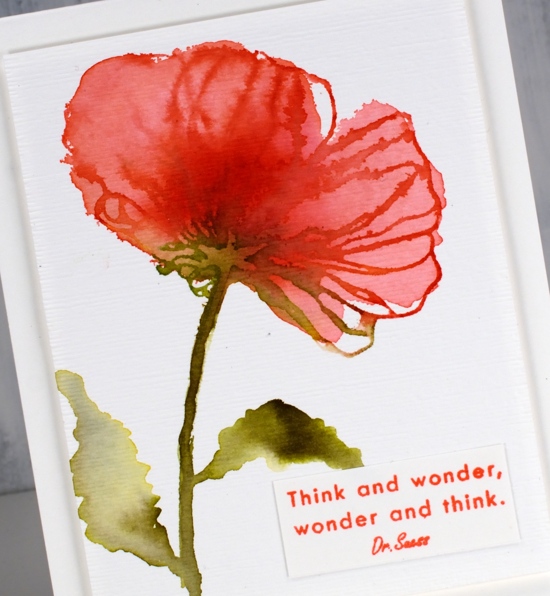
There is a masking stencil that co-ordinates with this stamp set so I started with the large stencil full of poppy shapes and a piece of hot pressed watercolour paper. I painted water into the large poppy shape so I could drop colour into it and get very soft blends. I don’t know if you ever paint with water but you can probably imagine the main problem with doing so. That’s right, it’s hard to see what you’re doing, especially if you are wearing your everyday glasses not your ‘art glasses’ Once I dropped some worn lipstick stain into the puddle I was able to make out the poppy shape a little better. I moved the colour around gently with a brush and dropped some festive berries stain in the centre for extra depth and some forest moss stain at the base of the petals and down the stem. I painted my own leaves with the forest moss stain. Once the stain had dried a bit I used the large poppy stamp to stamp some detail over the top in festive berries and forest moss stain. The stamp outline doesn’t match the painted shape exactly but I like the artsy hand painted look.
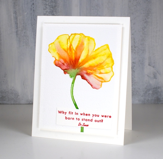
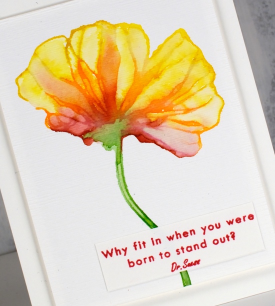
My second poppy was done with just the stamp plus four distress stains. I painted mustard seed stain around the top of the petals, carved pumpkin across the middle and fired brick at the base. I painted mowed lawn on the stem and base of the flower. I spritzed the stamp then used the stamp positioner to stamp on hot pressed watercolour paper. The result was a very wet rainbow style image. I painted one strip of petal at a time starting at the yellow end and working toward the red so the blend would go from light to dark and not be taken over by the dark red stain. I worked on strips that were not adjacent to each other to give sections a chance to dry before I painted the one next door. Although the poppy was quite wet with stain and water I was able to keep subtle details on the petals.
The last card is my favourite, I like the depth of colour achieved with a seedless preserves/festive berries/peeled paint combo. I used the same method as for the previous card but blended larger sections which caused some of the petal detail to disappear. I also dried the poppies after blending the colour once then added more stain and water over the top which created some petal like watermarks.
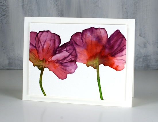
When it came time to turn the panels into cards I just wanted to add a little texture or dimension. I chose to pop up each panel on foam but before doing that I put my panels inside an embossing folder and ran them through my die cutting machine. The folder gives the panel the look of canvas. Subtle but cool.
I stamped the two Dr Seuss quotes from the same ‘Wonderland’ set on little scraps and added them to two of the cards with removable adhesive because I’m not convinced they are needed. What do you think? I like the quotes but I also like the way the poppies look like mini canvases…
Supplies
Wonderland
Posted: March 8, 2019 Filed under: Altenew, Watercolour paints 36, Wonderland | Tags: Altenew 69 Comments
I’m collaborating with the Foiled Fox again and I’m thrilled to say there is a giveaway involved! With all the new flower stamps appearing and hopefully real flowers not too far behind we thought it would be fun to have a ‘Fave Flowers’ themed giveaway;. I’ll keep posting flowery cards here on the blog and let you know some of my favourites.

To enter the giveaway all you need to do is let me know your favourite flower in the comments below and you will be entered to win one of two $25 gift certificates from the Foiled Fox online store.
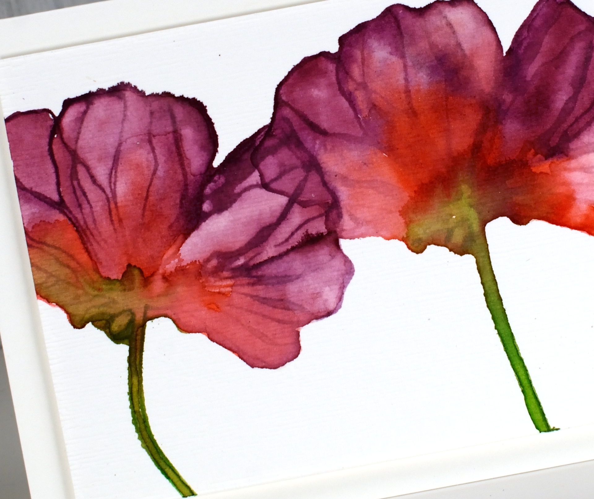
Poppies are a favourite of mine and if I found one this colour it would definitely be a hit. The ones I’ve had in my garden have all been orange, although now I think about it, I haven’t seen them the last few summers. If they need special attention you can be sure they didn’t get it! These poppies are from the Altenew set ‘Wonderland‘ which has quite a few poppy images, large, medium and small. I stamped on hot pressed watercolour paper in nocturne ink then embossed with clear powder. I did the large poppy first then masked it with the co-ordinating stencil mask before stamping the smaller poppies either side. The stencil masks are a great idea especially for someone like me who does not like to fussy cut. Once all the embossing was done I painted the flowers and background with Altenew watercolour paints.
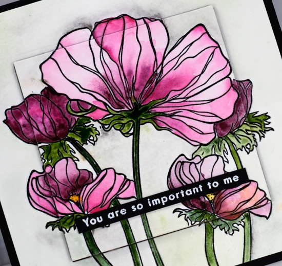
Rather than leave the panel flat I die cut a square from the centre and from a piece of black foam so I could pop it up on the card front. I added a sentiment from the same set embossed in white on black cardstock. I’m looking forward to hearing about your favourite flowers and stamping some more myself. Make sure you pop over to the Foiled Fox blog for more details on this card and another chance to comment and enter the giveaway.
Supplies
Angelique
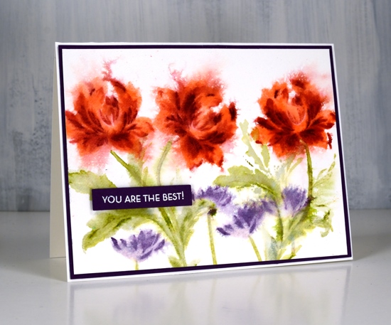
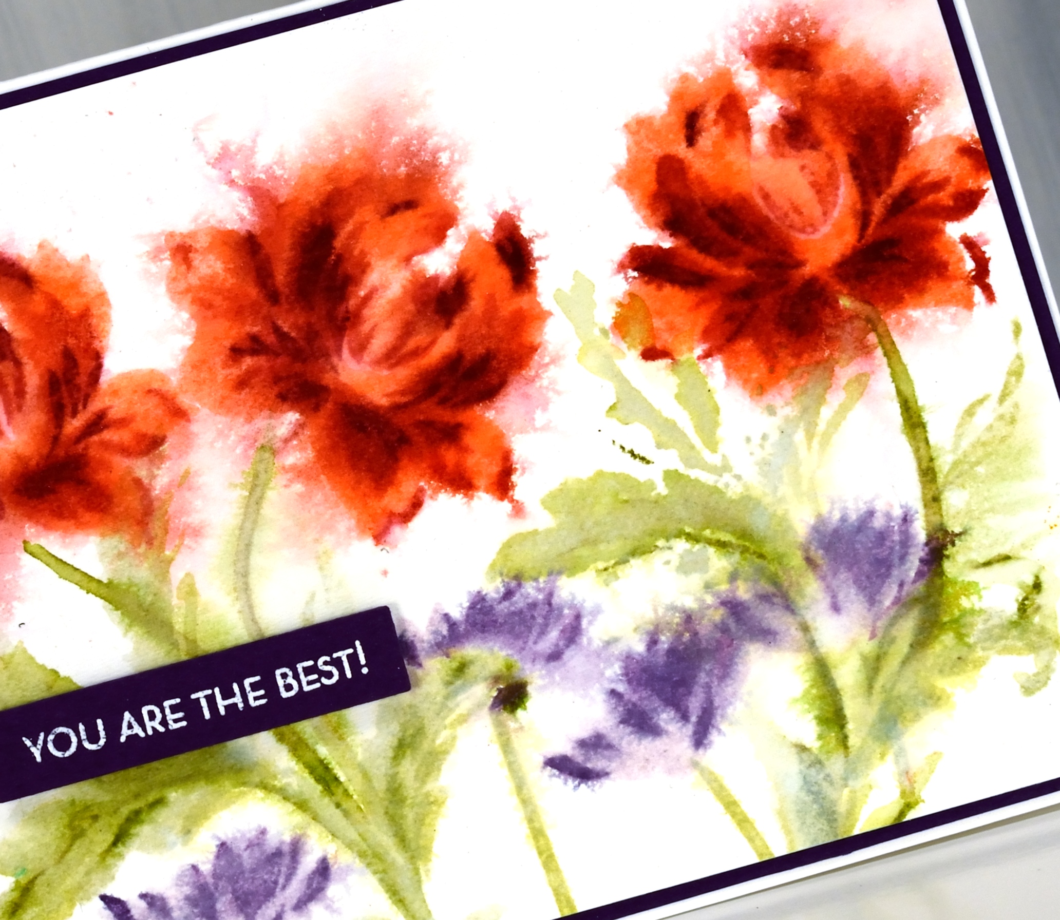
Posted: March 6, 2019 Filed under: Altenew, Angelique, Leaf Canopy | Tags: Altenew, Ranger Distress inks, Ranger Distress stains 12 Comments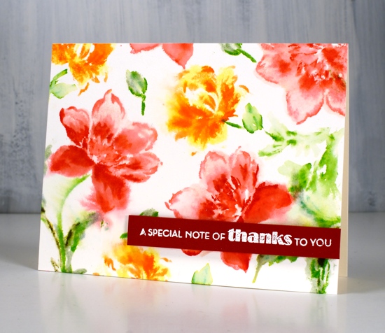
These pretty blooms represent my first experiment with an Altenew layering floral stamp set; this one is called ‘Angelique’. I clearly remember my Stampin’ Up days with the 2-step stamping but I haven’t done any in a while. I don’t think the layering sets are necessarily designed for watercolour styles but you know that’s how I like to do things. I experimented with a few processes, stamping then spritzing and spritzing then stamping, spritzing the paper not the stamp, the stamp not the paper and spritzing everything!

I think, but I’m not exactly sure, I mainly spritzed the stamp for this panel with maybe a tiny spritz after stamping on that left hand flower. I started by stamping the largest layer in spun sugar distress stain. Next layer I stamped in worn lipstick distress ink with a spritz of water to dilute it, the final detail layer I stamped in festive berries distress ink. Because I started with stain and spritzed the ink before stamping the image was wet enough to soften and blend a bit. I did a bit with a paint brush too but I didn’t want to lose the detailed layers.
The leaves I did in a similar manner with bundled sage, mowed lawn and forest moss. The sentiment from Altenew’s Leaf Canopy set is embossed in white on a red cardstock strip and popped up on dimensional foam tape.
The second panel was stamped with less spritzing during the stamping process, just a little in fact on layer number two. Instead I waited until all the stamping was done and spritzed in one direction to make the petals feather out then the other direction to balance things. This time I used abandoned coral, fired brick and aged mahogany inks for the roses, milled lavender and dusty concord for the little flowers and old paper, shabby shutters and peeled paint for the leaves. Even though it looks like black, I matted the panel with purple cardstock and added an embossed sentiment also on purple and cut it out with the Avery Elle sentiment dies that are making me neat and happy right now.
You might be wondering why I don’t just stamp these very pretty floral stamps with out adding any spritzes of water?? Sorry I just don’t think I can do it…
Supplies