Inspiration and Conversation
Posted: February 24, 2026 Filed under: Hand painted, sennelier watercolours | Tags: Fabriano Watercolour Paper, Hand painted, sennelier watercolours 18 Comments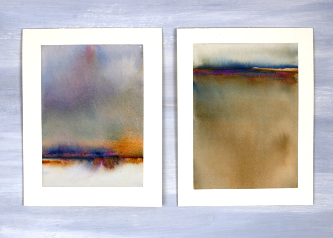
Today I wanted to have a bit of a chat with you, my readers, and especially take a few sentences to tell you how much I appreciate you. Some of you I have met but many of you I have not. Despite not having met in person I feel that we have formed a community and it is a very friendly and generous one. I took a break from the blog last year for several months and when I returned I was very encouraged by the comments and messages I received. Yes, it was nice to be missed, but more importantly it was lovely to see people engaging in discussion about techniques and materials. Many of you are kind enough to say you learn from my posts; I am so glad you do, but I also learn from you when you take the time to suggest products, methods and artists to check out.
Some of you have told me it is not as straight forward to comment these days. I’ve noticed this and I’m not sure why. I really enjoy hearing from you and read every comment and message I receive.
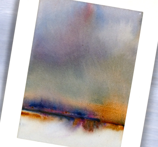
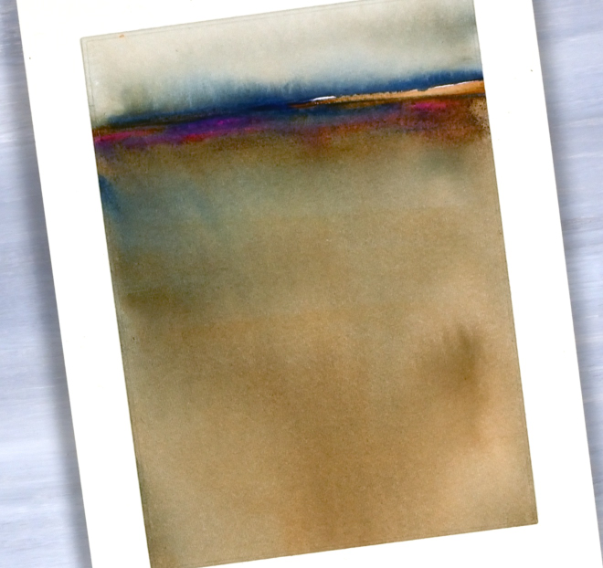
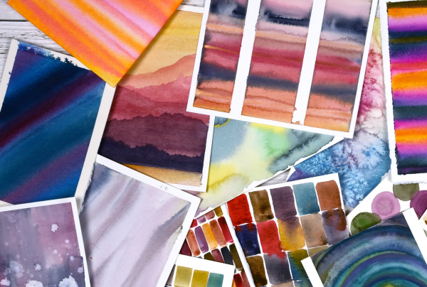
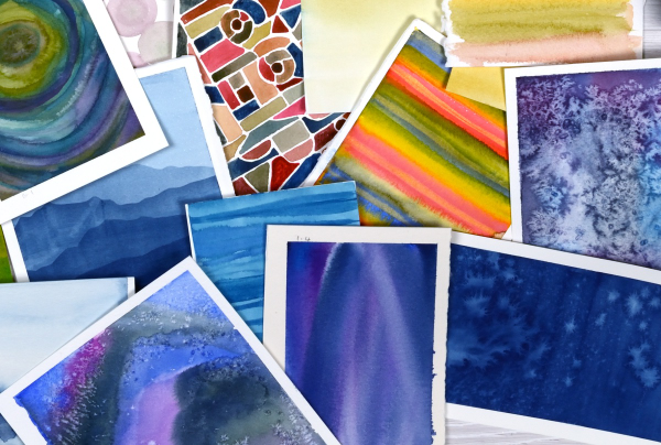
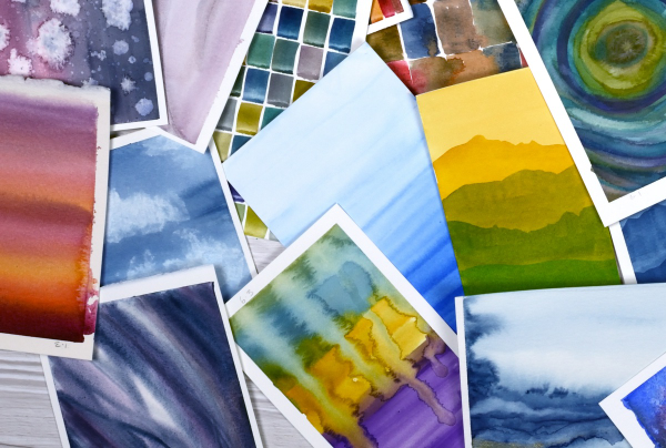
Today’s cards are inspired by the art of Claudia Drexhage. I encourage you to check out her website or instagram as her paintings are stunning and you will see where I got the idea for today’s abstract landscapes. I have only dipped my little toe into this technique but hopefully I’ll go in further in the future. One thing I find interesting about it is the way the abstract landscape can be seen one way and also turned upside down. I can’t remember which way I painted these panels originally but when I turned them into cards this week I decided I liked one with a big sky and the other with a big foreground. What do you think?
Thank you again for dropping in today and being part of this community. I look forward to seeing a few of you soon at some artsy get-togethers I am hosting but for those who don’t live close I look forward to seeing your inspiring creations if you share them on the interwebs or hearing from you in the comments or contact me button. Your encouragement and friendship mean a lot to me!
Birds on Birches
Posted: December 9, 2025 Filed under: beneath the birches, Dies, Penny Black, sennelier watercolours, winter trees | Tags: Fabriano Watercolour Paper, Penny Black creative dies, Penny Black stamps, sennelier watercolours 3 Comments
In case you were wondering I have done some watercolouring for Christmas cards this year; it’s not all napkin art. I created a batch of cards for a friend which included either watercolour skies or watercolour trees.
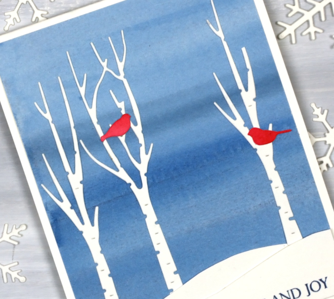
I painted a blended sky with a couple of different blues then added hand-cut snowbanks and die-cut trees and birds from the Penny Black sets, ‘beneath the birches‘ and ‘winter trees‘.

This would be a simple card to make in multiples by painting a large sheet of watercolour paper to divide into sky panels then add the white and red elements. The greeting is from the PB ‘Christmas sentiments‘ set. How is your Christmas card sending going? I sat in a waiting room yesterday and wrote about eight cards instead of reading a book or scrolling so that advanced me through my list a little.
Sunset Grasses
Posted: May 7, 2025 Filed under: Nature's Paintbrushes, Penny Black, sennelier watercolours | Tags: Fabriano Watercolour Paper, Penny Black stamps, sennelier watercolours 5 Comments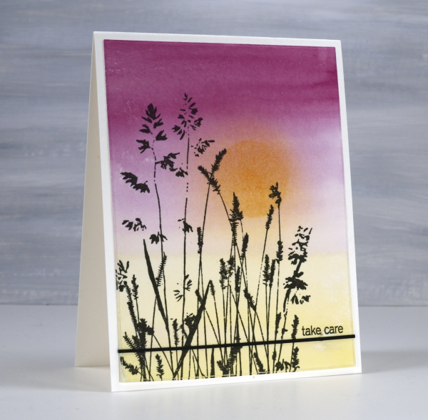
I have been away from my workroom, paints, stamps, papers and computer. I thought I might have shared a few blog posts while I was away but instead I took in the beauty of my surroundings snapping oodles of sunset photos along with other lovely scenery and dear faces. Now that I am back at home I will share some cards interspersed with occasional photos taken while away.
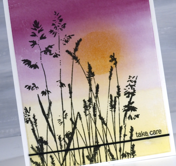
It’s been over a month since my last post which included snowflakes but before that one I was sharing cards made from watercolour panels. I ended last year and began this year wrapped up in colour mixing. I am still doing it and the result is quite the pile of panels ready to be stamped, die-cut or collaged into cards. This panel is an example of a gradation from one colour to another. I painted yellow from one end, deep pink from the other and blended them only slightly in the middle. When I picked the panel out of the pile I blended some darker yellow ink over the top through a circle post-it stencil then blended the edges once the stencil was removed.
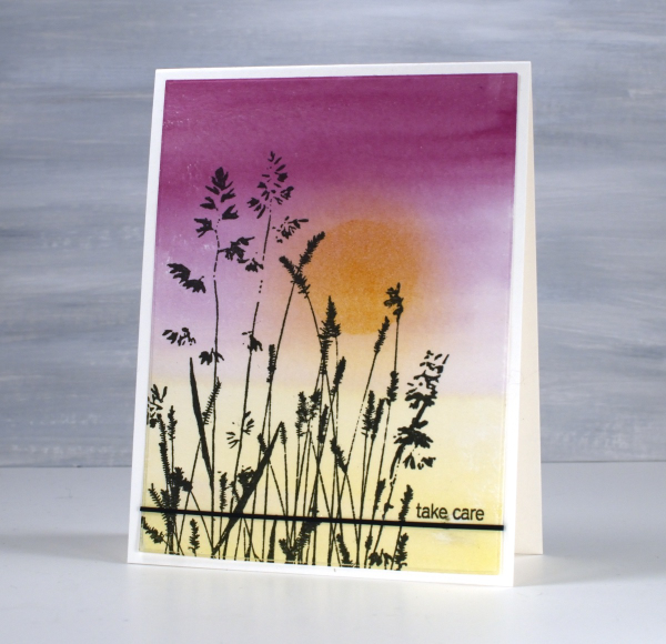
The lovely Penny Black ‘nature’s paintbrushes’ was a simple addition along with a thin strip of cardstock and a tiny sentiment from the PB ‘snippets’ stamp set. Thanks for dropping by despite how quiet it’s been her lately!
Pile of Watercolour Possibilities
Posted: February 27, 2025 Filed under: Classes, Hand painted, sennelier watercolours, Watercolour | Tags: Canson watercolour paper, Classes, Fabriano Watercolour Paper, Kuretake Gansai Tambi watercolour paints, sennelier watercolours 7 Comments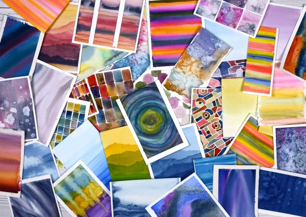
After teaching a couple of watercolour classes lately I have amassed quite the pile of panels. They are full of potential for card making. As well as painting separate panels I’ve also been creating abstract or background watercolours in a couple of art journals.
The purpose of the exercise has been two-fold. The main plan was to revisit a range of watercolour techniques in order to share them with others in classes. Additionally I chose to work small so we could complete quite a few practice pieces during class leaving us with ‘card sized’ panels to turn into cards later if we wished.
I have enjoyed the preparation and the classes so much that I have almost 100 panels on hand! My next in person class is going back to basics in regard to card making. I will cover assembly tips and tricks as well as design principles in order to create balanced and beautiful card layouts. It is exciting to have all these panels around just waiting to be transformed into cards.
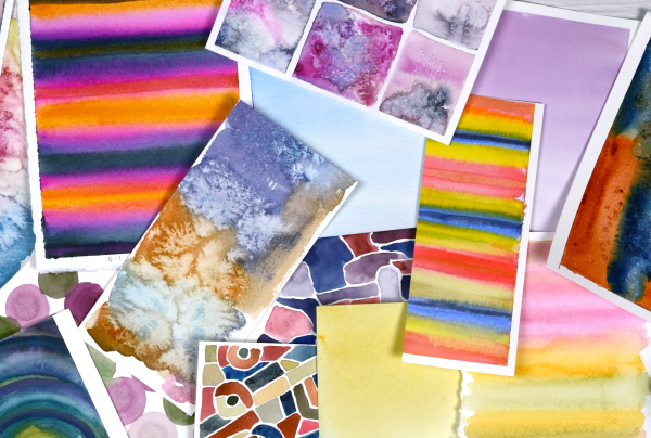
As you can imagine I also have piles of gel prints, alcohol ink panels, collages and patterned papers that could be turned into cards. It’s rather nice to have all these options…
Whimsy and Watercolour
Posted: February 24, 2025 Filed under: Classes, Hand drawn, Hand painted, sennelier watercolours, Watercolour | Tags: Classes, Fabriano Watercolour Paper, sennelier watercolours 3 Comments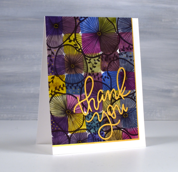
As I mentioned in January I have been playing with watercolour techniques then adding whimsical doodles over the top. Today’s card is another example. I switched the order in the title of the blog post because the whimsy has over powered the watercolour in this panel even though both elements are still obvious.
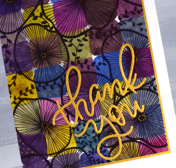
I used only three paint colours to paint the squares on the watercolour paper, some touching while wet, resulting in soft blends. All the colours you see were mixed from the same three paints – a blue, a pink and a mustard. The doodling was done with a black fine tip pen and a gold gel pen.
Even though the gold details from the gel pen are a minor part of the design they were the catalyst for choosing a gold mat and sentiment. In my upcoming in-person class I am teaching design principles and assembly techniques for card making and this thank you card is one of my examples. ( I wish I could remember who makes that pretty thank you die, but I’m not sure)
A New Handmade Book
Posted: February 7, 2025 Filed under: Finetec paints, Hand painted, Handmade book, sennelier watercolours | Tags: Fabriano art journal, Fabriano Watercolour Paper, Handmade book, sennelier watercolours 6 Comments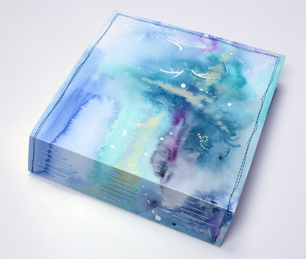
I’ve completed another challenge with Ali Manning in her Handmade Book Club. I have written before about Ali’s wonderful teaching. The most recent class was no exception. It was called ‘Valentine Palooza’ as a nod to the February timing and the cute heart binding on the spine of the book. The Handmade Book Club offers some free classes, some short challenges open to non-members (I have now done four of these) and a monthly or yearly membership ( something I would like to join at some point).
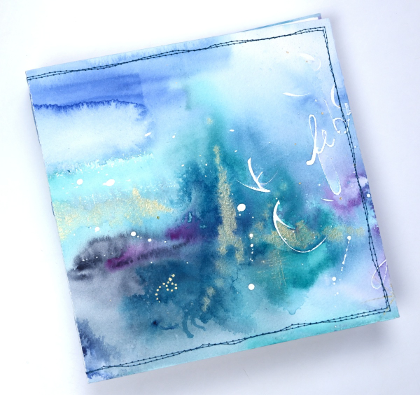
For this most recent challenge I chose to use cold pressed watercolour paper for the cover and hot pressed watercolour paper for the signatures. I watercoloured the cover in a loose abstract style over the top of some masking fluid words and squiggles. As I write this I realise I didn’t take any photos of the inside cover. Both the back and front covers fold over to make the cover more sturdy so my watercolour patterns continue inside.
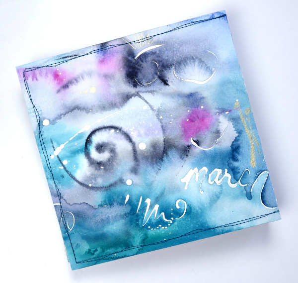
This cover was inspired by Tiffany Sharpe’s lovely stitched and watercoloured cover. I made my book 7″x7″ which was different to the rectangular examples in the workshop but all the steps are the same once you work out your dimensions. I have now made three 7×7 watercolour journals and like the page size for art journalling.
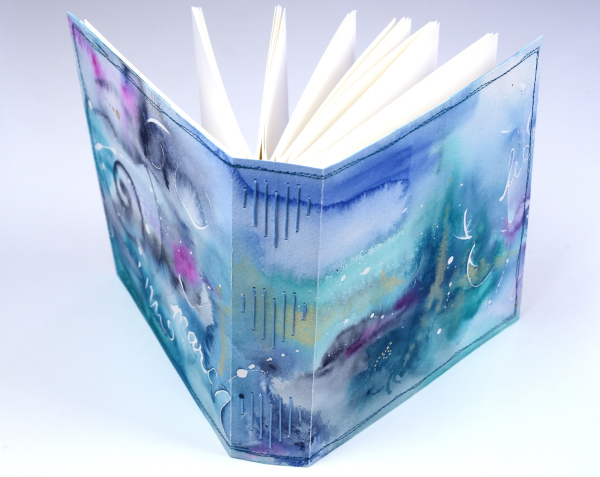
I’m playing with watercolour techniques a lot at present in preparation for my upcoming in person class on Watercolour Techniques. You will see some of the technique samples turned into cards eventually and some will be the base for future journal pages. You can see the other books I have made here: Mixed Media Journal, Coptic Journal, a second Coptic Journal, and Scrappy Journal.
Standing Ducks
Posted: March 12, 2024 Filed under: Echidna Studios, sennelier watercolours, standing ducks | Tags: Echidna Studios, Faber-Castell Polychromos Colour Pencil, Fabriano Watercolour Paper, sennelier watercolours 5 Comments
Introducing ‘standing ducks‘, a lovely digital stamp set from Echidna Studios. The weather has turned much warmer round here so there are puddles instead of snow to be seen; the type of weather where you might see ducks standing or swimming around. It is too early for ducklings but in the past we have had to slow down and stop for duck families on the busy road behind our house.

I printed both ducks from the set on hot pressed watercolour paper then painted them with Sennelier watercolour paints. I added some finishing touches with coloured pencils. I also printed the left facing duck on some pastel paper as I received a set of pastel pencils for my birthday and have started learning how to use them. As you can imagine pastel is very soft so it is fun to blend but easy to smudge. When I have done a little more learning and practicing I hope to share some pastel pencil colouring.
This card is another ‘larger than usual card’ measuring just over 5″ x 7″. The piece of watercolour paper I printed on had one deckled edge so I tore the other three edges to keep a deckled look round the whole panel.
Tulips & more tulips
Posted: February 21, 2024 Filed under: Echidna Studios, sennelier watercolours, tulip background, tulip set, Watercolour | Tags: digital stamps, Echidna Studios, Faber-Castell Albrecht Durer Watercolour pencils, Faber-Castell Polychromos Colour Pencil, Fabriano Watercolour Paper, sennelier watercolours 11 Comments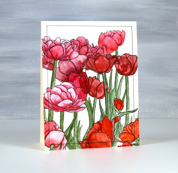
If there are tulips already blooming where you live you must let me know in the comments! It will be another two or three months before they bloom around here. All the more reason to have some blooming here on the blog. The group you see on the card above are part of a new digital stamp called ‘tulip background‘ from Echidna Studios. The whole image is a landscape oriented design and I printed it on hot pressed watercolour paper to be 8½” wide which gave me plenty of choice when deciding which part to use on a portrait oriented card.

I used Sennelier watercolours to paint the design using various mixes of four different reds and pinky red paints. I also used one of the reds to give the green paint a more muted realistic tone. Once I had painted all the tulips and stems I used polychromos pencils to add extra shading and shadow. This is a technique I learnt from Kathy Racoosin and it always adds to the finished panel. I ruled a narrow black line around the panel to frame it.

The flowers below are from a co-ordinating digital set simply called ‘tulip set‘ also from Echidna Studios. The set includes three individual tulips. I didn’t paint this one, my daughter did, using watercolour pencils. She also fussy cut each of the three tulips to create a pretty layered arrangement. This post includes an affiliate link to The Foiled Fox, if you use it I receive a small commission at no extra cost to you.

Seedlings
Posted: March 2, 2023 Filed under: Echidna Studios, seedlings, sennelier watercolours, Simply Graphic | Tags: digital stamps, Echidna Studios, Fabriano Watercolour Paper, sennelier watercolours, Simply Graphic 8 Comments
If you are a plan ahead – plant ahead person then you might have some seedlings growing somewhere in your house or green house. These are the only seedlings I have at this point but I must say they are looking quite healthy.
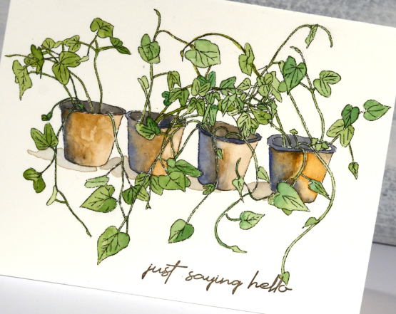
This is a digital stamp designed by my daughter and available in her etsy store Echidna Studios. I printed it so that it just fitted on an A2 card front but I think it might be nice to print it larger and feature only one or two pots on a card front with the shoots and leaves coming off the edge of the panel.
I printed on hot pressed watercolour paper and used my Sennelier pan paints for all the colouring. I used a mix of greens for the greenery and a mix of blue and brown for the pots. I really like blue and brown combos these days, something that I wouldn’t have imagined a few years back.
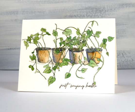
The sentiment is from Simply Graphic’s ‘English Sentiments’ set; I like the handwritten look and the size of the words. I know I could be handwriting a few sentiments myself here and there but I always add the sentiment last and by that time I don’t want to mess up a otherwise completed card with a crooked or uneven sentiment. That being said I think I should try a few handwritten sentiments on upcoming cards…
(Compensated affiliate links from Foiled Fox, Scrap n Stamp)
Old Stone Doorway
Posted: February 3, 2023 Filed under: Echidna Studios, old stone doorway, sennelier watercolours, Simply Graphic, Watercolour | Tags: Echidna Studios, Faber-Castell Albrecht Durer Watercolour pencils, Ranger archival inks, sennelier watercolours, Simply Graphic 12 Comments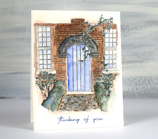
Isn’t this a sweet front path and door? It makes me want to head inside or wander around the garden. This digital stamp is another design by my daughter which is available in her etsy store, Echidna Studios. I printed it on Arches cold press watercolour paper. You know I generally use Fabriano hot press watercolour paper but I am trying to ‘use what I have’ so I pulled out the Arches for a change. I like how the texture of the paper adds texture to the front of the house.
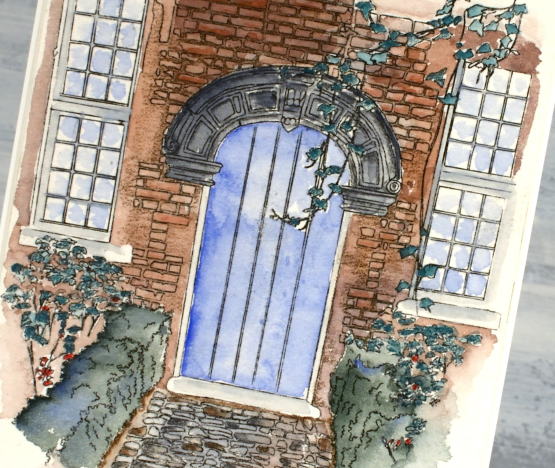
Using my Sennelier watercolour paints I painted a wash of brown over the brickwork, blue over the door and grey for the stonework. I also mixed a bluey green for the hedges. Next I switched to watercolour pencils and added shading to the bricks and stones, coloured the leaves and painted from the tip of my pencils to make the window and door frames grey and the reflections light blue. The sentiment is from Simply Graphic and is stamped in prize ribbon sketch archival ink
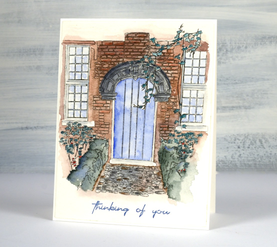
I almost stopped a couple of times as I wasn’t happy with the colours I had chosen and the lack of detail in the washes. I did keep going though and it pulled together. One thing that helps is that I didn’t use too many colours and I like the way the watercolour fades away at the edges. There are little white patches where I didn’t touch up the painting and I think they work too in adding a highlight here and there. I have printed another one out because a red brick house might also be fun to do.
The designer of this stamp is coming over for dinner tonight so I will ask where this door is in real life…
(Compensated affiliate links used when purchasing from Foiled Fox)