
Sunset Grasses
Posted: May 7, 2025 Filed under: Nature's Paintbrushes, Penny Black, sennelier watercolours | Tags: Fabriano Watercolour Paper, Penny Black stamps, sennelier watercolours 5 Comments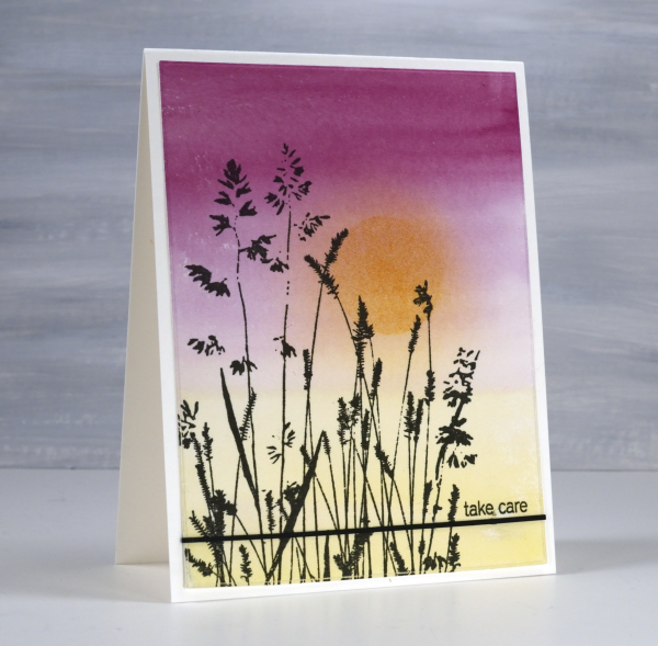
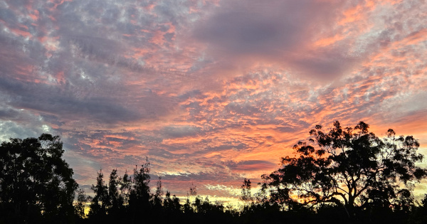
I have been away from my workroom, paints, stamps, papers and computer. I thought I might have shared a few blog posts while I was away but instead I took in the beauty of my surroundings snapping oodles of sunset photos along with other lovely scenery and dear faces. Now that I am back at home I will share some cards interspersed with occasional photos taken while away.
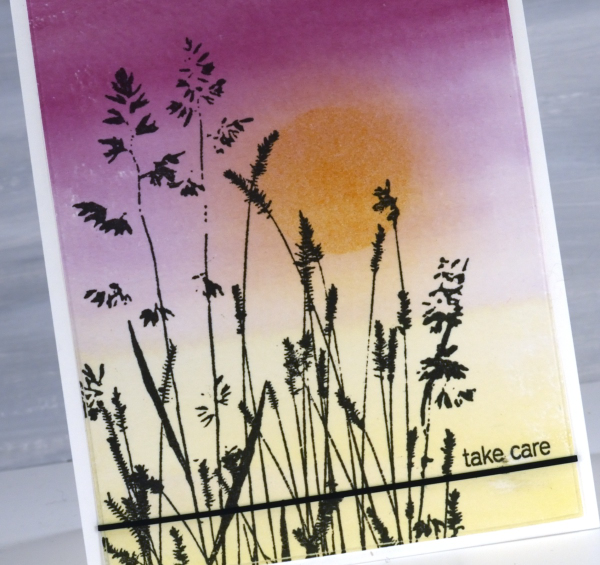
It’s been over a month since my last post which included snowflakes but before that one I was sharing cards made from watercolour panels. I ended last year and began this year wrapped up in colour mixing. I am still doing it and the result is quite the pile of panels ready to be stamped, die-cut or collaged into cards. This panel is an example of a gradation from one colour to another. I painted yellow from one end, deep pink from the other and blended them only slightly in the middle. When I picked the panel out of the pile I blended some darker yellow ink over the top through a circle post-it stencil then blended the edges once the stencil was removed.
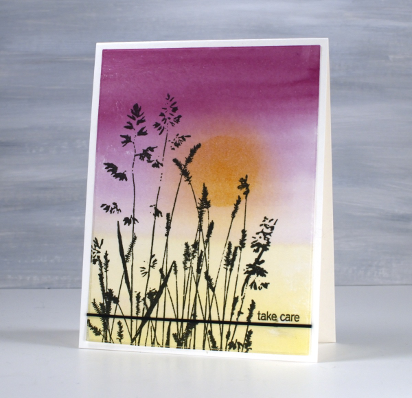
The lovely Penny Black ‘nature’s paintbrushes’ was a simple addition along with a thin strip of cardstock and a tiny sentiment from the PB ‘snippets’ stamp set. Thanks for dropping by despite how quiet it’s been her lately!
Vintage sunbursts
Posted: June 10, 2016 Filed under: Nature's Paintbrushes, Sunbursts | Tags: Penny Black stamps, Ranger Distress inks, Speedball elegant writer 9 Comments
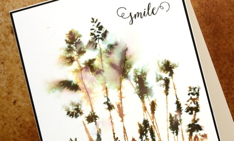
I have two last cards to wrap up my vintage watercolour week. These differ from all the previous cards as they were stamped with solid or ‘silhouette’ stamps rather than outline stamps. The technique used on all my other cards involved pulling brown ink from the outline either into the image or into the back ground.
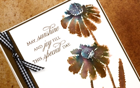
With a solid stamp the inside of the image is already full of ink so I adapted my technique in order to get the same vintage brown & black effect. Because there were no petals or wings to be filled I didn’t incorporate watercolour pencils into these designs. On the ‘sunburst’ stamp above I inked most of the stamp with vintage photo distress ink but left the flower centres and the base of the stems to be inked with the elegant writer pen. I spritzed the stamp so the brown and black would blend into each other and the pink and green tones would bleed out of the black. I moved the colour around a little with a paintbrush.
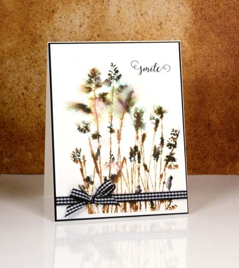
On the ‘nature’s paintbrushes’ stamp I inked first with vintage photo ink then added the elegant writer black on the seed heads of the grasses. I spritzed with water before stamping and also on the watercolour panel so the colour and image would bleed into the surrounding area.
When I was looking for some ribbon or twine to finish the cards I spied my black gingham and was surprised how much I liked it on the predominantly brown card.
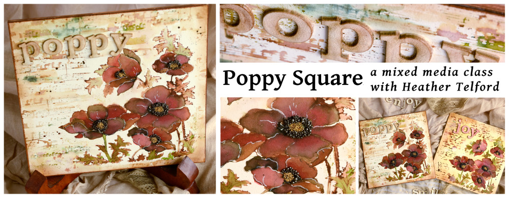
Thank you so much for leaving me such kind comments this week; I glad some of you have tried the technique or plan to. I know many of you are not in my area but for those who are, I have a June class where we will be using similar techniques to make a poppy themed art square. (My first mixed media class!) All the details are on my upcoming classes page. I am also offering it at Crop A While in Orleans.
Supplies:
Stamps: Sunbursts, Nature’s Paintbrushes, Happy Snippets, Treasured Sentiments(PB)
Inks: Vintage Photo distress ink (Ranger) Elegant writer pen (Speedball)
Cardstock: Hot pressed Fabriano watercolour paper, black and natural cardstock (Neenah)
Also: black and white gingham ribbon
Let Green March In!
Posted: March 14, 2016 Filed under: CAS, Nature's Paintbrushes, One-Layer Simplicity challenge | Tags: color burst, One-Layer cards, Penny Black stamps 11 Comments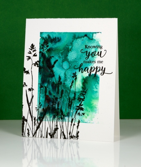
The One Layer Simplicity challenge is hosted by our very artistic team member Karen Dunbrook this month and she has challenged us to use green and one neutral tone on our one layer cards. I have a few of the new liquid metals from Ken Oliver so I thought I would try out the Verdi Gris along with some green colour burst powder.
I taped a wide margin on my watercolour paper card base, sprinkled green powder over the exposed area and spritzed with water. Once the colour was moving I added some of the verdi gris liquid metal mixed with some water. You cannot see the shimmer in my photo but it is pretty in real life. Once the panel had dried a little I splattered some water droplets which lightened the colour in a few spots. To finish it off I added the large ‘Nature’s Paintbrushes’ stamp and a sentiment in black. Making a one layer watercolour card can result in a buckled card base but ironing it fixes the problem and dries it at the same time if you happen to be a little impatient.
If you haven’t checked out this month’s challenge take a look and get inspired. It is fun to see all the different greens already featured in the submissions received.
Supplies:
Stamps: Nature’s Paintbrushes, Sentiment Collection(PB)
Mediums: Colorburst powders, Liquid Metal (Ken Oliver) Versafine Onyx Black ink (Tsukineko)
Cardstock: Cold pressed Fabriano watercolour paper


