
OLS29 Christmas in July
Posted: July 1, 2016 Filed under: CAS, One-Layer Simplicity challenge, Spread Cheer | Tags: Faber-Castell Albrecht Durer Watercolour pencils, Penny Black stamps, Speedball elegant writer, Tsukineko Memento inks, Tsukineko Versafine inks 18 Comments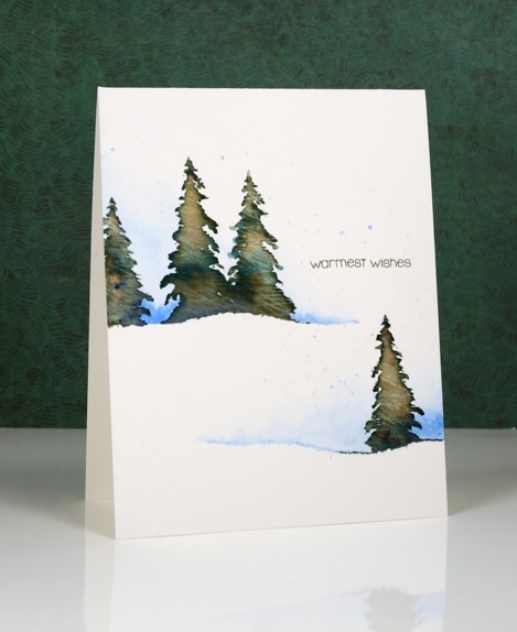
I am hosting the One Layer Simplicity Challenge this month and the theme is ‘Christmas in July’. I know some of you make Christmas cards all year but I usually start around now and keep going until December! If you haven’t even thought about Christmas cards then perhaps this challenge will be a motivator. Perhaps you want to enjoy the summer sun and not think about December at all – that is totally fine too!
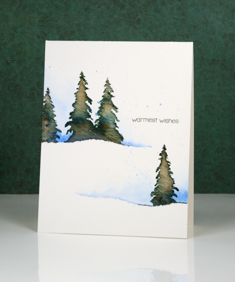
To make this one layer card I tore a piece of painter’s tape lengthwise into two strips and positioned them on my watercolour paper card base. I painted some blue along the torn tape edge and faded it to white. Keeping the tape in place I stamped a few trees in Memento Northern Pine ink and added a few dabs of black elegant writer pen. After stamping I painted over the tree to blend the ink. Northern Pine separates into brown and green when diluted which gives the foliage some variety in colour.
I’ve been reading a book called ‘The Non-Designer’s Design Book’ which has made me think about layout in terms of alignment, repetition, contrast and proximity. The book is concerned mainly with text documents like business cards, menus, ads, etc but the principles are relevant to art layout too. I found myself trying to apply what I’ve learnt when working out where my sentiment would go.
Supplies:
Stamps: Spread Cheer(PB)
Inks: Northern Pine Memento ink, Versafine Olympia green (Imagine Craft/Tsukineko)
Pencils & Pens: blue watercolour pencil (Faber Castell), elegant writer pen (Speedball)
Cardstock: Canson Moulin du Roy 100% cotton hot pressed watercolour paper
Let Green March In!
Posted: March 14, 2016 Filed under: CAS, Nature's Paintbrushes, One-Layer Simplicity challenge | Tags: color burst, One-Layer cards, Penny Black stamps 11 Comments
The One Layer Simplicity challenge is hosted by our very artistic team member Karen Dunbrook this month and she has challenged us to use green and one neutral tone on our one layer cards. I have a few of the new liquid metals from Ken Oliver so I thought I would try out the Verdi Gris along with some green colour burst powder.
I taped a wide margin on my watercolour paper card base, sprinkled green powder over the exposed area and spritzed with water. Once the colour was moving I added some of the verdi gris liquid metal mixed with some water. You cannot see the shimmer in my photo but it is pretty in real life. Once the panel had dried a little I splattered some water droplets which lightened the colour in a few spots. To finish it off I added the large ‘Nature’s Paintbrushes’ stamp and a sentiment in black. Making a one layer watercolour card can result in a buckled card base but ironing it fixes the problem and dries it at the same time if you happen to be a little impatient.
If you haven’t checked out this month’s challenge take a look and get inspired. It is fun to see all the different greens already featured in the submissions received.
Supplies:
Stamps: Nature’s Paintbrushes, Sentiment Collection(PB)
Mediums: Colorburst powders, Liquid Metal (Ken Oliver) Versafine Onyx Black ink (Tsukineko)
Cardstock: Cold pressed Fabriano watercolour paper
Sky’s the limit
Posted: December 31, 2015 Filed under: Gleeful, One-Layer Simplicity challenge | Tags: Brusho, One-Layer cards, Penny Black stamps 12 Comments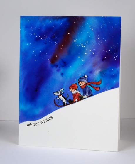
Happy New Year everyone! It’s the first of January which means it is the first day of a new challenge at One Layer Simplicity. I am hosting this month and the challenge is to make a one layer card inspired by the phrase ‘the sky’s the limit’. You can make the sky the focus of your card like I did, be inspired by the phrase itself or come up with an idea of your own. Link your project over on the One Layer Simplicity blog any time before January 24th.
To create my great big sky card I first flicked some masking fluid on watercolour paper then taped it down to keep it from warping when wet. I stamped the sled carrying passengers in versafine onyx black ink. Underneath the sled I positioned frog tape to mask the toboggan hill. To mask the children and dog I used my new Molotow masking pen. With all of that masked I was able to paint the rest of the panel with brushos to create a pretty blue and pink expanse. Once the sky dried I gently removed the masking over the stamp and coloured the image with watercolour pencils. Finally I removed the tape and added a sentiment. The panel did warp a little so I ironed it. Are you surprised to see people on my card today? Yep, me too!
Thank you for your response to my two ‘Top 10’ posts; you were very kind and encouraging. I am excited to share some new products and techniques in the coming year as well as continue using and describing some of my favourite tried and true methods and materials.
Supplies:
Stamps: Gleeful, Holiday Snippets (PB)
Mediums: Brusho powders, Versafine Onyx Black ink
Cardstock: Hotpressed Fabriano watercolour paper
Also: Winsor & Newton Masking fluid, Molotow Masking pen
OLS 21 Whatever the Weather
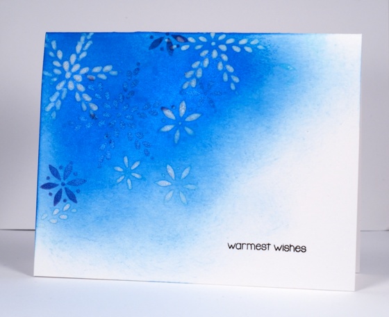
Posted: October 1, 2015 Filed under: One-Layer Simplicity challenge, Summer Fun | Tags: Penny Black stencils, Ranger Distress inks, Tsukineko Memento inks 4 Comments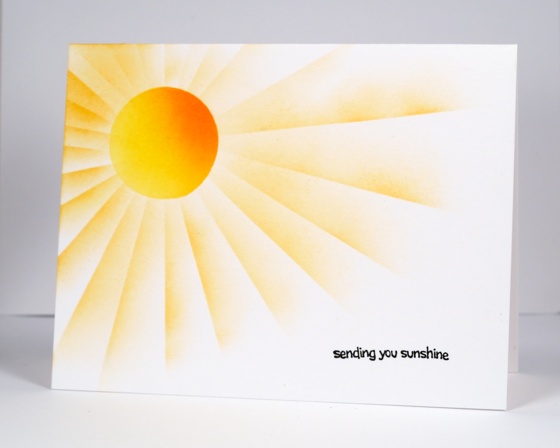
It is time for a new challenge at One Layer Simplicity and I am the October host. The One Layer Simplicity team (Susan, Karen, Ardyth and myself) issues a new challenge each month. We always have a different theme but the same requirement to keep the card one layer and the design simple. This month my theme is ‘Whatever the Weather’. In the southern hemisphere spring has sprung and here in the northern hemisphere the temperatures are dropping as autumn takes over. To participate in the challenge your card needs to be weather related. I used post-it masks to make a warm sunny card and a stencil to create a chilly snowflake card.
Supplies
Stamps: Summer Fun, Holiday Snippets (PB)
Stencils: Snowdance (PB)
Inks: Memento dandelion, cantaloupe, tangelo & versafine onyx black(ImagineCrafts/Tsukineko) Salty Ocean, chipped sapphire distress ink (Ranger)
Cardstock: Neenah Solar White
Also: Pearl-ex Interference blue powder
Oodles of love
Posted: February 9, 2015 Filed under: CAS, One-Layer Simplicity challenge, Oodles of Love | Tags: CAS, One-Layer cards, Penny Black creative dies, Tsukineko Memento inks 10 Comments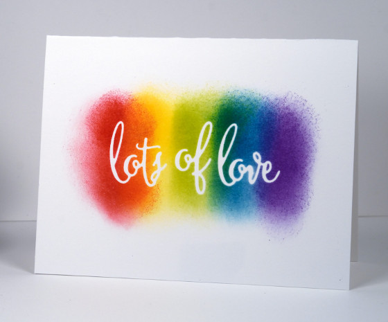
This one layer card is for the Clean and Simple challenge at Splitcoaststampers today to have some kind of rainbow connection on your card. It also works perfectly for this month’s One Layer Simplicity challenge “You Blend!”.
I used the ‘oodles of love’ die to cut a mask from masking paper. I stuck that directly on my card base and sponged a rainbow of colours over the top. I removed the mask to reveal crisp white words. That’s all there was to it, a clean and simple card that actually was simple; doesn’t always happen that way as you know!
Supplies
Creative Dies: Oodles of Love (PB)
Inks: Memento love letter, dandelion, pear tart, teal zeal, grape jelly (ImagineCrafts/Tsukineko)
Cardstock: Neenah Solar White
OLS 13 You Blend
Posted: February 3, 2015 Filed under: CAS, Framed Flower, One-Layer Simplicity challenge | Tags: CAS, Penny Black creative dies, Tsukineko Memento inks 12 Comments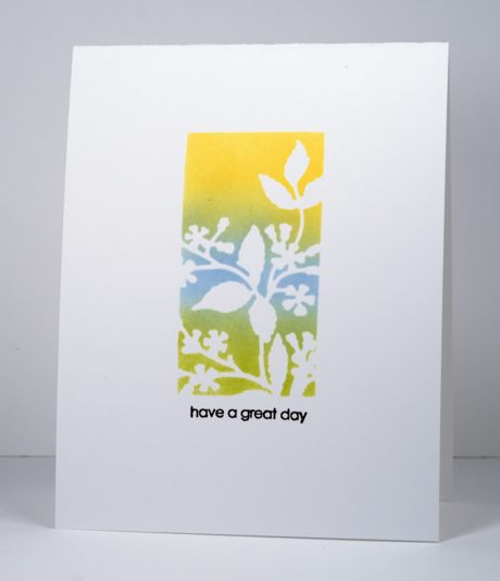
I can’t remember the last time I managed to participate in a challenge so I am happy to be posting a card for the One Layer Simplicity monthly challenge. The challenge is to blend something on your one layer card. I pulled out a new die called ‘framed flowers’ and used it to cut a mask. I added post-it notes all around the edges of the die cut mask so I would be left with just the rectangular image. My blending was done with memento inks and sponges, one of my tried and true techniques. My colour scheme was inspired by the current Runway Inspired Challenge #77, which is why I went for a black sentiment where I would usually just repeat one of the colours in my image. I like the black, it provides a nice contrast and I love the new set it came from, ‘snippets’ which has thirty-one little sentiment stamps. Thirty-one! Yay!
I hope you get a chance to check out the entries on both challenges and get inspired to play along.
Supplies:
Stamps: Snippets (PB)
Creative Dies: Framed Flowers (PB)
Inks: Dandelion, Summer Sky, Pear Tart (Imagine Craft/Tsukineko)
Cardstock: Neenah Solar White 110lb
OLS#9 Hip to be square
Posted: September 4, 2014 Filed under: CAS, One-Layer Simplicity challenge, Tree-mendous | Tags: Penny Black stamps, Tsukineko Memento inks 7 Comments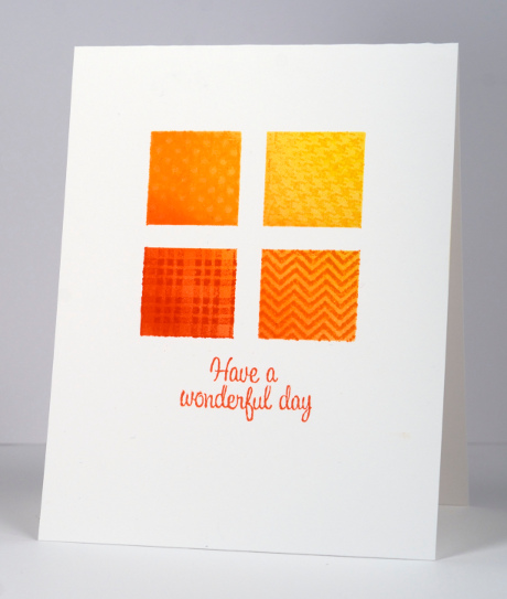
Ardyth has a wonderful challenge happening on the One Layer Simplicity challenge blog this month. We have to use squares on our one layer cards. It can be one square or many squares; there are so many possibilities. I decided to mask and sponge my squares with a bit of a diagonal ombre thing happening. I taped around the edges of the large square with painters tape then cut two narrow strips and criss-crossed them in the middle. My sponging blends from yellow through orange to a burnt orange colour (listed below) and then I added a little pattern to each square by masking the other three squares and stamping. The patterns are from the transparent set, ‘Treemendous’ and they were perfect for this technique. I also used a sentiment from the same set which makes this a one layer, one stamp set and one colour scheme card, but that is not required for the challenge!
The challenge is to have fun with squares on a one layer card. Hope you’re inspired.
Supplies:
Stamps: Treemendous (PB)
Inks: Memento Dandelion, Tangelo, Cantaloupe, Morocco ink (Tsukineko)
Cardstock: Neenah Avon Brilliant White 110lb cardstock
One Layer Simplicity: Shades of Summer
Posted: August 1, 2014 Filed under: CAS, Coloured pencil, One-Layer Simplicity challenge, Poppy Time | Tags: CAS, Faber-Castell Polychromos Colour Pencil, Penny Black stamps, Tsukineko Memento inks 14 Comments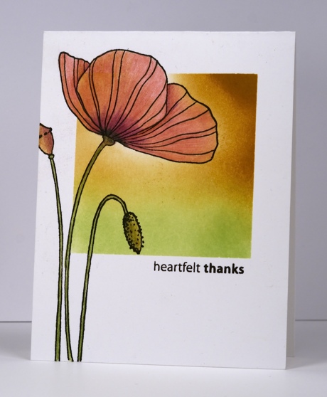
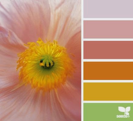
Susan is hosting the new One Layer Simplicity Challenge and she has chosen six gorgeous summer colour palettes to inspire us. I chose the one below which was a challenge as I don’t often combine pinks and yellows.
I just did a big clean up and reorganization of my craft area and in doing so found the card base above with the square already masked and the green sponging started. I sponged more of the square in memento peanut brittle. I then removed the mask and stamped the poppy in versafine onyx black. I decided to use my coloured pencils for the poppy because I had the colours in the photo. I blended one colour pencil over another rather than using a blending fluid or blender pencil.
Also entered in Inkspirational Challenge to use markers or pencils
Supplies:
Stamps: Poppy Time, Amazing (Penny Black)
Inks: Versafine Onyx Black, Memento New Sprout, Peanut Brittle (Tsukineko)
Also: Faber-Castell Artist Polychromos Colour Pencils
One-Layer Simplicity Challenge #7: Wave the Flag
Posted: July 1, 2014 Filed under: CAS, Maple Leaf, One-Layer Simplicity challenge | Tags: Fabriano Watercolour Paper, Penny Black stamps, Ranger Distress stains 6 Comments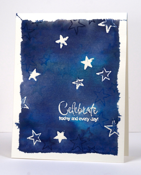
I am hosting the July challenge at One Layer Simplicity. In honour of Canada Day (July 1st) and American Independence Day (July 4th) I decided to make the challenge about flags. I want you to take a look at your country’s flag and find some inspiration there. It could be the colours, the layout, the patterns or the images. I created two cards because I have lived my life in two countries. I was born and raised in Australia and lived there for the first 35 years of my life. I married my Australian husband and both my daughters were born there. When they were 4 & 6 our family moved to Canada and seven weeks after we arrived my son was born. We have lived here ever since which will be 14 years next month. The card above is inspired by the Southern Cross on the Australian flag. I miss seeing the Southern Cross when I look up into the sky at night.
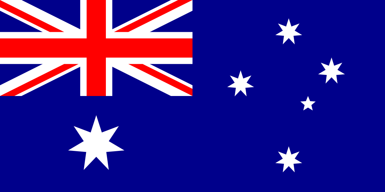

I cut a card base from watercolour paper as I planned to make it quite wet with distress stains and water. To frame the stars I tore the edge off some masking tape and taped the card base to a cutting mat. Once taped I stamped stars of different sizes and the sentiment in versamark then embossed with clear powder. I swiped three blue distress stains across the watercolour paper filling the whole space with colour. To blend it I spritzed a generous amount of water mixed with pearl-ex powder. You can see the sparkle of the pearl-ex powder below. After the panel had dried a little I stamped some more stars, this time in blue inks. When dry I removed the tape and ironed the panel embossed side down onto computer paper to melt and remove the embossing.

My second card is inspired by both the colour and the image on the Canadian flag. The beauty of the maple trees in autumn is something I look forward to every year. To create my second card I used the torn off bits of masking tape to make a narrow torn frame around the square front below. I then sponged red ink around the borders and stamped a maple leaf several times over the sponging. I can’t wait to check out your flag inspired cards and see how many countries end up being represented in our challenge
Supplies:
Stamps: Hello Winter , Sweet Wishes, To You, Foliage Fancy, Maple Leaf (PB)
Inks: Versamark (Tsukineko) Chipped Sapphire, Tumbled Glass, Broken China Distress Stains and Chipped Sapphire, Salty Ocean and Fired Brick distress inks (Ranger)
Cardstock: Fabriano 100% cotton hot pressed watercolour paper
Also: clear embossing powder, Pearl Ex
Golden Blooms
Posted: May 6, 2014 Filed under: CAS, One-Layer Simplicity challenge, Petal Power | Tags: Penny Black stamps, Ranger Distress stains, Tsukineko Memento inks 19 Comments
After years of avoiding yellow and orange tones in clothes and fabrics I am really enjoying using their bright warmth in stamping these days. I especially like the combination of yellow, orange and navy. I know leaves are rarely navy but orange and navy are opposite on the colour wheel so they create a contrasting stable colour scheme. I chose three colours to participate in this week’s Less is More challenge and the layout is inspired by the CAS(E) this sketch for the week. I just realized I can link up with our current One Layer Simplicity Challenge also to use flowers on a one layer card.
I cut a curved mask to cover the lower two thirds of the card base then chose three stamps from the transparent set Petal Power. I inked the solid petal stamp with mustard seed distress stain and added spiced marmalade along the petal edges. I then inked the co-ordinating outline stamp with just spiced marmalade on the top edge and stamped over the blooms. I stamped a few leaves in chipped sapphire distress stain and added the sentiment in Memento Paris Dusk.
Supplies:
Stamps: Petal Power, Sweet Wishes (PB)
Inks: Memento Paris Dusk (Tsukineko) Chipped Sapphire, Spiced Marmalade, Mustard Seeds Distress stains (Ranger)
Cardstock: Neenah Classic Crest Solar White 110lb smooth


