
Tranquil in watercolour
Posted: November 11, 2016 Filed under: Tranquil | Tags: Penny Black stamps, Ranger Distress inks, Ranger Distress stains, Speedball elegant writer, Tsukineko Versafine inks 5 Comments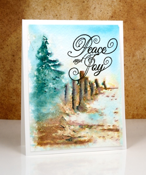
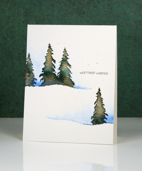
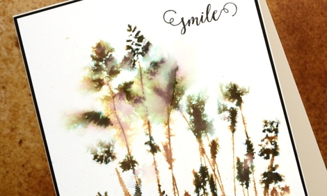
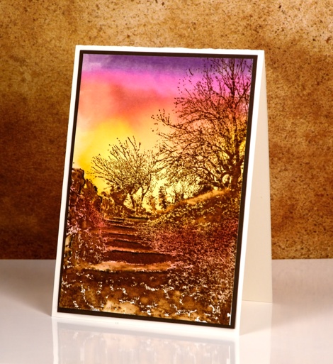
I’ve already posted two cards this week made with the scenic stamp, ‘tranquil’; this is my last one for now in a much looser watercolour style. On the previous two cards I stamped the image in versafine ink and it was sharp against a watercolour sky.
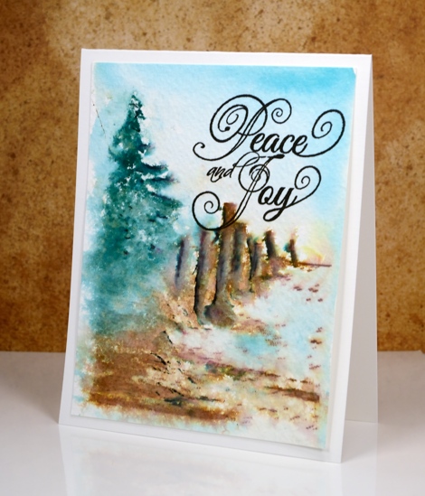
To create this scene I inked the tree in pine needles distress ink and the fence and ground in vintage photo distress ink and stamped it on cold pressed watercolour paper. I added shadows to the stamping with a black elegant writer pen then spritzed the panel with water to soften the whole image and let colours blend a little. I painted the sky with broken china distress stain to fill the rest of the panel, then added a sentiment in black ink.
Supplies
Stamps: Tranquil, Winter Joy (PB)
Ink: vintage photo, pine needles, broken china distress ink (Ranger) versafine onyx black ink (Tsukineko) elegant writer pen (Speedball)
Paper: cold pressed watercolour paper
Stockings were hung
Posted: November 3, 2016 Filed under: Brick wall, Christmas stockings, Diamond pattern, Textures, Winter lantern | Tags: Penny Black creative dies, Penny Black stamps, Ranger Distress inks, Speedball elegant writer 8 Comments
…by the chimney with care. This is the last of my Winter Warmth series and the one that almost didn’t make the cut because I misjudged the size of the stocking! I created the whole background panel then pulled out the die to add the stocking only to find it was a tad larger than I’d remembered. My children assured me some stockings are so large they cover half the fireplace so I continued with the design.
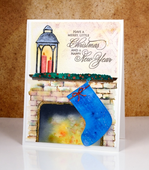
I created the background by stamping on cold pressed watercolour paper with distress inks. I first masked a space where the fireplace would be and a positioned a post-it across the panel where the mantel would end up. I stamped the brick wall stamp in brown and added darker tones with an elegant writer before blending with water. Above the mantel I stamped ‘diamond pattern and softened it with water. When I removed the post-it from the fireplace I used yellow, orange and black brusho to paint my ‘fire’. The lantern was done in two pieces just like I did on the ‘lakeside card‘ and yellow ink was added on the panel behind to make it glow.
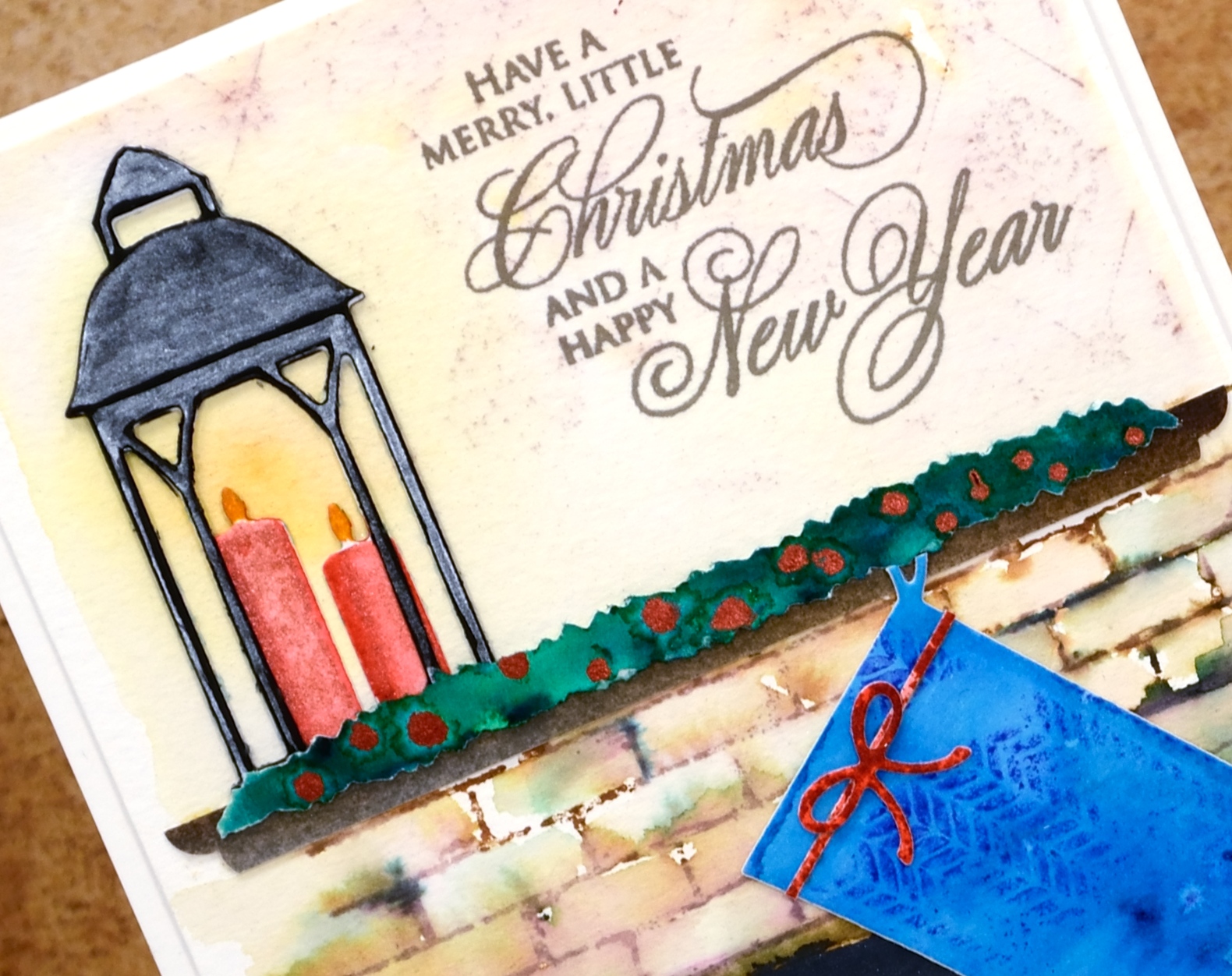
The swag over the mantel is a strip of watercolour paper painted with green brusho then dotted with siren smooches ink. I attached it over a strip of painted brown paper cut to look like a mantelpiece. The stocking was cut with one of the ‘Christmas Stocking’ dies then stamped with a texture stamp so it looked like fabric. This one had a higher fiddliness factor than most of my cards which increased my respect for those of you who create far more intricate die-cut cards on a regular basis.
Thanks for visiting this week as I shared my Winter Warmth cards. I’ll be back next week with some more snowscapes.
Supplies
Stamps: brick wall, textures, diamond pattern, season’s gifts (PB)
Dies: winter lantern, Christmas stockings, little ornaments (PB)
Ink: vintage photo, fired brick, blueprint sketch, scattered straw, spiced marmalade distress inks (Ranger)
Paper: hot pressed watercolour paper, cold pressed watercolour paper, black cardstock
Paint: scarlet, ost blue, yellow, gamboge, black, dark brown, emerald green brusho powder, Finetec Artist Mica watercolour paint
Also: elegant writer pen, siren smooches ink
OLS29 Christmas in July
Posted: July 1, 2016 Filed under: CAS, One-Layer Simplicity challenge, Spread Cheer | Tags: Faber-Castell Albrecht Durer Watercolour pencils, Penny Black stamps, Speedball elegant writer, Tsukineko Memento inks, Tsukineko Versafine inks 18 Comments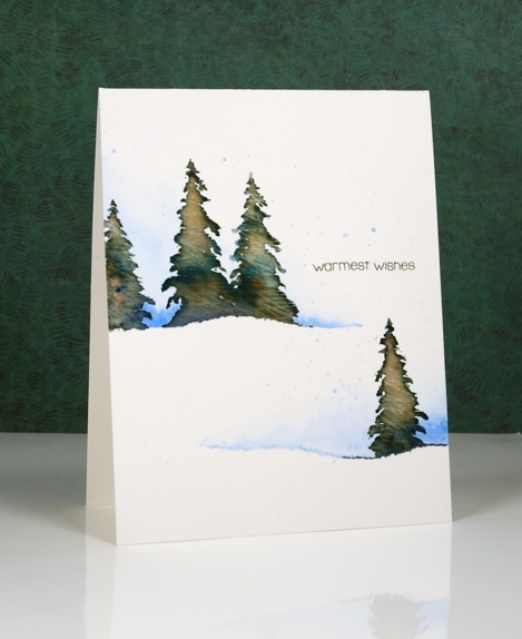
I am hosting the One Layer Simplicity Challenge this month and the theme is ‘Christmas in July’. I know some of you make Christmas cards all year but I usually start around now and keep going until December! If you haven’t even thought about Christmas cards then perhaps this challenge will be a motivator. Perhaps you want to enjoy the summer sun and not think about December at all – that is totally fine too!
To make this one layer card I tore a piece of painter’s tape lengthwise into two strips and positioned them on my watercolour paper card base. I painted some blue along the torn tape edge and faded it to white. Keeping the tape in place I stamped a few trees in Memento Northern Pine ink and added a few dabs of black elegant writer pen. After stamping I painted over the tree to blend the ink. Northern Pine separates into brown and green when diluted which gives the foliage some variety in colour.
I’ve been reading a book called ‘The Non-Designer’s Design Book’ which has made me think about layout in terms of alignment, repetition, contrast and proximity. The book is concerned mainly with text documents like business cards, menus, ads, etc but the principles are relevant to art layout too. I found myself trying to apply what I’ve learnt when working out where my sentiment would go.
Supplies:
Stamps: Spread Cheer(PB)
Inks: Northern Pine Memento ink, Versafine Olympia green (Imagine Craft/Tsukineko)
Pencils & Pens: blue watercolour pencil (Faber Castell), elegant writer pen (Speedball)
Cardstock: Canson Moulin du Roy 100% cotton hot pressed watercolour paper
Vintage sunbursts
Posted: June 10, 2016 Filed under: Nature's Paintbrushes, Sunbursts | Tags: Penny Black stamps, Ranger Distress inks, Speedball elegant writer 9 Comments
I have two last cards to wrap up my vintage watercolour week. These differ from all the previous cards as they were stamped with solid or ‘silhouette’ stamps rather than outline stamps. The technique used on all my other cards involved pulling brown ink from the outline either into the image or into the back ground.
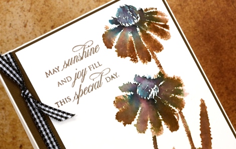
With a solid stamp the inside of the image is already full of ink so I adapted my technique in order to get the same vintage brown & black effect. Because there were no petals or wings to be filled I didn’t incorporate watercolour pencils into these designs. On the ‘sunburst’ stamp above I inked most of the stamp with vintage photo distress ink but left the flower centres and the base of the stems to be inked with the elegant writer pen. I spritzed the stamp so the brown and black would blend into each other and the pink and green tones would bleed out of the black. I moved the colour around a little with a paintbrush.
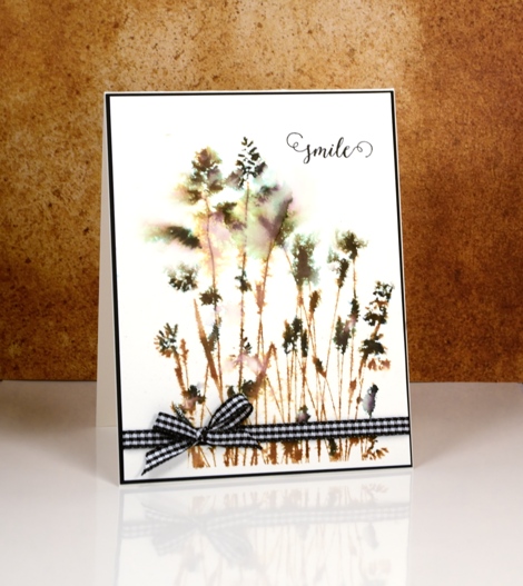
On the ‘nature’s paintbrushes’ stamp I inked first with vintage photo ink then added the elegant writer black on the seed heads of the grasses. I spritzed with water before stamping and also on the watercolour panel so the colour and image would bleed into the surrounding area.
When I was looking for some ribbon or twine to finish the cards I spied my black gingham and was surprised how much I liked it on the predominantly brown card.
Thank you so much for leaving me such kind comments this week; I glad some of you have tried the technique or plan to. I know many of you are not in my area but for those who are, I have a June class where we will be using similar techniques to make a poppy themed art square. (My first mixed media class!) All the details are on my upcoming classes page. I am also offering it at Crop A While in Orleans.
Supplies:
Stamps: Sunbursts, Nature’s Paintbrushes, Happy Snippets, Treasured Sentiments(PB)
Inks: Vintage Photo distress ink (Ranger) Elegant writer pen (Speedball)
Cardstock: Hot pressed Fabriano watercolour paper, black and natural cardstock (Neenah)
Also: black and white gingham ribbon
Vintage Flower Box
Posted: June 9, 2016 Filed under: Flower box | Tags: Faber-Castell Albrecht Durer Watercolour pencils, Fabriano Watercolour Paper, Penny Black stamps, Ranger Distress inks, Speedball elegant writer 13 Comments
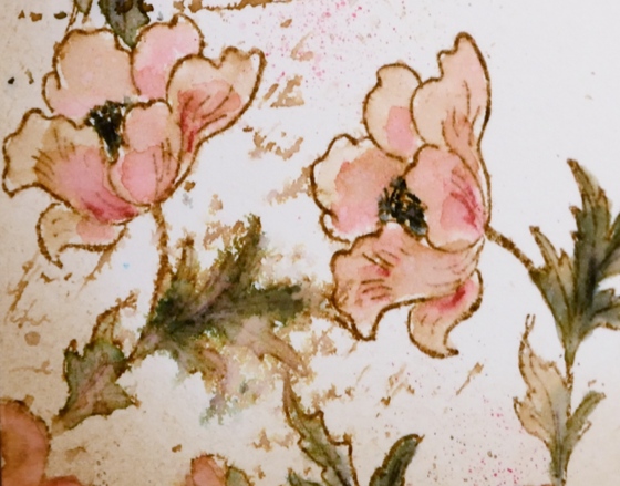
I’m continuing my vintage watercolour theme today with the square ‘flower box’ stamp. I completed this panel using the technique shared in my video tutorial. I stamped the image with vintage photo ink and added black here and there with the ‘elegant writer’ pen from speedball.
Most of the leaves and the centres of the large flowers have a black/green tinge to them; this is what happens when you add water to the elegant writer ink. I also spread it around the corners with a paint brush.

The orange and purple colouring is from watercolour pencils. I pulled colour from the pencils and filled the petals and flower shapes drawing in brown from the stamped outlines at the same time. I added splatters of colour from the pencil and water droplets for an aged look.

The word ‘smile’ is laser cut from matboard and glazed with crackle glaze. Thanks for joining me this week; I’m so pleased you are enjoying my vintage theme.
Supplies:
Stamps: Flower Box (PB)
Inks: Vintage Photo distress ink,Vintage Photo distress stain (Ranger) Elegant writer pen (Speedball)
Cardstock: Hot pressed Fabriano watercolour paper
Also: Albrecht Durer watercolor delft blue, raw umber, dark orange pencils (Faber-Castell), Rock candy clear crackle paint(Ranger)
Vintage Watercolour tutorial
Posted: May 4, 2016 Filed under: Fly High, Playful, Tutorial | Tags: Faber-Castell Albrecht Durer Watercolour pencils, Penny Black stamps, Ranger Distress inks, Speedball elegant writer, Tutorial, video 31 Comments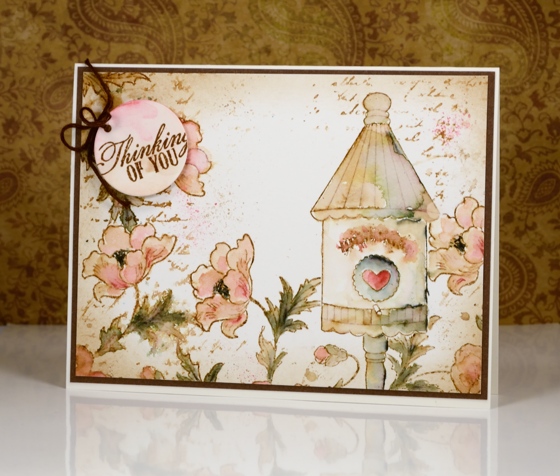
I have a tutorial for you today (gasp) which I made for SplitcoastStampers. In it I show my technique for creating a vintage style watercolour. By vintage style I am referring to muted sepia tones in this case with some blurred script and watermarks to give it an even more aged look.
I chose a birdhouse from the Fly High set and paired it with the Playful stamp using masks to stamp all my elements before I started watercolouring.
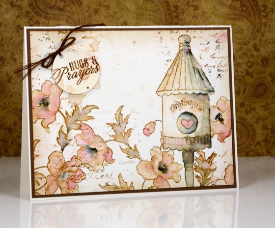
The two examples above are fairly similar; I changed the sentiment and naturally the watercolouring is not exactly the same. If you visit Splitcoaststampers you can see the stepped out photo tutorial or you can watch my video tutorial below.
This video came together quite smoothly (with the help of my son and my husband) so here’s to more!
Thank you for being so kind in your comments. You really are such an encouragement to me. I hope you try some vintage style stamping; all you need is some brown ink and a few watercolour pencils. The fun of the elegant writer pen is entirely optional.
Supplies:
Stamps: Playful, Fly High, Soar (PB)
Inks: Vintage Photo distress ink (Ranger)
Cardstock: Hot pressed Fabriano watercolour paper, brown cardstock
Also: elegant writer (Speedball) Albrecht Durer watercolor pencils 142, 180 (Faber-Castell)
Terraced Lane
Posted: April 28, 2016 Filed under: Stamped Landscapes, Terraced Lane, Watercolour | Tags: Penny Black stamps, Ranger Distress stains, Speedball elegant writer, Tombow dual brush pens 13 Comments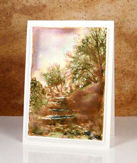
If you enjoy scenery stamps like I do there are a couple of beautiful designs in the new ‘A Little Bit of Sunshine’ release. This one, ‘Terraced Lane’ is a detailed stamp depicting both trees and steps. I will be trying this one in a range of colour schemes.
These two cards display two ways to approach such a detailed stamp. On the panel above I stamped first in vintage photo distress ink then added colour with a mowed lawn distress marker, the black elegant writer pen and a tiny bit of blue marker in the sky. I blended the green and black with water and a paintbrush to fill the scene with some colour then framed the top left corner free hand with vintage photo ink and some diluted black ink.
To create this sunset version I worked in the opposite order creating the background sunset with tombow dual brush pens first then once it was totally dry, I stamped the image in brown over the top. I finished the scene off by blending a few areas around the steps but left most of the stamping sharp.
Supplies:
Stamps: Terraced Lane (PB)
Inks: Mowed Lawn, Vintage Photo distress stains (Ranger) Elegant writer pen (Speedball) dark plum 679, rhodamine red 725, pink rose 703, light ochre 991 dual brush pens(Tombow)
Cardstock: Fabriano 100% cotton hot pressed watercolour paper, brown cardstock, Neenah natural white cardstock
Poppy Gems 3
Posted: March 9, 2016 Filed under: Poppy Gems | Tags: Penny Black stamps, Ranger Distress stains, Speedball elegant writer 10 Comments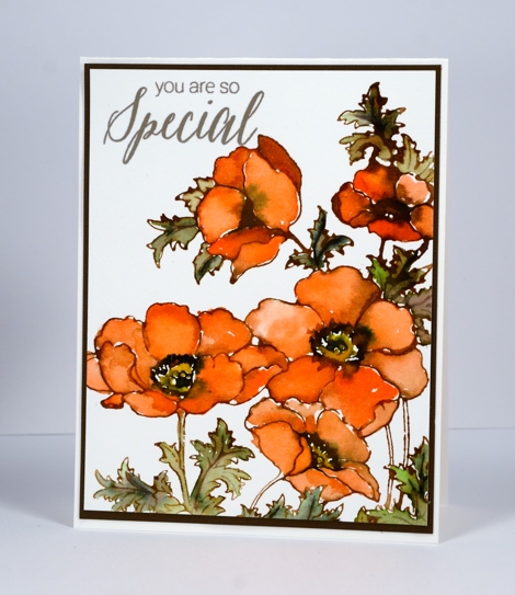
This is the third of my Poppy Gems cards; each design has been a little ‘cleaner’ than the last. The main difference on today’s card is the clean white background behind the orange blooms. I have stuck with the same layout each time which incorporates almost the whole large stamp. I think there is scope to mix it up for my next Poppy Gems offering.
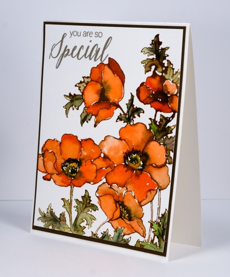
I stamped the whole image in Vintage photo distress ink which blends really easily with water or stains giving a slightly brown tone to all the added colour. I used the stains listed below to paint the flowers and leaves and added some elegant writer pen in the flower centres and on the veins of the leaves. Once again I added water to the elegant writer to get it to bleed and add some extra tones to the images.
Supplies:
Stamps: Poppy gems, Special Thoughts (PB)
Inks: Versafine Vintage Sepia (Tsukineko) Vintage photo distress ink, Ripe persimmon, Mowed Lawn, Mustard seed and Vintage photo distress stains (Ranger)
Cardstock: Fabriano 100% cotton hot pressed watercolour paper, brown cardstock
Poppy gems 1
Posted: February 27, 2016 Filed under: Flourish and butterflies, gift card pocket, Poppy Gems | Tags: Penny Black creative dies, Penny Black stamps, Ranger Distress stains, Speedball elegant writer 28 Comments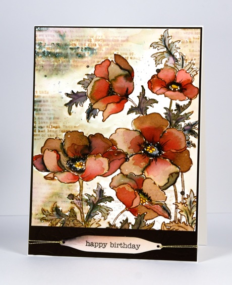
Over the next week or so you are likely to see the new ‘Poppy gems’ stamp a few times. I have already stamped it in four different colour schemes and varied the mediums and styles. This one is by far the ‘busiest’ and is quite the contrast to the clean and simple stamping I have been sharing lately.
I created this earth toned panel initially with just brown and black but after doing most of the blending with water I decided to add a bit of red to the petals over the brown. I stamped with distress stain and pulled it into the petals and leaves with a paint brush. I added black with the elegant writer pen which bleeds pink and green tones when wet. I decided to add the text details after the flowers were finished keeping it loose and watery with the addition of water to both the stamp and panel. I stamped the text upside down the first time so I had to make it blurred so my error would not be less noticeable!
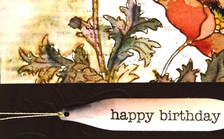
I die cut a few flourishes with the new ‘flourish and butterflies’ die and attached them to the base for a tone on tone detail; you can just make it out in the photo below. The sentiment is stamped on a tag from the new ‘ gift card pocket’ die.
Thanks for dropping by; I hope you are enjoying a relaxing weekend.
Supplies:
Stamps: Poppy gems, footnotes, snippets (PB)
Dies: flourish & butterflies, gift card pocket
Inks: festive berries, mustard seed, vintage photo distress stains & ink (Ranger) black elegant writer pen (Speedball)
Cardstock: Fabriano 100% cotton hot pressed watercolour paper, brown cardstock


