Cape Wickham Lighthouse
Posted: October 13, 2023 Filed under: cape wickham lighthouse, Echidna Studios, Stamped Landscapes | Tags: Echidna Studios, Fabriano Watercolour Paper, sennelier watercolours 10 Comments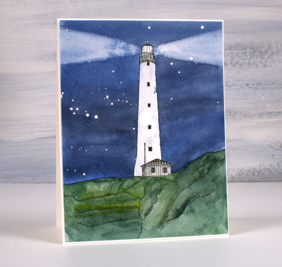
Recently I posted a card featuring a bridge in Oregon and asked if anyone knew or had visited the bridge. It was lovely to hear from people who lived in Oregon or had visited. One person lived very near the bridge. I would love to hear from people who have seen today’s lighthouse, it is quite remote. This image is another Echidna Studios digital stamp and is special to me for several reasons.
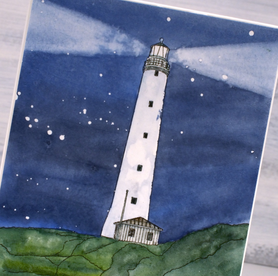
The lighthouse is called the Cape Wickham Lighthouse and it is on King Island in Australia. My daughter created the digital design from a photo but it wasn’t one of her photos; she’s never been there. The reference photo is from a slide my dad took in 1963 when our family lived on King Island. I was born there and at age 2 had my photo taken in front of the lighthouse. So you see there is input from three generations of my family in this card!
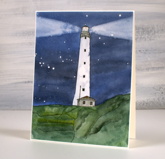
I printed the digital image on hot pressed watercolour paper, masked the lighthouse with a few strips of painter’s tape then splattered masking fluid over the sky. I painted the sky with Sennelier watercolours and while it was still damp painted removed paint with a damp brush to create the beams of light. Once the sky was dry I removed the tape so I could add some shadow to the lighthouse and paint the grass and hut. I removed the masking fluid to reveal the stars once everything was dry. (now I’m not sure that the Cape Wickham light shines out both ways like that but I used artistic license).
Let me know if you have seen or heard of the Cape Wickham lighthouse; it is the tallest in the Southern Hemisphere!
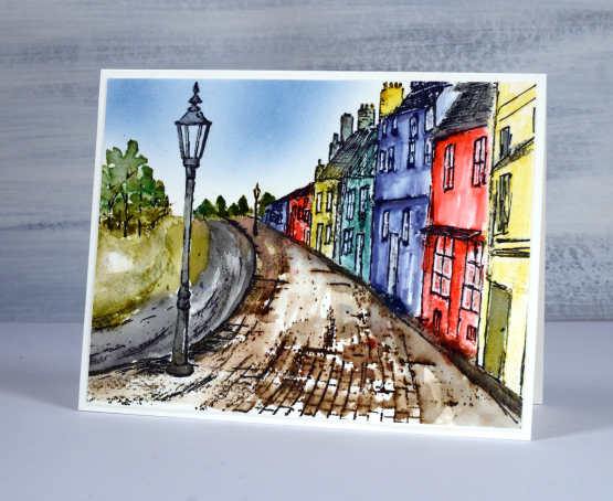
Village Stroll
Posted: July 28, 2023 Filed under: Stamped Landscapes, Stroll | Tags: Penny Black stamps, Ranger Distress inks 8 Comments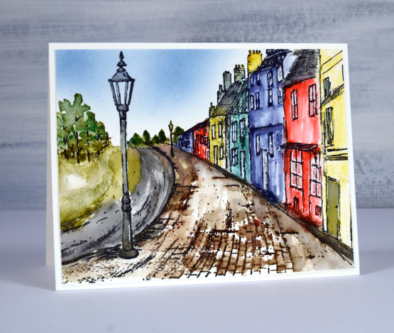
This lovely scenic stamp from Penny Black is called ‘stroll’ and it gives you a hint about why it has been so quiet on the blog lately. No I haven’t been in Europe strolling down pretty cobblestone streets but I have been on a break doing a little strolling with family while visiting several pretty places in Ontario and Quebec.
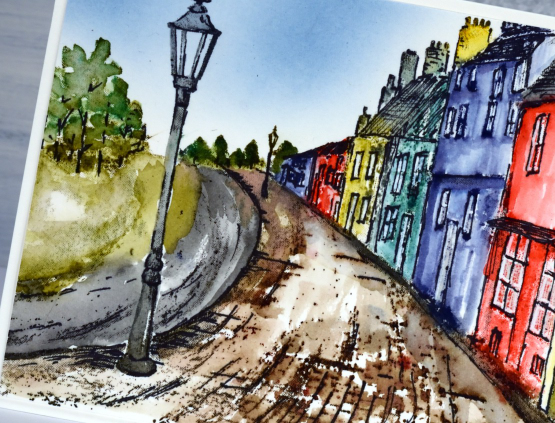
When I searched for a reference photo to guide my choice of colours my first search gave me a very similar English street, lovely but rather monochrome. I will try that approach next. Once I put Danish village street in the search I found something more colourful which ended up being the inspiration for this panel. As usual I worked on Fabriano hot pressed watercolour paper.
My approach was to use a stamp positioner and stamp first the cobblestone path, the trees, the lamp-post and then each house, all in distress inks. I then used a paintbrush and water to blend the colour in each stamped area. When the blended ink dried I stamped over the road and path with archival and amalgam inks to provide outlines. I was aiming for a sketched look so I used a permanent black marker to add outlines to all the houses as well. I fiddled back and forth between blending more distress inks and adding more outlines until I was happy with the image. To add sky I blended whatever blue ink was already in my blending brush! (looks like it could have been faded jeans but who knows?)
My recent strolls took me through the very pretty town of Perth, Ontario as well as L’Anse St Jean, Tadoussac, Quebec City and Mont Tremblant in Quebec. Where have you been strolling lately?
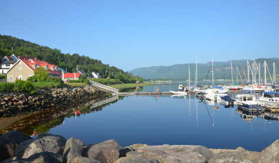
The L’Anse St Jean marina at 8:30 in the morning just before we took a boat tour of the Saguenay Fjord.
Seaside
Posted: June 23, 2023 Filed under: Penny Black, seaside, Stamped Landscapes | Tags: Fabriano Watercolour Paper, Penny Black stamps, Ranger Distress inks 9 Comments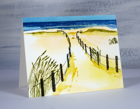
This image brings back so many memories for me. I love the ocean and beach so approaching the water down a sand covered path makes me very happy. I spent my first ten years in Tasmania and we had beach holidays at St Helens. After we moved to Canberra our family would go to Bateman’s Bay then in later years Bateau Bay and Port Macquarie. When I visit my Dad on the Central Coast we will sometimes walk along Soldiers Beach or just drive there to watch it during a storm.
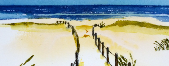
To create a sandy background I swiped a piece of hot pressed watercolour paper through some smooshed yellow inks. It gave an uneven coverage which I left to dry before stamping. Using a stamp positioner I stamped first the fence posts in grey and brown then inked and stamped the grasses with a couple of green markers. I stamped the sea in uncharted mariner(of course) then the shadows in the sand with fossilized amber.
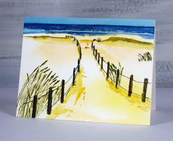
The initial stamping on hot pressed watercolour paper is always a bit patchy so I keep the panel in the positioner so I can restamp certain areas to build up depth of colour. I also use a paintbrush or markers to add colour directly to the panel. I painted the sky with broken china ink and finally added white dots to the ocean with a white gel pen. Now if I could just get to the ocean as easily as stamping the ocean…
(Compensated affiliate links from Foiled Fox & Scrap n Stamp)
Streaming
Posted: January 26, 2023 Filed under: Penny Black, Stamped Landscapes, streaming | Tags: Fabriano Watercolour Paper, Penny Black stamps, Ranger Distress inks, Staedtler watercolour brush pens 8 Comments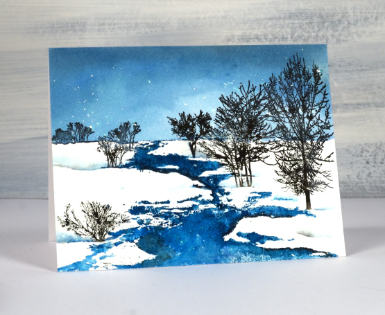
As I write this a snow storm continues outside so there will be scenes like this one to enjoy in days to come. The whole scene is one of Penny Black’s beautiful scenic stamps; this one is called ‘streaming’. I worked on hot pressed watercolour paper in a stamp positioner and had splattered masking fluid over the panel before I began.
I used a few different inks so I could blend in some areas and get sharp images in others. The first thing I stamped was the top of the stamp including the horizon in uncharted mariner distress ink. Once I could see the horizon I painted more of the same ink to fill the sky adding a little black soot to the blending at the top to darken the sky. I let the panel dry before stamping the stream also in uncharted mariner ink. I took my time blending the stream because I wanted a bit of variety in the depth of colour. You can probably see a few areas that look quite dark where I added black ink to create the look of shadow at the water’s edge.
I inked the trees in black archival ink and black starless sky ink (from Ciao Bella) I also used black and blue markers here and there to add ink to fiddly places. I painted some of my own shadowy snow drifts to fill out the scene.
(Compensated affiliate links from Foiled Fox, Ecstasy Crafts & Scrap n Stamp)

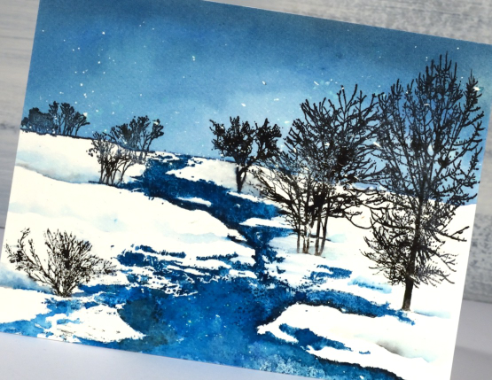
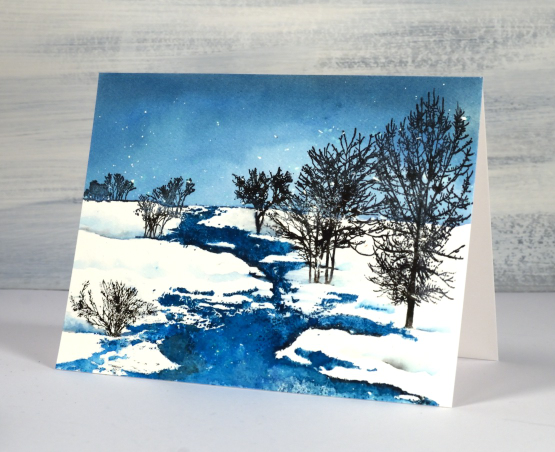
Traverse
Posted: December 27, 2022 Filed under: Penny Black, Stamped Landscapes, traverse | Tags: Penny Black stamps, Ranger Distress inks 4 Comments
Just like many of you we have experienced some crazy weather in the past week. We were very thankful to have our family together over the Christmas weekend, I know many people had to change their plans. The scene above, made with the Penny Black stamp, traverse, is a lovely wintery scene and not unlike what we are seeing around here now.
As usual I worked on hot pressed watercolour and kept it in a stamp positioning tool. The paper was splattered with masking fluid before I started, that’s how I ended up with all the little white dots of snow falling. I stamped the top half of the stamp first in pale green, but I should have chosen pale blue. I did this so I could see where the trees were and the top of the bridge. While the panel was securely in the stamp positioner I painted the sky with faded jeans distress ink making sure the ink came right down to the top of the bridge and past the tops of the trees. When the painted sky was almost dry I stamped the trees in rustic wilderness and pine needles inks. With a damp paintbrush I blended the inks making sure I left sections of the tree white to look snow covered. I moved onto the cabin which I stamped in vintage photo and black soot. The bridge is stamped in black soot and hickory smoke ink and blended with a paintbrush.
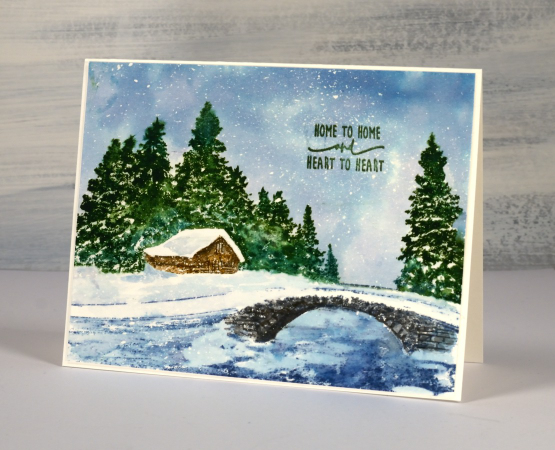
I stamped the creek and surrounds in faded jeans distress then blended some uncharted mariner in for variety. I finished off by removing the masking fluid and adding a sentiment in rustic wilderness archival ink. Hope you are having a relaxing week.
(Compensated affiliate links from Foiled Fox, Scrap n Stamp & Ecstasy Crafts)
Snowfield
Posted: November 14, 2022 Filed under: Penny Black, snowfield, Stamped Landscapes | Tags: Fabriano Watercolour Paper, Penny Black stamps, Ranger Distress inks, Stamped Landscapes 12 Comments
I have teamed up with the Foiled Fox today to bring you this snowy scene. It’s all one big beautiful Penny Black stamp called snowfield. The PB scenic stamps are fun to combine with each other or just add a few elements to but I generally stamp them first all by themselves. I like to get to know the stamp because a scenic stamp often has foreground, middle ground and background elements. In order to use watercolour techniques with them I need to work out what part of the stamp I should ink first.
In a snowscape it is also important to think about which parts of the panel need to stay untouched by ink or paint so they can look like fresh white snow! If you pop over to the Foiled Fox blog you will find my step by step process described. I used both water soluble (distress inks) and waterproof (archival inks) on this scene. I blended several colours on the fence posts so those were stamped with distress inks. The details on the trees are very fine so I used archival inks for a solid print along with some distress which I could blend over the larger trunk and branches to fill the silhouette shape. Of course the sky and snow is all done with distress inks because I wanted to add water so I could blend and dilute.
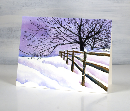
When painting shadows around snowy areas it is sometimes hard to keep all the white areas white; that is where a paint pen, gel pen or some white paint can come in handy for touching up at the end. You can even add paint splatter at the end rather than masking fluid at the beginning if you like.
I hope you take some time to visit the Foiled Fox blog; they have a world of inspiration waiting for you.
(Compensated affiliate links from Foiled Fox)
Snowy Panorama
Posted: November 7, 2022 Filed under: panorama, Penny Black, Stamped Landscapes | Tags: Fabriano Watercolour Paper, Penny Black stamps, Ranger Distress inks 7 Comments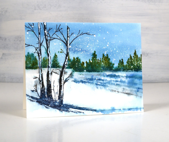
As I post yet another winter scene I can tell you there is still no sign of winter round here. We’ve been having mild fall days. It is weird for it to be so warm with the trees almost bare! To create today’s card I used Penny Black’s ‘panorama’ stamp. I stamped the horizon line first in broken china distress ink. This is a step I often do if I want to paint the sky with the wet on wet technique. By stamping the edge where the snow meets the trees I was able to paint water on the whole panel from the horizon up then add in broken china and uncharted mariner to get a varied blue sky. I did get blue ink on the white tree trunks but I had already decided I would touch them up with white paint at the end of the process.
While the sky was still drying (in the stamp postioner) I inked the distant trees with forest moss and pine needles and stamped. The ink soaked into the damp paper creating the soft focus effect you see above. I dried the panel then switched to an archival ink to stamp the three foreground trees. I also stamped them in black soot distress ink and the lines in the snow with uncharted mariner. I blended a bit with a paint brush but also spritzed lightly to get the inks to feather out a little.
You can probably tell I started with splattered masking fluid on the watercolour panel. I tend to do a few panels at a time so they are ready later when I want to stamp a winter scene. If you don’t want to bother with masking fluid you can always splatter with white paint when you have finished your scene.
Thank you to all who left me a kind message on my Rivulet card post. Many of your guesses were close; like me you picked a brown and a blue. The two inks were uncharted mariner and ground espresso; I love the range of hues I got when those two mixed.
(Compensated affiliate links from Foiled Fox, Scrap n Stamp & Ecstasy Crafts)

Rivulet
Posted: November 3, 2022 Filed under: Penny Black, rivulet, Stamped Landscapes | Tags: Fabriano Watercolour Paper, Penny Black stamps, Ranger Distress inks 23 Comments
I love it when I find a stamp that looks like somewhere I’ve been. I couldn’t tell you exactly where this is but I have experienced scenery like this. I’ve said it before but winter here in the dark cold north is very beautiful. This gorgeous PB stamp is called ‘rivulet‘ and I used only two inks! I am going to let you guess the inks. I’ll update the links below in a few days but I’d really like to see your guesses. (hint: they are distress inks)
I worked on a piece of hot pressed watercolour paper splattered with masking fluid. I used the splatter brush I have used in the past. It gives a fine splatter. If I want bigger spots masked I will use an old paint brush. I worked in a stamp positioner, stamping first in one ink colour, then partially inking the stamp with the second colour before stamping again. I used a fine tip paint brush to blend the ink to fill the tree trunks and rivulet. I smooshed the inks on my glass mat so I could pick up extra ink if needed to fill some areas.
The panel is larger than my usual 4.25″x 5.5″ but I didn’t want to trim it so I left a little extra space at the bottom of a larger card base for the sentiment from PB set ‘jolly snippets. I have already made a second card with this stamp, changing ink colours to suggest a different time of day. Don’t forget to leave your ink colour guesses for this card in the comments below!
(Compensated affiliate links from Foiled Fox & Scrap n Stamp)

Autumn in the mountains
Posted: October 7, 2021 Filed under: arbors, Penny Black, picturesque, Stamped Landscapes | Tags: Penny Black stamps, Ranger Distress inks 5 Comments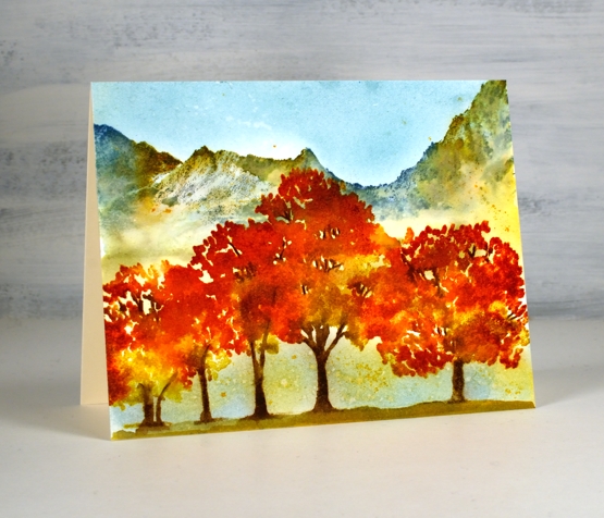
Outdoors is pretty ‘speccy’ right now. We don’t have too much of the deep red yet but I have seen it here and there. I have got into the habit of going for a walk or run soon after breakfast so I’ve seen the increase in autumn colours over the last few weeks. Yesterday there was fog when I set out so everything was a bit more muted but by the time I headed home the sun was burning off the fog and the golden tones were shining.
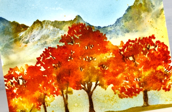
The first step in creating this scene was to stamp the top half of the mountain stamp (PB picturesque) in faded jeans and speckled egg distress inks on hot pressed watercolour paper. I painted below the mountains with water softening the colours at the bottom so there was no distinct line where the mountains ended. I then painted over the top of the mountains with water and dropped some spiced marmalade, forest moss and ground espresso ink into the wet area to add colour.
I dried the panel before starting on the trees using the PB arbors stamp. I stamped with ground espresso, fossilized amber, spiced marmalade and crackling campfire, not all at once, a couple of colours at a time to build up the coverage. I spritzed the stamp before stamping but didn’t spritz the paper.
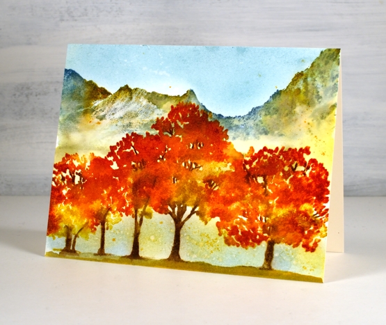
When I was satisfied with the trees I painted ground underneath them and dried the panel again before blending speckled egg ink in the sky and below the branches. To finish I splattered both water and fossilized amber ink to break up the expanses of blue.
Supplies
(Compensated affiliate links used when possible)

Trailing leaves
Posted: September 10, 2021 Filed under: mountain magic, Penny Black, Stamped Landscapes, trailing | Tags: Penny Black stamps, Ranger Distress inks 9 Comments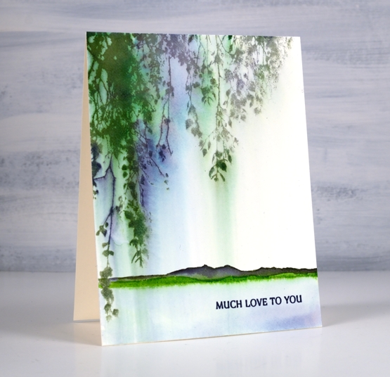
The PB ‘trailing’ stamp featured in this card is definitely a versatile one; it works both hanging down as is here and growing up from the ground.
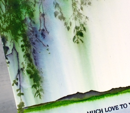
This card was very simple to make but I love the pretty blends and ‘weeping’ nature of the leaves. I inked the stamp with mowed lawn, chipped sapphire and iced spruce distress inks and stamped it on hot pressed watercolour paper. Soon after stamping I used a wide watercolour brush to paint water downwards over the stamping. The brush pulled ink from the stamping, blending and diluting it in the process.
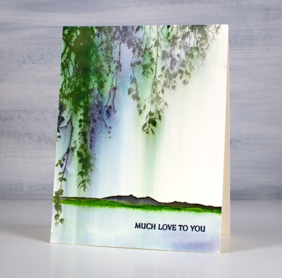
Once the panel was completely dry I inked the hills from the PB ‘mountain magic’ set in both mowed lawn along the base and then chipped sapphire along the top. I painted over the top with water and pulled the mowed lawn ink below the stamped image to look like the edge of a lake. As I am writing this I’m thinking about trying exactly the same design but in warm autumn tones…
Supplies
(Compensated affiliate links used when possible)