Leaf & Lavender Gel Print – Video
Posted: July 9, 2024 Filed under: Classes, gel press, Tutorial | Tags: Classes, gel press, gel printing, Tutorial, video 6 Comments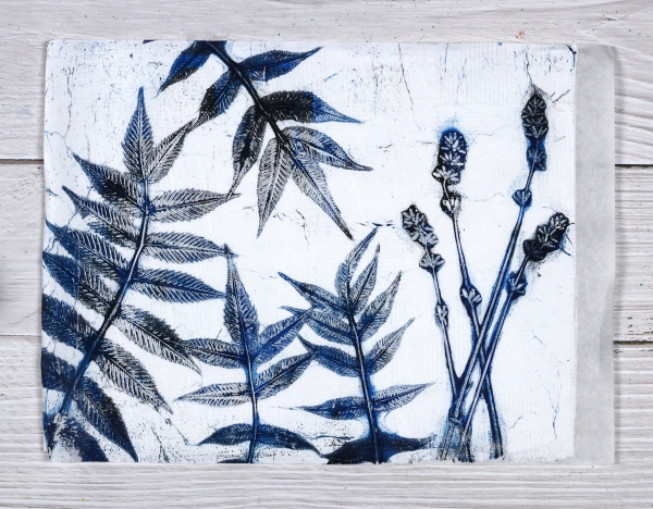
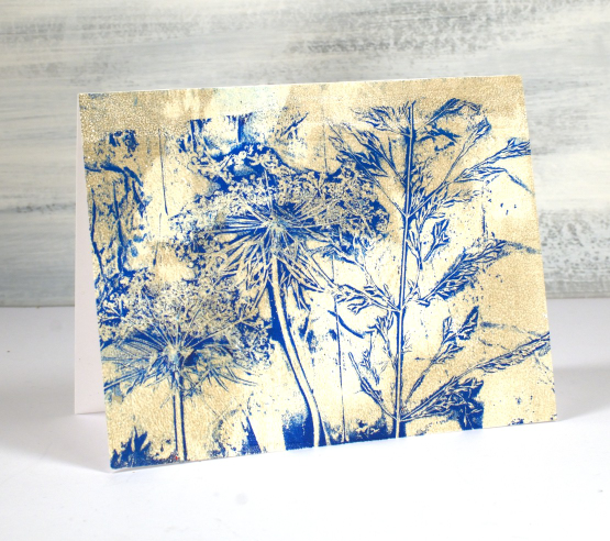
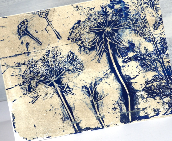
With all the summer rain and summer sun we’ve been having lately I am surrounded by plants and flowers. And when that happens what do I do? Well yes, I pick some and put them in vases. I wander around the garden and enjoy them but I also gel print them. I’ve done a couple of plant printing sessions recently and have some prints, cards and videos to share over the next few weeks.
I set up to film recently and began with what I thought would be a warm up print; I don’t always film my warm ups but I am so happy I did because I think this print was the best of the session.
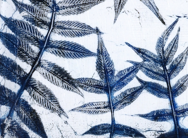
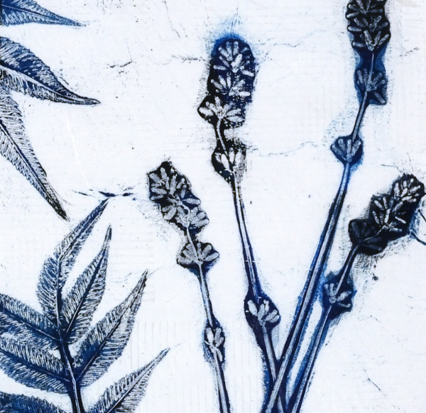
I did this print without an end purpose in mind but I think it would make a great book cover for a future hand made book. The leaves look like sumac but I’m not certain. The flowers are lavender from my garden and the buds were closed when I printed them. I noticed today the buds have opened so I will pick some more and try printing them again. The fragrance was lovely as I used them but the ‘fragrance’ of acrylic paint definitely overpowers the lavender on the print.
My mind is full of botanical gel printing ideas right now as I am not only making videos but also teaching an in-person class here in Ottawa. I’ll be back with more botanical gel print inspiration soon as I’ve already turned some prints into cards.
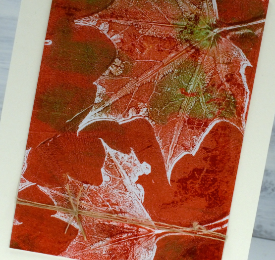
The leaves are turning – video
Posted: October 16, 2023 Filed under: Echidna Studios, gel press, Mooneys Trees, Stampin Up, timber embossing folder, Tutorial | Tags: Echidna Studios, gel press, gel printing, Tutorial, video 7 Comments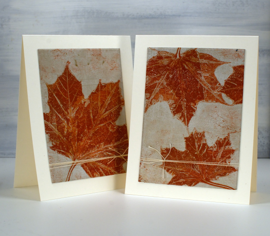
As the leaves start to turn around me I brought a few green ones to the gel plate and printed them in the colours of autumn. I filmed as I printed so you can see a few different techniques. There is a brief appearance of backyard wildlife that must have come in on the freshly picked leaves. Let me know if you know what it was.
As you will see in the video I used a 5″x7″ gel plate and a mix of liquitex, decoart and sennelier acrylic paints to pull prints on printer paper.
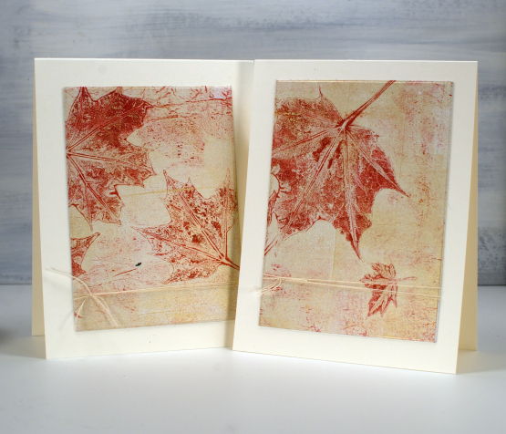
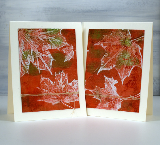
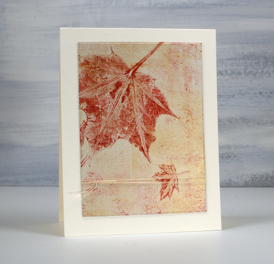
Recently I have been turning 5×7 inch prints into card fronts with a strip left for a matching envelope. For today’s cards I attached the whole print to cardstock then used WaffleFlower rectangle dies to cut panels from each print, added twine to both panels then attached them to cream card bases. There are no strips left for the envelopes but twice as many cards. I have left them without sentiments but if needed I can tie a little sentiment tag onto the twine.
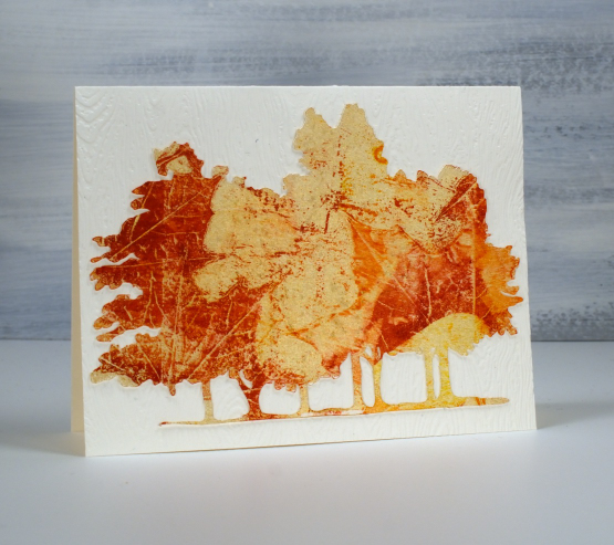
The print below is also featured in the video. I thought it would be fun to print leaves onto the Mooneys Trees cut out. I used the digital cutting file to cut from cream cardstock then picked up the leaf print from the gel plate. My new timber embossing folder from SU was the perfect background.
The close up below is the two step print, pulling first the background with the leaves still on the plate, then the leaf texture after they have been removed.
I think this final card might be my favourite. I didn’t plan it this way but it looks like that little leaf is falling away from the bigger one.
Today’s post features affiliate links to the following companies. If you buy through these links I receive a small commission at no extra cost to you. The Foiled Fox & Scrap’n’Stamp
Gel Print Floral Card Combos – Video
Posted: October 2, 2023 Filed under: gel press, Tutorial | Tags: gel press, gel printing, Tutorial, video 2 Comments
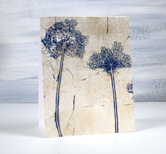
One of my favourite things to print on a gel plate is flowers. One of my favourite flowers to print is Queen Anne’s Lace. You might think, as I did, that Queen Anne’s Lace would be too fragile to print but it is surprisingly strong and the gel plate picks up all that delightful detail.
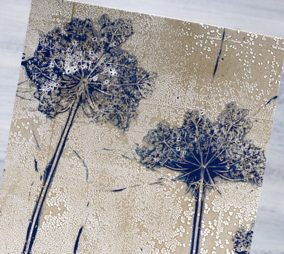
I don’t always print an envelope and card front in one go but it is a nice way to get a matching pair. I used a 9″x11″gel plate to easily fit both. I mention in the video that you can print the flowers over and over; the paint that clings to the flower head makes it sturdier rather than pulling it apart. The first few prints might leave some seeds on the gel plate and print but that just adds to the realism in my opinion.
Thank you to those of you who subscribed to my youtube channel last week. I am slowly building my community of subscribers again after losing my first channel. There are some of my early gel printing videos on the new channel marked with a ‘from the archives’ label and there is a gel printing playlist if you want to binge the lot.
If you don’t have a gel plate large enough to pick up a card front and envelope in one print you could always do two prints one after the other keeping your paint colours the same.
Below are a few more card and envelope combos I’ve printed using this same technique with a sticker to mask a space larger enough for the address.

You can see on this card featuring Queen Anne’s Lace and grasses that the print does not reach to the top of the card front. I guess I didn’t press down evenly when taking the print.
Of course you can make co-ordinating card and envelope prints using any pattern; it doesn’t have to be plants but when I have plants, not snow in the yard I like to choose plants. I’ve also used stencils.

I hope you give this technique a try; it makes an eye catching bit of mail to send. Make sure you use removable stickers to mask your address box; you can probably guess why I mention that!
If you are new to gel printing check out my online course Gel Print Journey to learn all the basics and try all sorts of patterns and combos.
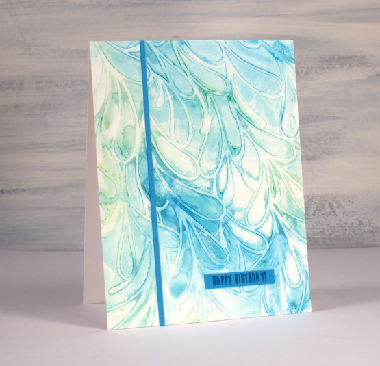
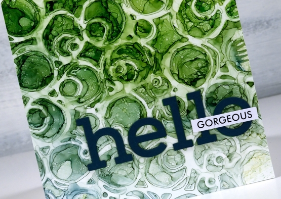
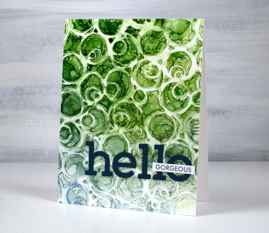
Alcohol Inks + Stencil on the Gel Plate
Posted: September 18, 2023 Filed under: Alcohol Ink, Dies, gel press, Lavinia, Penny Black, Tutorial | Tags: Alcohol Ink, gel press, Lavinia, Tutorial, video 5 Comments
Recently I posted a card featuring a gel print made with alcohol inks and a stencil. You can check out that card here. There was quite a lot of interest in seeing a video of my process so that is what I have for you today. One of the bonuses of this technique is the way I can make more than one print from the same initial application of alcohol ink. I worked with T-Rex alcohol inks on a 5″x7″ gel plate.

As you will see in the video the first card (shown above) is made from the first print pulled from the gel plate.
The second print pulled from the gel plate features the same inks but they are more muted because I diluted them to move them from the stencil to the plate. I quite like the softness of the second print.
If a print works for me and honestly, they don’t all work, I often don’t want to cover them up with extra decoration or die cuts. That’s why I kept these card designs very simple with just a die cut ‘hello’ added to the first card. The second print which I made into the card below features an even smaller birthday sentiment and one thin strip of the same cardstock.

One of the reasons I like to work with alcohol inks on the gel plate is the fact that I can pull the prints with a piece of paper, in the case of these prints I used printer paper. When I work with alcohol inks apart from the gel plate I generally use a thicker plastic surface such as yupo or craft plastic. The inks move beautifully on those surfaces but the plastics are bulkier and a bit more expensive so it is nice to have the gel plate + paper option. The featured prints from today’s video were done on a 5″ x 7″ gel plate which meant I could get a 5.5″ x 4.25″ card front as well as a left over strip to add to the envelope.
If you are new to gel printing in general and would like to know more about creating a range of patterned prints please consider my online class, Gel Print Journey, where I cover all the basics with acrylic paint and all sorts of patterned and textured items. If you purchase any of my online classes before the end of September use the code: ENDOFSUMMERSALE for a 20% discount.
Chipboard Decorations
Posted: December 9, 2022 Filed under: chipboard, christmas ornaments, gel press, grafix, Sizzix, Tutorial | Tags: collage, gel press, gel printing, grafix, Tutorial 3 Comments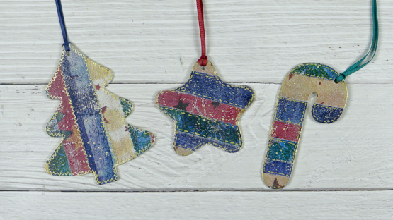
I have been creating collage panels with my many gel prints lately, most for Christmas cards. The striped and patchworked collages looked so pretty I decided to try the process on Grafix chipboard.
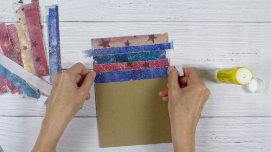
I collaged on both sides and love the way they turned out. I made a video of the process then made more chipboard decorations in different colours.
I used a serious chipboard cutting die to cut the ornaments. It is from Sizzix and I was pleased to see how clean the cuts were. If you have a digital cutting machine you would be able to cut the chipboard into any number of shapes.
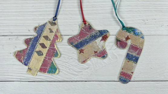
After cutting out the shapes I used a gold gel pen to add stitching lines and gold paint to coat the edges. A crop-a-dile made quick work of punching holes so I could add ribbon to the shapes.
(Compensated affiliate links from Foiled Fox, Scrap n Stamp)
AI Brussel Sprouts video
Posted: February 18, 2022 Filed under: Alcohol Ink, Concord & 9th, grafix, simple serif alphabet dies, Tutorial | Tags: Concord & 9th, grafix, grafix craft plastic, pinata alcohol ink, Ranger Alcohol Ink, Tutorial, video 9 Comments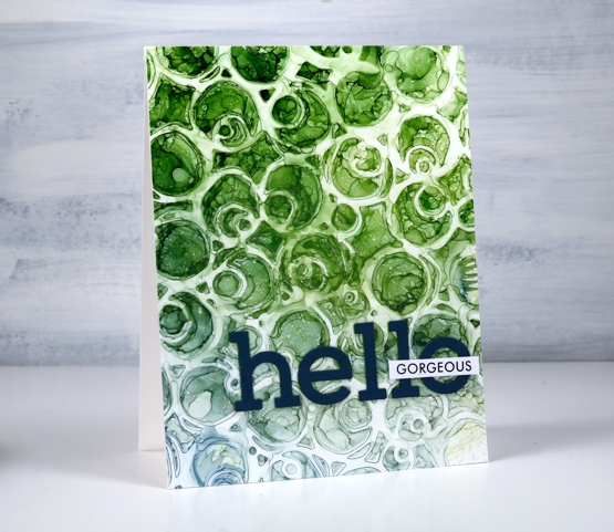
If you are a little baffled by the title of this post don’t worry no brussel sprouts were harmed or eaten or even incorporated into the making of this video! But would you agree that the little patterns formed inside the circles on the panel look a bit like brussel sprouts?
You will see in the video I didn’t set out to make a brussel sprout pattern; I actually changed track part way through the process. The video shows the technique I started with along with stencil technique I ended up doing. So it’s basically a 2 for 1 deal.
There are several ways to use a stencil with alcohol inks and this is just one. Make sure you check out Ardyth’s youtube channel for more ideas. I mentioned in the video that some alcohol inks tend to be a bit pushy and end up taking over a colour scheme. The lime green did so on this card but I’m glad there are some blues tones still visible at the base of the card.
I finished the card with die-cut letters and a single word from Paper Rose Studio’s So Extra sentiment strips.
You can see other cards made using this technique here and here.
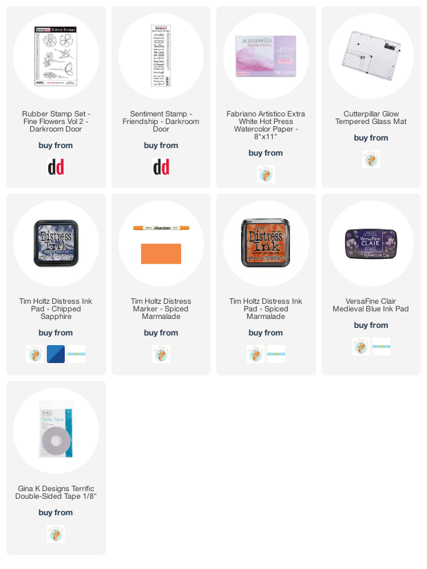
Supplies
(Compensated affiliate links used when possible)
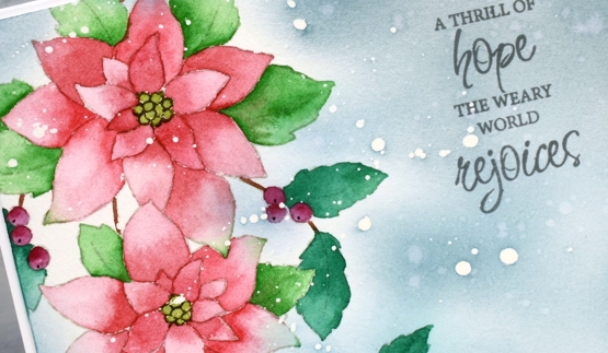
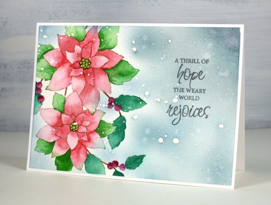
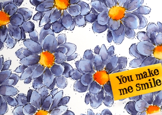
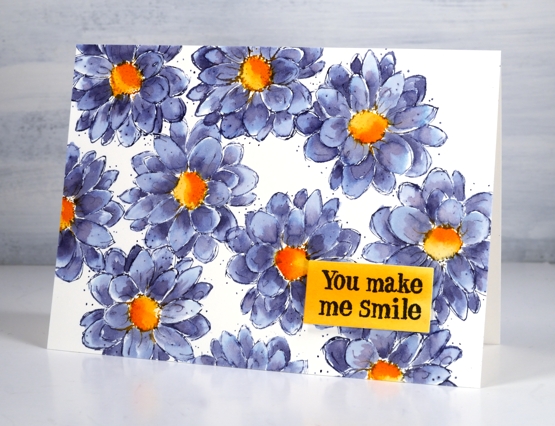
Carmine – No Line Watercolour Video
Posted: November 16, 2021 Filed under: carmine, Penny Black, sennelier watercolours, Tutorial | Tags: distress markers, Fabriano Watercolour Paper, Papertrey ink, Penny Black stamps, sennelier watercolours, Tsukineko Versafine inks, Tutorial, video 9 Comments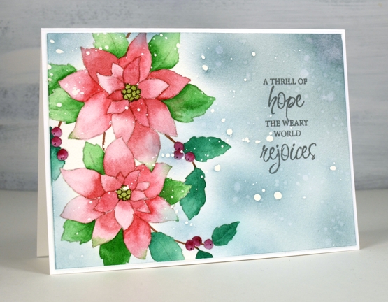
I hope you enjoy today’s no-line watercolour video. When I first saw this stamp I knew it would be perfect for the technique. There are a few little petals but most of the image is made up of open leaves and petals which are easy to see while painting. I used soft stone ink for the initial image on cold press watercolour paper and Sennelier watercolour paints for all the painting.
If you don’t always have a plan for the background you will see how I added one after all the painting was done. Take a look at the video below to see my process.
This is such a pretty stamp and might get inked up again soon to keep my stock of Christmas cards growing. I think it would look good embossed in white on a coloured background. Stay tuned!
Supplies
(Compensated affiliate links used when possible)
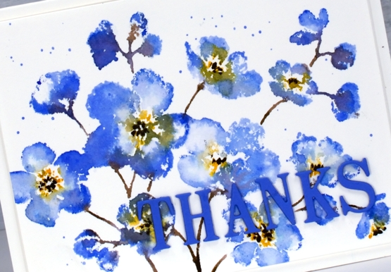
Fine Flowers watercolour video
Posted: August 3, 2021 Filed under: Darkroom Door, fine flowers vol 2, Tutorial | Tags: Darkroom Door stamps, distress markers, Ranger Distress inks, Tutorial, video 6 Comments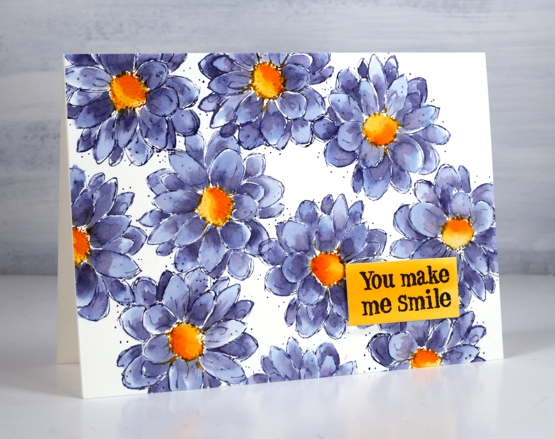
This pretty outline flower is from the Darkroom Door set ‘fine flowers vol 2’. There are six flowers in the set and I am working my way through trying out each stamp. I began inking and stamping this zinnia/dahlia style flower and was so happy with the colour combination I stopped stamping and set myself up to film. You can see the process in the video below.
I’ve exclaimed about inks that colour separate before( and go into more detail in my online class Colour Clues ) but one of my favourites in this regard is chipped sapphire distress ink. You can see in the close up below grey blue, navy blue, pale blue and purply blue. Hardly any effort required!
All the stamps in the set have the same sketchy style and tiny dots so I did not add any further fanciness. It really was a minimal supplies card in the end even though I did not start with that plan in mind.
By the way Rachel Greig from Darkroom Door is running a challenge throughout August called #artfulaugust. If you check her instagram you can see a list of prompts. I am going to join in as often as possible as it is an open ended no pressure challenge. I have already missed one day but I am not going to dwell on that I will just dive in when I can. Kathy Racoosin is also running the Daily Marker colouring challenge during August, another low pressure, designed for fun and relaxation challenge. I hope to participate in that when I can too. Let me know if you are joining in.
Supplies
(Compensated affiliate links used when possible)
Daydream Watercoloured Flowers -Video
Posted: February 18, 2021 Filed under: daydream, Karin brushmarkers, Penny Black, Tutorial | Tags: Karin brushmarkers, Penny Black creative dies, Penny Black stamps, Tutorial 7 Comments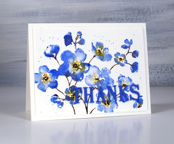
Penny Black has a new release called ‘Daydream’ and it’s filled with spring goodness. I guess many of us start daydreaming about spring in February. The stamp featured in my card today is called ‘daydream’ and I’ve paired it up with a new die, ‘thanks & hello’.
I’m enjoying working with the Karin brushmarkers both for watercolouring line images and for inking stamps. In today’s video I ink the stamp with four markers but my technique is slightly different to my usual method and involves some ‘water stamping’
In the video below you can see why the juicy Karin markers are perfect for this technique. As I’ve mentioned in previous posts, a little ink goes a long way. I’m looking forward to trying this technique again on a different stamp with even less ink for a paler more subtle look.
I chose to keep the panel simple on a white background but you could add a pale wash before starting or do some second generation stamping for background flowers. Maybe I’ll try that next.

This blue which has a hint of purple is my favourite blue. It reminds me of cornflowers which featured in my bridal bouquet and was the colour of my bridesmaid’s skirts.
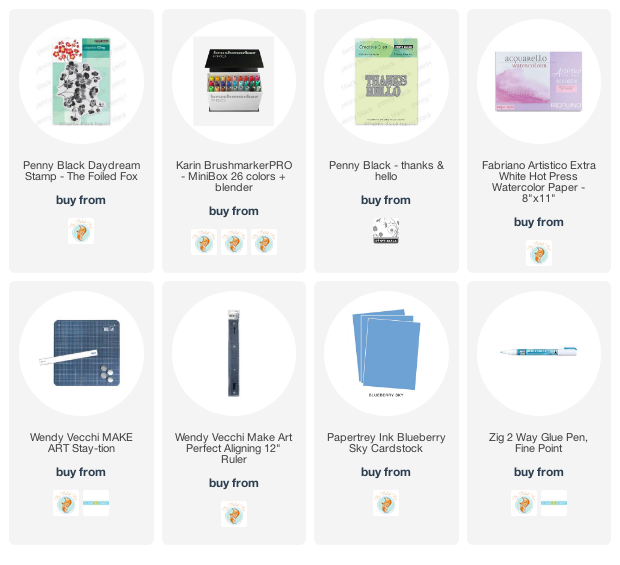
Supplies
(Compensated affiliate links used when possible)
Moving Alcohol Inks with Air – Video
Posted: February 3, 2021 Filed under: Alcohol Ink, Brutus Monroe, CAS, Dies, grafix, light as a feather, nesting squares, Penny Black, polar bears, Tutorial, Waffle Flower | Tags: grafix, grafix craft plastic, Penny Black creative dies, Penny Black stamps, pinata alcohol ink, Ranger Alcohol Ink, Tutorial, video 16 Comments
I’ve had the alcohol inks out recently and spent some time trying to get soft wavy patterns on craft plastic. I have seen several artists who do this technique beautifully but I am very much still a beginner with it. I have a few cards to share today along with a video showing my process for two of the panels. I worked on white craft plastic from Grafix which is heavyweight and totally opaque. For most of the panels featured today I used only two alcohol inks plus plenty of 99% rubbing alcohol; each panel was created with a metallic and a non-metallic ink.
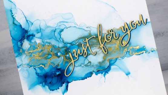
This first panel was made with turquoise AI and gilded alloy AI; I love the range of blues when diluted with rubbing alcohol. The ‘for you’ Penny Black die cut is two layers of turquoise cardstock topped with one layer of pale gold.
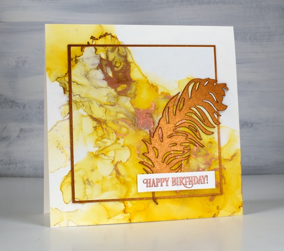
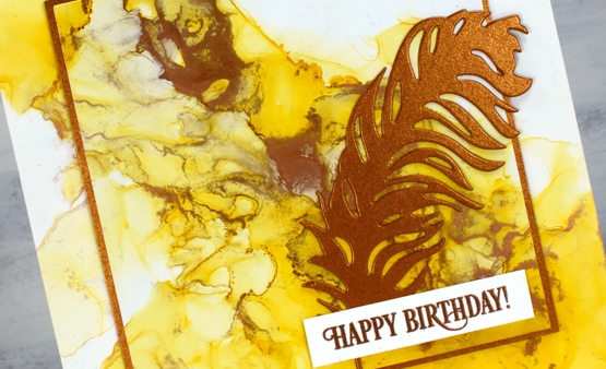
This warm toned card was made with honeycomb AI and mined alloy AI then die cut with a WaffleFlower square nesting die. I used the WaffleFlower additional square dies to cut a larger copper square then added the PB ‘light as a feather’ die cut and a PB birthday sentiment embossed in Brutus Monroe penny embossing powder.
You can see the process for both cards above in the video below.
As I am working on alcohol ink panels I am evaluating my process and working out what I want to try next. I just bought a cheap lazy susan to work on the blown flowers and I’m pretty sure I don’t need to use as much coloured ink when I make the initial drops. You can be sure I will let you know what I discover.
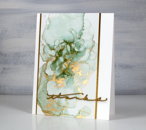
I have a couple more cards made off camera using the same technique shown in the video. The card above features juniper AI and statue alloy AI with the PB ‘many thanks’ die cut from antique gold cardstock and stacked twice.
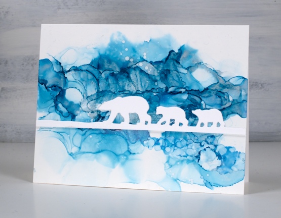
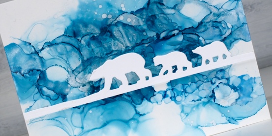
When this panel was finished it reminded me of photos of the artic and far north where the icebergs and glaciers are made up of beautiful shades of blue. It’s kind of a cross section perspective where we can see below and above the ice the bears are walking on. I did use two blue inks plus a silver for this one, ranger turquoise and stream with pinata silver. The bear die is ‘polar bears’ from Penny Black.
We’ve been watching Cecilia Blomdahl’s youtube channel about her life on Svalbard, an island off the north coast of Norway. She lives in the world’s northern most town. Polar bears are definitely around so you don’t wander outside the village without your weapon!
Supplies
(Compensated affiliate links used when possible)