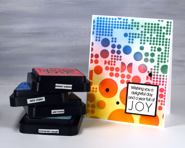
Totally Dotty
Posted: July 15, 2024 Filed under: AALL & Create, Foiled Fox store, nesting squares, Penny Black, The Foiled Fox, totally dotty stencil, Waffle Flower | Tags: AALL & Create, Penny Black stamps, Ranger Distress inks, Waffle Flower dies Leave a comment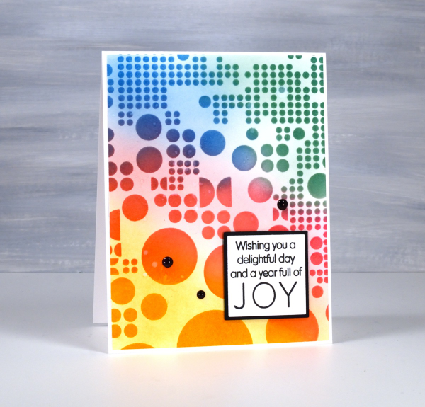
Yes, the stencil used for this card is called ‘Totally Dotty’! I mean what else would you call it? It is a large stencil from AALL & Create sent to me by the Foiled Fox so I could do totally dotty things with it. I blended inks through it for this card but I have also blended paint through it on gel prints and will no doubt use it with alcohol inks and art journals as well.
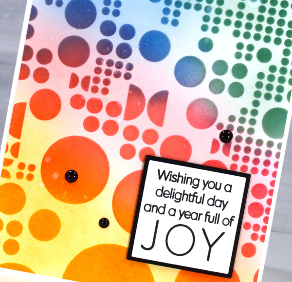
I blended wild honey, picked raspberry, salty ocean and evergreen bough distress inks through the stencil with blending brushes then, when I lifted it, blended more ink to soften the stark white background. This is a technique I’ve seen the blending wizards use.

Such a colourful background called for a contrasting sentiment so I stamped in black on white then matted in black using Waffle Flower square nesting dies. Nesting dies definitely cut down on the mistakes I make in creating very slim mats for panels. Did you see I added enamel dots; not a common embellishment for me but the water splatter just didn’t make enough impact so shiny black dots to the rescue. Make sure you pop over to the Foiled Fox blog and online store to be inspired and delighted. (Yes, there are affiliate links used in this post, no extra cost for you but a bonus to me!)
Moving Alcohol Inks with Air – Video
Posted: February 3, 2021 Filed under: Alcohol Ink, Brutus Monroe, CAS, Dies, grafix, light as a feather, nesting squares, Penny Black, polar bears, Tutorial, Waffle Flower | Tags: grafix, grafix craft plastic, Penny Black creative dies, Penny Black stamps, pinata alcohol ink, Ranger Alcohol Ink, Tutorial, video 16 Comments
I’ve had the alcohol inks out recently and spent some time trying to get soft wavy patterns on craft plastic. I have seen several artists who do this technique beautifully but I am very much still a beginner with it. I have a few cards to share today along with a video showing my process for two of the panels. I worked on white craft plastic from Grafix which is heavyweight and totally opaque. For most of the panels featured today I used only two alcohol inks plus plenty of 99% rubbing alcohol; each panel was created with a metallic and a non-metallic ink.
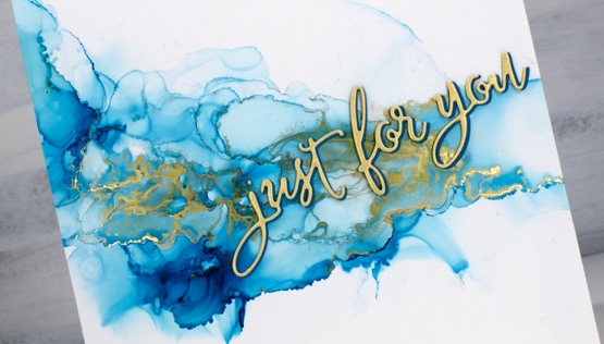
This first panel was made with turquoise AI and gilded alloy AI; I love the range of blues when diluted with rubbing alcohol. The ‘for you’ Penny Black die cut is two layers of turquoise cardstock topped with one layer of pale gold.
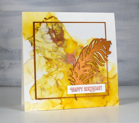
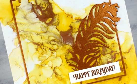
This warm toned card was made with honeycomb AI and mined alloy AI then die cut with a WaffleFlower square nesting die. I used the WaffleFlower additional square dies to cut a larger copper square then added the PB ‘light as a feather’ die cut and a PB birthday sentiment embossed in Brutus Monroe penny embossing powder.
You can see the process for both cards above in the video below.
As I am working on alcohol ink panels I am evaluating my process and working out what I want to try next. I just bought a cheap lazy susan to work on the blown flowers and I’m pretty sure I don’t need to use as much coloured ink when I make the initial drops. You can be sure I will let you know what I discover.
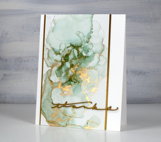
I have a couple more cards made off camera using the same technique shown in the video. The card above features juniper AI and statue alloy AI with the PB ‘many thanks’ die cut from antique gold cardstock and stacked twice.
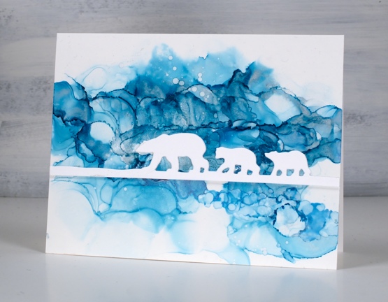
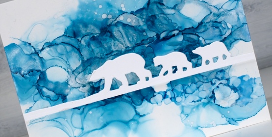
When this panel was finished it reminded me of photos of the artic and far north where the icebergs and glaciers are made up of beautiful shades of blue. It’s kind of a cross section perspective where we can see below and above the ice the bears are walking on. I did use two blue inks plus a silver for this one, ranger turquoise and stream with pinata silver. The bear die is ‘polar bears’ from Penny Black.
We’ve been watching Cecilia Blomdahl’s youtube channel about her life on Svalbard, an island off the north coast of Norway. She lives in the world’s northern most town. Polar bears are definitely around so you don’t wander outside the village without your weapon!
Supplies
(Compensated affiliate links used when possible)
All the Birthdays
Posted: October 7, 2020 Filed under: A2 layers, Additional A2 layers, all the birthdays, CAS, Concord & 9th, nesting squares, Waffle Flower | Tags: Concord & 9th, gel press, gel printing, Ranger archival inks, ranger embossing powders, Tsukineko Versafine inks, Waffle Flower dies, WOW embossing powders 4 Comments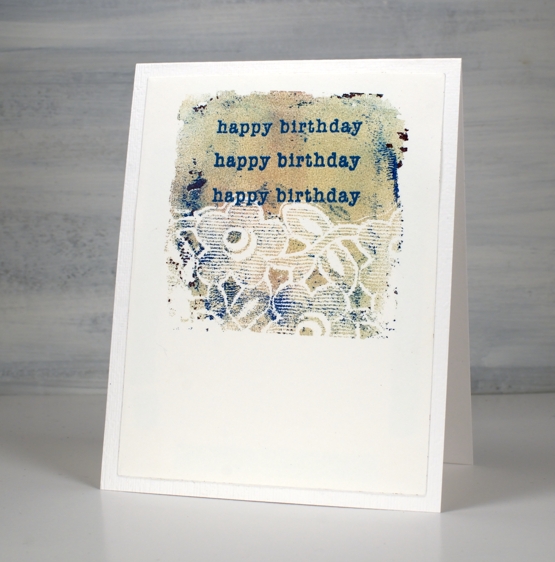
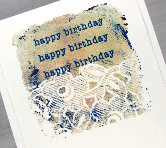
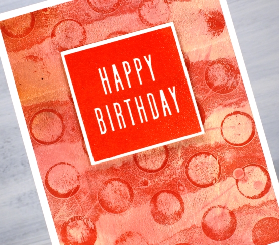
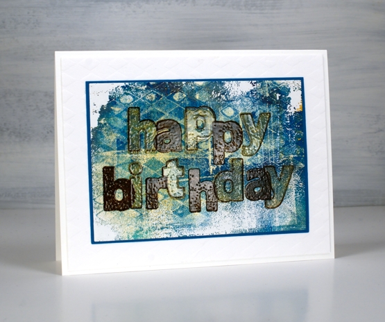
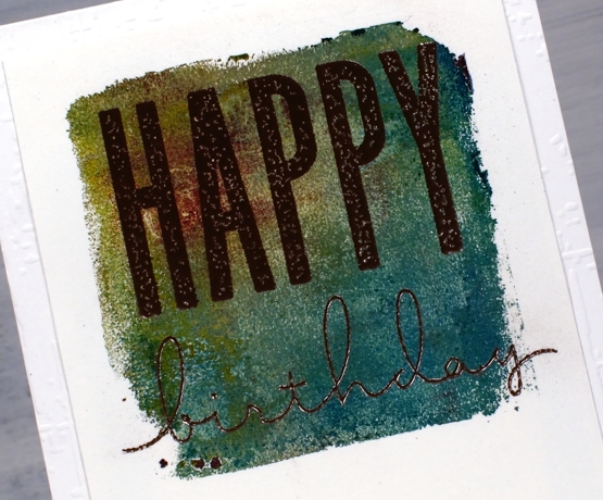
I made a short stack of birthday cards yesterday with a new Concord & 9th set, ‘All the Birthdays’. I pulled out several prints from earlier gel printing sessions and chose some which would work as panels for birthday cards.
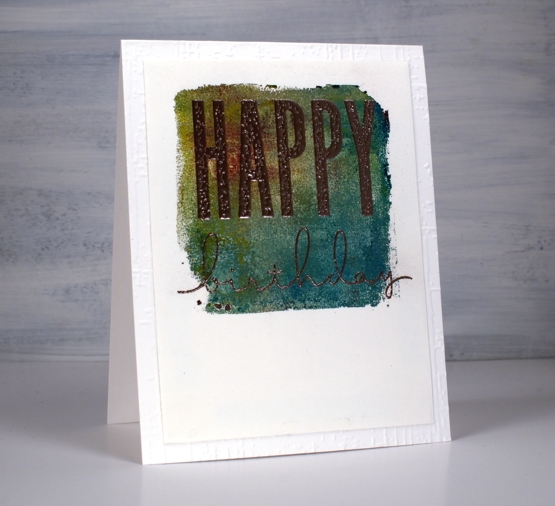
On the card above I used ranger blue embossing powder and the card below versafine tulip red was the perfect match for my printed background.
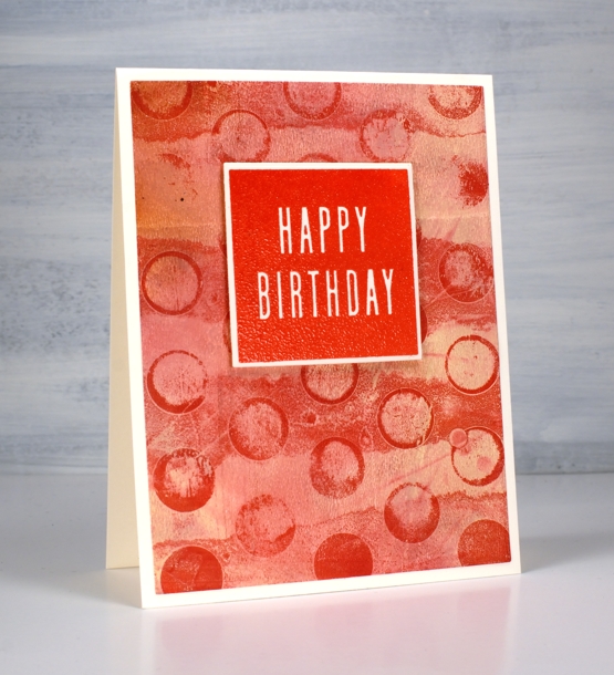
Some were printed using the petite set A gel presses so they were already shaped as squares. Others I cut from larger prints. I used stencils and lace to make the prints and a range of acrylic paints.
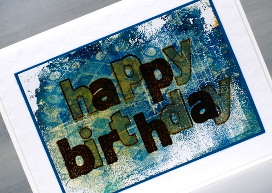
One of the stamp combinations from the C&9 ‘all the birthdays’ is a pair of stamps that overlap to spell ‘happy birthday’; there are outline stamps that frame the solid letters also. That is what I used on the card below with gold and brown inks then clear embossing powder.
I also added some texture to a few of the card bases or mats with embossing folders and stencils.
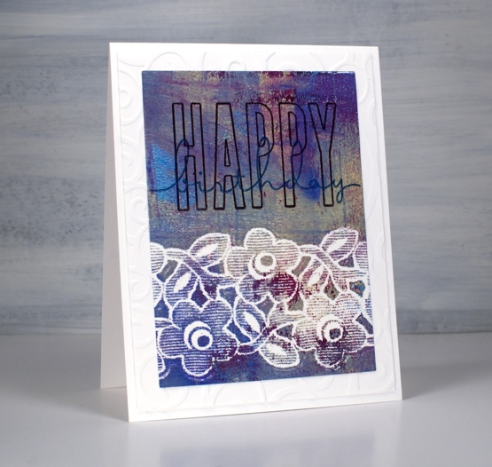
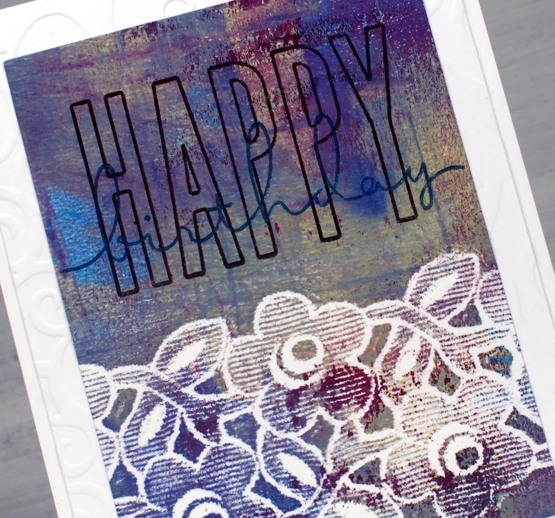
The printed panel below included such pretty blues and purples I wanted to match them in the sentiment so I stamped with archival dusty concord and faded jeans then, before the ink dried embossed in clear powder.
The card below features rose gold embossing powder; it looks a little darker than expected on this panel, maybe because of the depth of colour in the print.
I really enjoyed pairing sentiments from the C&9 set with my leftover gel prints. I did have some embossing challenges though; I’m just not an embossing champion. Stray powder, over heating, underheating, even when I use a powder tool and preheat the heat tool I still make mistakes. This lot took me all afternoon but I am very happy with them and I’m pleased to have boosted my birthday card stash. Now if I can just remember to send them…
Supplies