
Masked Autumn Leaves – Video
Posted: September 23, 2024 Filed under: Echidna Studios, grafix, Leaves digital stamps and cut files, Tutorial | Tags: Echidna Studios, Fabriano Watercolour Paper, grafix, video 4 Comments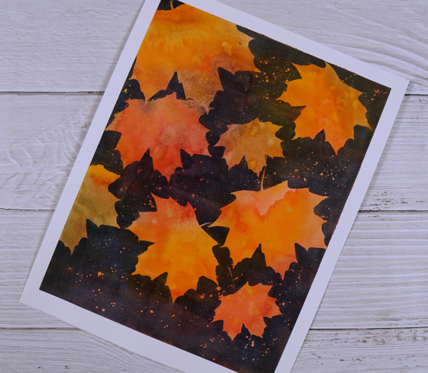
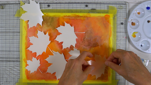
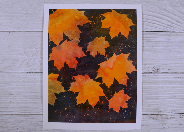
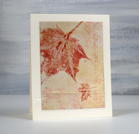
I recently completed an autumn painting using Grafix extra tack frisket film to mask autumn leaves. I began by painting the whole panel in yellows, oranges, reds, browns and greens. I used watercolour paints and did some mixing on my palette and also on the hot pressed watercolour paper.
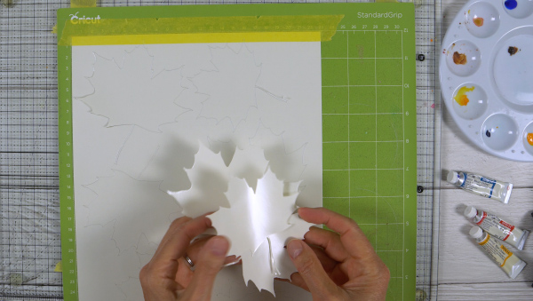
Once I had a multicoloured panel I added maple leaf masks cut on my Cricut from Grafix extra tack frisket film. I used the maple leaf image from the new Echidna Studios Leaves digital stamp and cut files set. The set includes six different leaves: Hickory, Maple, Honey Locust, Linden, Sumac, and Oak. I cut maple leaves in a variety of sizes. Watch the video below to see the whole process.
I liked using this method rather than painting one leave at a time because it was quicker and resulted in more random colour patterns on the leaves.
I left my panel as an 8.75″x11.25″ painting but you could also cut a panel up into several pieces to make autumn or thanksgiving cards.
Leaf & Stencil print – Video
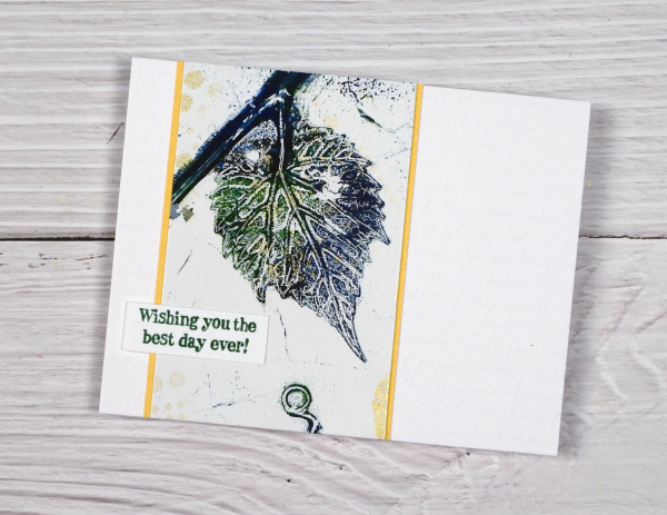
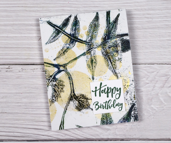
Posted: July 16, 2024 Filed under: Darkroom Door, gel press, gelli plate, simply perfect mix & match sentiments, Tutorial | Tags: Darkroom Door stamps, gel press, gel printing, Spellbinders, video 6 Comments
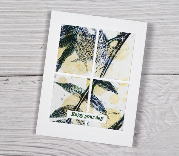
Last week I shared a leaf and lavender gel print video; in today’s video I have added some gold dots through the totally dotty stencil for some shimmer and extra interest. In the video you will see the gel printing process. I turned the printed panel into five cards and I have listed the added stamps or dies below each card photo. I have an in-person botanical gel printing class coming up on Saturday July 27th and there are a couple of spaces left if you’re interested.
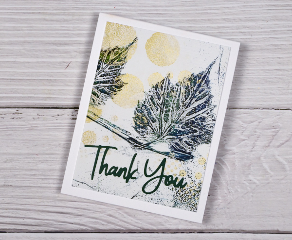
I added a die-cut sentiment in dark green to the panel above using the Spellbinders ‘simply perfect mix & match’ sentiment dies.
Even though I brayered blue, green and black paint very randomly on the plate, I like the way patches of one colour or another appear on the leaves.
To create the card above I embossed a white panel using the Stampin’ Up embossing folder scripty, added a gold mat behind the gel printed panel and added a Darkroom Door sentiment from the ‘happy birthday’ sentiment strip.
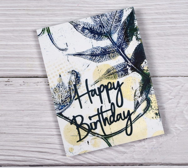
The panel above covers the whole card front and has a stacked green die-cut sentiment from the same Spellbinders set mentioned earlier. I stacked two layers for the sentiment to help it stand out from the stems on the gel print.
Another full card front panel above with a Darkroom Door sentiment. The gold looks shinier in real life but I think you can see some shimmer on both the card above and below.
You can cut your gel print panels to any size, sometimes cutting a large shape into smaller shapes is a good way to add interest to a layout. I’ve added another DD sentiment to the card above. I had fun printing the panel and working out how to get the most out of it for cards. I can give these away individually but I think I might keep them together as a gift set.
Leaf & Lavender Gel Print – Video
Posted: July 9, 2024 Filed under: Classes, gel press, Tutorial | Tags: Classes, gel press, gel printing, Tutorial, video 6 Comments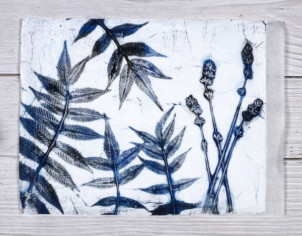
With all the summer rain and summer sun we’ve been having lately I am surrounded by plants and flowers. And when that happens what do I do? Well yes, I pick some and put them in vases. I wander around the garden and enjoy them but I also gel print them. I’ve done a couple of plant printing sessions recently and have some prints, cards and videos to share over the next few weeks.
I set up to film recently and began with what I thought would be a warm up print; I don’t always film my warm ups but I am so happy I did because I think this print was the best of the session.
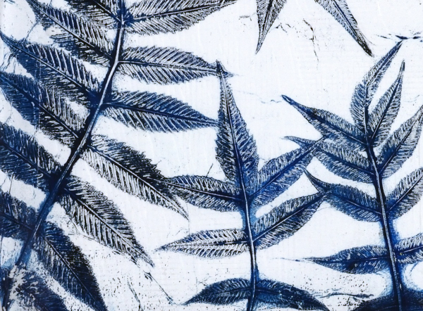
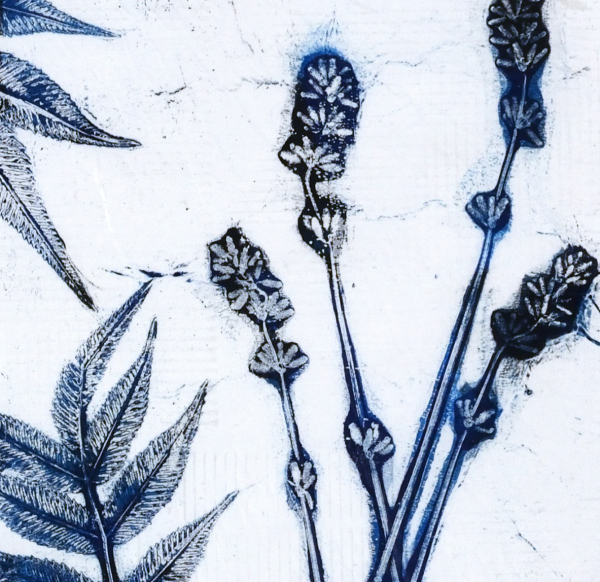
I did this print without an end purpose in mind but I think it would make a great book cover for a future hand made book. The leaves look like sumac but I’m not certain. The flowers are lavender from my garden and the buds were closed when I printed them. I noticed today the buds have opened so I will pick some more and try printing them again. The fragrance was lovely as I used them but the ‘fragrance’ of acrylic paint definitely overpowers the lavender on the print.
My mind is full of botanical gel printing ideas right now as I am not only making videos but also teaching an in-person class here in Ottawa. I’ll be back with more botanical gel print inspiration soon as I’ve already turned some prints into cards.
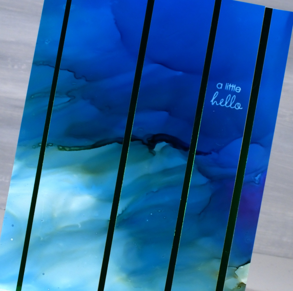
Alcohol Ink & Foil – Video
Posted: April 17, 2024 Filed under: Alcohol Ink, grafix, Penny Black, Tutorial | Tags: Alcohol Ink, grafix, grafix craft plastic, Penny Black stamps, Ranger Alcohol Ink, video 4 Comments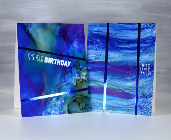
Recently I spent a happy few days creating with alcohol inks after quite a break. They did not disappoint! I am looking forward to more experimenting and maybe some Christmas card designs.
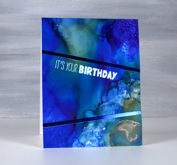
I created some cards using Grafix white craft plastic (also called bright white dura-lar), Grafix metallic foil board and Grafix double tack adhesive. These are all products I’ve used before and definitely recommend. You can see my process in the video below.

In the cards above and below you can see the wavy ocean effects I achieved easily by applying alcohol inks with a felt applicator. I love watching the inks continue to move after I lift the applicator.
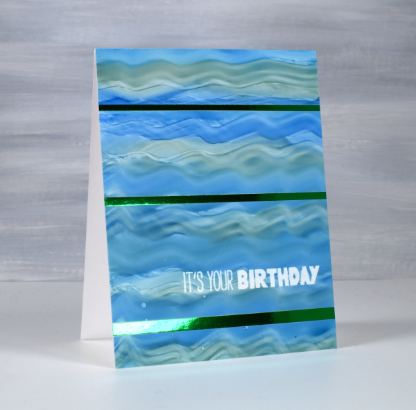
The panels below were all made by moving the alcohol inks and isopropyl alcohol around. I tilt the panel and use an air blower to move the the ink. Where there was too much of one colour or too much intensity of colour I diluted with isopropyl alcohol or just dabbed ink off the panel with a paper towel
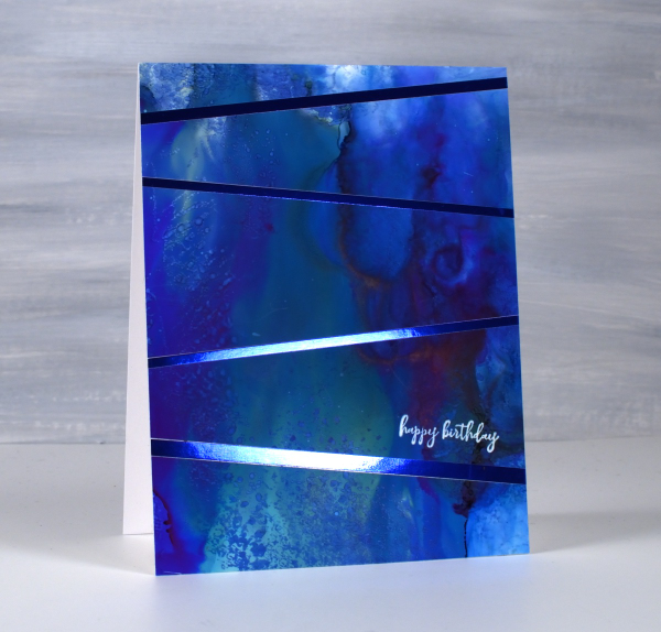
I used some of the green and the blue metallic foil board from Grafix to add to my designs. To see another project using the foil board click here.
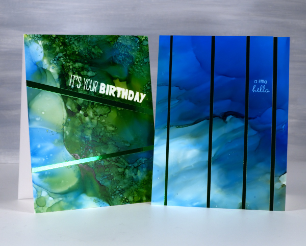
To add the sentiments I used an alcohol lift inkpad from Ranger. Its been a while since I’ve used alcohol lift ink and I was thrilled with how well it lifted the ink from the grafix white craft plastic. With a few repeat impressions and removal of diluted ink I was able to remove the bold green and blue inks to reveal sharp white words.
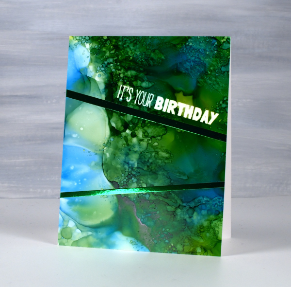
The sentiments are from the Penny Black ‘how sweet!’ set and ‘Let’s Go Wild’ set. Both are rubber cling sets which seem to hold the lift ink well and apply it evenly. This post includes affiliate links from Foiled Fox and Scrap’n’Stamp . If you buy through these links I receive a small commission at no extra cost to you.
Faux Postage Stamps – Video
Posted: March 7, 2024 Filed under: Darkroom Door, Elizabeth Craft Designs, fine flowers vol 2, global postmarks, Nature Walk, postage stamps, Tutorial | Tags: Darkroom Door stamps, Elizabeth Craft Designs, Ranger Distress inks, video 7 Comments
Recently I created some faux postage stamps from a stamped and watercoloured panel. I pulled out another floral panel from my ‘pile of possibilities’ and filmed myself making some more faux postage stamps to feature on cards. The watercoloured panel features a repeated flower from the Darkroom Door set, ‘fine flowers vol 2’ and there is a video of my watercolouring process for that too.
The large postage die set I used is from Elizabeth Craft Designs and includes a die to cut perforated stamps of different sizes which remain joined until you cut or tear them apart. There are also dies which cut rectangles to fit in each of the ‘postage stamp’ spaces. There are also bonus number and symbol dies, so the set offers quite a lot.
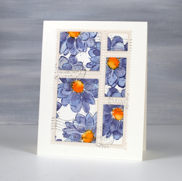
I chose this set because I liked the way the postage stamps were all joined and I have the option of creating combinations or individual stamps. There are dies available from other companies which just cut the perforated lines and I demonstrate how to do the same thing with that kind of die towards the end of the video. Adding stamped postmarks and even small words makes the faux postage look real and I’m really enjoying using stamped panels, patterned papers and gel prints to make my own postage. I think any hand delivered card I make from now on should have a handmade postage stamp on it!

Digital Stamps for Starters – videos
Posted: January 11, 2024 Filed under: Christmas stockings digital stamp set, digital stamps for starters, Echidna Studios, Tutorial | Tags: digital stamps, Echidna Studios, video 4 Comments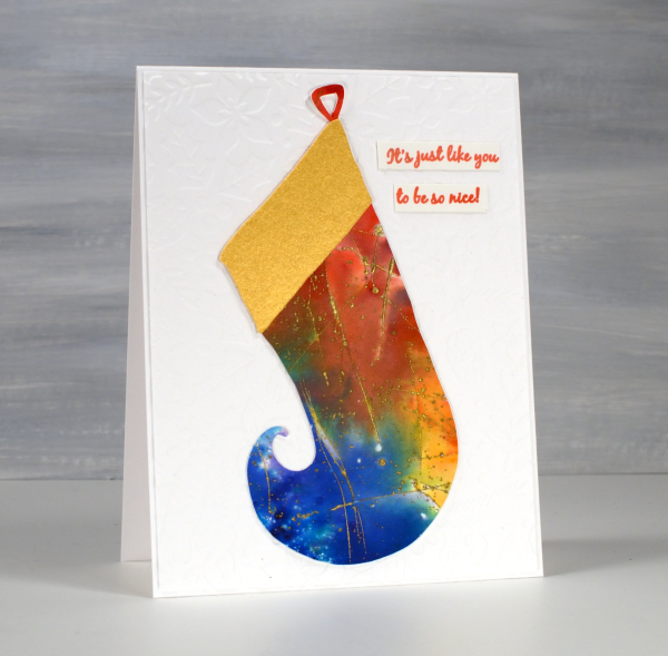
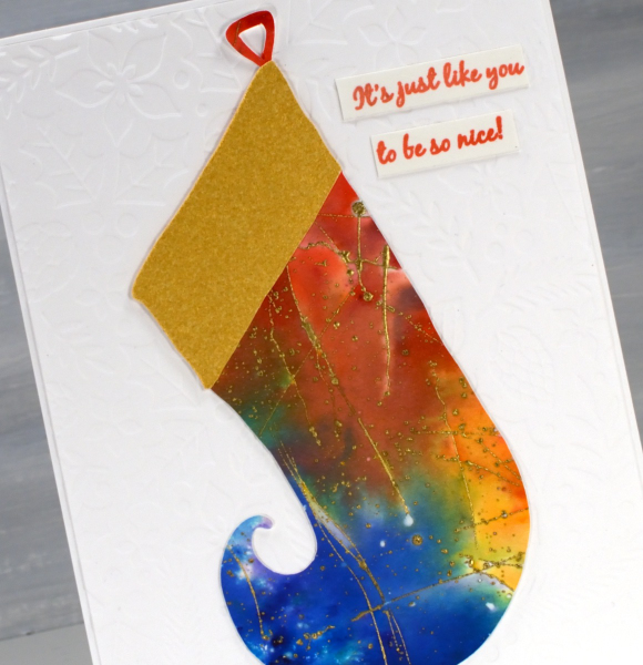
I know the 12 days of Christmas are over, but I have one more Christmassy card to share before other themes and occasions start to appear. The style of this card will be familiar to you as I have become a fan of embossed backgrounds; this one is Gina K’s ‘holiday flora’ folder. On top is a stocking from Echidna Studios. Last year the digital Christmas Stocking stamps were released including three intricately patterned stockings for printing. This year the set is expanded to include cutting files so you can cut these lovely curly toe stockings from any cardstock you like. I chose an embossed and watercoloured scrap I had been hoarding for years!
Over the past year as I have featured digital stamps from Echidna Studios many of you have expressed interest but not known where to start with digital designs. As promised we have some how-to videos created by my daughter and posted on the Echidna Studios youtube channel. The first video explains how to buy a digital stamp on Etsy. If you find my daughter is speaking rather quickly just change the setting to 75% or hit pause to catch your breath; she is quite speedy in this first video!
In the second video she explains how to open the SVG file on your computer for printing. She and I both use inkscape to open our digital files, it is free to install on your computer. But I’ll let her explain all that:
The third video explains how to use the files to create a card. Resizing, centering and adding words are all covered in detail and I followed her instructions myself the other day to print a couple of the gingerbread digital stamps on cardstock for future cards. I definitely paused the video at times to re-watch and take note of all the steps. When I had a question I did have the video creator in the house to ask but if you have questions please put them in the comments under the video and one of us will get back to you as soon as possible.
We hope you will follow the Echidna Studios youtube channel and consider trying digital stamps and cutting files if you haven’t already. There are more videos and products coming this year. As this is my first post of 2024 I wish you happy new year! I look forward to creating and sharing all sorts of projects on the blog this year. There will be cards, art journaling, watercolouring, gel printing, collage, handmade books and more. What are you hoping to create this year?
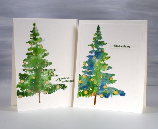
Bauble Beauty – video
Posted: December 20, 2023 Filed under: bauble beauty, Penny Black, Tutorial | Tags: Penny Black stamps, video 7 Comments
I have mentioned more than once my ‘brushstroke binge’ on this year’s Christmas cards. The Penny Black ‘bauble beauty‘ stamp was one I used several times and decided to make a video of my simple dye-ink watercolour technique. Keep in mind I worked on hot pressed watercolour paper; the inks don’t react the same way on regular cardstock.
Brushstroke stamps are so called because they appear to be stamps made from painted images. I often use dye inks when stamping them so I can add some water to the stamping and get a watercolour look. On the cards featured here I used a range of different inks but also vary the amount of water added on the stamp and at the blending stage. The card below features only one ink for the foliage, the magical northern pine memento ink. All the rest of the cards were stamped with the blue and green distress inks.
You can see on the two cards below I was more generous with water on the left hand card blending the ink over the whole tree shape. On the right hand card I left patchy areas unblended which kept the green inks more separate and made the tree slightly see through.
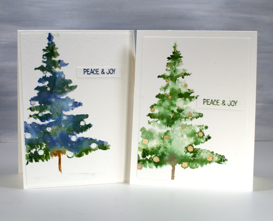
I painted pearlescent baubles on all the trees after the ink had dried. As the video shows some of the baubles disappeared at the stamping stage when the diluted ink spread over most of the tree shape. In those cases I filled the baubles I could see and added pearlescent circles on top of the blended tree where I thought more baubles should go.
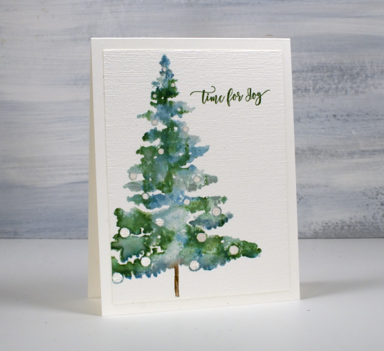
The finishing touches on all the cards included die-cutting then embossing with the retired stampin up ‘subtle’ embossing folder. It creates a nice linen/canvas look; maybe there are other folders available that do a similar thing. I chose small sentiments from Penny Black sets, some stamped directly on the watercolour panel; others on little die-cut strips.
Today’s post features affiliate links to the following companies. If you buy through these links I receive a small commission at no extra cost to you. The Foiled Fox & Scrap’n’Stamp.
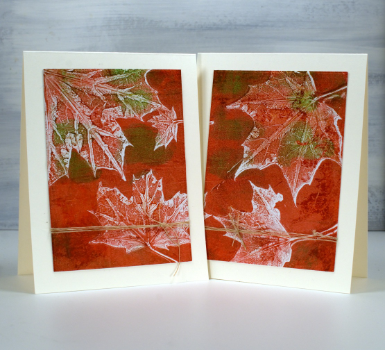
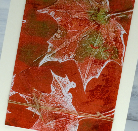
The leaves are turning – video
Posted: October 16, 2023 Filed under: Echidna Studios, gel press, Mooneys Trees, Stampin Up, timber embossing folder, Tutorial | Tags: Echidna Studios, gel press, gel printing, Tutorial, video 7 Comments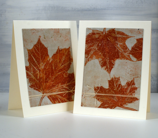
As the leaves start to turn around me I brought a few green ones to the gel plate and printed them in the colours of autumn. I filmed as I printed so you can see a few different techniques. There is a brief appearance of backyard wildlife that must have come in on the freshly picked leaves. Let me know if you know what it was.
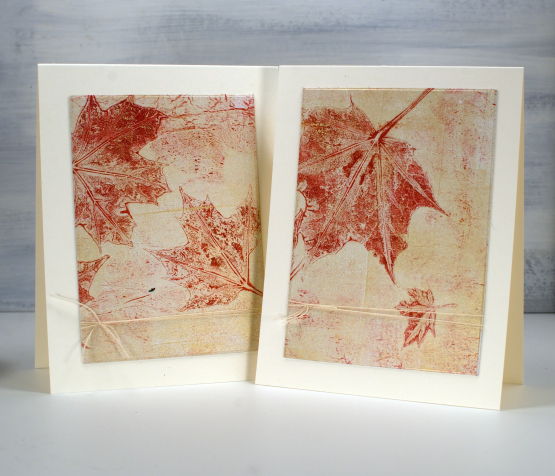
As you will see in the video I used a 5″x7″ gel plate and a mix of liquitex, decoart and sennelier acrylic paints to pull prints on printer paper.
Recently I have been turning 5×7 inch prints into card fronts with a strip left for a matching envelope. For today’s cards I attached the whole print to cardstock then used WaffleFlower rectangle dies to cut panels from each print, added twine to both panels then attached them to cream card bases. There are no strips left for the envelopes but twice as many cards. I have left them without sentiments but if needed I can tie a little sentiment tag onto the twine.
The print below is also featured in the video. I thought it would be fun to print leaves onto the Mooneys Trees cut out. I used the digital cutting file to cut from cream cardstock then picked up the leaf print from the gel plate. My new timber embossing folder from SU was the perfect background.
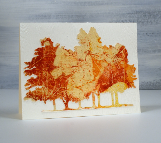
The close up below is the two step print, pulling first the background with the leaves still on the plate, then the leaf texture after they have been removed.
I think this final card might be my favourite. I didn’t plan it this way but it looks like that little leaf is falling away from the bigger one.
Today’s post features affiliate links to the following companies. If you buy through these links I receive a small commission at no extra cost to you. The Foiled Fox & Scrap’n’Stamp
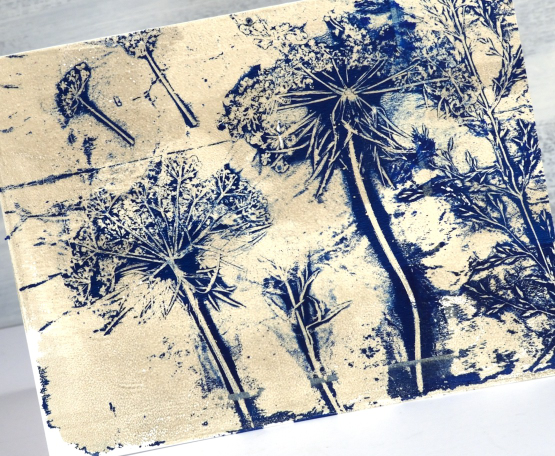
Gel Print Floral Card Combos – Video
Posted: October 2, 2023 Filed under: gel press, Tutorial | Tags: gel press, gel printing, Tutorial, video 2 Comments
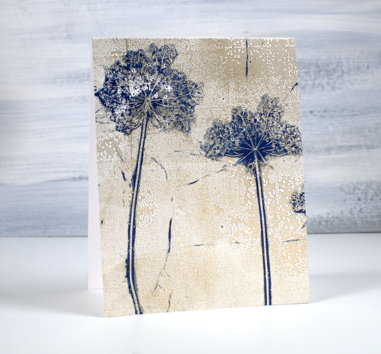
One of my favourite things to print on a gel plate is flowers. One of my favourite flowers to print is Queen Anne’s Lace. You might think, as I did, that Queen Anne’s Lace would be too fragile to print but it is surprisingly strong and the gel plate picks up all that delightful detail.
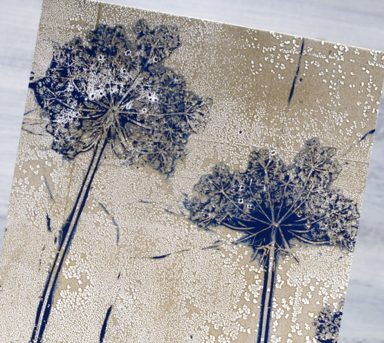
I don’t always print an envelope and card front in one go but it is a nice way to get a matching pair. I used a 9″x11″gel plate to easily fit both. I mention in the video that you can print the flowers over and over; the paint that clings to the flower head makes it sturdier rather than pulling it apart. The first few prints might leave some seeds on the gel plate and print but that just adds to the realism in my opinion.
Thank you to those of you who subscribed to my youtube channel last week. I am slowly building my community of subscribers again after losing my first channel. There are some of my early gel printing videos on the new channel marked with a ‘from the archives’ label and there is a gel printing playlist if you want to binge the lot.
If you don’t have a gel plate large enough to pick up a card front and envelope in one print you could always do two prints one after the other keeping your paint colours the same.
Below are a few more card and envelope combos I’ve printed using this same technique with a sticker to mask a space larger enough for the address.

You can see on this card featuring Queen Anne’s Lace and grasses that the print does not reach to the top of the card front. I guess I didn’t press down evenly when taking the print.
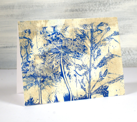
Of course you can make co-ordinating card and envelope prints using any pattern; it doesn’t have to be plants but when I have plants, not snow in the yard I like to choose plants. I’ve also used stencils.

I hope you give this technique a try; it makes an eye catching bit of mail to send. Make sure you use removable stickers to mask your address box; you can probably guess why I mention that!
If you are new to gel printing check out my online course Gel Print Journey to learn all the basics and try all sorts of patterns and combos.
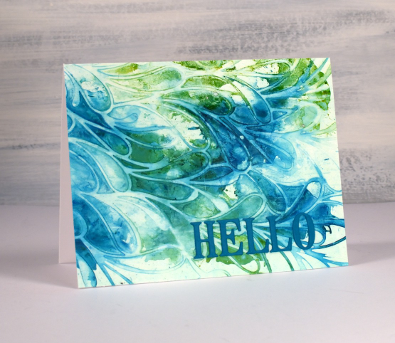
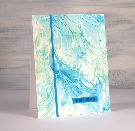
Alcohol Inks + Stencil on the Gel Plate
Posted: September 18, 2023 Filed under: Alcohol Ink, Dies, gel press, Lavinia, Penny Black, Tutorial | Tags: Alcohol Ink, gel press, Lavinia, Tutorial, video 5 Comments
Recently I posted a card featuring a gel print made with alcohol inks and a stencil. You can check out that card here. There was quite a lot of interest in seeing a video of my process so that is what I have for you today. One of the bonuses of this technique is the way I can make more than one print from the same initial application of alcohol ink. I worked with T-Rex alcohol inks on a 5″x7″ gel plate.

As you will see in the video the first card (shown above) is made from the first print pulled from the gel plate.
The second print pulled from the gel plate features the same inks but they are more muted because I diluted them to move them from the stencil to the plate. I quite like the softness of the second print.
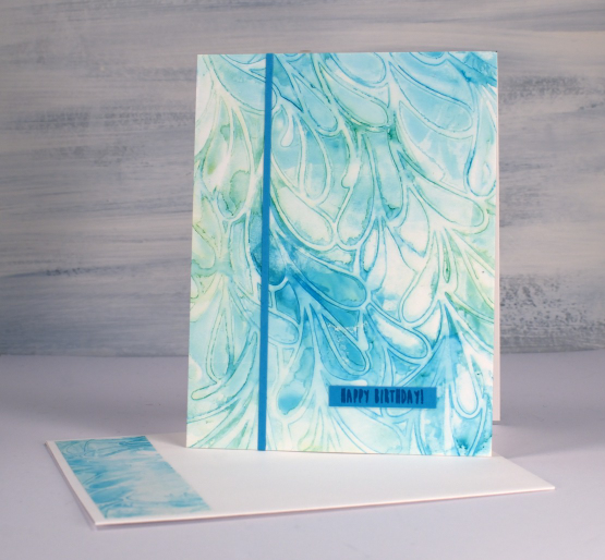
If a print works for me and honestly, they don’t all work, I often don’t want to cover them up with extra decoration or die cuts. That’s why I kept these card designs very simple with just a die cut ‘hello’ added to the first card. The second print which I made into the card below features an even smaller birthday sentiment and one thin strip of the same cardstock.

One of the reasons I like to work with alcohol inks on the gel plate is the fact that I can pull the prints with a piece of paper, in the case of these prints I used printer paper. When I work with alcohol inks apart from the gel plate I generally use a thicker plastic surface such as yupo or craft plastic. The inks move beautifully on those surfaces but the plastics are bulkier and a bit more expensive so it is nice to have the gel plate + paper option. The featured prints from today’s video were done on a 5″ x 7″ gel plate which meant I could get a 5.5″ x 4.25″ card front as well as a left over strip to add to the envelope.
If you are new to gel printing in general and would like to know more about creating a range of patterned prints please consider my online class, Gel Print Journey, where I cover all the basics with acrylic paint and all sorts of patterned and textured items. If you purchase any of my online classes before the end of September use the code: ENDOFSUMMERSALE for a 20% discount.


