Totally Dotty
Posted: May 6, 2026 Filed under: AALL & Create, Classes, Concord & 9th, many mandalas, totally dotty stencil | Tags: AALL & Create, Classes, Concord & 9th, Fabriano Watercolour Paper, Stencils 4 Comments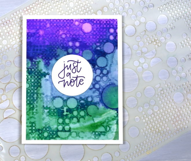
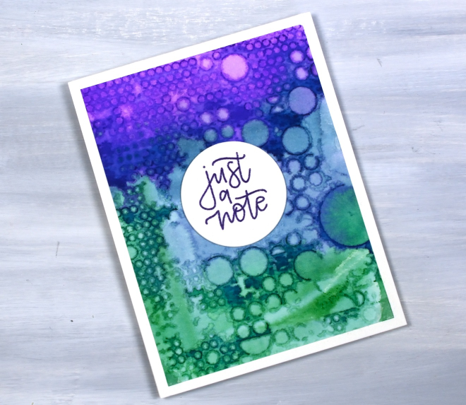
This stencil is appropriately called ‘totally dotty.’ It is a big stencil from AALL & Create and is cool for gel printing, alcohol inks and as it turns out, watercolour as well.
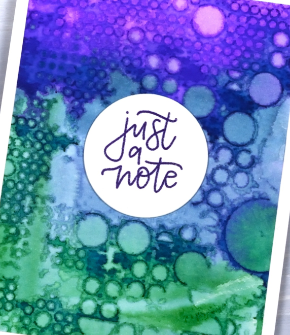
I have done quite a few stencil prints lately both in preparation for and during my recent workshops. I used different watercolour mediums including distress stains which provide quite saturated colour as you can see in the panel above. Pressing the painted panel on the stencil or vice versa can create very funky and distinct patterns as well as subtle dreamy ones. This panel ended up very distinct except for an area in middle. Not a problem as you can see; I stayed with the dotty theme and stamped my C&9 ‘many mandalas‘ sentiment on a circle for the centre.
This post includes an affiliate link from Scrap’n’Stamp . If you buy through this link I receive a small commission at no extra cost to you.
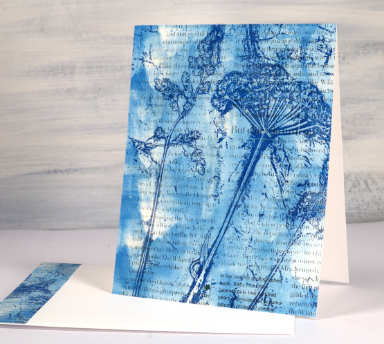
Roses Stencil in Blue
Posted: April 7, 2026 Filed under: Brusho, Classes, cricut, Echidna Studios, grafix, Roses digital stamp set, Watercolour | Tags: Fabriano Watercolour Paper, Brusho, Classes, grafix, Echidna Studios, Stencils 3 Comments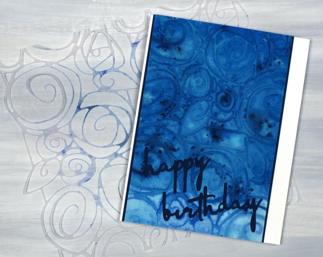
I’m continuing to enjoy my stencil and watercolour experimenting, this time featuring a stencil I designed myself and cut on the cricut. The stencil is made from two sections from a rose border digital design which is part of a trio of rose themed images available in the Echidna Studios etsy store. To create more of a square stencil I joined two parts of the border design together in cricut workspace before cutting them from Grafix matte dura-lar. I know many people don’t use cricuts or digital cutting machines but the technique would work with any fine line stencil.
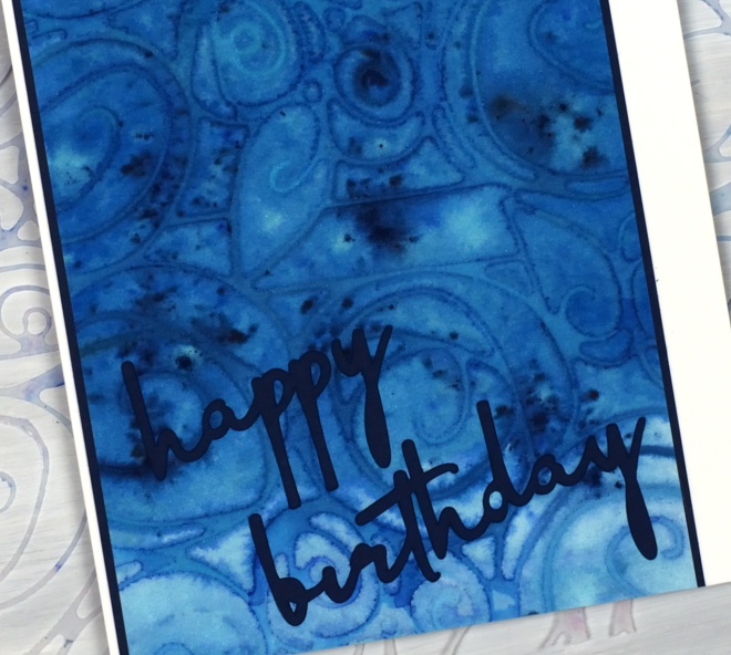
I painted the panel in blue paint before dropping the stencil on top, then added brusho powder and some spritzes of water. I am continuing to finalise techniques for my Stencils & Watercolour workshop here in Ottawa and this was one of the panels I created on watercolour paper. (there is one space left in the Monday workshop and several spaces in the Saturday workshop)
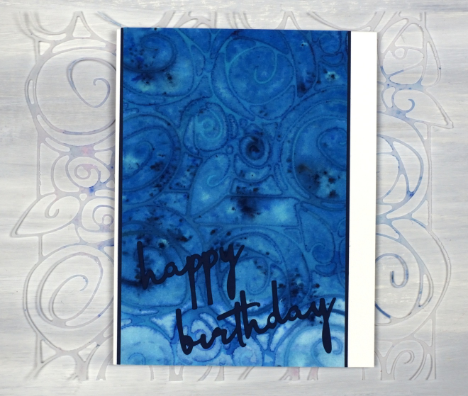
The sentiment was also cut on the cricut from the navy cardstock which also frames the stencil print. I know the cricut can be used for many things but my favourite use for it is definitely stencils! Looking at the photos as I write this I notice I did not glue the tittle over the ‘i’ in birthday. I had better try and find it!
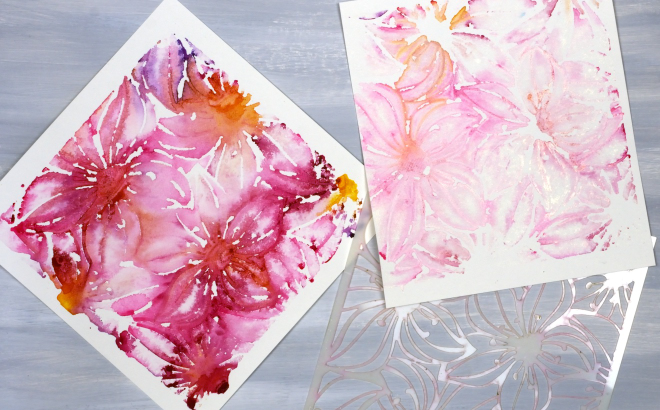
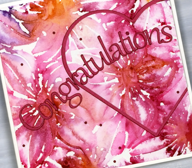
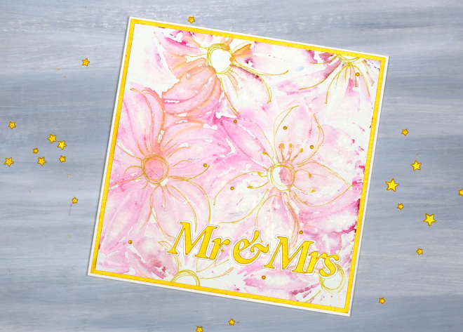
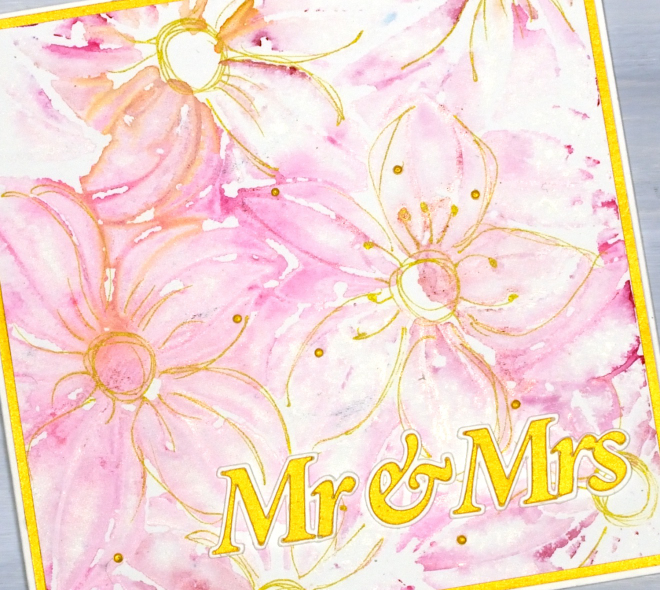
Stencil & Watercolour wedding cards
Posted: March 27, 2026 Filed under: Classes, clematis burst stencils, Creative Expressions, cricut, Watercolour | Tags: Fabriano Watercolour Paper, Classes, cricut, Stencils 2 Comments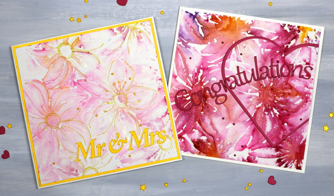
I’ve been creating quite a few patterned panels using stencils and watercolour while designing a workshop. There have been many experiments and most, but not all, have turned out quite well. You can see in the photo below the Creative Expressions square ‘Clematis Burst’ stencil beside two panels. The bright one on the left was the first impression and the one on the right the second impression using paint remaining on the stencil.
As I never seem to have any wedding cards on hand when someone asks for one I decided to make both panels into wedding cards, one bold and one subtle. I cut the sentiments on the cricut and also the large red heart
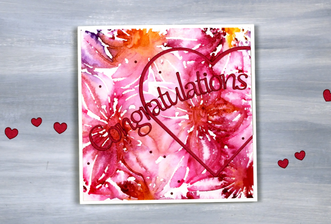
When you look closely you can see both ‘prints’ are loose and a bit messy but I don’t mind the impressionistic look!
I used a gold gel pen to add definition to the flowers on the lighter print, not every petal but enough to make sure they looked like flowers!
I am teaching a Stencils & Watercolour workshop here in Ottawa in late April and early May, you can find all the details on the CLASSES page.
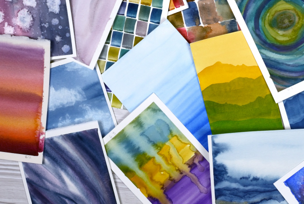
Pile of Watercolour Possibilities
Posted: February 27, 2025 Filed under: Classes, Hand painted, sennelier watercolours, Watercolour | Tags: Canson watercolour paper, Classes, Fabriano Watercolour Paper, Kuretake Gansai Tambi watercolour paints, sennelier watercolours 7 Comments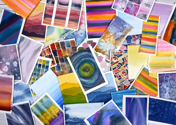
After teaching a couple of watercolour classes lately I have amassed quite the pile of panels. They are full of potential for card making. As well as painting separate panels I’ve also been creating abstract or background watercolours in a couple of art journals.
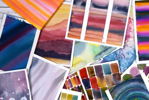
The purpose of the exercise has been two-fold. The main plan was to revisit a range of watercolour techniques in order to share them with others in classes. Additionally I chose to work small so we could complete quite a few practice pieces during class leaving us with ‘card sized’ panels to turn into cards later if we wished.
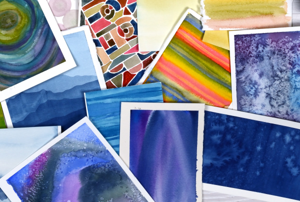
I have enjoyed the preparation and the classes so much that I have almost 100 panels on hand! My next in person class is going back to basics in regard to card making. I will cover assembly tips and tricks as well as design principles in order to create balanced and beautiful card layouts. It is exciting to have all these panels around just waiting to be transformed into cards.
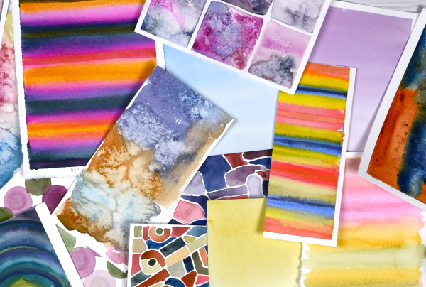
As you can imagine I also have piles of gel prints, alcohol ink panels, collages and patterned papers that could be turned into cards. It’s rather nice to have all these options…
Whimsy and Watercolour
Posted: February 24, 2025 Filed under: Classes, Hand drawn, Hand painted, sennelier watercolours, Watercolour | Tags: Classes, Fabriano Watercolour Paper, sennelier watercolours 3 Comments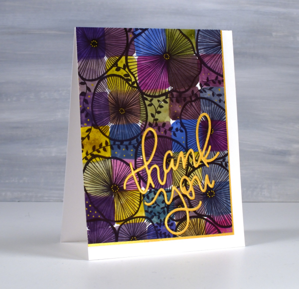
As I mentioned in January I have been playing with watercolour techniques then adding whimsical doodles over the top. Today’s card is another example. I switched the order in the title of the blog post because the whimsy has over powered the watercolour in this panel even though both elements are still obvious.
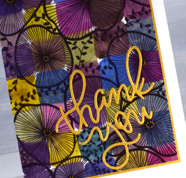
I used only three paint colours to paint the squares on the watercolour paper, some touching while wet, resulting in soft blends. All the colours you see were mixed from the same three paints – a blue, a pink and a mustard. The doodling was done with a black fine tip pen and a gold gel pen.
Even though the gold details from the gel pen are a minor part of the design they were the catalyst for choosing a gold mat and sentiment. In my upcoming in-person class I am teaching design principles and assembly techniques for card making and this thank you card is one of my examples. ( I wish I could remember who makes that pretty thank you die, but I’m not sure)
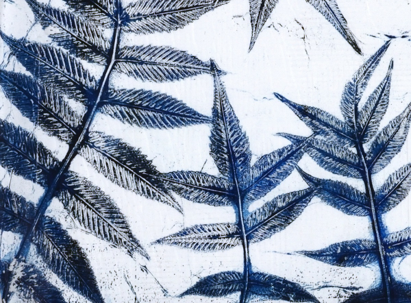
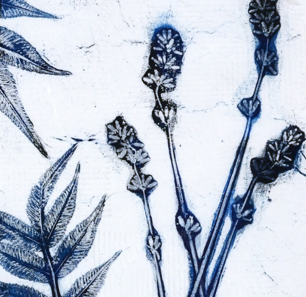
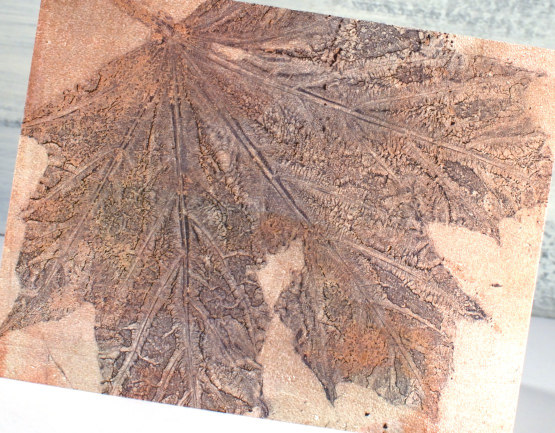
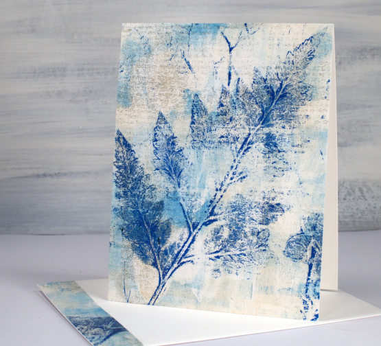
Leaf & Lavender Gel Print – Video
Posted: July 9, 2024 Filed under: Classes, gel press, Tutorial | Tags: Classes, gel press, gel printing, Tutorial, video 6 Comments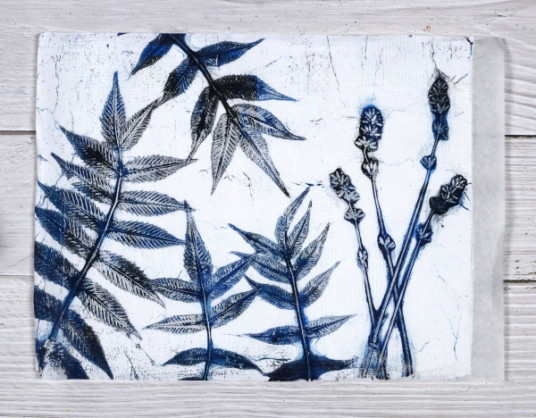
With all the summer rain and summer sun we’ve been having lately I am surrounded by plants and flowers. And when that happens what do I do? Well yes, I pick some and put them in vases. I wander around the garden and enjoy them but I also gel print them. I’ve done a couple of plant printing sessions recently and have some prints, cards and videos to share over the next few weeks.
I set up to film recently and began with what I thought would be a warm up print; I don’t always film my warm ups but I am so happy I did because I think this print was the best of the session.
I did this print without an end purpose in mind but I think it would make a great book cover for a future hand made book. The leaves look like sumac but I’m not certain. The flowers are lavender from my garden and the buds were closed when I printed them. I noticed today the buds have opened so I will pick some more and try printing them again. The fragrance was lovely as I used them but the ‘fragrance’ of acrylic paint definitely overpowers the lavender on the print.
My mind is full of botanical gel printing ideas right now as I am not only making videos but also teaching an in-person class here in Ottawa. I’ll be back with more botanical gel print inspiration soon as I’ve already turned some prints into cards.
Last minute ink smudge!
Posted: October 12, 2023 Filed under: bell & berries, Classes, Penny Black | Tags: Classes, Fabriano Watercolour Paper, Penny Black stamps, Ranger Distress inks 11 Comments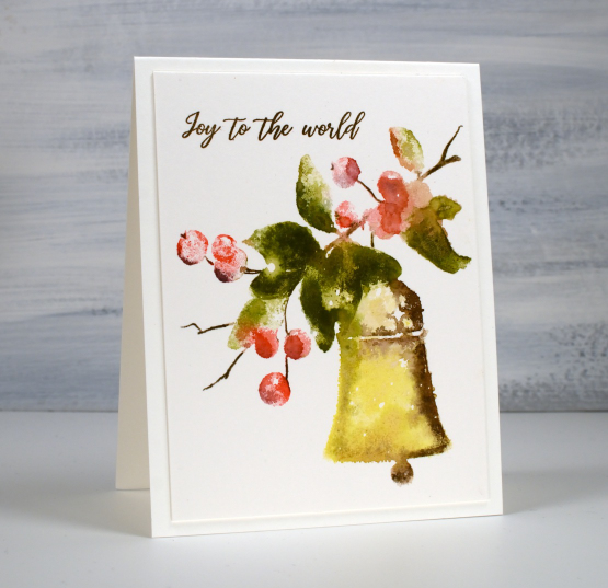
You can probably guess from the title that this card was involved in a last minute ink smudge incident. The Penny Black bell & berries stamp was stamped, blended and dry, the panel was trimmed and attached to the card base and I had just stamped the sentiment in vintage photo archival ink when the unthinkable happened. Not just one but two archival ink smudges appeared on the card, one on the top right edge and the other on the bottom edge. I think we can all assume that the culprit was my right hand! If that ink was water based I might have been able to dilute and remove it but there is none of that magic happening with archival ink.
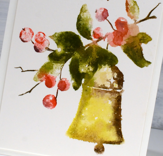
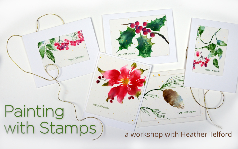
Not only was this card destined to be sent out as one of my Christmas cards but it was also a sample in my upcoming Painting with Stamps class. I reassured myself with the thought that although the two smudges would prevent it from going in the mail, it wouldn’t stop it from being a sample and perhaps a cautionary tale as well.
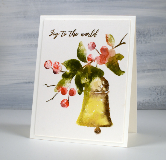
But dear reader, do you see any smudges? Indeed you don’t. The fortunate positioning of those smudges meant that I could trim the whole smudge off both the right hand side and bottom edge I cut through both card base and panel combined then attached the smaller two layer panel to a new card base. My card’s mailing status has been restored.
So, if you are interested in learning how to position your smudges for the easiest rescue and recovery come along to my next in person class; there are a few spaces left.
Today’s post features affiliate links to the following companies. If you buy through these links I receive a small commission at no extra cost to you. The Foiled Fox Scrap’n’Stamp
Oops; I forgot your birthday
Posted: September 28, 2023 Filed under: Classes, gel press | Tags: Classes, gel press, gel printing, online class 2 Comments
My family and friends know I have issues with remembering birthdays in a timely manner. I combined a vintage sewing pattern image with a partial gel print to send an apologetic belated birthday greeting.
Combining vintage pictures or photos with gel prints on a card is an idea I got from my friend Betty. She has made many clever cards using the same combo. Now that I have made one of my own I’m going to have to do it again, hopefully not due to a missed birthday!
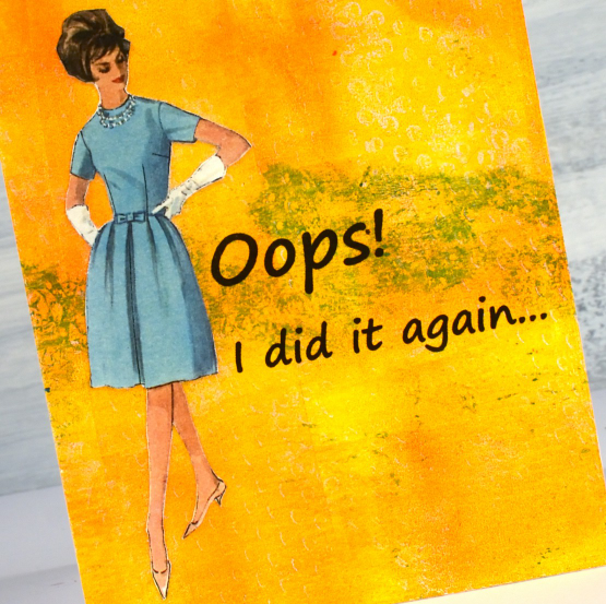
I’ve been prepping for my next Art Journal Adventure class which features images from vintage sewing patterns so that is how I happened to have this fashionista backed and cut out. The bright orange print is one from my online Gel Print Journey class and the contrast turned out to be a winner. Since I am talking about classes please check out my Classes page and if any of the online courses capture your interest use the code ENDOFSUMMERSALE at checkout for a 20% discount during September.
To be notified about future classes join my mailing list CLICK HERE.
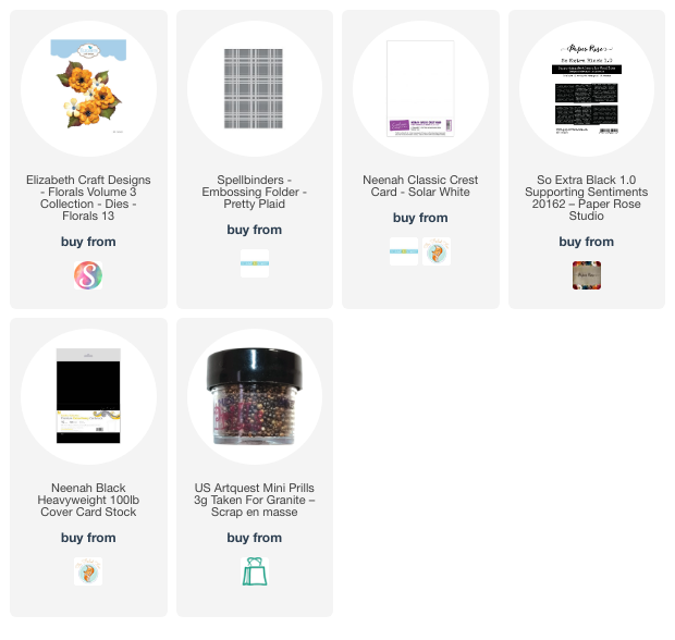
Gel Print Journey
Posted: May 31, 2023 Filed under: Elizabeth Craft Designs, florals 13, gel press, online class, pretty plaid, Spellbinders | Tags: Classes, gel press, gel printing, online class, video 4 Comments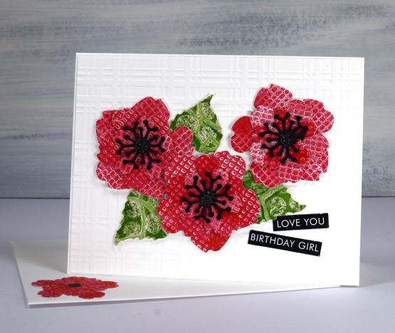
As I have mentioned a few times lately I have a new online class available. It’s called Gel Print Journey. I added the promo on Youtube today and thought I would share it here with you my blog readers as well. It is a class for both beginners and enthusiasts (and those who like me, tried it once and took a while to try it again). The card shown above is just one of the projects I made after a gel printing session. I grabbed the red print from the embossing folders lesson and the green print from one of the stencils lessons and die-cut all my elements to make a birthday card. Although there are project ideas at the end of the class the focus of the lessons is all gel printing. I just thought I would share one of the projects with you today because it is a bright happy card!
If you haven’t tried gel printing at all, GASP, this class will take you through the basics and provide you with oodles of textures and techniques to try. If you have tried gel printing I am sure you will enjoy putting your dies, stencils, embossing folders, recycling and plants to work to create one of a kind prints.
I added the red petals and green leaves to an embossed white background to keep them looking fresh and bright. There are little prills in the centres and a sentiment from Paper Rose studio.
As blog readers you have just one more day to use the TEAMBLOG10 discount code but if you read this after May has ended just pop over to youtube to see the code I shared over there. If you have any questions don’t hesitate to leave a comment below. I will continue to share gel printed cards and projects here on the blog and have some upcoming videos on youtube as well.
Have a great day!
(Compensated affiliate links from Foiled Fox & Scrap n Stamp)
Gel Plate Plant Prints
Posted: May 16, 2023 Filed under: Classes, gel press, online class | Tags: Classes, gel press, gel printing, online class 6 Comments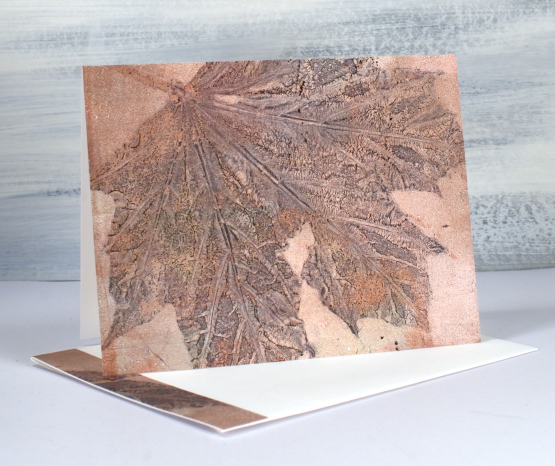
I have a few more plant gel prints to share with you. I put these ones together as a gift a while ago but saved this post to co-ordinate with the launch of my new online class Gel Print Journey. This class has been in the works for a while so I am excited to finally share it with you. It is an introductory class covering printing with acrylic paints and includes loads of techniques, hours of video instruction and a few inspiration galleries at the end so you can see what I do with some of the prints. (there is a discount code at the end of this post)
In the new class three of the lessons cover leaf, grass and feather prints teaching the techniques used to make the cards in today’s post. For the card above I used one large leaf but often I use a mix of leaves, grasses and when available, flowers.
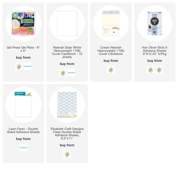
Because I made all these prints with a 6″x6″ gel plate I was able to cover the card front and save a strip to add to the edge of the envelope. I used double sided adhesive to add these prints to my card fronts but a tape runner or gluestick would also do the job.
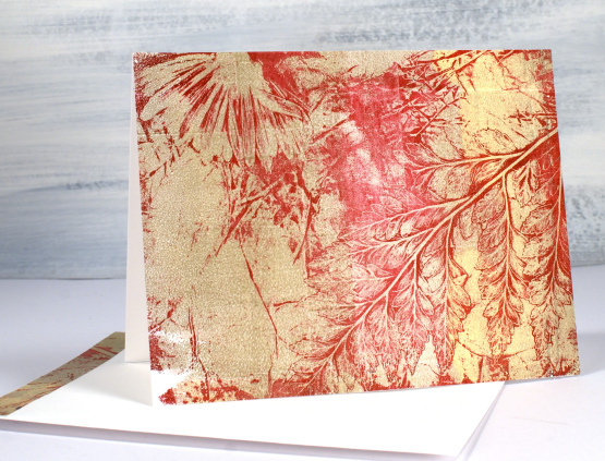
As you can see in the print above ferns print very well. I rolled red paint on my plate, pressed a fern frond and a flower into the paint, removed paint all around the elements with tissue paper then pulled the remaining print with gold paint. So much fun! Now that I have plants growing again in my garden I will be creating a new pile of nature prints.
I promised to let you know when my class launched and because my blog readers are such an encouragement to me feel free to use the discount code TEAMBLOG10 for a 10% discount when you register.
(Compensated affiliate links from Foiled Fox & Scrap n Stamp)