Alcohol Ink Trees
Posted: August 17, 2026 Filed under: Alcohol Ink, Creative Expressions, grafix, Kristina Werner Joyful and Merry dies, Kristina Werner Joyful and Merry stamp set, Spellbinders, winter pines | Tags: Alcohol Ink, Concord & 9th, Creative Expressions, grafix craft plastic, Spellbinders 3 Comments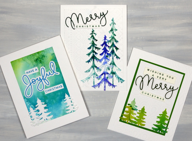
The alcohol ink cards continue, this time with a tree theme. If you didn’t see my first collection of alcohol ink cards please visit here. Once more I worked with only 2 or 3 alcohol inks to create patterned panels. I have been starting with 4.5″x 6″ yupo or craft plastic panels which I can turn into a large background panel, two smaller backgrounds or numerous trees.
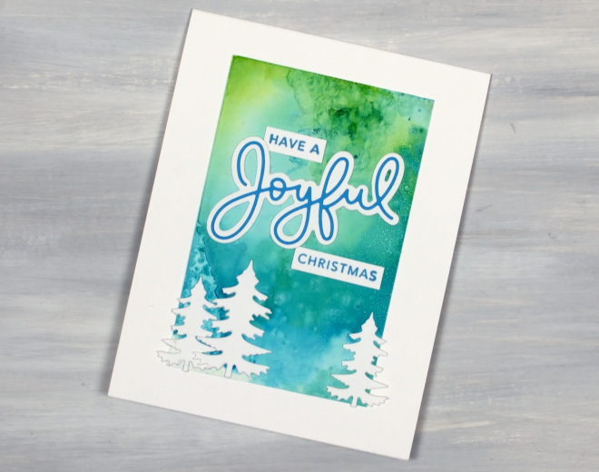
To add interest to alcohol ink panels I use several different techniques. I always add isopropyl alcohol to the panels to move and blend the inks and sometimes move the liquid around by tilting the panel or blowing the ink with an alcohol ink blower.
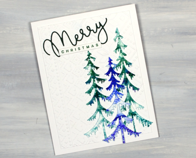
Another technique which gets quite intricate or softly blended results is to apply ink or isopropyl to a felt pad and ‘stamp’ it onto the yupo or craft plastic. Many of the cards I’ve been making feature an embossed panel behind the alcohol ink elements. I’ve used “a nordic themed”ski lodge” embossing folder from Spellbinders and an Anna Griffin ‘regal braid’ folder for today’s cards. The greeting stamps and dies are from Kristina Werner’s sets “Joyful and Merry stamp set” and “Joyful and Merry dies“. I don’t actually own them but you can be sure I made good use of them before my sister-in-law took them home to Australia. All the trees are cut using a fabulous Creative Expressions die set called Festive Collections – Winter Pines.
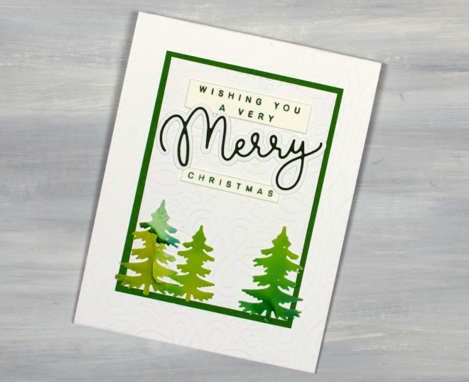
And, if you know me, you know there are more tree cards to come; this is just a smattering!
Stencil & Watercolour wedding cards
Posted: March 27, 2026 Filed under: Classes, clematis burst stencils, Creative Expressions, cricut, Watercolour | Tags: Classes, cricut, Fabriano Watercolour Paper, Stencils 2 Comments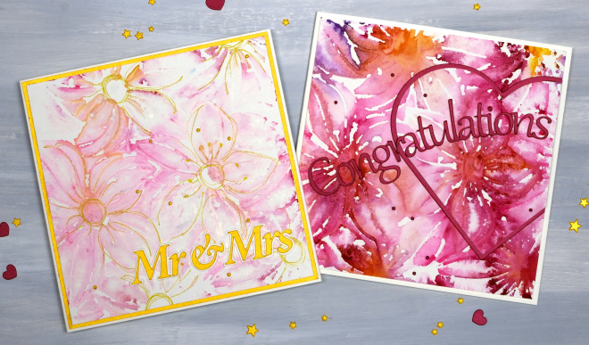
I’ve been creating quite a few patterned panels using stencils and watercolour while designing a workshop. There have been many experiments and most, but not all, have turned out quite well. You can see in the photo below the Creative Expressions square ‘Clematis Burst’ stencil beside two panels. The bright one on the left was the first impression and the one on the right the second impression using paint remaining on the stencil.
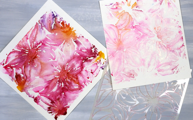
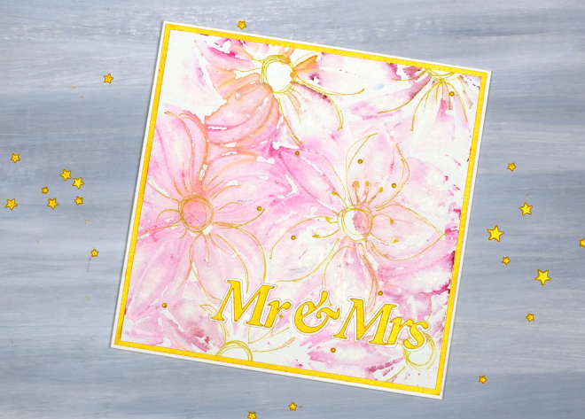
As I never seem to have any wedding cards on hand when someone asks for one I decided to make both panels into wedding cards, one bold and one subtle. I cut the sentiments on the cricut and also the large red heart

When you look closely you can see both ‘prints’ are loose and a bit messy but I don’t mind the impressionistic look!
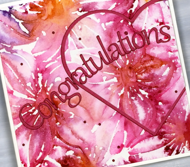
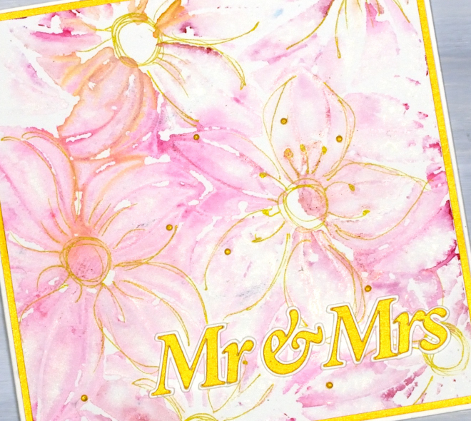
I used a gold gel pen to add definition to the flowers on the lighter print, not every petal but enough to make sure they looked like flowers!
I am teaching a Stencils & Watercolour workshop here in Ottawa in late April and early May, you can find all the details on the CLASSES page.