
Alcohol Ink Baubles
Posted: August 24, 2026 Filed under: Alcohol Ink, baubles, Christmas filigree, Concord & 9th, Echidna Studios, Kristina Werner Joyful and Merry dies, Kristina Werner Joyful and Merry stamp set, Penny Black, simple strips, Spellbinders, Taylored Expressions | Tags: Alcohol Ink, grafix craft plastic, Penny Black creative dies, Ranger Alcohol Ink, Spellbinders, Taylored Expressions, Yupo Paper 2 Comments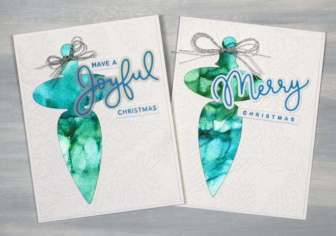
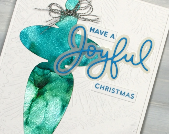
The alcohol ink cards continue but there is a new element featured in the shimmery baubles above. I created alcohol ink patterns on Ranger alcohol ink silver sparkle cardstock. Whatever colours you blend over the cardstock automatically shimmer and shine. On the cricut I cut the finials using the “Christmas Filigree Digital Stamp and Cutfiles” from Echidna Studios. Both decorations are on panels embossed with the Spellbinders “forevergreen” folder and feature Kristina Werner’s Joyful and Merry sentiment dies and stamps.
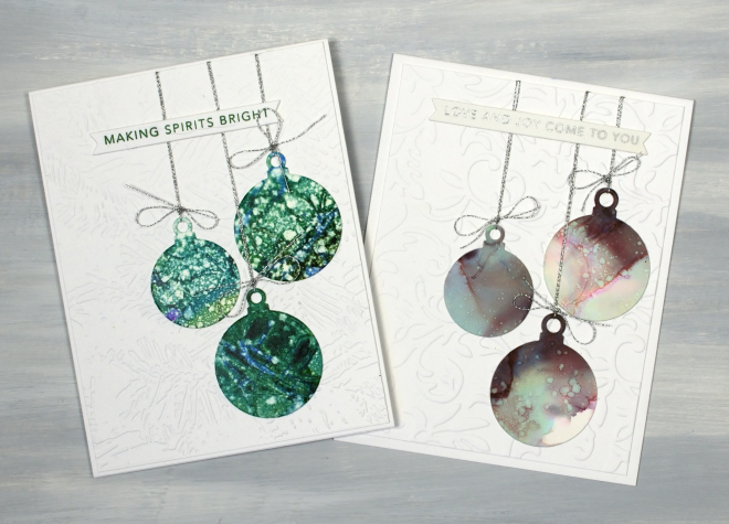
I also made simple round baubles using Penny Black dies and patterned panels. Basically any pretty alcohol ink panel is fair game for creating some baubles. As is my pattern they are also stuck on embossed panels, tied with silver cord and sentimented with Taylored Expressions “Simple Strips Christmas sentiments”.
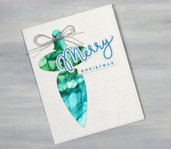
I don’t actually own any of this sparkly cardstock; a friend let me use some of hers, but I can highly recommend it if you want a very simple way to make your alcohol patterns look fabulous.
Tiny Towns under Alcohol Ink Skies
Posted: August 19, 2026 Filed under: Alcohol Ink, Dies, grafix, Penny Black, Sizzix, Spellbinders, Taylored Expressions, Tiny Tree | Tags: Alcohol Ink, grafix craft plastic, Penny Black creative dies, Penny Black stamps, sizzix embossing folder, Spellbinders, Taylored Expressions 4 Comments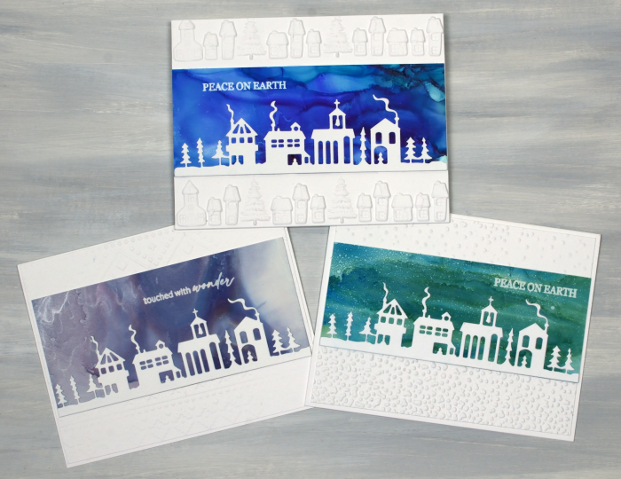
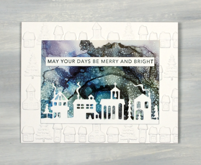
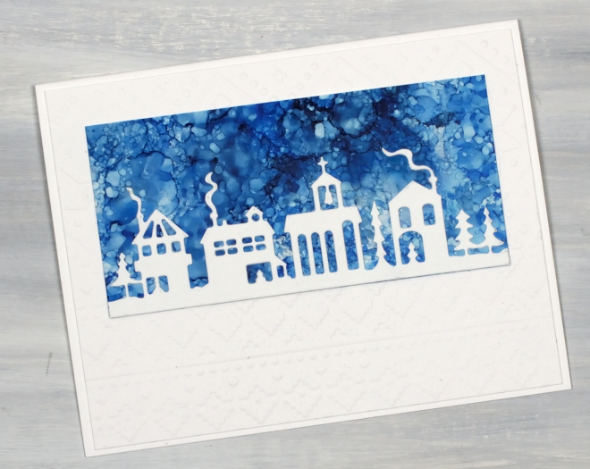
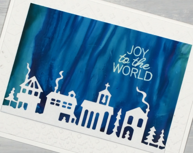
I do like the look of little houses and buildings against a bold or colourful sky. I’ve done the same thing numerous times with watercolour panels. The little town featured in these cards is the Penny Black ‘tiny town‘ die. Once again I have completed my cards with embossed panels and PB or Taylored Expressions sentiments.
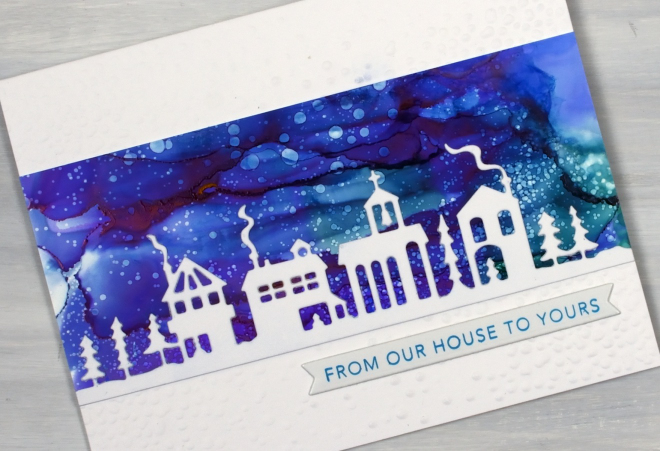
One thing you might notice is that some of the sentiments are stamped on the alcohol ink sky not on a strip of cardstock. After several alcohol ink sessions resulting in a stack of useful panels I remembered my alcohol lift ink. Lift ink does exactly as the name suggests, it lifts alcohol ink off the surface (in this case yupo or grafix craft plastic). Once lifted the ink needs to be wiped off the stamp and a few more applications made in exactly the same spot. It is also necessary to blot the stamped area with a tissue or cloth to remove any ink which has been diluted by the stamp pad. I was very happy with the results and you will see just how happy in a bunch of future cards.
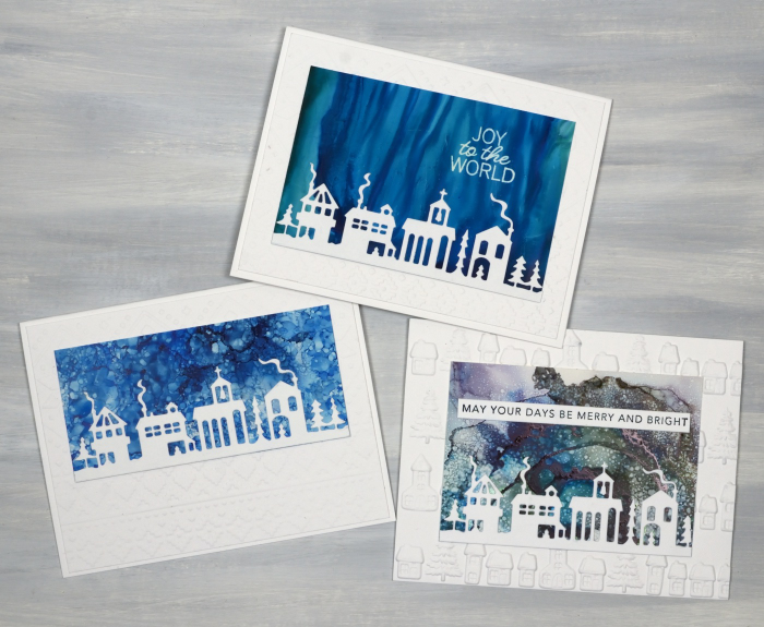
Once again I have created different alcohol ink patterns by tilting the panel to move the ink, blowing the ink with a hand pump or spritzing the ink with isopropyl alcohol to create the spotty or starry look.
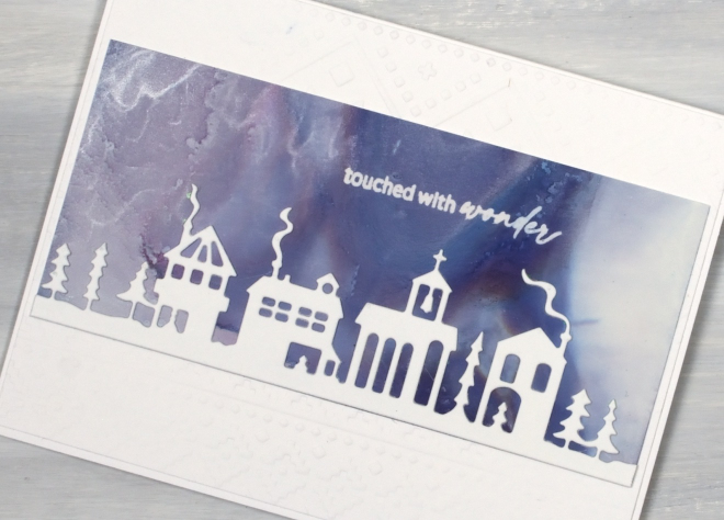
I used several different embossing folders to add snow, more little houses or the spellbinders “ski lodge” folder to the background. The little houses embossing folder is from Vaessen Creative and was found at the new craft supply store in Ottawa.
Thank you for the encouraging comments left on the recent alcohol ink blog posts. I am glad to be providing some inspiration to get your own inks out. If you haven’t seen the previous alcohol ink posts look here and here.
And stay tuned there are more little houses, trees, baubles and Bethlehem skies to come. Have a great day!
Alcohol Ink Trees
Posted: August 17, 2026 Filed under: Alcohol Ink, Creative Expressions, grafix, Kristina Werner Joyful and Merry dies, Kristina Werner Joyful and Merry stamp set, Spellbinders, winter pines | Tags: Alcohol Ink, Concord & 9th, Creative Expressions, grafix craft plastic, Spellbinders 3 Comments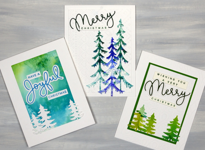
The alcohol ink cards continue, this time with a tree theme. If you didn’t see my first collection of alcohol ink cards please visit here. Once more I worked with only 2 or 3 alcohol inks to create patterned panels. I have been starting with 4.5″x 6″ yupo or craft plastic panels which I can turn into a large background panel, two smaller backgrounds or numerous trees.
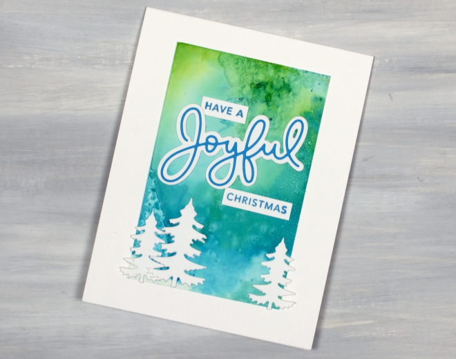
To add interest to alcohol ink panels I use several different techniques. I always add isopropyl alcohol to the panels to move and blend the inks and sometimes move the liquid around by tilting the panel or blowing the ink with an alcohol ink blower.
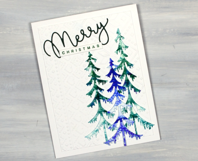
Another technique which gets quite intricate or softly blended results is to apply ink or isopropyl to a felt pad and ‘stamp’ it onto the yupo or craft plastic. Many of the cards I’ve been making feature an embossed panel behind the alcohol ink elements. I’ve used “a nordic themed”ski lodge” embossing folder from Spellbinders and an Anna Griffin ‘regal braid’ folder for today’s cards. The greeting stamps and dies are from Kristina Werner’s sets “Joyful and Merry stamp set” and “Joyful and Merry dies“. I don’t actually own them but you can be sure I made good use of them before my sister-in-law took them home to Australia. All the trees are cut using a fabulous Creative Expressions die set called Festive Collections – Winter Pines.
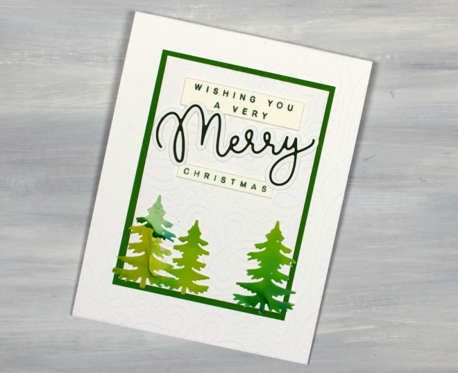
And, if you know me, you know there are more tree cards to come; this is just a smattering!
Watercolour trees & skies
Posted: December 23, 2025 Filed under: Penny Black, ski lodge embossing folder, Spellbinders | Tags: Fabriano Watercolour Paper, Penny Black stamps, Spellbinders 1 Comment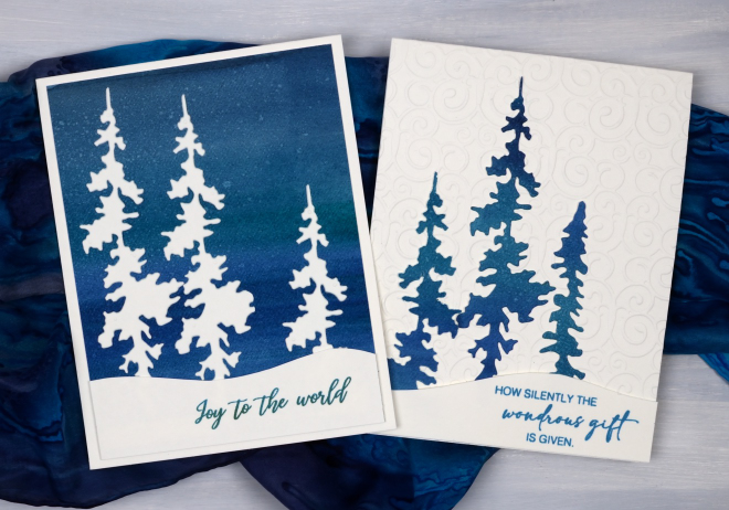
Here are a few more watercolour Christmas cards I made this year. I painted a large panel of watercolour paper in blues and greens blended together to create a striped mix of tones. From the large panel I cut background rectangles a bit smaller than my card bases and trees of different heights to arrange against embossed white skies. I don’t know the name of the tree die set as I borrowed it from a friend. I really like the non-symmetrical trees featured on the cards above.
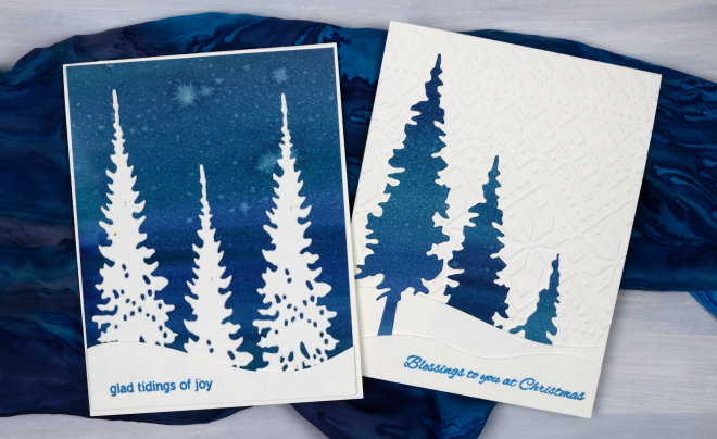
To create the snow banks I cut curved hill shapes, sometimes one, sometimes two per card. The cards were all finished with Penny Black sentiments. I have sent most of my cards but there are a few that will be new year greetings. Last week the snow was gradually disappearing around here as we had warmer temperatures and rain. This week it’s a different story; it’s been snowing for days.
Let heaven and nature sing
Posted: November 27, 2025 Filed under: Penny Black, Spellbinders | Tags: Penny Black stamps, Spellbinders 8 Comments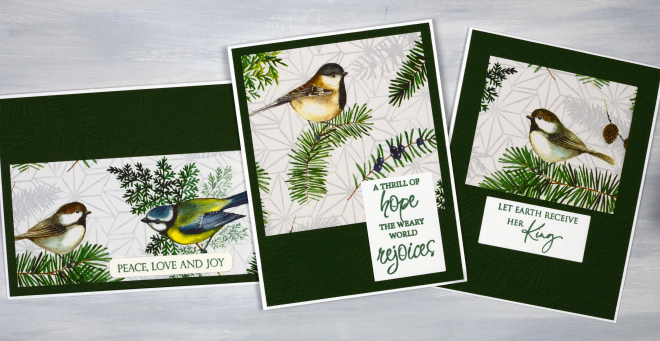
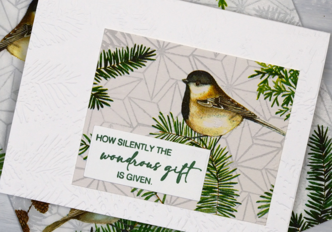
This is the second collection of napkin/serviette Christmas cards I’ve made, this time with sweet birds and foliage featured. As I mentioned in an earlier post I have had success with a glue stick or double sided adhesive to adhere the single layer of napkin to cardstock, but there are other methods which several of you were kind enough to share with me.
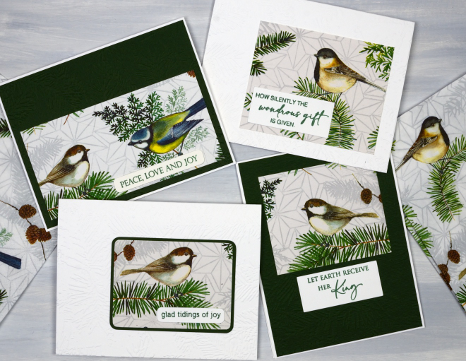
Thank you to everyone who got in touch to let me know about the following options: spray adhesive, modpodge, freezer wrap adhered with a hot dry iron and a full sheet of Avery sticker paper. Some involve wet adhesive, some dry and the freezer wrap uses the melted wax in the paper so I imagine each method produces a slightly different thickness and flexibility. I will report back again if I try some of these approaches.
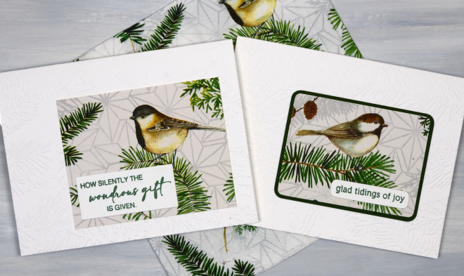
As is often the case it is hard to see the texture in the background panels and card bases. I have used the Spellbinders ‘in the pines’ embossing folder on both the white and the dark green panels and it does look nice and co-ordinates with the pine sprigs on the napkins.

The sentiments are a mix of Penny Black sentiments, the favourites I pull out every year.
The map card
Posted: October 21, 2025 Filed under: Collage cards, cricut, Spellbinders | Tags: collage, cricut, Spellbinders 6 Comments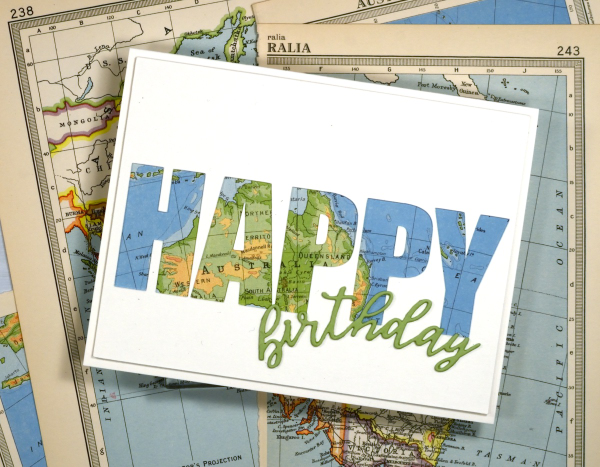
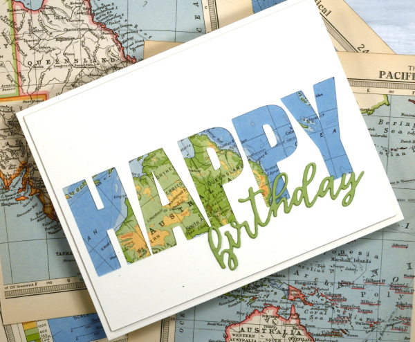
I’ve recently been using the cricut to cut letters in different fonts to complete my cards. I took the process a little further by cutting words out of the card front in order to reveal some coloured paper behind. This one shows a vintage map; tomorrow’s card features some patterned paper from a magazine.
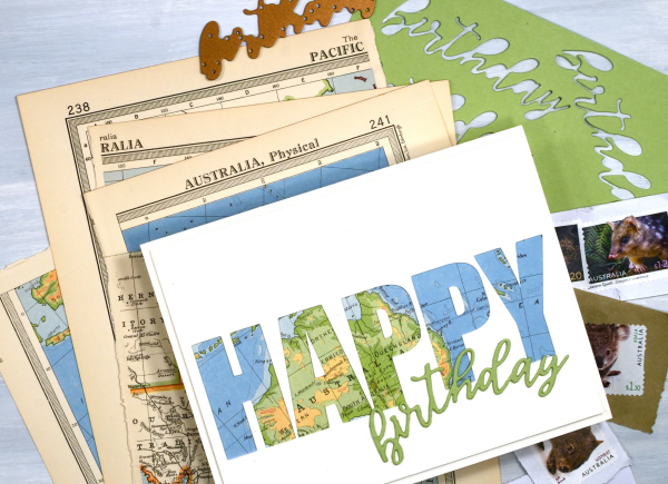
To create this birthday card for my son who just returned from visiting our family in Australia I had fun positioning the map behind the cut out to reveal some of the places he stayed. The map page is from an old atlas I am using for collage. The birthday die-cut is from the Spellbinders ‘serenade sentiments’ set which also has co-ordinating shadow dies. (currently the shadow for the word ‘birthday’ is missing somewhere in my work room!)
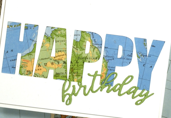
I wish I could tell you which font I used on the cricut but it appears I didn’t record that important information, something tall and bold! You could also do this technique with alphabet dies, the trick is to have dies open enough to show a decent amount of the paper behind. When cutting the letters out of course I am saving them in case I can use them on another card.
The Calendar Card
Posted: January 9, 2025 Filed under: Collage cards, simply perfect mix & match sentiments, Spellbinders | Tags: collage, Spellbinders 8 Comments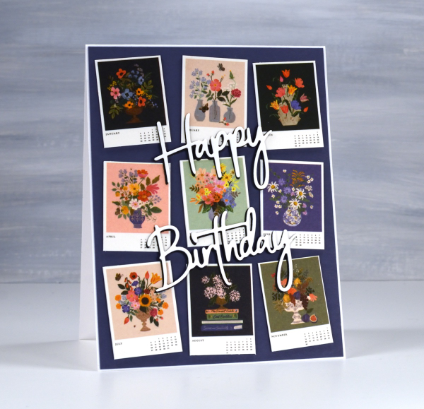
I’ve always liked the thumbnail page on a calendar. There’s something about seeing all the pictures in miniature which I find very cute. So when I bought a desktop calendar for a friend’s birthday I decided to remove the thumbnail page and create the card from the tiny month images.
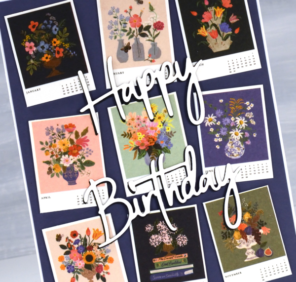
The calendar is made by the Rifle Paper company and the paintings are quite delightful.
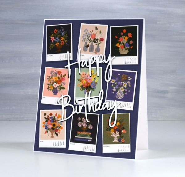
I stacked a white die-cut sentiment on a black one to help it stand out against the busy background. The dies are Spellbinders ‘simply perfect mix & match’ sentiment dies.
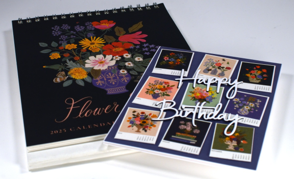
This gift has the added feature that if the recipient wishes, she can give me back the calendar pages as the months pass and I will turn them into cards for her to use. I enjoyed coming up with this card and idea and will be going through my calendar collection in the future to find both thumbnails and full pages I can turn into cards. In some ways I have come full circle; I made cards from calendars when I first started card making as a child.
Mini Mittens
Posted: November 21, 2024 Filed under: cricut, Echidna Studios, mittens, my designs, ski lodge embossing folder, Spellbinders | Tags: cricut, Echidna Studios, Penny Black stamps, Spellbinders 9 Comments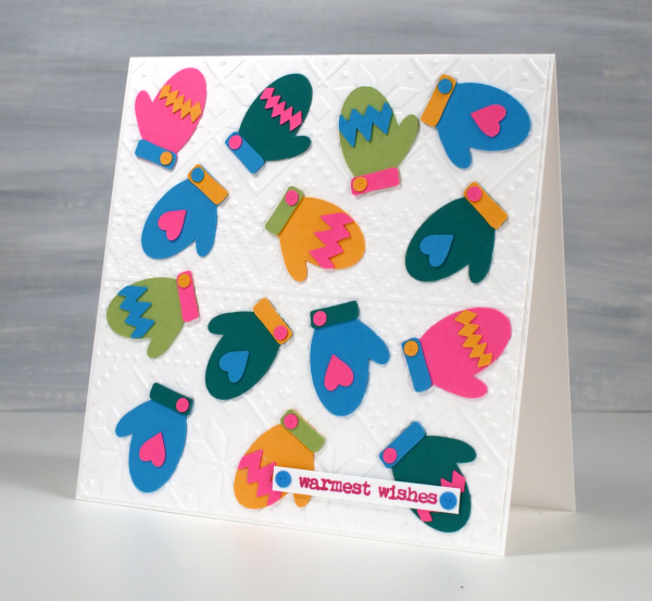
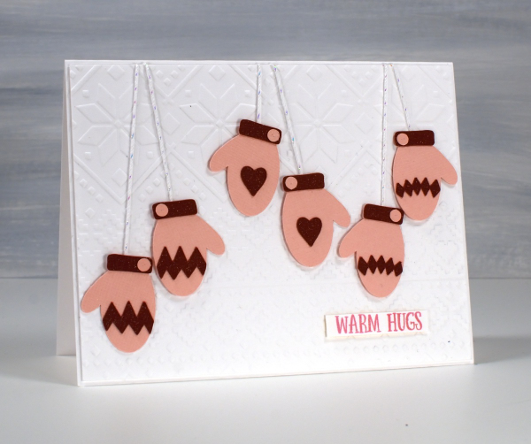
I do like an alliterative title but I restrained myself from calling this post Many Mini Mittens! I designed these mittens and accessories as cutting files for the cricut and I’m having so much fun with them. The Mittens digital stamp & cut-file set is available in the Echidna Studios etsy store. When I taught my bookish Christmas card class recently I had a cool stocking to cut from vintage papers but no mittens. To begin with I just designed the mitt and the cuff but I couldn’t stop so now the digital set has a heart, a poinsettia, diamond pattern, a zig-zag pattern, a snowflake, two cuffs and a little button. The buttons are too sweet.
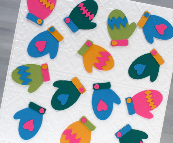
This colourful card started as an experiment to see how small the cricut would cut the mitts without tearing them. These little mitts are 1¼” in length; everything else is obviously smaller and cut just fine.
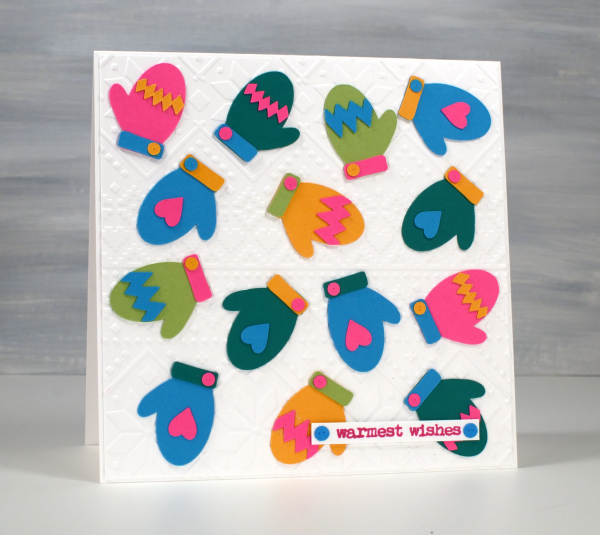
I had fun arranging the elements on the mittens so there wasn’t too much of one colour or repetition of the same coloured patterns. I did create them in pairs because who wants a whole bunch of unmatched mitts? I’ve experienced that in our own mitt basket – why so many right mitts and no left mitts?!
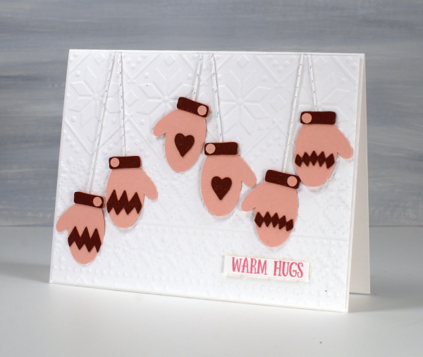
And because I couldn’t stop I cut some matching pairs the same size but using linen textured pink and burgandy cardstocks. I used a clear wink of stella brush pen to make all the burgandy bits sparkle but as I write this I see it didn’t show in the photo. Trust me it adds to the cuteness. ( I had forgotten about my wink of stella pens)
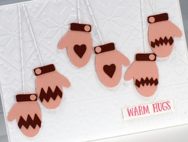
For both cards I used Spellbinders ‘ski lodge’ embossing folder to make a background because ❄! I found suitable Penny Black sentiments from the ‘Merry Up‘ set. Come back tomorrow and I will share the larger, knitted mitten cards I also made with this digital set.
Masked & Blended Leaves
Posted: October 24, 2024 Filed under: Echidna Studios, grafix, Leaves digital stamps and cut files, Spellbinders | Tags: Echidna Studios, Fabriano Watercolour Paper, grafix, Ranger Distress inks, Spellbinders 5 Comments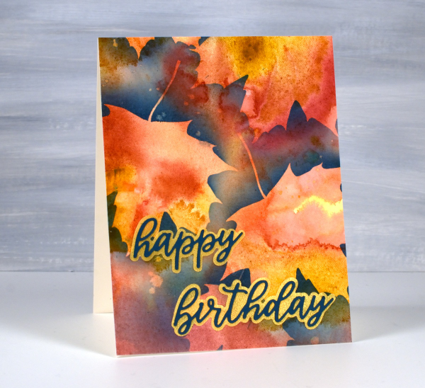
It’s been a couple of weeks since I posted, sorry about the blog neglect. In my last post (which also featured leaves) I mentioned I had just started to see some reds and oranges along with the earlier yellow leaves. This week the colours have been stunning! So many deep reds contrasting with the remaining greens and still more yellows and oranges. Even crawling in traffic has had its upside as I gaze at the autumn leaves.
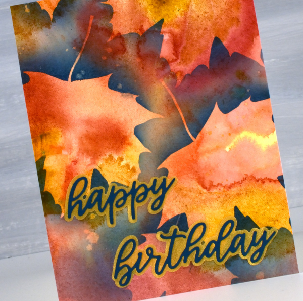
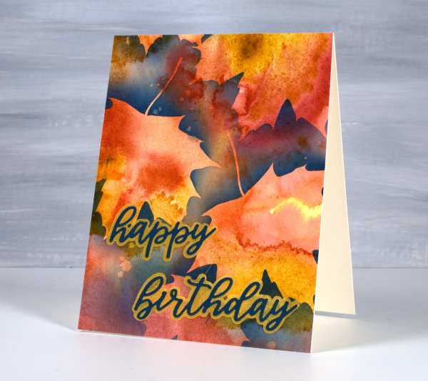
About a month ago I posted a video showing how I created a watercolour painting of leaves using masking (more leaves). Today’s card featured the same process using a maple leaf design from the Echidna Studios Leaves digital stamp set. Instead of painting the final dark layer over the masks, as shown in the video, this time I blended chipped sapphire ink using a blending brush. I think the navy edge around the leaves shows them off beautifully but because I didn’t blended too heavily you can still see the watercolour underneath. I finished this card off with a layered sentiment from the Spellbinders ‘serenade sentiments etched dies set‘
This post includes affiliate links from Foiled Fox. If you buy through these links I receive a small commission at no extra cost to you.
Brusho Daisies
Posted: July 19, 2024 Filed under: Brusho, daisy delight, Darkroom Door, Spellbinders | Tags: Brusho, brutus monroe embossing powder, Darkroom Door stamps, Spellbinders 7 Comments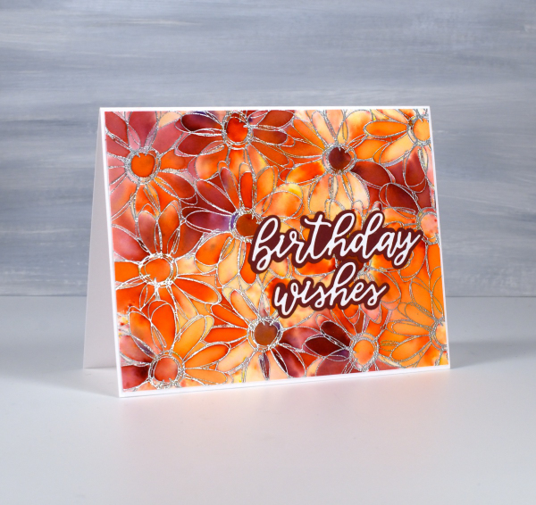
Yesterday I did some embossing with a friend and, as I was introducing her to brusho paints, I remembered how much I like the emboss resist technique with brushos. I don’t do too much heat embossing these days because of the gritty mess of embossing powder that ends up on my desk even when I am careful. But the results with brusho…

I embossed the Darkroom Door ‘daisy delight’ stamp on hot pressed watercolour paper with sterling embossing powder. I spritzed the panel with water then sprinkled orange and crimson brusho powders over the top. The trapped colour is just what I hoped for.
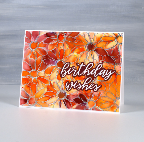
I added a Spellbinders sentiment from the die set, ‘Serenade Sentiments‘ to complete the card. So maybe it is worth getting gritty occasionally. This post includes affiliate links from Foiled Fox. If you buy through these links I receive a small commission at no extra cost to you.












