Alcohol Ink Skies over the Neighbourhood
Posted: September 8, 2026 Filed under: Alcohol Ink, Dies, grafix, neighbourhood border, Penny Black, simple strips, Taylored Expressions, Uncategorized | Tags: Alcohol Ink, grafix craft plastic, Penny Black creative dies, Penny Black stamps, pinata alcohol ink, Ranger Alcohol Ink, Taylored Expressions 2 Comments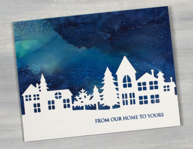
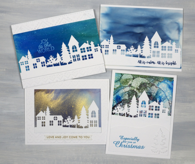
Today’s cards are similar to the recent tiny towns cards but feature the larger Neighbourhood Border die which only cuts along the top leaving the option of changing the amount of snowy foreground on cards.
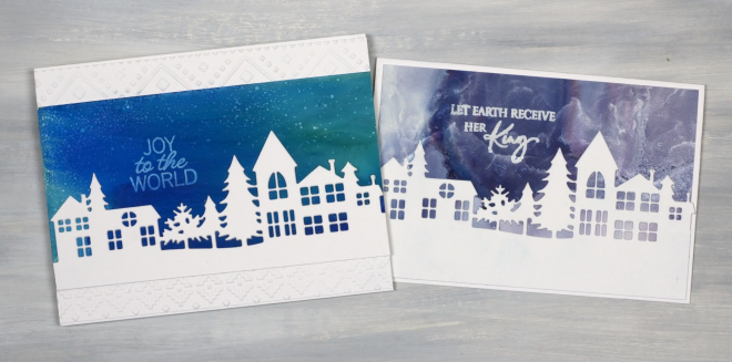
I used a range of techniques for the skies including tilting a few different alcohol ink colours on a panel to create soft blends as shown above left. I also added repeated spritzes of isopropyl alcohol over an inked panel to create the bubbly sky shown below left. A few of the panels have metallic alcohol inks included for some silver or gold shimmer.
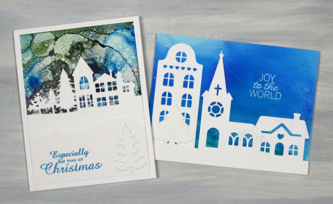
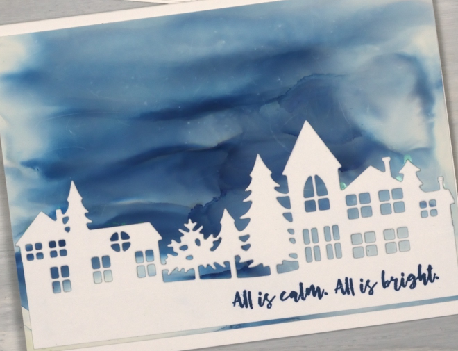
The card above right features elements from a Cricut cutting file I bought and cut apart to get the apartment building, church, cottage and tree. The alcohol panels were all done on yupo or Grafix white craft plastic and the card bases and die-cuts are from Neenah solar white cardstock.
I used a mix of Penny Black and Taylored Expression sentiments and once more stamped a few of them with Alcohol lift ink to lift the words right out of the sky! As I share this post the alcohol inks are back on the shelf and the gel plate is on the work desk. I am keen to show the gel prints soon but have a couple more collections of alcohol ink Christmas cards to feature. I honestly can’t believe how many I did, but it was so enjoyable I just kept creating panels outside on the pleasant summer days.
Big Alcohol Ink Trees
Posted: September 1, 2026 Filed under: Alcohol Ink, Concord & 9th, grafix, Kristina Werner Joyful and Merry dies, Kristina Werner Joyful and Merry stamp set, simple strips, Stampin Up, Taylored Expressions, Tim Holtz | Tags: Alcohol Ink, Concord & 9th, grafix craft plastic, Stampin Up, Taylored Expressions, Tim Holtz 2 Comments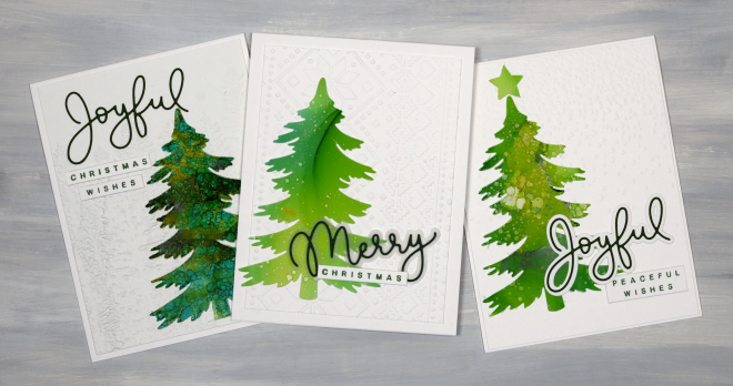
Time for another bunch of alcohol ink Christmas cards featuring one of the tree dies from the lovely Creative Expressions Festive Collection – Winter Pines set. The set has 6 different trees some tall, some short, some wide some skinny. The one featured here is a great size and shape so I used it over and over. The cards above feature Kristina Werner’s Joyful and Merry Stamps and Dies.
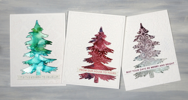
You can see the tree on the left was made with the Ranger alcohol ink silver sparkle cardstock. The tree on the right was made with a stencil on alcohol inks, hence the pattern. All the sentiments are from Taylored Expressions Simple Strips – Christmas stamp cut with the coordinating die.
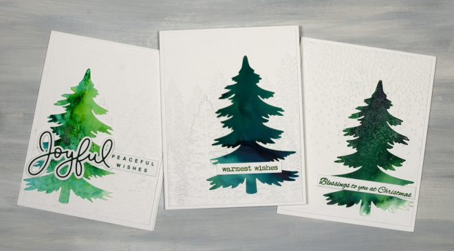
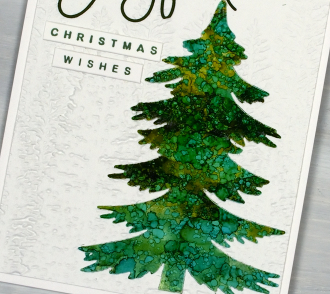
I used an embossed background behind every tree, often the retired evergreen folder from Stampin Up. I also used the snowflakes/speckles one from Tim Holtz.
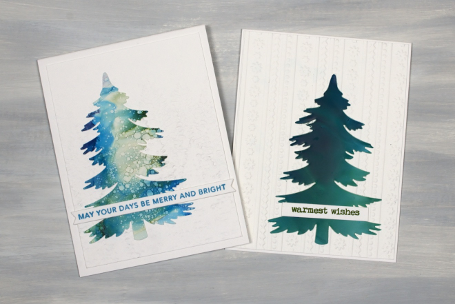
Of all the tree cards I made (and there were many) the one above on the left is my favourite. I like the mix of soft blues with a bit of dark blue and green and some splatter circles. I wish I remembered which alcohol inks I used but I don’t. It doesn’t matter too much. You can see I used dark blues and greens as well as light and some pinks, purples and silvers too.
Alcohol Ink Baubles
Posted: August 24, 2026 Filed under: Alcohol Ink, baubles, Christmas filigree, Concord & 9th, Echidna Studios, Kristina Werner Joyful and Merry dies, Kristina Werner Joyful and Merry stamp set, Penny Black, simple strips, Spellbinders, Taylored Expressions | Tags: Alcohol Ink, grafix craft plastic, Penny Black creative dies, Ranger Alcohol Ink, Spellbinders, Taylored Expressions, Yupo Paper 2 Comments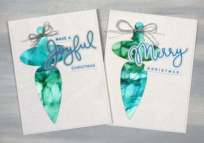
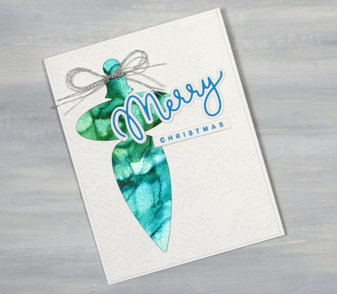
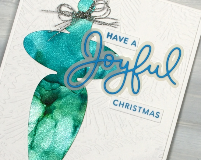
The alcohol ink cards continue but there is a new element featured in the shimmery baubles above. I created alcohol ink patterns on Ranger alcohol ink silver sparkle cardstock. Whatever colours you blend over the cardstock automatically shimmer and shine. On the cricut I cut the finials using the “Christmas Filigree Digital Stamp and Cutfiles” from Echidna Studios. Both decorations are on panels embossed with the Spellbinders “forevergreen” folder and feature Kristina Werner’s Joyful and Merry sentiment dies and stamps.
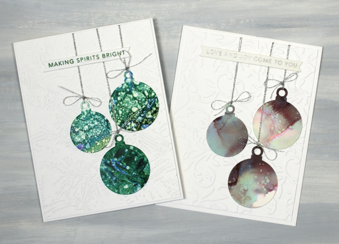
I also made simple round baubles using Penny Black dies and patterned panels. Basically any pretty alcohol ink panel is fair game for creating some baubles. As is my pattern they are also stuck on embossed panels, tied with silver cord and sentimented with Taylored Expressions “Simple Strips Christmas sentiments”.
I don’t actually own any of this sparkly cardstock; a friend let me use some of hers, but I can highly recommend it if you want a very simple way to make your alcohol patterns look fabulous.
Puppy’s Quilt
Posted: April 30, 2021 Filed under: Colorado Craft Company, puppy's quilt, sennelier watercolours, simple strips, Taylored Expressions, weathered | Tags: Colorado Craft Company, Fabriano Watercolour Paper, sennelier watercolours, Taylored Expressions 5 Comments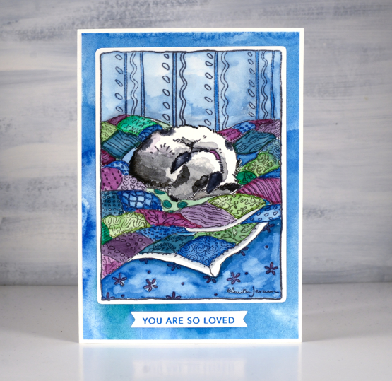
I created this sweet dog card for a friend to give her grand-daughter. You know it is unusual to see animals on my cards but this stamp had the perfect mix of watercolourable-quilt and not-too-difficult-to-paint dog. The colour scheme is all my own choice, no surprises there, but some of the technique was provided by the talented and prolific Sandy Allnock. When she created with this stamp she used the opportunity to teach how to paint a bold shadow. I decided not to add a bold shadow but just watching her paint the image was helpful. It made me realise there was absolutely no need to add more than one colour to each quilt square even though the fabric included patterns.
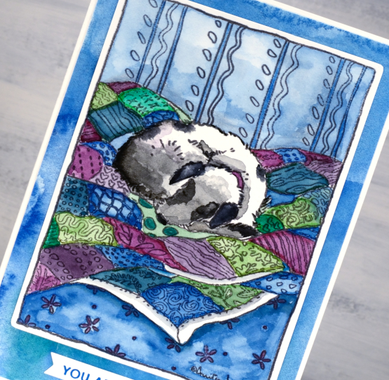
I stamped the image on hot pressed watercolour paper in versafine clair morning mist, a pigment ink which would not move when I added water and watercolour paint over the top. I used Sennelier watercolours for all the painting and to create a custom watercolour mat to frame the image also. I watched Sandy’s video more than once to help me paint the dog taking care to leave some areas bright white while the sections closer to the quilt were shadowy and grey.
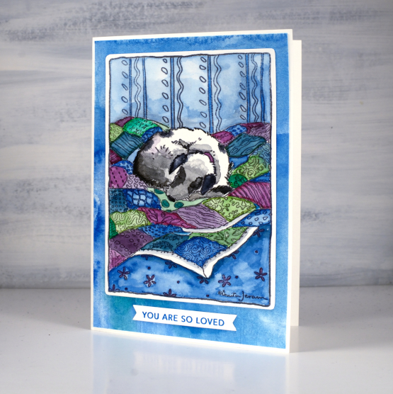
The sentiment is from the Taylored Expressions ‘simple strips’ set stamped in versafine deep lagoon and cut with the co-ordinating simple strips die. If you haven’t seen the simple strips series from TE they are very clever; you get one large stamp with 18 different sentiments and one die that cuts them all into banner style strips. Very handy to have a bunch of strips on hand to add to cards. It isn’t noticeable in the photos but the blue watercoloured mat has some texture as I embossed it with the weathered embossing folder, also from Taylored Expressions.
Supplies
(Compensated affiliate links used when possible)