Ransom Alphabet cards
Posted: December 14, 2022 Filed under: Brushed Christmas vol 1&2, Brutus Monroe, Darkroom Door, ransom alphabet | Tags: brutus monroe embossing powder, Darkroom Door stamps, WOW embossing powders 6 Comments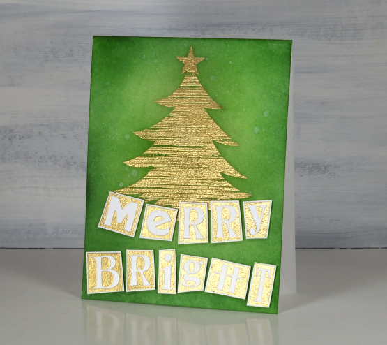
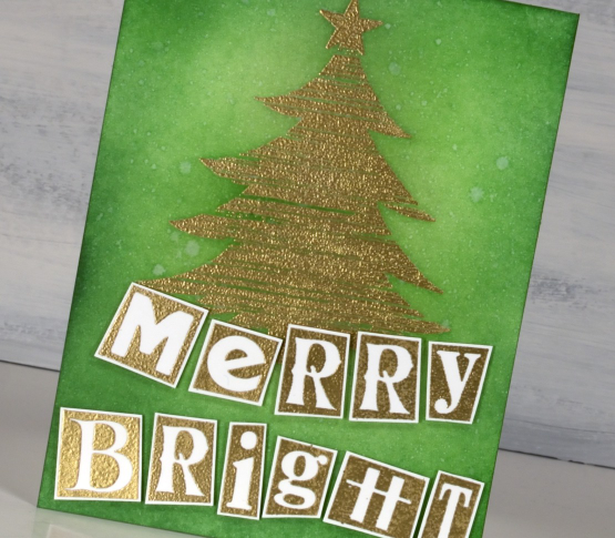
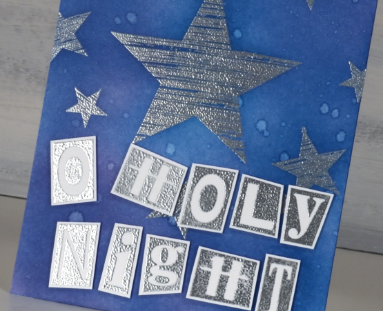
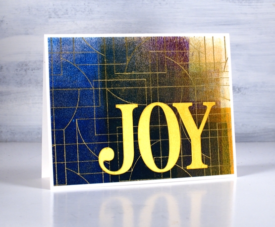
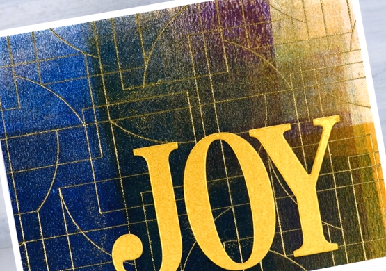
Darkroom Door recently released the ‘ransom alphabet’; it looks like letters cut from random newspapers or magazines. I decided not to cut my stamp into separate letters yet, so stamped it as one large stamp containing both alphabet, a few symbols and numbers 1-10. I embossed one sheet in gold powder and another in silver. I also stamped again on some small strips of cardstock to get the extra letters I needed to complete the greetings.
Both cards and alphabets are neenah solar white cardstock. I stamped a tree and star from the Darkroom Door ‘Brushed Christmas vol 1’ set then blended three greens over the card front using blending brushes. I spritzed water over the panel then blotted it with a paper towel to get a twinkly effect. A pearlized spray would have been even better but my workroom is upside down and inside out at present so locating the shimmer spray was asking too much!

I used the same process to create the ‘O Holy Night’ card but used a blue and a purple ink for the blended background. I wondered if the ransom alphabet was perhaps a bit too funsy for such a theme but then I remembered Mark 10:45, ‘the Son of Man came not to be served but to serve, and to give his life as a ransom for many.”
I’m looking forward to putting this set to use in my art journal. I think it might be necessary to cut the rubber stamp into separate letters eventually but for now it is still one large stamp.
Darkroom Door has so much inspiration on their blog. They are currently featuring all the products from their new release one product at a time. So many styles, colour schemes and projects.
(Compensated affiliate links from Foiled Fox, Scrap n Stamp & Ecstasy Crafts)
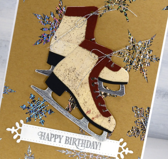
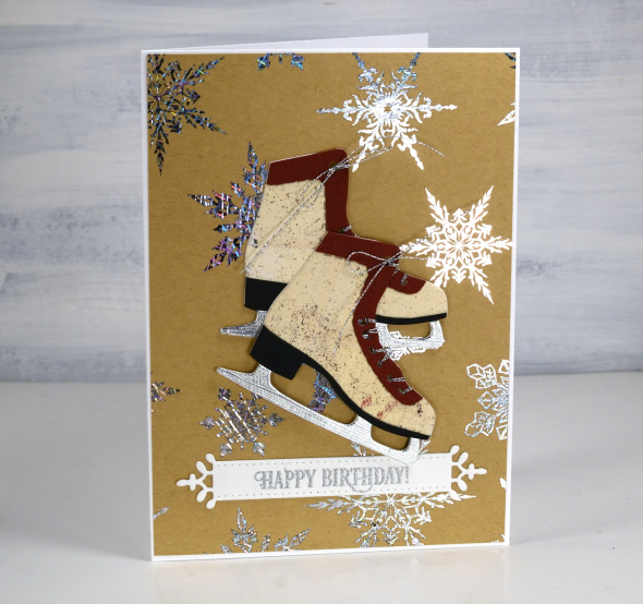
Let’s Skate
Posted: November 22, 2022 Filed under: birds and banners, Brutus Monroe, Dies, Echidna Studios, Foiling, layered Xmas wreath die set, let's skate, Penny Black, silver sketch deco foil, snowflake digital stamp set, stocking stuffers | Tags: Brutus Monroe, brutus monroe embossing powder, digital stamps, Echidna Studios, Foiling, Penny Black creative dies, Penny Black stamps 4 Comments
Don’t let that blog post title trick you. I won’t ever be the one saying, “Let’s Skate”! I will happily say, “Let’s make cute cards with skates on them.” My less than stellar skating experience ended when my children became proficient and I realised I didn’t have to get out on the ice and wobble around any more.

These lovely skate dies are from Penny Black and I was thrilled when I saw them. I have been using them in the Christmas card class I’ve been teaching but decided to make a few vintage looking pairs with various pieced layers. Quite unusual for me to piece layers but I do like how they turned out. On card above I filled them with die-cut foliage.
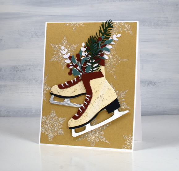
Both pairs of skates are popped up on snowflake backgrounds printed then foiled from my daughter’s snowflake designs available in her Etsy store. I printed the file on kraft paper on my laser printer then foiled in white on the piece above and Brutus Monroe silver foil on the design below.

The vintage style cream colour I used for the boot is a gel print, black cardstock for the heel, silver for the blade and some burgandy for the trim. Fiddly but worth it in the end.
These skates look really cute cut from patterned or collaged paper too. Not cute enough to make me want to skate though!
(Compensated affiliate links from Foiled Fox, Scrap n Stamp & Ecstasy Crafts)
Beauty of the Earth journal page
Posted: January 26, 2022 Filed under: Art Journal, Brutus Monroe, Darkroom Door, honeycomb, Nature Walk, number medley, Stencils, World Map, you are everything | Tags: Art Journal, Darkroom Door stamps, Darkroom Door stencils, Ranger archival inks, Ranger Distress inks, Ranger Distress stains 5 Comments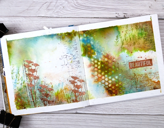
I have another double page spread in the 6″x 6″ journal today. Don’t tell the others but this one seems to be getting all the attention at present!
The pages in this journal are thick watercolour paper so I wanted to take advantage of that and use watercolour techniques. Most of the pages I have completed up until now have had a base layer of gesso or acrylic paint.
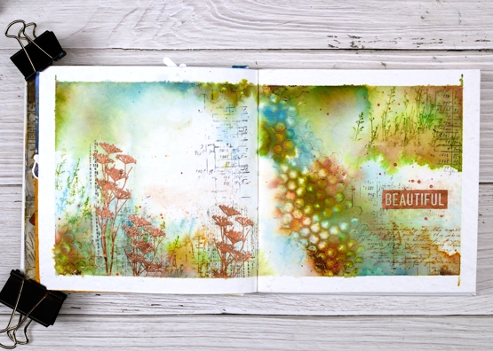
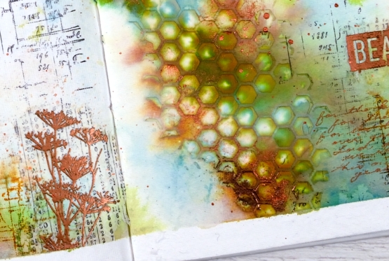
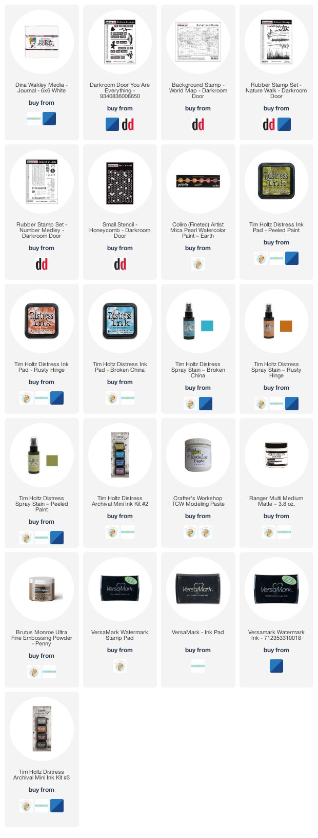
As you can see I taped the edges of the pages with tape before starting. I added some stamping in black here and there using a stamp from the Darkroom Door ‘number medley’ set. Next I used the DD ‘honeycomb’ stencil and modeling paste to add a texture strip from left to right down the centre of the spread. I added a small section bottom left also. Once the paste was dry I began painting colour around the honeycomb and across both pages. I spent a while doing this so as to see the blends and build up some depth of colour.
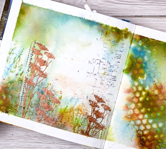
Other than some black stamping I used only three colours of distress ink, both spray stain and from the ink pads. I took care to keep some white space; sometimes I realise too late that I have colour all over the pages. I stamped some grasses in peeled paint archival ink so they would not dilute and broken china distress ink so they would dilute. I also stamped sections of the world map in rusty hinge. Although I loved the combo of peeled paint, rusty hinge and broken china I thought a bit of metallic shine would be nice so I added some wildflowers embossed in Brutus Monroe ‘penny’ powder.
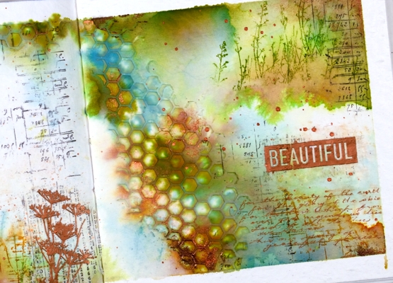
With a copper coloured gel pen I wrote the first verse of ‘For the Beauty of the Earth’ in the lower right hand corner then added the embossed word ‘beautiful’. And of course there is some copper splatter to finish it off. This is a style and look I have been hoping to create so you’ll probably see a few more like this one.
Supplies
(Compensated affiliate links used when possible
Floral Focus in pencil
Posted: July 5, 2021 Filed under: Brutus Monroe, floral focus, Heather lowercase die set, Inktense pencils, Pink Fresh studio | Tags: brutus monroe embossing powder, Inktense, Pink Fresh studio 7 Comments
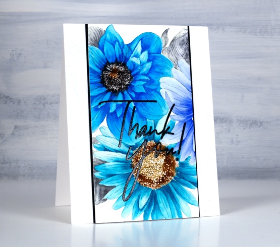
Last week I shared a card featuring the Pinkfresh Studio background stamp, ‘floral focus‘ watercoloured with Karin Markers. Today I have another card with the same stamp but pencil coloured this time using Derwent inktense pencils. At some point I should do pencil colouring on white or cream cardstock again but I am still in love with the look of pencil on kraft. Inktense pencils are watersoluble but you can also use them as traditional pencils with no water added, that’s what I did here.
I embossed the background stamp in white powder, another technique that looks great on kraft cardstock then used the inktense pencils to fill the flowers and leaves. The flowers are coloured with red violet, fuchsia and antique white. The leaves and stems I did with felt green and apple green and the small flowers are coloured with sun yellow and antique white.
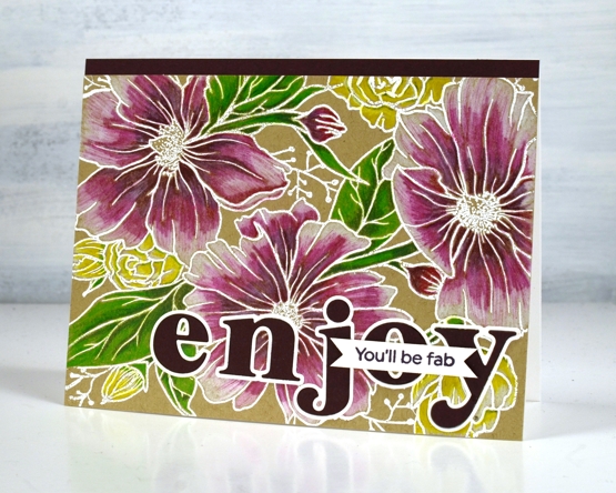
To finish the card I added a strip of violet cardstock and cut letters from the same cardstock with the Pinkfresh ‘Heather lowercase letter’ dies. The little sentiment is from PF set ‘scripted bold sentiments. You might think this is an odd pairing of sentiments; I was thinking it would suit someone starting something new, some encouragement along with a reminder to enjoy the experience.
Supplies
(Compensated affiliate links used when possible)
Gel print backgrounds
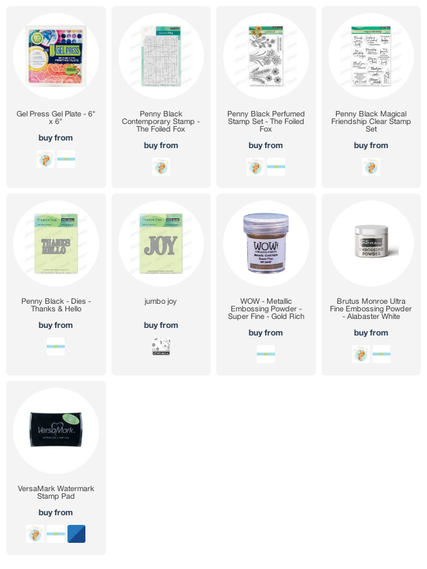
Posted: June 14, 2021 Filed under: Brutus Monroe, contemporary, gel press, perfumed | Tags: brutus monroe embossing powder, gel press, gel printing, Penny Black creative dies, Penny Black stamps, WOW embossing powders 8 Comments
I have had my gel plate out recently and I am addicted. It is what happens when I get it out. Gel printing can be frustrating because some of the prints are a whole lot of nothing much while others are full of pattern, texture and colour. I never know whether the next print will be the former or the latter so I keep on printing. I have a stack of prints sitting around and I decided it was time to cut a few up to make cards. I added some stamping and die-cuts.
This first card is my favourite but I must be honest with you, it isn’t a gel print. It is the scrap paper I cleaned the brayer on! I love how pretty the colours and blends are but I’m a bit miffed that my clean up page was prettier than many of my prints!
To turn it into a card I stamped and embossed the PB ‘contemporary’ stamp in white and added the hello, cut with the PB ‘thanks & hello’
Same deal with this background but embossed with gold and adorned with the PB ‘jumbo joy’ die.
I’m glad to add another card to my very small Christmas card stack. My resolution to add to it every month seems to be a bit off and on.
This background is a recent print and includes a fun thread printing technique I saw on Birgit Koopsen’s instagram. She recently completed a challenge gel printing every day in May. She generously shared all the techniques she tried.
I added flowers from the PB ‘perfumed’ set and a sentiment in white embossing powder.
I guess the title of this post was a bit inaccurate as only one of these cards features a gel print background! Watching beauty emerge when gel printing is so much fun. To glance over at my brayer clean up sheet and realise I have to save it because it looks like a pastel check table cloth is a bonus. To see the pale ghosts of stencils turn up on third or fourth prints also amazes me.
I did not participate in Birgit’s recent challenge as I was busy busy launching the new online Floral Faves class but now the gel plate is out I am challenging myself to post something gel-print related every day this week. See you tomorrow.
Supplies
(Compensated affiliate links used when possible)
Tropical florescence
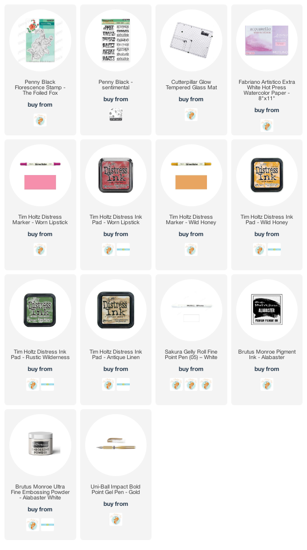
Posted: May 3, 2021 Filed under: Brutus Monroe, florescence, Penny Black | Tags: brutus monroe embossing powder, Fabriano Watercolour Paper, Penny Black stamps, Ranger Distress inks 8 Comments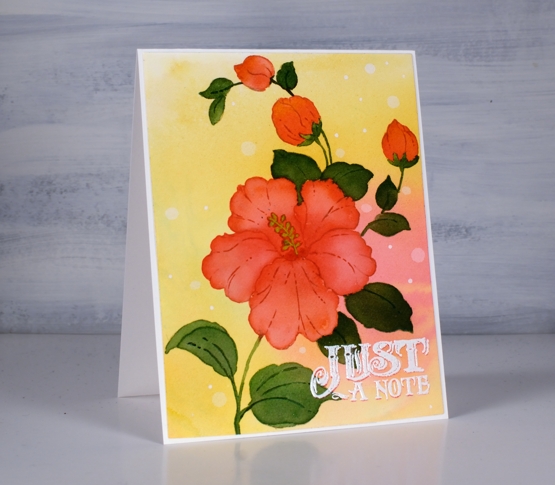
This is the second appearance of the beautiful hibiscus stamp from Penny Black (it’s called Florescence and it’s a stunner) and I’ve been working with it behind the scenes as I complete my next online class. To create this tropical look I smooshed worn lipstick and wild honey inks on my glass mat and spritzed water over them until they ran together then took a piece of hot pressed watercolor paper and swiped it through the diluted inks. To get good coverage and blends I tilted and spritzed more water on the panel then left it to dry.
With the panel in a stamp positioner I inked the large hibiscus and buds with worn lipstick ink stamped then inked the rest of the stamp with antique linen so I could see the whole image for some no-line watercolour. I painted one petal at a time with worn lipstick ink adding more towards the center of the flower. For the buds I used a mix of worn lipstick and wild honey.

For the leaves I stamped and painted with rustic wilderness distress and sometimes added worn lipstick to the blend so I’d have variation in the leaf colours.
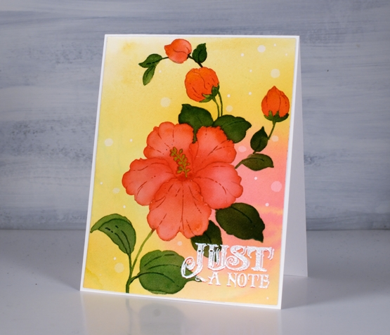
That little sentiment seemed to lend itself to the tropical, surf shop vibe so I stamped once in worn lipstick, then moved the panel ever so slightly down so I could stamp again in white to create a drop shadow look. I definitely dried it and used an anti static tool before sprinkling the white embossing powder over the words otherwise it could have all ended up white.
I’m so excited to have another online class in the works; the projects are all filmed so it’s editing time, supply list creating time and intro filming time. I’ll have more details, dates and sneak peaks for you soon!
Supplies
(Compensated affiliate links used when possible)
Rose Dance on black
Posted: February 12, 2021 Filed under: Brutus Monroe, Finetec paints, Penny Black, rose dance | Tags: brutus monroe embossing powder, Finetec artist mica watercolour paint, Penny Black stamps 6 Comments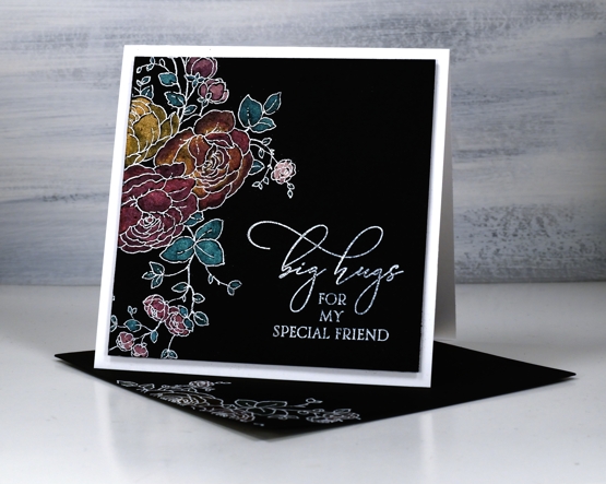
Today’s rosy card features just a portion of the Penny Black rubber cling stamp, ‘rose dance’. I’ve been creating with this stamp for a couple of days, coming up with different ways to use it. It is quite a large stamp, 6″ x 4″ but you don’t need to use the whole stamp on a card. I used only a section to create an embossed white border on a square panel of black watercolour paper.

I painted the outline design with Finetec Mica Pearlescent watercolours; I didn’t spend much time being detailed or doing blending because the pearlescent on black is very pretty without too much fussing. I wish you could see the shimmer a little better in the photo but trust me it is there in real life.
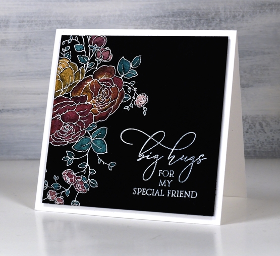
I embossed a sentiment from the PB special sentiments set in Brutus Monroe alabaster ink and popped the panel up on two pieces of black cardstock to lift it above the card base. And you might have noticed I remembered to make a matching envelope this time.
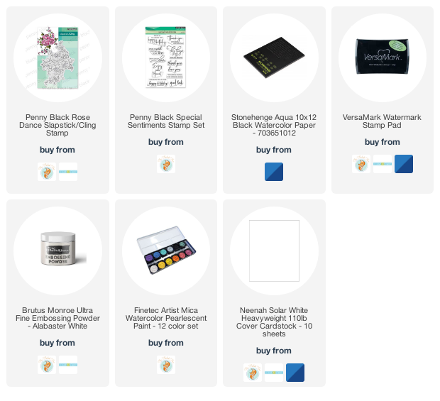
Supplies
(Compensated affiliate links used when possible)
Moving Alcohol Inks with Air – Video
Posted: February 3, 2021 Filed under: Alcohol Ink, Brutus Monroe, CAS, Dies, grafix, light as a feather, nesting squares, Penny Black, polar bears, Tutorial, Waffle Flower | Tags: grafix, grafix craft plastic, Penny Black creative dies, Penny Black stamps, pinata alcohol ink, Ranger Alcohol Ink, Tutorial, video 16 Comments
I’ve had the alcohol inks out recently and spent some time trying to get soft wavy patterns on craft plastic. I have seen several artists who do this technique beautifully but I am very much still a beginner with it. I have a few cards to share today along with a video showing my process for two of the panels. I worked on white craft plastic from Grafix which is heavyweight and totally opaque. For most of the panels featured today I used only two alcohol inks plus plenty of 99% rubbing alcohol; each panel was created with a metallic and a non-metallic ink.
This first panel was made with turquoise AI and gilded alloy AI; I love the range of blues when diluted with rubbing alcohol. The ‘for you’ Penny Black die cut is two layers of turquoise cardstock topped with one layer of pale gold.
This warm toned card was made with honeycomb AI and mined alloy AI then die cut with a WaffleFlower square nesting die. I used the WaffleFlower additional square dies to cut a larger copper square then added the PB ‘light as a feather’ die cut and a PB birthday sentiment embossed in Brutus Monroe penny embossing powder.
You can see the process for both cards above in the video below.
As I am working on alcohol ink panels I am evaluating my process and working out what I want to try next. I just bought a cheap lazy susan to work on the blown flowers and I’m pretty sure I don’t need to use as much coloured ink when I make the initial drops. You can be sure I will let you know what I discover.
I have a couple more cards made off camera using the same technique shown in the video. The card above features juniper AI and statue alloy AI with the PB ‘many thanks’ die cut from antique gold cardstock and stacked twice.
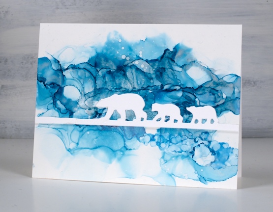
When this panel was finished it reminded me of photos of the artic and far north where the icebergs and glaciers are made up of beautiful shades of blue. It’s kind of a cross section perspective where we can see below and above the ice the bears are walking on. I did use two blue inks plus a silver for this one, ranger turquoise and stream with pinata silver. The bear die is ‘polar bears’ from Penny Black.
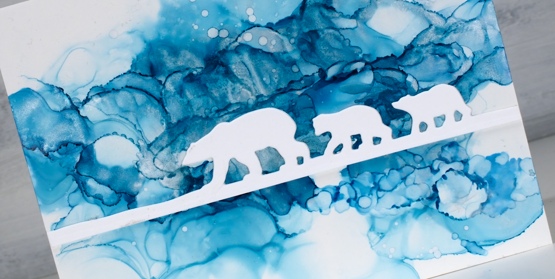
We’ve been watching Cecilia Blomdahl’s youtube channel about her life on Svalbard, an island off the north coast of Norway. She lives in the world’s northern most town. Polar bears are definitely around so you don’t wander outside the village without your weapon!
Supplies
(Compensated affiliate links used when possible)
Big & Bold thank you cards
Posted: January 25, 2021 Filed under: Brutus Monroe, Colorado Craft Company, Concord & 9th, Daisy & Dahlia, Karin brushmarkers, phrase builder you, Pink Fresh studio, simple serif alphabet dies | Tags: brutus monroe embossing powder, Colorado Craft Company, Concord & 9th, Karin brushmarkers, Pink Fresh studio 9 Comments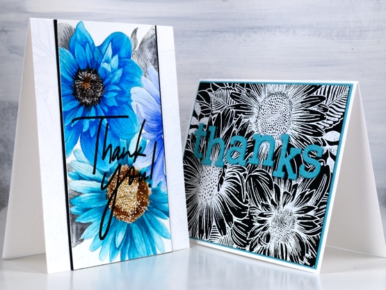
I’ve teamed up with the Foiled Fox again, as I love to do and I’m sharing two cards featuring the Colorado Stamp Company’s ‘daisy & dahlia’ stamp. I made a couple of cards last year with this stamp using a very different colour scheme.
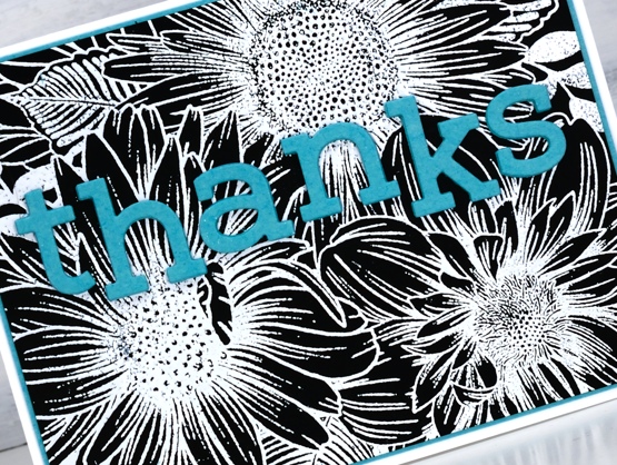
On the card above I wanted to show you how much depth and variation you can get from single Karin brushmarkers. I was so happy to see the light and shadow I could achieve on each petal with one or two dabs of ink from the marker then blending with water. The blue flower on the right which is barely showing was coloured with a bold dark blue but as you can see it was possible to dilute it to a pale blue. I used the following Karin brushmarkers on the panel: black, henna, cool grey , rose wood, cyan, turquoise, royal blue.
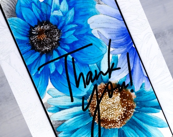
It’s not easy to see but you might notice a white on white embossed image on the card base; it’s the same stamp providing a bit of texture. You can learn more about my process by visiting the Foiled Fox blog today
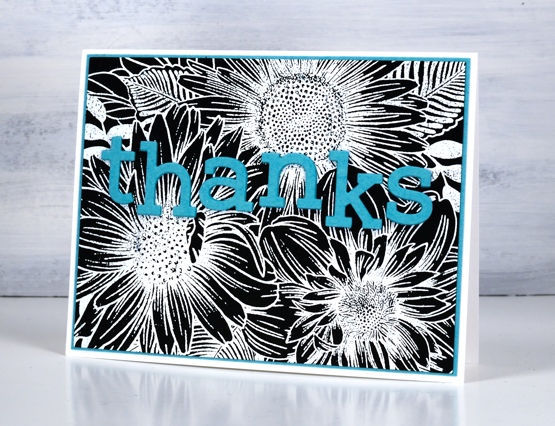
I kept some of the colours but went for a bolder look on my second card embossing the same large stamp in white on black cardstock. As you can see this stamp works as a coloured image and and a black and white image. White on red, red on white, blue on white, there are many colour combos which I’m sure would also look bright and beautiful.
Make sure you check out all the details on the Foiled Fox blog and take the time to check out Shauna’s stunning floral card from last Friday; it is a beauty.
Supplies
(Compensated affiliate links used when possible)
Blossom birthday
Posted: October 16, 2020 Filed under: all the birthdays, Brutus Monroe, Concord & 9th, meadow blossoms, Papertrey Inks | Tags: Concord & 9th, Fabriano Watercolour Paper, Kuretake Zig clean color real brush markers, Papertrey ink 4 Comments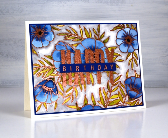
Even as my flowers fade and disappear I am still inspired to make floral cards. I’ve teamed up with the Foiled Fox today to share a blog post here and over there. If you are looking for all the creative process details pop over to the Foiled Fox blog. Today’s card features the C&9 ‘all the birthdays’ set again. It has only been in my house a week or so and already it has helped me out several times. Having one set with at least ten different ways to stamp happy birthday is a winner. There are probably more than 20 combinations when you look at all the separate word stamps and single letters in the set.
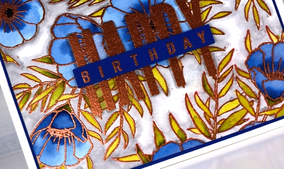
I wanted to combine a background image with a sentiment and ended creating my own background by repeat stamping with two stamps from the Concord & 9th ‘meadow blossoms’ set. Before heating the panel I stamped the word HAPPY from the new C&9 ‘all the birthdays’ set. I embossed with copper powder then coloured with ink from Papertrey ink cubes. The ink cubes are very juicy so I often smoosh them on my glass mat then pick up ink with a paint brush.
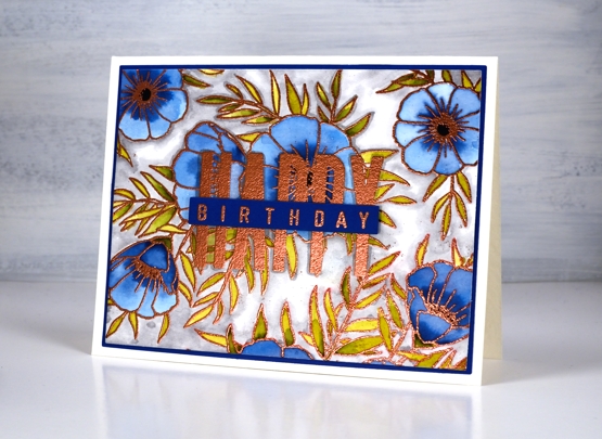
I filled the background with a grey zig clean color real brush pen and blended it with water. To complete the card I matted with with the dark blue cardstock I keep reaching for and finished the sentiment on a strip of the same blue. Having this new birthday set has got my birthday card production back on track. I have no excuses for not sending out birthday cards. Thank you Foiled Fox!
Supplies