
Peaceful Conifers
Posted: December 18, 2023 Filed under: Coniferous Silhouettes, Echidna Studios | Tags: Echidna Studios, Foiling, Penny Black stamps 10 Comments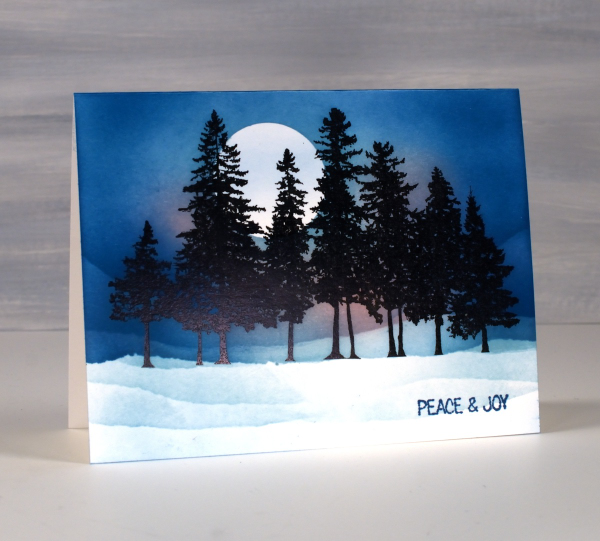
This digital tree stamp from Echidna Studios is definitely a favourite of mine so here is another version of a masked moonlit winter scene. I printed the detailed ‘Coniferous Silhouettes‘ image on neenah solar white cardstock and foiled the print with black foil for extra blackness.
I punched a moon mask from a post-it note and tore snow masks from painters’ tape then used blending brushes and speckled egg, uncharted mariner and spun sugar distress inks to create the moonlit scene.
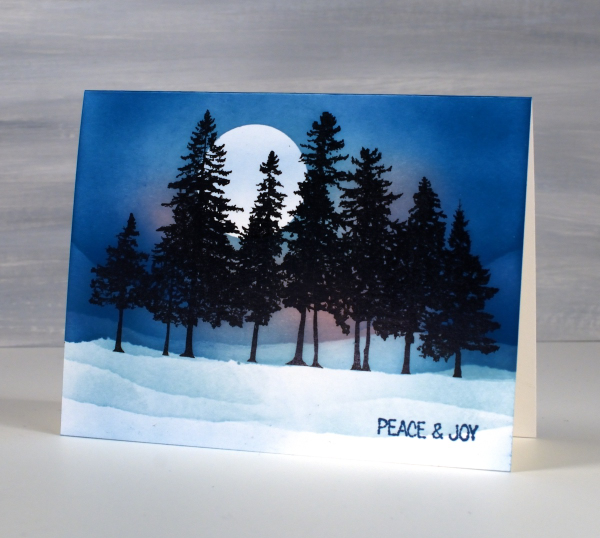
Looking at it as I write this blog post I realise there should be tree shadows in the foreground…a challenge for another day. Today’s post features affiliate links to The Foiled Fox. If you buy through these links I receive a small commission at no extra cost to you. Peace & Joy everyone.
Alcohol Ink & Trees
Posted: January 13, 2023 Filed under: Alcohol Ink, grafix, Penny Black, Taylored Expressions | Tags: Foiling, Penny Black stamps, Ranger Alcohol Ink, Taylored Expressions 9 Comments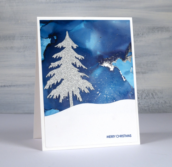
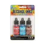
I have another alcohol ink sky to show you today paired with a very sparkly tree. I don’t own the tree die or the sparkly silver paper but this tree was a leftover from a class I attended and it looks so pretty against the blue sky. It is hard to capture on camera but there are lines and dots of silver foil on the alcohol ink background.
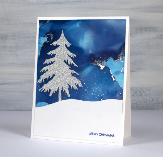
When playing with alcohol inks on yupo or craft plastic you sometimes end up with areas of thick sticky ink. You can dilute and move it with isopropyl alcohol or you can press foil on it while it is still a bit tacky. Once again I cut a snowy hill by hand and added a Penny Black sentiment.
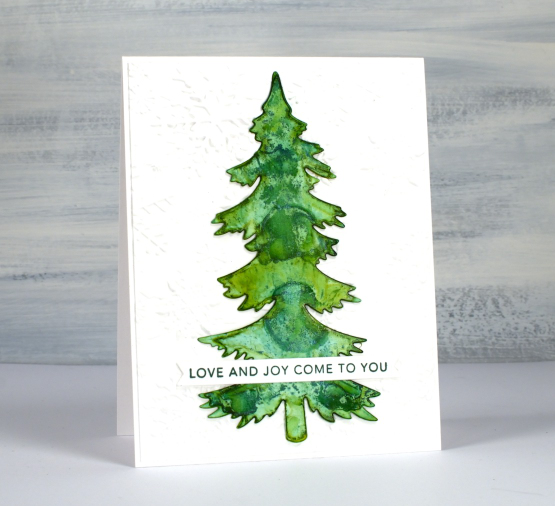
On this second card the tree is the coloured instead of the sky. I cut the tree from white craft plastic and added alcohol inks (both original and pearl formula) to another piece of craft plastic so I could then press the tree onto the alcohol inks to make a pattern and pick up the ink.
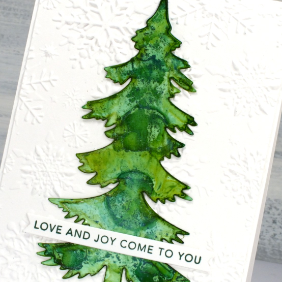
I attached the tree to an embossed background and added a Taylored Expressions sentiment. There are a few more alcohol ink Christmas cards still coming. I am happy to have inspired a few of you to look at your stash of panels to see what you might be able to turn into backgrounds and skies.
(Compensated affiliate links from Foiled Fox & Scrap n Stamp)
Let’s Skate
Posted: November 22, 2022 Filed under: birds and banners, Brutus Monroe, Dies, Echidna Studios, Foiling, layered Xmas wreath die set, let's skate, Penny Black, silver sketch deco foil, snowflake digital stamp set, stocking stuffers | Tags: Brutus Monroe, brutus monroe embossing powder, digital stamps, Echidna Studios, Foiling, Penny Black creative dies, Penny Black stamps 4 Comments
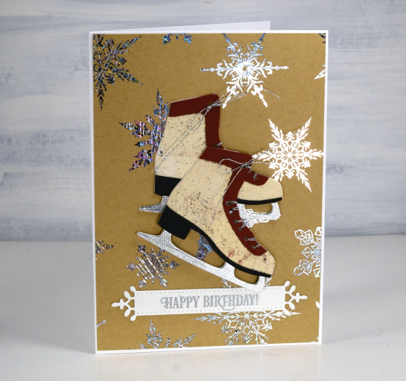
Don’t let that blog post title trick you. I won’t ever be the one saying, “Let’s Skate”! I will happily say, “Let’s make cute cards with skates on them.” My less than stellar skating experience ended when my children became proficient and I realised I didn’t have to get out on the ice and wobble around any more.

These lovely skate dies are from Penny Black and I was thrilled when I saw them. I have been using them in the Christmas card class I’ve been teaching but decided to make a few vintage looking pairs with various pieced layers. Quite unusual for me to piece layers but I do like how they turned out. On card above I filled them with die-cut foliage.
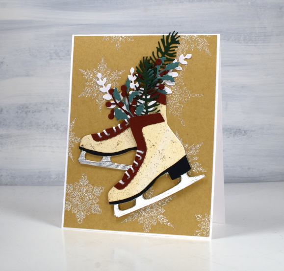
Both pairs of skates are popped up on snowflake backgrounds printed then foiled from my daughter’s snowflake designs available in her Etsy store. I printed the file on kraft paper on my laser printer then foiled in white on the piece above and Brutus Monroe silver foil on the design below.

The vintage style cream colour I used for the boot is a gel print, black cardstock for the heel, silver for the blade and some burgandy for the trim. Fiddly but worth it in the end.
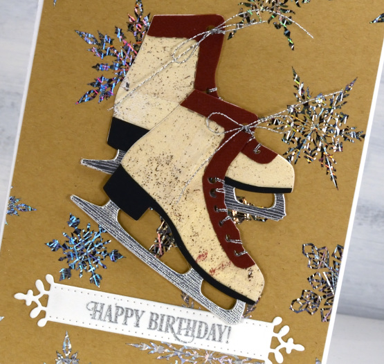
These skates look really cute cut from patterned or collaged paper too. Not cute enough to make me want to skate though!
(Compensated affiliate links from Foiled Fox, Scrap n Stamp & Ecstasy Crafts)
Stay Cosy
Posted: November 16, 2022 Filed under: Dies, Echidna Studios, Foiling, Penny Black, Skis 'n' sled, snowflake digital stamp set, winter wardrobe | Tags: Echidna Studios, Foiling, Penny Black creative dies, Penny Black stamps 5 Comments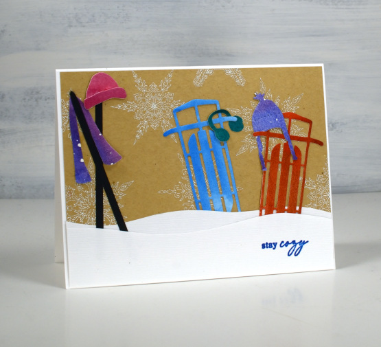
Today is the perfect day for a ‘stay cosy’ message. Overnight the snow started falling and the world is white once more. I guess that lovely long autumn wasn’t going to last forever!
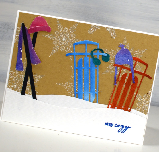
This card came together quite easily as I had some of the elements left over from other projects. The background is made from a digital stamp designed by my daughter (Echidna Studios on Etsy). I printed the snowflakes on kraft paper with my laser printer then foiled with white white foil. I love how delicate and pretty they are.
The sleds, skis and cosy winter clothes were left over from previous years and I had stored them with the dies just in case. They are all cut from painted watercolour paper. I hand cut the snow drifts from linen textured paper and added the sentiment from the PB ‘jolly snippets’ set.
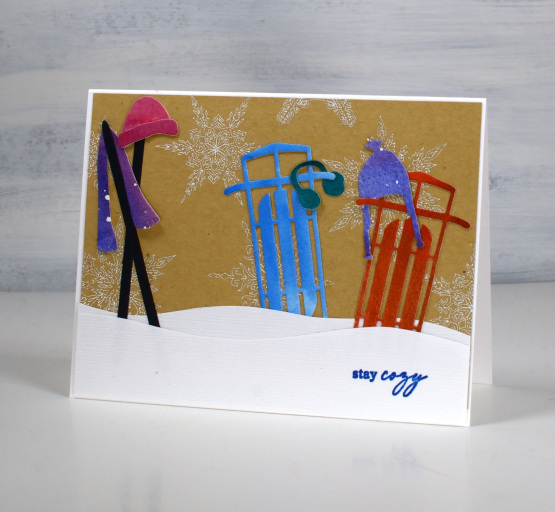
Hope you stay cosy today!
(Compensated affiliate links from Foiled Fox, Scrap n Stamp and Ecstasy Crafts)
Marbled hearts
Posted: February 2, 2021 Filed under: Alcohol Ink, All my hearts, Foiling, Penny Black | Tags: Foiling, Penny Black creative dies, Penny Black stamps, Ranger Alcohol Ink 7 Comments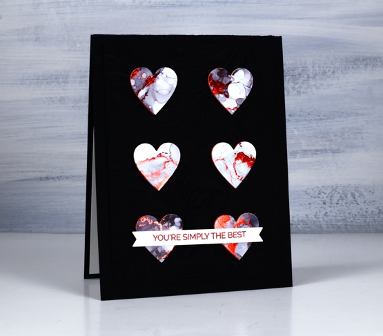
These hearts were cut from another alcohol inked panel, this one done with only pitch black ink from Ranger. The ink was diluted with rubbing alcohol and moved around on the panel with air and tilting. I also added some bubbles or circles by splattering some rubbing alcohol over the pattern.
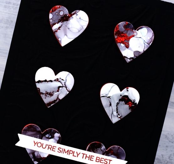
I didn’t add foil straight away after completing the panel instead I came back to it days later and ran the panel through the minc with some red foil over the top. The red foil stuck to some nice fine lines as you can see as well as some chunkier sections. What you can’t see is an area where a large blob of foil attached itself. I avoided that area when cutting six hearts using a small heart die from the Penny Black set ‘all my hearts’. I cut six hearts from red foam to pop the hearts up on the card base.
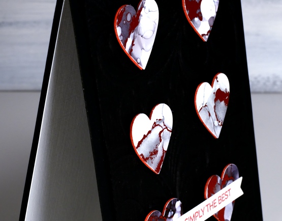
I tried several times to take a photo which would show the dry embossed background behind the popped up hearts but I didn’t succeed. It seems you’re not going to see the shine of the foil and the dimension of the background in one photo. If you click on the photo above you might be able to see the texture a bit better. I used the embossing folder that came with the Gemini Junior, it’s called ‘Regency Swirls’ and it is one of those very detailed 3D folders. I am wanting to add to my embossing folder collection, I’d love to hear your suggestions for some subtle ones and some really fancy ones.
I completed the card with a sentiment from Penny Black’s ‘trust me’ set stamped in red ink and popped up on a narrow banner. Thanks for dropping in today; I will be back tomorrow with an alcohol ink tutorial video.
Supplies
(Compensated affiliate links used when possible)
Foiling without heat
Posted: August 10, 2020 Filed under: balloons!, Brutus Monroe, Catherine Pooler inks, Penny Black, silver sketch deco foil | Tags: Brutus Monroe, Catherine Pooler inks, Foiling, Penny Black creative dies, sizzix embossing folder 4 Comments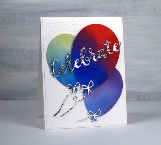
I’m celebrating the opening of my online class today. All the lessons and projects are now available so if you haven’t heard click here to see what it’s all about.
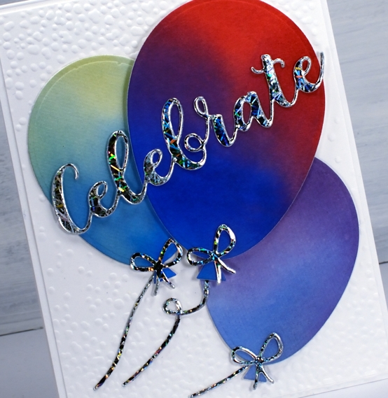
What’s a celebration without balloons and shiny things? I know you don’t see too much sparkle and shine around here but I was intrigued to see how this Brutus Monroe deco foil would look with some watercoloured balloons.
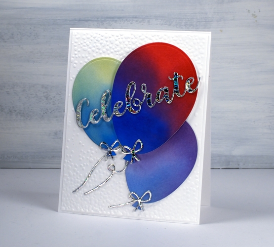
Once I had created a foiled sentiment and some bows I flipped the arrangement and paired foiled balloons with a blended sentiment. As you can see in the photos below I allowed some of the foil to be over exposed in the photo so you could see how it pretty the pattern is as it picks up the light.
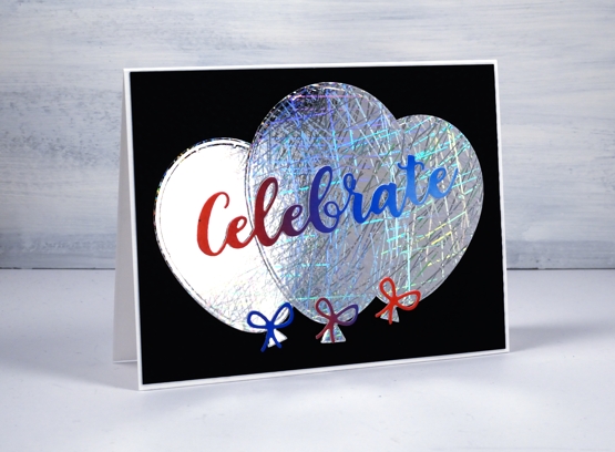
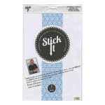
I did my foiling without heat by attaching double sided adhesive (stick-it) to cardstock then removing the backing so I could lay the ‘silver sketch’ transfer foil’ directly on the adhesive. I pressed it down with my fingers carefully to avoid air bubbles then die cut the balloons, strings and sentiment from the foiled cardstock. Once cut I removed the foil top layer to reveal beautifully foiled die cuts. Rather than attaching the balloons to plain black or white card stock I ran the panels through my die cutter inside the ‘snowfall/speckles embossing folder, then flipped the panel around to emboss speckles on both ends.
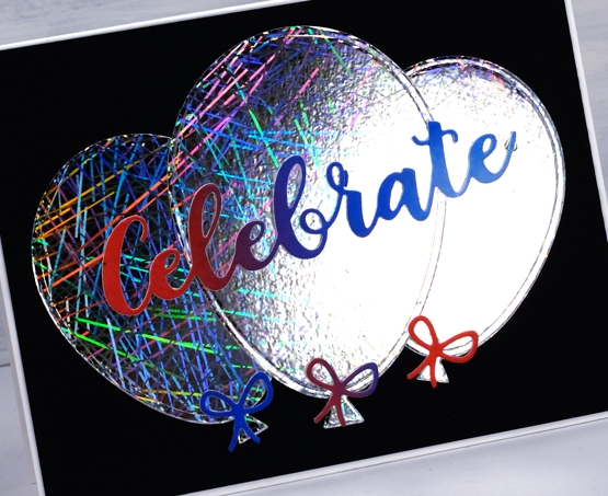
You can see all that pretty reflective pattern on the foil even better in this close up. Thank you Foiled Fox for sending pretty shiny things my way!
Supplies
Yay for Yupo
Posted: May 14, 2018 Filed under: Alcohol Ink, Foiling, YAY for you | Tags: Foiling, My Favorite Things, Ranger Alcohol Ink, WOW embossing powders 5 Comments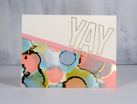
I’m sharing some sweet patterned cards over on the Foiled Fox blog today. Pop over there to see how I made these alcohol ink and foil cards.
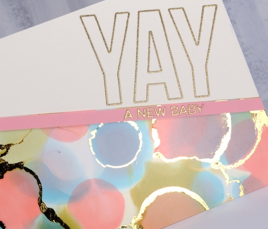
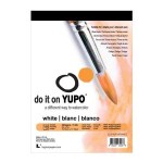
I used heavy weight yupo paper which was great to work with and I love the shine of foiling over alcohol ink!
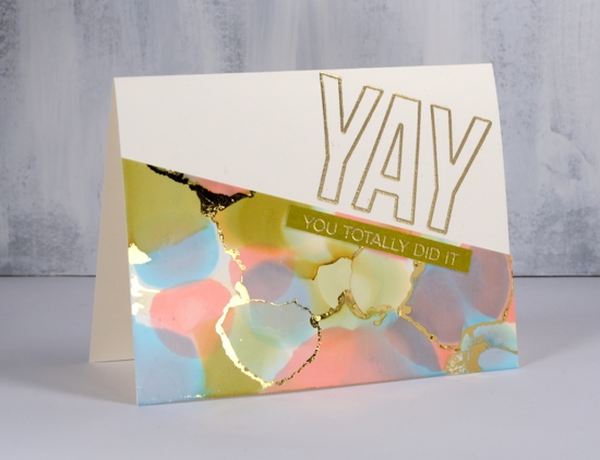
I ran my alcohol ink panel through my Minc on the zero heat setting but you don’t have to have a minc; you could use your die cutting machine to apply pressure or just burnish with your fingers to get the foil to stick to the alcohol ink.
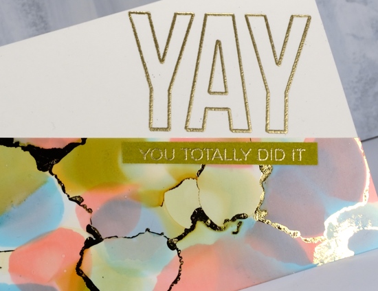
The ‘Yay for you’ set from My Favorite Things gave me all sorts of options for sentiments; I settled on a baby card and an achievement/congratulations card. You can read my step by step instructions over at the Foiled Fox.
Supplies
Stamps: Yay for you (MFT)

Paper: heavy weight yupo, neenah natural white, pink, olive green
Inks: shell pink, willow, cloudy blue alcohol inks (Ranger), delicata golden glitz ink
Also: WOW gold embossing powder, gold foil, minc
Flower Field
Posted: May 1, 2018 Filed under: flower field, Foiling, Zigs & zags | Tags: Foiling, Kuretake Zig clean color real brush markers, Penny Black stamps, Penny Black stencils, WOW embossing powders 6 Comments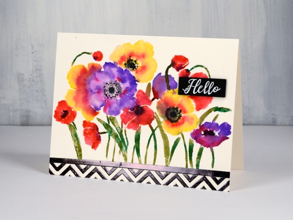
There are an unusual amount of processes involved in today’s card and I will say there are definitely ways to cut corners and get the same effect. It’s a bit like my approach to cooking; if I look at a recipe and the list of ingredients is more than 10, I’m reluctant, if there are multiple processes then I’m not interested! I’m very much a fan of the ‘one pot dinner’. My husband, on the other hand, will create all manner of elements from scratch before even starting the main recipe.
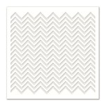
In the case of this card you might happen to have some black and white chevron cardstock to add to the card front. I did not, so I made my own with the Penny Black zigs & zags stencil. My chevron does have the bonus features of texture and shine. I taped my stencil on watercolour paper ( the same type I used for the floral panel) and spread transfer gel over it. I let that dry then lay black foil over it and ran it through the minc. I also ran some adhesive tape over a strip of cardstock and added black foil to that too so I would have a bold strip to position between the chevron and flower panels.
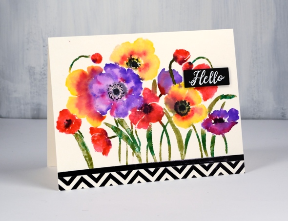
To create my bright and breezy flower panel I put the Penny Black ‘flower field’ stamp in my stamping platform and worked one colour at a time with zig clean color real brush pens. (I remember last time I posted about these pens I hinted that I might just need a few more colours. When I was in Toronto a couple of weeks back I picked up a few more.) I coloured directly onto the flowers with the pens and was able to add colour over colour as the brush tips are easy to clean off by drawing on a piece of scrap paper. I did spritz the stamp a little before stamping on the hot pressed watercolour paper so the images would be soft and blended. I added some black to the centres while the panel was still damp but dried it before adding fine details with a pigma micron pen.
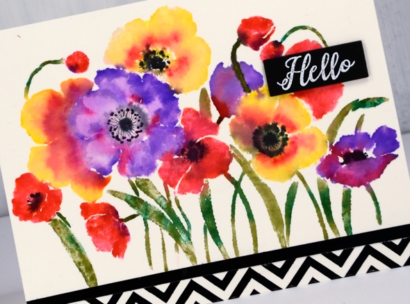
My little sentiment strip is embossed white on black to tie in with the zigs & zags.
Thank you for dropping in.
Supplies
Stamps: flower field 40-594, radiant 30-481
Stencil: zigs & zags (PB)
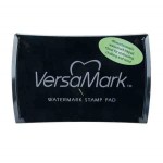
Ink: versamark
Markers: kuretake zig clean color real brush pens (violet, pink, olive green, carmine red, green, yellow, black), black pigma micron .01
Paper: hot pressed watercolour, natural white, black

Also: transfer gel, black foil, white opaque embossing powder
![]()
Tools: minc, stamping platform
fantastic
Posted: April 20, 2018 Filed under: Alcohol Ink, curved stitch | Tags: Foiling, Minc, Penny Black creative dies, Ranger Alcohol Ink 7 Comments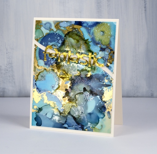
Not long ago I learnt from a couple of friends that foil will stick to some alcohol inks. I posted a card at that time and continued to experiment with foil and alcohol ink panels. If the alcohol ink sitting on the yupo paper is a little sticky the foil will stick more readily than if the inks are long dried. I ran today’s panel through my minc not long after I’d created it and a lot of gold foil stuck. Foil doesn’t stick to all colours of alcohol ink and I’m sorry to say I have not done exhaustive testing to know which ones work. I just layer on some foil, run it through the minc and see what I get!
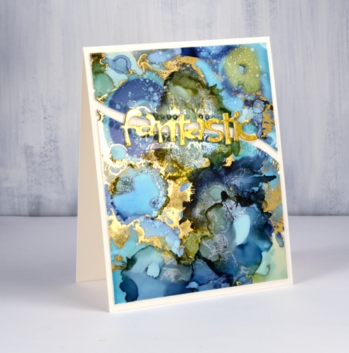
I was pretty happy with what I got this time there were some really pretty gold highlights, but a few more than I wanted. I decided to see whether I could add alcohol ink over the top of the foiling just to tone some of the gold down a little. I was pleasantly surprised to see the gold foil change to a dull silver when it came in contact with the ink. It is definitely hard to photograph the results but my blue and green panel has gold highlights as well as subtler silver patterns.
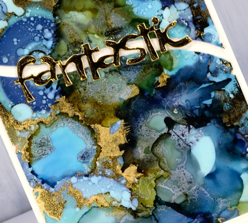
To turn my panel into a card I backed the yupo with white cardstock then cut it in two using the curved stitch die from Penny Black. I stacked some gold die-cuts to make the word ‘fantastic’ look a little more fantastic and added it all to a natural card base. I think this one might turn up as a graduation card this June.
Supplies
Dies: curved stitch, fantastic

Inks: ranger alcohol inks aqua, willow, denim
Paper: yupo, neenah solar white, neenah natural white, gold foil

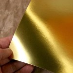
Also: gold foil, minc, rubbing alcohol
You’re spectacular
Posted: April 6, 2018 Filed under: Brusho, fantastic, Zigs & zags | Tags: Brusho, Foiling, Penny Black creative dies, Penny Black stamps, Penny Black stencils 6 Comments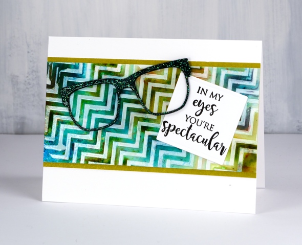
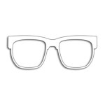
Does that background look a little skewed to you? It’s that exact feature that made me use it for an ‘eye sight’ themed card, something you might have to look at with your head on the side.
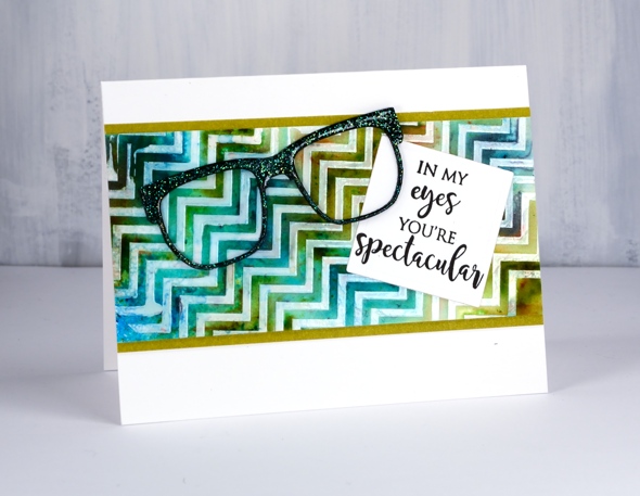
I taped the zigs & zags stencil from Penny Black onto a piece of hot pressed watercolour paper then spread deco transfer gel over. I carefully removed the stencil and let the gel dry. Once dry I lay a piece of white foil over the panel and ran it through my minc foiling machine. The result was a white on off-white chevron panel. Because I had created it on watercolour paper I was able to use brusho and a spritzer to make a multicoloured pattern. Once the panel dried and I decided on the ‘spectacle & eyesight’ theme. I wanted the die cut glasses to look a little fancy so I added adhesive sheet to the back of black cardstock then cut three pairs of glasses. I was just going to emboss them with clear powder but thought sparkly clear powder might be even better. After adhering the three die cuts together in a stack I pressed the top layer onto my versamark ink then dipped it in WOW clear sparkle powder. Even though the powder is clear it ended with a slight green sparkle to it. It looks a little different depending what base colour you emboss over. I pressed the glasses onto my versamark again and embossed in clear powder over the top of the sparkle.
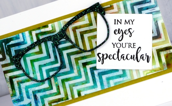
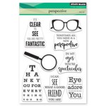
My sentiment is just one of the eyesight themed sentiments in the ‘perspective’ transparent set from Penny Black. To complete the card I matted the zig zag panel in a co-ordinating colour, attached the sentiment then the glasses and attached it all to a white card base. Not my usual style but I had a lot of fun putting it together.
Supplies
Stamps: perspective
Dies: glasses (PB), 2″ square die
Stencil: zigs & zags (PB)
Paint: colorburst turquoise, olive green, ultramarine
Ink: versamark
Paper: hot pressed watercolour, neenah epic black, neenah solar white, olive green
Also: clear sparkle embossing powder, clear embossing powder, double sided adhesive sheets, MINC, white foil, deco transfer gel
![]()
![]()
![]()


