
Zig Zag Print cards
Posted: May 28, 2024 Filed under: gel press, Heather lowercase die set, Penny Black, Pink Fresh studio, Stencils, Tim Holtz, wild flowers #1, Zigs & zags 3 Comments
Recently I posted several ’tiled’ collage cards on the blog and mentioned there would be more to come. Today’s cards once again feature gel printed panels arranged and decorated in two ways.

I used three different gel prints to ’tile’ the card above, a plain blue print, a print created with a zig-zag stencil and a print made with the an impression from an embossing folder. To tie together the dark blue, light blue and yellow + blue prints I added a navy wildflower (Tim Holtz) and navy ink splatter.

To create the square birthday card below I used ’tiles’ from the same print but rearranged them on the card front so they didn’t fit together like a jigsaw.

The brassy-gold paint used on the gel print prompted me to die-cut letters, stars and the word birthday from a similar colour cardstock to create a sentiment. This post includes affiliate links from Foiled Fox. If you buy through these links I receive a small commission at no extra cost to you.

Belle
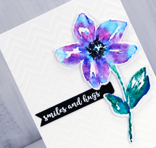
Posted: May 21, 2018 Filed under: A Pocket Full, belle, Foiling, Zigs & zags | Tags: Kuretake Zig clean color real brush markers, Minc, Penny Black creative dies, Penny Black stamps, WOW embossing powders 4 Comments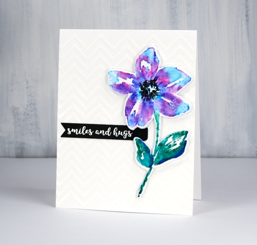
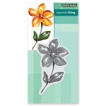
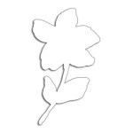
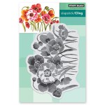
The zigs & zags stencil has popped up again today as a background for this die cut and watercoloured flower. I applied deco transfer gel directly to my card base (neenah solar white 110lb) then ran it through my minc with white foil. The result is a subtle chevron background. I wanted my flower to match the white card base exactly so I used the same neenah solar white which meant I did not add much water at all when blending my zig pens after stamping. I used a mix of blue, pink and purple and a blue/green combo on the leaves and stem then just a damp brush to blend with water. I made sure the blending was dry before stamping the black centre several times then used the co-ordinating die to cut out the flower plus a white foam one to pop it up over the background.
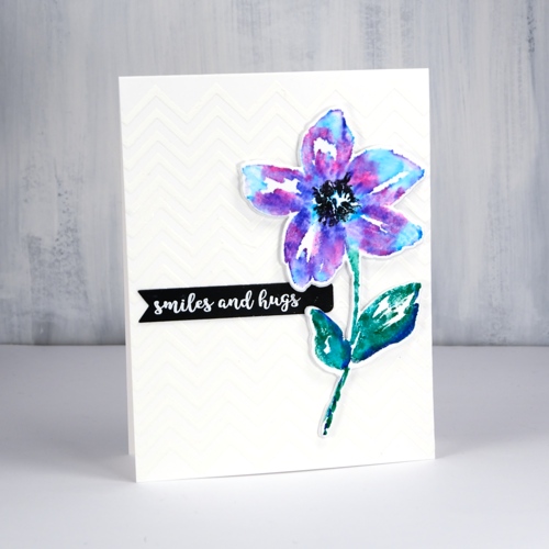
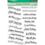
The little black banner was die cut with one of the dies from the PB ‘pocket full’ die set. I have pulled out all my little label, banner and tag dies from different sets and grouped them together so I can quickly cut the right size for a sentiment. This sentiment from the handy ‘banner sentiments’ set is embossed in white powder.
Supplies
Stamps: belle, banner sentiments
Die: belle cut out, a pocket full
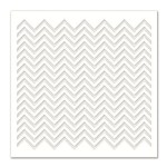
Stencil: zigs & zags
Paper: neenah solar white, neenah epic black

Markers: kuretake zig clean color real brush pens pink, blue, violet, cobalt blue, green, black
Also: transfer gel, white foil, foam, minc, white embossing powder
![]()
Flower Field
Posted: May 1, 2018 Filed under: flower field, Foiling, Zigs & zags | Tags: Foiling, Kuretake Zig clean color real brush markers, Penny Black stamps, Penny Black stencils, WOW embossing powders 6 Comments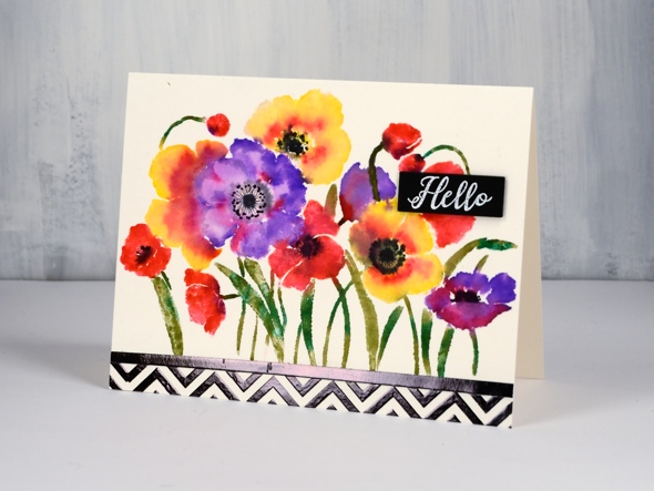
There are an unusual amount of processes involved in today’s card and I will say there are definitely ways to cut corners and get the same effect. It’s a bit like my approach to cooking; if I look at a recipe and the list of ingredients is more than 10, I’m reluctant, if there are multiple processes then I’m not interested! I’m very much a fan of the ‘one pot dinner’. My husband, on the other hand, will create all manner of elements from scratch before even starting the main recipe.
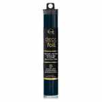
In the case of this card you might happen to have some black and white chevron cardstock to add to the card front. I did not, so I made my own with the Penny Black zigs & zags stencil. My chevron does have the bonus features of texture and shine. I taped my stencil on watercolour paper ( the same type I used for the floral panel) and spread transfer gel over it. I let that dry then lay black foil over it and ran it through the minc. I also ran some adhesive tape over a strip of cardstock and added black foil to that too so I would have a bold strip to position between the chevron and flower panels.
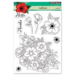
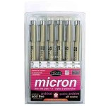
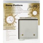
To create my bright and breezy flower panel I put the Penny Black ‘flower field’ stamp in my stamping platform and worked one colour at a time with zig clean color real brush pens. (I remember last time I posted about these pens I hinted that I might just need a few more colours. When I was in Toronto a couple of weeks back I picked up a few more.) I coloured directly onto the flowers with the pens and was able to add colour over colour as the brush tips are easy to clean off by drawing on a piece of scrap paper. I did spritz the stamp a little before stamping on the hot pressed watercolour paper so the images would be soft and blended. I added some black to the centres while the panel was still damp but dried it before adding fine details with a pigma micron pen.
My little sentiment strip is embossed white on black to tie in with the zigs & zags.
Thank you for dropping in.
Supplies
Stamps: flower field 40-594, radiant 30-481
Stencil: zigs & zags (PB)
Ink: versamark
Markers: kuretake zig clean color real brush pens (violet, pink, olive green, carmine red, green, yellow, black), black pigma micron .01
Paper: hot pressed watercolour, natural white, black

Also: transfer gel, black foil, white opaque embossing powder
![]()
Tools: minc, stamping platform
You’re spectacular
Posted: April 6, 2018 Filed under: Brusho, fantastic, Zigs & zags | Tags: Brusho, Foiling, Penny Black creative dies, Penny Black stamps, Penny Black stencils 6 Comments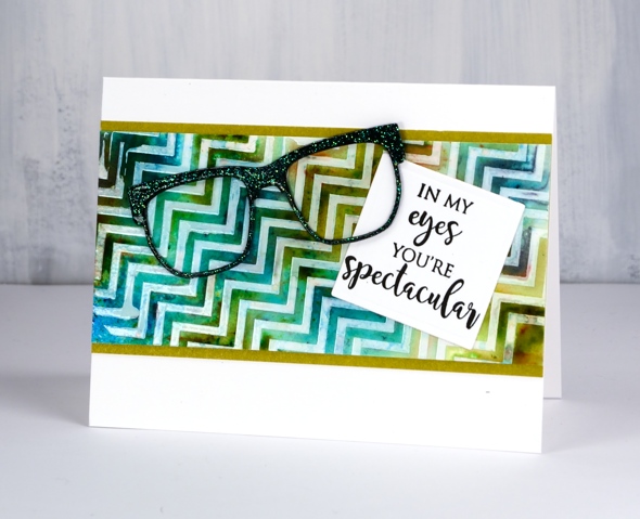
Does that background look a little skewed to you? It’s that exact feature that made me use it for an ‘eye sight’ themed card, something you might have to look at with your head on the side.
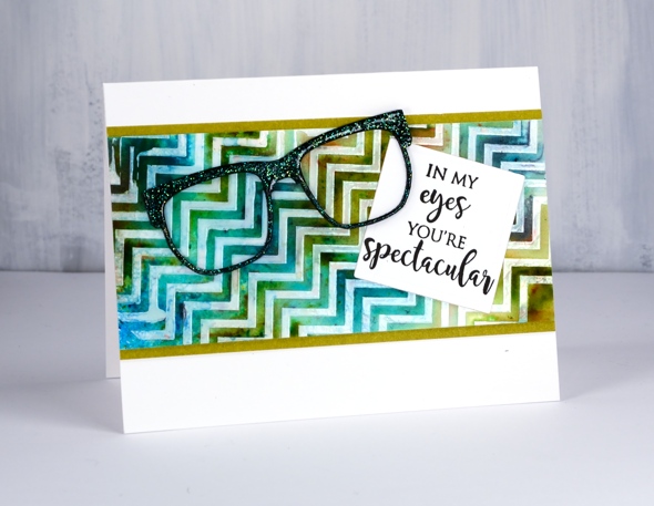
I taped the zigs & zags stencil from Penny Black onto a piece of hot pressed watercolour paper then spread deco transfer gel over. I carefully removed the stencil and let the gel dry. Once dry I lay a piece of white foil over the panel and ran it through my minc foiling machine. The result was a white on off-white chevron panel. Because I had created it on watercolour paper I was able to use brusho and a spritzer to make a multicoloured pattern. Once the panel dried and I decided on the ‘spectacle & eyesight’ theme. I wanted the die cut glasses to look a little fancy so I added adhesive sheet to the back of black cardstock then cut three pairs of glasses. I was just going to emboss them with clear powder but thought sparkly clear powder might be even better. After adhering the three die cuts together in a stack I pressed the top layer onto my versamark ink then dipped it in WOW clear sparkle powder. Even though the powder is clear it ended with a slight green sparkle to it. It looks a little different depending what base colour you emboss over. I pressed the glasses onto my versamark again and embossed in clear powder over the top of the sparkle.
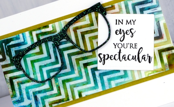
My sentiment is just one of the eyesight themed sentiments in the ‘perspective’ transparent set from Penny Black. To complete the card I matted the zig zag panel in a co-ordinating colour, attached the sentiment then the glasses and attached it all to a white card base. Not my usual style but I had a lot of fun putting it together.
Supplies
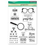
Stamps: perspective
Dies: glasses (PB), 2″ square die

Stencil: zigs & zags (PB)
Paint: colorburst turquoise, olive green, ultramarine
Ink: versamark
Paper: hot pressed watercolour, neenah epic black, neenah solar white, olive green
Also: clear sparkle embossing powder, clear embossing powder, double sided adhesive sheets, MINC, white foil, deco transfer gel
![]()
![]()
![]()
Strange things are happening
Posted: August 1, 2016 Filed under: Field of Dreams, Zigs & zags | Tags: Kuretake Gansai Tambi watercolour paints, Penny Black creative dies, Penny Black stencils 9 Comments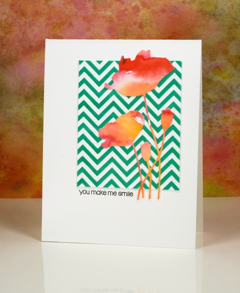
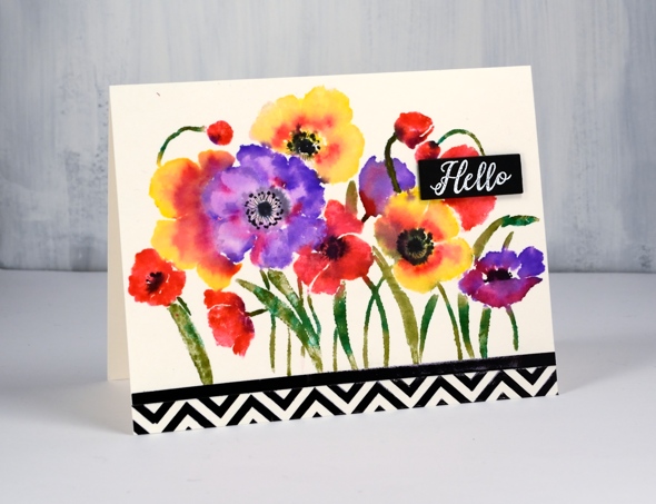
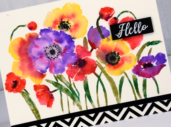
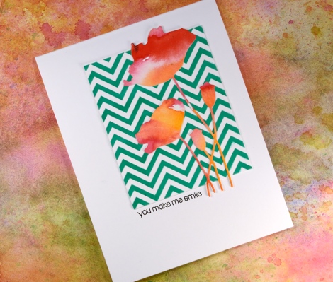
Strange indeed to see me enter a challenge, follow a sketch, use a chevron pattern and texture paste! I would not be surprised if you thought someone else had taken over my blog. There are two signs, however that this is my card, those watercoloured poppies might look familiar and the placement of that little sentiment is pretty standard for me also.
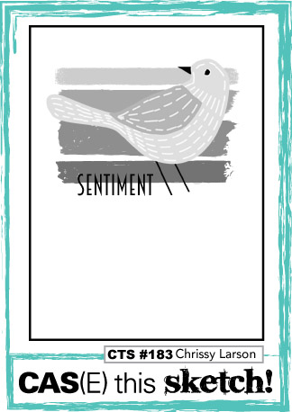
How did this happen? Well, I have been meaning to try adding texture to cards for a while so I picked up some molding paste and applied it through a couple of stencils. In this experiment I mixed liquid metal into the paste before spreading it through the ‘Zigs and Zags’ stencil from Penny Black. It didn’t end up with a metallic look but it took on the green of the ‘verdi gris’ liquid metal. It has been a while since I did a challenge other than One Layer Simplicity (new one is up today) so I checked a couple of my favourites and found the sketch on “Case this Sketch“.
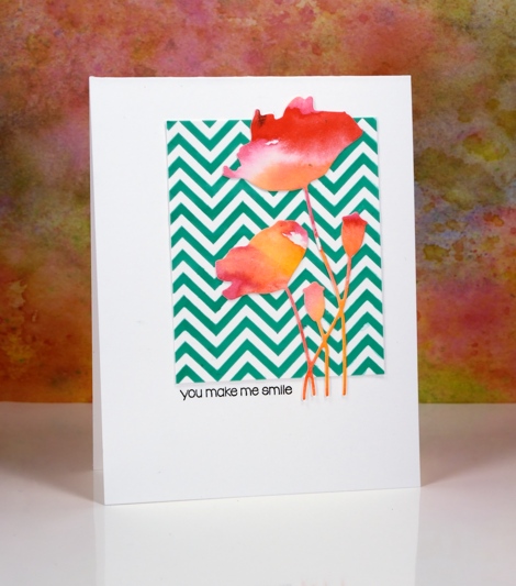
The die-cut poppies were sitting on my desk along with some other left over watercolour painted panels. (I will share projects featuring the other panels later this week.) This card really is an exercise in contrasts, the soft blends of the paint against the sharp corners of the zigzag, the pops of red over the stripes of green and the tiny black letters in the midst of a large expanse of white space.
As Joan Bardee would say:
MOOD WHEN DONE: Surprised but satisfied!
Supplies:
Stamps: Snippets (PB)
Dies: Field of Dreams (PB)
Stencil: Zigs & Zags (PB)
Inks: Versafine onyx black (Tsukineko)
Mediums: Molding paste (Golden) Verdi gris liquid metal (Ken Oliver) Watercolour paint (Kuretake Gansai Tambi)
Cardstock: Hot pressed Fabriano watercolour paper, Neenah solar white cardstock
Farewell to summer: Hummingbird
Posted: September 21, 2015 Filed under: Footnotes, Sweet Visit, Zigs & zags | Tags: Penny Black stamps, Penny Black stencils, Tsukineko Memento inks 6 Comments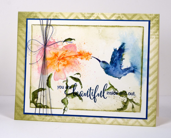
This card just says ‘cottage life’ to me especially as the few hummingbirds I have seen were at friends’ cottages. I inked the stamp with memento markers, spritzed, stamped then blended with water before another spritz to spread the colour further. To create a border I ran a watercolour pencil inside the masking tape which was holding the panel down then softened the pencil line with a paintbrush. In a surprising departure from my usual habits I sponged the card base through a stencil around the edges as well as adding a little text.
I hope you are enjoying some late summer like I am.
Supplies:
Stamps: Sweet visit, Heartfelt, Footnotes (PB)
Inks: Nautical Blue, Bahama Blue, Danube Blue, Paris Dusk, Olive Grove, Bamboo Leaves, Desert Sand, Rose Bud, Tangelo, Potter’s Clay Memento markers (Imagine Craft/Tsukineko)
Cardstock: Fabriano hot press watercolour, Neenah natural White, Teal
Also: Zigs & zags stencil (PB), Gold and blue machine embroidery thread


