
Zig Zag Print cards
Posted: May 28, 2024 Filed under: gel press, Heather lowercase die set, Penny Black, Pink Fresh studio, Stencils, Tim Holtz, wild flowers #1, Zigs & zags 3 Comments
Recently I posted several ’tiled’ collage cards on the blog and mentioned there would be more to come. Today’s cards once again feature gel printed panels arranged and decorated in two ways.

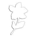
I used three different gel prints to ’tile’ the card above, a plain blue print, a print created with a zig-zag stencil and a print made with the an impression from an embossing folder. To tie together the dark blue, light blue and yellow + blue prints I added a navy wildflower (Tim Holtz) and navy ink splatter.

To create the square birthday card below I used ’tiles’ from the same print but rearranged them on the card front so they didn’t fit together like a jigsaw.

The brassy-gold paint used on the gel print prompted me to die-cut letters, stars and the word birthday from a similar colour cardstock to create a sentiment. This post includes affiliate links from Foiled Fox. If you buy through these links I receive a small commission at no extra cost to you.

Filled with daydreams
Posted: March 10, 2021 Filed under: branch of love, daydream, dotlets, Penny Black, rain or shine | Tags: brutus monroe embossing powder, distress markers, Fabriano Watercolour Paper, Penny Black stamps, Penny Black stencils, Ranger Distress inks 11 Comments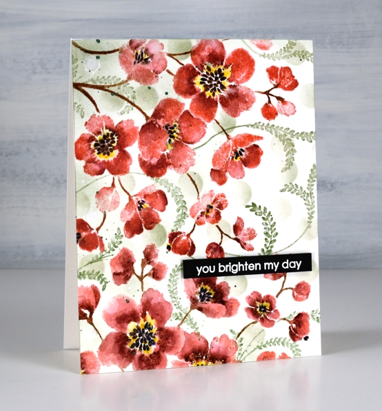
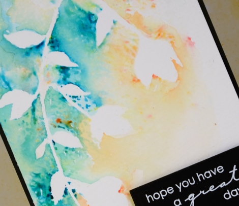
I’ve created with the Penny Black ‘daydream‘ stamp before but you might not recognise it as the same stamp used on today’s card. Last time I stamped the large rubber cling stamp once in blue. This time I’ve stamped it twice to almost fill the card front in pink and deep red. I’ve also added some filler foliage.

I kept the stamp in the stamp positiioner while I completed one print of the stamp then rearranged the panel and stamp to be able to stamp again in a slightly different direction to cover the lower third. I inked the stamp first with worn lipstick distress ink, added shading with an aged mahogany distress marker, stems with ground espresso and centres with black soot. I spritzed ever so lightly because I didn’t want to loose much definition but I did want the inks to blend a bit. After one impression I blended a few areas with a paintbrush and stamped more aged mahogany where needed to help define the petals. Once the ink and blending was dry I coloured around the black centres with a mustard seed marker.

To add filler around the red blooms I stamped the fronds from the PB ‘branches of love’ set in bundled sage ink then blended over them with a paintbrush and minimal water. I also used a blending brush to blend some bundled sage circles through the PB ‘dotlets’ stencil. I splattered some moss green pearlescent paint then popped up an embossed sentiment to finish the card.
Thanks for dropping by today; you do brighten my day!
Supplies
(Compensated affiliate links used when possible)
Blooming journal page
Posted: April 8, 2019 Filed under: Art Journal, Hand lettered, Hypnotic, Penny Black, Script, timeless, winter branches | Tags: Penny Black stamps, Penny Black stencils, Ranger Distress inks, Ranger Distress stains 13 Comments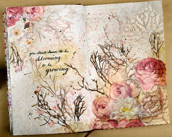
I’m been working in one of my Fabriano Venezia art journals again experimenting with vintage style. I started by painting absorbant ground over the double page spread then stamped the PB ‘script’ stamp in tea dye and antique linen distress inks. I spritzed the inked stamp before pressing it onto the page so I would get blurred prints.
Once that dried I spread modeling paste through the PB hypnotic stencil and had to go and do something else so I wouldn’t mess it up before it was dry. Even so I still stuck my finger on it while it was wet and smudged some.
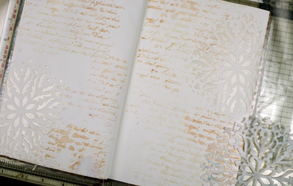
Once the paste dried I spritzed the ‘see ya latte’ shimmerz spray over the pages then wiped it off the stencilled area so it would darken the background. I am not an experienced art journaller but I am using one to try things out. On this page I was trying to create a vintage look. I stamped the ‘timeless’ rose stamp from Penny Black three times in brown distress inks then blended the ink into the petals. My journal is not watercolour paper so ink and paint don’t move on the page as easily. I didn’t like the roses enough to keep them all, instead I covered some with flowers cut from leftover Italian papers. I glued them on with matte medium and painted diluted gesso over them to decrease the contrast then added a bit of distress vintage medium for the aged tea stain look.
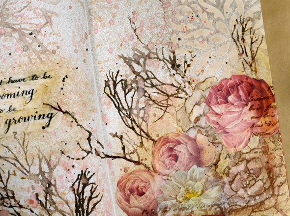
I did a smaller collage of flowers on the opposite corner then stamped PB winter branches over the pages with vintage photo and ground espresso distress inks. I added some pretty scroll stamping with the PB set ‘flourish borders’ in white ink and some more of the ‘script’ stamp in brown ink. Tattered rose distress stain matched the paper flowers so I splattered a decent amount of that over everything too! I mentioned on my previous journal page post how I struggle with adding words to a page. I chose a quote from Ruth Chou Simon’s book ‘Gracelaced‘ which encourages and challenges me every time I open it. I wanted to write the words with my nib pen but when I tried, the ink spread into the page and looked like a blob so I wrote on calligraphy paper, tore the words into strips and glued them over the blob. Some of the letters are blurred because I didn’t let it dry long enough. I need a bit more patience when working in my art journals…
Not exactly what I set out to create but as I said, the art journal is for playing with mediums and ideas. Have a great day
Supplies
Belle
Posted: May 21, 2018 Filed under: A Pocket Full, belle, Foiling, Zigs & zags | Tags: Kuretake Zig clean color real brush markers, Minc, Penny Black creative dies, Penny Black stamps, WOW embossing powders 4 Comments
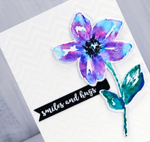
The zigs & zags stencil has popped up again today as a background for this die cut and watercoloured flower. I applied deco transfer gel directly to my card base (neenah solar white 110lb) then ran it through my minc with white foil. The result is a subtle chevron background. I wanted my flower to match the white card base exactly so I used the same neenah solar white which meant I did not add much water at all when blending my zig pens after stamping. I used a mix of blue, pink and purple and a blue/green combo on the leaves and stem then just a damp brush to blend with water. I made sure the blending was dry before stamping the black centre several times then used the co-ordinating die to cut out the flower plus a white foam one to pop it up over the background.
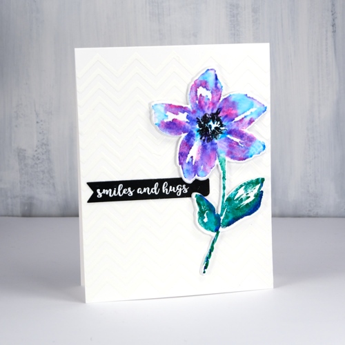
The little black banner was die cut with one of the dies from the PB ‘pocket full’ die set. I have pulled out all my little label, banner and tag dies from different sets and grouped them together so I can quickly cut the right size for a sentiment. This sentiment from the handy ‘banner sentiments’ set is embossed in white powder.
Supplies
Stamps: belle, banner sentiments
Die: belle cut out, a pocket full
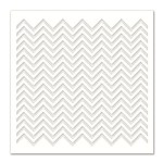
Stencil: zigs & zags
Paper: neenah solar white, neenah epic black

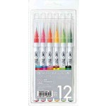
Markers: kuretake zig clean color real brush pens pink, blue, violet, cobalt blue, green, black
Also: transfer gel, white foil, foam, minc, white embossing powder
![]()
Flower Field
Posted: May 1, 2018 Filed under: flower field, Foiling, Zigs & zags | Tags: Foiling, Kuretake Zig clean color real brush markers, Penny Black stamps, Penny Black stencils, WOW embossing powders 6 Comments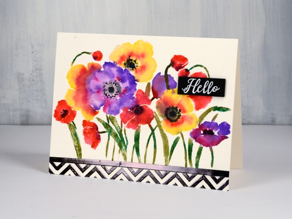
There are an unusual amount of processes involved in today’s card and I will say there are definitely ways to cut corners and get the same effect. It’s a bit like my approach to cooking; if I look at a recipe and the list of ingredients is more than 10, I’m reluctant, if there are multiple processes then I’m not interested! I’m very much a fan of the ‘one pot dinner’. My husband, on the other hand, will create all manner of elements from scratch before even starting the main recipe.
In the case of this card you might happen to have some black and white chevron cardstock to add to the card front. I did not, so I made my own with the Penny Black zigs & zags stencil. My chevron does have the bonus features of texture and shine. I taped my stencil on watercolour paper ( the same type I used for the floral panel) and spread transfer gel over it. I let that dry then lay black foil over it and ran it through the minc. I also ran some adhesive tape over a strip of cardstock and added black foil to that too so I would have a bold strip to position between the chevron and flower panels.
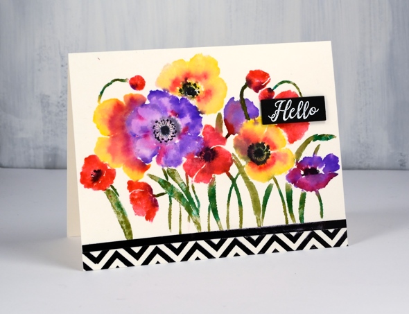
To create my bright and breezy flower panel I put the Penny Black ‘flower field’ stamp in my stamping platform and worked one colour at a time with zig clean color real brush pens. (I remember last time I posted about these pens I hinted that I might just need a few more colours. When I was in Toronto a couple of weeks back I picked up a few more.) I coloured directly onto the flowers with the pens and was able to add colour over colour as the brush tips are easy to clean off by drawing on a piece of scrap paper. I did spritz the stamp a little before stamping on the hot pressed watercolour paper so the images would be soft and blended. I added some black to the centres while the panel was still damp but dried it before adding fine details with a pigma micron pen.
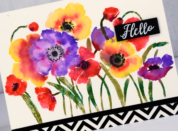
My little sentiment strip is embossed white on black to tie in with the zigs & zags.
Thank you for dropping in.
Supplies
Stamps: flower field 40-594, radiant 30-481
Stencil: zigs & zags (PB)
Ink: versamark
Markers: kuretake zig clean color real brush pens (violet, pink, olive green, carmine red, green, yellow, black), black pigma micron .01
Paper: hot pressed watercolour, natural white, black

Also: transfer gel, black foil, white opaque embossing powder
![]()
Tools: minc, stamping platform
You’re spectacular
Posted: April 6, 2018 Filed under: Brusho, fantastic, Zigs & zags | Tags: Brusho, Foiling, Penny Black creative dies, Penny Black stamps, Penny Black stencils 6 Comments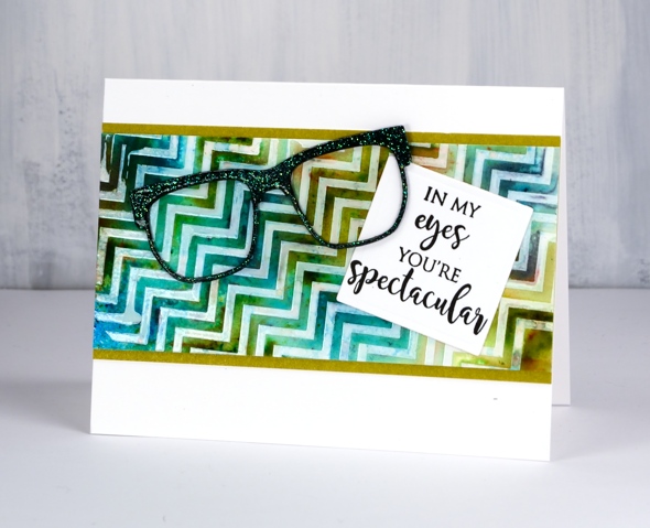
Does that background look a little skewed to you? It’s that exact feature that made me use it for an ‘eye sight’ themed card, something you might have to look at with your head on the side.
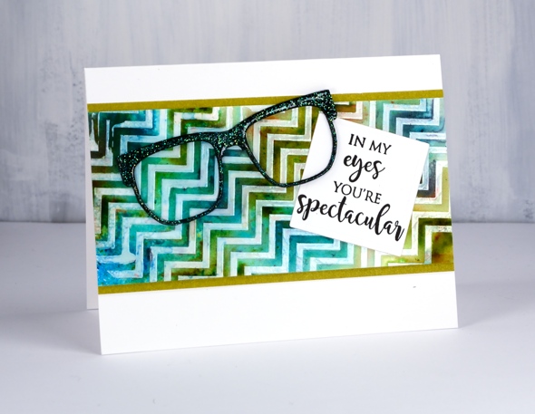
I taped the zigs & zags stencil from Penny Black onto a piece of hot pressed watercolour paper then spread deco transfer gel over. I carefully removed the stencil and let the gel dry. Once dry I lay a piece of white foil over the panel and ran it through my minc foiling machine. The result was a white on off-white chevron panel. Because I had created it on watercolour paper I was able to use brusho and a spritzer to make a multicoloured pattern. Once the panel dried and I decided on the ‘spectacle & eyesight’ theme. I wanted the die cut glasses to look a little fancy so I added adhesive sheet to the back of black cardstock then cut three pairs of glasses. I was just going to emboss them with clear powder but thought sparkly clear powder might be even better. After adhering the three die cuts together in a stack I pressed the top layer onto my versamark ink then dipped it in WOW clear sparkle powder. Even though the powder is clear it ended with a slight green sparkle to it. It looks a little different depending what base colour you emboss over. I pressed the glasses onto my versamark again and embossed in clear powder over the top of the sparkle.
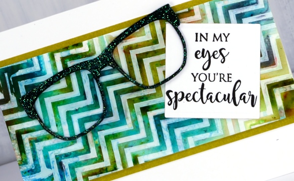
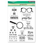
My sentiment is just one of the eyesight themed sentiments in the ‘perspective’ transparent set from Penny Black. To complete the card I matted the zig zag panel in a co-ordinating colour, attached the sentiment then the glasses and attached it all to a white card base. Not my usual style but I had a lot of fun putting it together.
Supplies
Stamps: perspective
Dies: glasses (PB), 2″ square die

Stencil: zigs & zags (PB)
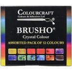
Paint: colorburst turquoise, olive green, ultramarine
Ink: versamark
Paper: hot pressed watercolour, neenah epic black, neenah solar white, olive green
Also: clear sparkle embossing powder, clear embossing powder, double sided adhesive sheets, MINC, white foil, deco transfer gel
![]()
![]()
![]()
Market news and a gilded card
Posted: June 14, 2017 Filed under: Gilding Flakes, Hypnotic | Tags: Gilding, Penny Black stamps, Penny Black stencils 5 Comments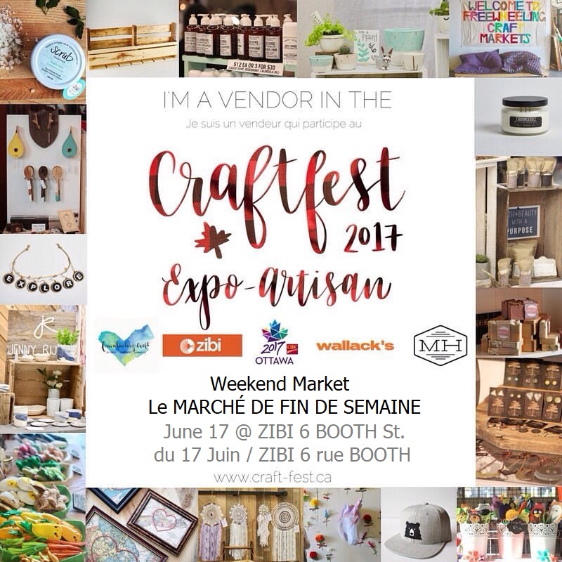
I know there hasn’t been much popping up here on the blog lately. My excuse is definitely craft market preparations. If you are a local please come and check out CraftFest 2017 this weekend. The market will be held on Albert Island which is not far from the War Museum. There will be close to sixty vendors on Saturday and you will find me at the Paper Duet booth with The Crafty Cigale and guest artist, Connie Schulz. We will have cards for all reasons and seasons along with bookmarks, gift tags and wine tags. I would suggest parking at or near the War Museum then walking the short distance across the bridge to Albert Island. Directions.
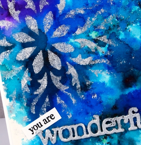
My recent gilded cards will all be on sale at the market including this bright blue and silver one. I used a Penny Black stencil and the Tsukineko Essential Glue pad. I sponged the glue onto a panel painted with colorburst powders. After removing the stencil I added silver gilding flakes.
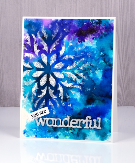
I used the same technique mentioned in my previous post to create a gilded sentiment and tucked a little stamped ‘you are’ in behind the silvery die cut ‘wonderful’.
I will be back on Friday with an exciting post the Foiled Fox and I have dreamed up. Make sure you check back in.
Supplies
Stencil: hypnotic (PB)
Dies: awesome (PB)
Paint: colorburst powders
Adhesives: essential glue pad (Tsukineko), Stick it adhesive
Shiny things: Nuvo silver bullion gilding flakes
Cardstock: hot pressed watercolour paper, Neenah solar white cardstock
Also: adhesive backed foam
Stencil negative
Posted: January 24, 2017 Filed under: Brusho, Promenade, Uncategorized | Tags: Brusho, Penny Black stamps, Penny Black stencils 14 Comments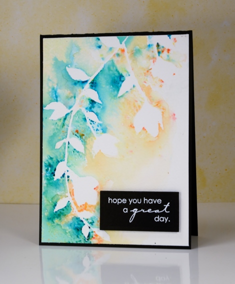
The technique I have to share today is one of those ‘don’t waste all that pretty paint’ techniques. Sometimes I will be creating something and paint or ink ends up all over a mat, stamp or in this case, a stencil after the initial project is completed. Rather than simply rinse the ink or paint off it is usually worth taking a print or swiping a piece of paper through the excess paint to pick up all the pretty.
I was creating panels using the Penny Black stencil, promenade, along with molding paste and brusho paint. Once I had finished sprinkling brusho over the stencil and paste, I spritzed with water before removing the stencil. The stencil was covered in diluted brusho so I pressed it onto a piece of cold pressed watercolour paper and this patterned piece was the result. Incidentally I also made two cards with the stencilled shape on them but they did not photograph well at all. They look fine in real life!
I like the ‘negative’ print from the stencil enough that I might just create a negative print as a technique on its own. But then would I end up with a pretty ‘positive print’ as a by product of my creating!?!
This post was brought to you from my ‘pile of possibilities‘.
Supplies:
Stamps: Amazing (PB)
Stencils: Promenade (PB)
Inks: Versamark(Tsukineko)
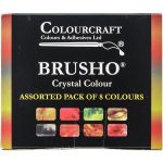
Paint: Brusho (Colourcraft)
Paper: Canson 100% cotton cold pressed watercolour paper, Neenah epic black
Also: white embossing powder
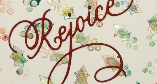
Holly Stencilling
Posted: October 27, 2016 Filed under: CAS, Holly medley | Tags: Brusho, Penny Black creative dies, Penny Black stencils 4 Comments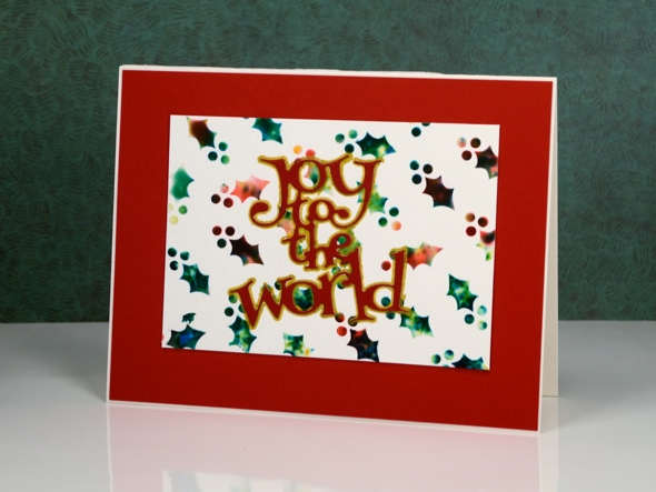
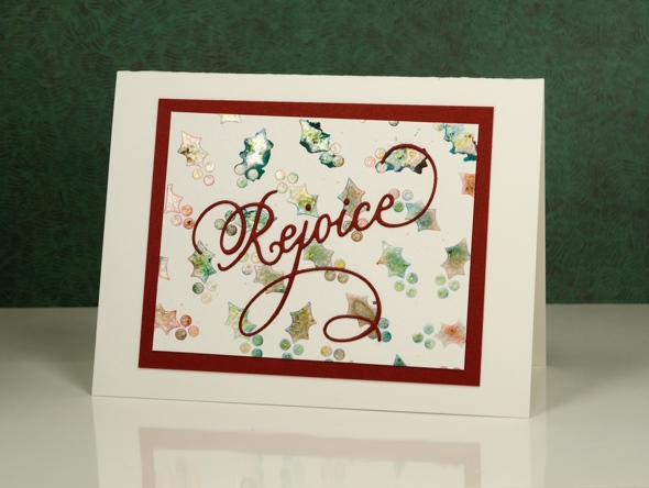
I have a couple more stencilled and watercoloured cards to share today. I used the same technique to create these panels as I did to make the ‘stained glass‘ panel shared earlier in the week.
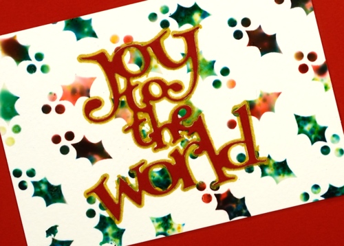
I began with the stencil taped to a piece of watercolour paper then spread molding paste over the stencil to fill all the little holly leaves and berries. While the paste was still wet I sprinkled brusho powder over the stencil then spritzed lightly with water. The water activates the brusho which spreads, blends and soaks into the paste. I removed the stencil and let the paste dry for quite a while before handling it. On the panel below I used a pearl paste instead of white to achieve a shimmery appearance. Water and colour did seep under the stencil in a couple of places but I trimmed the panel to utilise the best portion.
I finished the cards with die-cut sentiments and mats. To make the ‘Joy to the world’ sentiment pop I traced around it with a gold gel pen. You can see in the photo below the shimmer from the pearl paste. When I sprinkled the brusho over and spritzed, it really did not look good; it was more of a dirty mustard colour. Once it dried, though it looked pearly with shades of yellow, green and gold peeping through.
I apologize if I did not answer your questions about the last post; I’ve been travelling around a bit this week and visiting family in Canberra and Newcastle. When the choice was computer time or duplo with my delightful three year old great nephew, well really, there was no choice!
Supplies
Dies: Joy to the World, Rejoice(PB)
Stencil: Holly Medley (PB)
Paints: Red and green Brusho (Colourcraft)
Paper: Fabriano watercolour paper, red cardstock
Also: molding paste, texture luxe pearl paste, gold gel pen
Stained glass
Posted: October 24, 2016 Filed under: Hypnotic | Tags: Brusho, Penny Black stencils 20 Comments
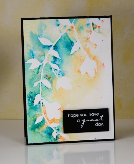
A month or so ago I spent some crafty hours playing with stencils, texture paste and brusho powders. I was spurred on by a friend who had achieved some beautiful results. This panel, which reminds me of a stained glass window, is one of my favourites from that day.
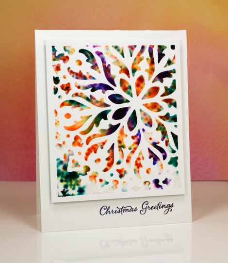
I taped the stencil to a piece of watercolour paper so part of the design would be exposed and framed. I spread a thin layer of paste through the stencil then sprinkled brusho paints over the top. With the stencil still in place I spritzed the whole thing so the brusho would react. The result is the blurry, spotty patterns you see below. Once I’d spritzed I carefully removed the stencil and let the panel dry; it took quite a while.

Because I had framed the pattern with tape I was able to trim the border to about 1/4″ and then pop it up on a card base and add a sentiment. I am still enjoying my time in Australia with family; I’ve posted a few photos on my other blog, Sentient.
Supplies
Stamps: Festive Snippets(PB)
Stencil: Hypnotic (PB)
Paints: Brusho (Colourcraft)
Ink: Versafine onyx black (Tsukineko)
Paper: hot pressed Fabriano watercolour paper
Also: molding paste, not sure which brand


