
Blooming journal page
Posted: April 8, 2019 Filed under: Art Journal, Hand lettered, Hypnotic, Penny Black, Script, timeless, winter branches | Tags: Penny Black stamps, Penny Black stencils, Ranger Distress inks, Ranger Distress stains 13 Comments
I’m been working in one of my Fabriano Venezia art journals again experimenting with vintage style. I started by painting absorbant ground over the double page spread then stamped the PB ‘script’ stamp in tea dye and antique linen distress inks. I spritzed the inked stamp before pressing it onto the page so I would get blurred prints.

Once that dried I spread modeling paste through the PB hypnotic stencil and had to go and do something else so I wouldn’t mess it up before it was dry. Even so I still stuck my finger on it while it was wet and smudged some.

Once the paste dried I spritzed the ‘see ya latte’ shimmerz spray over the pages then wiped it off the stencilled area so it would darken the background. I am not an experienced art journaller but I am using one to try things out. On this page I was trying to create a vintage look. I stamped the ‘timeless’ rose stamp from Penny Black three times in brown distress inks then blended the ink into the petals. My journal is not watercolour paper so ink and paint don’t move on the page as easily. I didn’t like the roses enough to keep them all, instead I covered some with flowers cut from leftover Italian papers. I glued them on with matte medium and painted diluted gesso over them to decrease the contrast then added a bit of distress vintage medium for the aged tea stain look.

I did a smaller collage of flowers on the opposite corner then stamped PB winter branches over the pages with vintage photo and ground espresso distress inks. I added some pretty scroll stamping with the PB set ‘flourish borders’ in white ink and some more of the ‘script’ stamp in brown ink. Tattered rose distress stain matched the paper flowers so I splattered a decent amount of that over everything too! I mentioned on my previous journal page post how I struggle with adding words to a page. I chose a quote from Ruth Chou Simon’s book ‘Gracelaced‘ which encourages and challenges me every time I open it. I wanted to write the words with my nib pen but when I tried, the ink spread into the page and looked like a blob so I wrote on calligraphy paper, tore the words into strips and glued them over the blob. Some of the letters are blurred because I didn’t let it dry long enough. I need a bit more patience when working in my art journals…
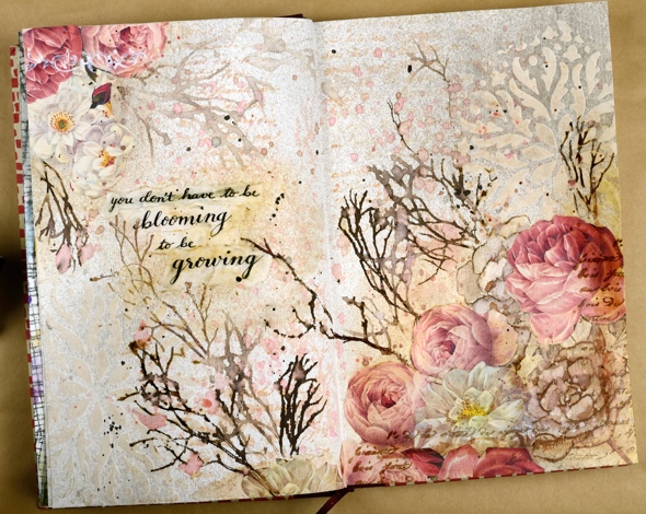
Not exactly what I set out to create but as I said, the art journal is for playing with mediums and ideas. Have a great day
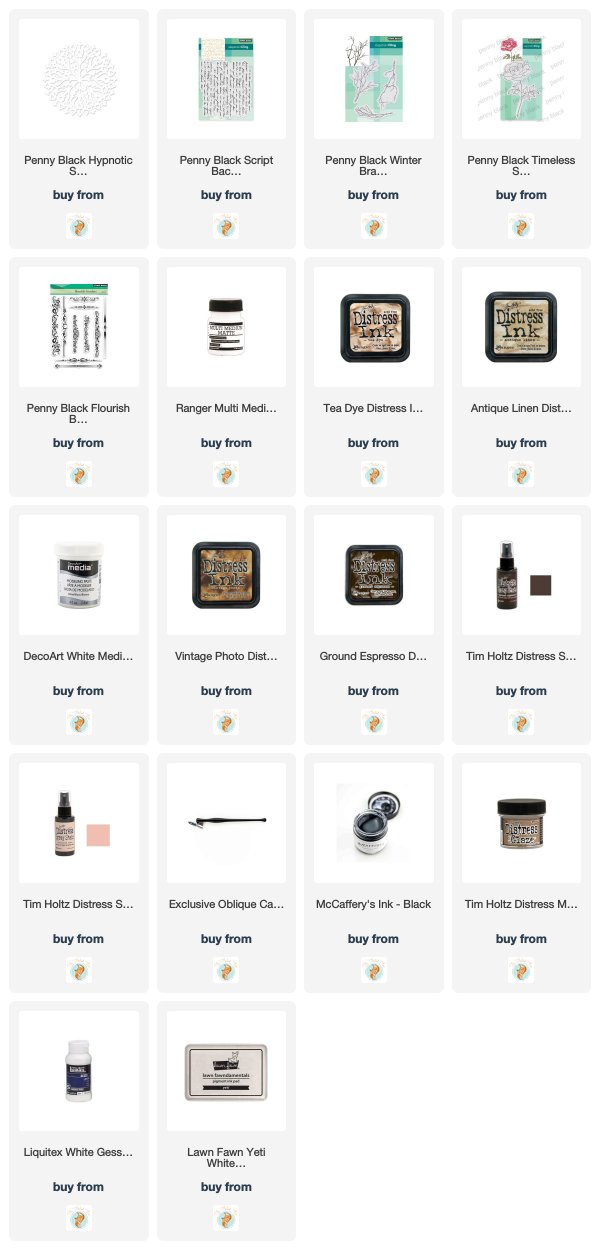
Supplies
Market news and a gilded card
Posted: June 14, 2017 Filed under: Gilding Flakes, Hypnotic | Tags: Gilding, Penny Black stamps, Penny Black stencils 5 Comments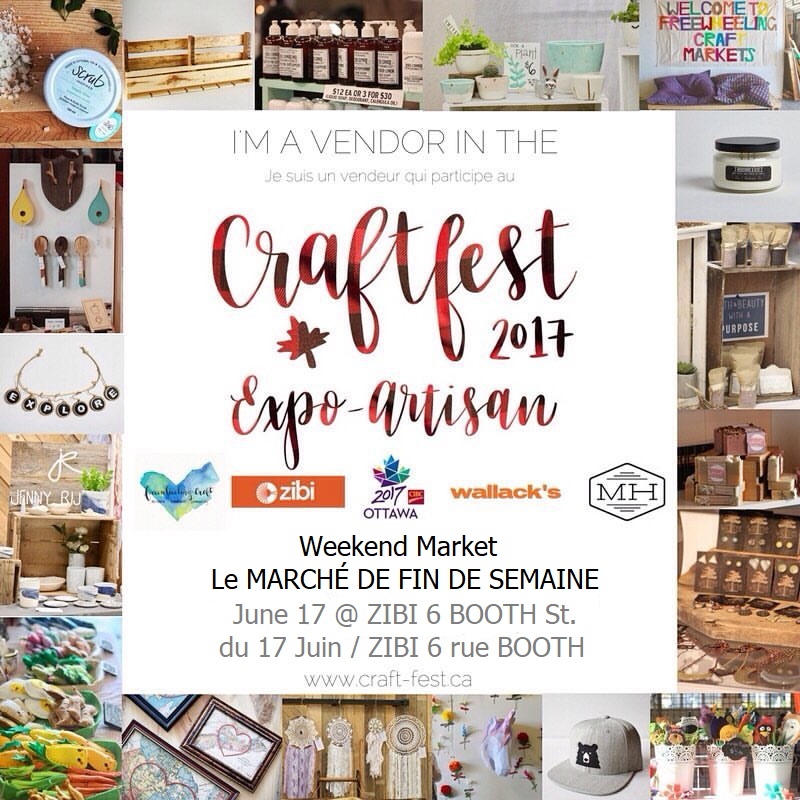
I know there hasn’t been much popping up here on the blog lately. My excuse is definitely craft market preparations. If you are a local please come and check out CraftFest 2017 this weekend. The market will be held on Albert Island which is not far from the War Museum. There will be close to sixty vendors on Saturday and you will find me at the Paper Duet booth with The Crafty Cigale and guest artist, Connie Schulz. We will have cards for all reasons and seasons along with bookmarks, gift tags and wine tags. I would suggest parking at or near the War Museum then walking the short distance across the bridge to Albert Island. Directions.
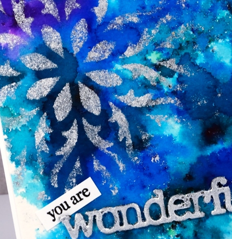
My recent gilded cards will all be on sale at the market including this bright blue and silver one. I used a Penny Black stencil and the Tsukineko Essential Glue pad. I sponged the glue onto a panel painted with colorburst powders. After removing the stencil I added silver gilding flakes.
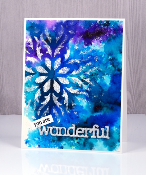
I used the same technique mentioned in my previous post to create a gilded sentiment and tucked a little stamped ‘you are’ in behind the silvery die cut ‘wonderful’.
I will be back on Friday with an exciting post the Foiled Fox and I have dreamed up. Make sure you check back in.
Supplies
Stencil: hypnotic (PB)
Dies: awesome (PB)
Paint: colorburst powders
Adhesives: essential glue pad (Tsukineko), Stick it adhesive
Shiny things: Nuvo silver bullion gilding flakes
Cardstock: hot pressed watercolour paper, Neenah solar white cardstock
Also: adhesive backed foam
Stained glass
Posted: October 24, 2016 Filed under: Hypnotic | Tags: Brusho, Penny Black stencils 20 Comments
A month or so ago I spent some crafty hours playing with stencils, texture paste and brusho powders. I was spurred on by a friend who had achieved some beautiful results. This panel, which reminds me of a stained glass window, is one of my favourites from that day.
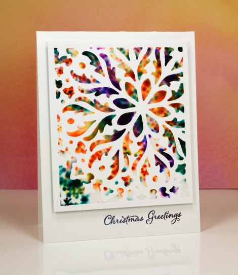
I taped the stencil to a piece of watercolour paper so part of the design would be exposed and framed. I spread a thin layer of paste through the stencil then sprinkled brusho paints over the top. With the stencil still in place I spritzed the whole thing so the brusho would react. The result is the blurry, spotty patterns you see below. Once I’d spritzed I carefully removed the stencil and let the panel dry; it took quite a while.

Because I had framed the pattern with tape I was able to trim the border to about 1/4″ and then pop it up on a card base and add a sentiment. I am still enjoying my time in Australia with family; I’ve posted a few photos on my other blog, Sentient.
Supplies
Stamps: Festive Snippets(PB)
Stencil: Hypnotic (PB)
Paints: Brusho (Colourcraft)
Ink: Versafine onyx black (Tsukineko)
Paper: hot pressed Fabriano watercolour paper
Also: molding paste, not sure which brand
Stencilled
Posted: May 31, 2016 Filed under: Alcohol Ink, Hypnotic | Tags: Penny Black creative dies, Penny Black stencils, Ranger Alcohol Ink 16 Comments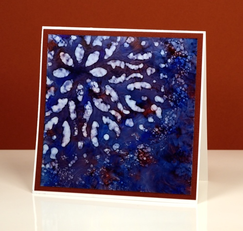
If you haven’t tried stencils with your alcohol inks you might be surprised at the lovely effects you can get. Let me warn you though, they might not do what you want them to, but they will probably do something cool. There is a bit of trial and error involved when working out how much blending solution or rubbing alcohol to apply through the stencil. Too much and it spreads under the stencil and you lose the pattern definition. Too little and you will not remove enough colour to get a pattern. It is worth playing with applicators too. Applying solution with a q-tip will take much longer but you will have more control.
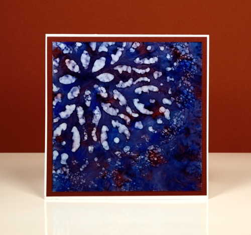
I started with a deep blue pattern on yupo paper with little patches of burgandy ink. When it was dry I positioned the ‘hypnotic’ stencil over one corner then removed colour with blending solution on a felt applicator. I kept an eye on the felt as I pounced it through the stencil because it was picking up blue ink. If it got too blue it wasn’t removing ink anymore. I like the batik look with some lines of blue in the white spaces
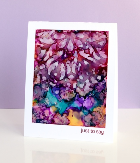
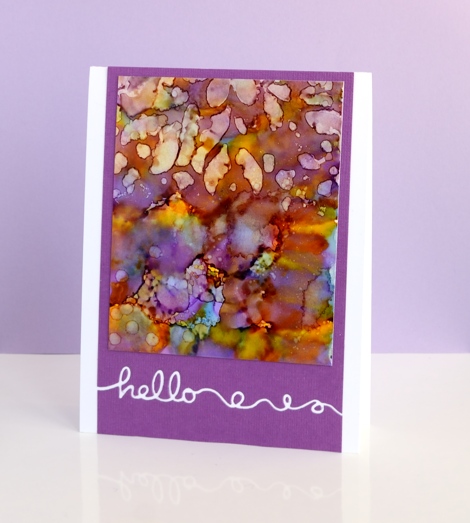
On these two purple toned panels I used the same technique but was not as careful to keep the stencil still on the one below. The pattern from the stencil is just a mix of abstract shapes. The blue panel at the top of this post is all about the stencilled pattern but these two messy purple ones are just here because I love the colours. Before I die cut the word ‘hello’ out of the purple cardstock I positioned a strip of ‘stick it’ adhesive on the back where the word would be. That made it easy to attach the panel to the card base and pop in the little loops and circles that were cut out. I saved the purple ‘hello’ cut out of the card below and stuck it inside the card above.
Supplies:
Stencil: Hypnotic (PB)
Stamp: Happy Snippets (PB)
Die: Doodles (PB)
Ink: Alcohol inks (Ranger)
Cardstock: Yupo, mauve cardstock, Neenah solar white
Patterns on patterns
Posted: March 30, 2015 Filed under: Hidden Hearts, Hypnotic | Tags: Penny Black creative dies, Penny Black stencils, Ranger Distress inks 4 Comments
I’ve been wanting to create something with the large ‘Hypnotic’ circle stencil ever since it arrived but there were flowers to stamp first! Inspired by the pretty colour schemes of Karen Dunbrook I pulled out all my blue and green toned distress inks the other day and sponged over and around this pretty stencil. There was already masking fluid splatter over the Neenah Solar White panel to create some extra texture. I chose a spot close to the centre of the circle pattern to be the lightest area then worked out from there making the outer edges of the stencil the darkest areas. When I was happy with the sponging I splattered some blue and green ink over the panel and dropped some water also. To create the watermark on the right I painted water onto the stencil then pressed it onto the sponging. Once all was dry I removed the masking fluid and added a sentiment, the circular ‘Hidden Hearts’ die cut and a strip of matching cardstock along the base of the panel.
It is almost time for a new One Layer Simplicity challenge but before that appears on April 1st, pop on over and see the details the design team highlighted from all the creative March entries. I tried to create a ‘words only one layer card’ for the challenge this month but my attempts went from bad to worse ending with card which was comical it was so wrong. Sorry, but you’ll never see that one. I am going to try again in April with a fresh new challenge.
Supplies:
Stencil: Hypnotic (PB)
Creative Dies: Hidden Hearts, Stylish Gratitude (PB)
Inks: peacock feather, salty ocean, pine needles, chipped sapphire distress inks (Ranger)
Cardstock: Neenah Solar white cardstock, turquoise cardstock,


