
Pastel Poppy Gems
Posted: June 16, 2016 Filed under: Poppy Gems | Tags: Faber-Castell Albrecht Durer Watercolour pencils, Fabriano Watercolour Paper, Penny Black stamps 10 Comments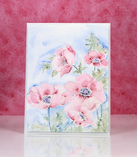
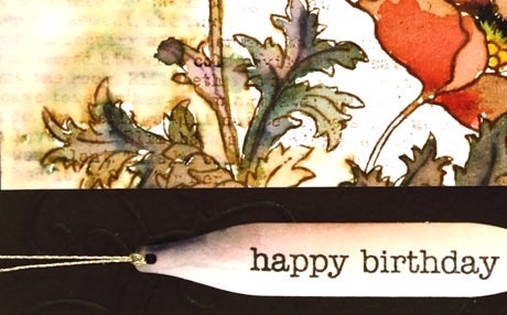
This week my colouring has grown softer each day. I changed mediums for this card and pulled out my tried and true watercolour pencils. I have added to my set lately but the originals are still the set I bought in university for my art subjects. I remember my parents thinking they were quite an expensive purchase then but I would say we got our money’s worth!
I embossed the poppy gems stamp in clear powder then painted each petal one at a time. I applied two pinks from the pencils and blended from dark to light, keeping some watermarks and blending others out. On yesterday’s card I kept the blending very smooth but sometimes I like to have a few watermarks here and there.
Colouring three times in a row is great practice for Kathy Racoosin’s upcoming 30 day colouring challenge. The next one starts on July 5th and lasts until August 3. I will share more details closer to the time but it is a great challenge, no pressure to colour every single day, plenty of wonderful inspiration from Kathy and some prizes along the way.
Supplies:
Stamps: Poppy gems(PB)
Inks: Versamark (Tsukineko)
Pencils: Pine green 267, Chromium green opaque 174, Dark red 225, Madder 142, True blue 148 (Faber Castell Albrecht Durer watercolour pencils)
Cardstock: Fabriano 100% cotton hot pressed watercolour paper
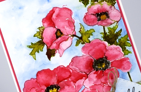
Bright Poppy Gems
Posted: June 15, 2016 Filed under: Poppy Gems | Tags: Fabriano Watercolour Paper, Kuretake Zig clean color real brush markers, Penny Black stamps, Tsukineko Versafine inks 15 Comments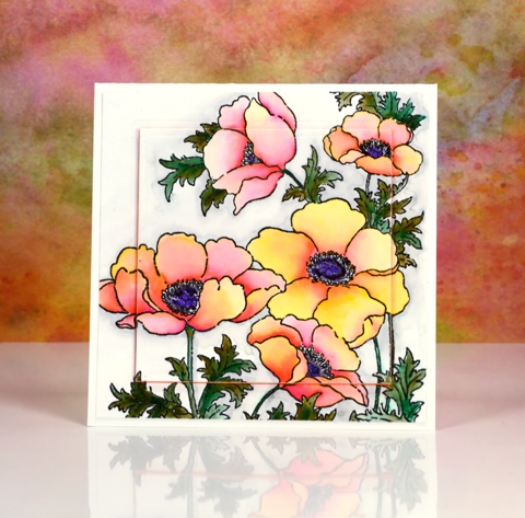
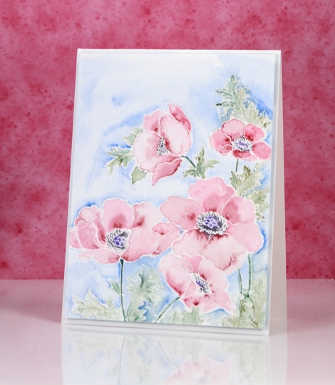
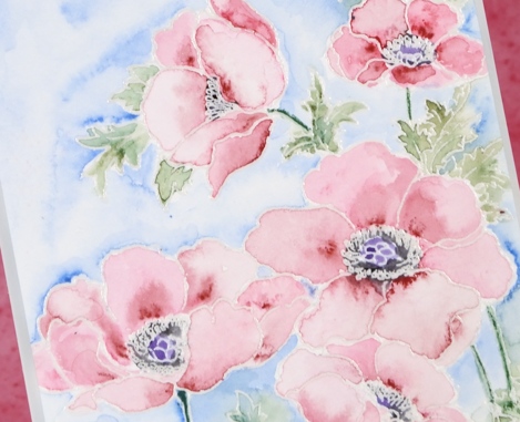
I’m sharing some more colouring today and yes, more poppies too. Poppies just keep on popping up on this blog don’t they!? Believe it or not I used the same medium on today’s card as yesterday’s very bright and bold card. The colours today are still bright but are blended out to much paler shades.
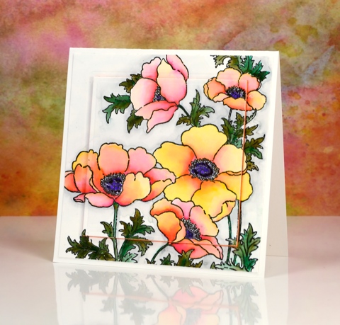
I stamped the large ‘poppy gems’ stamp in versafine onyx black and embossed in clear then used zig clean color real brush pens. Yesterday I pretty much filled the petals with colour and blended one colour over another. On today’s card I started with a little pink at the centre edge of each petal and a little yellow at the outside edge and blended the two colours with water to create a softer effect.
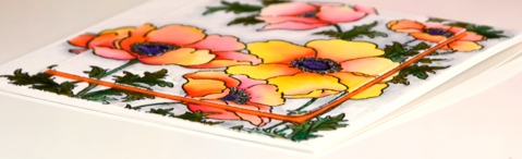
I spied the raised panel layout on a couple of pretty cards recently and chose to do it on this one with a piece of orange fun foam. I have an even paler more pastel poppy card up next. See you soon and thanks for dropping by.
Supplies:
Stamps: Poppy gems, (PB)
Inks: Versafine Onyx Black (Tsukineko) Zig Clean Color real brush markers (Kuretake)
Cardstock: Fabriano 100% cotton hot pressed watercolour paper
Also: orange fun foam, spellbinders square die
Poppy Gems 3
Posted: March 9, 2016 Filed under: Poppy Gems | Tags: Penny Black stamps, Ranger Distress stains, Speedball elegant writer 10 Comments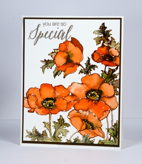
This is the third of my Poppy Gems cards; each design has been a little ‘cleaner’ than the last. The main difference on today’s card is the clean white background behind the orange blooms. I have stuck with the same layout each time which incorporates almost the whole large stamp. I think there is scope to mix it up for my next Poppy Gems offering.
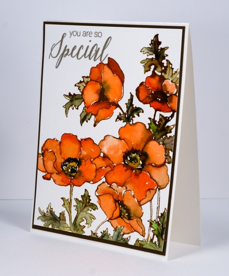
I stamped the whole image in Vintage photo distress ink which blends really easily with water or stains giving a slightly brown tone to all the added colour. I used the stains listed below to paint the flowers and leaves and added some elegant writer pen in the flower centres and on the veins of the leaves. Once again I added water to the elegant writer to get it to bleed and add some extra tones to the images.
Supplies:
Stamps: Poppy gems, Special Thoughts (PB)
Inks: Versafine Vintage Sepia (Tsukineko) Vintage photo distress ink, Ripe persimmon, Mowed Lawn, Mustard seed and Vintage photo distress stains (Ranger)
Cardstock: Fabriano 100% cotton hot pressed watercolour paper, brown cardstock
Poppy Gems 2
Posted: March 4, 2016 Filed under: gift card pocket, Poppy Gems | Tags: Dr Ph Martin Hydrus watercolor paints, Faber-Castell Albrecht Durer Watercolour pencils, Penny Black creative dies, Penny Black stamps 20 Comments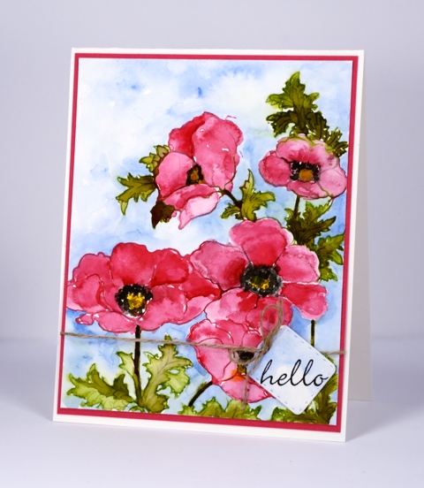
The Poppy Gems return today but in a more traditional colour scheme than last week’s card. I stamped with liquid watercolour paint on this panel, a technique not unlike what I often do with the distress stains. I used a paintbrush to apply the paint to the stamp then, after stamping, used water to blend the colour into the petals and leaves. In the centres and shadows on the flowers I layered colour to increase the intensity. The paints are Dr Ph Martin Hydrus watercolours which dry permanent. This feature was helpful when I decided to add a background weeks after completing the flowers. There was no chance I would make the pinks and greens bleed into the sky when I added blue with a watercolour pencil and waterbrush.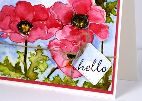
The little tag is a cut with the new die from Penny Black, ‘gift card pocket’ which comes with so much more than just the pocket die.
Thank you for dropping by today; I will be back soon with more alcohol ink adventure as well as another couple of cards made with the ‘Poppy Gems’ stamp. I hope you have a great weekend.
Supplies:
Stamps: Poppy gems, Perfect Pairing (PB)
Dies: gift card pocket (PB)
Inks: Versafine Onyx Black (Ranger)
Pencil: Albrecht Durer watercolour pencil sky blue 147(Faber-Castell)
Paints: Dr Ph Martin Hydrus Liquid Watercolours – Set 1
Cardstock: Fabriano 100% cotton hot pressed watercolour paper, pink cardstock
Also: linen thread
Poppy gems 1
Posted: February 27, 2016 Filed under: Flourish and butterflies, gift card pocket, Poppy Gems | Tags: Penny Black creative dies, Penny Black stamps, Ranger Distress stains, Speedball elegant writer 28 Comments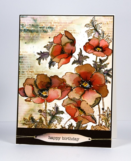
Over the next week or so you are likely to see the new ‘Poppy gems’ stamp a few times. I have already stamped it in four different colour schemes and varied the mediums and styles. This one is by far the ‘busiest’ and is quite the contrast to the clean and simple stamping I have been sharing lately.
I created this earth toned panel initially with just brown and black but after doing most of the blending with water I decided to add a bit of red to the petals over the brown. I stamped with distress stain and pulled it into the petals and leaves with a paint brush. I added black with the elegant writer pen which bleeds pink and green tones when wet. I decided to add the text details after the flowers were finished keeping it loose and watery with the addition of water to both the stamp and panel. I stamped the text upside down the first time so I had to make it blurred so my error would not be less noticeable!
I die cut a few flourishes with the new ‘flourish and butterflies’ die and attached them to the base for a tone on tone detail; you can just make it out in the photo below. The sentiment is stamped on a tag from the new ‘ gift card pocket’ die.
Thanks for dropping by; I hope you are enjoying a relaxing weekend.
Supplies:
Stamps: Poppy gems, footnotes, snippets (PB)
Dies: flourish & butterflies, gift card pocket
Inks: festive berries, mustard seed, vintage photo distress stains & ink (Ranger) black elegant writer pen (Speedball)
Cardstock: Fabriano 100% cotton hot pressed watercolour paper, brown cardstock


