
Crumple & Colour journal page
Posted: February 14, 2022 Filed under: Art Journal, gel press, Hand drawn | Tags: Art Journal, Dr Ph Martin Hydrus watercolor paints, gel printing 6 Comments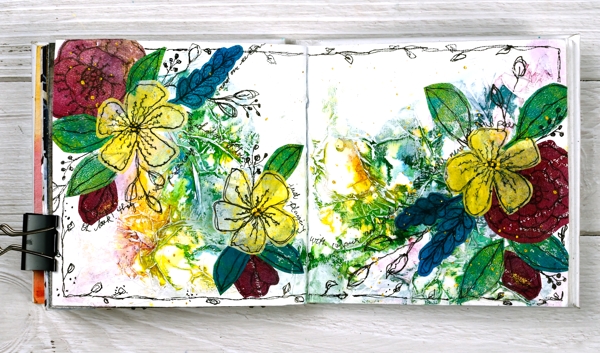
While creating art journal pages lately I’ve noticed that they often look a bit rubbishy until the end or just before the end! It’s a good thing to keep in mind throughout the process, especially as the process sometimes stretches over a few days.
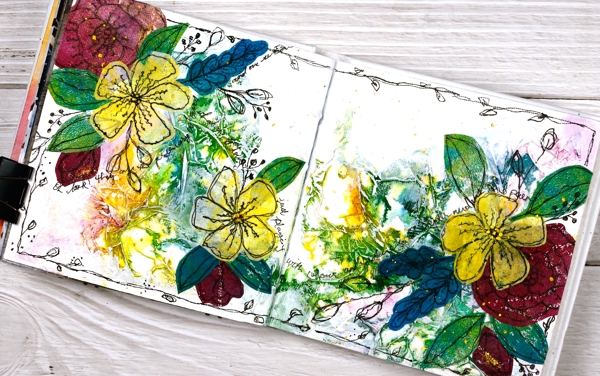
I started this page while I was at Crop A While and a friend looked over at me and said, “Heather is having fun playing with toilet paper!” For the record I was having fun with tissue paper not toilet paper! Working in the 6″x 6″ Dina Wakley journal I glued crumpled tissue paper over the whole spread with gel medium, scrunching it as I went to make folds and texture over the pages. (it didn’t look at all special at this point)
Later I used my Dr Ph Martin’s hydrus watercolours to drop blue, yellow and red ink over the pages. I worked one ink at a time tilting and diluting the ink so it would spread over and around the crumpled paper. (still underwhelming)
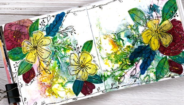
I let the watercolours dry and left the page for several days. The colours were bright and there were some nice blends and patterns but too bright for me so I painted over the spread with white gesso. My aim was not to totally cover the watercolours but to soften their impact and highlight the texture of the paper. I used my fingers to move the paint and a baby wipe to remove it where it was too thick. (looking better but still messy)
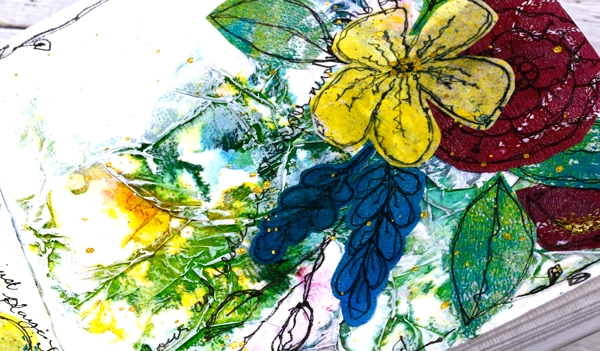
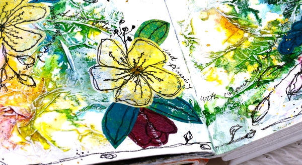
Settling on a focal point for an art journal page is sometimes hard; I don’t always begin with one in mind. You won’t be too surprised to see I chose flowers. I have a box of gel printed panels, some on rice paper and some on light card or computer paper. I found several prints on rice paper that matched the colours on the page and doodled flowers and leaves on them with a permanent black marker. I cut them out and started arranging them on the pages. (it was beginning to show promise)
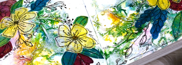
After quite a few rearrangements I glued down the flowers and leaves making sure I didn’t cover up all the yummy colour and texture but also didn’t cover up the important white space. (it was finally looking ok) With the elements in place I continued to doodle more foliage on the pages including a border around the whole spread. I scribbled some thoughts around the flowers then splattered gold paint over the finished pages.
I am very happy with the final result but had no idea it would end up like this. At one point during the process I thought, “hmmm, I don’t think I’ll do this technique again…”
But I will.
Supplies
(Compensated affiliate links used when possible)
Gingerbread Journal page
Posted: January 7, 2022 Filed under: Art Journal, Brusho, My Favorite Things | Tags: Art Journal, Brusho, Dr Ph Martin Hydrus watercolor paints, My Favorite Things 7 Comments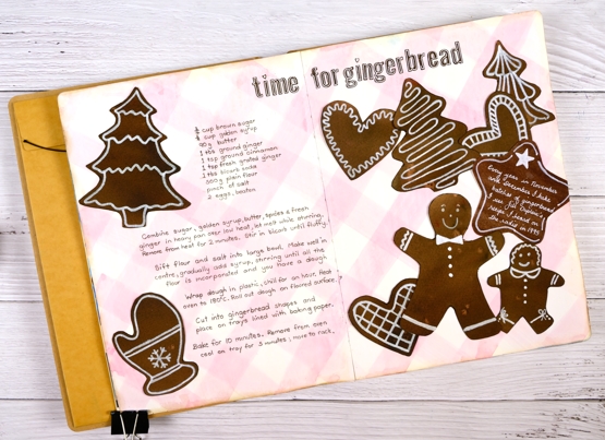
Six years ago I was given a delightful and incredibly thoughtful gift. Four friends I met through teaching card making classes gave me an art journal. It’s a large Dylusions 9″x11″, a very generous gift in itself.
The journal was just part of the gift. What amazed and touched me deeply was that these friends worked on individual pages in this journal far enough in advance to have completed four different spreads before they gave it to me. Each person completed a 2 or 3 page spread describing Christmas traditions they were familiar with.
I have in my journal pages about Polish and German Christmas traditions along with a description and illustration of Mummering in Newfoundland and a depiction of the carol, ‘I Saw Three Ships’. The depiction is set in Bass Strait with a view of a King Island lighthouse, a nod to my birthplace! I was speechless when I opened the gift and it still brings me joy whenever I look at it.
After Christmas that year I began two different spreads in the journal having decided it was to be filled with Christmas themed art journalling. Although I began soon after receiving the journal I didn’t finish a page until last week. I am embarrassed to have let it sit so long but in the interim I have completed many journal pages in other books and have ideas aplenty dancing around in my head – like sugarplums!
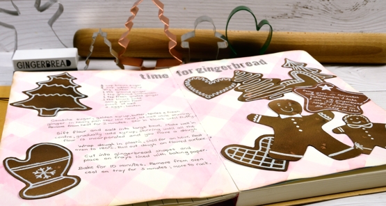
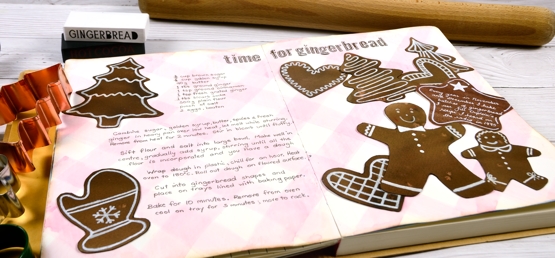
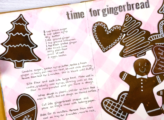
Gingerbread baking and decorating is a tradition for me and a fitting choice for my first Christmas spread. I started making gingerbread in Australia in 1995 after hearing a radio interview with Jill Dupleix whose recipe I use to this day, more often than not with gluten free flour now. This year I made several batches, a couple with friends on a Sunday afternoon where much mixing, cutting and decorating was enjoyed.
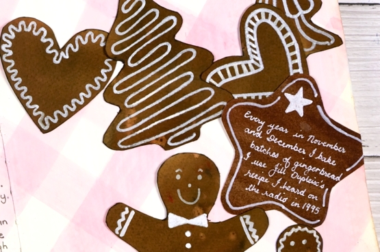
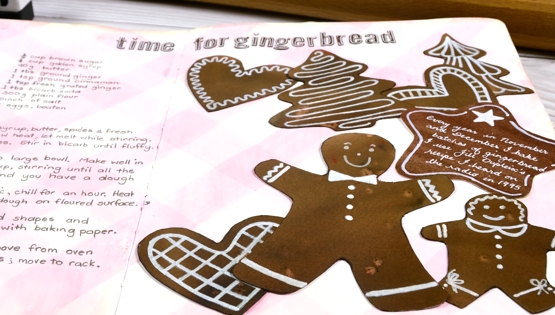
I used my own cookie cutters to trace the shapes onto watercolour paper painted with dark brown and light brown brusho. The background ‘check tablecloth’ I painted with a mix of Dr Ph Martin’s deep red rose and hansa yellow. The gingerbread shapes sat for years with pale white patterns on them and it was only this year after trying quite a few white paints and pens that I was able to make the patterns bolder with a posca paint pen.
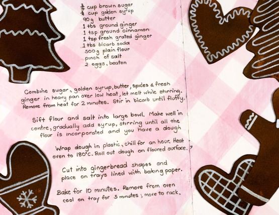
I finally added the recipe, glued the cookies down and added a title using MFT little lowercase letters (I think they are retired now but they worked to look like little gingerbread letters).
So that is the story of a wonderful journal, four kind and generous friends and an adventure started in 2015 which I am happily continuing even though I made a very slow start.
Supplies
(Compensated affiliate links used when possible)
Vintage layers
Posted: April 5, 2021 Filed under: Darkroom Door, French Script, global postmarks, mesh, Nature Walk, Papertrey Inks, scratches, you are everything | Tags: Darkroom Door stamps, Dr Ph Martin Hydrus watercolor paints, Fabriano Watercolour Paper, Papertrey ink 12 Comments
Today’s cards developed bit by bit over a week or so. I worked on flower panels one day, middle layers another day, let them sit a few days, searched for ribbon another day and finally a week later put them together still adding stamping, splattering and blending right up until I called them finished!
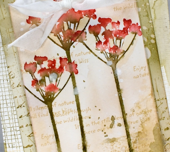
I featured the silhouette floral stamps from the new Darkroom Door ‘you are everything’ set. There are four floral stamps along with eighteen word stamps I mentioned in a previous post. The flowers above are stamped on cold press watercolour paper with papertrey inks. I used pale peony and pure poppy on the petals and olive twist on the stems. I spritzed lightly before stamping then blended further with a paintbrush on the paper. I used the same technique on the purple flowers in the second card but worked on hot pressed watercolour paper.
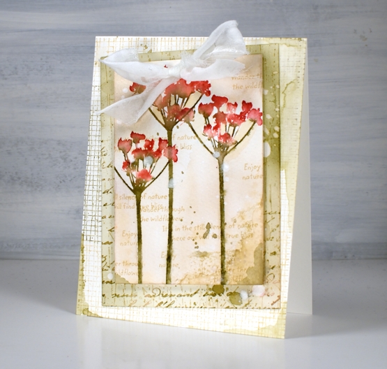
For the vintage and collage details on the card I above I used olive twist and fine linen inks to add painted areas, stamped text, splatter and blending with a brush.
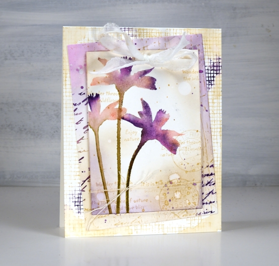
The flowers above are stamped in pale peony, royal velvet and olive twist and I stuck with fine linen and royal velvet as the inks on the layered areas also.
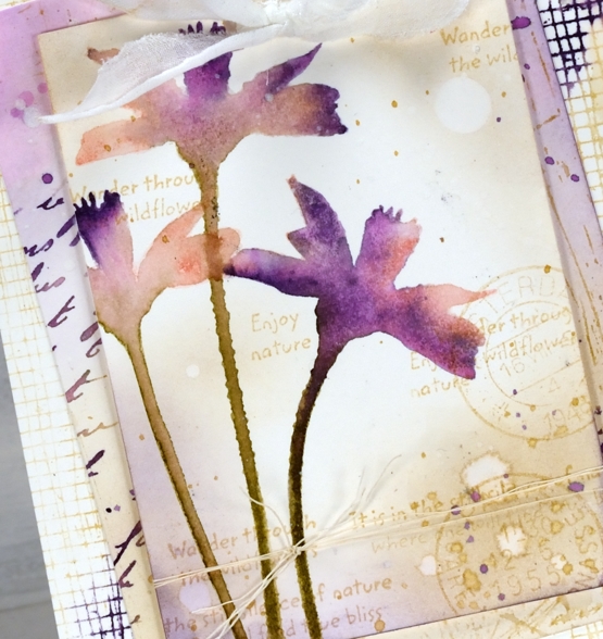
I’ve listed all the stamps I used to add texture and interest to the floral panel and the layers underneath. You can see some of my favourite ‘filler’ stamps including French script and global postmarks. I also splattered water and white paint for some watermarks and subtle blots!
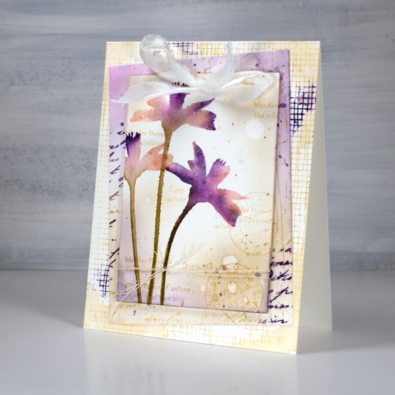
To finish both cards I punched a couple of holes in the top to thread some fabric through. I didn’t have a cream silk or sheer ribbon so I ripped some strips of what might be silk but I can’t remember. The ripped edge worked fine with my vintage layered look.
Supplies
(Compensated affiliate links used when possible)
Under the same sky
Posted: March 23, 2021 Filed under: Darkroom Door, long distance, vintage planes | Tags: Darkroom Door stamps, Dr Ph Martin Hydrus watercolor paints, Fabriano Watercolour Paper, Tsukineko Versafine inks 7 Comments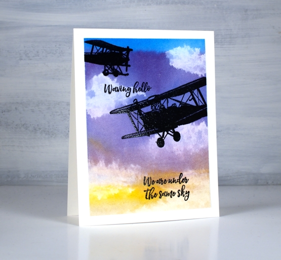
After pairing the cool new ‘long distance’ sentiments from Darkroom Door with a map stamp I took another look at the strip of sentiments (there are eleven) and picked out a couple that would work with planes and a sunset sky. I must admit my matchy-matchy side was pretty happy these two sentiments are in the same font and the three on my map card were also in the same font.
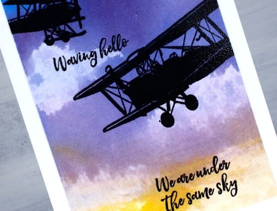
I taped a piece of hot pressed watercolour paper to my glass mat and painted six colours from top to bottom of the panel with plenty of water to dilute and mix the colours as I went. I used the Dr Ph Martin’s Hydrus watercolours for the sky and the colours are linked below. I put only a drop of each in wells of the palette then added three or four drops of water. Considering the paint brush was also dipped in water before picking up paint you can see these liquid watercolours are highly pigmented. I painted the whole panel twice starting with the phthalo blue each time and finishing with the gamboge. While the panel was still wet I scrunched up a tissue and dabbed paint off. You can see the tissue takes out a lot of colour bringing the dabbed area almost back to white.
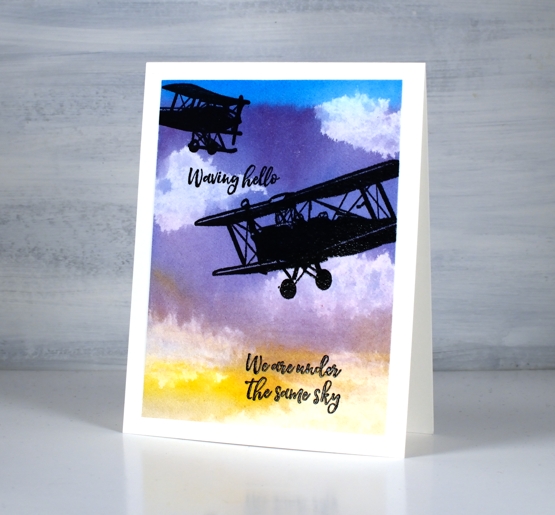
Once the panel was totally dry I trimmed it and stamped two planes from DD vintage planes and two sentiments in versafine clair nocturne before embossing over the black ink in clear powder.
I was thinking about a comment my dad left on the long distance + map card about the recipient being able to return the same message to the sender on receipt of the card and I wondered about a ‘send it on’ idea. It is a bit different to what my dad suggested but instead of writing in the card I will write on a piece of loose paper inside the card and suggest the recipient remove my note and add one of their own before sending the card on to another person. For fun the senders and recipients could note their names on the back of the card. Hmmmm, perhaps I should try it with the map card and maybe this one too.
Supplies
(Compensated affiliate links used when possible)
Magnolia Blossoms
Posted: August 26, 2020 Filed under: magnolia blossoms, My Favorite Things | Tags: Dr Ph Martin Hydrus watercolor paints, Fabriano Watercolour Paper, My Favorite Things, Tsukineko Versafine inks 6 Comments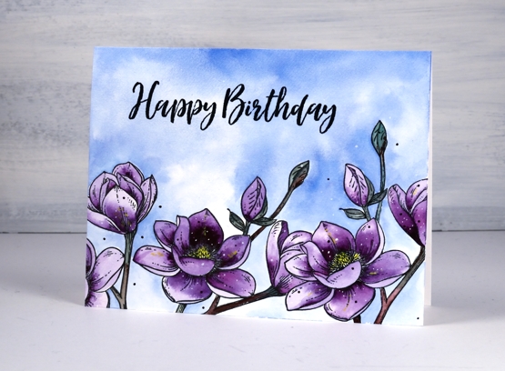
I have teamed up with the Foiled Fox again to bring you these pretty purple blooms made with My Favorite Things, ‘magnolia blossoms’ stamp set. The set contains two stamps; I have used one, stamped three times. To hide one bloom behind another I stamped a mask first on masking paper. I worked on hot pressed watercolour paper, stamped in versafine clair nocturne and embossed in clear powder.
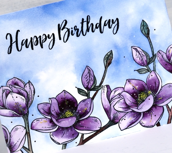
I painted both the sky and the flowers with Dr Ph Martin’s Hydrus watercolour paints. They are highly pigmented so I added a droplet of each colour to a palette then added water. I describe the whole process on the Foiled Fox blog today so pop over there to learn more and take a look around.
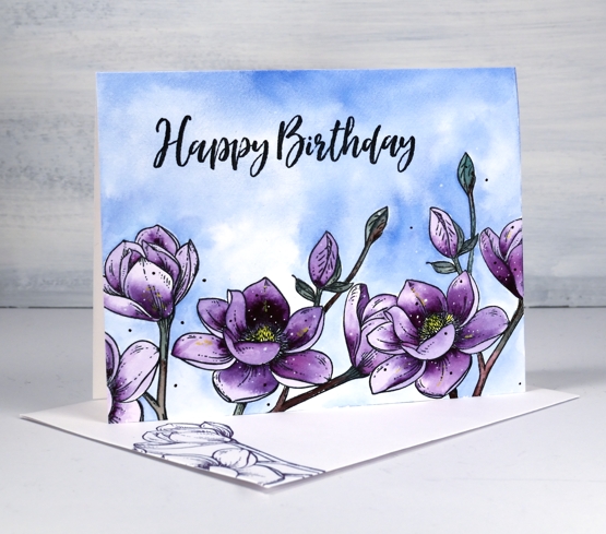
The sentiment is also from a MFT set, ‘brushstroke expressions’ stamped in nocturne and embossed in clear for a little shine. See that little pop of yellow in the centre of the blooms, it’s what I call a booster in my new ‘Colour Clues’ class. If you want to know more, click here.
Supplies
The Good Life
Posted: July 2, 2020 Filed under: birches, Penny Black, Stamped Landscapes, the good life | Tags: Dr Ph Martin Hydrus watercolor paints, grafix, Penny Black stamps, Ranger Distress inks 11 Comments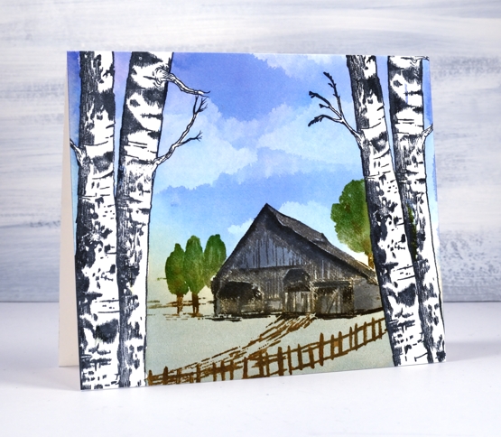
I am happy to have a stamped and painted scene to share today. I often create scenic cards and panels in winter but I used liquid frisket on this panel to create a summer vista seen through a frame of birches. I teamed up with Grafix , used their liquid frisket kit and filmed the process.
With a technique like this it would be easy to make a card for any season. The birches could frame a snow scene, autumn foliage or even some mountains in the distance.
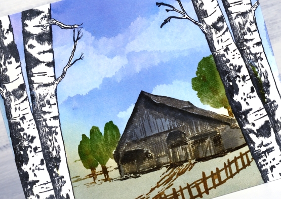
Painting the sky was fun, you can see in the video I painted the whole sky area in blue then added all the clouds by dabbing colour away with a kleenex tissue.
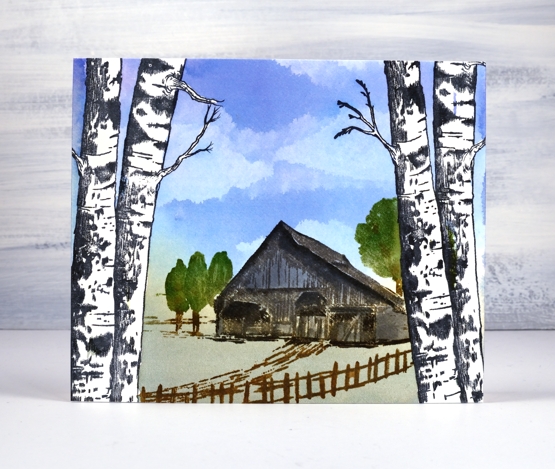
You can see in the video I stamped the house and trees with archival ink first then built up colour, depth and shadow with distress inks for the watercolour look. Because the Dr Ph Martin inks used on the sky are permanent once dry I was able to stamp and blend over the house and trees without affecting the sky at all and of course over the masked trees too.
Supplies
Autumn Bliss
Posted: September 30, 2019 Filed under: autumn bliss, calligraphy, Hand lettered, Penny Black, Watercolour | Tags: calligraphy, Dr Ph Martin Hydrus watercolor paints, Finetec artist mica watercolour paint, Penny Black stamps, Pointed pen 5 Comments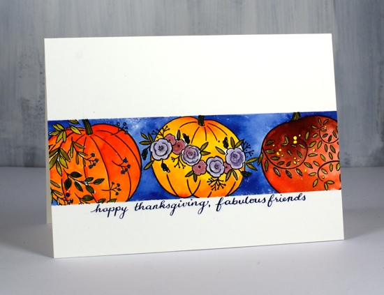
This card is one of those rare ones where the end result is very close to the dreamed up idea.
I started by masking a piece of hot pressed watercolour paper with tape. I taped it into the stamp positioner using the grid lines as guides to get it straight and, wonder of wonders, it actually ended up straight. I stamped the pumpkins from the PB ‘autumn bliss’ set in Gina K’s jet black amalgam ink. I bought the amalgam so I could compare it to my current fave black, versafine clair nocturne. The amalgam stamped well and dried quickly but I didn’t find it superior to the versafine clair.
I wanted bold bright colours and wondered which of my watercolour mediums would give me that result. I settled on my Dr Ph Martin’s Hydrus liquid watercolours. They are definitely bold and bright! Of course they can be diluted for a softer look but I was happy to make the most of their vibrancy. Even though I put barely a drop of each colour on my palette I still ended up with more than I needed. I tried to limit my colour scheme by mixing some of my own colours. I started with gamboge and brilliant cad red for the middle pumpkin and painted all but the flowers. I then mixed the gamboge with the brilliant cad red for the left hand pumpkin and again painted all but the leaves. It was very tricky avoiding the leaves especially before I realised that I had my reading glasses on instead of my stronger ‘art glasses’. Sadly my art glasses are becoming my reading glasses so in the new year I am hoping to get some new ‘art glasses’ to help me see and paint all the fiddly bits. The right hand pumpkin is brill cad red and Venetian brown.
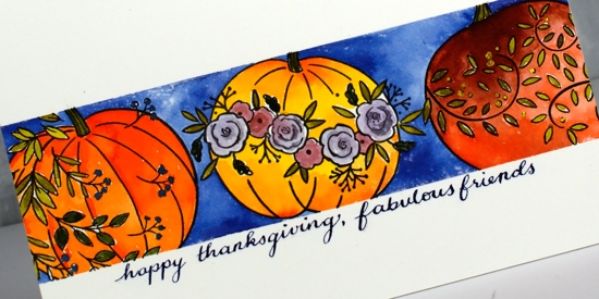
With my art glasses on I painted all the leaves and stalks with a green made by mixing gamboge with ultramarine. The flowers on the middle pumpkin I painted in a diluted deep red rose/ultramarine mix. I added little dots of gold to the right hand pumpkin using finetec pearlescent ink then used a rosy colour from the same set to add shimmer to the flowers. If I did the pumpkins again I think I would paint them one solid colour first with a little shadow and shading then use the pearlescent inks over the top to add all the flowers and leaves. The pearlescent inks are opaque and would not have let the underneath colour show through.
After all the pumpkin decorating, I painted the background with ultramarine. If you have masked with tape before you will know how satisfying it can be to peel back the tape to reveal crisp straight edges and also how frustrating when some paint has seeped underneath. Well, again, wonder of wonders, no seepage! Now, the last wonder of wonders is really the biggest. I occasionally do my own calligraphy sentiments, more often than not it does not end up straight, neat or the right size so I end up cutting the painted panel off and attaching it to a whole new panel in order to get rid of the messed up sentiment. This time I ruled my pencil lines, practiced the sentiment on a scrap, wrote it in pencil on the panel and finally wrote it with pointed pen in a mix of ultramarine and pearlescent ink. The next step was key; I have messed it up in the past. I left the room and went and had my lunch, that way I was not tempted to erase the pencil before the writing was dry, dry dry! I used one of those nifty battery operated erasers to gently erase all the pencil and then did a happy dance!
I hope you don’t think I am overdoing it in my satisfaction with this card, I know it’s nothing out of the ordinary, it’s just that it could have gone wrong in quite a few places but happily it didn’t.
Supplies
Grateful for everything
Posted: September 21, 2018 Filed under: grateful for everything | Tags: Concord & 9th, Dr Ph Martin Hydrus watercolor paints 9 Comments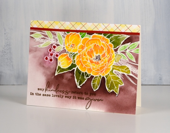
This gratitude themed card heralds the beginning of a gratitude focus on my blog for the coming week. Starting next Monday I will be collaborating with the Foiled Fox crew to celebrate gratitude. Before I dive into that collaboration though I thought I would share this card and issue an invitation to you, my wonderful readers. I am very thankful for those of you who pop in to see what I have been creating. Some of you have been visiting for years, others are new around here; some of you leave me a little encouragement from time to time in the comments section and others contact me with questions and feedback; I love hearing from you.
With gratitude as my focus over the next week and in fact next two weeks leading up to our Canadian Thanksgiving, I thought I would send out some cards to you, my readers. Thing is though, I’ll need to you supply an address if you would like to receive a card in the mail. Please don’t leave your address in the comment section, instead use the Contact Me button at the top of the page.

This lovely spray of flowers is from Concord & 9th; I have embossed it on hot pressed watercolour paper with clear powder. The bold colour is from Dr Ph Martin’s Hydrus inks. They are liquid watercolour inks and are very saturated. You don’t need much ink to get wonderful depth of colour; a little goes a long way and they mix beautifully to create new colours. I only used four colours to paint this panel but with a little mixing or diluting I was able to create an olive green and a pale green, a yellow and a couple of oranges as well as use the brown and red straight from the bottle.
To create a strip of co-ordinating plaid paper I used the plaid background stamped in memento dandelion ink for the yellow then added green and red ruled lines with distress markers. To divide the busy plaid strip from the busy floral panel I added a very thin strip of red cardstock. As usual I switched to versafine ink for the sentiment because it stamps fine lines so well. Isn’t that a sweet and thoughtful sentiment? I’m looking forward to sending it out to friends; maybe it will end up in your mail box.
See you next week for more gratitudinal fun! (is that a real word?)
Supplies
Stamps: grateful for everything, plaid background (C & 9)
Inks: versamark, versafine vintage sepia, dandelion memento ink & candied apple distress marker, peeled paint distress marker
Paint: Dr Ph Martins deep red rose, phthalo green, gamboge, Venetian brown
Paper: hot pressed watercolour paper, neenah cream, red cardstock

Also: T-ruler, glass mat, clear embossing powder, cutterpillar paper trimmer
![]()
Parade of flowers
Posted: March 7, 2018 Filed under: Parade of flowers | Tags: Dr Ph Martin Hydrus watercolor paints, Penny Black creative dies, Penny Black stamps, Ranger Distress inks, Tsukineko Versafine inks 5 Comments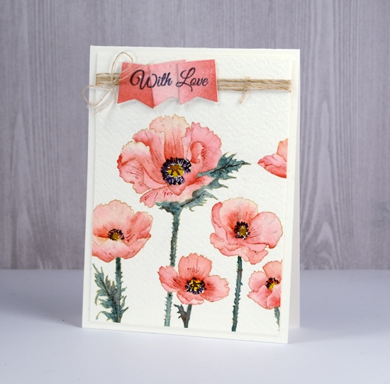
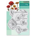
The flowers continue to bloom across my blog this week and it’s making me pretty keen for spring to arrive. Today’s poppies are as realistic and detailed as you are likely to see from me! A little different from my distress stain loose and watery florals. I used a stamp positioner to stamp ‘parade of flowers’ in antique linen distress ink on cold pressed watercolour paper; because of the texture of the cold pressed paper I stamped a few times to guarantee a complete image.
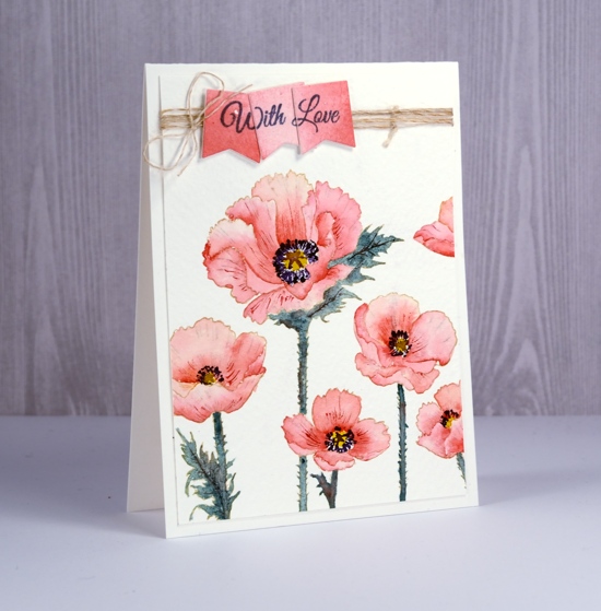
All the painting was done with Dr Ph Martins Hydrus watercolours. When undiluted the colours are very vibrant so I put only a drop of each colour in a palette then added water. To keep the colour scheme muted and cohesive I limited my paint choices. The petals are painted with ‘deep red rose’ and the leaves and stems a mix of phthalo green, deep red rose and Venetian brown. The centres of the flowers are gamboge, with dark details added in ultramarine and Venetian brown.
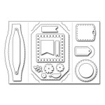
I worked on one petal at a time painting first with water then dropping in some deep red rose paint. I blended the colour to the edges then added more paint if necessary to create shadow or deeper colour near centre of flower. While each petal dried I worked on a non-adjacent one. When all the petals were dry I added some more red here and there to create a bit more depth and when that dried I used a very fine tipped brush to paint veins on some of the petals. I wanted to stamp the sentiment on a matching panel so I painted diluted deep red rose paint on a scrap of hot pressed watercolor paper the die cut three tags using die from ‘gift card pocket’ set. With the stamp postioner I was able to stamp ‘With Love’ sentiment from ‘special wishes’ set on tags one at a time so when together they would over lap each other.
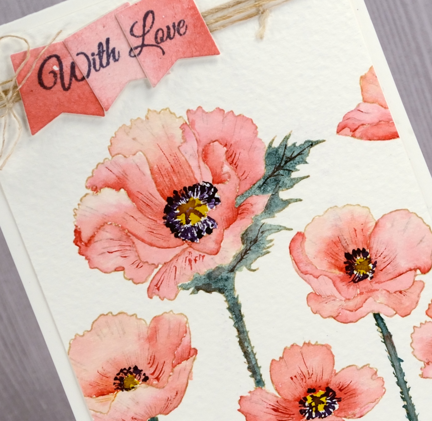
I wrapped twine around top of painted panel, attached the three sentiment tags over the top and attached the panel to a natural coloured card base.
Don’t forget to pop over to the ‘Sparkle with Us’ challenge hosted by The Foiled Fox and me. There is already some sparkly inspiration linked up but we’d love to see more.
Supplies
Stamps: parade of flowers, special wishes

Die: gift card pocket
Paper: rough 100% cotton watercolour paper, hot pressed watercolour paper
Ink: antique linen distress ink, imperial purple versafine ink
Paints: deep red rose, gamboge, pthalo green, Venetian brown, ultramarine Dr Ph Martins Hydrus watercolors (soon to be available at The Foiled Fox)
Also: antique hemp twine
Tweet conversation
Posted: September 20, 2017 Filed under: tweet conversation | Tags: Dr Ph Martin Hydrus watercolor paints, Penny Black stamps, Tsukineko Versafine inks 3 Comments
To finish the card I trimmed the panel, added a sentiment in black and attached to natural coloured card base.
Supplies
Stamps: tweet conversation, joyful wishes (PB)
Ink: versafine onyx black
Paint: Hansa Yellow light, Phthalo green, Ultramarine Dr Ph Martin’s Hydrus watercolours,
Paper: hot pressed watercolor paper


