Pink & Blue Squares
Posted: May 18, 2024 Filed under: Collage cards, Dies, gel press, gift card pocket, Penny Black, Tim Holtz, wild flowers #1 | Tags: collage, gel printing, Penny Black creative dies, Tim Holtz 3 Comments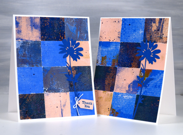
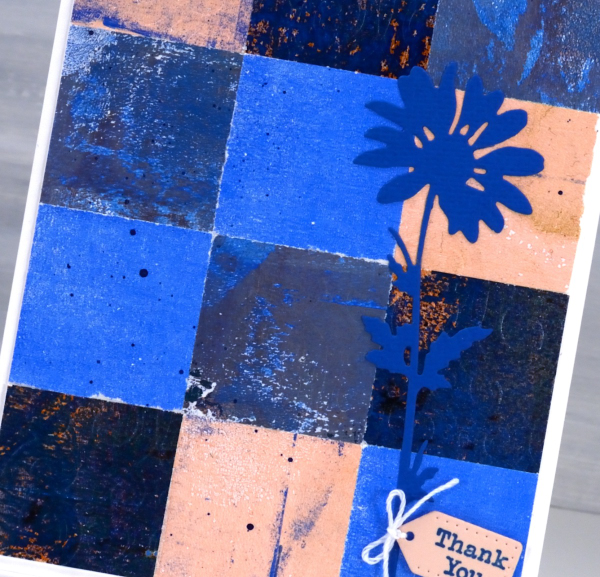
As mentioned in previous posts my stash of gel prints is considerable. I am always on the look out for ways to use them. Large prints are great for covers on handmade books; I use many smaller prints for card fronts and collage.
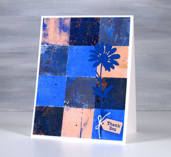
These two collage cards are made from four or five different gel prints. I punched the squares with a 1 3/8″ punch then fiddled around with the layout until I was happy with it. Because I love things to match all the prints had some blue in them and there is some repetition of pink as well.
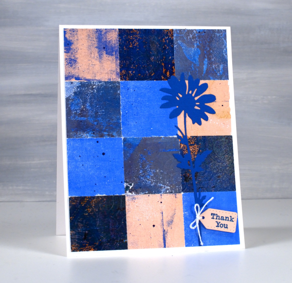
The prints were part of my stash and were not made specifically for these cards so some have patterns and others were probably second or third pulls to clean off a plate. Once I had them arranged to my satisfaction I die-cut Tim Holtz wildflowers and added a tiny Penny Black tag. You’ll see more of this style in the next few weeks as I made them in several different colour combinations. Those of you who know me might have noticed the dark blue splatter on the both cards; I always think a bit of splatter ties thing s together.
Greenery Collage Cards
Posted: April 3, 2024 Filed under: Collage cards, Darkroom Door, Dies, Finetec paints, gift card pocket, global postmarks, Leaves, measuring tape, Mixed Media, paris postcard, Penny Black, Tim Holtz, wild flowers #1 | Tags: collage, Darkroom Door stamps, Finetec artist mica watercolour paint, Mixed Media, Penny Black creative dies, Penny Black stamps, Tim Holtz 6 Comments
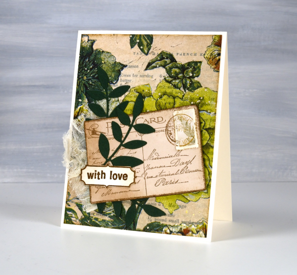
Continuing with the collage theme I have three cards featuring greenery from a paper napkin. I know people have been creating with paper napkins for years but I am new to the game. I have a small collection of pretty paper napkins to use on cards, book covers and journal pages. The green ones featured here are large dinner napkins found at Winners, probably in that tempting ‘just before the checkout’ area!

I glued the printed layer of the napkin over book pages to make my main panels and aged the edges with green and brown inks. I created a couple of little vintage postcards with the Paris postcard stamp, a background with the Measuring Tape stamp, sentiments and postmarks all from Darkroom Door.
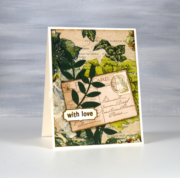
Once again I used some cute dies from Penny Black to cut tickets, file divider, tag and leaves adding blending around the edges for the vintage look.
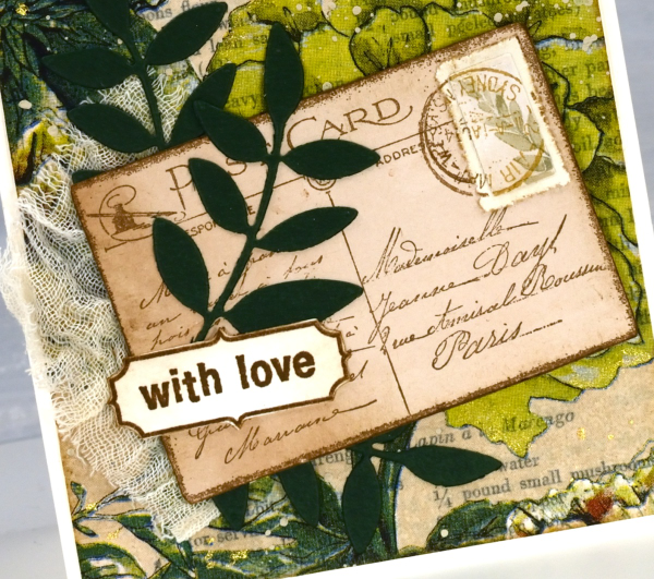
The scrap of cheesecloth, the lace and the grosgrain ribbon were all found around here, maybe the ribbon is actually vintage; it looks a bit discoloured from age which meant it co-ordinated well.

The lovely Queen Anne’s lace die is from the Tim Holtz ‘wildflowers #1 set.
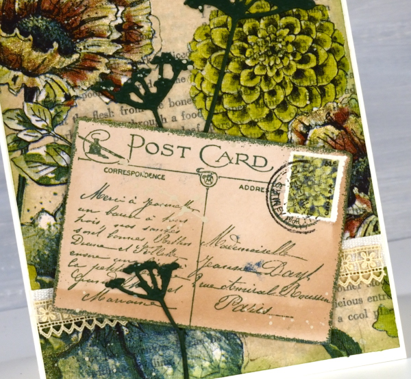
I did make my own little postage stamps for the postcards because I’m still in love with faux postage. These ones had to be quite small so I didn’t use a die I just punched tiny holes with a needle to perforate the edges. You can see a bit of splatter here and there with ivory paint and there are touches of gold watercolour paint on the petals of a few flowers too!
This post includes affiliate links from Foiled Fox and Scrap’n’Stamp . If you buy through these links I receive a small commission at no extra cost to you.
Vintage Collage Cards
Posted: April 1, 2024 Filed under: Collage cards, Darkroom Door, Dies, gift card pocket, handwritten ledger, Mixed Media, number medley, Penny Black, Tagged | Tags: Darkroom Door stamps, Mixed Media, Penny Black creative dies, Ranger archival inks 6 Comments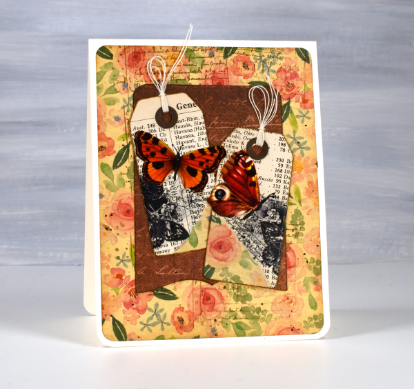
I’ve recently fallen down an vintage ephemera rabbit hole and emerged to make some of my own backgrounds and elements. There are companies that make beautiful co-ordinating ephemera, papers, chipboard pieces, etc. but I am committed to ‘using what I have’ so I’m pulling from old books, calendars, greeting cards, sewing patterns and scrapbooking paper along with a few handy tools.
I’m not going to list every die, ink or paper but I will mention some of my favourite resources. The old books that I am removing pages from include music books, dictionaries, atlases, novels, poetry and recipe books. I also have some lovely papers and vintage pages that friends have given me, so it is fun putting them to use.

The inks I reach for are the distress brown tones from Ranger, not always the dye inks, but often the archival inks as they don’t dilute or smudge when I add glue or stamp on glossy paper.

I have a bunch of background stamps and sets from Darkroom Door which give me vintage style text, patterns and elements including but not limited to the ‘handwritten ledger‘ and ‘number medley‘.

I found amongst my Penny Black dies a file folder, notebook page, several tags, tickets, pockets and decorative borders. I also treated myself to a corner rounding punch that punches in three different sizes and of course the postage stamp die set I’ve featured a few times recently.
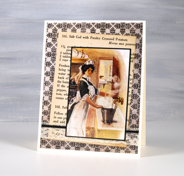
I pulled out twine, ribbon and lace for finishing touches and some vintage butterfly cut-outs that were all joined together by little tabs. I have had them for years ever since I inherited my mother’s teaching resources. You can seem them in the close up below.

Now just in case you are worried, I am not ripping pages out of beloved old books, but I am putting to use some books I inherited and don’t have a personal attachment to. Anne, Heidi, Jo March, Jane, Ratty and Mole are all safe! Old calendars, diaries, magazines and greeting cards are fair game because honestly, I’ve held onto some of them for a very long time. This post includes affiliate links from Foiled Fox and Scrap’n’Stamp . If you buy through these links I receive a small commission at no extra cost to you.
Fuchsia Favourites
Posted: March 22, 2024 Filed under: captivating, Dies, gift card pocket, online class, Penny Black | Tags: online class, Penny Black creative dies, Penny Black stamps 9 Comments
As I wait for spring I thought I would post a couple of cards I made a few years ago when filming my Floral Faves online course. I used the beautiful ‘Captivating‘ stamp from Penny Black to teach a no-line watercolour technique. All my online courses are discounted by 40% for a one more week.
Edited to add: use the code LEAPYEAR40 if the discount doesn’t appear automatically.
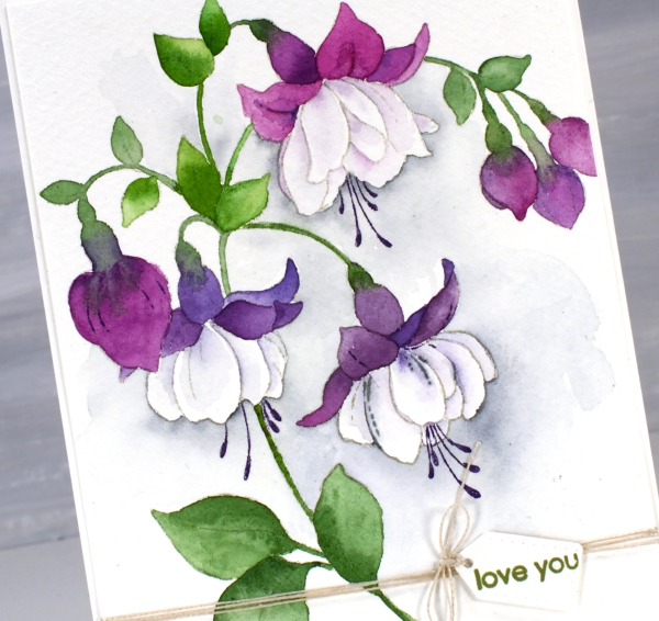
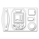
I used watercolour paints to colour the two cards featured today but I have also used waterbased inks smooshed onto a glass mat as they also work well for the technique. I added the tiny little tag from the PB ‘gift card pocket die set‘. It’s a set that I never use to make gift card pockets but often reach for one of the tag or label dies included.

I had fuchsias looking pretty in the planters at my front door last year. They were the opposite colouring of the ones above with pale pinky purple petals hanging down and creamy white petals at the top.

It might be time to pull out this stamp again and try it with the new pastel pencils. For more inspiration with this stamp click here and here. Today’s post features affiliate links to The Foiled Fox.
Delicate Pines – 9 Ways!
Posted: November 29, 2021 Filed under: delicate pines, Dies, gift card pocket, joyful ornaments, jubilation, juniper, onramental branch, Penny Black, tall trees, Taylored Expressions, trees and hills | Tags: Catherine Pooler inks, Penny Black creative dies, Penny Black stamps, Taylored Expressions, Tsukineko Versafine inks 8 Comments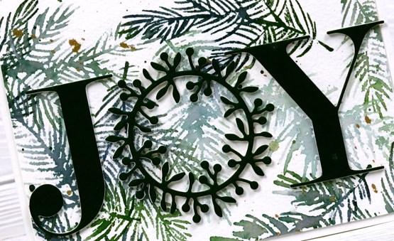
Welcome to a long post with quite a few photos!
When I last counted up the names on my Christmas card list and the number of cards I have completed the two numbers were not close to matching. I decided a quick way to grow the stack of cards would be to stamp a big panel then slice it up to make several cards.
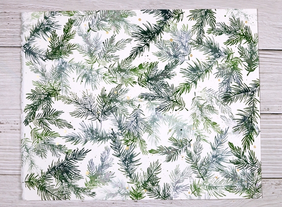
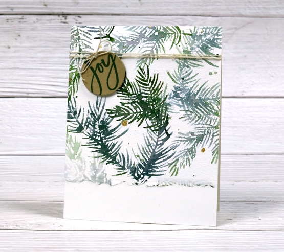
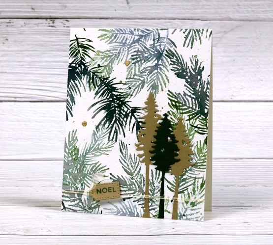
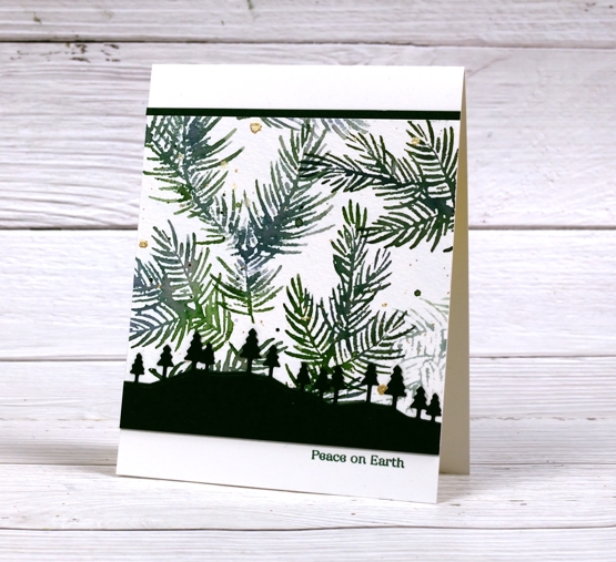
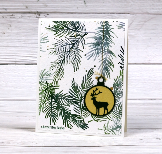
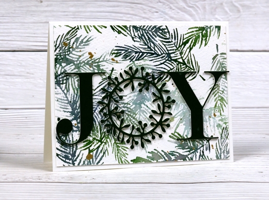
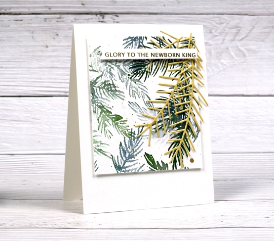
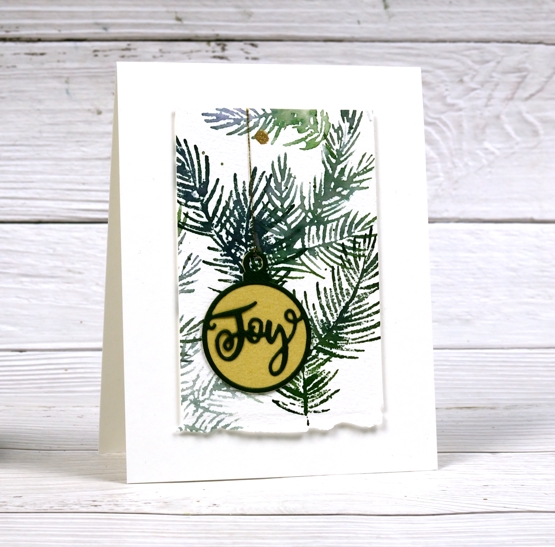
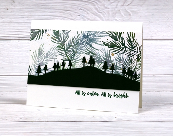
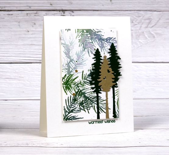
Turns out this idea was not all that quick. It took a while to make these cards because although they are from the same stamped panel, they are still all different. The photo above shows the original panel stamped with Penny Black’s new ‘delicate pines’ set of 3 stamps and two Catherine Pooler inks. After the stamping I added ink splatter then gold paint splatter.
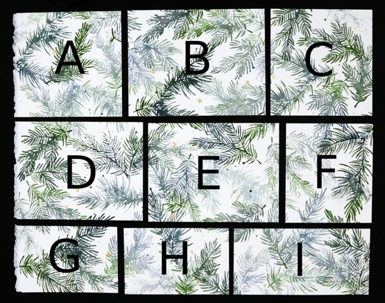
I kept the deckle edge on the 11″x14″ cold pressed watercolour panel and sliced up the panel lengthwise first. A,B & C are all 4¼” wide, D,E & F are all 4″ wide which left G,H & I all 2¾” wide. Below are all the finished cards. I used some pale gold, Bazzill avocado green and kraft cardstocks for the die cuts and framing. I used versafine clair rainforest ink to add sentiments and some linen twine here and there. All the cards are shown below with the size of the stamped panel portion included underneath (all the finished cards are 4¼”x 5½”)
A. 4¼ x 4½
B. 4¼ x 5½
C. 4¼ x 4⅛
D. 4 x 5¼
E. 4 x 5¼
F. 4 x 3½
G. 2¾ x 4¼
H. 2¾ x 4¼
I. 2¾ x 5½
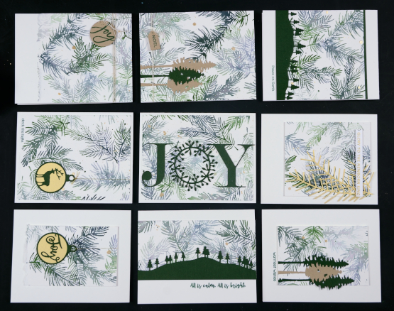
The finished cards above are in the places that correspond to the labelled photo up at the beginning of the post. I had them laid out on a cutting mat on the floor beside me as I put them all together so I didn’t get them mixed up. I wanted you to see how I used each size in a different way.
I hope you find some inspiration from these cards. Remember that three of my online classes are on sale until the end of November. Use the code HTNOV to get a 25% discount on the Floral Faves class, Winter Wonder class and the Colour Clues class.
The stores I have affiliate links with are also having sales right now (isn’t everyone?) I have put the links in the right hand side bar of the blog for easy access. Just click on the store name and start shopping!
Supplies
(Compensated affiliate links used when possible)
Scooter
Posted: July 28, 2021 Filed under: Dies, gift card pocket, Karin brushmarkers, Penny Black, puptastic | Tags: Karin brushmarkers, Penny Black creative dies, Penny Black stamps 4 Comments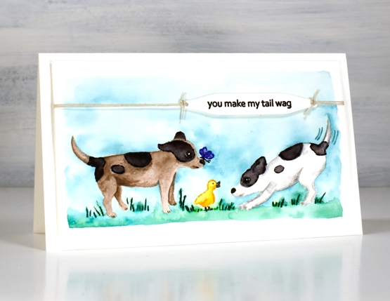
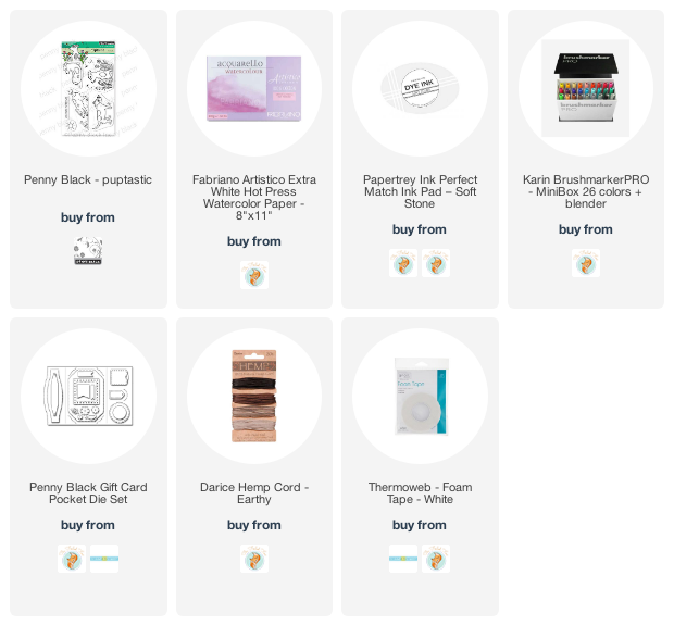
If you have visited the Penny Black blog lately you will have met Scooter; that’s her on the right. The Scooter release features a pup and her friends. The real life Scooter was part of the Penny Black family and now there is a range of stamps featuring her real and imagined activities. Penny Black is donating a portion of the proceeds from Scooter stamp set sales to Muttville a senior dog rescue program.
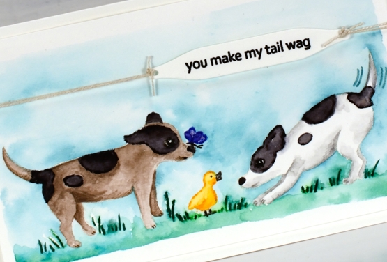
Unaccustomed to painting cute critters like Scooter it took me a while to get in the groove. For this little scene featuring stamps from the Puptastic set I stamped the outline images in papertrey soft stone ink then watercoloured with Karin brushmarkers. The sky and grass is also diluted ink from the Karin markers.
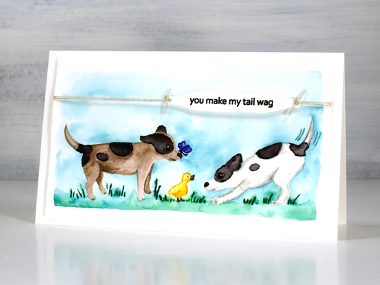
To complete the card I stamped the sentiment from the same set on a label cut with a tag from the PB ‘gift card pocket’ die set, tied it with twine and popped it up on dimensional tape.
Thank you for all your kind words about my garden pics. It really has become a relaxing pastime for me. I think because it is finally under control I can enjoy working on a patch for a short time or strolling around trimming off deadheads. It is no longer just about weeding!
Supplies
(Compensated affiliate links used when possible)
Bird’s eye view
Posted: April 23, 2021 Filed under: bird's eye view, Dies, Flower Frolic, gift card pocket, Karin brushmarkers, Penny Black, Script | Tags: distress markers, Karin brushmarkers, Penny Black creative dies, Penny Black stamps, Ranger Distress inks 7 Comments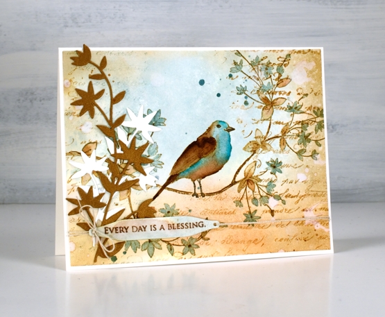
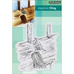
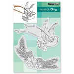
This cute bird on a branch stamp is new from Penny Black and is called ‘bird’s eye view’. We recently installed a new bird feeder in our backyard. It is on a shepherd’s hook metal pole to discourage the squirrels. The feeder itself has the anti-squirrel spring mechanism which closes access to the seed when something as heavy as a squirrel lands on it. You can probably guess what I’m going to say next; squirrels are wily creatures as are chipmunks! I can say that no adult squirrels have successfully fed directly from the feeder, they hang around underneath and eat what falls to the ground. We have seen a smaller squirrel climb the pole and lean over to take seed from the feeder without putting weight on it and a chipmunk that is light enough to sit on the feeder and stuff it’s face happily!
I know from experience you win some and lose some with feeders and I am enjoying the cardinal couple, the chickadees and the sparrows that are popping in. I think we’ve seen a finch or two but not certain.
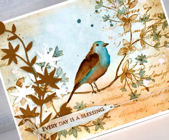
To create this vintage themed card I limited myself to a brown and blue colour scheme. The browns are tea dye, antique linen and vintage photo distress inks; the blues are speckled egg distress ink plus the arctic blue and cyan Karin brushmarkers. First I smooshed tea dye and speckled egg inks on a glass mat, diluted them with water then swiped a piece of hot pressed watercolour paper through the inks. Once the background was dry I stamped the ‘bird’s eye view’ image on the panel with antique linen and kept the panel in the stamp positioner while I added darker ink by applying distress marker to the stamp where I needed darker browns and black.
I painted the leaves in both tea dye and speckled egg inks and did the same with the bird before adding vintage photo ink to the wing, tail and legs. Once the bird was finished I felt the speckled egg blue was not deep enough so I used the blue Karin markers to add ink directly to the paper then blended with a paintbrush.
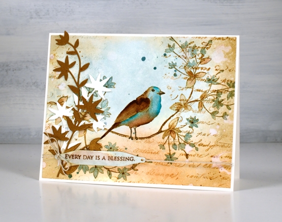
To add to the vintage look I blended around the edge of the panel with vintage photo ink then dropped splats of water here and there to create watermarks. I also stamped the PB script stamp which never fails to add some vintage charm. I hunted through my dies to find a pretty foliage die that mimics the shape of leaves and cut both bronze and cream pieces to attach to the left of the panel. Continuing the vintage theme I stamped a partial sentiment on a little tag and tied it to the panel with twine. Yes, of course there is also some ink splatter.
Let me know if you have successfully deterred squirrels from you backyard bird feeders; I’d love to hear your techniques.
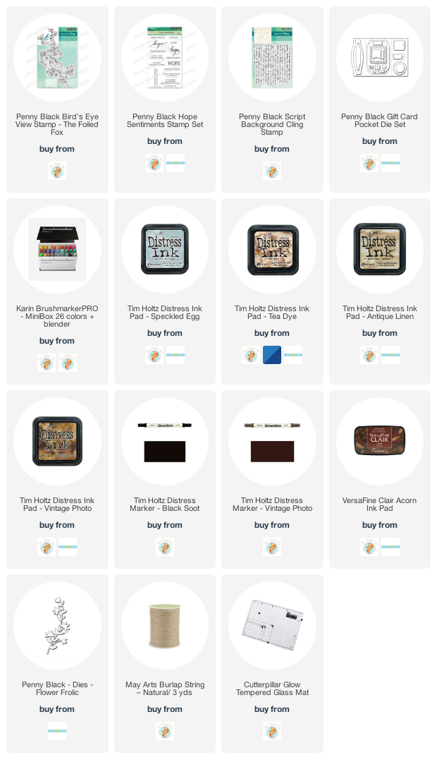
Supplies
(Compensated affiliate links used when possible)
Vintage collage card
Posted: March 8, 2021 Filed under: Coliro paints, Darkroom Door, diamonds, Dies, Finetec paints, French Script, Gazette, gerberas, gift card pocket, global postmarks, Penny Black, shall we dance, Stencils | Tags: Coliro paints, Darkroom Door stamps, Darkroom Door stencils, Fabriano Watercolour Paper, Finetec artist mica watercolour paint, Penny Black creative dies, Penny Black stamps, Ranger Distress inks 4 Comments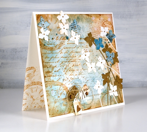
A friend commissioned me to make a ‘vintage’ themed card recently and I happily pulled out a bunch of Darkroom Door stamps to do so. You can see the pocket watch stamp managed to feature three times but the French script, global postmarks, and gerberas also contributed. I stamped, blended and painted with two brown tones of distress ink, two blues and a black. (all the supplies are listed below)
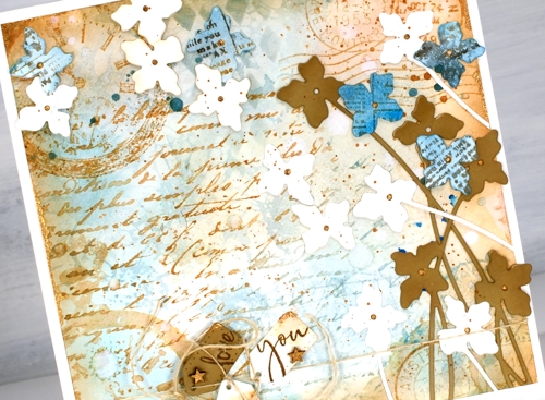
To begin I smooshed some speckled egg and antique linen distress inks on a glass mat, added water swiped the panel through the diluted ink. After that the gerbera background stamp became part of the base layer in speckled egg distress ink. I layered the other stamps over the top in tea dye and antique linen inks and blended some speckled egg ink through the DD diamonds stencil. Of course there is splatter, watermarks and extra blending to darken the edges. To add a dimensional feature I die cut several stems of flowers with the Penny Black ‘shall we dance’ die, some are from watercolour paper, some from tan cardstock and a few from paper painted with salty ocean ink and stamped with the DD gazette stamp.
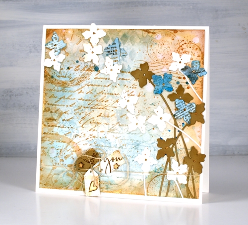
Almost finished, I added a strand of twine around the base and tied some tiny tags on with stamped PB sentiments on them and some little wooden stars I found. I was pretty happy with all this vintageness but decided to risk some gold paint. I splattered and added it to the tiny stars and heart, the flower centres. Where it worked best though was unevenly painted along the edges of the square panel. You probably can’t even see it clearly but it ended up being one of my favourite parts of the card.
By the way there are yummy new stamps on the Darkroom Door website. You will see them here soon, a few are winging their way here as you read this! Have a great day.
Supplies
(Compensated affiliate links used when possible)
Stamping is for the birds part 2
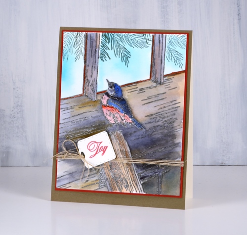
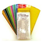
Posted: October 31, 2018 Filed under: A Bright Tomorrow, gift card pocket, Peerless watercolours, winter lookout | Tags: Peerless Transparent Watercolors, Penny Black creative dies, Penny Black stamps, Tsukineko Versafine inks 5 Comments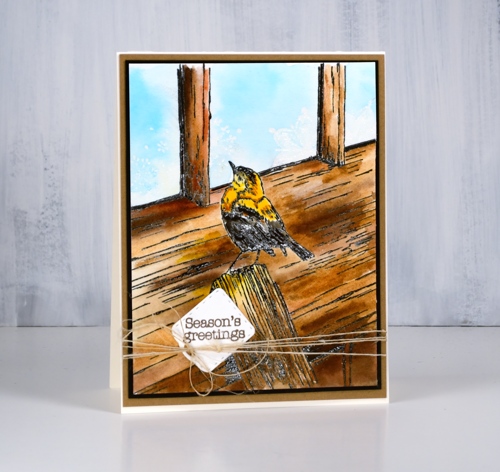
The second installment of my ‘stamping is for the birds‘ series features the Penny Black stamp ‘Winter lookout’ with a little bird on the outside looking in. I have seen a few other beautiful cards using this stamp and wish I had added a little foliage but there is always next time. Take a look at this gorgeous card by Susie Lessard.
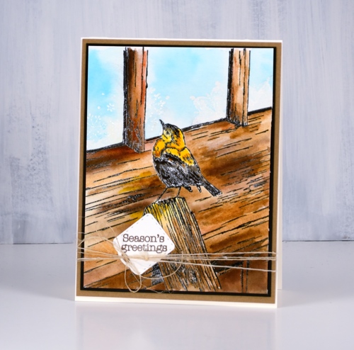
I stamped in versafine clair nocturne ink and embossed in clear powder then painted the bird and all the wood with my peerless watercolours. To create variation in the wood I painted with several browns and some warm mustard yellow as well. Once I had finished the woodwork I had to decide how I would do the window. I chose frosty patterns like we often get on our windows in winter so I used the delicate snowflake stamp from the PB set, ‘A bright tomorrow’ to emboss in clear powder. When I painted pale blue into the window area it resisted the snowflake shapes.
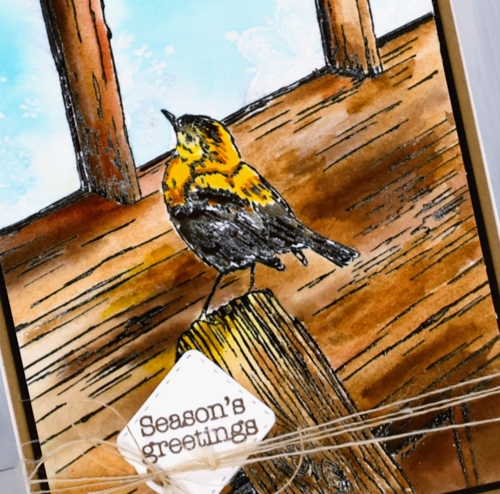
I tried a second colour scheme embossed in versafine smokey grey, featuring greys and blues and stamped some pine branches inside the windows as if garlands were hanging there.
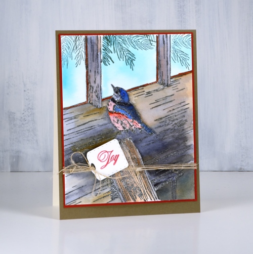
I finished both cards with co-ordinating mats and sentiments stamped on little tags from the ‘gift card pocket’ die set. I think I have only once made a gift card pocket but I often use the little tags and banner dies from the set. I added some finer details to both cards with black and brown markers once the painting was all finished as sometimes embossing does not preserve all the definition.
Supplies
Stamps: winter lookout, a bright tomorrow, festive snippets, joy of peace (PB)
Die: gift card pocket (PB)
Ink: versamark, nocturne versafine clair, morning mist versafine clair, northern pine memento

Paper: hot pressed watercolour, neenah cream, neenah black, kraft, red, olive green

Paint: peerless watercolours
Also: clear embossing powder, brown marker, black marker, twine
![]()
When a plan goes awry
Posted: October 17, 2018 Filed under: Christmas berries, dancing daisies, gift card pocket, winter branches | Tags: Penny Black creative dies, Penny Black stamps, Ranger Distress inks 10 Comments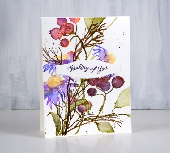
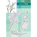
Today’s card was the result of a thought I had after making a Christmas themed card featuring the berries seen on this one. The Penny Black berry stamp is called ‘Christmas berries’ so it is hardly surprising that I made a Christmas card with them but I wanted to see if I could put them to use in a non-Christmas card too.
I started by stamping the dancing daisies in blue, purple, green and yellow (they were all distress inks and I will make a guess at them in the list below but once again I didn’t write them down). After stamping I blended the petals and leaves with water and a paint brush. I masked the daisies as I had saved masks from a previous project, stamped the berries in pinky, purply colours so they wouldn’t look Christmassy and blended again with water.
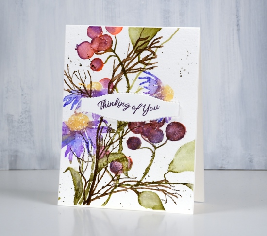
Finally I added some ‘winter branches’ in brown ink. This is where my plan started to unravel. I didn’t want to mask all those berries and flowers to put the winter branches in the background so I stamped them over the top and blended them with a paintbrush also. With the blending they became more prominent than I wanted; without the blending they looked badly stamped because I was working on textured cold pressed watercolour paper.
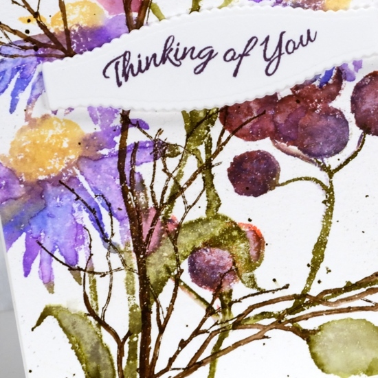
I finished off the panel with some dark brown splatter then moved onto another project undecided whether to turn this one into a card or not. When I came back to this panel later I decided to break up the dominance of the brown winter branches with a sentiment panel. I used a die from the gift card pocket set to cut a decorative shape from hot pressed watercolour paper and adhesive backed foam then stamped a sentiment from the banner sentiments set. I ended up liking the idea and the colours of this card but it’s not my best layout.
Supplies
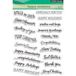
Stamps: dancing daisies, Christmas berries, winter branches, banner sentiments (all PB)
Inks: blueprint sketch, dusty concord, fossilized amber, forest moss, festive berries, gathered twigs distress inks & monarch versafine clair
Paper: cold pressed watercolour paper, hot pressed watercolour paper
Die: gift card pocket (PB)
Tools: adhesive backed foam, Misti