
Alcohol ink trio
Posted: January 15, 2019 Filed under: Alcohol Ink, Dragonfly Frame, Serenity | Tags: Penny Black creative dies, Ranger Alcohol Ink, Yupo Paper 11 Comments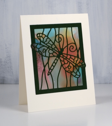
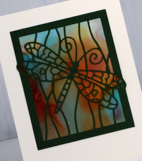
I created these alcohol ink panels months ago! They were the result of a primary colours experiment with pool (blue), raspberry (red) and honeycomb (yellow) alcohol inks and both heavy and light weight yupo paper. I restricted myself to the three colours to see what I could come up with and how they reacted with each other.
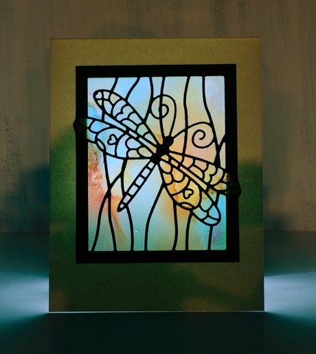
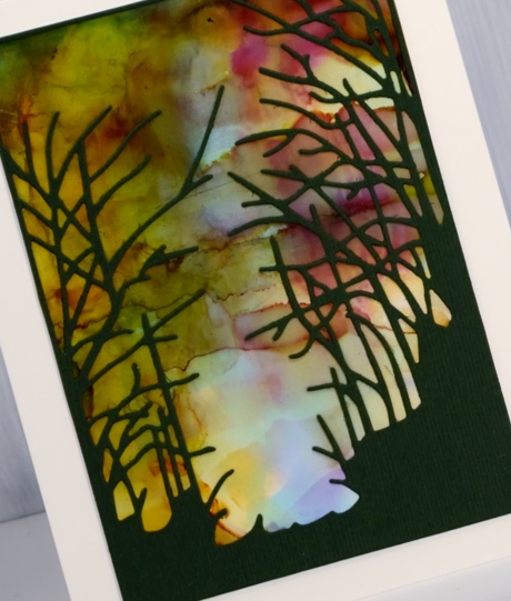
I was able to get very soft blends by adding rubbing alcohol and tilting the yupo around. This panel was done on light weight yupo which is translucent. When I held it up to the light the colours softened and looked like stained glass. I decided I had to cut the cardstock out behind the dragonfly ‘window’ so a light could be placed under the card to show off its soft blended colour. Not a real tealight mind you, remember this is paper crafting! I took a photo to give you an idea of the pretty stained glass effect you see with a soft light underneath.
The same colours appeared but with more lines by working the inks for longer. By that I mean that I kept adding and tilting and blending so there are more secondary and tertiary colours in the mix.
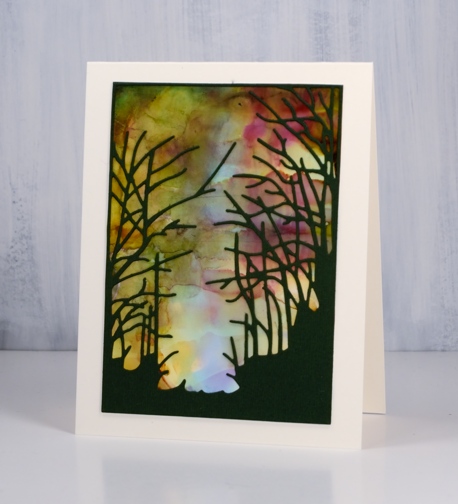
When it came to making the panels into cards I decided die cuts over the top was all I wanted to add. I used three Penny Black dies, dragonfly frame, serenity and heartfelt thanks. For all the cards I put double sided adhesive on the back of the green cardstock before die cutting the images and words.
In the final sample I was able to keep some of each ink colour distinct as well as each secondary colour (blue+yellow=green) (yellow+red=orange) (red+blue=purple). There is also a bit of brown which is is a tertiary colour made when a primary and a secondary mix.
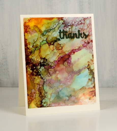
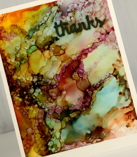
I created this panel by dropping the inks onto the yupo panel and letting them move and fill the space. When there was a good mix of colour patterning the whole area I switched to placing tiny drops of ink or rubbing alcohol onto the panel to create the bubble patterns. Each tiny drop expanded into a little circle or blob shape. The pattern looked very busy all on its own so I just added a small die cut word.
Supplies
Dies: serenity, dragonfly frame, heartfelt thanks (Penny Black)
Inks: pool, raspberry, honeycomb Ranger alcohol inks


Paper: yupo both light and heavy weight, neenah cream cardstock, green textured cardstock

![]()

Also: double sided adhesive, rubbing alcohol


Such effective cards, Heather. They’re lovely!
Beautiful! Thanks for the descriptions of your process.
Those backgrounds are amazing and I love the black die cuts with these backgrounds. I’ve never tried light weight Yupo paper. It looks like stained glass… which weight do you prefer in Yupo paper?
Thank you Regina.
I like working with the heavy weight yupo as it handles like cardstock and the inks move a bit more slowly than with the lightweight. If you want light to shine through as it did in my dragonfly card it has to be the lighter weight.
I love these backgrounds, alcohol ink on Yupo paper is just fantastic. The colours you have used along with the black die cuts make wonderful combinations, I love it xx
Thanks Hilary; I was really happy with all the colour variation I got from just three inks!
These cards using alcohol inks are all beautiful Heather and I adore the dragonfly and serenity black silhouette frames over the first two examples, and the third being a busier look is perfect with just the sentiment die. TFS. x
I love the three cards you posted with the alcohol inks! The inks are so fun to work with . Two of my granddaughters have made backgrounds for a lot of my cards by just playing with them. I hadn’t posted anything on my blog yet but just added it in case you would like to see it. )
Heather all your work with alcohol inks is stunning. I love the pairing with die cut frames and would never in a million years have thought of lighting behind the image, despite often thinking it looks like stained glass, it is beautiful. I also like the bubble effect in your last card..
Amazing backgrounds, Heather! The black die cuts are perfect to let the beautiful colors shine through!
Gorgeous backgrounds, I love the variety of looks you achieved! Love the light behind the butterfly card!