
A wilderness path
Posted: August 27, 2017 Filed under: Alcohol Ink, Brusho, Wilderness Vol.2 | Tags: Brusho, Darkroom Door stamps, distress oxide inks, Ranger Alcohol Ink 7 Comments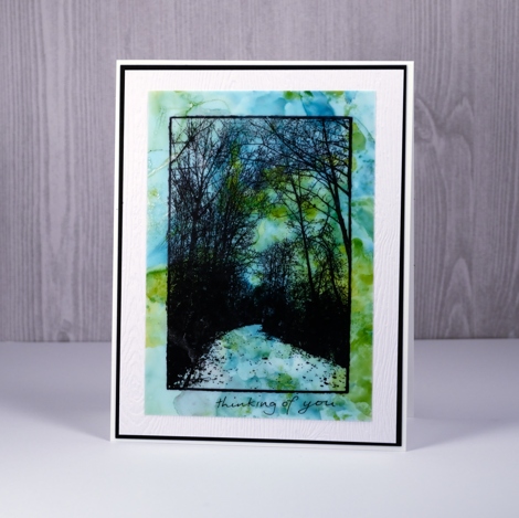
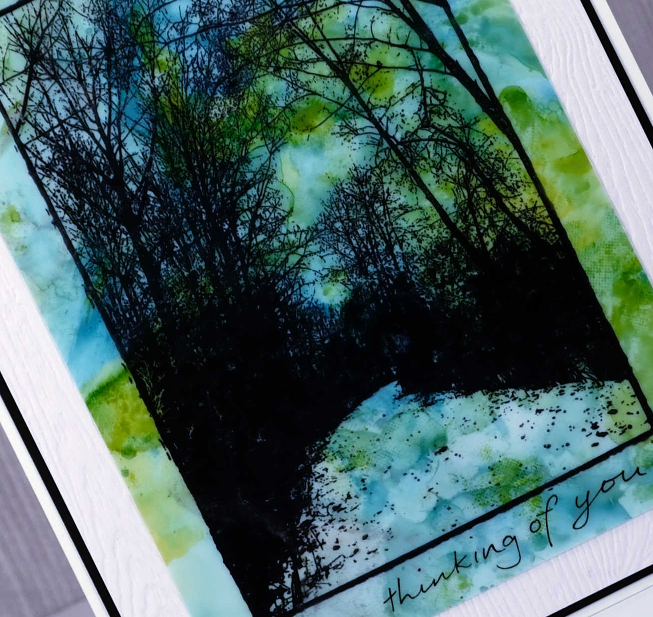
This peaceful wilderness path is a scenic stamp from Darkroom Door. I’ve used it in three different ways to create some seasonal backgrounds. For the card above I created an alcohol ink background on yupo in the blues and greens of summer. I stamped the path stamp over the alcohol ink panel in stazon jet black ink. I hand wrote the little sentiment with a fine micron pen.
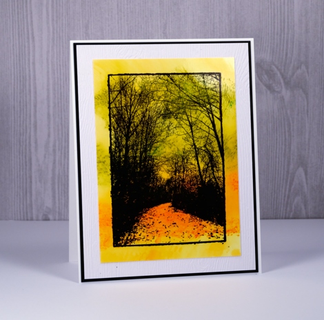
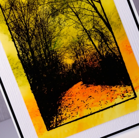
To create my golden fall scene I used distress oxide inks on glossy photo paper. I pressed the orange and yellow inks onto a craft mat, spritzed them and swiped my photo paper panel through the ink. Most of the colour soaked into the paper immediately but I set it aside to dry for a while and found there was a chalky residue that stayed on top. I wiped that off and was left with a background to which I stamped over with stazon jet black ink.
My chilly winter scene was created using brusho powders on a craft mat. I sprinkled some blue and purple on the mat, spritzed it then swiped some photo paper through the colour. The first print is usually quite intense so I think the one below must have been a second impression.
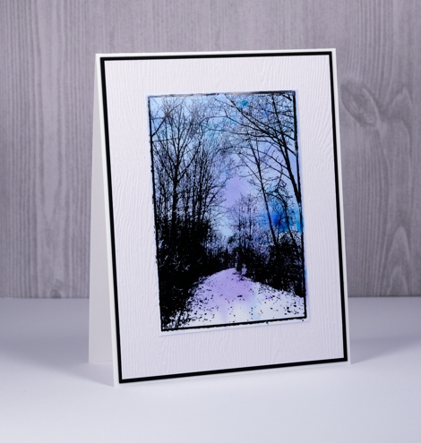
These cards are also on the Darkroom Door blog today so pop over there for all the complete supply list.
Ferns
Posted: July 20, 2017 Filed under: Alcohol Ink, CAS, Wilderness Vol.2 | Tags: Darkroom Door stamps, Ranger Alcohol Ink, Tsukineko Stazon inks, Tsukineko Versafine inks 5 Comments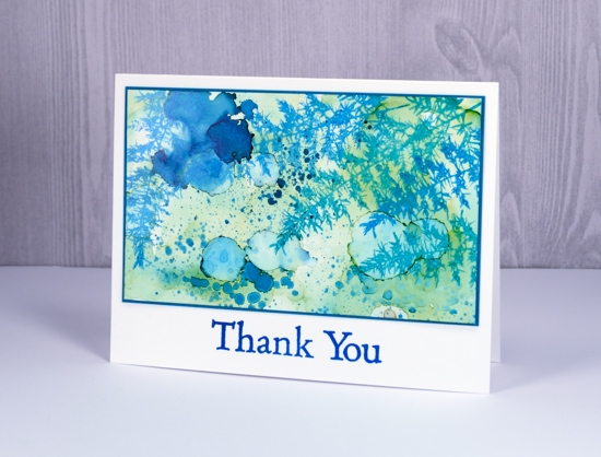
Here ends a week without internet at home! I think some internet free time is definitely a good thing but I’d rather it be planned than thrust upon me. One happy outcome is the stack of edited photos I have ready to slot into blog posts.
This one is an alcohol ink on yupo panel. The abstract panel has been sitting in my ‘pile of possibility’ for some time so I don’t remember which colours of ink I used. Just guessing though, I would say pool and juniper but I might be wrong about juniper. There’s a blue and a green for sure, possibly two blues. I used opaque yupo paper but it is still worthwhile to back it with white cardstock to keep the colours bright so I did that before matting it with teal.
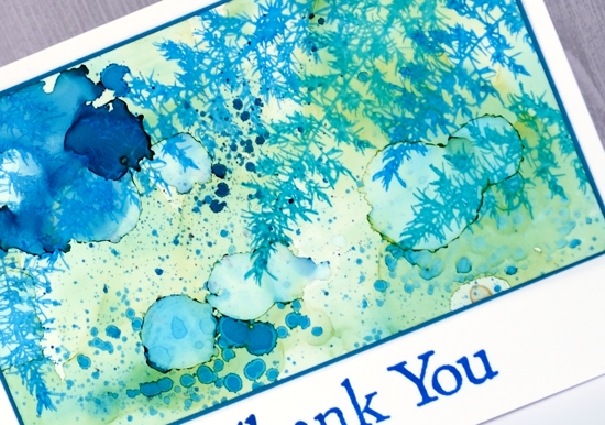
I stamped the fern from Darkroom Door’s Wilderness Vol 2 set. It is a lovely delicate image. I used stazon ink on the yupo and it spread ever so slightly but as you can see not enough to lose the fine detail of the stamp. At first I didn’t have a sentiment but the white space below the panel did look a bit empty so I added a simple thank you. Stamps and inks are linked below.
Supplies:
Stamps: wilderness vol 2, thank you (Darkroom Door)
Inks: pool & juniper alcohol inks (Ranger) blue Hawaii stazon, deep lagoon versafine (Tsukineko)
Papers: opaque yupo, neenah solar white cardstock, teal cardstock
Fern frond wedding card
Posted: August 16, 2011 Filed under: CAS, Wilderness Vol.2 16 CommentsAfter being a little experimental the other day I returned to the safety and comfort of masking and sponging. Sigh…that’s more like it.

We went to a beautiful wedding on Saturday where the bridesmaids wore purple and carried green and red flowers. I went with purple and green colour scheme for my card. I masked so I could sponged about a third of the card. I sponged with sage shadow, almost amethyst and elegant eggplant. Before removing the mask I stamped the fern a few times. With the mask off I stamped the fern again and added the sentiment.
Thank you for all the encouraging comments about my “experiment”. I appreciate you taking the time to write me a note.
Supplies:
Stamps: Wilderness Vol.2 (Darkroom Door), Teeny Tiny wishes(SU)
Inks: Sage Shadow, Almost Amethyst, Elegant Eggplant
Cardstock: Flourishes Classic Ivory
Sponged wooded path
Posted: August 9, 2011 Filed under: CAS, Wilderness Vol.2 9 Comments
This stamp is so lovely that it doesn’t really need me to add anything. I have used it once before with embossing and autumn colours so this time I tried the colours I see around at present and a little sponging outside the lines.
I spent most of the weekend at the National Youth Track & Field Championships volunteering and watching my daughter compete so I am now catching up on the inspiring cards that were posted over the weekend.
Supplies:
Stamps: Wilderness Vol.2 (Darkroom Door), Hugs & Wishes(SU)
Inks: Basic Black, Certainly Celery, Bashful Blue, Close to Cocoa
Cardstock: Flourishes Classic White
Fern frond fragments
Posted: May 31, 2011 Filed under: CAS, Wilderness Vol.2 10 Comments
This is the last of my fern frond cards for now. The next stamping task I have is some simple garden wedding invitations.
I did not set out to create three squares for this card; it just happened. I stamped the ferns across a piece of cardstock but there was nothing special about the arrangement. After punching out three fragments and adding the green and blue sponging I was much happier. Dividing the squares with the sentiment was also experimental but I like the way it turned out. As the sponging was applied after the squares were punched each one has a slightly dark border. Although I started out with a white card base, artichoke turned out to be the best choice as it created a border which highlighted the ferns and words.
I think this one might be my favourite out of the three fern cards I created recently.
Supplies:
Stamps: Wilderness Vol.2 (Darkroom Door), Teeny Tiny Wishes
Inks: Old Olive, Always Artichoke, Bashful Blue
Cardstock: Flourishes Classic White, Always Artichoke
Fern fronds
Posted: May 27, 2011 Filed under: CAS, Wilderness Vol.2 13 Comments
Here is another take on the fern frond. I have seen several lovely fern cards lately. Take a look at one by Godelieve here and one by Ali here.
I pulled out the old olive stamp pad for this one and used post-its to mask my rectangle. I embossed one fern in clear in the centre of my panel and then sponged all around it before adding few more ferns in old olive and artichoke. The “thankyou” was hand written.
Thanks for dropping by; I know my posts are a little sparse at present but I really appreciate your visits and your encouraging comments.
Supplies:
Stamps: Wilderness Vol.2 (Darkroom Door)
Inks: Old Olive, Always Artichoke, Versamark
Cardstock: Flourishes Classic White
A fern frond
Posted: May 23, 2011 Filed under: CAS, Wilderness Vol.2 7 Comments
Sorry about the false start yesterday, I guess I hit publish instead of save!?
I am enjoying working my way through my new stamps from Darkroom Door. Most recently I played around with the fern stamp from Wilderness Vol 2.
To create the stamped panel I applied ink to the stamp with markers, both wild wasabi and garden green. I stamped the fern three times, misting both the stamp and the stamped panel. After sponging around the edges I added the sentiment. I tried various options for mounting the panel on the card before settling on a green mat, a large white mat and a green card base. Although I often make one or two layer cards an extra layer can sometimes complete the card.
Supplies:
Stamps: Wilderness Vol.2 (Darkroom Door), Teeny Tiny Messages(SU)
Inks: Wild Wasabi, Garden Green
Cardstock: Flourishes Classic White, Wild Wasabi
Less is More: Embossing
Posted: May 14, 2011 Filed under: CAS, Stamped Landscapes, Wilderness Vol.2 43 Comments
When I first began browsing the Darkroom Door site, I kept coming back to this stamp. Images of trees are a favorite of mine and this scene of a wooded path is the type of scene I try to create with tree stamps.
This week’s challenge at Less is More is to emboss; I chose to heat emboss the woodland scene in black, then add some colour by sponging. I didn’t know if the detail of so many fine interwoven branches would work without detail embossing powder but I am very pleased with the result. Before sponging I masked the edges of the image.
I am looking forward to trying other colour schemes and techniques with this beautiful stamp.
Supplies:
Stamps: Wilderness Vol.2 (Darkroom Door), Teeny Tiny Messages(SU)
Inks: Versamark, Apricot Appeal, Pumpkin Pie, Summer Sun
Cardstock: Flourishes Classic Ivory
Also: black e.p.


