
Speaking my Language
Posted: June 19, 2018 Filed under: Bister, friend duo die, Nuvo shimmer powder, typewriter text | Tags: Bister, My Favorite Things, Nuvo shimmer powder 4 Comments
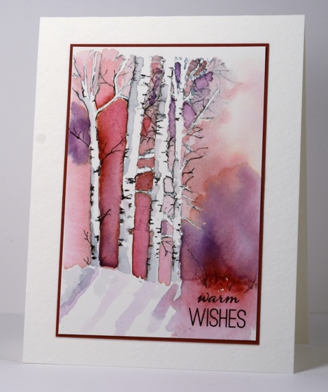
After the interest and kind comments expressed yesterday about the bister & emboss resist combo I thought I’d show you another done with the same ingredients. I embossed the typewriter text stamp on hot pressed watercolour paper and created two different looks with two brands of paint powder. The blue one features blue bister, like yesterday’s card and the tones are muted and earthy. The pink card features Nuvo cherry bomb shimmer powder and the tones are bright and sparkly.
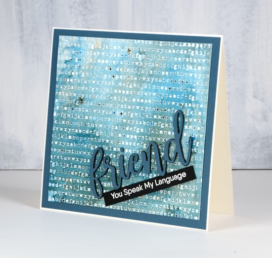
Once again the paint powders created a range of shades and pooled in different places trapped by the embossing. I thought it was particularly clever the way the letters trapped dark colour at times and white space at other times.
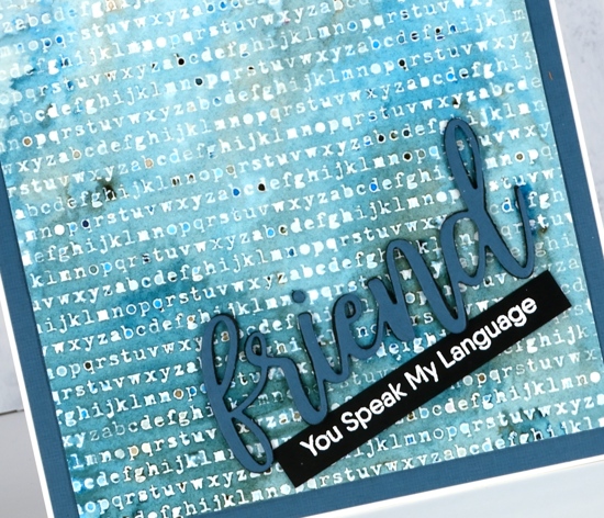
I cut the ‘friend’ die cut in blue card and black foam to make a stacked word then added the embossed sentiment strip underneath.
The pink card features the same steps but there is shimmer here and there over the panel. I also added sparkle to the die cut ‘friend’ by embossing the whole word with versamark and clear sparkle powder.

I doubt I will ever tire of playing with paint powders; the results are different every time!

Supplies
Stamps: Anything but basic friendship, typewriter text (MFT)


Dies: friend duo

Inks: versamark, versafine clair charming pink

Paints: blue bister, cherry bomb nuvo shimmer powder
Papers: hot pressed watercolour paper, Neenah solar white, Neenah natural, Neenah black, pink, blue


Also: clear sparkle embossing powder, white embossing powder (WOW), black foam
![]()


Happy Together
Posted: June 18, 2018 Filed under: Bister, Happy together, Tranquility | Tags: Bister, Penny Black stamps 19 Comments
I am quite happy with the way these little cacti turned out using only one colour of bister paint powder. Bister can create surprising results. I used blue bister powder on hot pressed watercolour paper over clear embossing.
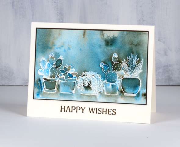
Bister paint powders have an earthy tone to them which you can see clearly on this panel. I sprinkled blue bister over the panel and spritzed with water until the paint activated. I tilted and turned the panel until the paint pooled in certain places. Where there was very little colour I used a paint brush to transfer some from a darker area. Once there was good coverage I let it dry partially then picked up some brown from the panel and painted shadows below each of the pots. I matted the panel in brown and added the sentiment in vintage sepia versafine ink.
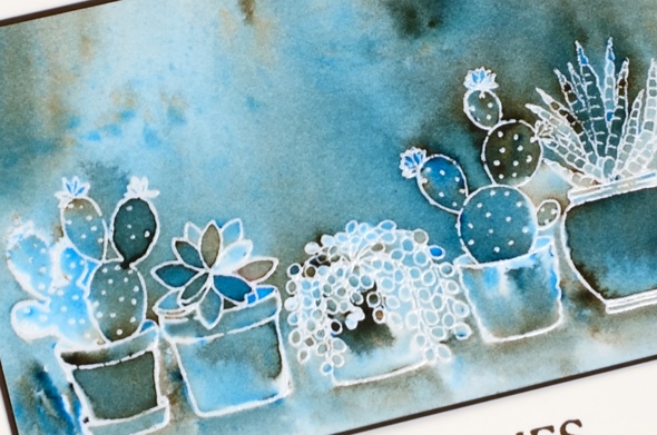
I thought it was very cool the way all those leaf shapes in the second from left cacti turned out different colours. This is why I love playing with paint powders.
Supplies
Stamps: happy together, tranquility


Paper: hot pressed watercolour, neenah natural white, brown
Inks: versamark, vintage sepia

Paint: blue bister (available in USA from ‘I Brake for Stamps’ and in Ottawa from ‘Crop A While’)
Also: clear embossing powder
![]()
Roses all over
Posted: January 30, 2018 Filed under: Bister, My Favorite Things, Roses all over, Shades | Tags: Bister, My Favorite Things, Penny Black creative dies 15 Comments
I pulled out my bister powders the other day; they were kind of pushed to the back of the watercolour shelf. They turned out to be a perfect match for this ‘roses all over’ stamp from My Favorite Things. Bister (and brusho and colorburst) does wonderful things when sprinkled over embossing because the powder gets trapped inside the ‘walls’ of embossing and keeps colours and shades separate. If you are not familiar with bister, you can read about it here. The colours are earthier than brusho and colorburst which is nice for a change.
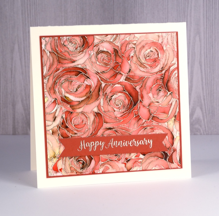
Believe it or not this panel is painted with just red bister; all that lovely variety is from one colour. I embossed the watercolour panel with platinum embossing powder then sprinkled the red bister over it and spritzed with water. I watched to see if sections were filling with colour before spritzing or sprinkling a second time. Once there was enough powder I used a paint brush in just a few places to blend or spread the colour. I did not have to do much with the brush because MAGIC.

I found a cardstock that co-ordinated to mat the panel and create a banner for the sentiment. The banner die is from the PB ‘shades’ set and the sentiment embossed in platinum is from the PB ‘banner sentiments’ set.
Thanks for dropping by.
Supplies
Stamps: roses all over (MFT), banner sentiments(PB)


Die: shades (PB)

Ink: versamark

Paint: bister powder red
Cardstock: hot pressed watercolour, neenah natural white, red cardstock


Also: platinum embossing powder

Burst of Bister
Posted: May 12, 2017 Filed under: Bister, CAS | Tags: Bister, Penny Black stamps, Tsukineko Versafine inks 8 Comments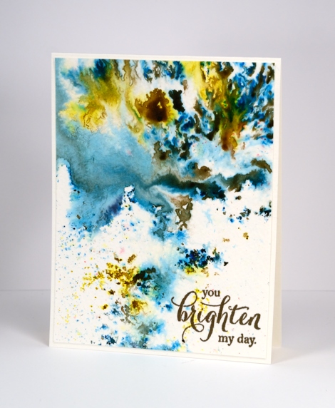
It’s been all about the colorburst and brusho powders with me lately so I thought it was past time to share the other watercolour powder in my life, bister. The concept is the same with bister; you add water and colour bursts out. The colours in the bister range are more earthy than the other brands and the crystals are, on the whole, coarser. The effects are just as magical as you can see on this panel.
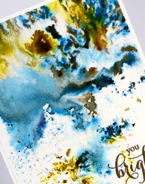
I think this panel is from my initial experimenting with watercolour powders. I really liked how the colours moved on the cold pressed watercolour paper but for a long time I didn’t have a plan for the abstract panel. Eventually I realised it didn’t need a plan; it was a stand alone! I added a sentiment and popped up the panel on foam to give it a ‘shadow frame’ and that is the card. This panel shows the versatility of watercolour powders quite well. By varying the amount of water added you can get small intensely coloured shapes which I think look a bit like mosaics, you can get soft washes and some patterning in between the two extremes.
Supplies
Stamps: special thoughts (Penny Black)
Paint: Bister paint powders
Ink: Versafine vintage sepia (Tsukineko)
Paper: cold pressed watercolour paper
My Favourites from 2015
Posted: December 30, 2015 Filed under: Bister, Brusho, Hand drawn, Hand lettered, Penny Black, Stamped Landscapes | Tags: Penny Black creative dies, Penny Black stamps 17 CommentsThank you for your response to the viewer’s top ten from 2015 and thank you for the encouragement to keep sharing here. I love reading your comments and visiting your blogs and I am hoping to respond to your comments more in the coming year because I enjoy the conversations that develop from time to time. Sometimes they are about techniques and products but often they are about memories, traditions and experiences. It is great getting to know you better.
I whittled my favourites down to 10 but there were a few more I wanted to include. The pink one I shared yesterday was a favourite but it already made one list! The cards included below are in the order I originally posted them and a click on the photo will take you to the original post.
This one is a favourite for what is happening in the background as well as the foreground.
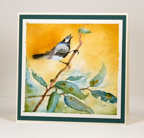
I used a die cut mask for this one and managed to make the leaves look like eucalyptus which of course reminded me of Australia.

I worked on this one in portrait orientation then once I was finished realised it looked better landscape.

I love Queen Anne’s Lace so it is not surprising to find some in my top 10.

This is just one of those watercolours that worked above and beyond my hopes and I will never manage to do the same again! My mother has grown roses this colour so that made it extra special.

A simple design and some bister made me happy. (and of course you can never have too many tree stamps!)
After I had created quite a few bister cards I borrowed some brusho and the love affair with watercolour powders continued. “Finding” a garden in a random pattern of brusho was so very satisfying.

One of my goals this year was to paint more from scratch. I felt like I had not done much but when I looked through this year’s posts I saw some that were entirely my own design, like the one above, as well as some where I combined some stamping with some hand painting as in the one below.
My recent series ‘Stamping the stories’ struck a chord with many of you and I enjoyed the conversations it generated about favourite stories.
I only just posted this one but it is definitely a favourite. I will be doing more with this vintage colour scheme and hand lettering in 2016 so stay tuned.
Thanks for indulging me as I shared some of my favourites. They certainly represent some of the techniques and products I have enjoyed this year as well as some of the subjects I love to include in my projects.
2015 top ten
Posted: December 29, 2015 Filed under: Bister, Penny Black, Stamped Landscapes, Watercolour | Tags: Penny Black creative dies, Penny Black stamps 28 Comments
Of the 170 posts I have written this year, here are the ten that were viewed the most. I guess you could call this ‘the viewers’ choice’ post. If you click on the photos you can get to the original post with all the nitty gritty details.
Of course the most recent posts don’t really stand a chance under these terms but that is way ‘best of 2015’ lists go.
The card above is from a video tutorial, one of only two I made this year! I’m sorry; you deserved more.
The one above performed surprisingly well considering it is one of my ‘loose and messy’ ones; sometimes I wonder if other people don’t like them quite as much as I do.
Another ‘messy’ one which I was quite excited about because it was one of my early bister experiments. It was the only 2015 Christmas card to make the top 10.
I love this one, not sure if I managed to part with it. If I did that person should know they’re pretty special.
This one is a classic example of ‘using a sentiment to cover up a mess’!

The ‘stacked die’ technique made from the same panel featured in the card at the top of this post.
One of my carefully painted ‘not messy at all’ poppy cards.
Last but not least, my older daughter’s birthday card, another blue bister creation. There are 4 blue cards, 3 pink cards, 2 orange cards and 1 green card, which may mean my readers like blue and pink as much as I do!
Thank you for your feedback through viewing and commenting during 2015. You, my readers, mean a lot to me; it is a delight and a privilege to share my creating with such an appreciative audience. I will be back with my favourite creations from 2015.
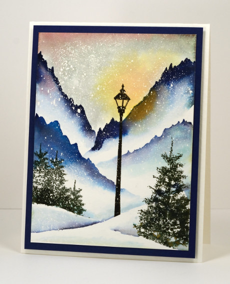
Bister landscape
Posted: November 2, 2015 Filed under: Bister, In the winter | Tags: Bister, Penny Black creative dies 11 Comments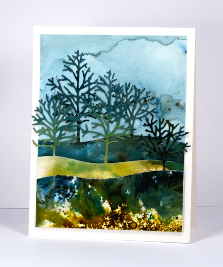
If your creating goes anything like mine you probably end up with multiple experiments scattered across your work space. After playing with bister, the green, blue and yellow powders in particular, I ended up with three extra panels, some dark, some light. The patterns and colours just called out to be made into a landscape using the new triple tree die from Penny Black. The die is called ‘in the winter’ but I know it is going to be handy all year round. I die cut the same hillside of trees from each panel then snipped off the trees I didn’t need so I could have the distant trees peeping out between the mid ground trees. I painted a new panel for the sky using just blue bister which I diluted so the trees would stand out against it.
Now that I have used up those stray scraps of bistered beauty; it’s time to play with some brusho. Stay tuned.
Supplies:
Dies: In the winter (PB)
Inks: Bister
Cardstock: Hot & Cold Pressed Canson
Warm toned leaves
Posted: October 16, 2015 Filed under: Bister, Lush & Lavish | Tags: Bister, Fabriano Watercolour Paper, Penny Black creative dies, Penny Black stamps, Ranger Distress stains 4 Comments
Here are the warm toned leaves I promised in contrast to the cool toned ones I posted a few days ago. Ottawa is enjoying fabulous colours this year; the yellows appeared first but now the orange and reds have joined in and they really are amazing.
Today’s loose and somewhat messy card reminds me of a leaf pile; we have had some pretty impressive ones over the years. Once again I created my panel in a couple of layers, starting with some orange toned leaves stamped onto wet watercolour paper. The leaf images bled in all directions creating the blurry shapes you see in the background. When they were dry I stamped with reds and browns and used a brush to fill in the leaves. I also sprinkled brown bister which ended up separating into black and brown with a few red and blue spots as well. When it was all dry I splattered some gold dots over the panel with a wink of luna pen. To complete the card I cut the ‘thank you’ sentiment out of both the panel and a piece of red cardstock so I could do an inlay to match the mat.
Are you raking leaves or have you yet to start like us?
Supplies
Stamps: Lush & Lavish (Penny Black)
Dies: Stylish Gratitude (Penny Black)
Inks: Rusty Hinge, Mustard Seed, Spiced Marmalade, Barn Door distress stains (Ranger)
Cardstock:Fabriano hot pressed 100% cotton hot pressed watercolour paper
Also: Gold wink of luna pen, brown bister powder
Cool tone leaves
Posted: October 13, 2015 Filed under: Bister, Filigree Foliage | Tags: Bister, Fabriano Watercolour Paper, Tsukineko Memento inks 10 Comments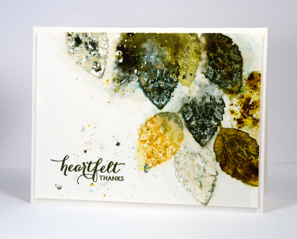
As you can see I haven’t put away the Filigree Foliage set. This time I didn’t paint out the filigree pattern as I have on previous cards; I kept it for a more decorative look. These colours reflect what is in my yard right now. There are plenty of yellow leaves floating down but the deep red ones are holding back.
I created this panel in layers starting by wetting the paper and stamping a few green leaves which then blended into the background laying down colour without leaving distinct shapes. When that had dried a little I stamped again in greens and mustard, spritzed some more water and also sprinkled some bister powder. Finally I stamped with water to create a few very pale impressions which picked up some of the bister lying around. I realise some of my stamped images are incomplete, some are distinct, others are blurred which is not everyone’s preference. I like to let the water and inks bleed and blend a little for some unique effects.
I’ll be back soon with some warm toned leaves. Thanks for dropping by.
Supplies
Fall trees with bister
Posted: September 28, 2015 Filed under: Bister, Twinkling | Tags: Bister, Penny Black stamps 8 Comments
Watercolour powders seem to be a perfect medium to use for fall scenes. The colours move and blend in similar ways to the colours on an autumn leaf. To create this scene I stamped the trunk and branches before I started on the leaves. I used two brown markers for the trunks and branches avoiding the circles on the stamp as much as possible. Next I cleaned the stamp and painted water onto the circles of the stamp and stamped again. It is not really necessary to use the stamp to apply water around the branches you could just add drops of water to your panel with a paintbrush. With the water drops sitting on the panel I sprinkled yellow and red bister powder over the water and watched the colours activate. To achieve the amount of blended colour desired I added a little powder or water here and there until I was happy. I blended some areas with a brush and let other parts stay relatively sharp and unblended. To finish I painted the blue sky with tumbled glass distress stain then matted both the panel and a sentiment and attached to a natural coloured card base.
I have filmed a periscope of this technique. It is available here on replay.
Supplies:
Stamps: Twinkling, Amazing (PB)
Inks: Distress gathered twig, ground espresso distress markers, tumbled glass distress stain (Ranger)
Cardstock: Canson 100% cotton cold pressed watercolour paper, burgandy cardstock, Neenah natural white
Also: yellow & red Bister powder


