
Orange blooms
Posted: August 4, 2015 Filed under: CAS, Promenade, Softly | Tags: Penny Black stamps, Penny Black stencils, Ranger Distress stains 20 Comments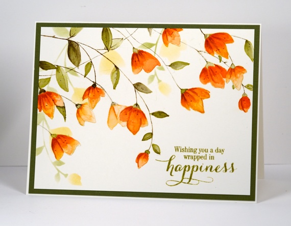
When I set out to create this card I knew I had stamped a similar layout with this stamp before but it wasn’t until the card was completed and I looked at the earlier card that I realised just how how similar! This one has a wee bit more going on and was painted with distress stains not watercolour pencils. I began by stamping the large ‘Softly’ stamp a couple of times. Each time I inked it I wiped off some of the antique linen ink so the two imprints would not interfere with each other too much. The antique linen ink is pale so I was able to paint inside the lines and have them disappear into the darker oranges and greens.
I had to repeat my mantra (walk away, just walk away) periodically through the making of this card because I was trying to follow the steps shown on this photo tutorial. I painted all the petals with a diluted wash of ‘dried marigold’ distress stain first. After it dried I added another layer keeping the colour undiluted. Once that dried I painted some darker areas with ‘spiced marmalade’, let it dry then finally added some ‘rusty hinge’. ( I have just discovered what a warm brown rusty hinge is; it works well with orange tones). After waiting once again for it to dry I added some details with the spiced marmalade and rusty hinge markers. I stuck with just ‘forest moss’ stain for the leaves but began by diluting for the first wash then increasing the intensity as I added shading.
When all the painting was finished I used the co-ordinating stencil ‘Promenade’ to sponge some background flowers before adding a sentiment and a green mat. This card is a little bigger than A2 (6.25″x4.75″) so I will need to hunt through my envelope supply to find a match.
Thank you so much for dropping by and for your kind comments. I have been interested to read about your opinions and experiences with the different watercolour powders I have been featuring.
Supplies:
Stamps: Softly, Sprinkles & Smiles (PB)
Stencils: Promenade (PB)
Inks: Spanish Moss Versafine (Tsukineko) Spiced Marmalade, Dried Marigold, Forest Moss, Rusty Hinge, Antique Linen distress products (Ranger)
Paper: Canson 100% cotton hot pressed watercolour paper, Green textured cardstock


Ooh, Heather! This is gorgeous! I love the colors, and your coloring with the Distress Inks turned out beautifully! I always love your simple layouts with the perfect matting. Shows the artwork off so richly! Hugs, sweet friend, and thanks for always inspiring me!
Beautiful card!!!!
So beautiful, Heather! I love the soft shadows behind the gorgeous blooms!
I really love this card. I have the stamp and I doubt I’ll be able to come up with something so beautiful, but I’m going to give it a try. Your cards are always an inspiration!
gorgeous card Heather – i think i like it better than your first one.
I absolutely love this card! It is a beautiful stamp and I love the colours you used! They’re perfect. I am going out to buty the supplies to try this ASAP!
Sent from Samsung tablet
Just gorgeous. Definitely invokes the feeling “happiness”.
Oh Heather, this is gorgeous! The stamping and colouring, paired with the soft stencilling is heavenly. LOVE it! x
What a lovely card Heather, its so clean and fresh. Must get the stamp. Thanks for all the brilliant card ideas.
I love the colours and soft look of some flowers – so pretty. Sentiment sets it all of a treat.
Love,love,love it !
After taking a quick look at the tutorial you referenced, walking away several times is definitely an important part of the success, I think! The finished card is beautiful.
STUNNINGLY…and different even tho’ somewhat the same as your earlier card…love them both!!! I have not been very successful with my Bister and Color Brust experiments….would appreciate a step by step video as I really don’t know what I am doing wrong – LOL!
Thanks for sharing,
Jan
Bister and color burst are unpredictable which makes them a bit hard to work with I admit. This card was painted with distress stains so I had way more control! I will try and get a bister tutorial done some time soon. Thanks for your kind comment.
Hello Heather, this is the first time I have seen your work. Wow, this is STUNNING!! Love love the colours in fact love everything about it. So professional. Glenis (Australia)
Another beautiful card. Your coloring is gorgeous. If only I could duplicate it!
Wow!! Stunning Heather!
Stunning!!
This is so beautiful.
I found a page online with multiple versions of cards made using this stamp. In seeing this card, I immediately said “that looks like a Heather Telford” and, sure enough….it was ! You have such talent; and and eye for color and style like no one else. I’m a huge fan.