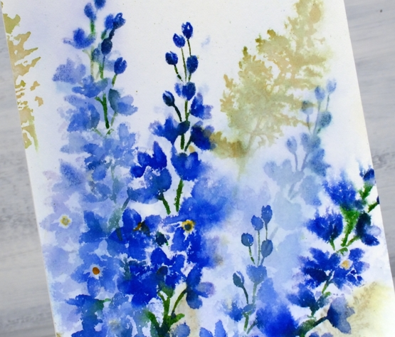
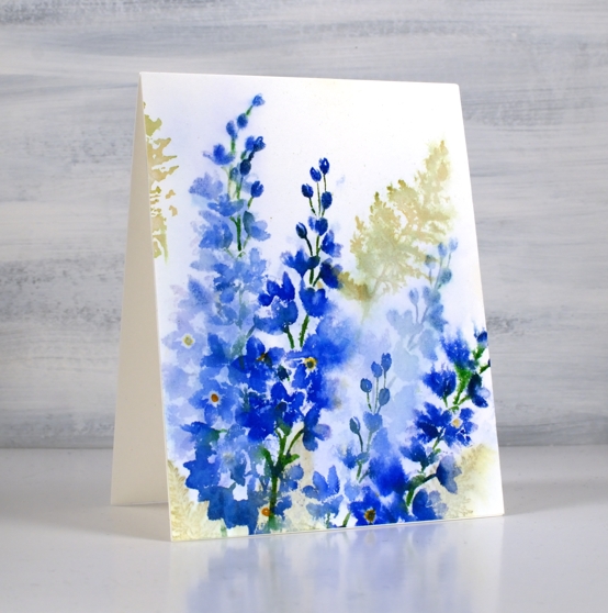
Autumn Bouquet
Posted: September 17, 2021 Filed under: autumn bouquet, fragile branches, fresh ferns, Penny Black | Tags: Fabriano Watercolour Paper, Penny Black stamps, Ranger Distress inks 12 Comments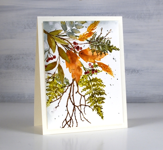
Are the leaves changing where you are? I noticed this morning a few patches of colour on the predominately green trees. The mornings are quite fresh too and the sunsets are amazing. Today’s card features a new Penny Black stamp ‘autumn bouquet’ teamed up with a couple of favourite filler stamps, ‘fresh fern’ and ‘fragile beauty’.
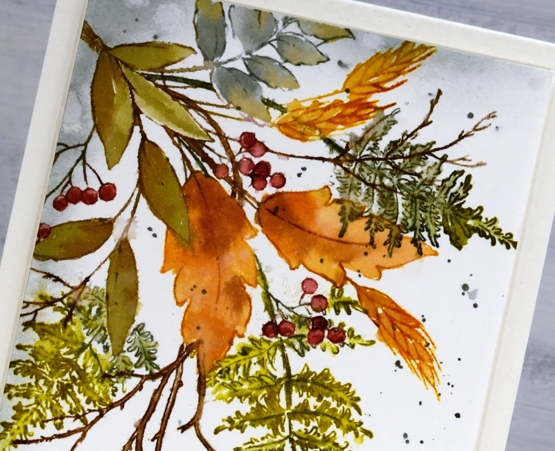
I kept the autumn bouquet stamp in the positioner so I could stamp each element one at a time. There are three types of leaves plus the wheat and the berries. All were done with a combination of inks. Often I ink the image using markers then smoosh the corresponding ink pad on my glass mat to give me ink for painting inside the stamped image.
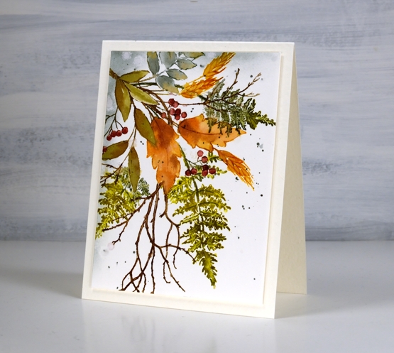
I used partial stamping to add the fern fronds and twigs. I usually ink the bit furtherest from the existing stamping then fill more in each time I stamp so as to avoid stamping over the top of other elements. This is because I am often too lazy to mask the stamping I’ve already done.
After painting and blending inside all the stamped images I used blending brushes to add iced spruce to two edges and splattered some over the panel. I trimmed and popped up the panel on a white luxe card base.
Have a wonderful weekend, thanks for dropping by.
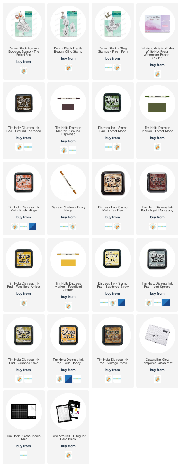
Supplies
(Compensated affiliate links used when possible)
Lilac & Fern
Posted: May 12, 2021 Filed under: fresh ferns, Karin brushmarkers, lovely lilacs, Penny Black | Tags: Fabriano Watercolour Paper, Karin brushmarkers, Penny Black stamps, Ranger Distress inks 10 Comments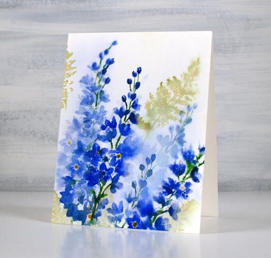
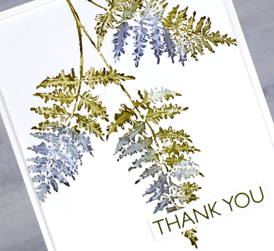
I don’t think I am alone in calling this stamp set a favourite. The two lilac stalks are pretty alone but with a sprig or two of fern they are delightful. I stamped this panel a while ago so the exact process is no longer firm in my memory but I do remember a crucial step which I will share with you.
I inked then stamped the lilacs with a mix of distress inks and Karin markers and the ferns with peeled paint distress ink. It looked ok but not the soft blended bunch I was after. I did like the combo of lilacs and ferns though so I thought I would dilute it all and see what happened. I didn’t spritz it; I drowned it. I dipped the whole panel in a bucket of water (the laundry is right beside my workroom) and watched a lot but not all of the colour drain away. The brightness of the peeled paint ink washed out but the olive stain remained. The lilacs washed out to a paler version of themselves and it was rather nice.
I re-inked the lilac stamps with the royal blue, lush green, henna and gold markers and stamped darker more distinct lilacs over the top. I have a friend who has had many successes with what she calls the ‘drowning’ method. It’s worth a try if your panel is not going in quite the direction you wanted; what have you got to lose? It’s only paper!
Although it is not quite ready yet my new online class, Floral Faves, is getting closer every day and I will be teaching techniques using your floral stamps to create card sized art works like the one above. I can’t wait to open the class and of course I will let you know as soon as it happens. Stay tuned!
Supplies
(Compensated affiliate links used when possible)
Fern and floral art journal page
Posted: March 5, 2021 Filed under: Art Journal, fresh ferns, garden variety, Penny Black | Tags: Art Journal, Fabriano art journal, Penny Black creative dies, Penny Black stamps, Tsukineko Memento inks, Tsukineko Versafine inks 8 Comments
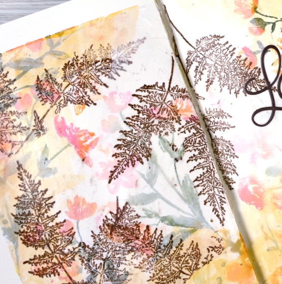
Recently when I was making a card with the new Penny Black stamps, ‘garden variety’ and ‘fresh fern’ I also began an art journal page. I really need to be braver with my art journal, I tend to reach for the same mediums that I use all the time in my cards. Today’s journal page was not particularly adventurous but I did pull out my box of pastes, gels and mixed mediums only to find several of them had dried up completely in their containers while others that used to be thick had turned to liquid. Those ones got tossed but a jar of distress collage medium came in handy along with some modelling paste. I think they might have both done the same job in the end.
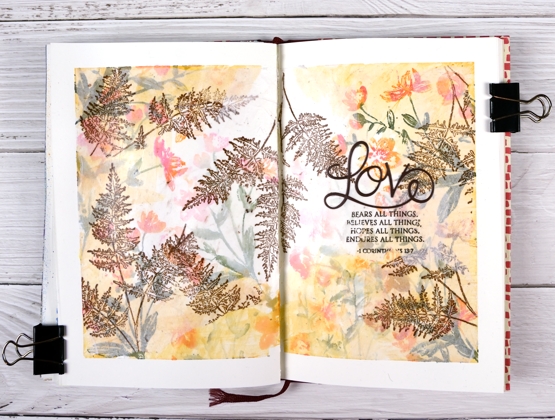
I’m still working in my Fabriano art journals made up of drawing paper so I’m trying not to rely on my watercolour habits and techniques. I began as usual by taping the edges of the pages both to keep the book open and to create an attractive frame.
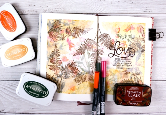
I inked the garden variety stamp with tangelo, northern pine and rosebud memento inks, spritzed it and stamped on the pages multiple times. I did first and second generation stamping to get both bold and pale prints. Then, feeling all brave and mixed media-ish I coloured some modelling paste with peanut brittle memento ink and applied it around the edges with a little plastic applicator (an old bank/library card would do). This step didn’t really yield the results I wanted but it was all in the spirit of experimentation so on I went.

I hadn’t used tissue paper in a while so I scrounged through our wrapping paper box and found some white, stamped the fresh fern in rich cocoa memento ink then tore it into sections before gluing it on the journal pages with collage medium. The tissue became almost transparent which gave the flowers behind a soft pearly look. I stamped the verse from 1 Corinthians on tissue too and glued it down in the same way replacing the first word, ‘love’ with a die cut.

I would love to know if you have an art journaller you admire. I am a big fan of Vicky Papaioannou and have watched many if not all her art journaling videos. I am interested to know what gels, pastes and mediums people use for what purposes. Which are best for resist effects, which are great for gluing, etc. Please share any recommendations you have.
Supplies
(Compensated affiliate links used when possible)
Ferns on ferns
Posted: March 2, 2021 Filed under: fresh ferns, Penny Black | Tags: Penny Black stamps, Ranger Distress inks 12 Comments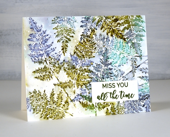
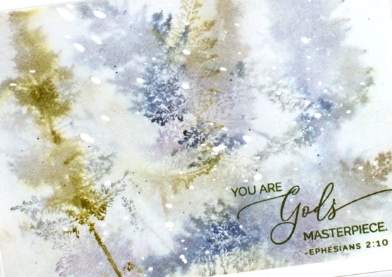
After I had added some ferns to a recent floral card I knew the PB ‘fresh fern’ stamp wanted to be the star of its own card. I started by making this card and just kept on playing with the fern stamp and a variety of blue and green inks.
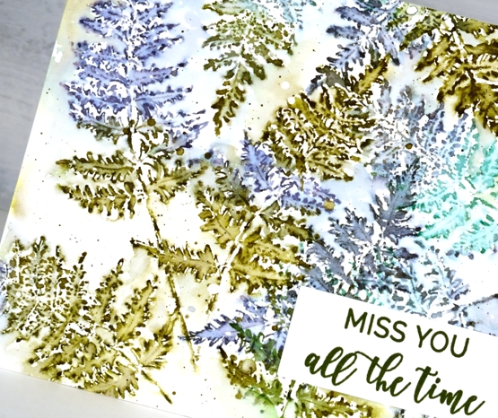
On the card above I stamped with forest moss, chipped sapphire and lucky clover then blended inside the fronds with a fine tip paintbrush and water. I overlapped some of the ferns and added some diluted ink around the ferns once I’d filled the panel. This one is finished with a sentiment from PB ‘family sentiments.’
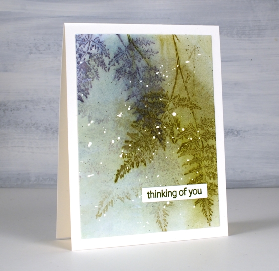
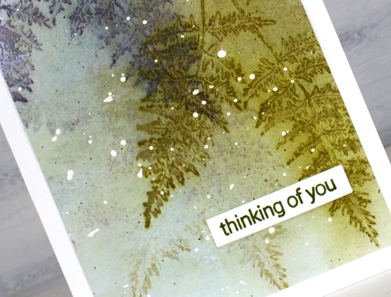
I think this second card is my favourite; I know it is very diluted and abstract but the glimpses of fern appeal to me even more than whole fern images. I stuck with forest moss and chipped sapphire because they are always winners and added iced spruce. I stamped on partly wet watercolour paper and dabbed the stamping dry before repeating the process.
The hot pressed watercolour panel had masking fluid splattered on it before I started so that’s why there are white dots here and there. I finished this one off with a stamp from the PB ‘inspirational sentiments’ set.
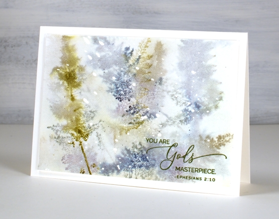
I added even more water to this next panel. As with the previous one I had masking fluid dots on the watercolour paper and worked with chipped sapphire, forest moss and stormy sky ink. After each print I painted water over the whole panel which spread some ink over the background and left some staining the paper. On the last two prints I didn’t blend with a paint brush so the ferns just softened on the damp paper.
I finished this one off by stamping the sentiment from PB ‘pansy gaze’ in versafine clair shady lane ink. After completing this one I thought I should stop diluting everything and stay inside the lines, just to see how it looked.
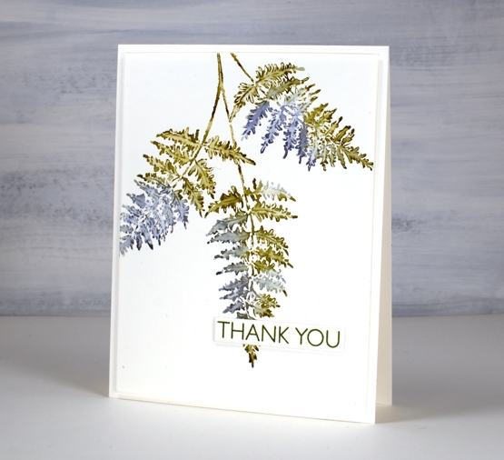
Same three inks and a size 0 paintbrush were all I needed for this very clean print of the ‘fresh fern. I popped a sentiment from PB ‘million thanks’ up over the tip of the fern and kept it all very simple.
So tell me, which one suits you? Blended and blurry or crisp and clean?
Supplies
(Compensated affiliate links used when possible)
Garden Variety
Posted: February 24, 2021 Filed under: fresh ferns, garden variety, Penny Black, Uncategorized | Tags: distress markers, Penny Black stamps, Ranger Distress inks 7 Comments
I’m enjoying having new flowers to arrange, stamp-wise, that is. Penny Black’s new ‘Daydream collection has some lovely floral stamps including the ‘garden variety’ I’ve used for today’s card alongside ‘fresh fern’, another new one. I used distress inks and markers to ink the stamps; I generally pick at least two colours for the flowers and two colours for the foliage then give the stamp a spritz so the inks begin to blend.
Once I’ve stamped the images I decide whether to blend further with a paint brush and water, for this card I kept it minimal but sometimes I do more blending for a looser watery look. I stamped the ferns after the flowers which required some partial stamping and as well as a little masking to make the ferns appear to be behind.
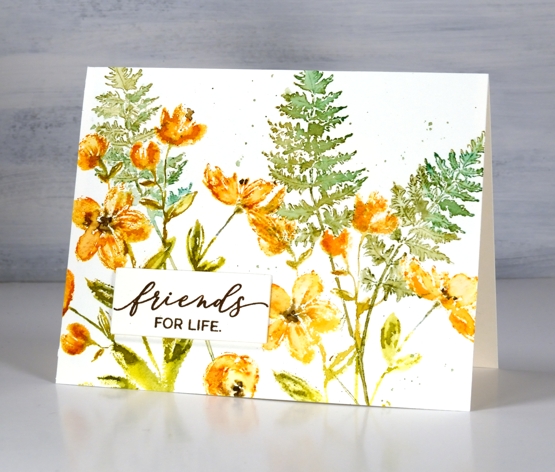
I finished the panel off with splatter then stamped a sentiment and stacked it up on three layers. I have an art journal page in process with the ‘garden variety’ stamp which I will hopefully finish and share with you next week.
Have a great day; thanks for spending some of it here on the blog with me.
Supplies
(Compensated affiliate links used when possible)