
Ferns on ferns
Posted: March 2, 2021 Filed under: fresh ferns, Penny Black | Tags: Penny Black stamps, Ranger Distress inks 12 Comments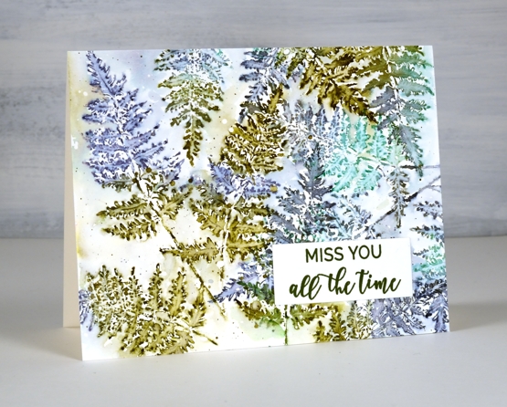
After I had added some ferns to a recent floral card I knew the PB ‘fresh fern’ stamp wanted to be the star of its own card. I started by making this card and just kept on playing with the fern stamp and a variety of blue and green inks.
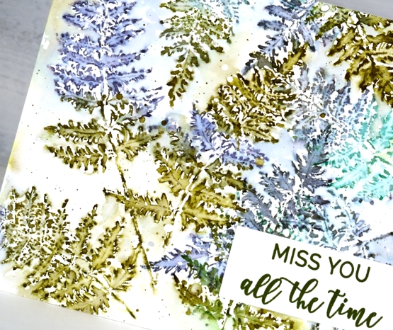
On the card above I stamped with forest moss, chipped sapphire and lucky clover then blended inside the fronds with a fine tip paintbrush and water. I overlapped some of the ferns and added some diluted ink around the ferns once I’d filled the panel. This one is finished with a sentiment from PB ‘family sentiments.’
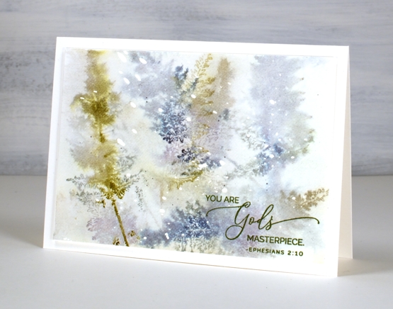
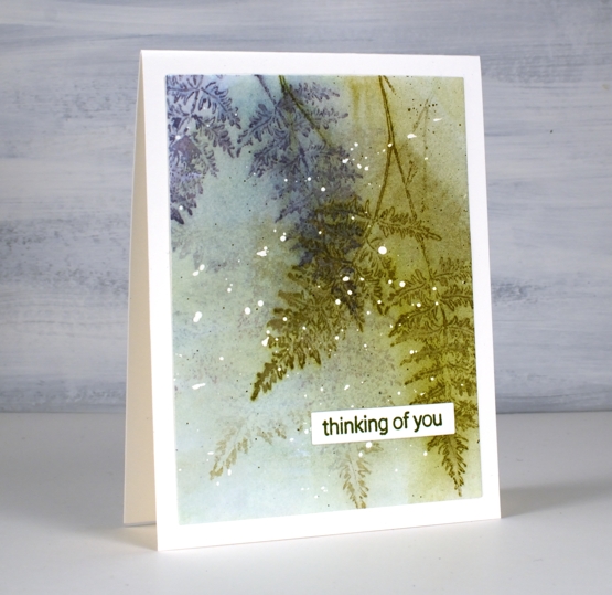
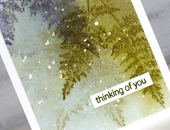
I think this second card is my favourite; I know it is very diluted and abstract but the glimpses of fern appeal to me even more than whole fern images. I stuck with forest moss and chipped sapphire because they are always winners and added iced spruce. I stamped on partly wet watercolour paper and dabbed the stamping dry before repeating the process.
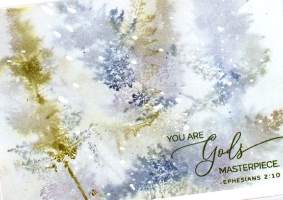
The hot pressed watercolour panel had masking fluid splattered on it before I started so that’s why there are white dots here and there. I finished this one off with a stamp from the PB ‘inspirational sentiments’ set.
I added even more water to this next panel. As with the previous one I had masking fluid dots on the watercolour paper and worked with chipped sapphire, forest moss and stormy sky ink. After each print I painted water over the whole panel which spread some ink over the background and left some staining the paper. On the last two prints I didn’t blend with a paint brush so the ferns just softened on the damp paper.
I finished this one off by stamping the sentiment from PB ‘pansy gaze’ in versafine clair shady lane ink. After completing this one I thought I should stop diluting everything and stay inside the lines, just to see how it looked.
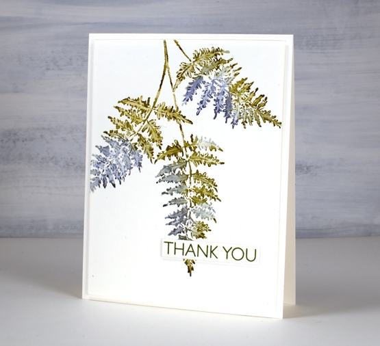
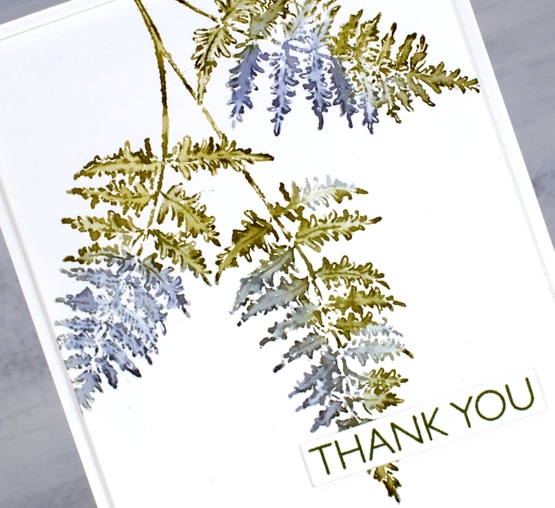
Same three inks and a size 0 paintbrush were all I needed for this very clean print of the ‘fresh fern. I popped a sentiment from PB ‘million thanks’ up over the tip of the fern and kept it all very simple.
So tell me, which one suits you? Blended and blurry or crisp and clean?
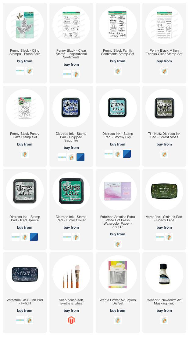
Supplies
(Compensated affiliate links used when possible)


love your ferns here in BC we have so many.Take care Colleen
I like the third one the best with the ferns hanging down! The blurry one is my second favorite.
There is something about these ferns that is so so organic and appealing and I love the loose look and the crisp and clean equally as well Heather and the colours are beautiful and the added turquoise colour you used as part of the mix on the first is gorgeous on the first, which you didn’t use on the others, and the very washy with just a hint of the fern in parts looks wonderful too, and then the very washy background but definite form to the ferns is different again on the third, and lastly the very straightforward clean and crisp outlines with beautiful colouring on the last. You see I really find it difficult to choose…lol. x
Thank you, Pat for your lovely message; I’m so glad you enjoyed features of all the ‘looks’!
I ordered this fern when I saw it in the Release because I KNEW YOU would do something wonderful with it! ☺ I love the clean and crispy one AND the ethereal, blended one; they are ALL gorgeous! I don’t have it yet but can’t wait to play with colours and composition. Thanks for all the inspiration! ♥♥♥
Hi Clelie, I’m so happy you’ve got this stamp coming soon. I think I will use it often as a filler but also as I did today as the main event. I hope you have fun with it.
Each of these is just gorgeous! But your water colored ones stole my heart. I need to be not intimidated when I try that. Yours is incredible! I may have to have that fern!
These are fabulous, I love the 2nd and the last the most, it is a tie between those two for my favorites!
All the versions using the Fresh Fern stamp are GORGEOUS, Heather. I love the colours you used. Would not have thought to put these together, but they are amazing! My favourite is the second one. I love the soft, etheral look. And I love the last one which is clean and simple … a style I LOVE. 🙂
I’m so excited to try this! I LOVE it!!!
As soon as I saw these gorgeous cards, Heather, I just had to order the fern stamp immediately! Blended or crisp and clear, I love them all, especially with the colours you’ve used. Simply beautiful!
To me it’s defenitly the blurred one.
I saw your work on FB and had to see how you made it and what you used for the cards, so here I am 😁.
Thanks for the explanation, maybe I will give it a try.
The colours for this work are great!
😍