
Blushing blooms
Posted: September 16, 2019 Filed under: blushing, blushing cut out, Peerless watercolours, Penny Black | Tags: Peerless Transparent Watercolors, Penny Black creative dies, Penny Black stamps 10 Comments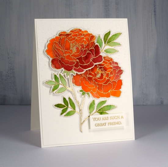
I have coloured this lovely flower a few times lately but I realised I hadn’t posted it all on my blog. I did some no-line colouring with the stamp which took a while due to the number of petals, but still produced a nice result which I’ll share at the end of this post. This weekend I decided to emboss the flower instead and paint it with peerless watercolours. I must say this technique was faster and less fiddly than the no-line petal by petal approach. I embossed two of them and painted them side by side with the same three paint colours. Peerless paint blends beautifully on the paper, in this case hot pressed watercolour paper, and I was able to add royal crimson over the top of flesh tint and vice versa until I was happy with the coverage and blending. The leaves were painted in olive green. I think I’ve mentioned before how much I love the quality, depth and blending of peerless watercolours.
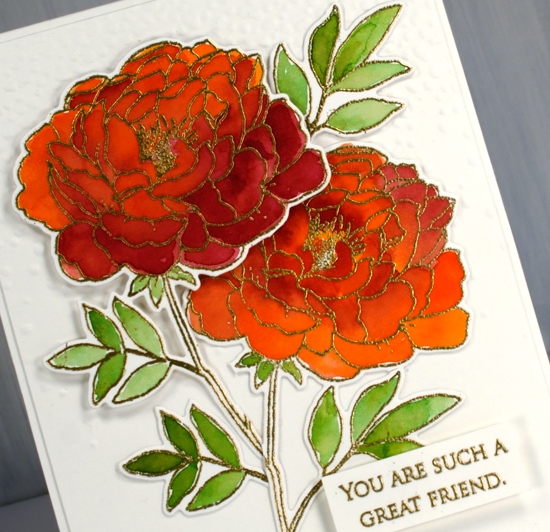
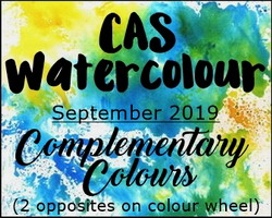
I used the co-ordinating die to cut out both flowers then arranged them on top of a ‘snowfall/speckles’ embossing folder background. I snipped a few of the leaves off and rearranged them to balance the composition. I also glued some pieces directly to the background and popped other pieces up on dimensional foam. The sentiment is from the grateful sentiments set and is embossed and popped up also. Because my orange/pinkish combo is opposite green on the colour wheel this card is a match for the current CAS watercolour challenge, a challenge I love but rarely get my act together to enter!
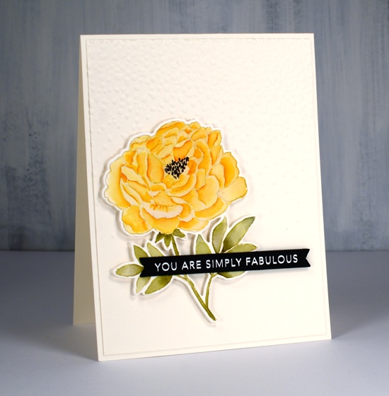
Here is a similar design I completed as part of my no-line watercolour class. I stamped in antique linen distress ink and used a selection of distress inks as ‘paint’. The sentiment is from a clever Taylored Expressions stamp and die combo.
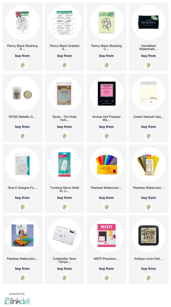
Supplies


They are both just gorgeous!
GORGEOUS creations! I absolutely love the orange flowers!
Both are very pretty, but the one with the yellow flower is so real looking because of the no line coloring. What a talent!
Stunning makes heather – simply love the colour in the first one. Vibrant and beautiful
It is fun to see the two very different techniques side-by-side…both ARE GORGEOUS! I like the pooling/shading effect you achieved with the embossed flowers…and your no-line technique is perfect. (I find it sooo hard!…but won’t give up…getting better!) 😀
Both are lovely Heather, but the first, the crimson one, left me awed by just how lovely it is.
Two beautiful and very different looks using this pretty flower image Heather. I love the gold embossing with the shades of bright red, and then the more subtle yellow tones using the no line watercolouring technique have worked brilliantly too. x
Both of these cards are gorgeous, Heather! Love the vivid colors of the first and the contrast with the embossing! The soft yellow no-line watercolor flower is so pretty! Awesome depth of each petal! Thanks so much for sharing with us at CAS Watercolour!
Two very beautiful cards! I agree that Peerless are great to work with and Arches is my fave indulgence:) Your colouring is wonderful. Thanks so much for joining us at CAS Watercolour Challenge.
Both cards are really gorgeous Heather. I love this image and how you’ve used it differently. The bright colours of your first card really stand out with the gold embossing. And always wonderful to have some dimension in the background from dry embossing. Thanks for sharing with us at CAS Watercolour! xx