
Bud & Bloom
Posted: March 16, 2023 Filed under: bud & bloom, Echidna Studios, Karin brushmarkers | Tags: Echidna Studios, Fabriano Watercolour Paper, Karin brushmarkers, Penny Black stamps 8 Comments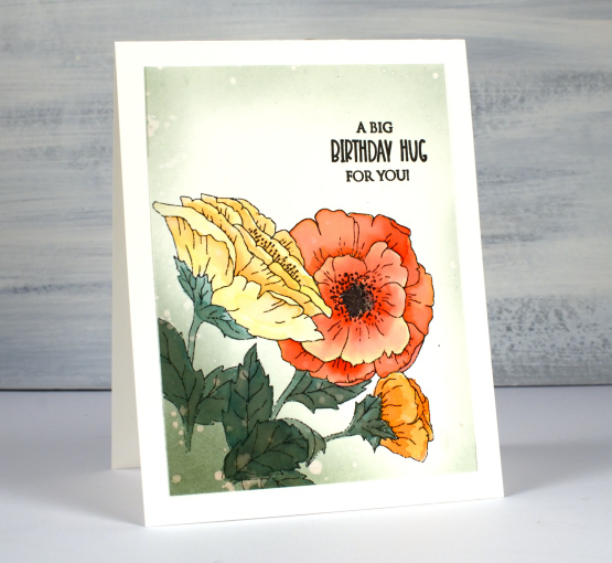
More flowers on the blog as we get more snow on the ground! The trio of flowers on the card above and the single bloom on the card further down the page are both digital stamps from the ‘bud and bloom‘ set available from Echidna Studios. I printed them on hot pressed watercolour paper then used Karin brushmarkers to add colour.
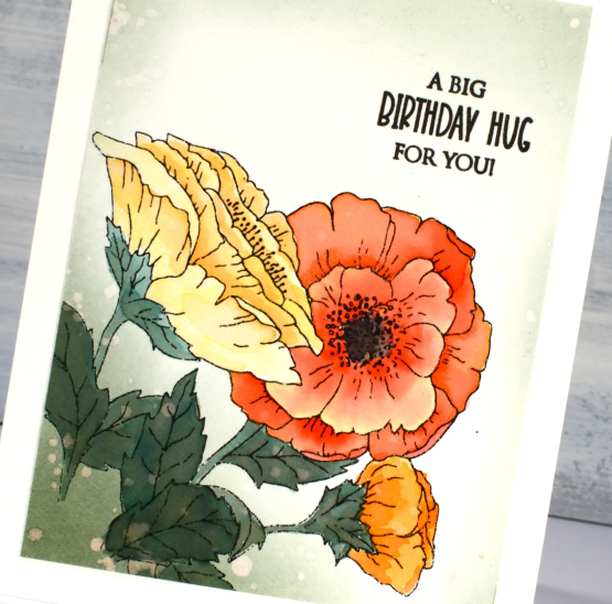
I haven’t used my Karin markers in a while but there are still as juicy as ever so a little ink goes a long way. I have seen the Karin markers used direct to paper, then blended with water and also scribbled onto a glass mat or palette then picked up with a brush. In the past I have tended to apply directly to my watercolour paper or directly on a stamp. This time I scribbled the markers onto my glass mat and blended colours before painting the flowers. I think this gave me more control over the blends. I worked with a yellow, a couple of oranges and a red to come up with the three mixes you see in the card above.
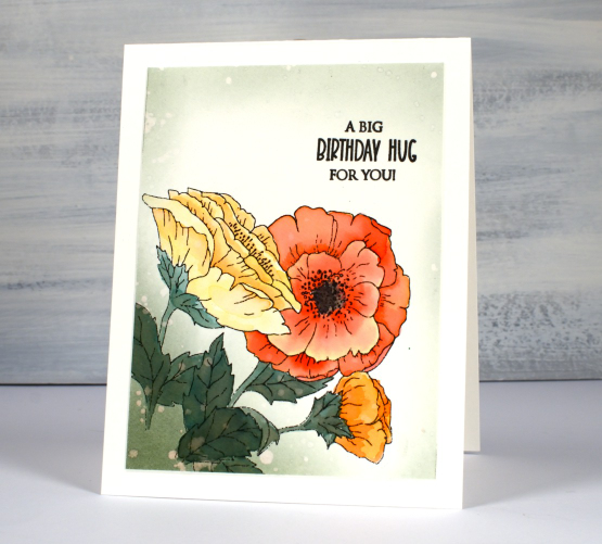
To add a green background to the card above I blended northern pine memento ink (the magic green ink) around the flowers then splattered water droplets over it and dabbed them up with a paper towel.
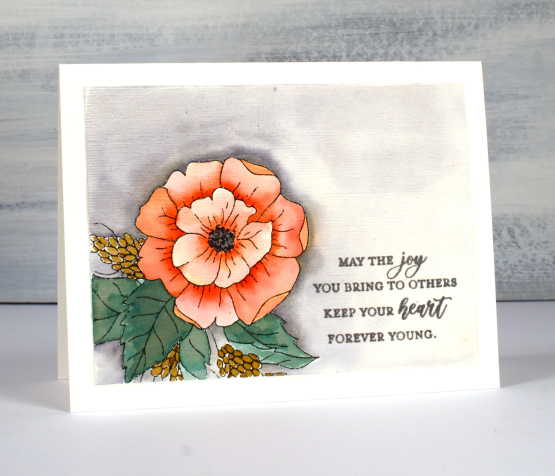
On the second card with the single bloom I added orange to the soft peach marker, once again picking up ink from a glass mat rather than applying it directly to the paper. While the ink was still wet on the paper I did touch the tip of the orange marker to the areas where I wanted deeper colour and shadow then immediately blended it out towards the ends of the petals. I added a little extra shading on both panels with coloured pencils, a trick I learnt from Kathy Racoosin a colouring wizard!
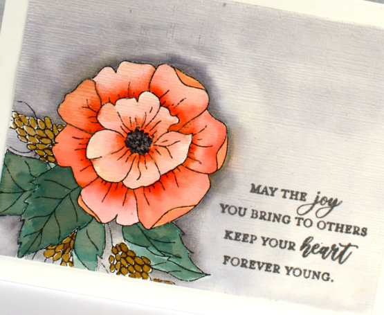
I used a warm grey marker from my set of 26 colours to add a background with a few spots of very diluted orange here and there. There are three greys in the set, a warm, a cool and a neutral grey. I tried each one on a scrap of watercolour paper before settling on the warm grey. I painted water onto the background then applied the grey ink onto the wet cardstock. I also added texture to this panel with the ‘subtle’ embossing folder which creates a canvas look.
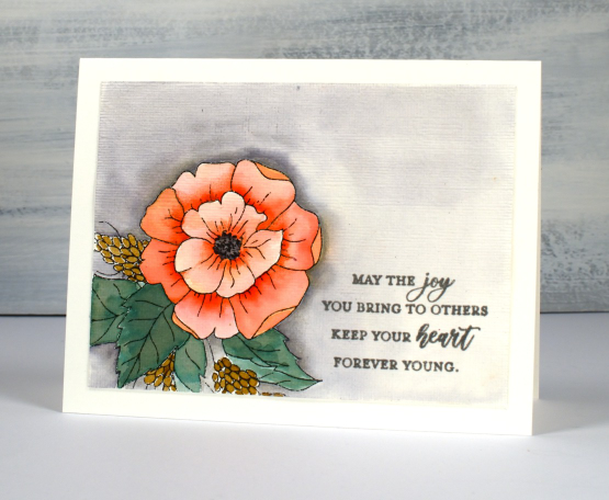
The sentiments on both cards are from the new Penny Black set, ‘delightful day’. I’ve mentioned before one of the bonuses of a digital stamp is that you can print it out whatever size you like. I’ve already printed the trio of flowers image larger on watercolour paper so the flowers will fill the whole panel. I hope to have that one finished to share with you soon.
Hope you have a delightful day whether you are surrounded by snow or flowers!
(Compensated affiliate links from Foiled Fox, Scrap n Stamp & Ecstasy Crafts)


Very Pretty Heather….they look so real. Wondered what EF you used to get the canvas look???
Paper Hugs,
Jan
Thanks so much Jan. The embossing folder is called ‘subtle’ and it is from Stampin Up. Unfortunately it is retired so it might only be available used. The canvas look is apparent after you have run it through the machine twice, once one way then rotating the panel 90degrees and running it through again.
Those colors just jump off the page! I never colored with markers but you did an outstanding job. I particularly love the soft wash in the background as well as the texture you added to the first one.
Two fantastic cards using these pretty flowers designed by your daughter, and the colours look great using your Karin Markers and a super idea to add some coloured pencil shading on them too. x
Love these flowers and the colors you’ve used with the graduating color on the petals! Wonderful backgrounds too!
So beautiful!
Refreshingly Pretty! I can’t decide who is more talented here – you and your amazing coloring or your daughter and her exquisite drawings. Family talent = Priceless!
[…] seen this digital stamp once before on my blog but it is much bigger this time. I printed it on hot pressed watercolour […]