Snow blooms
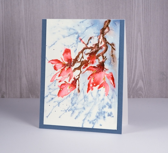
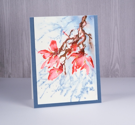
Posted: February 8, 2018 Filed under: a little secret, Effulgent | Tags: Penny Black stamps, Ranger Distress inks 12 CommentsI sense a bit of a theme in this week’s cards; do you think maybe I’m thinking about spring? I am surrounded by gorgeous floral stamps in my workroom but by six foot snow banks outside. So today’s card started out as just a pretty pink magnolia but ended up caught in some flurries.
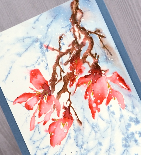
My plan was to build up colour step by step, keep it controlled and neat (not loose and watery). I stamped the whole stamp in worn lipstick ink then coloured the darker areas of the petals with a festive berries marker, the sepals in forest moss marker and the twigs in gathered twigs marker. I then blended the colour with water on a small brush so it was still fairly neat.
I wanted some extra foliage in the background and that’s when things started to go a little freestyle. I masked the flowers with a post it and stamped the ‘a little secret’ stamp a couple of times in stormy sky ink. The two stamps did not really look like they belonged together so I left behind my ‘neat’ plan and started spritzing the water around. The background softened but not quite enough so I painted some stormy sky into the background also. As I painted stormy sky right up to the edge of the branch the brown bled into the blue, things got loose and watery and, in my opinion, more appealing. I added some aged mahogany ink to the the centres of the flowers and some gold gel pen highlights. Then I wanted some snow as well so I splattered white gesso over the petals. I found a co-ordinating blue to frame the panel and kept it without a sentiment for now.
Supplies
Stamps: effulgent, a little secret


Distress inks and markers: worn lipstick, festive berries, forest moss, gathered twigs, stormy sky, aged mahogany


Paper: hot pressed watercolour paper,

Paint: white gesso

Also: gold gel pen

Distress oxide trials – Desaturation
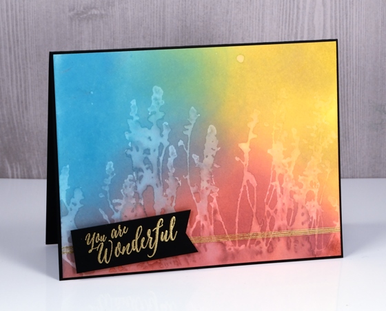
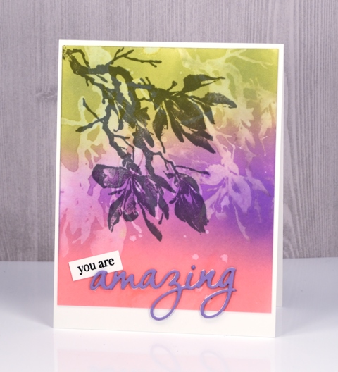
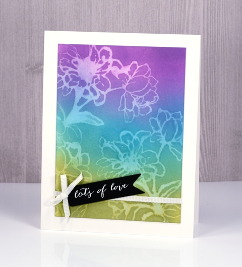
Posted: May 3, 2017 Filed under: Effulgent, Feathery, full of glee, Tagged | Tags: distress oxide inks, Penny Black creative dies, Penny Black stamps 15 CommentsCan you tell I like the way ‘distress oxide trials’ sounds like an significant chemical experiment? That’s why I called today’s post ‘desaturation’ rather than just ‘stamping with water! The effect does come, however, from stamping with water. I think it is my favourite technique so far. I began by blending the inks onto hot pressed watercolour paper. They do blend nicely on neenah classic crest paper but they blend even better on watercolour paper. By blending I mean sponging ink onto the paper, also called inking by some crafters.
For the these three cards I sponged three colours onto the paper and overlapped them to get nice soft blended colours. The sponging doesn’t take long, it doesn’t leave marks shaped like the edge of your applicator and it creates intense colour.
After sponging my colours over the whole panel I put the panel into my MISTI, positioned my stamp then spritzed it with water. All the stamps used for these cards are red rubber; (slapstick cling from Penny Black, names listed below) I haven’t tried with clear stamps yet. The stamp just has to hold onto the water for the technique to work.
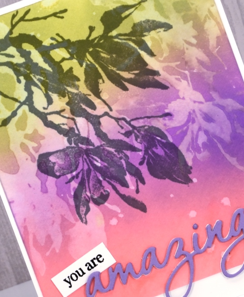
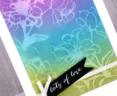
After stamping a water print onto the blended colour, I lifted the stamp and dabbed a paper towel over the print. It left a pale image on the coloured panel.
It’s not a really sharp image but it is definitely recognisable and I love the look.
The trials are not over but if you are looking for a technique to start with try some sponging; the finish is so rich and creamy. Then if you are feeling scientific try some desaturation as well. If you have thought of a technique you’d like me to try please leave me a comment below.
Supplies
Stamps: full of glee, feathery, Effulgent, stitched flowers, happy snippets (PB)
Die: tagged, omg (PB)
Inks: worn lipstick, broken china, fossilized amber, wilted violet, peeled paint distress oxide inks (Ranger) versamark, versafine onyx black & smokey gray (Tsukineko)
Papers: hot pressed watercolour paper, neenah solar white, neenah epic black, violet cardstock
Also: gold & white embossing powder, white ribbon, gold thread
Effulgent
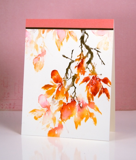
Posted: February 21, 2017 Filed under: CAS, Effulgent | Tags: Penny Black stamps, Ranger Distress inks 18 CommentsI am having fun creating with the new brushstroke stamps from Penny Black. This one is called ‘effulgent’; I checked the definition and think my colour choices help it live up to its name. The combination of red and orange make it ‘shine forth brilliantly’.
I used a stamp positioner for this panel but you could just as easily create it without. The trick to this design is in the re-stamping. I inked the stamp with distress markers, spiced marmalade and festive berries on the flowers, forest moss on the branch and old paper where the branch meets the flower. I spritzed the stamp to help the colours blend and dropped water here and there on the watercolour panel before stamping. After stamping once I used a brush to blend parts of the image then moved the panel, spritzed the stamp again and stamped a second generation, or paler image. Again I blended on the watercolour panel with a small brush then repeated the process, each time repositioning the panel and spritzing the stamp but not re-inking it.
I chose not to add a sentiment but found some co-ordinating textured cardstock to finish the design.
Supplies
Stamps: Effulgent (PB)
Ink: forest moss, old paper, festive berries, spiced marmalade distress markers (Ranger) (Tsukineko)
Paper: hotpressed 100% cotton watercolour paper, textured coral and brown card stock

