
Distress oxide trials – Desaturation
Posted: May 3, 2017 Filed under: Effulgent, Feathery, full of glee, Tagged | Tags: distress oxide inks, Penny Black creative dies, Penny Black stamps 15 Comments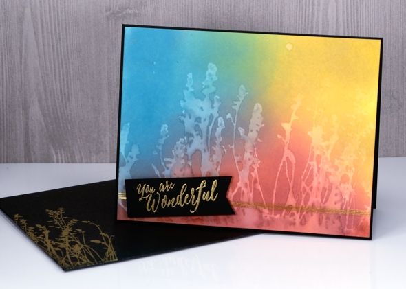
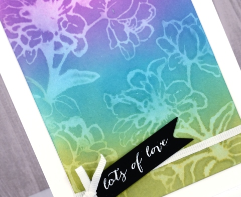
Can you tell I like the way ‘distress oxide trials’ sounds like an significant chemical experiment? That’s why I called today’s post ‘desaturation’ rather than just ‘stamping with water! The effect does come, however, from stamping with water. I think it is my favourite technique so far. I began by blending the inks onto hot pressed watercolour paper. They do blend nicely on neenah classic crest paper but they blend even better on watercolour paper. By blending I mean sponging ink onto the paper, also called inking by some crafters.
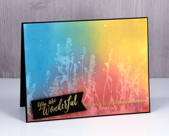
For the these three cards I sponged three colours onto the paper and overlapped them to get nice soft blended colours. The sponging doesn’t take long, it doesn’t leave marks shaped like the edge of your applicator and it creates intense colour.
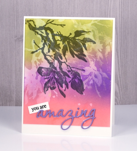
After sponging my colours over the whole panel I put the panel into my MISTI, positioned my stamp then spritzed it with water. All the stamps used for these cards are red rubber; (slapstick cling from Penny Black, names listed below) I haven’t tried with clear stamps yet. The stamp just has to hold onto the water for the technique to work.
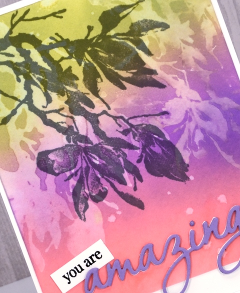
After stamping a water print onto the blended colour, I lifted the stamp and dabbed a paper towel over the print. It left a pale image on the coloured panel.
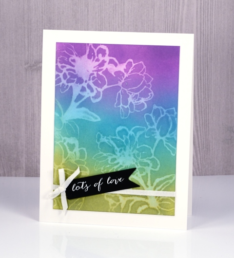
It’s not a really sharp image but it is definitely recognisable and I love the look.
The trials are not over but if you are looking for a technique to start with try some sponging; the finish is so rich and creamy. Then if you are feeling scientific try some desaturation as well. If you have thought of a technique you’d like me to try please leave me a comment below.
Supplies
Stamps: full of glee, feathery, Effulgent, stitched flowers, happy snippets (PB)
Die: tagged, omg (PB)
Inks: worn lipstick, broken china, fossilized amber, wilted violet, peeled paint distress oxide inks (Ranger) versamark, versafine onyx black & smokey gray (Tsukineko)
Papers: hot pressed watercolour paper, neenah solar white, neenah epic black, violet cardstock
Also: gold & white embossing powder, white ribbon, gold thread


Hello Heather, I am so happy to have Internet at the moment (in central Qld) catching up on all your beautiful work. I was trying to resist these new inks, but you are not making it easy!! You have sold me on this technique. Thanks so much for road testing and giving feedback.
Gorgeous! Seeing your cards makes me want to run to my craftroom and have another play with my oxide inks. I think these inks are the best crafty investment I’ve made this year.
Ditto Marianne’s comment!! Cant wait to get home from work tonight to have a play with the inks.
Love your art and I, too, have been experimenting with the oxide inks. Watercoloring does not come easy for me, but I am determined. LOL Try the Mixed Media Vellum Surface paper..I think the brand is Strathmore…it’s nothing like regular vellum except for the smoothness of the surface…it’s heavy weight, too, so it holds up well to using lots of water. I like using it best when blending inks. I got the tip from a blog post and tried it….very pleased with the results.
I love the look you’ve created. Thanks, will try this. Edna
Three gorgeous cards and this is so helpful Heather and I have made up my mind to give them a try soon. This technique certainly works superbly well with these inks and the colour combinations you have used are fabulous. x
Fabulous artwork Heather. Can’t wait for the weekend for some arty playtime. Thanks for the ideas.
Brilliant technique and wonderful cards, thank you! xxx
Really like the look Heather….TFS!
Paper Hugs,
Jan
This works so well! Seems to me there’s a much better contrast water-stamping with the oxides than with regular distress. Something else to try!
Yes definitely more contrast but I still love my original distress inks for their lovely watercolour looks.
I love the desaturation look and will have to give it a try with the regular Distress Inks. I haven’t been able to find the oxide inks to purchase, yet. I do have a question, though – can you use the Perfect Pearls on top of these oxide inks, too? Love your cards!
Hi Sharon, I haven’t tried adding any shimmer yet. Another experiment I will add to the list.
Love these Heather!
I love your cards! I REALLY want some Distress Oxides, I just wish they weren’t so pricey! You have inspired me to try some simple cards. I tend to do very busy cards, but yours are just wonderful!