
Correspondence
Posted: November 30, 2017 Filed under: Correspondence, World Map | Tags: Darkroom Door stamps, distress oxide inks, Finetec artist mica watercolour paint 7 Comments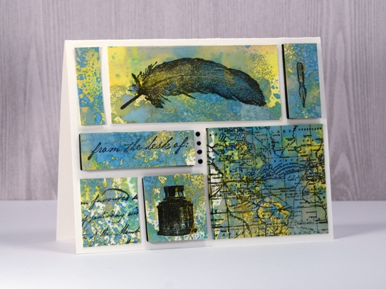
For today’s card I pulled out the Darkroom Door vintage style “Correspondence set” and the “World Map” stamp. This mosaic style card was made for the wedding anniversary of friends of mine. I chose the correspondence and map stamps because they are a couple who love books, travel and literary memorabilia.
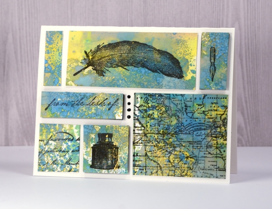
To create my background I used a layering technique featuring distress oxide inks. I pressed fossilized amber, broken china and cracked pistachio inks onto a craft sheet. I spritzed with water and pressed my hot pressed watercolour paper onto the ink. After picking up a layer of colour I dried the panel before laying it back into the ink to pick up more colour. By drying the panel in between layers I was able to keep the colours bright and distinct. Once I had layered enough colour I splattered some gold paint lightly over a few areas then let it dry.
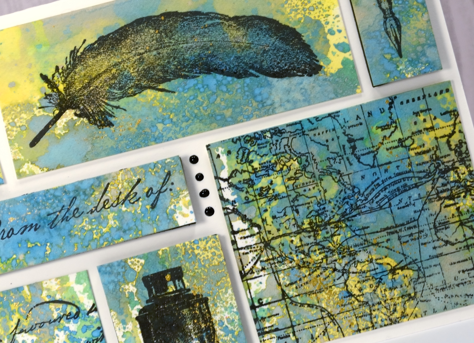
I chose several stamps from the Correspondence set and stamped them in versafine onyx black ink onto the distress oxide background. I also stamped the world map stamp so I could cut out a little map panel. The next step was a bit like putting a puzzle together as I trimmed and arranged my stamped and unstamped rectangles to fill a natural coloured A2 card front. Once I was happy with my layout I added black foam to the back of three rectangles to add height and visual interest. I was left with one little space which I filled with four dots of ebony black nuvo crystal drops.
Supplies used:
Stamps: Darkroom Door Correspondence set, Darkroom Door World Map
Ink: Versafine Ink Onyx Black
Distress Oxide inks: Fossilized Amber, Broken China, Cracked Pistachio
Also: gold paint, Nuvo Black ebony crystal drops, black foam sheet, craft mat
Paper: Neenah solar white, Hot pressed watercolour paper


WOW as usual, I love what you did with this card. It is still easy to execute. Once again thank you and congratulations.
Awesome card, I love the background colors and the mosaic layout!
This is just great. Love your solution to the little open space left over, with the Nuvo drops. That space would have driven me nuts. Not sure I would have thought of a solution. Thanks!
What a great idea for an anniversary card and I’m sure they will be thrilled with it Heather. I love the way you have laid out the panels at different heights and the oxide background goes beautifully. x
This is quite marvellous Heather. I love that you have raised some ’tiles’ for interest and left some flat. I also like your colour palette very much; the blue, green and amber shout sky, sand and sea to me reflecting the topic of travel & correspondence. So different.
Amazing use of color and space!!! I can tell you had fun creating this Anniversary card. Thanks for the inspiration!
Beautiful card. Love the mosaic tile effect.